
Don't wanna be here? Send us removal request.
Statistics
We looked inside some of the posts by natrozpackaging and here's what we found interesting.
Average Info
Notes Per Post
6
Likes Per Post
6
Reblog Per Post
0
Reply Per Post
0
Time Between Posts
5 days
Number of Posts By Type
Photo
16
Text
1


Fun Fact
BuzzFeed published a report claiming that Tumblr was utilized as a distribution channel for Russian agents to influence American voting habits during the 2016 presidential election in Feb 2018.
Photo

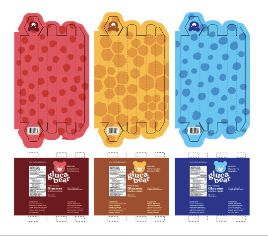
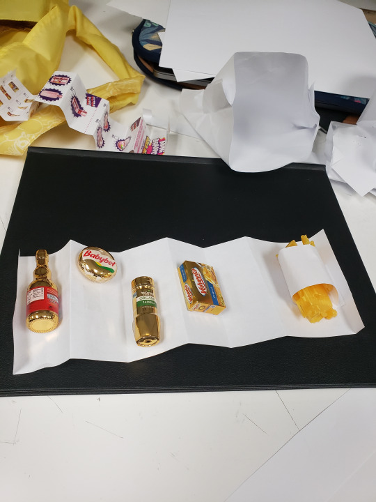
POST #14: Finished Prototype
It is done!!!
I used a matte paper for the tube itself and the stickers, and opted for a glossy paper for the outside strip. The outside strip adds extra stability as well as adding a bit of grip. I know when my sugar is low I struggle to hold on to the tubes, but with the glossy photo paper it sort of adds a slightly sticky grip to it which I felt was very fitting. The gloss paper also lets the type look very sharp and readable, as I needed a small size for some words. The sticker is taken from the pattern on each flavour and then printed on sticker paper.
0 notes
Photo
POST #13: Finalized Design
This is my final design for the Glucabear glucose travel tubes. I’ve included a before and after.
I got wonderful crit from everyone. The “harsher” the crit I find the better the things I create. I’ll probably request very blunt critiques from now on.
Things that needed fixing:
-almost no hierarchy, nowhere for the eye to look at first
-change the website to be super readable instead of the logo
-add french for everything
-logo bigger!
-logo looks black, too dark
-fix the glue edge
-picnic blanket doesn’t read well right away
-sideways much too hard to read
-logo too small
-colours very plain
Having a lot of crit sort of gives restraints where there wasn’t before because you know what to avoid and it gives you direction. I’ve had projects with very little crit before and it’s quite a struggle but this one was lovely.
To fix the problems with the first batch:
-vertical arrangement is easier to read
-huge focus on hierarchy and guiding the eye
-french added
-logo pinpointed and large
-logo colour matches the flavour
-glue edge changed to the back
-picnic blanket changed to a fun, flavour-related pattern
(can I make a package without a pattern? I guess not)
-colours brightened and changed to a fun primary colour scheme, leaving room for other flavours and possibly a rainbow of flavours
-tamper-proof sticker is in the shape of the flavour-related pattern
My package now, instead of being cute and sort of gentle is vibrant and lively. it matches my orginal words of playful, alive, charming & friendly.
0 notes
Photo


POST #12: Rough Prototype & Digital
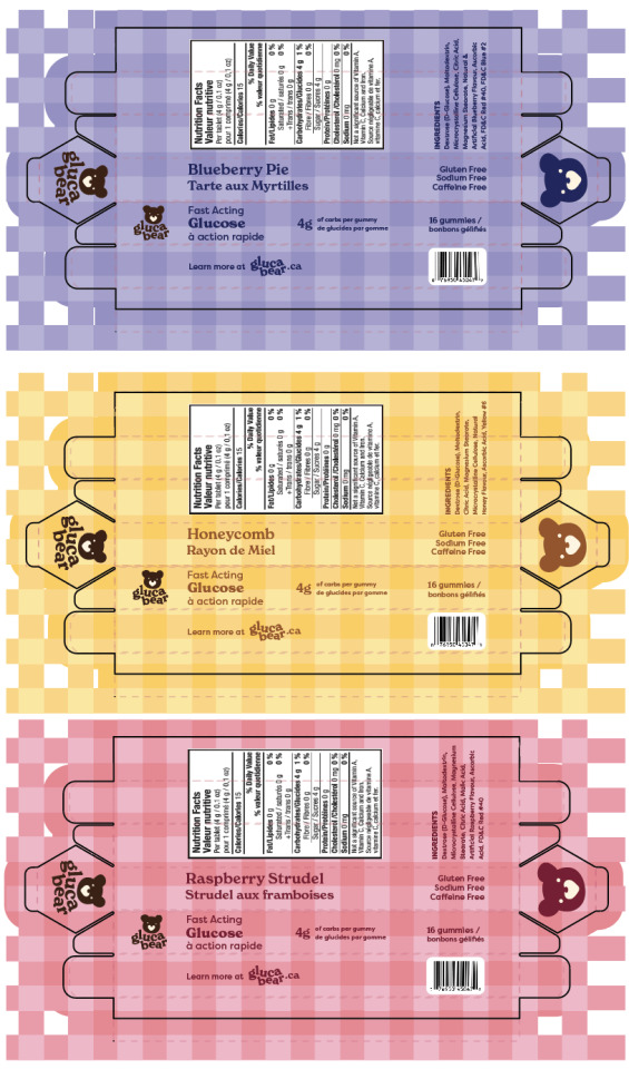
So I mentioned drifting away from the fairytale, pastry bear aesthetic, however it has a hold on me and has stuck with me. I went ahead with the hexagonal tube shape, as it is the same shape your hands and the grooves in your hands make, as well as being reminiscent of a honeycomb shape. I used my own hands for reference as my hands are the same size as my 7 year old nephews so I figured that was fine. The tube fits exactly 16 gummy bears, which are what my glucose product would be. 16 bears is enough for 4 low blood sugar attacks, as each would have 4 carbs and you need about 15-16 carbs per low. The plaid pattern is supposed to resemble a picnic blanket. Each tube is coloured based on the flavour to make it extremely obvious whihc flavour is which. There’s a blueberry pie, honeycomb, and a raspberry strudel. They would be stacked on the shelf horizontally, and to read the ingredients and nuteritional information, you tilt the package vertically. The bottom flap is glued shut, whereas the top flap will have a very sticky sticker that will rip when you open it to prevent tampering. I think I want to add a small drawing beside the flavour name; a blueberry pie for the blue package, a dripping honecomb for the yellow and a little raspberry strudel for the pink package. The drawing could also be the sticker for the top flap. I think I want to include the circle behind the logo to help it stand out a bit more. The paper I used is very glossy and pretty, but it needs to be more stable. If I use a thicker cardstock, it will stand up better in a bag. I think a matte paper might be more on brand as well, feeling a bit more natural. I might be able to make it a bit like an old book texture, like in a book of fairytales. As far as colour palette, aesthetic and type, I think I like the placement and hierarchy. It’s not super busy, especially considering you need a fair bit of information fit onto a thin tube with very thin sides. I think I want to make the “Glucose” more prominent because the packaging is so different from regular glucose packaging. It’s likely people would walk by it without realizing. All in all I am pleased so far with the thought I’ve put in and the actual work I’ve done so far; just needs a bit of tweaking.
1 note
·
View note
Photo


POST #11 Thumbs, Roughs, Mock ups, Rationale
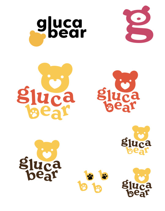
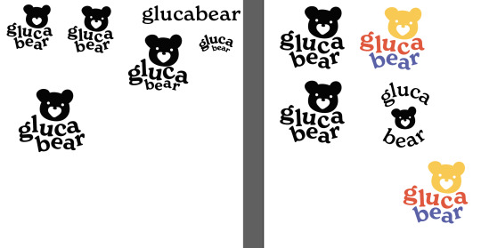
LOGO/BRANDING
I think I’ve relatively decided on my logo. I fiddled around as best I could with it, but my brain won’t let me do anything else to it so I think that means it’s done. The type is meant to almost resemble alphabet blocks. I think it has sort of a calm energy to it, which is good. I’m not as keen on the colours. The original flavour, and original logo, is honey flavour, so I did very normal yellow and brown. For the other flavours, the yellow is replaced with whatever colour makes sense for those flavours. My concept for flavours is “flavours that a cartoon bear would eat” that also sound appetizing. Like goldielocks and the three bears, homemade pie in a forest cottage. So fruit pastries, like blueberry pie and apple turnovers, or simply honeycomb flavour. I want them to be more appetizing than the regular flavours that exist, like raspberry or orange. I know the ones I have are just gross, but the thought of ones that actually taste fun is pretty exciting. I’m going to do some more colour combos today and see if I can move away from “pastry bear” into something different, just for a wider scope of theme. As of now I don’t think these colours are working in the way I want them to.
Rough Rationale
CHALLENGE
The main challenges for Glucabear glucose tabs are easy opening and packability. Because they are used in emergency situations by both parents and children, it needs to be very, very easy to open. Easy enough that someone who’s having low blood sugar can get into it. It also needs to be in a shape where it can fit into most bags. In order to be fully packable, it needs to be sturdy enough that it stays together in a busy children’s backpack. It also needs to appeal to both children and the parents who purchase them for their children. The package should also be recyclable and able to be thrown into the recycling bin with little effort afterwards, especially when children might be tossing them in the bin. Making it as easy as possible for them is the goal.
APPROACH
The package itself will be made of thick cardstock of some kind; something that is recyclable. It will be sturdy enough that when kept in a bag with things moving around, it will keep its shape and protect the glucose inside. The package will be waterproof incase a child is walking to school in the rain or the bag falls into water. The outside is waterproof, but the inside is also lined with food safe beeswax for extra waterproofing. A tube shape, possibly hexagonal to be on theme with honey & honeycomb, or a more flat box in a hexagonal shape with an opening that lets you shake the glucose out would be on brand and easy to open. The glucose themselves are gummy bears made of glucose. They replace the pre-existing styles of glucose with something fun, on brand and the texture is much more pleasant for children with sensory issues than regular, chalky glucose.
OUTCOME
I think the project will turn out exactly as I hope, meaning a sturdy, portable package for children’s glucose that is on brand and sustainable. Using cardstock is an easy way to make something recyclable, and it’s quite sturdy as well. Ideally, this package can fill the current hole in the industry regarding tools and medicine for diabetic children in a fun and sustainable way.
THUMBS


MOCK-UPS

My first mock-up is this resealable bag. It would us plastic parts to reseal itself, and the top part would be perforated so you tear it off to open it, and the pull apart the resealable parts.


This one is much more interesting IMO and works better for fitting in a kid’s bag for travel. This is a really big version; it would likely be 5 or 6 inches tall, with a 2-3 inch diameter. It’s hexagonal, like honeycomb, but this shape also gives it stability. The top flap folds in to close it, and it would be held in place with a sticker on shelves to prevent tampering. The inner flaps needs to be fiddled with as well; the pointy edges could lead to papercuts and they also make it finicky to open. The tube shape is nice because you can quickly pour the glucose out. I think it’s very easy to open, enough thta a child having a low will be able to open it. Better yet, absolutely no plastic, unlike with the resealable bag.
0 notes
Photo

POST 10 b: Inspiration, Moodboard, Client Research
INSPIRATION
My keywords for my package are playful, alive, charming, and friendly.
Playful is experimental and light. Alive is vibrant and full of vitality. Charming is warmth and a desire to look at. Friendly is easy to read, accessible, and “round”.

I love the hexagonal shape of this package. It would be easy to pour out each glucose tab with an opening like this.

I enjoy the use of colours and sort of geometric animal shape here.

The use of flat colour combos works well here. Lots of colours are being used, but each flavour is very distinguishable from the other.

The animals are super playful and have some cool texturing/patterns. I like the big text, too.

The “hand-lettered” type is interesting and really feels friendly. I don’t think a glass bottle works for my product, but I do like the use of the juice as a background, and then changing “ghost” to a single colour for differentiation. Very simple, but a good attention to detail.

These stack in such a fun way! I think it might be interesting to do this with a small hexagonal shaped box? Maybe on each side there is a bear wearing different tops and bottoms, and fi you stack the boxes, you can make it look like bears wearing different outfits?

I like the use of different species of bears. Similar shapes, but drawn in a way that they are all very identifiable. The “primary” colours works well here.

This might have been the main inspo for my idea. I love the honeybee and bear combo. I feel like the forest aesthetic of bears and honey gives lots of room for itneresting ideas, and it’s super recognizable to kids. The illustration here and the simplicity make it shine.
CLIENT RESEARCH
Since I’m making up my own brand, I included a totally made up client survey from Patrick’s classes.
What is the name of your company?
Glucabear
What is your business/what do you do?
We are a company who created diabetic devices and medication aimed at children. We design & create blood sugar check kits, emergency glucose, and various other tools used by diabetic kids.
How old is your company?
2021
What is the size of your company?
We are a small company of about 100. We have tech people who work specifically on our monitoring kits and the apps that go with those kits, we have textile designers who work on the cases the kits go in and various other textiles, and we have pharmacists and scientists who formulate our glucose items. We work out of one main office in Abbotsford, but our factory for textiles and other goods is located in Toronto.
Describe your business in one sentence.
Sugarbear+ is dedicated to making the lives of diabetic children easier by providing fun and child-friendly tools for dealing with their diabetes.
Describe your business in two words?
Playful Health
Describe your business in one word?
Children
What doesn’t your business do, or do well?
We are the only company that creates diabetic tools specifically for children. As a result, our customer base is smaller than that of other companies catering towards diabetics.
What differentiates your business from competitors?
We cater specifically to children. We have a strong focus on organic ingredients and ethical acquired materials.
What are your business objectives?
To provide a fun, comfortable and easy experience for children when dealing with their diabetes.
If you company/brand was a person who would it be? Why?
If our brand was a person, it would be a playful paediatrician. They are knowledgable and trustworthy with children at the heart of what they do. They also know how to appeal to kids and make tough experiences easy and enjoyable for them.
How do you want the public to perceive your image?
We want to be seen as playful, children-oriented, safe, and ethical.
What do you want to be famous for?
We want to be famous for creating diabetic tools for children.
What words should the general public associate your business with? Name at least 3.
playful, alive, charming, & friendly
MOODBOARD

0 notes
Photo


POST 10 a: Some Client Research & Discovery
So no brands currently exist that are glucose for children, so I chose this medication for children instead as something in my “genre”.
a) What does the packaging tell you about the brand?
The packaging here is very neat and organized for easy reading, but it’s very playful and makes use of a different animal and colour for each type of medication. If you were to show a child this packaging, they would likely be interested in the animals and bright colours. This brand comes across and trustworthy and catered towards children and their needs. They want to make medication-taking fun for children. Giving children medication is difficult, including glucose as it’s very boring and quite disgusting.
b) How does it do that specifically?
The logo itself is rounded with a heart and fun little rays, making it come across as very friendly. The colours are bright and inviting, and clearly differentiate each flavour/type. Each type further has an animal character to differentiate the types of medication. The character add emotional and an aspect of fun to the package. The characters are shown taking the medicine, which may encourage children to also take their medicine.
c) What differentiates each “flavour"?
Colour and an animal mascot differentiate each flavour.
d) How specifically is this done?
There is a repetitive use of one colour and black and white throughout a “type”. This use of one colour makes it very recognizable, especially when the colour matches with the medication, like with the iron supplement being red. Each type also has a very distinct animal also in this colour. Each animal type is unique as well. They are drawn in very distinct ways so not only are they different animals, but they are caricatures and have distinct silhouettes.
9. Determine your additional objectives for your package.
Package should have an appeal to children.
It needs to be easily openable and storable in a bag or backpack.
Readable and accesible.
Recyclable but sturdy enough to be kept in a bag for emergency.
12. What will you do? Find your product. Why does this product need your redesign?

Emergency glucose made specifically for children. These are travel size. Few emergency glucose supplements exist, and none exist for children. All look very medicinal and most come in unappealing flavours. The chalkiness of glucose tabs is very gross to me, let alone to children. Children hate taking medicine as is, so something that’s fun and playful, easy for them to open, and easy and pleasant to eat in an emergency will make the process much less stressful for them. They have enough problems as is being diabetic without needing to be forced to eat chalky glucose in an emergency.
1 note
·
View note


Photo


POST #8
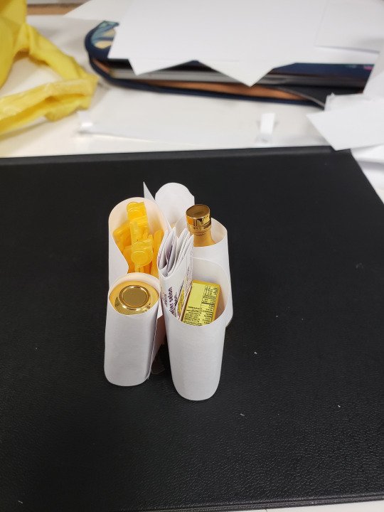
Just a quick one because it’s 2am and I’ve been building all evening. This is what my package ended up looking like so far.
0 notes
Photo


POST 7: Continuation
I got tons of feedback last class and tried my best to incorporate everything. Most feedback involved simplifying and getting rid of things. It looks less vibramt this week due to my printer running out of ink (and it’s expensive).
Things I did:
-remove all mini photos to simplify and add mystery
-add the pink on the inside
-remove “exclusive gold minis”
-fix up the body text for the body (Still needs work so I did not show it here)
-shrink “all new collectible mini toys” & center it
-shrink the starburst and logo so they fit on the face of the package and nothing sticks out (packages will stack nicely together now)
-removed all gold stars except around “GOLD RUSH”
-put “open me” on the wedges
Things I need to do:
-fix the gap between purple, outer package; starbusrt has shrunk so need to make up for this
-finish up the copy on the body of the box
-lengthen the closing strap
-change measurment of fold lines on purple outer package, some are the wrong size
I felt a bit rushed this week but this following week will be better hopefully.
0 notes
Text
Renewed Rationale
RATIONALE
Challenge:
My main goals for this project are to fully eliminate any plastic and rubber, only use recyclable materials, make the package reusable by also acting as a toy, and improve the design so it stands out against competitors. My main difficulty will be in designing the package in a way that it appeals to children enough that they decide to use it as part of the toys. Constraints would be only using recyclable materials, keeping the “surprise” aspect, as the entire idea of the toy is that it’s a surprise what you recieve, and the package has to hold a bunch of tiny objects in a nice way, while still being large enough to stand out on a shelf.
Approach:
I plan on using my glossy photo paper in the final print, as it’s very similar to the weight of many kinds of cardboard packaging and I can print it at home that way. The package will act as another toy, potentially a grocery basket shape with a handle? Some of the minis that come in the package are also cardboard. It needs to be designed in a way where it is sturdy enough to hold up use, while also holding very small toys.
Outcome:
I think my goals are reasonable and not too out of the question. The plastic can be eliminated very easily, and I think it’s definitely doable to make the package a toy as well. By the end of the project, I should have a completely recyclable package that holds the surprise toys in an organized manner. The package will act as another toy, and be redesigned so it stands out amongst the see of pink & purple kid’s toys.
Rationale has changed a lot:
Challenge:
-the toy aspect is no longer valid, we are going for recyclable instead of reusable, though it would look very cool on a shelf
Approach:
-Glossy paper will still be used, but will likely also need a special kind of glue or velcro for the flap
-It will not act as another toy
Outcome:
-Package will not be a toy, but will still be recyclable
0 notes
Photo


POST 6: Rough Prototype
So I had some extra time this week so I thought I would try and get as much done as possible, so there was much more to critique for class. I attempted to design a new logo & branding for the package, with a nod to the tone and design of the older packaging.
Things I like:
-The orange, purple & pink colour scheme is fun, without being overly girly like the previous packaging.
-The patterning on the package. I didn’t draw it myself, but I will be drawing a pattern out for the final package, likely outlines of some of the minis you can get.
-The starburst that comes off the edge of the package, along with the brand type. It feels explosive and fun.
Things that are not great:
-The thin typography needs some work, it’s not a good typeface for that.
-The face of the wedges has mini images in the wrong direction.
-the outlined starburst on thr face of the wedges is odd.
-unsure about the “gold rush” font. I went for a child-friendly western font, but I’m not sure if that’s working or not.
For takeaways:
1. Children’s packaging is a lawless land of colours that make no sense and weird type so my inspiration is lacking.
2. I chose a very challenging shape and package design but I really hope it pays off in the end with some hard work because it would be a unique portfolio piece.
3. I REALLY like orange and I wish it was used more.
0 notes
Photo


POST #5:
Reduce, Reuse, Recycle, Rot
It was super interesting to tear paper apart and try to make packaging inspired by Refuse, Reuse, Reduce, Recycle & Rot. It was definitely good to think outside the box becasue it ended up helping me become unnattached to my first package. I don’t normally find myself getting attached to things I create, but I was a bit too attached to the bag.

The original package was cute and fit the theme very well, but after some critique I realized that children would more than likely just rip into it. The bag being kept after may be more targetted towards adult collectors (like myself). The most important flaw, however, is the lack of excitement towards opening the package. The original has round wedges that pop out, and you rip open each pieces one by one to get your mini. The bag has none of that fun, which means if I were to try and get the company to take on an eco friendly package, they would kick me out of the office.


This was the mockup I decided was my strongest after some experimenting. Each wedge fits together to make a polygon. You have a wedge for each mini, and a dedicated wedge for the collector checklist, which was missing from the original package. The wedges unfold by taking the strip and the top and pulling it to the left, unravelling the wedges. Now you are able to open each wedge one by one, and the entire package can go into the recycling, or you can put the minis back in and put them on your shelf. The polygons stack neatly on top of one another. I like how the starburst shape looks when you open it, but I think I need to finesse it some more so it looks a bit better when it’s closed. I had my roommates open it up. It seems relatively intuitive to open, and they enjoyed unraveling it.
1 note
·
View note
Photo

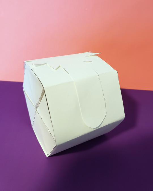
POST 4: Rationale & Thumbs (placeholder image)
RATIONALE
Challenge:
My main goals for this project are to fully eliminate any plastic and rubber, only use recyclable materials, make the package reusable by also acting as a toy, and improve the design so it stands out against competitors. My main difficulty will be in designing the package in a way that it appeals to children enough that they decide to use it as part of the toys. Constraints would be only using recyclable materials, keeping the “surprise” aspect, as the entire idea of the toy is that it’s a surprise what you recieve, and the package has to hold a bunch of tiny objects in a nice way, while still being large enough to stand out on a shelf.
Approach:
I plan on using my glossy photo paper in the final print, as it’s very similar to the weight of many kinds of cardboard packaging and I can print it at home that way. The package will act as another toy, potentially a grocery basket shape with a handle? Some of the minis that come in the package are also cardboard. It needs to be designed in a way where it is sturdy enough to hold up use, while also holding very small toys.
Outcome:
I think my goals are reasonable and not too out of the question. The plastic can be eliminated very easily, and I think it’s definitely doable to make the package a toy as well. By the end of the project, I should have a completely recyclable package that holds the surprise toys in an organized manner. The package will act as another toy, and be redesigned so it stands out amongst the see of pink & purple kid’s toys.
THUMBS

Some different ways to hold the minis.

A shopping bag and some more ways to hold minis.

Logo redesigns, more inside ways to hold minis.


Shopping basket with “z-fold” to keep minis in place.
MAPPED LAYOUT


My roommates brew beer on the weekends, and we have a lot of boxes with empty bottles. In order to keep the bottles standing and stable, there are these dividers that stack into each other using slits cut in thr cardboard, and it ends up making a “tic tac toe”-esque shape- this would be great for holding the minis in place and using very little packaging to do so.

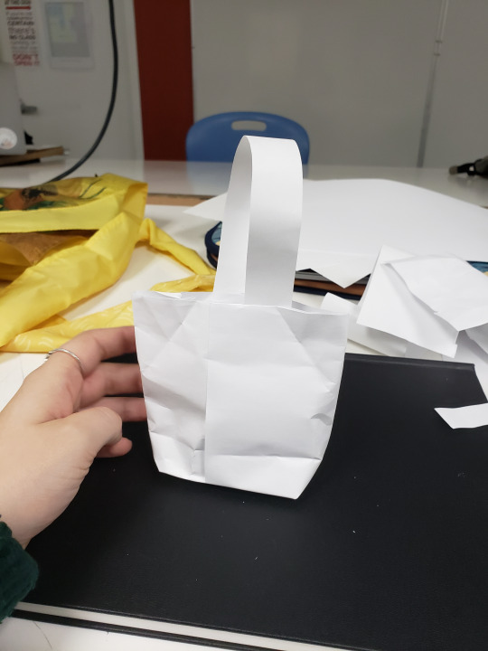
After many hours & many tears (half kidding), I managed to come up with a few ideas for this packaged redesign. I won’t sugar coat it; this was really bloody difficult and a pain in my tush. My brain just couldn’t comprehend how to break down a package into its unfolded and unglued version, despite having done so a few weeks prior. I spend a very long time cutting paper up and trying to figure out how to fold it into a package that made sense. I tried to draw out mapped layout after mapped layout, but it made no sense to me without building. I had to google packaging tutorials. Thank goodness I did. I stumbled upon a tutorial for a giftbag, and it was exactly what was in my head. I could finally visualize how to put this damn thing together. I fiddled with it for awhile and tried some different things.
In order to reduce packaging, I decided to have the handles built in to the carstock. No need for a seperate ribbon or anythign to act as a handle.


I made a mock up, and everything fit inside well. I wanted the inside divider to be a bit flexible, because the minis you get are random and you need to be able to make them all fit. This way, you should always be able to fit all your minis, as the individual sections can change shape depending on if you need more room or not for each individual mini. The handles fold down into a cut in the back, so it stays closed and is a surprise.
I’m very glad this part is over. I realize that I don’t really do well when it comes to visualizes and breaking down 3d objects. I am quite keen on my little bag though. If I don’t use it for this project, I’ll definitely use it for christmas gifts.
1 note
·
View note
Photo


POST 3: “Before” Product
As soon as I heard the words overpackaged, children’s art supplies and toys came to mind. Kids love unwrapping stuff, much to the environment’s dismay. It’s not their fault, they definitely get conditioned from an early age to love unwrapping toys, just as the LUSH documentary said.
I actually really like kids toys, and these Mini Brand things are something I wanted to look at for awhile. They’re tiny versions of regular, average, every day products. That’s it. So there’s an ethical problem with the toy itself; teaching kids that products are collectibles and REALLY ingraining that brand recognition in them when they’re young.
At first glance, I thought it was just a plastic ball, with an extra plastic layer around it, which is very redundant. So I removed the plastic layer...

And there was another layer of plastic. Not sure what purpose that serves, honestly. But what I thought was a plastic ball is actually this weirdly segmented ball, with a rubber (?) piece keeping it together.

Unwrapping the second plastic layer, and voila! We have our weird chocolate-orange-esque container. I took the rubber thing off and opened it up.

And there’s more plastic. There’s a little plastic layer on each segment. I don’t even understand the segments. They’re very cumberson and floppy when you take off the rubber part.

So this is how much plastic was used. The only recyclable part is the yellow segments, which are huge.

This is the actual product you’re getting. You get a few miniatures, maybe an inch or two in size, a checklist, and some instructions for building the little shopping cart.
I was genuinely suprised at how much plastic there was. I expected to be able to reuse the ball thing, but it’s a huge pain to stick it back together. It went strsight into the recycle bin, and the other plastic went in the garbage.
The beauty of this toy when redesigning it is that it’s a surprise bag essentially. You don’t know what you’re getting inside, so there’s no need to worry about showing what the toy is. I noticed tons of toys had plastic so the toy inside could be shown. With this, you don’t need to worry. I’ve never designed something where the audience is children, so this will be good practice.
A sidenote, I cannot for the life of me tell the brands of children’s toys apart. It was a huge aisle of pink and purple for the girls, and red and blue for the boys. Nothing was differentiated. I suppose kids don’t care what the branding is, but there’s gotta be a better way than what’s currently being done.
1 note
·
View note
Photo


POST 3: Activity 2
I definitely learned more from the printing & cutting aspect of this project than the digital part.
I have a decent printer at home, so I printed my packaging off on a piece of matte photo paper. The quality of the paper was nice and stiff, but not too stiff, so scoring and cutting went smoothly.
The first thing I noticed was how thick my typography was for my serif font & my slab font. WAY too thick. I imagine this is due to my printer, but I should still keep this in mind. It would have been valuable to do a test print in black and white before hand.
Secondly, for the black starburst shape on the front, I orginally cut out the type from the shape. In printing, this caused some problems, where it didn’t show up properly. Leaving the type as an actual shape vs a cut out helped it print much better.
My images themselves, like the eyes and the mascara brush illustration are blurry, as I scanned them and cut them out to put on my packaging, but I wanted to include them for accuracy sake so I’m not terribly upset about the blurring.
Another thing that was off was my colours. The original packaging is a peachier tone, and mine was a cooler pink. And of course I don’t have access to embossing or metallics, so I had to settle for a light grey and no embossing.

One very important thing I missed in my digital creation were these slight inset corners on the flaps. When I printed my piece out, the flaps dind’t fit inside the box. I realized it was because of these slightly inside edges. They’re there so that it fits snugly inside the box.
All in all, I came very close to recreating my package. My typography is very close, in size and font, my placement of objects was measured and placed with care, and except for missing the inset edges of the flaps, my box is accurately sized and fit together very well. All in all, I learned how detail-oriented you need to be when it comes to packaging. There’s a lot more to think about, like how things physically fit together, and little tricks to making it work, like inset edges and such.
0 notes
Photo

POST 2
I had a blast remaking my package!!
First, I laid everything out in illustrator. The die cut, outer box, measurments, etc.
I then spent about 2 hours in adobe fonts trying to match type. “roller lash” is an exact match (luxus brute), while the decorative slab is close (filmotype), and then my sans-serif is Freightsans Pro. I used a ruler and painstakingly (probably too painstakingly) went in and measured to try and best match my typography.
After type, I placed all my decorative shapes and background colours, as well as the upc code and photos. I measured as I went and kept my file at 100% zoom.
I’m proud of the outcome. The goal was to try and match as closely as possible, and I think I did a decent job at achieving that.
0 notes
Photo

POST 1
To start off in Package Design, we were tasked with breaking down a random package. I ended up with a little mascara box.
There’s a surprising amount of thought that went into the box. In order to make it fold comfortably and fit together, very specific curves and little cuts were chosen. Breaking the actual shape down was very valuable for understanding what actually needs to be considered in regards to a piece of packaging. It’s a very detail-oriented task, and I definitely enjoyed peeling apart and remaking the little box.
1 note
·
View note