
Statistics
We looked inside some of the posts by natroztypography and here's what we found interesting.
Average Info
Notes Per Post
17
Likes Per Post
16
Reblog Per Post
1
Reply Per Post
0
Time Between Posts
7 days
Number of Posts By Type
Text
11
Last Seen Tumblr Blogs


Fun Fact
Tumblr has 411 employees.
Text
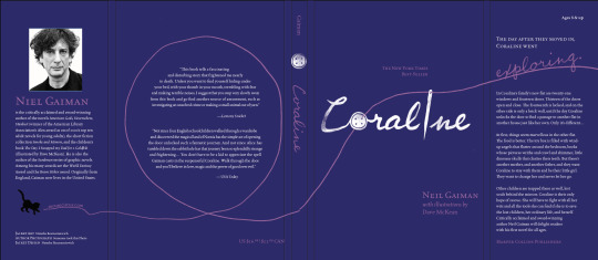
Creative: Proof 2
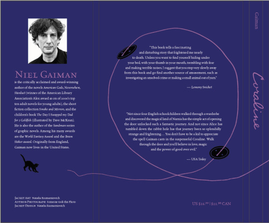


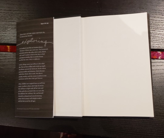

Pardon the horrible print quality, I’ve run out of printer ink and it’s having a rough time.
I’m excited to see the finished product with colour and proper printing. Now that I’ve simplified it further and fixed some crimes, I can see this is a proper dust jacket.
Some things to fix:
-the cat and end of the thread need to be moved much further down. The type here is too cluttered and close
-I need to move the bind title and the back cover slightly, it’s not centered
-I need a few more cm on the top on bottom, they don’t quite cover the entire book, it’s a bit short
-The title has a slightly off alignment, “cora” is higher up than “ine” so it feels a bit strange
I will fix these up, buy more ink, and print it off to display in my bookcase.
7 notes
·
View notes
Text
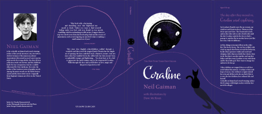
Creative: Proof 1
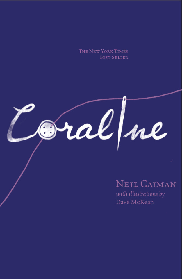
So I decided to take my feedback and really simpify and tweak some things. I moved the cat element to the autho jacket page, and completely removed the moon image. I fixed all the text on the back cover, getting rid of all the rivers, and I upposed the leading on all my type. The script font wasn’t working, so I hand-lettered some where I wanted it to be. I appreciate how the title looks, playing with the image and type together, and I like the aligned type to the needle. The hand-lettering has a bit of weathering, keeping in theme with the book and how ancient the Other Mother is. I think I need to seperate the type from the button, I don’t like how it connects. I do like how the thread spans the entire jacket, but I might need to go in and redraw it so it looks a littler smoother.
1 note
·
View note
Text
Project 2: Planning
So this is what I’ve come up with so far.
My goals for this cover are as follows:
-a minimal dust jacket with 2 or 3 colours
-a focus on a more mature cover but keeping the playfulness and whimsy
-keep the thread across the entire dust jacket and work the typography around it
My colour palette is quite minimal. Purple is a very whimsical colour, something playful and creative, but it’s also the colour of a night sky and is often associated with intuition and tarot cards and fortune-telling and the like. There are two characters in the book who are retired actresses that read Coraline’s cards and give her a stone that allows her to find the lost souls of the children. I can’t think of a more fitting colour to reference the importance of intuition here.
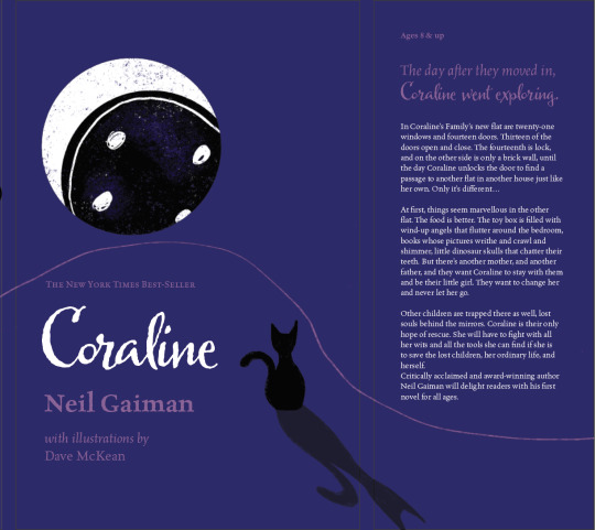
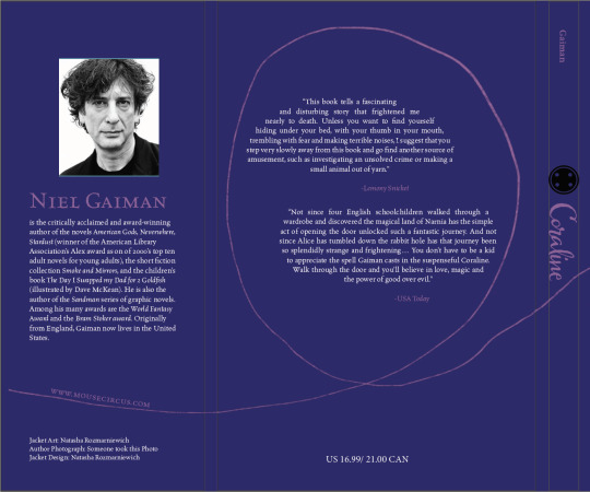
For my imagery, I wanted to to be very, very simple. The button is eclipsing the moon. In Coraline, the Other Mother wants to sew buttons onto Coraline’s eyes to steal her soul and consume it. So I wanted to represent that in a way that also related to right before the climax of the story. Before the climax, Coraline notices that moon being eclipsed references how much time she has left to find the rest of the children’s souls. That imagery is what I chose for the cover. The button itself has a starry appearance, almost a bit like a galaxy. This references after the climax. The Other Mother’s hand rips off and follow Coraline after she escapes back through the door. In order to trap it and prevent the hand from stealing the key to the door, Coraline traps it in a well, a bit far off from the house. It’s said that the well is deep enough you can see stars from the bottom. This part stuck with me, so I wanted to tie it into the cover in some way. It also adds some nice texture to the illustration. The cat helps Coraline escape and is a very large part of the entire book, so I wanted him to be looking at the moon. The shadow is to hint at the Other World being a twisted, upside-down version of Coraline’s reality. I also wanted to keep the bind of the book simple, so I used the same font and added a little button to break up the type.
As for the quotes on the back, it’s a kind of boring chunk of text. I wanted to add interest by changing the typical shape into something different, and had the idea of placing inside a loop of thread. It needs shifting, but the concept is strong I feel.
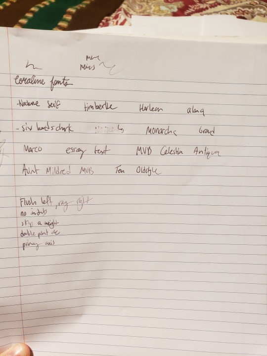
I decided upon Celestia Antiqua MVB for my main typography, and Harlean for Coraline’s name and more visual text. I went through a large list of trial and error fonts. I actually found that harlean perfectly summed up the story; something quite edgy and dark, but with plenty of childish wisdom. The reason I enjoyed these two fonts was because I felt they represented the Other Mother and Coraline. Coraline is obviously represented by Harlean, but the Other Mother is represented by Celestia Antiqua. The both have a similar texture of being hand-drawn, as the Other Mother tries to mimic Coraline’s world, but in reality she fails, and the difference is obvious. The contrast of these fonts was nice.
All in all, I feel like I’m going in the right direction with my symbolism and my font choices.
2 notes
·
View notes
Text
Project 2 Discovery
The book I’ve chosen is Coraline. I’ve stolen the summary of it and included it below:
Our story starts out when a young lady named Coraline Jones moves into an apartment in an old house with her parents. Her neighbors include two elderly retired actresses and a strange man who lives upstairs and trains mice for a circus act. Despite this weirdness, Coraline is very bored. Her parents work a lot and they tend to just ignore her.
One day, Coraline discovers a door with a brick wall behind it. Seems kind of strange, right? But get this: when she opens the door later, there's a hallway back there. Now that's strange. When Coraline goes through the door, she ends up in an entirely different world: it's kind of like her own, but something's a little off. In the other world, Coraline has an other mother (the beldam), an other father, and other neighbors. And bonus, cats can talk.
Coraline decides this other world is weird (we agree) and so she heads back home. But when she arrives, her parents are missing: the beldam has kidnapped them, and Coraline will have to go back into the creepy other world to rescue them. Fast forward a bit: and, spoiler alert, she succeeds! She gets her parents back and, in the meantime, also rescues the trapped souls of three kidnapped children who have been stuck in the other world for a long time. Coraline beats the evil beldam, saves the day, and returns home.
But wait: it's not quite over. It turns out the other mother's hand has followed Coraline home (it's like Thing on the Addams Family!). Coraline plays one last trick to trap the other mother's hand in a deep well. Phew, finally the scariness is over. After all this excitement, Coraline is ready to start the school year; and boy, is school going to seem really tame by comparison.
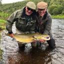
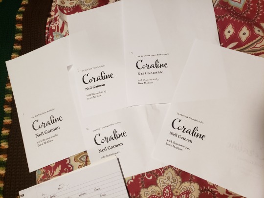
Coraline is probably my favourite children’s book, though it’s a tad dark for a children’s book. Here are the photos of my copies of the book; one very well loved, and a brand new one I purchased to make a dust jacket for:


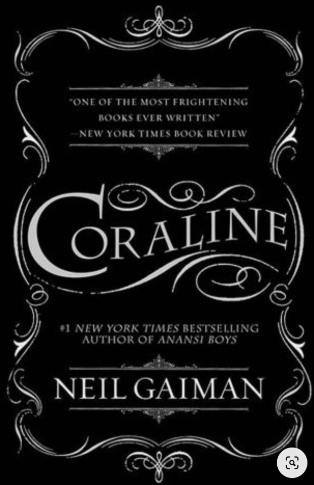
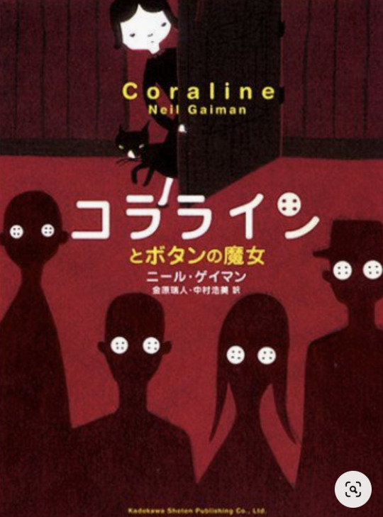
As for these covers, the first one is just scenes from the actual movie. I’m not fond of it and it’s a bit literal. The second one is more fitting, and find that it has that creepy, “stuck it pitch black and thinking monsters are watching you” feel. But it’s also a literal depiction of Coraline herself.
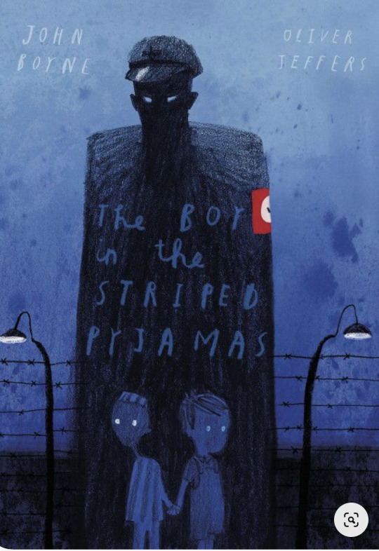
Some other covers found online:
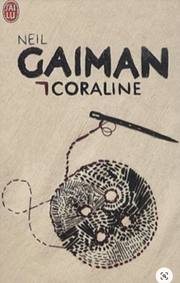
I appreciate the simplicity of this and the fact that it’s just text. It reminds me of string used for sewing, the way it flows around the cover. It also comes across as very old, like something pre-Victorian, which suits the Other mother, as she is incredibly old and witchy.
This cover makes me uneasy in a way that the other ones do not.
This cover is probably my favourite, as it’s simple but the textures and ink really add to an uneasy feeling. The contrast plays nicely too. It’s a very symbolic cover.
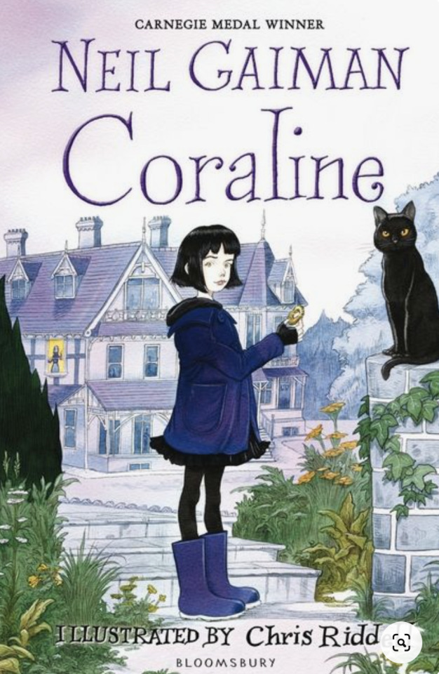
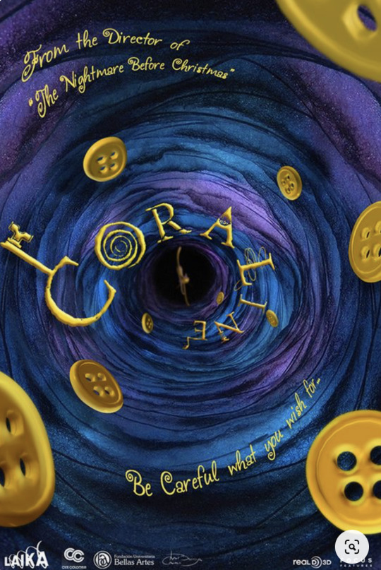
Probably my least favourite cover. It doesn’t capture that feeling of the novel whatsoever and is a decently false representation of what’s going on in the book.
I think what a lot of the covers I’m seeing missing is subtlety. There’s a lot of literal depictions and almost shallow covers. A big part of Coraline is that she’s a character you can insert yourself as, like many children’s books do. I find depicting her literally takes away that insertion and almost makes the morals of the novel less relevant. The rats play a large part in the story as well, and no one has utilized them as a cover. The feral cat that lives around the house and helps Coraline has a fued with the Other Mother’s rats, and is an important mirror to the Other Mother trapping Coraline, like the cat does to the rats. Utilizing these symbols would make for a better cover. Another thing that seems to be missing is a more adult cover. Coraline has been described as an adventure for children, but a nightmare for adults. Neil Gaiman says it’s the oddest book he’s ever written in that sense. There’s a huge cult following for Coraline, and I’m sure I’m not the only one that would appreciate a decorative, more adult cover for the book.
Some keywords:
stone, mirror, rats, cats, spider’s web, trap, snowglobe, parents, alternate reality, tunnel, door, skeleton key, buttons, sewing, claw, pink house, moon, mother, children, souls
The Other Mother has a very cold way about her and her fake kindness. She is a lot like a spider, trying to coax prey in and trap them in a web.
Coraline is a defiant and explorative child.
The cat is very similar to the Cheshire cat.
Moments in time:
Before the climax: Coraline is walking through intense wind the Other Mother has thrown at her to deter her from re-entering the house with the souls from the lost children.
During the climax: Coraline throws the cat at the Other Mother and it scratches one of her button eyes off as Coraline dashes for the snowglobe holding her parents.
After the climax: Coraline realized the Other Mother’s hand has followed her through the door, so she devises a trap in the well and the hand falls down, lost forever.
Takes place in early 2000′s England, so nothing particularly exciting here for design.
Inspiration pieces:
This cover is clever, simple, and intertwines the text with the illustration.
This is unsettling, hand drawn, and has a very adult-fairytale aspect to it.
The visual is very strong, but I like the misty typography that gives this a very distinct atmosphere, you can almost feel the chill of the mist.
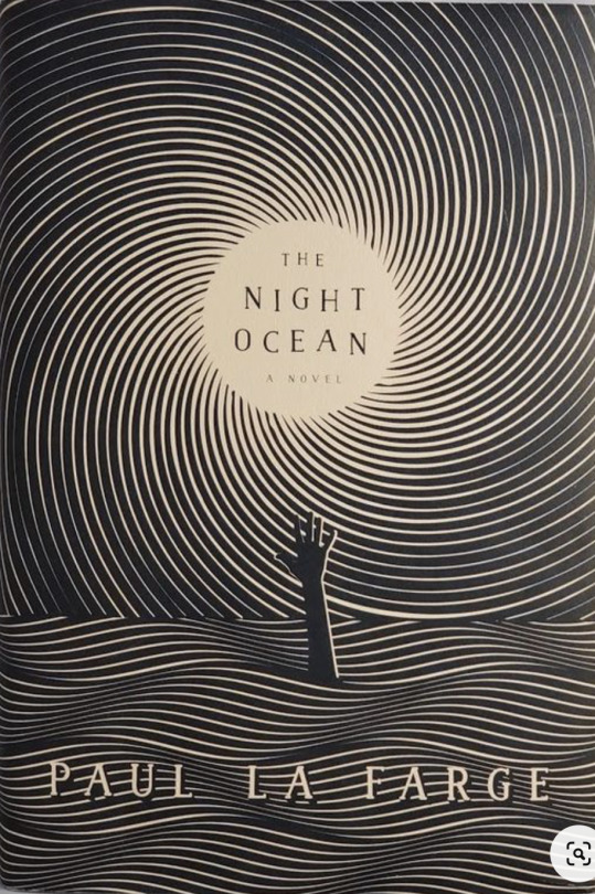
I appreciate the minimalist black and white palette, and also the use of linework to depict an image. It doesn’t overpower the text, it frames the title very nicely.
My thumbs:

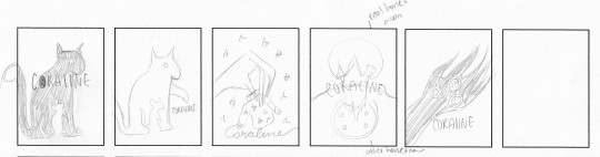


As far as ideas go, I’m definitely leaning toward the buttons and sewing thread. They are a very prominent symbol in the book. I really like the idea of having the thread spell out Coraline, and having the button as the “o”. The shadow of the cat with the cut out rat is also pleasant and further reinforces the idea of “cat and mouse” that is prominent in the book as well.
2 notes
·
View notes
Text
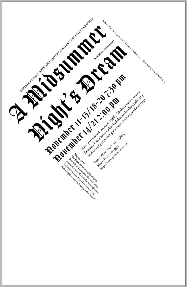
Project 1 Application: Proof 3 Final
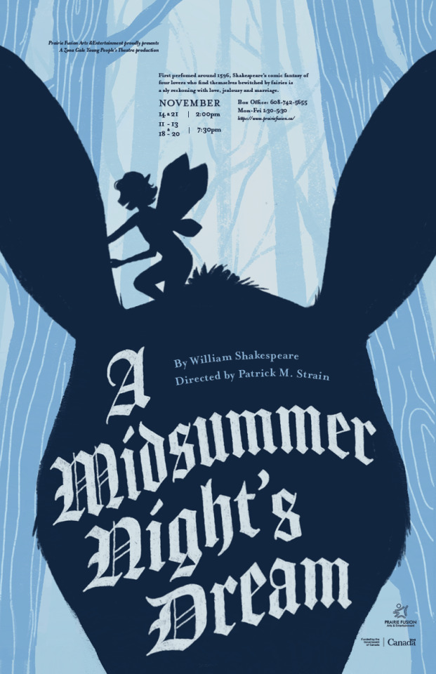
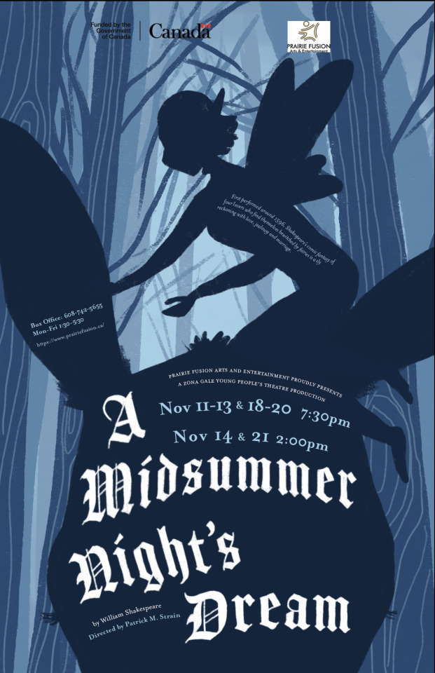
Here is the final poster! I took all of my feedback and applied it, and brought back the hand lettered title. I darkened the background and gave the title a curve, and put the logos tightly in the bottom corner. It’s quite a bit more comfortable to look at now, and the hierarchy finally makes sense.
Typography has been very difficult for me. It’s not a free as many other aspects of design, but it’s probably the most important thing for us to master. It’s very nit-picky as well. My relationship with typography has improved over this project, and there are many InDesign skills that I now have under my belt.
0 notes
Text
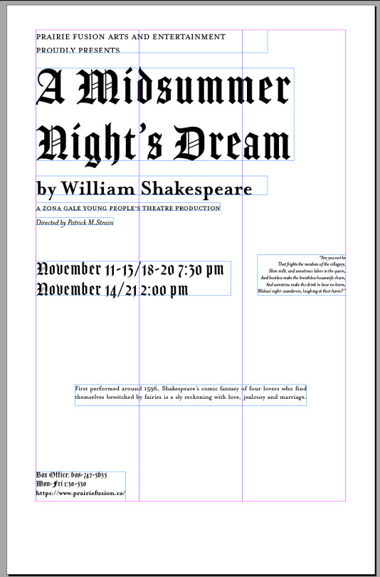
Creative: Proof 2
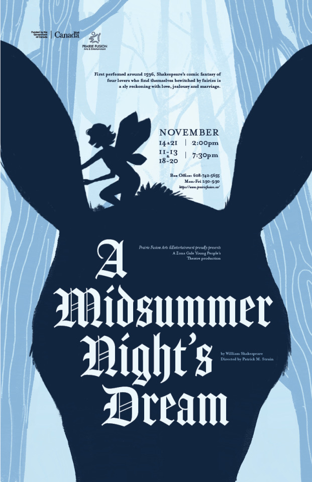
A few things that need work are:
-The image of the donkey’s head is awkward, I need to find a happy medium with it
-logos are stilla bit akward
I do think my poster stands out, however it would benefit from some tweaking. I may darken the closer trees and keep the further ones light. I’m going to try a few different colour palletes, maybe purple and green as well. I think the simplicity and the contrast helps it stand out among the other posters.
0 notes
Text
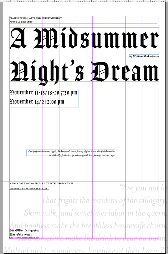
Creative: Proof 1
Thumbnails:
In regards to thumbnails, I don’t think I did enough. For some reason, I didn’t enjoy ideating this time around. I have decent variety in these thumbs however. There are lots of ideas I can work with.


I ended up choosing these two and doing a quick sketch of the fairy on top of the donkey’s head.

Digital Creation

I wanted to try the donkey’s head without the fairy, so I very hastily photoshopped this image together. My original font looked pretty rough here, so I used this one (Goodlife I think?) and it turned out alright. I think part of the charm is how unrealistic the donkey looks on the body. Maybe it reminds me of taking magazine scraps and making a collage.

I was unsure about using actual photos, so I decided to try an illustration as well. I traced over my original font in procreate to give it a hand-drawn look. I like the idea of trees in a forest, and the text in a silhouette of a fairy and a donkey. I do like the colours I chose as well. I like this better than the photo version, but the quote and the box office text, as well as the text in the left ear, don’t fit as well as I would like. I will experiment further with them. I also want to take the title typography a bit further. As it’s hand drawn, I would like to add some flowers and leaves growing out of it, because the flower is quite important and symbolic to the play. I think using the script font from the photo of the donkey poster might work better so I’ll have to try it out.
0 notes
Text
Project 1 Planning: Grids
Not going to lie, I struggled a bit with this.
EXPERIMENTS
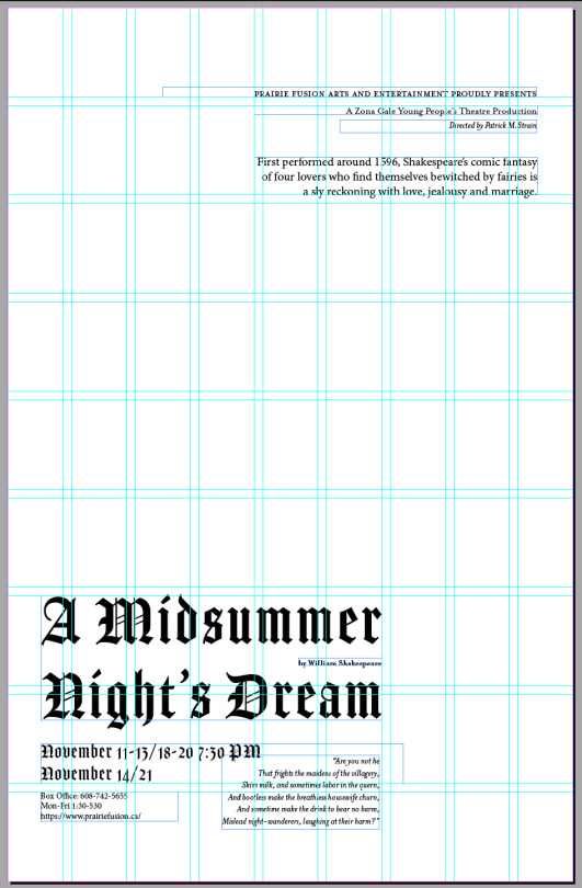
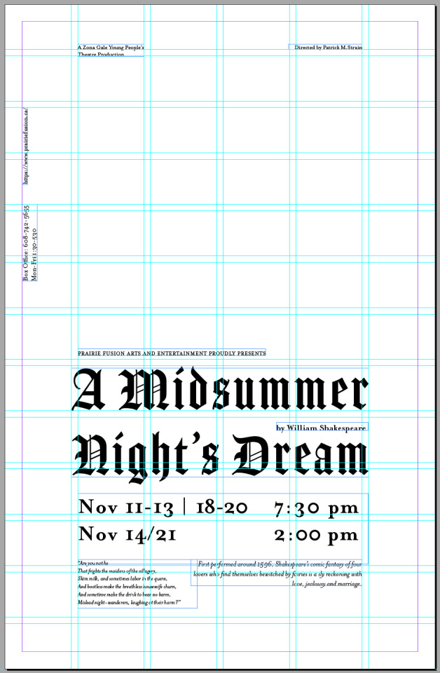
These were some of my experiments with the grids. I disliked pretty much all of these. Instead of working with the grid and letting things fall into place, I sort of pushes against them and let them frustrate me. There is so much text to work with and it’s a struggle to put it in a good place. I definitely could have pushed myself a lot more, and it felt like I didn’t have enough time to do it even though there was tons of time to do this part of the project. The rule of thirds grid we placed on the master pages REALLY threw me off and made me uncomfortable. There were just too many lines happening and I got frustrated.
FINAL GRID AND TYPE PLACEMENT
I attempted to do this part without a margin and felt myself floundering in attempting to actually put type together. As soon as I added a margin, things started to fall into place. I realized that, for me, I really like the squares instead of columns, for putting things together, but I absolutely need some kind of margin involved as well.
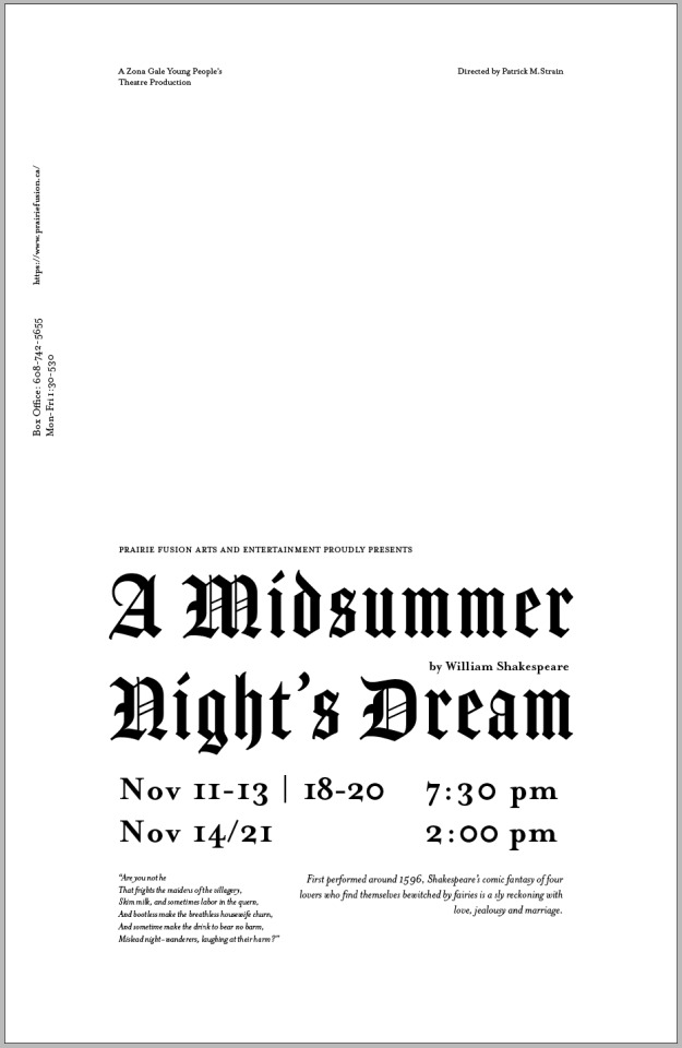
I took a look at a lot of movie posters as inspiration for my layout. They had a few things in common, such as extreme contrast between lines and a very large space for an eye-catching image. I decided on a large title and dates, because those two pieces of information are the most important. William Shakespeare is centered inside of his play’s name. I put information about the play, like a quote and the description, below the title block. Box office information is small, and situated on the side, as well as the play’s production team name and director name. I made some information very small, because ideally the name, date and image will draw people closer and they’ll read the smaller information. This allows for the title to be very big and contrasted against the other information, but more importantly, the image will be front and center. I hope I’ve left enough space where adding an image won’t feel cluttered.
I need to tweak the font sizes I’ve chosen for the quote and description a bit; they feel a tad awkward next to each other.
0 notes
Text
Discovery Phase: Type Choices
I’m really excited to do this poster redesign for a few reasons.
1. “A Midsummer Night’s Dream” takes place in the 12th century, so fonts from that time are very recognizable.
2. The play has fairytail elements and is Shakesperean, which are both very strong aesthetic words to derive elements from. It also takes place in Athens, and Greece has colours & patterns that are also very recognizable.
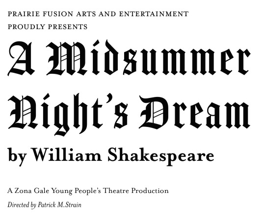
I decided to only go with two fonts. I have Amador, which is my blackletter font for large titles and eye catching stuff, and Mrs Eaves, which is a serif, used for my smaller titles here.
I chose Amador in this case because Blackletter is from the 11th-12th century. “A Midsummer Night’s Dream” takes place in the 12th century so it’s a fitting style of type. I specifically chose Amador because it is both decorative (with elegant lines and curls) but also very readable at larger size, especially for a blackletter. It echoes Shakepeare’s time and reminds me of very old fairytale books, ones with red leather, emobossed titles, and gold trim. With decorative patterns on the inside of the book, and detailed ink drawings of the book’s events. Because the play being advertised has strong magical/fairy tale elements, it was important to tie those in to the typography on this poster. I want to use Amador for the large type, like the title of the play, the dates and times the play is being hosted, and for the box office phone number & times. ( A side note for this font: I realize that Blackletter type looks very medieval and European and the play takes place in Athens. This play in particular heavily involves fairies, and I think that plot point is important to channel in. the design of the poster. I will channel the play’s setting for subtley, such as through the smallcaps of Mrs Eaves, and through imagery.)
For a secondary font, I needed something that had many options, like small caps, italics, and many different weights. I found this to make my search quite difficult, until I fell upon Mrs Eaves. It had all of these and more. This is a font that also reminds me of storybooks; it has a certain playfulness to it. Due to the fantastic events of the play (like being enchanted by a fairy, for example, into a donkey), this playfulness is important to highlight. It has a slightly feminine appearance, possibly due to the roundness of certain letters and the contrast in line weight. I found the femininity of such a font to lend itself well to the romance aspect of the play. Love plays a very important part in this play, and Mrs Eaves is a romantic font for me. I want to use this font for other aspects of the poster, like the director’s name and for William Shakespeare’s name. It has so many options, like the smallcaps, it will be very good for variety. I like the smallcaps of this font especially because it reminds me of classic roman fonts. It taps into the setting of the play, which is in Athens.
These two fonts contrast each other nicely, but they both also tap into elements of fairytales and storybooks.
0 notes
Text
Good Type Redo
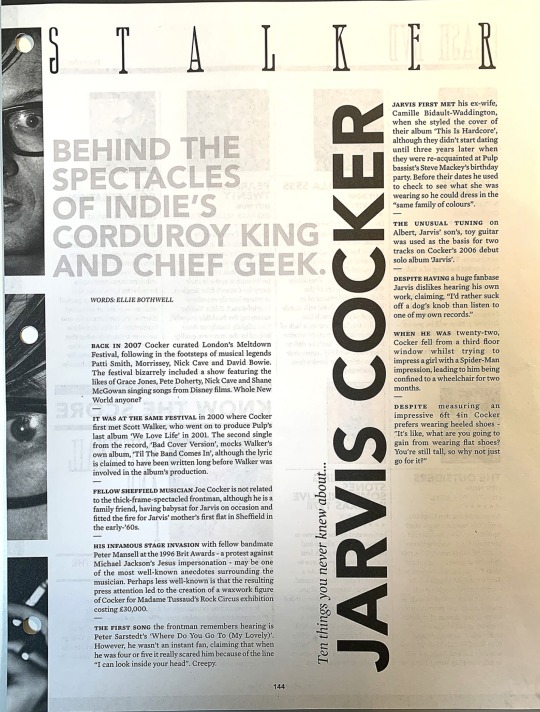
There were quite a few good qualities and things I liked about this layout:
-It has blocks of text, some more rectangular and some more sqaure, that almost mimic pages laid on top of one another
-Each piece of text fits comfortably and is tune with one another, while there is a bit of “edginess” In the way the “ten things...” and “Jarvis Cocker” is laid out. It seems the man they are speaking about is quite the character, so a bit of edginess makes sense.
-The leading, word length, and font size were all very comfortable to read, nothing was too small or awkward
-The smallcaps used in front of each paragraph break up the paragraphs in a way that makes it less intimidating to start reading.
-There is good contrast against the background, but also variety in the tone of type on the page; the pull quote thing is a light grey, the title is deep black, etc.
-Good word length per line.
-An underlying grid, but it’s a fun grid and not a boring one. It’s not just columns beside each other, but carefully chosen columns in specific places that function together to make a lovely page.
-Great amount of white space. Thanks to good decisions in type sizes, typefaces, and image placement, we get some very comfortable white space that hold everything together.
I struggled a bit with this assignment. Finding a close-match font withe the same feeling as the original wasn’t as hard, but it needed small-caps for the beginning of the paragraphs, and an italic for the “ten things you...”. This was a challenge, as I couldn’t find many free fonts that resembled this type as closely as I wanted. I went in with the type ruler and found font sizes and measurments of all the type on the page and tried to mimic it as best as I could. I printed it out and held it away from my face along with the original to see if they feeling, colour of the type, and layout matched properly.
As far as things I would change, the only thing I felt was off about the layout was how close “STALKER” was to the images. It feels slightly too tight. But then again, that closeness is mimicked in the pull quote to the images, and “Jarvis Cocker” to the pull quote. I think I’m just being picky.
Actually going in and dissecting someone’s layout really helps you understand their decision making, and how to got to the place they were at when they finished. There was care in choosing a font not too large but still readable in order to get a lot of information on the page and still have lots of white space. The pull quote was a lighter tone but still larger in size. Making it lighter makes sure to not overwhelm the page, and put it below “Jarvis Cocker” in hierarchy. The images of the eyes are meant to mimic someone looking through a keyhole or a magnifying glass, like a detective would when investihgating someone. The font of “STALKER” adds to this effect. One of my favourite things I notices was the placement of “Ten things...” against the “J” in “Jarvis”. I originally thought it would make more sense to line it up with the top of the J, and have the J act as a beginning line, and the tail of the J shoots you towards the body copy. But it would be worse! Because you’d have an ugly gap with the paragraph and white space beside it. It’s subtle, but moving the “Ten things...” line down balances it more and prevents that awkward white space. I also realized how different even very similar fonts can be. Subtle changes, like rounded edges versus sharp edges, or more contrast in line weight, make a huge difference and it made finding close-match fonts pretty rough. When we were originially assigned this assignment, I put it off thinking it was going to be very boring, but it was the opposite. It was bloody difficult and took awhile. I learned a lot doing this, and I think I’ve gotten better at putting myself in another designer’s shoes.
4 notes
·
View notes
Text
Type In the Wild
An example of good typography:

For me, the staples logo is an excellent example of typography. It features Helvetica Bold, and a stylized L. Helvetica is clean and professional, both traits that Staples wants to be seen as. It’s very readable, and the letters themselves are spaced perfectly. They are all an even weight, and it’s comfortable to look at. As Staples is an office store for everyone, from business men to people who work from home to teachers, a versatile font like Helvetica is an excellent choice. The stylized L makes it very clear that this is an office supples store, as it’s a staple.

I took this photo last year because I hated it so much. It’s so busy and so hard to read. The font used is Frankfurter SB Bold, as far as I can tell. I don’t mind the font but I really mind it used here. It seems very unprofessional, with the colour choices as well as using it for the “laundry & pressing”. That line is difficult to read. It feels like such an odd choice for a dry cleaners. It should feel tidy and clean, but it feels cluttered and messy, almost sleezy. In a way, I can understand using a playful font to show that it’s a family business and you can trust them, but it’s poorly constructed here.

This is how I chose to improve the window sign. I used a fun script for the name of the company, and a similar but slightly more professional font for the Dry Cleaners. Dry Cleaners is nice and big and readable, and put together on one line instead of seperated. The logo is down below, front and center, instead of off to the side and awkward in the top corner. The services offered by this dry cleaners are smaller, and very readable beneath the Dry Cleaners. It no longer says “Tailoring” twice as well. It is streamlined and proper hierarchy has been introduced. I picked a few colours from the original signage, the teal and the yellow/gold as they felt familial and clean, whereas the orange was a bit too funky and energetic for a family-owned dry cleaners.
1 note
·
View note