Text
The end of the first semester!
It has been an experimenting semester, my first ever course in uni, and my first ever course that's been entirely shifted online. Every week, Andy provided a video lecture based on the history and theory of how the design industry developed and connects until the contemporary design field. It was interesting learning how the design changed in time, and how historical social events affected the art movement at the period. Through these lectures, I broaden my perspective on the history of arts and design movements and adapt them to my artworks. Andy also encouraged doing little workshop activities that link to the lecture of the week. By not only visually learning, but also physically approaching the theory of the lecture, it helped me to fully acquire what I learned. The tutorial session with Bailey gained my ability to create considered and creative outcomes with demonstrations of adobe programs, inspirational activities, and feedback session in depth.
I have taken a lot from this semester. I enjoyed exploring communicating in different types of media of online journals, pdf documents, videos, and learning design technical expertise throughout the course. It has been a wonderful semester! Thanks to Andy, Karen, and Bailey :)
7 notes
·
View notes
Text
I love how we used the same media but came out with such a different style! Shai’s video reflects the concept of futurism very well and the effective use of animation and sound effects makes the video so professional and engaging.
“Ask Me Anything” Project: Execution
If you missed it, this is the part one all about the development and iteration of my project.

Holke79. (Unknown Year). Kinetic Type. Retrieved from: http://www.holke79.com/project_kinetictype.html
So this post is all about the execution of my video… and man it was hard. I envisioned a video like Zang Tumb Tumb and how it was very type heavy filled with movements but the problem is, I have never even touched After Effects nor Premiere Pro… I actually paid for a course in Domestika called “Animation for Typographic Compositions” by a great artist Holke79, a freelance motion designer who focuses on type. I paid $21 when it was supposed to be $75 so like… who’s winning though? Anyway, I watched the introduction of it and I was like… there’s no time. So I delved into After Effects and Premiere Pro all on my own and tried my best to figure it out. So basically I bought a course and didn’t watch it, moving on… It was really challenging especially because these programs doesn’t know what “fast” means because they’re annoyingly slow to run but we managed and this is when all nighters came in.
I didn’t realise that making 4-5 words of a SENTENCE takes (no kidding) 2 hours (or more) to make depending how much graphics and effect you’re putting on it. I think that my first question took me a day to finish. SO like… yes, this project took a lot more time than any of my assignments did. And my first draft looks something like this:
youtube
This is 38 seconds… And this wasn’t even the full answer.
Anyway, when it was my turn to share for feedback in class my connection cuts off so I emailed her instead and she gave me an in-depth feedback that really helped me:
- She likes the direction I’m going so far - It’s clear and there are some fun bits - Including graphics are very effective - Balanced image and text which makes the frame really solid - Text movements are all at the same time making it feel mechanical - Not too sure about the “LIVE” and the film grain
And I was a bit worried about the voice over so she suggested that instead of having a voice over; sounds, drumming, ambient noise and choral singing could be added in instead, of what the Futurist will sound like.
So before the next class which was the catch-up class, I really want to have a solid video to show for the one-on-one feedback and I managed to finish everything, questions & answers:
youtube
Some points she said was that:
- There are points where you can really tell the effects so it’s not as effective as the ones that includes graphics. - Some parts were too fast. - Some parts are out of place such as the lightning and the “Individuality” at the start.
So then I refined it and added some sound fx for the final:
youtube
The sound FX is harder to do because I found it challenging to find something that will best represent the Futurist and so I just opted for machine/mechanical sounds and hoped that it’s a bit more effective.
Overall, i’m proud that I challenged myself in this project and the final outcome was actually what I envisioned, and i’m proud of my efforts of finishing it earlier than when it’s due and yeah… hope you liked it too :)
2 notes
·
View notes
Text
ask me anything!
I added an ambient sound of a street in France from zapsplat.com, to give a bit of background sound without distracting the animation but I wanted more ‘French’ feeling since Cubism was first found and mostly developed in France, so I added a music 6 Divertimentos, Op. 2: No. 3. Andantino by Andres Segovia in very low volume so it would blend with the ambient sound. I also added more sound effects.
I fixed up the animation based on the feedback from Bailey and my peers. I organised the aligns, text leading, and the flow of the movements (turning and waving hand)
This is my final outcome of assignment3.
vimeo
0 notes
Text
week 13 ask me anything feedback
This was the last officia feedback session with Bailey which Iam so glad to have.
vimeo
I had my video made up till the end so I could just make some refinements responding to the feedback. My concern was that I wanted to add more sound in my video but wasn’t sure wheather to put background music or more sound effects.
Bailey’s feedback
Positives
Lot more focused
More streamlined
Animations are nice
Compact consistent style
Need to improve
Timing of animation is sometimes off
Turning too suddenly
Poof too quick, bit more bouncy
aligns are different
don't get stuff too close to the edge
Leading is different
Getting feedback really helps me a lot to develop and think more critically towards my work, cause I think it tends to be hard finding mistakes when I’ve been staring at it for days and being used to it.
1 note
·
View note
Text
week 12 layouts & ask me anything feedback
Week 12 was the last practical session with Bailey 😢
We had a short practice of putting different layers with Photoshop. Bailey sent out this simple, almost plain-looking layout page and limited us to change the layout emphasizing each image, text, and distortion in five minutes.
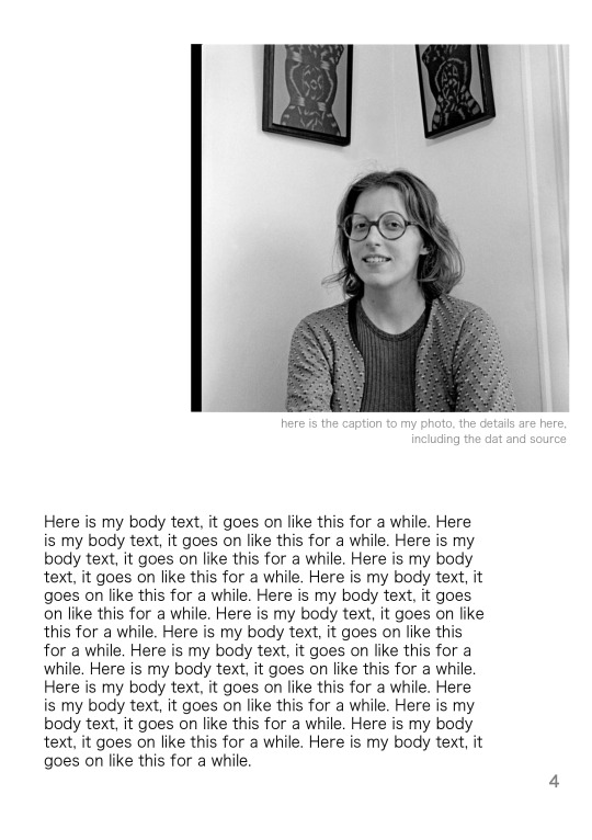
This is the original layout from Bailey.

emphasising image/ text/ distortion (I lost my distortion file so I had to recreate it)
It was a quick exercise but really gained my ability to think about the big picture instead of hanging onto small details.
I’m not really familiar with Photoshop so I actually spent half of my time exploring different features of Photoshop.
It was nice to see other people’s outcomes. There were lots of people who've done a great distortion layout and went really experimental in such a short amount of time. This was a fun, brief, and useful practice.
Then we had our WIP feedback time. My feedback from Bailey was...
Positive
Strong beginning, good acting and phasing
Mirror Device is working well
Nice pan transmitting
Purple pieces falling is graphically nice
The layout of artists is nice
Negatives
Breaking glass effect too often
Too many things going on
Unnecessary features (broken pieces piling)
Colour palette not fitting
Small mistakes
Typeface too blocky for answers
Suggestions
Find pairing font for quotes
Unifying colour (maybe use purple)
The due date is coming soon!
0 notes
Text
week 11 ask me anything WIP
This week I made videos of intro and answer for ‘how do people identify you?’
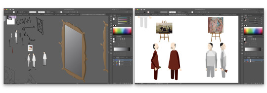
Left: intro Right: ‘how do people identify you?’
I didn’t sketch on paper this week, I used brush tool in illustrator to briefly visualise my idea. I illustrated person before cubism with organic shapes and for the cubist I only used straight lines and geometric shapes.
I got images from Jean-François Millet, The Gleaners, 1857, https://en.wikipedia.org/wiki/The_Gleaners and Pablo Picasso, Les Demoiselles d'AvignonParis, 1907, https://www.moma.org/collection/works/79766 , and created easels with them.
vimeo
I want to add more sound in the video like background music of some more sound effects. I’m happy with the animation of person moving, I think I’ll use them into other questions or answers with some changes.
1 note
·
View note
Text
week 10 ask me anything WIP
In week 10 I continued my iteration of playing with different layout options.
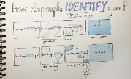
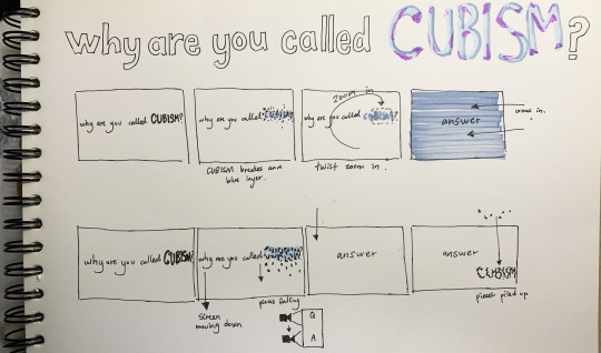
I first sketched my ideas on paper.
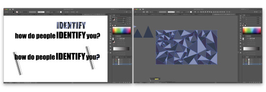
I used Adobe illustrator to create the question, I used ‘impact’ font. I created outline to ‘IDENTIFY’ and used pen tool to make geometrical shapes like mosaic tiles sticked together.
I quiet liked the geometrical shapes filling in ‘IDENTIFY’ so I decided to use similar look for transitioning pages. I made different size of triangles and filled the page with them. I used monocromatic harmonious colours of greyish purple colours to create the look of broken glass pieces.

Then I converted them into Adobe animate to create motions. I moved each pieces frame by frame to make smooth movement of falling.
vimeo
This was the outcome of ‘how do people identify you?’ question. I’m happy with this outcome but it would look better if it moves slower.
vimeo
I did similar process with ‘why are you called cubism?’ question. I used different directions of fan transition and it came out pretty smooth. I also added glass breaking sound from https://freesound.org .
1 note
·
View note
Text
week 10 collage and détournement
Collage is appropriating something that is pre-existing and creating a new meaning. Early 20ths modernism did not have as much as mass media but Postmodernism was the age surrounded by both digital and real images and media to play with. It encourages mix media outcomes.
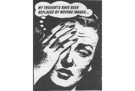
In 1960’s Paris, Situationist International adapted ‘détournement’ technique developed in 1950s, which means rerouting and hijacking. It is a method of propaganda, a method which reveals the wearing out and loss of importance of those spheres. The approach was taking existing artworks in different mediums and hijacking. They used détournement to criticize the mass media mass culture around them.
Images below are examples of situationist work. They replaced the texts on the image to what they wanted to say.

source: screenshot from tutorial
source: Situationist, Détournement, https://www.widewalls.ch/situationism-influence-history/
Cultural jamming was another method taking détournementtechnique,became popular in the 1990s, which is taking ads, logos and recognizable cultural artifacts, and hijacking them to critique.
Below are cultural jamming examples from Adbusters. They hijacked the famous logo and turned the messsages against themselves

source: coca-cola Adbusters, https://www.adamsmith.org/blog/coca-cola-a-symbol-of-capitalism
source: McDonald’s Adbusters, https://www.slideshare.net/AnnLongley/anti-consumerism-dec-2011/8-Canadian_culture_jamming

source: screenshot from tutorial
source: https://www.tooli.co.kr/fun/384555
This is how situationist idea got reformed in different kind of eras through time. From the start, is situationist, détournement, cultural jamming, and memes. They are all using the same idea of détournement. Memes are now part of mass media itself.
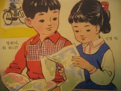
The photo below is a type of Korean meme, the characters are from primary school textbook in the 90s and they put texts like modern slangs and swearing that relates to the image. It was a pretty popular type of meme, since the majority of people can recognise the characters and they were suppose to say something educational.
Bailey showed different ideas and techniques of collage.
source: Asger Jorn, 1964, https://www.pinterest.com.au/pin/208080445256971352/?nic_v1=1a3yKX0A0%2FhkJnDFXe06mScV%2FgSqkz26UE0DlXKchbuzgbygKexKdI27fWu8ROoVcq
source: Asger Jorn, 1969, https://www.mutualart.com/Artwork/Ohne-Titel/3C6706F57F74A723
source: Asger Jorn, The Busy Lover, 1965, https://www.pinterest.com.au/pin/414683078159870490/?nic_v1=1absVhACT2bwUyJmjDNYO1ODfMKVOxZ8ioqMfY3Hp8lH%2BTzQ8TeWXmLQ%2BfpKJdHP0Y
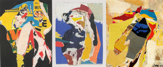
Asger Jorn used decollage technique of pasting all images and posters together and then tearing them up and create landscape. He also worked mix media. The way he ripped the built-up pages create dynamically torned texture and shapes. I like how his works show the variety of materials he used.
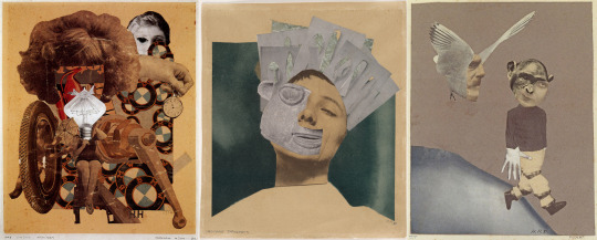
source: Hannah Hoch, The Beautiful Girl, 1920, https://utopiadystopiawwi.wordpress.com/dada/hannah-hoch/the-beautiful-girl/
source: Hannah Hoch, Indian Dancer, 1930,https://www.moma.org/collection/works/37360?sov_referrer=artist&artist_id=2675&page=1
source: Hannah Hoch, Flucht (Flight), 1931, https://www.artsy.net/artwork/hannah-hoch-flucht-flight
Hannah Hoch’s work had détournement and criticism. I really like the style of her dada collage. Her collage is well structured and I also like how she is criticising something without literal words. Her works showed me how collage does not only have a dynamic structure, but it can also create a delicate feeling.
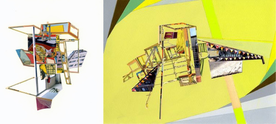
source: Mary Lum, Second Fold, 2008, https://bombmagazine.org/articles/mary-lum-s-edge-conditionsv/
source: Mary Lum, Incident, 2011, https://www.artsy.net/artwork/mary-lum-incident-1072
Mary Lum approaches a very unique technique of playing with 3d aspects and creating space with collage. It contains architectural bend and plays with space on a flat surface. It’s a very modern type of collage and how she creates such depth with only pieces of paper is amazing.
For an hour and 15 minutes, we were given to create a collage based on one of these techniques.
Détournement
Create spaces/ Landscape
Subtraction
Composite
Mixed media
The figure revised
Text/ Poetics
Juxtaposition
Digital
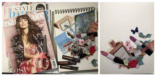
I had four magazines Marie Claire, Bazaar, Elle and Style Forecast. First three were fashion magazines and one was about interior. First I wanted to create space like Mary Lum’s collage works but didn’t have sources so I decided to use the détournement technique criticising about forcing appearance in media. I finished my collage on paper and converted it to Photoshop. I removed the background, added blocked colour background and reduced the vibrance to make coherent looks.

I played around with the background colour and vibrance of the image.

I wanted to have détournement feeling like Hannah Hoch’s ‘The Beautiful Girl’, criticising forcing of beautiful appearance to girls shown in media so I added the text bubble saying ‘these are all you need’, but I don’t really think I was successful. I still like the collage of beauty products and flowers popping out from a phone, and I think the composition is well structured.
2 notes
·
View notes
Text
week 9 ask me anything! media research
This week i put more focus on exploring different media and finding the right one for me.
I first looked at zine designs.

source: screenshot from The New York Times Magazine,David Marchese, 07.08.19, https://www.nytimes.com/interactive/2019/08/07/magazine/nicolas-cage-interview.html
This is an interesting way to approach additional information during the interview since the text will be like spoken from the first person (Cubism) speaking and it will break the voice if Cubism explains every detail or like the facts we know from today not at that period.
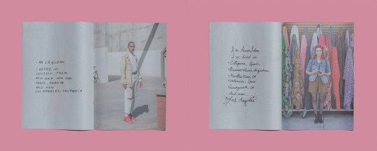
source: newspaperclub, Jason Travis, 09.03.2018, https://www.newspaperclub.com/blog/posts/15019-interview-jason-travis-photographer?utm_source=Newspaper+Club+Newsletter&utm_campaign=f88a35126f-EMAIL_CAMPAIGN_MARCH_21_2018_FEB_ROUNDUP&utm_medium=email&utm_term=0_7e2a19d1aa-f88a35126f-416669229
The use of the handwritten style with full-page imagery looks aesthetic, the handwritten style of the text gives personal feeling, and having it sitting on the separate white space as its own kind of pull quote gives weight and meaning. I could adapt this to my page for questions perhaps.
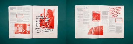
source: Pratt, 20.01.16, http://portfolios.pratt.edu/gallery/16861787/Spare-Change-News
I really like the combination of this typed text and handwritten texts. They look less restricted and much more appealing and just typed texts. The use of colour is also interesting, they’ve only used orange and black which draws attention onto the important parts like the highlighted textbox, imagery, and small text that looks like a note.
Then I had some research on animated videos.
youtube
This video has only used typography, I like how dramatic the transformations between letters are, the whole video looks playful containing various features even though it’s only black and white.
youtube
This video has various eye-catching animation and effects. It’s fun and playful but might be too distracting for an interview.
youtube
Andy showed this performance of Marinetti in the week 8 lecture and I found it very interesting. The use of dynamic movement and scale was extraordinary and the sound effects also created strong characteristics.
youtube
This typography animation was very creative and smart. It used simple movements and effects but they all reflect each word in the best way. I could use this style for my questions, not the answers cause it’ll be difficult to read long paragraphs if they move.
I created a short video of my question “Why did you leave the art industry?”
vimeo
I did this to see the brief look of what my outcome might look like and get used to the program since I’ve never used after effects before. I first created the text and made cracks on them in Adobe illustrator, then used Adobe aminate to make the breaking and dropping animation, and converted to Adobe after effects for zooming in and sound effect.
If I do continue working on this type of video, I will have the answer of the question coming forward from far behind so it feels like the camera is going inside the question (like inside the letter V), and every questions will have other simple motions relating to cubism.
I used glass breaking effect because cubism pursued an innovating new way of art that was significantly different from previous arts, like breaking the tradition, and also the shapes on cubist paintings are geometric shapeds like broken pieces of glass combined.
2 notes
·
View notes
Text
week 9 lecture the end of the future
Week 9 lecture was about the what came after the utopian idealism of modernism.
Future was invented by the futurists and finished by 1970’s Punk Rock movement.
When I think about ‘punk style’, it reminds me of something very off the limit and free. Punk movement was the liberation from modernist pop. It influenced counter-cultural movements that were designed and distributed and the communication was hijacked by this movement.
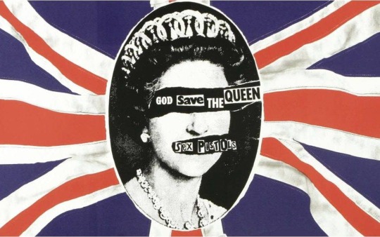
source: https://www.telegraph.co.uk/music/artists/god-save-queen-40-sex-pistols-made-controversial-song-history/
This poster by a British punk rock group ‘Sex Pistols’ has portrait of the queen been collaged with types and approached black mail notice from a kidnapper. There is almost violent attack, looking even inappropriate and disrespectful. It has notion of French situationnist distorting cultural artifact.
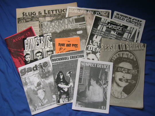
source: https://en.wikipedia.org/wiki/Punk_zine#/media/File:UK_and_US_zines.jpg
These are the punk zines from 1970s. They don’t respect the aesthetic built from previous art movements, they ignore the traditional composition, harmony or typography, and approached completely refreshing design. It looks kind of rebellious to me. A lot of them have collage-like aesthetic.
Punk movement was breaking away from 'metanarratives' modernism has established. It was also responding to the culture of the time which was struggling in a moment where the government was taking a lot of money from poor people and there was lot of unemployment. It was a reaction to give identity to people.
Andy introduced another type of Punk from Milan and Northern American, the group ‘Memphis’.
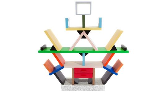
source: Ettore Sottsass, bookshelf, 1980, https://www.creativebloq.com/inspiration/10-iconic-examples-of-memphis-design
The aesthetic of Memphis group is very different from the previous punk design. Opposing to modernism authenticity, the book shelf can’t tell what materials there are. All materials are laminated and the surface, pattern and playfulness takes more places than the materials. it is a wide range of bizarre creation, which connects with the approach of Punk.
source: couch, 1984, https://wearethemutants.com/2018/09/20/no-powerful-idea-lasts-long-the-memphis-group-and-the-1980s-look/
source: lamp,1984, https://www.shlomitofir.com/inspired-by-memphis/
source: chair, 1984, https://wearethemutants.com/2018/09/20/no-powerful-idea-lasts-long-the-memphis-group-and-the-1980s-look/80s-aesthetics-memphis-3-2/
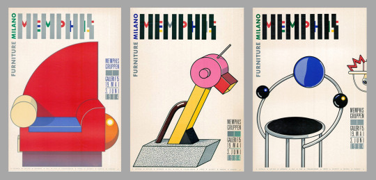
These are the zine covers from Memphis from 1984. They look completely different from the 70s punk zines, these have more design considerate composition, illustration and vivid colours. They look more simple and modern and less rejecting the traditional aesthetic. The furnitures of Memphis is like collage of geometric shapes rather than sublime sketched shapes.
youtube
This video is an intro of an American TV episode ‘Saved By The Bell’ in 1989. It approached the Memphis style with strong vivid colours, crazy pattern and shapes flying everywhere. But I personally don’t like how they just threw everything which looks just childish, whilst the Memphis' designs reflect more consideration.
Nathalie Du Pasquier, an artist from Memphis group said
“most people think about Memphis, that it was just fun. But bright colors are not childish. Those patterns were not funny. It was totally misunderstood in the sense that it was taken for a joke – that the serious thinking was part of Modernism, and because what we were doing was in reaction against that, it meant we were not serious, in the sense that we thought they were important, and we deeply felt them.”
(‘Surface Matters’, Metropolis, April 2015)
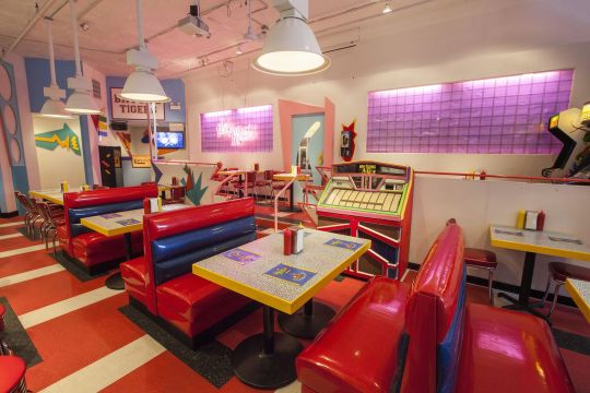
source: Saved by the Max pop-up restaurant, Chicago, https://www.curbed.com/2017/6/23/15864234/furniture-memphis-design-ettore-sottsass
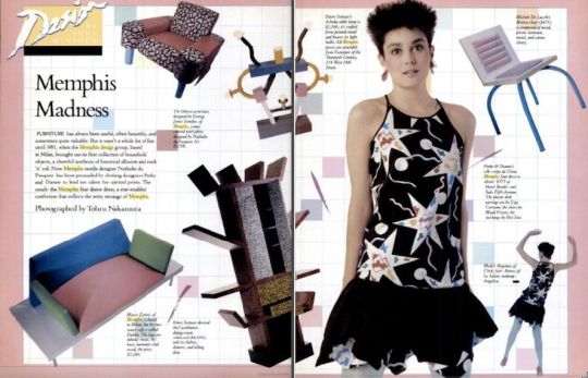
source: New York magazine, 1982, https://www.curbed.com/2017/6/23/15864234/furniture-memphis-design-ettore-sottsass
These are also Memphis inspired works. They look so playful and the space makes you happy from just being there. The colour palette of the first photo somehow reminds me of The Simpsons’ vivid look. I believe Memphis’ punk style is timeless because it has been more than 30 years since the movement ended but Memphis is maintaining the style and still being loved.
Both style of punk movement intended to inspire and give identity to people but the they took a different directionand the outcomes were also very different. It only lasted for about a decade but it changed the aspects of design and opened the limitation of expression.
2 notes
·
View notes
Text
week 8 ask me anything! topic research
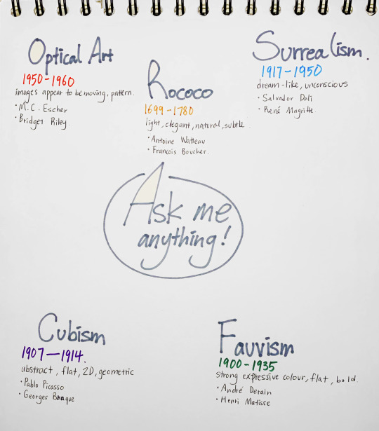
This is a brief mind map of my possible topics chosen for assessment 3. They are the art movements I have interest in and want more knowledge about it.
I chose Optical art because I went to an exhibition of ‘Escher and Nendo’ at NGV last year and the mathematical optical art of Escher really caught my eyes.
For Rococo, I don’t really know much about the history of the art movement but I love the theatrical and elegant style of Rococo’s artworks, fashion, and interior design. I feel like Rococo is a maximalist style with all the details and decorations.
Surrealism is one of my favorite art styles. I like the unrealistic elements creating a strange and even uncanny mood. I love the fact it’s exploring people’s unconsciousness and dreams.
I think Cubism is one of the art movements that have the strongest characteristics and influence. I think it’ll be interesting to research historical backgrounds about cubism, why it’s shapes are geometric and aggressive(?), or what influenced it to have such a significant style. It’s just so interesting to research about it.
I didn’t have much knowledge about Fauvism, but as I was researching the art movements the strong use of colour and brush strokes caught my eyes.
For the media, I want to create a 2D animated video or a zine, I’ve never really created an animated video before but I think it’ll be interesting media to capture the characteristics of the art movements.
In the tutorial Bailey gave me feedback about my chosen topics.
Optical art is too broad and hard to argue the effect of art and there is a lack of option.
Cubism is easy to see what influenced.
When choosing the movement that's broad, I can interview the movement itself or choose a piece of art or an artist and it can talk about the movement.
Research about what stands out working for my media
This project encourages experiment!
Responding to the feedback, my topic will be ‘Cubism’ in video media!
0 notes
Text
week 7 lecture bauhaus
Bauhaus is a highly influential school of design in Germany founded by architect Walter Gropius.
Bauhaus had craftsmanship, weaving, and pottery, theatre, and stagecraft all fit together working closely and inspiring each other, which produced incredibly creative artworks and artists.
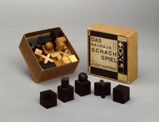
source: Josef Hartwig’s chess set, 1922, http://www.eyemagazine.com/blog/post/modern-games
This is highly abstract designed chess pieces by Josef Hartwig, a Bauhaus sculptor. At first, I didn’t really understand the meaning of the shapes because I don’t play chess, but Karen explained that the simple shapes reflect the permitted movement each piece can have. Knowing the intention, this design seems very smart creative. It has no unnecessary decorations.
Andy metnioned several artists from Bauhaus and encouraged us to have further research of their works. The artist I found most intersting was Oskar Schlemmer.
Oskar Schlemmer
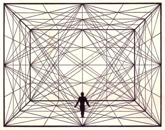
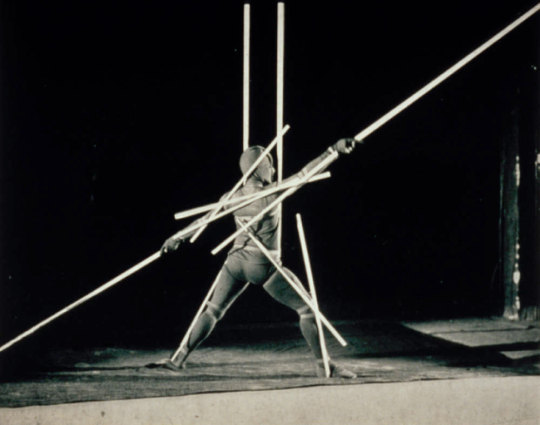
source: http://socks-studio.com/2017/07/19/when-body-draws-the-abstract-space-slat-dance-by-oskar-schlemmer/
Schlemmer's art combined pure abstraction and representational art. His works presented his fascination with man-machine hybrid figures. His theater and dance work combined his interest in the representation of the human body with kinetic studies and an investigation of the relationship between performer and space.
youtube
Especially in 'Triadic Ballet', he presented people in architectural forms looking almost machinery like. He transformed his observations into abstract geometrical and mechanical choreography and costumes. Everything is based on number three, three performers, and three acts.
Restrained movements and facial expressions of robotic-like figures looked kind of creepy to me. Andy explained it shows the outcome of industrialized western Europe in artistic form.
“The Bauhaus was not an institution … it was an idea.”
(Mies van der Rohe)
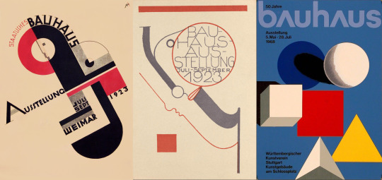
Joost Schmidt, poster, 1923/ Oskar Schlemmer, postcard, 1923/ Herbert Bayer, poster, 1968
source: https://www.artsy.net/article/artsy-editorial-bauhaus-shaped-100-years
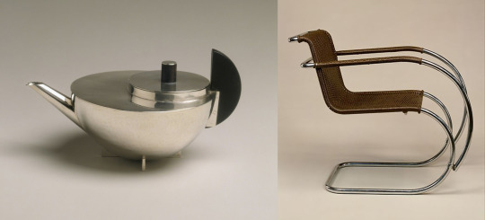
Marianne Brandt, Tea Infuser and Strainer, 1924/ Ludwig Mies van der Rohe, "MR" Armchair, 1927
source: https://www.metmuseum.org/toah/hd/bauh/hd_bauh.htm
Artists in Bauhaus worked amongst each other and each design process was influential. It had a multidisciplinary approach benefit, extracting materials, and processes that were already existing and bend them to their design.
The artworks they produced have such contemporary looks with the approach of minimalist style. But minimalism is not just simplicity, it went over lots of development and thinking processes, and that’s what made these designs look very well-considered and timeless until now.
0 notes
Text
week 6 shape shifters
Andy suggested activity to create multiples of quartered circles and form typeface of all alphabets with them.
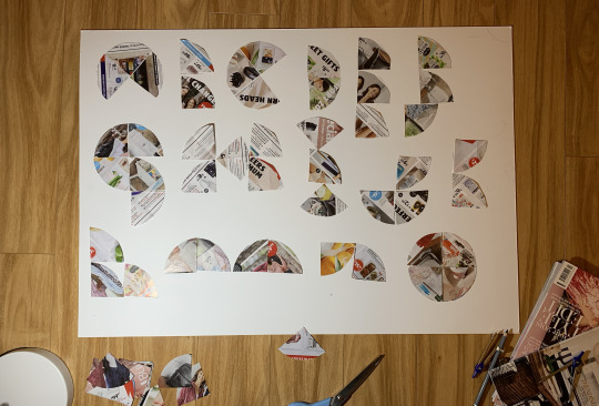
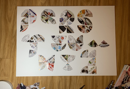
This shape shifting activity has driven me to way beyond what I have been thinking of typefaces. I never thought of making whole alphabets only with the same cut circles and it was cool that my outcomes are actually pretty legible! (except for some like U and Y I honestly can’t really tell them). I’ve always had a lack of exploration of typefaces compared to graphics from high school, I always chose the safe option. But this activity supported me to be a little more creative and experimental towards typefaces.
0 notes
Text
my question is...
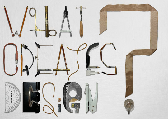
My final outcome of assessment 1 "Hello, my question is..."
0 notes
Text
week 5 my question is... WIP
I was a bit behind on my project 1 so this was a busy week for me.
During the practical lesson this week, Bailey went through our process individually and gave us feedback. I only had a brief concept and sample of my photos and a question chosen “What creates design?”.
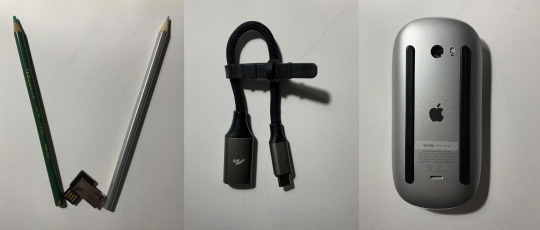
My concept of the elements were the things on my desk, which reflects the question because they are literally the things I use to create a design.
Bailey’s feedback was
Typeface needs to have a consistent style
It will be nice if the colours have unity
Think about the scale and proportion of the objects
Responding to the feedback, I decided to apply the typeface style of W, to have long strokes and the crossbars to be placed very low, and vertically long proportion.
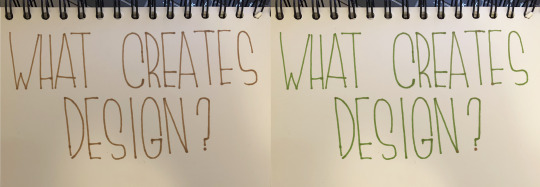
This was a brief sketch of how my typefaces are going to look like. I wanted to stick on one colour for the whole image and I was considering between green and brown. For me, lots of design inspirations come from nature and I thought inspiration was also part of the creation of a design. That’s why I chose brown and green, which reflects nature.
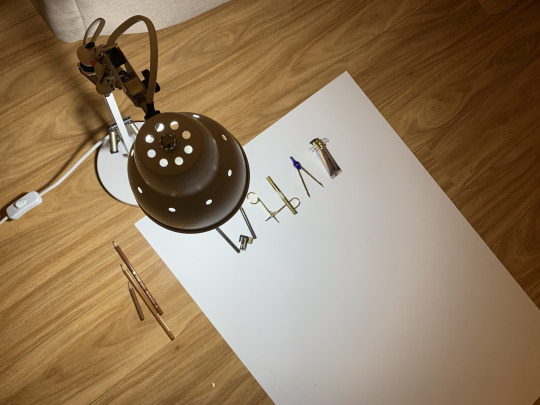
I started forming the letters for my question and this was the environment of my photo booth (which had terrible lighting so I had to grab another lamp).
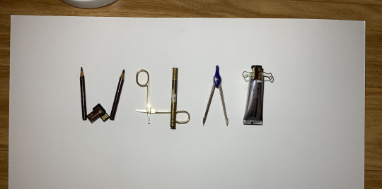
The first try of ‘WHAT’ looked okay but I felt like it’s losing the typeface concept because I was focusing on the proportion between the letters, not the shape of each letter. I figured that creating one whole photograph like this would be almost impossible and won’t match my concept style so I decided to take individual photos.

I took each photo of the letters and removed the background and edit it in Photoshop.
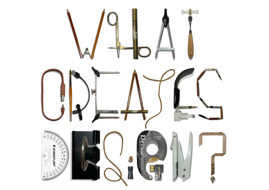
This was my first layout. All words aligned horizontally centered and consistent scale. It was neat and legible but I thought it was a bit boring, so I played around with the layout and proportion.
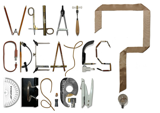
This was the final layout. I ㅣmade the scale of ‘?’ larger to have an experimental proportion with less blank space. I like this layout because the length of the words fit right in the shape of ‘?’. It would have been better if I could make ‘DESIGN’ horizontally longer to fit the layout better but it still looked playful and more dynamic.
For the background, I tried full colour of tints of brown, white, and black but the blocked colour made the whole image too edit-made so I took a photo of my watercolour paper with a rough texture and used it was my background. It made the image to blend in with each other and emphasis the pop colour of brown.
0 notes
Text
week 4 scribal activity
This week Andy suggested creating a pangram through scribal activity.
Scribal activity is creating a sentence with string-like materials, with continuous lines as possible.
It was a quick and fun activity, I’ve always liked the simple designs with continuous line drawings. It can simple and modern but also elegant and medieval-stylised.
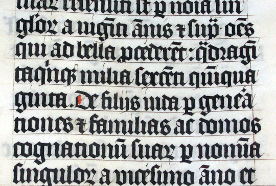
source: Bible, photographed by Adrian Pingstone, 2005, https://en.wikipedia.org/wiki/Blackletter
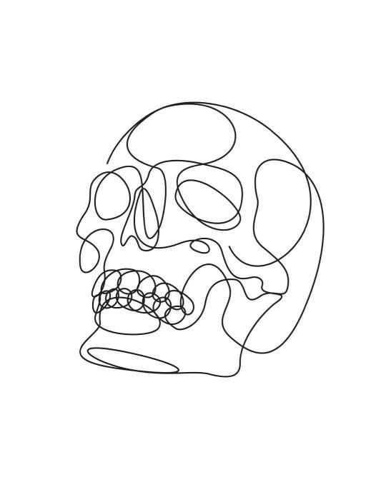
source: Portrait of Monique II, @differantly, 6.9.18, instagram, https://www.instagram.com/p/BnWUiDzhCXP/
This is a piece from DFT, a line drawing artist who I recently found. His works are really inspiring, they look simple but show decent amount of details and creativity.
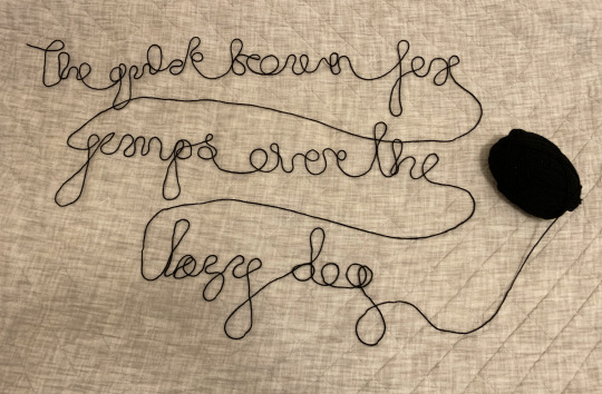
“The quick broen fox jumps over the lazy dog”
Andy used noodles but I used a knitting string because, since the COVID19, pasta became so rare. I created the whole sentence with one continuous string on my blanket because I thought it would look nice with the string. No big reason, haha.
0 notes
