
Statistics
We looked inside some of the posts by nb-spatialdesign and here's what we found interesting.
Average Info
Notes Per Post
0
Likes Per Post
0
Reblog Per Post
0
Reply Per Post
0
Time Between Posts
1 day
Number of Posts By Type
Text
7
Last Seen Tumblr Blogs


Fun Fact
Tumblr has been banned in Indonesia for providing people with access to pornographic content.
Text
CATALOGUE DESIGN SOLUTIONS
#1

A Passage / Exhibition & Catalogue - Stergios Galikas
This spread in this catalogue features a little bit of information on the work/artist, and a picture of the work/artist who/that is being featured in the exhibition. Here on this spread, there is only one artist/work being featured.
#2

Inuit Sculture Now - Stefan Canuel, rgd
These pages seem pretty straightforward. Artist name and details, picture of the work that is being exhibited, and a paragraph of information about the project. Here, on the spread there are featured two different artists.
#3

ICA 2017 FESTIVAL CATALOGUE FOR GRAPHIC DESIGN AND INTERACTIVE MEDIA
I think that this catalogue, has an exceptional use of the grid and white-space. With this example, and others, I seem to realise that the most important elements within a catalogue is the work, the and the artist. The function of the catalogue here is to help the audience to understand more the work.
#4

Collect & Assemble | Exhibition Catalogue - Annie Portelli
Sometimes, an image speaks for itself. But one must not forget that the catalogue is there to help the audience, and not speak for them. What happens when one doesn’t understand what is being displayed in front of them?
#5

die Angewandte - DIGITAL FRICTIONS exhibition catalogue - studioelastik .com
This might be a good idea if one inserts a spread with a fun element in the catalogue for the ICA 2019 Festival. In the case of the image above, the designer inserted a couple pages with nothing but colours. This might act as a breathing space for the viewers, and it may be essential if the department has a large number of students that are being exhibited.
0 notes
Text
CATALOGUE DISPLAY SOLUTIONS
O R D I N A R Y S O L U T I O N S
#1 - PLAIN CATALOGUE STAND
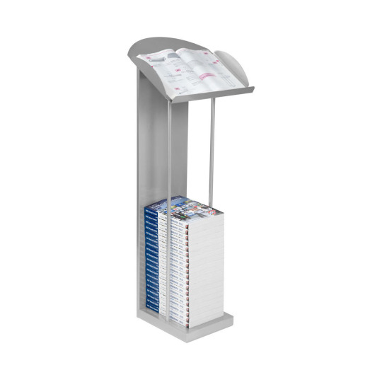
Catalogue Display with Lectern Shelf
These can be made from various materials; wood, cardboard, plastic, steel and many more. This method allows editorials to be clearly visible to the public, though, there is nothing that ‘distinctive’ about them.
#2 - AESTHETICALLY PLEASING WALL-MOUNTS
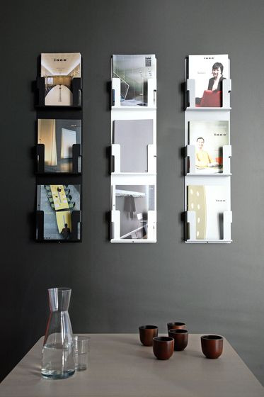
Ad Case by Inno
Simple, yet it is very aesthetically pleasing. These wall-mounts have a very minimalist look, and because they are attached to a wall, this solution will save up floor space.
C R E A T I V E S O L U T IO N S
#1 - INDIVIDUAL PAGES
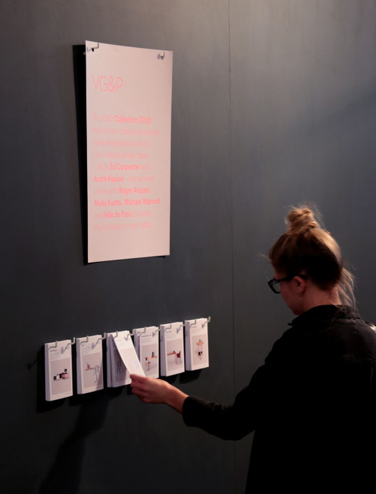
VG&P for CDW'16 – Exhibition and Print - Sofi Azaïs
Here in this image, the information about the works that are being exhibited are hanged on a wall separately. In this exhibition, the catalogues are displayed hanging on a wall as individual card, rather than the traditional editorial that one may see in most exhibitions.
#2 - HANGING IN THERE!

ZINES OF THE WORLD - TIFF FESTIVAL, POLAND 2016
Although this project may be an installation at a design exhibition, it may prove to be a great way to display the department catalogues in an exhibition. It’s only drawback may be that it needs to be constantly updated; meaning that for every catalogue that is removed, another one has to take its place.
#3 - THIS IS LIT!

Bloomberg's NYC Headquarters Features Interactive Multitouch Table and Column - ScreenMedia Daily
Imagine that the lights acted as shelves? How cool would it be if the ICA 2019 Festival had shelves that lit-up with the Distinct colour-palette?
#4 - EYE CATCHING SHELVES

CITY SUNDAY by Minus Tio
Catalogue holders can be made and be given a Distinctive feature. For example, the ‘finger-print’ pattern that can be seen on the icon of the Distinct logo-mark.
#5 - MYSTERY!
WALL CASE by Mikko Laakkonen, 2007
The promotion of the Distinct brand features prominently the works of students. But such works are not shown completely, but there is a mystery in place. These wall cases allow the audience to be curious of what is found in these cases.
#6 - THE WALL

Archtober 2015
Not everything is perfect, but anything an be altered to make it look perfect. Here, the wall was painted, and the catalogues were designed to pop-out.
0 notes
Text
WAY-FINDING SOLUTIONS
Spazju Kreattiv already has a way-finding system that works well within the spaces. But to someone who is experiencing their first time in the museum, and they want to take a look at a certain exhibition, they have no idea were the space is located.
The following are some examples on how one can add-on to the way-finding that there already is:
N E O N L I G H T S
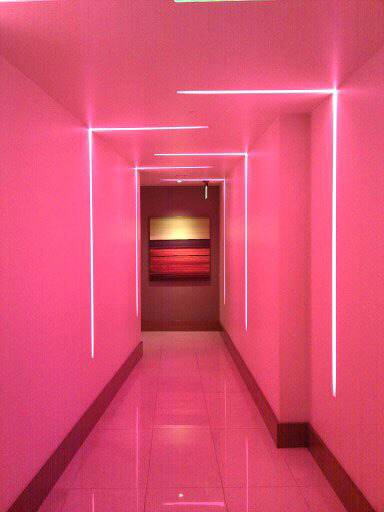
Neon lights are a great way to indicate the space and the department exhibiting in the said space. Although this may be a great idea to identify the departments, there might be several drawbacks.
The first one is that neon light can be a bit expensive to buy. The second is that the distinct colour palette consists only of four colours, and there are six departments in all. The third problem that I see with neon lights is the amount of natural light that one may find in the exhibition area. There are spaces C in Spazju Kreattiv which will be perfect for the neon light experience, but spaces A and B will prove to be a bit challenging due to the large sky-light that there is. Though, I believe that these spaces would look amazing at night.
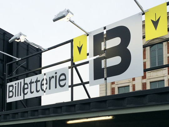
F R E E S T A N D I N G S I G N S

This might be another great way to identify the spaces and the departments. Using the distinct style-guide, we can implement this throughout Spazju Kreattiv. This, can serve also for us to produce a design of a map (as seen in the image) to help the visitors in getting around the spaces. These free-standing stands could me made either from wood or from corrugated cardboard, both with a printed sticker stuck to them.
The idea of the may may be a bit useless in our case, for the simple reason that, unlike other museums abroad, which are usually massive, Spazju Kreattiv is not that big, and it is very easy to get around.
L A R G E - F O R M A T P R I N T I N G
Make it obvious for those people coming to the ICA Festival. Make it obvious where each department is exhibiting their works by using large format printing that guide viewers along the exhibition. Not only this can be done on the inside, but it can also be done on the outside. St.James is situated in Valletta’s fortifications, and we can use this to our advantage by producing a large banner which displays the ICA 2019 festival.
M major drawback to this idea is the cost and expenses, as large-format printing tends to be a bit costly.
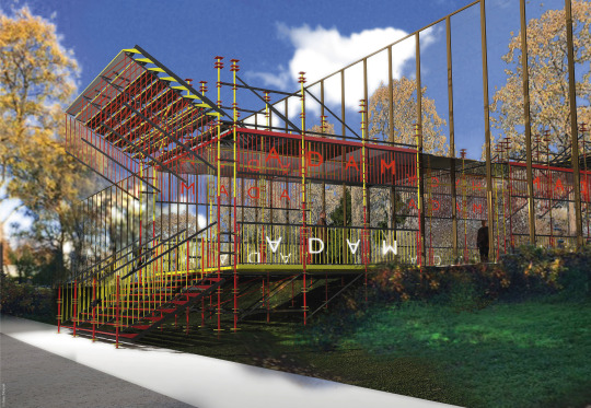
S E A T I N G A R E A

As seen in the A.D.A.M Museum, there are several seating areas for the visitors. And these seating areas are rather stuck to the theme of the exhibition.
In Spazju Kreattiv, there are also several benches where one can sit down and relax a bit. These seats are wooden with a varnish coating to make them glossy. To make these seats more ‘distinctive’, we can wrap them with the a colour from the Distinct brand.
0 notes
Text
A.D.A.M DESIGN MUSEUM; BRUSSELS (BELGIUM)
The front entrance of this design museum already gives a small indication that what lies inside will be something incredible to experience.
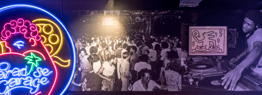
NIGHT FEVER - DESIGNING CLUB CULTURE 1960 - TODAY
A temporary exhibition at the ADAM Design Museum in Brussels, Belgium.
I N T E R I O R L I G H T I N G
Neon:

Neon signs here give the viewer a dynamic perspective of the theme of the exhibition. Apart from being highly related to the theme, and it is more of an exhibition piece, it also has a function in the spatial design of the floor-space by giving the place a neon reflection.
I N T E R A C T I V I T Y
Audio Experience:

Night Fever allows its audience to interact with what is being exhibited.
Projections:
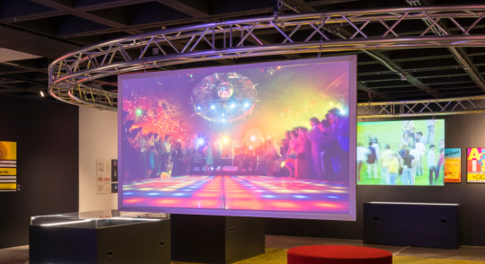
These can be an audio-visual experience to the audience. Large-screen projections engage the audience and visitors. These may be essential in transmitting important information and sponsors.
N A V I G A T I O N
A Way-Finding System:
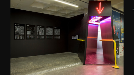
Neon lights are also kept consistent in the implementation of the way-finding system around the exhibition. The walkways are also lit up. This could be a great idea in colour-coding departments and spaces, as it can easily help ICA attendees in navigating their way through the festival.
Distinctive Furniture:

Furniture in the exhibition is also taken into a consideration. This sofa is there for people to rest on if they are tired from going around the exhibition space. Its bright red colour is very distinctive, and fits in perfectly within the exhibition space.
C O N T E N T
Exhibits and Information:

Placing information next to the exhibits themselves will keep the viewers informed as they go though the exhibited works. In this exhibition, ADAM Design Museum placed the information using printed thick paper with a bunch of text, and stuck them next to the works themselves.
Content Mounting: Directly on Wall
These posters are placed directly on the wall of the exhibition area.
Content Mounting: Grid Mounting

Although the exhibited pieces are not placed on the metal grid, the information that accompanies the exhibited pieces is placed on this mount. Not only this metal grid-mount creates a texture, it rather fills up the space on the rather empty wall. It gives dynamic.
Murals:
Murals fill up the empty space between one exhibited piece and another.
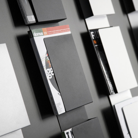
C A T A L O G U E S
Different ways ADAM Design Museum share catalogues / leaflets / brochures:
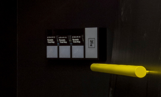
A wall-brochure / catalogue holder, which will be available for the audience.
0 notes
Text
ATOMIUM; BRUSSELS (BELGIUM)
The Atomium is a 2,500 tonne, 102 metre tall metal structure which was constructed in 1958 for the World Fair, which took place in the same year. This iconic structure is made up of 9 spheres, with most of the spheres being an exhibition space.

O N E S P H E R E T O A N O T H E R
Lights:
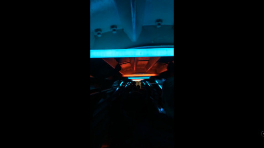
Escalators are lit up with various neon colours to make the journey seem like a futuristic one.
Through the Doorway:

Disguising doorways to look different; giving the doorway a whole new look.
D I S P L A Y I N G I N F O R M A T I O N
Filling up the Empty-Space:

The Atomium museum fills up the empty space within its sphere-structure with useful information related to the exhibition. This makes sure that there is maximum usage of space within the small area.
Using Stickers:

Stickers prove to be very helpful when displaying information. Just stick them to a board of gypsum and write anything that you wish!
P R O J E C T I O N
Filling-Up Empty Space:

The Atomium museum also fills-up its empty spaces within the structure with a projection related to the exhibition. In this case we can see that it is of a small animation with the characters which the artist being exhibited created.
U N C O N V E N T I O N A L L O O K
3D:
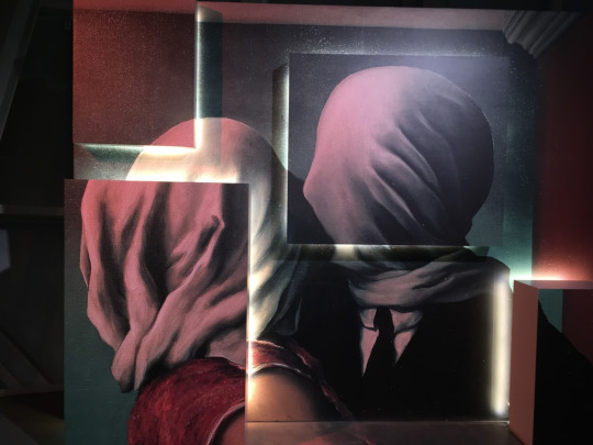
Here, the museum showcases a painting using an unconventional method. In the first picture, one can see that, although it is a large ‘sticker-copy’ of the painting, it is split into 5 parts, making it pop out to the viewer.
0 notes