
Statistics
We looked inside some of the posts by nelllamb0920 and here's what we found interesting.
Average Info
Notes Per Post
1
Likes Per Post
1
Reblog Per Post
0
Reply Per Post
0
Time Between Posts
3 hours
Number of Posts By Type
Text
9
Photo
8
Last Seen Tumblr Blogs


Fun Fact
Tumblr has 16.74 million mobile monthly users in the US.
Text
Evaluation

Timofeev’s work has inspired me due to his use of colour and geometric line.
bright
clean
geometric

My tower
imposing
cubic
harsh

Tower drawing
electrical
metallic
gridlike

Independent towers
saturated
shadow
clean

The main materials I used throughout the project were initially just pen drawings but using different types of markers and finalisers, however when it came to the independent aspect of the project I chose to use photoshop to work upon my previous drawings using them as a base layer. Throughout the independent aspect I became more confident using photoshop, my abilities have become more advanced using photoshop when adding upon a pervious image to create a whole new design.

My struggles at first with the project were understanding and using photoshop to my advance in not creating an unrecognisable design but adding onto my previous ones to emphasise features and create a stronger link to my inspiration. I overcame this by experimenting with different tools to reach my desired effect and naturally I came to terms with finding the limit to digital manipulation in my designs.

My strongest influences that were not artists were soviet buildings as they are harsh and imposing I wanted to bring that element into my work but using colours from artists work allowed my designs to have another level.
1 note
·
View note

Photo


Experimenting with photoshop to create a silhouette effect with colour and tine.
0 notes
Photo


From my first concept I picked the same original image to work from. I duplicated the image and mirrored it to create a larger structure. I felt the first composition would work better as a larger freestanding building as it resembled soviet styles.
0 notes
Photo

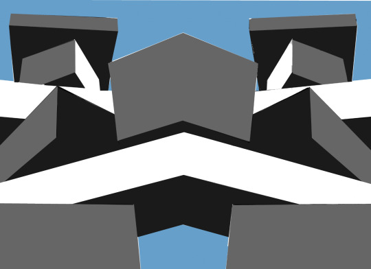
I added a blue background as to add more contrast between the greyscale of the building and the setting, I used blue as it provided a contrast but also to vaguely mimic the sky to make the piece feel more like a building a skyline.
0 notes
Photo

This is a quick design I used to create as a base for a larger design. I chose to replace the faces of the box with plain colours on the greyscale to mimic soviet style architecture.
0 notes
Photo


My second photoshop concept was using the new images of the boxes. I added colour to the face of the box that was pointed towards the camera as to make it more prominent and give the illusion of the fronton a large building. Adding yellow rectangles in different sizes was done to imitate windows, I added the circle to experiment with other tools on photoshop.
0 notes


Photo

My first attempt at photoshop during this project, I chose this design as I drew boxes that could br turned into windows. I decided to use a mixture of tools to create the shapes. I used a larger colour palette with blues and pinks with high saturation but I want to play off the tones in the original design just with more emphasis.
0 notes
Text
For the second week of my project I decided to create more structures but on a larger scale. Using boxes varying in size I created more towers, however I wanted to manipulate these digitally as to create structures appear more like buildings. I also saw this as an opportunity to strengthen my digital abilities, as digital work isn't my strongest point I decided to play around when creating structures. Using these photos as my base I wanted them to be very cubic and straight as to allow me to confidently make these appear as buildings.


0 notes


Text

Taking elements from my first design I tried to convey the idea of a circuit board into my structure. Using pens that have a metallic finish makes the lines seem more wire like. Only adding shading through crosshatching allows the focal point to be the lines. When I look at this design I see a building with electrical wires running down it. This can be seen in mainly asian cities where there are exposed wires running down buildings, emphasising this but keeping the lines clean and non overlapping allowed me to keep the structural element visible and not overwhelm the lines.


0 notes
Text
With mixed media design I chose to highlight areas more with colour but keeping to a blue colour palette allowed me to incorporate more tones and using different materials to source the blues incorporated different textures. Using large blocking for my darkest tones it allowed me to use finer lines and pattern on lighter areas without making the design feel mess. When I was creating this piece I saw that the lines and shapes started to resemble a circuit board so I played off that adding flowing but strict lines down the structure to imitate wires.


0 notes
Text


Creating my first set off towers with books of varying thickness and dvd cases. I came up with multiple compositions that could be interpreted as structures more similar to modern buildings but also designs that could be translated more to appear more dystopian. I took my photos at a lower angle looking up to give the appearance of a imposing structure this allowed me when it came to drawing to experiment with tones making areas darker to make the structure more looming.


0 notes
Text
dystopian urban settings
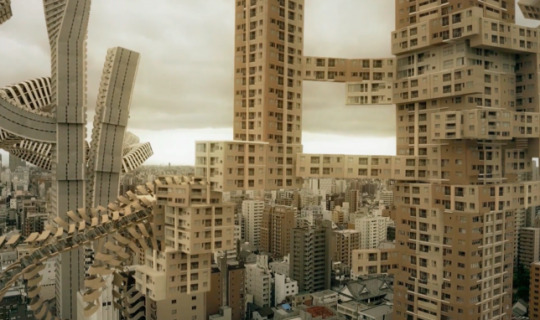
Dystopian settings ties in with the soviet buildings as the designs are very harsh and cold looking. However the urban settings designed digitally can break all the rules when it comes to architecture. As these city scapes are not real they can be however the artist decides them to be, such as defying gravity and creating a distorted illusion of what we know and making it unsettling. The strongest point of these designs is the unsettling nature, showing what we know and altering it to make it familiar but unnatural at the same time.
0 notes
Text
Ancient sites

My main focus when taking inspiration from ancient sites is the distressed nature of the structures and how the aesthetics contrast todays buildings. Having being made with natural materials the sites show the materials after the have been effected by weathering and natural decay and distressing. Taking this into my own designs I would focus on the shapes rather than the site as a whole, breaking down the structure into its simplest forms of shapes can allow me to interpret the ancient design into a more contemporary one.
0 notes
