
Statistics
We looked inside some of the posts by nevecaddick and here's what we found interesting.
Average Info
Notes Per Post
0
Likes Per Post
0
Reblog Per Post
0
Reply Per Post
0
Time Between Posts
16 hours
Number of Posts By Type
Text
17
Last Seen Tumblr Blogs


Fun Fact
Premium Tumblr themes are available from anywhere between $9 to $49.
Text
05/01/21
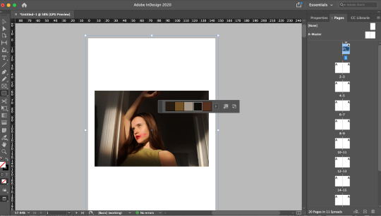
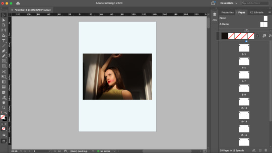
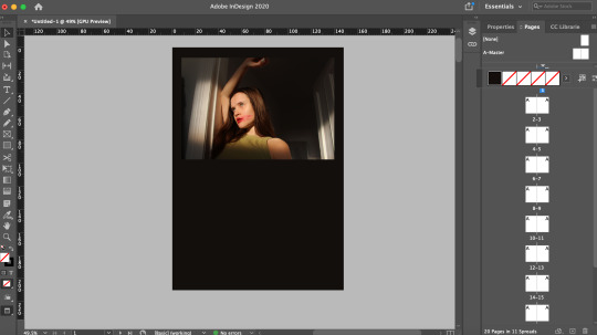
MP1
I have continued to work on my zine/book, with regards to the layout and overall design. I believe this to be my final layout to which I will submit for my final pilot project.
Here is a link to Issuu where my zine can be viewed in a zine format -
https://issuu.com/nevecaddick/docs/the_womxn_final
However, I have also attached screenshots of the mock up of my book/zine below, starting with the front cover, and through to the last page:


0 notes
Text
03/01/21
MP1
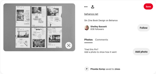
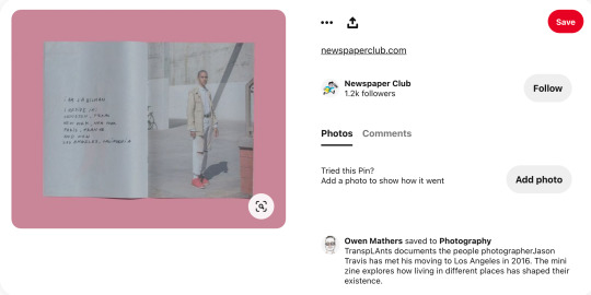
Having worked on some designs through scanning objects, I wanted to develop more designs regarding handwritten text. I would like to overlay this sort of text over images or place it beside an image to offer more context. I got inspiration for this idea whilst browsing online, researching photographic books and zines. I have attached screenshots of these publications below:
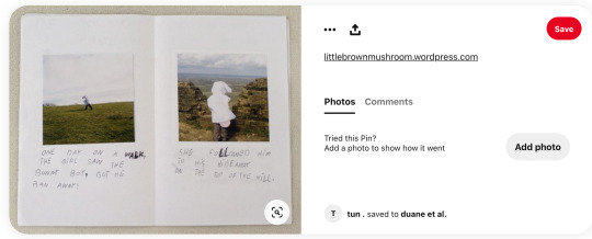
Over the past few weeks I have been jotting down random sentence that came to my head that could relate to my project. I have attached a screenshot of this below:

From here, I looked at each image that I wanted text to be placed on top of or beside, and began writing these down with a pen and paper - ready to scan...

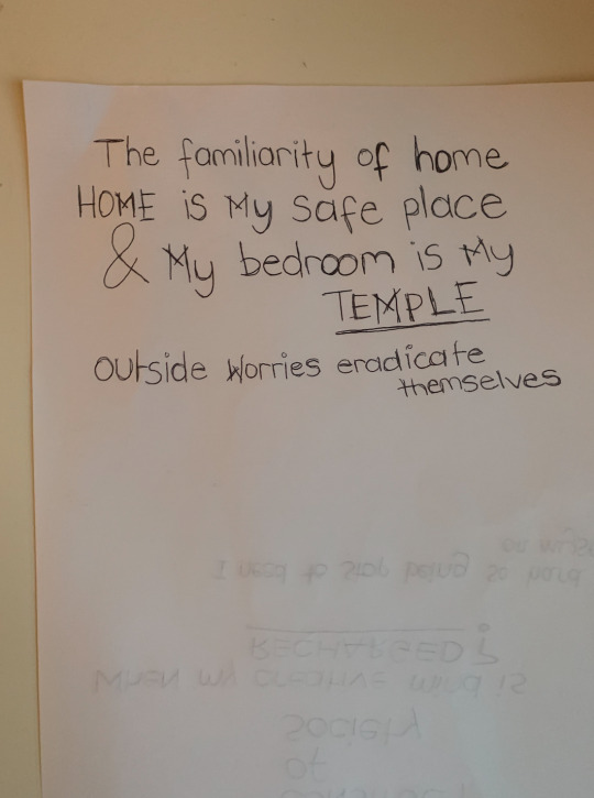
After this, I then scanned the paper with my text which was connected to my laptop and began editing the text on Photoshop - making sure I erased all the white negative spaces. Eventually, the text was ready to be inserted into Indesign and place within my work. Screenshots of the final results are attached below:


I consciously made an attempt to cross over any capital letters, in a similar way that the ‘W’ in my title is designed:
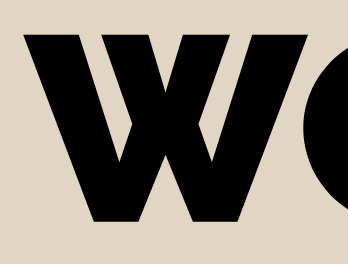
I did this to make that connection to my title and to encourage a sense of fluidity throughout my work. As well as this, I also wanted to continue making references to the ‘X’ that symbolises the theme of my entire project - in detaching ‘women’ from the term ‘men’. I wanted the ‘thoughts’, that were being scribbled down, to constantly make reference to empowerment and embodiment of reclaiming identity.
What went well?
For me, the overall aesthetic of these textual designs worked out well and how I initially intended. I wanted the text to appear as if it had been spontaneously scribbled down, as an attempt to vent one’s mind and thoughts - I believe this objective was met successfully. I also really like the idea of carrying the references of the ‘X’ throughout my project; to connect the photographs, the text, and the concept of the project as one body of work.
What could be improved in the future?
To improve, I would like to incorporate different forms of media such as different types of pens, paint, ink, collage techniques, and layering. Using these additional forms of media would communicate the meaning behind the text more effectively. The message being translated is organic and could be better developed with experimentation of similar mediums, such as the ones listed.
0 notes
Text
02/01/21
MP1
So far, I have carefully selected and added some of the photographs that I want to be in my final pilot project zine/book.
I have separated the book into segments, for each subject, where a narrative is subliminally given to run alongside their visual representation:
First = Belonging to home - feeling safe and secure, feeling happy at home
Second = The needed for escape - Immersing themselves in the outdoors, feeling happy and confident
Third = Owning identity - Confidence whether happy or sad
I am planning to add a variety of text and typography into my work. I began experimenting with text that I have written and scanned, to then edit in Photoshop then add to my zine/book on Indesign. As I do not have a scanner, I have used my iphone and used an app called ‘Genius Scan’ which enables a similar effect, which I can hopefully process in the same way. These scans are attached below:

This design is created on the back of a postcard. I wanted the text to be rough and spontaneous, so without thinking, I wrote down the first things that came to my mind when thinking about self-care and the key to feeling confident within myself.
The text reads: - Loving myself is important!! - How do I expect to win if I don’t feel right within... - I am happy within my mind, soul, body, spirit - CONFIDENCE through LOVE
I took inspiration for this design after scrolling and researching ideas for designs on Instagram. I came across this design by “Mabdulle”:

I liked this image through its rough sketch-like design with what appears to be with paint, then edited into black and white. I think it represents what it is trying to present really wellm the culture of london and the vibrancy and the chaos within the city. I would love to include typography that accompanies my work, that allows the viewer to imagine and create a vision - to trigger emotions.
I further developed upon this idea, however, this time, adding colour:

Despite the influence for this work being in black and white, I added colour to the design to produce a more interesting visual that might better appeal to the viewer. It catches the eye better and provokes more thoughts.
The newly-added text reads: - What if I want to feel sad - I’m not always (confiden’T’ce through love)
I wrote this text over the top to show that, yes, we feel that loving ourselves in important but what if we just want to feel sad. We are not robots and we have emotions that are healthy - happy or sad. We’re not programmed to constantly feel confident, it is a journey of battling within ourselves to find what truly makes us happy.

I decided to write something down on a piece of paper and stick it down on a surface with cellotape, to then scan it onto my phone to see what sort of textures would come through. As for the texture elements, I really like the sense of touch that you get from this image. However, as for the text itself, I do not like the handwriting style and I do not particularly think the text would work within my zine/book.
What can I take forward?
From the image, I can take forward the idea of conveying a sense of touch through typography or through the imagery itself.

0 notes
Text
29/12/20
MP1
Now all of my potential, final images are tweaked and adjusted, I can begin to design layouts for my book/zine.
What to think about:
- Front cover -> Size of title and front cover image -> Title font and title colour -> Background colour
- Pages -> How many pages? -> Think about what double-page spreads will look like -> Consider blank pages for ‘thinking space’ -> How edited pictures (in black and white or warped) will look alongside images that aren’t so obviously edited... do they work or does it ruin the fluidity of the project?
- Typography -> Where to place typography/text -> Font size, colour -> Google fonts, make your own -> Text to work with the image beside it (if beside one)
- Images -> Image size -> What images work well together on a page -> Portrait, landscape -> Sequences -> Think about narrative... important!
To begin, I started configuring what my front cover will look like. At first, this challenge was easy as I knew what photograph I wanted on the front cover, however, the real challenge came when choosing what colour to make the background. It was difficult to find a colour that complimented the photograph and the title. I also had to create a title and find a way to lay that out on the page.
I used Indesign to design my zine/book, I have attached below the progression of my work:


These screenshots show me experimenting with various alternative front cover options. Exploring different background colours and positioning of the front cover photograph. At first, I thought this task would be simple but, for me, it was a difficult. I didn’t realise incredibly indecisive I would be about the colour of the front cover but I wanted to make it work because it is the first thing the viewer will see. It has to look appealing otherwise they won’t want to read it.
I experimented with plain white and pastel colours before using the eyedropper tool to click a section of the actual image to try and blend the background in with the image. I wanted to emphasise the feeling of fluidity, even on the front cover, but this did not work how I had hoped. It was too dark and didn’t make the initial impression that I wanted.
I ended up using a beige-toned background which goes with the skin tone in the front cover image, and will work cooperatively with the rest of the images in my book/zine.
------
Once I was happy with the background colour, I started working on the title, concerning my desired font, font size, and font colour. I looked on ‘google fonts’ a platform that lets you download free fonts onto your computer to use on any platform. I took a few screenshots of this, which are attached below:
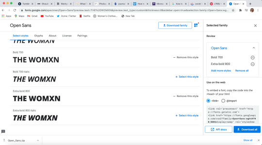
I like the simplicity of this font, but, it seems quite boring.

I like this font better, it feels similar to the previous font in the simplicity that I liked before. However, this font changes the design of the ‘w’ by overlapping its lines. I like how this also looks like an ‘x’ in the way that it crosses over, I think it works nicely with the letter ‘x’ in the word, and for the theme of my overall project.

I was also considering a font that follows a handwritten design, this is something to consider in my work as I want to follow the idea of diary/blog entries.
In the end, I chose to take the font style ‘Raleway’ (second screenshot).
------
After choosing the font, I began experimenting with it on Indesign, deciding where to place it and where it works best.


After these experimentations, I came up with my final design:

What works well?
I decided to go with this design because firstly, for me, the background colour works effectively with the image in complimenting the displayed tones. I also think the title works really well when falling off the page like it is. Something was off before I had this idea, I was going back and forth trying to make it work, but doing this design really brought a peaceful balance to the front cover.
0 notes
Text
27/12/20
MP1
Today, I continued editing photographs from my previous shoots. This time I began editing my second shoot, example from this are linked below:

This photograph did not need much done to it in post-production, so very minor adjustments were made. Here you can see that I have adjusted the brightness and the contrast very slightly to emphasis the subject and the emotion in my depth.

I continued, by modifying the ‘levels’ setting.
Followed by trying to remove the light reflection being made on the mirror in the background. I decided I wanted to remove this as it was too distracting and did not work with the overall image. However, in doing so, the lines of the mirror became bent and wonky which made the image look heavily manipulated - I did not want this. So, mid-way through this edit, I became quite stressed and I thought I would just undo these changes and leave it how it was. However, I thought there must be a way to configure this and make it appear normal. So, I looked up a tutorial on YouTube and followed the instructions...
The main step that transformed the wonky lines was making a selection and dragging the selection downwards. Overall, these steps were easy and not worth the initial panic. However, I did not know how to do this before, so initially it seemed like a daunting task. But now, it is something I will be able to do without getting stressed before-hand.
The final result worked out well and I am happy to take the image forward in my project. The final image is linked below:

Example of other photographs I edited from this shoot are attached below:

Here, it shows that I have made similar alterations to the image by adjusting the brightness and the contrast.

Something I did differently on this image to my previous one was increasingly the viberacy very slightly. The skin tone on my face was different to the tone of my body, so I thought it could try and make the image more balanced by modifying these settings - which I believe worked well.
0 notes
Text
16/12/20
MP1
Now, I believe I have all the photographs needed to begin editing my images and to start thinking about how they will be presented. Before, I start designing the layout of the presentation of my images, I want to think about how I wish to edit them to communicate my message most effectively.
I began with my first shoot - Firstly, I scanned through the shoot to find my favourite ones. I then took these images into Photoshop, and one by one I went through each image, refining and defining and cropping out any areas that I think didn’t benefit the overall image.

I decided it looked better in black and white as it made it less distracting and set a tone for the image - calm and peaceful. I then edited all of the photographs that were in this sequence, into black and white, to see if the narrative worked better in black and white.


What works well?
I think these images work successfully as a sequence without being in black and white but they work more effectively when they are. I like that the reflection on the painting isn’t so prevalent and the distractions that may have been picked up before, aren’t so obvious. For me, the images being in black and white draws the attention to the subject, before the surroundings.
What doesn’t work?
My only concern is that these images, being in black and white, won’t compliment the rest of my work the way I’d like it to. I want my work to operate on fluidity and, for me, I couldn’t imagine one set of photographs working in black and white while the others aren’t. But if I can make it work, I think it would work really nicely within the project’s narrative.
A number of the photographs from this shoot had minor details that I did not want in them, so I cropped them out. At first, I was apprehensive doing this because I didn’t want to end up creating an unbalanced image but I think it worked out fine.
For one of the mirror images I took, I wanted to experiment with the visual representation of body dysmorphia by warping the reflection of the subject made in the mirror...
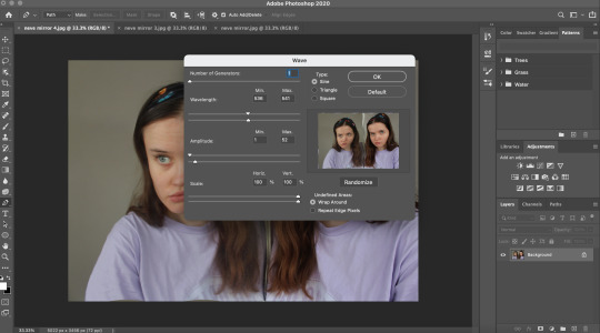
I did this by warping the image through a setting called ‘wave’ on Photoshop and playing around with these settings to increase and decrease the waves and their intensity. The final result of this experimentation is attached below:

The warped reflection symbolises, quite literally, a warped version of one’s reflection. It signifies a version of oneself that is different to how they actually look, but in doing so, they convince themselves that what they are looking at is real.
What do I like?
For me, the subtle change that is created works really well in conceptualising body dysmorphia. I like how the subject to the right is not affected by the manipulation, but looking into the camera as if to say “what do you think?”, I think this emphasises the idea of needing people’s approval for validation.
I think this composition works really well, in an uncanny way, in representing women who have to deal with body dysmorphia on a regular basis.
0 notes
Text
13/12/20
MP1
Continuing on from yesterday's shoot, I wanted to carry on taking photographs of this subject. I have attached some of the photographs from this shoot, below:

What went well?
For me, this photograph is successful as it project the subject the way I intended. There is a relationship being made between the subject and the viewer - it’s like being in conversation with the subject. I think the eye-contact is making this direct link. The subject appears confident and her character is communicated through the lens as strong and assertive.
The colour scheme throughout the image is something else that works well, for me. With the tones of the subject - her hair and skin - complimenting the background colours of the building and the fence. These elements work well in creating a healthy balance as an all-round aesthetically pleasing photograph.
What could be improved?
To improve this image, the light could be worked to better define her face. But as the weather was grey with no sun, and I had no lighting equipment, this is difficult. Hopefully, I will be able to configure this in post-production on Photoshop.

What works well?
I really like the composition of this image and I think it would work really well as a double spread over two pages, in my book. Again, the colour scheme working really well the emphasise the subject but still acknowledging the background and letting this contribute to the subject’s character.
What can I take forward from this?
I will take forward the idea of having the subject on one side of the frame wit the other sided. being occupied by nothing but contextual background. Up until now, I have always put contextual imagery and images of the subject themselves in separate photographs, sometimes editing them together in post-production, but this works much more effectively as one image. And, I like the idea of spreading the image over a double page - perhaps add text to one side?

I also wanted this photograph to be taken in the same place as the images of the subject being dressed ‘normally’ to communicate the idea of appearing confident, even if you are feeling like sad inside. This takes a lot of mental strength and women constantly push these boundaries to exceed expectation.
What works well?
So far, I have taken images of the subject in a normal state - one they would present to the outside world. However, I want to communicate a different side to women. One that can appear destructive or damaged - I think this objective is effectively met. The light contrasting with the shadows on her face to define her expression, and the style of her messy hair adds to the emotion.
What could have been done better?
Perhaps a closer-up shot would have benefited this composition. In this particular instance, what the subject is wearing has no relevance to the overall message that is trying to be communicated. I think had the portrait been slightly closer, the feeling of the photograph would have been more personal and powerful.

What went well?
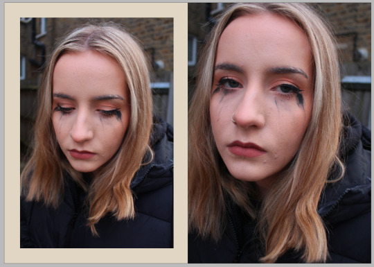
I really like the intimacy of this image, with the eye-contact and facial expression. For me, I powerfully communicates a feeling of sadness and exhaustion. With the smudged eye makeup making a connection to my previous shots with the smudged red lipstick - I like this link.
I also like that the positioning of the camera is slightly closer to the subject’s face as it emphasises all her facial aspects - leaving little to be distracted by.
0 notes
Text
12/12/20
MP1
Today, I took more photographs, this time of a different subject. Having captured a more mature/older woman, I wanted to capture a young woman who is just about to get into the real world. Again, due to COVID-19, our options for locations were limited.
I have attached some of these images below:

What went well?
Being outside and using natural lighting, the subject is captured well and her emotion is prevalently defined - making a good composition.
I like how the background isn’t too distracting, with just mere colours and saturations forming context behind her. And, I like the contrast of her black clothing, with the bright greens and blues in the background - the colours work well with each other - it allows the subject to stand-out.
For me, the subject is positioned in a good place, where the natural sunlight is behind her and creating shadows from the trees. I like that there aren’t any harsh shadows contouring her face, in this particular instance, so the viewer can see her face in a soft light.
What can be taken forward?
For me, previously, I have always thought in order to take a powerful portrait shot, if using natural light, I will need to have the light positioned directly on the subject’s face. However, from this shoot, and this photograph particularly, I will take the idea of having the sun shining in the background. Softly highlighting the face instead of sharply contouring the face, as this can sometimes not work the way it is planned.

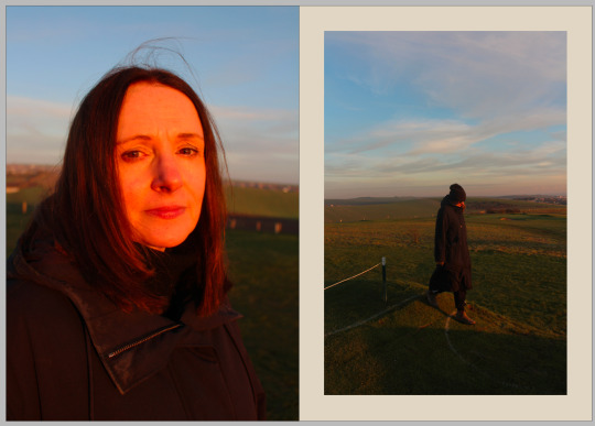
What went well?
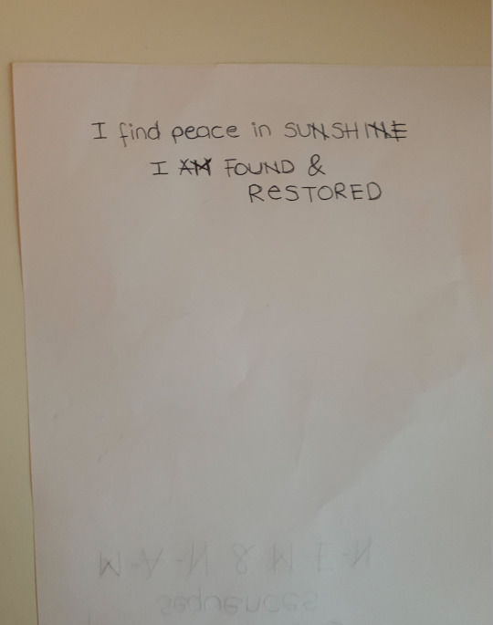
Again, I really like the composition of this image. The subject lives in an area surrounded by large blocks of flats, so it was important, to me, to capture this context and have her placed amongst it. The natural sunlight hitting the buildings while having the subject situated in its shadows, emphasises the idea of belonging and finding peace in where you come from.
The subject is displaying a natural and neutral, yet, confident facial expression which works well with the tone of the image.
What could be improved?
For me, the depth of field could have been taken into account more productively. I think a shallow depth of field would have really benefited this image and taken it to the next level.

What works well?
The result of this image displays what I intended to accomplish. I wanted a strong and confident subject being emphasised by natural light - ths is done. How she chose to dress, how she chose to make-up her face, and style her hair are all well emphasised in this image. Alongside the emotion that is being translated, all of these element compliment each other effectively. For me, I really love how the light communicates her personality through the tones and the shadows that are created.
For me, this is a strong option for my final piece.
What can be improved?
To improve this image, perhaps, it would be interesting to crop this photograph slightly. I like how her clothing and style is captured but maybe a better balance of her face and her clothing would improve this image - to emphasise her face and expression more.

What went well?
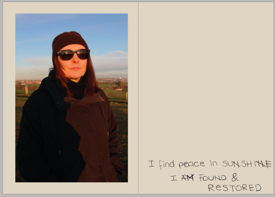
As the sun was quite bright, I slightly underexposed this image to make sure details of what the subject is wearing were clear. I also did this as I wanted to preserve the tones of her skin - I think this has worked well. I like the body language that is being communicated, with her legs being shown, which is different to the previous shots.
In terms of the background, I really like the green fence that is behind the subject. And, how the pattern and the colour of this fence contrasts to the clear blue sky in the background - with the golden tones from sunlight.
What could be improved?
I think the subject’s body language could have been a little more natural and less staged for the photograph, as I want this project to showcase women being as natural as possible. That being said, I also want to capture women feeling confident and this image does convey that message.

What went well?
The narrative behind this image wa caught well. I wanted to document the subject getting ready for the day, in how she believes she looks best out in public - how she wants people to see her. This process touches base with a lot of women (and men sometimes), in terms of their daily routines, so this can relate to the viewer effectively.
The light is also situated well, by highlighting the front of her face and contouring her facial structure.
What can be taken forward?
From this photograph, I can take forward the idea of documenting these routines. I hadn’t had plans to take a photograph like this for this project, but I saw her getting ready and took the opportunity. I would like to develop on the idea of daily habits and routines.
------
Overall, for me, this shoot was successful. I got various images that can make a strong case in empowering women and showcasing their confidence and being in control. I believe that I am going in the right direction, in capturing the content I need for this project.
0 notes
Text
09/12/20
MP1
Despite having various images that I know I will take forward into my final project. So far, I have not begun editing any of the photographs in post-production. Instead, I have been focusing on taking as many photographs as I can to have wide range to choose from and to continue stimulating ideas.
Today, I decided it was time to take images of a new subject. For my project, I want to take photographs of different people who will represent their own lives, personalities, and narratives. I want each subject to be able to tell their own story whilst finding a way to connect to the adjacent subjects in the project.
I had already captured a sequence of images that I have already captured, with the subject in her room surrounded by her belongings, and then the powerful images of the subject captured in the natural light. I now wanted to take imagery of a subject that was immersed in activity they enjoy doing outside - I want to show this side of the woman subject, as the version of a personality that is captured at home and indoors is often different. And if not, this will also be interesting to capture.
Being in a place with COVID-19 restrictions, at first, I thought this would make it hard to find an activity that was interesting enough whilst keeping up the quality of the image. I followed my mum around for the day, she goes on a walk with the dog everyday, so I took the opportunity to try and capture some interesting photographs. Some of these images are attached below:

At first, I thought the light that was coming from the sun would make the photographs easier to take. However, if anything, it made the task more difficult. There was virtually no objects creating any shadow, so the subject was completely exposed to the sunlight - it was hard to make her skin tone work well with the sun, without creating to much of a red tone. However, there was. little wind which made the positioning of the subject easy.
What went well?
For the overall objective of this image, I think it is captured effectively. I wanted some profile shots of the subject, to allow the viewer to visualise the subject entirely. I think the image represents the subject and her personality well. I also like the depth of field, with the background being out of focus and instead all focus being on the subject.
Similarly to photographs I have analysed and mentioned previously, I have purposely included what the subject is wearing. I wanted to show the audience what she chooses to dress in, off her own accord, when going outside in public. This, and how she decides to style her face and hair when going out on a walk.
I think this image conveys a sense of calm, serenity, and happiness but still projects a representation of someone who has gone through a lot and has lots of stories to tell behind her exterior being. This is the kind of idea I want my viewer to think about, I want to leave room for them to think and question the image as well as their own emotions and thoughts.
What could be improved?
For me, the image is too red-toned as a result of the sunlight beaming directly onto the subject’s face. I would need lighting equipment to accommodate this problem, which I did not have access too, but this is something to note for the future. This red-tones could potentially be edited for the final result, however, I want to keep the photograph as original as possible.

What went well?
I wanted to include the subject’s dog in one of the images, to show the viewer an aspect of their life that brings the subject purpose. Her pet dog is an important part of her life and I wanted to show that. I think this relationship between the dog and the subject is captured well.
What could be improved?
It is incredibly hard to keep a dog still when taking a photograph. It often fell on, if the dog was positioned and captured correctly, the subject wasn't, and vise-versa. So perhaps, this could have been worked on more thoroughly as I wouldn’t liked the composition to be the dog facing the camera.

In this photograph, I saw an opportunity to capture the subject walking through a snippet of light being cast over the grass hill. The light that was being created by the sun made a really interesting composition, by sectioning parts of the field. I asked the subject to walk through this tiny pathway of light and I think what was captured works really well.
What went well?
The overall composition of the image works well with the contrast of the black clothing worn by the subject, against the warm tones of the sun shining on the grass. The subject could almost be seen to be representing the shadows, taking over the sunlight, as evening was about to fall. I also like how there is motion being captured in the image and the subject seems unaware of the image being taken, so the body language being displayed is natural and true to character.

Whilst walking past this bush, I noticed how the light was cutting through which I thought would make an interesting compositional background for the subject.
What went well?
I like how much of the subject is captured, with the majority of her clothing being displayed - giving the viewer a better understanding of her. And, the natural light works well in highlighting parts of her body-frame, whilst putting other aspects in the shadows. I also think the background, with the natural light shining on the green bush works well with the shadowy field in the background.
What could be improved?
To improve this image for future photographs, I need to better consider what the subject has on their face. I think this would have made a better composition, had the subject not been wearing sunglasses - more emotion and expression would have been projected. However, this could be argued to be a manipulation of how the subject chose to dress to suit my objective, so perhaps, I could have taken both with and without.
-----
Overall, I think this shoot was a success in creating a series of images which reflects the subject and her personality. I will be taking this images forward in my project, both the images themselves, and the skills that I have critically evaluated to be improved on next time.
0 notes
Text
07/12/20
MP1
It is often assumed that artificial lights do a better/easier job in capturing powerful portrait shots. However, today, I saw an opportunity to show what natural light can do to a portrait and how it can capture intense emotion.
There is a small window at the top of the staircase in my house where light almost always passes through as the sun sets. It was about 3:30pm at this point, so the sun was radiating rich golden tones, lighting up the whole house, which I took full advantage of and began shooting some more digital self-timer shots.
I have attached some of these images from this shoot, below:

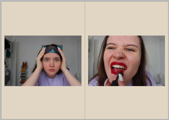
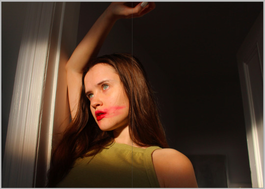
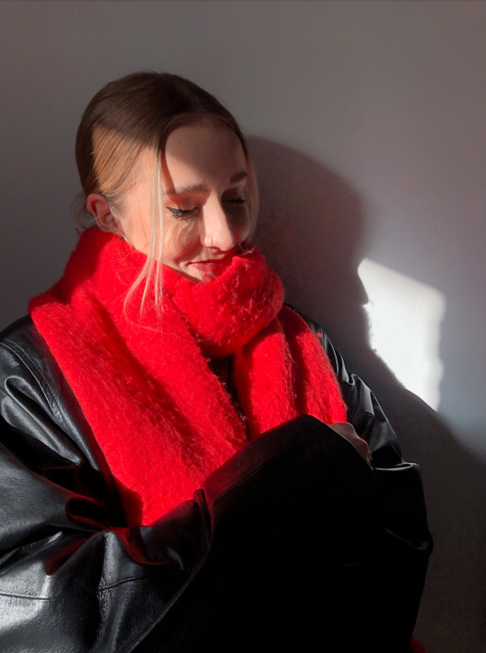
Spontaneously, I decided to put red lipstick on when constructing this composition, after thinking about the golden/warm tones being projected onto the door-frame.
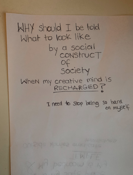
I also took inspiration from my previous shoot, where I wore red lipstick in a few of my images and wanted to continue this theme. However, this time, I decided to make it come across more dramatic - the thought the came to mind at the time, was “reckless”. I wanted to show a subject who is fed up of being told how to look by society - sort of in a rebellion sense.
The smudging of the lipstick symbolising the beginning of the end, with regards to the stereotyping and prejudgments made towards how women should look and dress, in the eyes of society.
What works well?
The lighting - The natural light in this photograph creates exactly what I had set out to accomplish in this shot. I love how the light dramatically slices through the image and across the subject. Highlighting and emphasising the face and the smeared red lipstick, as well as the intense emotion being communicated in the subject’s eyes. The light contrasting really well with the more shadowy areas of the image.
Camera position - I like how the camera is angled upwards, as if the viewer is looking up at the the subject. Allowing the light to shape the image and emphasise the body of the subject with the emotion that is being projected.
Subject position and expression - I also think how I have positioned myself, as the subject, works really effectively in creating a compelling composition. I like how I have raised one of my arms and my head sort of leaning into it, almost as if I am patiently waiting. I like how the light does not shine on my whole arm, with parts of it being in the shadows, this works well in further emphasis of the face and the expression being conveyed.
The facial expression is emotionally intense, allowing the viewer to approach the image from a number of different perspectives.
What needs to be improved?
To improve this image, I would like the light reflection on the mirror to be removed as it is distracting.
-----
For me, this is a really successful shot in capturing the overall objective of my project. A woman, with smudged red lipstick down the side of her face, symbolising the empowerment of women reclaiming their identity and reinventing society’s judgments.
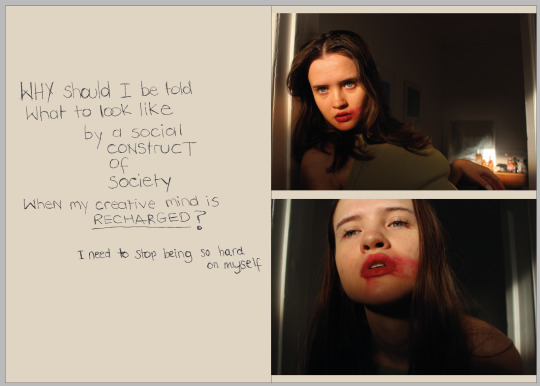
I plan to have this image as the front cover of my zine/book. - On this note, I wanted to visualise how this photograph could be positioned on my front cover. I have attached this draw up of plans below:

For my previous zine, made last semester, I used a portrait image for the front cover which worked really well as it covered the whole page and had a powerful impact on the viewer straight away. However, if I am to use this image, it is landscape, so I will have to carefully consider how I get a similar effect. And, how the image can work well with the title font and size.

What works well?
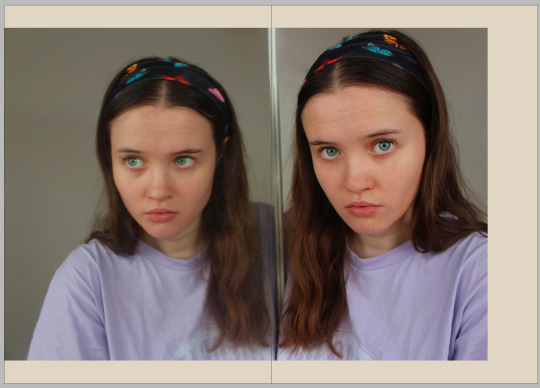
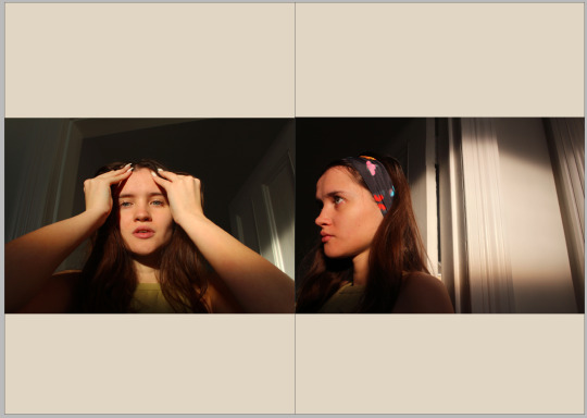
Again, the light really benefits the composition of the photograph. I like the positioning of the hair and how it shapes the facial structure. The eye-contact made by the subject, going directly through the lens, brings a chilling element to the image and this effectively connects to the viewer.

What works well?
The light that is highlighting the face whilst shadowing the rest of the body, makes an interesting contrast and a dynamic composition. The light is sort of sectioning parts of the image making it easier to dissect. Although the body is in the shadows, I like the positioning of the subject and the interesting body language that is being provoked with the facial expression - for me, they compliment each other well in terms of the overall tone trying to be projected.
What could be improved?
I do not like the light that is being reflected on the mirror in the background - I wish I had removed this. However, I was too worried about losing the light, I didn’t realise until afterwards! Hopefully, I can find a way to edit this out in post-production.

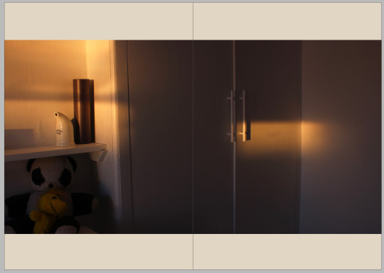
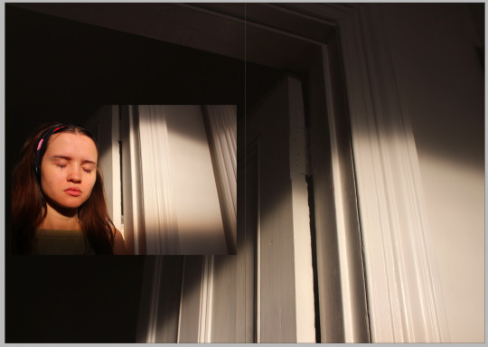
As well as taking photographs with a subject, I wanted to make sure I captured merely the light on the walls to set a scene for the narrative. For me, this is simple yet effective by creative a tense and dramatic feeling. I love the effect that the natural light has on manipulating what was just a white door frame before. Turning it into a compelling composition that could provoke many questions from the viewer.
What works well?
The positioning of the light and how the camera is set up to capture this.
How could this be improved?
This image has not been developed in post-production yet, I would like to see how this image can be progressed with overlays and manipulation.
0 notes
Text
05/12/20
MP1
I want to configure a narrative that will flow through my work for the viewer to follow. As I have had to limit the amount of subjects I can photograph, due to the lockdown restrictions, I have had to rethink my initial plans for this. I have been beginning to feel stressed at the daunting task of replanning my project. so, today, I began shooting for some potential final images. For me, this often enables me to begin creating a flow of ideas that come off one another. Each idea inspiring the next and eventually beginning to see a project take shape.
Essentially, the main objective behind my work remains - women. To begin generating ideas, I took what was available to me and began shooting myself. I took all images of self-timer and I used a digital canon camera with a 18-55mm lens, put it on a tripod and shot in natural lighting. On this particular day it was over-cast and grey, I would have preferred a studio light to compensate for this lack of natural light but as I did not have access to one, I had to make it work. Although I would have preferred to be in control of the lighting in these photographs, especially because I was shooting myself, the natural light worked well in creating the mood and tone for my images.
I have attached some of the photographs from this shoot, below:

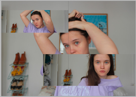
I took this photograph with the idea of capturing the subject, in this case myself, in a state of placidity. As if I am reflecting on myself and my thoughts. I consciously included the objects around the room as they are belongings which add to the character I am portraying - an insight into this life. Purposely leaving the closet door open to encourage the feeling of a spontaneous split-second moment, being captured. Stuck in a thought-process or reflection of oneself. The face is neutral and hands placed on the hairband to capture the sense of motion.
What worked well?
For me, the emotion captured in this photograph is something that worked most effectively in this image - with the objects in the background adding to the personality and character of the subject. I like where I am positioned with these objects surrounding me and the various colours on display, coming from my top, the shoes and the hairband. And, I like that I am not looking directly into the lens, but just above it. This interestingly gives the viewer a sense of connection to the subject without it being too personal.
The overall objective for this image was produced and it has given me various ideas as a result. Ideas such as, creating a sequence of similar images to develop this particular image into a story/narrative. Continuing with the feeling and tone that this image conveys, would create a strong narrative.

Would a woman be doing ‘stereotypical’ activities?
The light also works well for this composition. As I am not setting out with the intention of capturing a strong portrait shot, the natural lighting does a good job of highlighting the subject whilst bringing the background into play simultaneously. The background isn’t too dark and the subject is not over-exposed - this is a good balance which generates an interesting composition.
What could be worked on, in the future?
Although I like the overall emotion that is conveyed in this photograph, I would like to see more/different expressions being captured if I were to continue this idea of a sequence. I want more emotion to be explored: happy, sad, confused, angry, frustrated, mysteriously, bored.

I wanted to capture an image that represented the environment the subject is immersed in on a day-to-day basis. However, I still wanted to include myself in the shot so the viewer could visualise the subject in their surroundings, together. I chose to position myself looking away from the camera to, sort of, detach myself from the scene, but still be present.
What worked well?
Taking this photograph on a self-timer, it gave me 10 seconds to switch from the photographer on one side of the lens to the subject on the other. For me, after experiencing this process and looking back on this photograph, I am proud of myself in being able to execute it they way I did.
I think the image presents and interesting composition with camera being situated in a good position, and the lens picking up characteristics from the environment and from the subject.
What could be improved?
To improve, I would like to re-take this image without the laptop being in the photograph. At first, I thought it would create a more insightful composition as it is an activity the subject does, however, that particular object does not flow well with the other objects in the image - not aesthetically pleasing. - Perhaps, I could edit this object out in post-production?
I am also not fond of the reflection on the painting above the subject as I think it is distracting and not necessary for the image’s composition. I would like to remove this in post-production, or re-take the photograph and be more aware of where the natural light is being reflected.

Playing with the idea of reflecting on yourself and on your thoughts, I wanted to incorporate a mirrored reflection into my work. I created this composition with the idea of reflecting on one’s thoughts about how they perceive themselves and how they may think others perceive them - both internally, and externally. For me, it is important that people, not only women, take the time to understand their minds by reflecting on what makes them happy about themselves as well as what they don’t particularly like.
This concept also began generating ideas about body dysmorphia and how this condition can affect these particular thoughts.
“Body dysmorphic disorder (BDD), orbody dysmorphia, is a mental health condition where a person spends a lot of time worrying about flaws in their appearance. These flaws are often unnoticeable to others.” - NHS website.
This concept is a topic that affects not only women, but men too. It is an inner state of mind that affects the way one perceives themselves - a negative interpreteation. In a sense, it is an illusion of the mind. The mind warps a perception of yourself which you believe - perhaps as a result of external factors.
I began playing with this idea on post production by manipulating this image and came up with this:

By warping the reflection of the subject in the mirror, I created what could be perceived as what the subject sees in the mirror - a warped version of themself. For me, if the image was to be presented by itself, it is successful in conveying the message I am trying to communicate.
However, I am not sure if it would work in amongst images which aren’t warped in such a way. For me, the image would not make sense and the message trying to be communicated would be undermined. If I can find other ways to present this idea, it could work with them as a sequence of images that compliment each other.

I wanted to take a photograph of the subject trying to fit in with society's ‘stereotypes’, in terms of women making an effort to look nice. However, I wanted to convey a sense of the subject not taking this idea entirely seriously - sitting un-femininely, make-up messy, hair messy, facial expression = bored, tired, fed up.
What works well?
For me, this photograph is successful in capturing the mood I intended to capture. The photograph sees a subject who has attempted to make an effort with their looks but not caring how they look, at the same time. The posture of the subject is compelling and the facial expression is thought-provoking, in terms of how they work together to create the overall feeling from the composition. For me, the message I wanted to capture and communicate is done effectively.
What could be improved for the future?
Lighting - In the future, I would like to see a composition like this, taken with a studio light when possible. I think this would be intense and dramatic and would convey the feeling in this image more powerfully.
------
Overall, looking back, today has been incredibly productive and I am excited to take some of these ideas forward into my forthcoming shoots.
0 notes
Text
26/11/20
MP1
Today, I wanted to make some further edits in photoshop to capitalise off the idea of incorporating colour to symbolise creativity and imagination.
The images I created are attached below:


I would like to work with and incorporate the idea of spelling the word Woman as “Womxn” as a signalling to feminism and the inclusion of trans women. - Project title, perhaps?
0 notes
Text
22/11/20
MP1
Today, I carried on experimenting with post-production in photoshop. I want to begin incorporating colour and vibrancy that doesn’t necessarily come from the photographs themselves.
As well as exploring the minds of women through their thoughts, emotions and reactions to things, I want them to be celebrated. Women are wonderfully creative and imaginative and this is evident through my peers whom are women, as well as strangers I see in the street, and those who I research. For me, there isn’t anything more telling that colour when it comes to illustrating creativity and imagination. I want this to be shown through my book as way of guiding the viewer through it.

I began by creating this simple design over one of the subjects in my project. I drew inspiration for this design from a poster I had researched and blogged about previously - a poster for “Radio Beat” (https://www.pinterest.co.uk/pin/260012578472236372/). I chose these colours because I asked the subject in the photograph what her favourite colours were. At first, I was apprehensive about these bright colours and how they would work with the bright red scarf but it ended up working together nicely. I wanted the design to be quite a loose sketch, as if a paint brush had been spontaneously taken to it. I reduced the opacity as the colours were slightly too bold as they were, but with this level of opacity the colours prove a feature of character.
What can be taken forward?
I would like to incorporate this into pages that I consciously leave blank. I intend to do this to provide a metaphorical breathing/thinking space, for the viewer to process what is being presented. But, I like the idea of adding colour like this to these pages. To provoke the concept that no matter what; a woman’s creativity is never absent and their mind is, or can always be, colourful.

This images post-production took slightly longer to create than the first. Going into it I thought I could use the same technique as I previously did, with the same colours and size of brush stroke. However, of course, this is a completely different photograph with a different subject and I needed to find a brush to compliment this.
For me, this final result works well in bringing out her character, however, perhaps too many lines in pink were placed across her body. I say this with particular regard to the pink line in the middle as perhaps that wasn’t necessary and comes across as a bit too much. However, as for the colours and the sizing of the brush strokes, I think this works well.

I also wanted to visualise what these images would look like on a page, together. At first, I thought these images with the lines side by side might come across as excessive, but since putting them together I think it is visually pleasing. To progress this further, perhaps, I could make the lines run off the page to make them connect better with the blank pages of the book.
0 notes
Text
19/11/20
MP1
Being in lockdown has severely affected my project as I currently cannot take photographs of a variety of people, which I had initially planned to when restriction weren’t so tough. But I am therefore limited to who the people I live with and luckily they are all girls, however, they all have their own commitments and responsibilities, so finding the time to begin my final shoots is taking its toll and I am going to need to begin planning how to confront this. Although I am beginning to navigate through this huge limitation, this is a timely process which can’t be sorted in a day.
So today, I wanted to concentrate on the images I took a few days ago and begin to process them through post-production - to gain more confidence and skill.

I began by overlaying a location photograph with a portrait I had taken. I did this because I thought the bright red scarf would counteract well with the grey weather in the location photograph. And, the street is somewhere the subject herself has connection with.
However, I don’t think this is a successful image as there is too much going on in the location photograph of the street, which distracts the viewer. For me, the image is too chaotic with no balance. For my project to have fluidity, photographs like this need to be worked on. I like the portrait photograph, I think that could work well in a composition like this, but, I need to re-consider the background image.
I constructed this image by overlaying a photograph of the individual over the photograph of the street, and simply reduced the opacity. I think it gives a nice effect, however, as concluded by this result, not all images work in this process.

What worked well?
I think this photograph is an improvement from the previous edit, I created. The background image of the reservoir follows a pattern of lines creating a geometric balance that the photograph of the woman fall neatly on top of. This combination finds a serene balance between person and place and the connection the viewer may interpret from it is up for question.
Initially, I didn’t think the red would work well with the blue hues of the sky but surprisingly, I think it worked nicely. For
For me, the subject of the woman takes on a whole new meaning when partnered with the background image. It seems more peaceful and tranquil.
What could be improved?
To improve, I think it would be good to experiment with text and typography over this image. Although, it might overwhelm the image, it may also bring more context as, perhaps, the image alone leaves too many questions unanswered.

What works well?
For me, this is my favourite image of these edits. I think both the image of the location, and the photograph of the women, work really well together in producing my intended result. I think it works so well because both of the images have a pavement at the bottom and a blue sky at the top, so the images were relatively similar to begin with. But, adding them together offers a mysterious tone to both photographs. It takes on a whole new metaphorical meaning as it looks like the women could be looking out onto the reservoir, which could reflect their mind and thoughts.
How could this be improved?

I think this image works really well as a landscape, also. The viewer is getting enough information from the image, without it being too much. It works as a simple yet effective way of conveying a tone and the feeling I want to communicate. The image cropped into a landscape frame is something I will take forward.
I think I could use this idea to my benefit with some of the previous edits too:

To start, I was surprised that the image being so heavily cropped worked so well but it does. There is something compelling about the composition of this edit that develops the initial image into something much more intense and thought-provoking. It could be argued that this might be too close and that the background should have more focus but as a compositional alternative, it works well and I can imagine it being in my zine.

For reference, I decided to try the same image but a little less close up. I like the end result, for me, it’s hard to decide which I prefer better as both give different tones but are equally impactful.
0 notes
Text
13/11/20
MP1
Today, I shot some photographs whilst thinking about what my final images could potentially look like. I wanted think, most importantly, about lighting and narrative. I also want to focus on depth of field but I currently do not and can not have access to a camera, due to the pandemic. This is a factor I was trying to evaluate throughout as it is something that would change and develop the appearance of the photographs a great deal.
I have attached these photographs below:
What went well?
Lighting - For me, the lighting transforms this composition from a flat image to one that is. brought to life. The natural lighting offers dimension and depth, adding highlights to parts of her face whilst creating shadow. This sort of reminds me of Pete Souza’s portrait of Barack Obama peering out the window. I love the blast of red contrasting against the dark but bold black tone of her coat, complimenting her skin tone nicely.
I also think her expression is caught well, it allows the viewer to interpret her personality without much being given away.
What could be improved?
To improve, perhaps, the photograph could be cropped slightly to allow more focus to be drawn into her facial expression. Although I want elements of her style and choice of clothing to be present, for me, it is essentially about the emotions that are expressed on the face and through body language. Cropping the image might help emphasise this.
I think I could also develop this image in post-production on photoshop which could progress the photograph.
What went well?
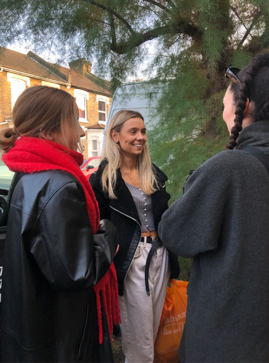
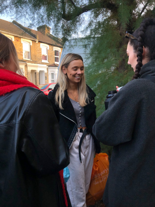
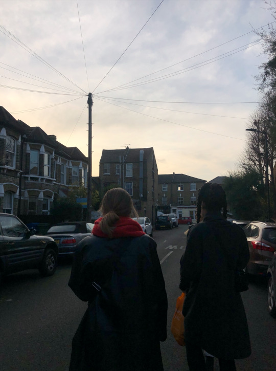
These images work effectively as a pair and I can visualise them presented in a book, side by side. Similarly, to my previous images, I love the symmetry that is displayed in these photographs - with two subjects having their backs turned and the subject in the middle. The expression on the subject’s face is captured well, with her manner being presented in a natural and elegant way. The lighting is also effective in creating acrisp and defined facial structure for the subject, with the houses in the background being highlighted but not distracting.
These images convey a sense of happiness and enjoyment.
What could be improved?
Again, I feel as though the photograph could be cropped slightly to fix more onto the subject in the middle’s face. I do not like how the bright orange plastic bag is in the frame as it doesn’t compliment the subject, nor does the colour go with colour pallete of the image. This should be resolved in post-production.

What went well?
The emotion on this subject’s face is captured well. The photograph conveys a sense of intimacy without it feeling staged or unnatural. The subject appears to be unbothered by the camera and looks content in whatever she is engaged with. The yellow brick wall also adds some character to the image. At first, I wasn’t sure if this would work however after looking at the image in post-production, I think it works nicely with her expression and body language.
What will I take forward?
Something to take forward from this image is the personal feel that it gives the audience. I want the viewer to be able to connect to my subject and the subject matter, and so far, a lot of my photographs have been somewhat disconnected. However, this image shows emotion and expression through body language as well as style and colour choices without the need to be cropped in anyway.
I also think this image highlights the importance of what is going on in the background. Hopefully, by the time I come to take my final images, I will have a powerful camera available to me allowing me construct photographs though depth of field, which will greatly benefit an image like this.
What went well?
This image works well at presenting context of environment and surrounding, as well as the style and fashion of my subjects. The colour scheme of the houses works well beside the colours that my subjects choose to wear, creating a visually pleasing image without too much distraction.
What could be improved?
This image could, however, be generally more interesting. Perhaps, the subjects could have turned around and faced the lens and I could ave done a few more shots at different angles.
I think the image would need to be cropped, or the bag would need to be edited out, as the plastic bag is something the viewer is drawn to look at and this isn’t what I intend to happen.

What works well?
For me, the subject is placed exactly where she needs to be and I am positioned in the correct place. If I was slightly to the left, or the subject to the right, it could have produced a chaotic image. The buildings in the distance are placed beside her and the subject herself is situation is sat in front of a tall dark green bush. This brings the attention towards her and then to the surroundings. I am glad she is not sitting in front of the horizon of tall buildings, as this provides context of the environment that she is immersed in. Perhaps, leading the viewer to interpret her character.
What could I take forward?
It is worth noting the idea of capturing both the environment and a portrait of a subject in one photograph. I often get caught up in these things needing to be two separate photographs for the viewer to navigate through but this doesn’t have to be the case. I can capture a portrait of someone immersed in their environment and make it just as powerful and thought-provoking.
0 notes
Text
09/11/20
MP1
Toady, I continued on from yesterday’s experimentation on post-production with distortion and text by beginning to use images with people. Although, I felt my end results yesterday made a visual improvement to my images, I think using images with people as subjects will make a much more interesting visual.
I have attached below, the journey from the beginning of the experimentation to the end:

To begin, I simple added text to the image. As I got further down from the sky, which had no objects to consider, I could either stop typing text or dodge the text around the subject. I decided to dodge the text as, for me, it made the image more mysterious and intriguing.
I also added a date at the top to act like a blog entry - an individual writing and collecting their thoughts. I wrote these sentences from ideas from my notes of thoughts and worries, which I have mentioned previously.
Going into this, I didn’t know what to expect. I wasn’t sure if the text would create too much direction, leaving the image unbalanced or just overwhelmed. Which, in the end, I don’t think happened and the text works well however I wasn’t sure about the boldness of the text, next to the subjects as they seem to be a little over-shadowed by the text.

I want the subjects in the photograph to flowingly connect with the text inserted beside them, not to act as if they are two separate images or have no correlation. To minimise the intensity of the text, I lowered the ‘opacity’ from 100% to 35%. This is quite a significant change in intensity but I think it worked effectively in bringing both the subjects and the writing together as one piece of work.
I also feel as though the lowered opacity of the text could mimic the rain or the wetness on the pavement. It portrays a calm and still ambiance which is reflected by the weather and the body language of the subjects. For me, this quality was not so prevalent in the initial edit of this image so I think this is a successful progression.
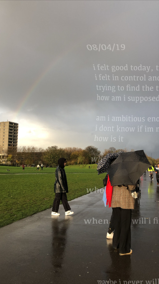
To develop further, I warped the text, which could reflect the destruction of the weather or one’s destructive thoughts. Reflecting the idea of not seeing straight but also symbolising how a windy and rainy day can distort an environment.
I like this effect and I think it projects the feeling that I am trying to convey effectively. In the future I would like to practice this more to see what else I can achieve.
0 notes
Text
08/11/20
MP1
I started experimenting in post-production on photoshop, in attempt to make some of these locational/context photographs appear more interesting and work within the boundaries of my project. I think images such as these allow a good excuse for thinking space/ a breather away from, perhaps, the intensities of my project. I want to allow the viewer to view my work as a somewhat diary of their own - I want them to take this journey and explore their own thoughts.
- How my project relates to them - Does it relate to them? - Does my work provoke any personal questions? - Does my work provoke a feeling of nostalgia? - How do they respond to what is being presented
I began incorporating text, as I have mentioned previously. Thinking about how I feel when looking at a certain image and thinking about particular thoughts that come to mind.

I chose to add the text “i just keep my mind busy” as a thought of distraction from subconscious thoughts and worries. The text going behind the building, particall lit by the sunlight to reflect how weather can impact one’s mood - good weather can often make someone happy but is this a distraction? I consciously chose to put the letter ”i” in lower case to resemble a feeling of spontaneity, as if someone isn’t particularly thinking about what they are thinking about - just thinking out loud.
I like this idea but it could be worked on as I’m not overly keen of the font or the size of the font. However, I do like the overall idea and think it could work well within my project.

I tried the image edited in black and white to approach the image from a different perspective. For me, the photograph presented in black and white changes the tone of the image, entirely. From what seemed to be more of an optimistic image, with regards to the sunlight and the clear sky, the black and white effect produces a more sombre feeling. The warmth of the image has been wiped out and we are left with a rather shady looking image.
However, in a way, I like the tone it portrays. I think the text, referring to both what it says and the font, works better in this edit. For me, this image reminds me of a rainy day which is another way to interpret the text as one who could feel lonely on a rainy day, is trying to keep their mind ‘busy’.
I think the text contrasts well behind the objects. With this edit in particular emphasising the lamp post which I think works well as an objects that creates balance within the image - a point of direction.

I carried on experimenting with this image to see what else could be made from it. By duplicating a layer and placing the black and white edit on top of the original added texture and depth to the image. It gives it a collage-like quality that could work well in a project that builds on the idea of a diary - a scrapbook feel, perhaps. But, this gives the viewer a way to view my work from a different perspective. It conveys a sense of touch and feel, which could be beneficial for my work, however, this needs practiced to be executed correctly and effectively.
I also like how the strip of the black and white edit acts like a glance into the thoughts and worries one is distracting themselves from. It could symbolise how one could be feeling if they weren’t to keep their mind busy.

To develop, I played around with distortion and warp effects in post-production. I also experimented with different font styles and font sizes because this was an issue that had previously arisen as I didn’t think it was quite working with the aesthetic. I like this new font as I view it as a more contemporary and fresh alternative and it could be perceived as one was typing it as it looks like a font on word or a notes app. This could be a different route to go down, perhaps, as a blog entry instead of a handwritten diary? - Technological -> links with social media - More contemporary, up to date - Younger adults 16-30 could relate to it better as technology and social media plays a big part in their reality.
As for the distortion of the black and white layer, I think it works well beside the text and the unaltered original photograph. Going off what I mentioned before, with regards to the black and white layer acting like a glimpse into the distracting thoughts one may be subject to, this takes it to a different level, for me. Perhaps, the distortion is reflecting the element of confusion that surfaces when one worries or has lonely thoughts. And, the text, in its plain and straightforward format, acts like one is making sense of these thoughts by blogging about it.
I like the overall feel of this image and I think there is alot to develop from. It is rewarding for me to see the slightly lackluster image at the beginning become something that can have depth and meaning and open up a vortex of interpretation and question.
-----------
I really enjoyed this exercise as I feel when you’re playing around with tools on photoshop you don’t realise how much you’re learning at the same time. No matter how much experience I have with photoshop, a part of me, before opening the programme, gets a little overwhelmed at the prospect of making something work with all the tools on there. But, it doesn’t take long before I am settled and into the swing of things again. I often refer back to photoshop tutorials to refresh my memory, both online and on blackboard, and this really helps me.
Below are some screenshots of me working through a tutorial online, to create what I was trying to acieve:
Step by step guides makes photoshop much easier and less daunting to follow, as you can go at your own speed without the embarrassment of messing up or making a stupid error.
0 notes