
Don't wanna be here? Send us removal request.
Statistics
We looked inside some of the posts by nikitachatfieldstudio and here's what we found interesting.
Average Info
Notes Per Post
2
Likes Per Post
1
Reblog Per Post
1
Reply Per Post
0
Time Between Posts
8 days
Number of Posts By Type
Text
13
Link
2
Photo
1
Last Seen Tumblr Blogs


Fun Fact
Users from the US are the majority of Tumblr visitors.
Text
GREY LYNN LIBRARY
CREATING A DIVISION NOT A SEPARATION - PROJECT
This project explores the idea of fluidity and movement within a static building. The idea of dividing a space through two completely different atmospheres - (harsh and soft). Inspired by Alvar Aalto’s architectural work on shapes as well as his glassware productions. The materials and furntiure are inspired by the 1920’s era, and the wooden bookshleves and community table are made from recycled timber found in the Grey Lynn local township - Welcoming the Kaupapa of Grey Lynn, and New Zealands fine timbers.
The two main features are the glass room, and the individual study space created through metal cutrains. These transparent materials act as a vizard of space, the separation, but not the division. Using movement, flow, sound, and material to create productive spaces.
My concept for this design begins with the contrast of fluidity and stillness. I have focused on shape, material, and layout to create a functional library. Shape is most important as the curtain details, the glass room, the bookshelves, and the furniture are rounded, which helps portray movement within the space. These organic and geometric shapes are inspired by Alvar Aalto, starting his career in the 1920′s. Throughout the design process I have presented the design through the 1920′s era design style, utilizing its stand-out items, bold shapes, monochromatic colors, and of course, fitting nicely with the historical building itself. Adding to this, I have created the key elements within this library, which are the bookshelves, and a communal table, using recycled timber located from Grey Lynn’s local residential and commercial buildings that have been knocked down, or currently being built. I wanted to combine the local Kaupapa into the library, as it holds the heart of Grey Lynns Maori values. This brings the public together into a safe place, into a functional library, with plenty of storage. I have done minor changes to the building, keeping in mind the constraints of its category 2 historical shell. My idea is to show that minor design layout changes, material exploration, and Kaupapa can make a massive difference to a library and its function.


Summary
My project explores the idea of fluidity and movement within the static shell, of the historical Grey Lynn library. The idea of dividing a space through two completely different atmospheres - (harsh and soft). Inspired by Alvar Aalto’s focus on shape and structure, his architectural work, and his glassware productions. The main concept is CREATING A DIVISION, NOT A SEPARATION within space. What I mean when I say this is, keeping an open floor plan, yet having private, individual work and reading spaces. The way I’ve done this is by using material. Material within a space can completely change the way it is portrayed, and how it functions.
The two main features within my design are created with glass, to form a soundproof room, and metal, to form a durable drapery. These transparent materials act as a visard of space, the division, but not the separation. Using movement, flow, sound, and material to create productive spaces for the public.
I have kept the shell the same, having being mindful of its historical significance, using minor changes to the space, can create a much bigger effect. My style is mixed with its 1920’s presence, and its modern demand. To bring Grey lynn’s Manawa into a safe space, I have introduced recycled timbers, sourced from the local community- to create the bookshelves which hold the most important element of this building.
Space can be created simply, it’s how, and what you utilize that can determine the atmosphere, and its function. Division, not separation.
Relfection
This year so far has been a rollercoaster to say the least! With covid creeping in, and a huge change in the history of New Zealand. Going online has been most difficult. Because what we do is communicate, share, help each other out. It is hard to be motivated when sat at home... but I did it!
The unfortunate events in my life that took a big turn around week 6, has disappointed me in this degree. I am saddened that I was/am mentally unstable to be exceeding my best work, and unfortunately it has shown In this project. I am well aware of all the things I am missing, and if it wasn't for this sudden change in my life, I would have been able to put my all into this design. I know I could have done much better, and I wish I had the time to, but these past 5 weeks had to be focused on my mental health and looking after myself. Life throws massive curveballs when it seems everything is tumbling down at once, But I believe ive done what I can, and I stood back up and pushed through to this point. I would change many things in my project, but for now, I am extremely proud of myself for pushing through and getting it done.
The help and understanding of AUT, and Carl, has me grateful. Only upwards from here!
0 notes
Text
HALL SPACE
In my plan, I have had the hall space smaller, by adding a plaster wall to extend the library. I've done this as mentioned, the hall wasn't being used as much as they'd hoped. I understand the need of space within the library is most important to this building, and the public, so I believe doing this step will benefit the use of space much more. Heres why:
This space is now 10 meters squared. Still big enough to host small events and classes. My idea for this space is completely open.
A yoga studio for the mornings. A space to hire out for events such as birthdays, small wedding receptions, book/reading classes, theatre space, music lessons, a Sunday market stall area. Depending on the activity, this space can hold up to 30 people.


0 notes
Text
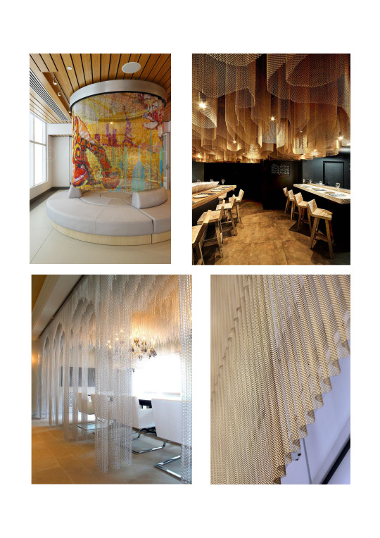
CURTAIN ASSEMBLY
These metal curtains will be used for the quiet table area, as well as a divider of the computers.
These steel beams will be approximately 10cmX10cm big. Custom made in a curving shape to form a single bean-like room. Inside will be a construction of wheels which connect to a hook - further hooking onto the metal curtain. This creates movement within the space, as the curtains can be completely closed in, or completely opened. This allows the public to choose and create their space for work, reading, study etc. It brings in a custom made space for every individual.

These beams will be attached with metal rods, mounted in the ceiling, 1m apart to hold the beams.

0 notes
Text
LETS GET UP TO DATE
In the past weeks I have struggled mentally in life, and it has made designing a challenging process, however, I have since changed up the layout, the purpose, the design, and at this point I have begun to pull together all the pieces and bring them together.
My current plan:
I have explored the shape of the bookshelves, curving them to keep the fluidity within the space. I have three distinctive spaces for everyones needs - and the fourth coming into place soon with the hall space. I have decided I want some of these spaces to be changeable, like the computer room, being able to be shut in with its moving glass wall, and perhaps the wall between the hall and computers could move to have diversity in spaces and an opportunity to have multiple functions going on in the building. A glass room for reading or preschool classes, for small children to come and not have others around worry about noise. I recognizable space that functions well, and creates a fascinating design for the library.

I have also changed a few structural elements.
1. I have removed the internal plaster walls that are directly in the entrance way, these were used for two small nooks, however I wanted to bring in more light, open the space up more, by using glass. These two nooks will be used for picking up books and storing books that have been requested by the library to use.
2. The staff room has been extended 5.8m from its original back facing wall. This is for an extensive range of space, to store books, store furniture if needed, and store staff belongings etc. The library is most in need of space, this was the main concern, so this can be a multi purpose room for only the staff to enter.
3. I have removed part of the wall that separates the hall and the library. Ive done this to widen the social spaces within get library. Ive taken in that the hall wasn't used as much as they'd hoped, and that it wasn't a necessity in the building, so instead of removing it completely, I have made it smaller, so it can still be function for classes, intimate theatre performances, private gatherings, and programs etc.
4. What I would like to do next is remove the hall wall that faces south - west, and make this a glass wall. This creates much more light, and open the space up, showing off the beautiful trees that are currently hidden. To make this space more presentable, some landscaping would make it less of a hiding dump ground. For night functions, this wall will have a custom made curtain that will close in the space, inspired by Petra Blaisse;s work.
or
Create rounded, 1920′s styled windows that can go floor to ceiling, to create a complete contrast of shape. This may link better with my Art Deco inspiration, and the building itself.

0 notes
Text
ART DECO
After reflecting on my floor plan and my fascination of fluidity and creating statement pieces, I have realised that I am self consciously creating a 20s style for the library. Perhaps its my inner love for the 20s era, or perhaps it just seems to fit well with the building, seeing as it was built in 1924!
I did some research into Art Deco, and noticed that I was aiming for the exact same thing and didn't even know. The 1920s had a very strong look with instantly recognisable features such as geometric prints and oriental touches as well as the use of chrome, glass and heavily polished wood. A monochrome colour scheme and use of mirrors as well as lighting displaying women holding globes were popular motifs. To link where I have gone so far, I am using glass, metal, organic shaped furniture, and wood. These have all been done in a modern way, but staying creative and practical with its layout, materials, and colour scheme.
I looked into pattern, color, and shape of wallpapers, which were very common in the 1920s. I love the first (image) pattern with its soft pinks, golds, negative spaces, contrasted with the textured dark navy blue. The composition of this has been made with detail, every line and curve has been placed perfectly to create an intricate moving pattern. The second pattern is more of a popular one. With its curved shape, and detailed lines creating an illusion. Paired with complementary colours for contrast.

I then looked into a more modern approach to Art Deco in todays era. A way to modernize the style, and make in functional to the current design. The curved furniture is what most stands out to me, and its contrast of woods, then texture - break down of design. With its monochromatic color scheme and instant recognisable objects.

GROUP DESIGN
This idea also links to my groups object we had designed together.
For our group piece of furniture, we chose to design a tile. An unlikely choice however one we found rather suited to all our designs and the Grey Lynn public Library. The existing bathrooms are in a state of disrepair and therefore must be redesigned. We figured a tile would be a simple way to transform the rooms whilst pertaining not only to the 1920’s history of the building but also our own personal aesthetics. In this way we could design a sample for that can be coloured, finished and rearranged to fit each of our unique designs.
We also believed the tile would be an interesting choice as bathrooms are often overlooked or considered at the last minute. By getting this over and done with at the beginning it would make our personal designs more detailed and well-considered
A tile also fits within the sustainable design kaupapa that is an essential concept of Eva and my design
We like the idea of creating a single form that could be fabricated/orientated differently in each of our spaces. In this way it would be customisable and therefore be a unique feature in all our designs.


0 notes
Text
EXPLORING MATERIALS
MOVING DIVIDER / CURTAIN
Beginning with the main features within the building - curved walls. I’ve been thinking how I can transform a space with transparent walls, to divide but not separate its surroundings. Do I keep them stationed as one hanging sheer curtain that opens and closes, or do I create a cardboard wall the moves in all sorts of directions. This feature is the biggest feature I want to focus on, and the material and textures I choose is going to be well thought out.
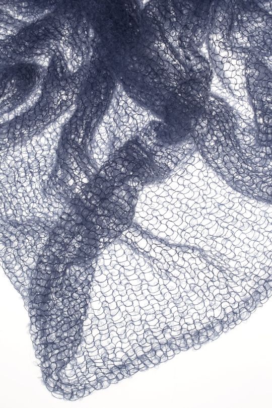
Ive explored into artist with similar ideas, starting with Mimi Jung, on her ‘Sight Unseen’. She creates furniture and objects starting from powder coated steel frame, and using ethereal mohair weavings. This creates such a beautiful contrast in material, and the colors she uses seem to contrast its surroundings too. The soft weaves create comfort, and its shapes create movement.

I found that ethereal mohair is more insulation than wool, although it’s not a necessity in a library, but they have more sheen which makes fabric made from them more attractive. It also wears better than sheep's wool.
This image shows how delicate the fabric is, and it’s buildable, so some areas can be more dense than others. However, because this material is from Angora goats, its quite expensive, and most times the goats are slaughtered for this fibre.
I also looked into paper materials - the construction of a wall that can expand or shrinks. This example is made from artist STEPHANIE FORSYTHE, found on MOLO, a company who makes extremely clever furniture, room dividers, and lights. This sustainable design explores shape, texture, and flexibility within the space, which is an extremely interesting way to divide a space up. However, linking this into the library space wouldn't work for my design needs, and those needs are transparency. This space needs a complete open floor plan to avoid any curious or misleading circumstances in hidden spaces. I could explore this idea with transparent paper but I feel it isn't durable enough for the space. Having to consider children, accessibility, and 10 years of use.

https://www.architonic.com/en/microsite/molo/3101289
Fabrics
My first idea was to use sheer fabrics for these spaces. Perhaps a linen curtain as some can be netted slightly stiff, but still flowy. But just like the Mohair, its still delicate and may not be durable enough for the space I'm using it in. Of course there is organza, which is light and silky, or even a tule. However, with any kind of fabric I feel it doesn't push the design enough.


Last week I would have gone with a fabric and said job done, today I push myself to go further, and ask myself, how am I applying my design sense into this library, how can I utilize materials in a way that can be durable, lasting, clever, and give me the sense of art. This feature is the main concept so far for this library, so why not make it a piece of art - an art installation.
Some other materials I have thought about are:
Wood
I thought about constructing some areas that wood could divide the space with, thinking about texture, color, and depth. But this would have meant they would most likely be stationed on the ground, disregarding the idea of moving objects and fluidity in the space.

So I though perhaps creating a design that was similar to a beaded curtain could also work. This wood could be parts of recycled material from the local building sights, or fallen sticks from trees. The idea of exploring organic shapes and textures, as well as colours and type of timbers could be a fun and creative way to bring in some local context, even as well as Maori history through the spiritual stories of trees.

This idea actually reminds me of Hella Jongerius work of the United Nations North Delegates’ Lounge, New York in 2013. And other designers Rem Koolhaas, Irma Boom, Gabriel Lester and Louise Schouwenberg.
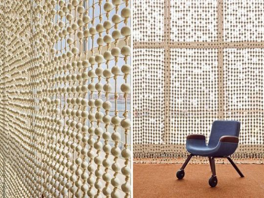
This work made with knotted yarn and porcelain beads, creates an extremely fascinating feature for the space, although its not diving the space, it changes the view of the space through its light and shadows. Its large existence also makes it to be a big master piece installation, and truly transforms the room.
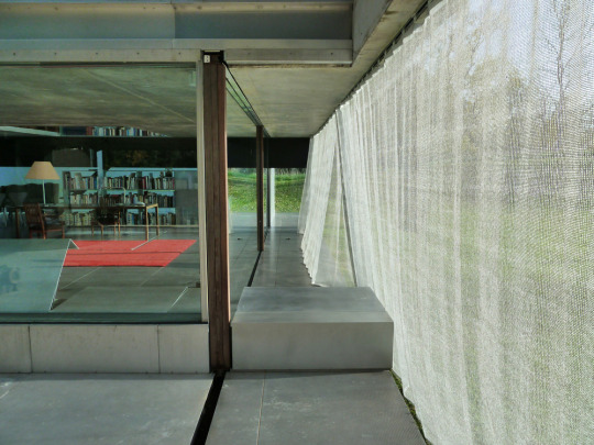
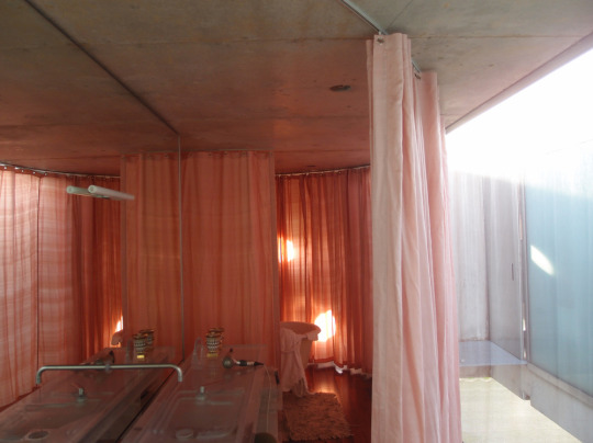
Another Artist that comes to mind is Petra Blaisse, who has been awarded for her exhibition and art installation within architecture. So much of her work is beautiful and well designed, but there is one called Maison à Bordeaux. She creates this home space entirely with curtains. She explores a range of material and colour, to make up the atmosphere of each room and space, creating a interesting, yet soft approach to architecture. Her work reminds me of my ‘Moving walls Experience’ project, where I explored the contrast of harsh structure, and soft walls.


Metal
An in between of durability and fluidity. A material that can be weaved, welded, recycled, and made sheer. I feel this material could be a great start to where I'm wanting to go. The exploration of metal being designed and made to divide a space, and a beautiful way to create movement in space.
This is something I've already made my mind up on, I think metal can be viewed in many ways through its colour and shape, and I feel its the best material I could use to make divided spaces for the individual quiet area. I would like to explore this material and use it within my design. It’s durability being the biggest reason, it is strong, hard to break, it isn't a fabric that will wear away or get stained. I could be creative through its design on the metal, perhaps a Maori symbol on it. It is sheer enough to see through, but dense enough to feel like a different space.
Ive also thought about what design this metal can be, I could make a custom made metal curtain, or perhaps use recycled material for this, and up-cycle it.
I did some appalling sick sketches to see what pattern could work to create a moving sheet of metal, then did some rough patten making on illustrator.

Glass
Semi reflective film - colored film
Other materials I have thought about but know now I will not use are:
Paper - Too light, too fragile for a curtain
Netting - Another durable material but not the look I am wanting in the space
Light - Light won't be a good enough diver of space, and this can interfere with reading placements
Plants - Lovely feature and colour but again not durable for kids and can be ruined
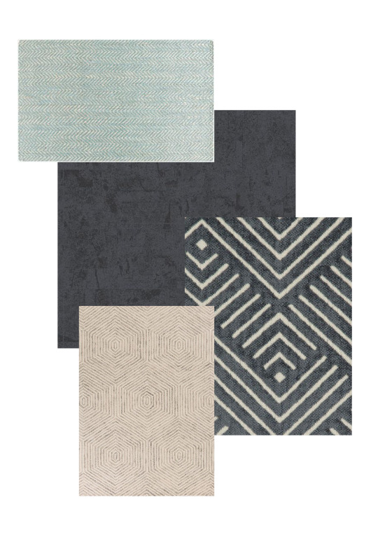
COLOR PALETTE
For the colors within the space, I wanted to keep it fairly neutral and modern, but bring in some soft colors to make it playful, and create a calming, motivated atmosphere.

Textures -
BOOKSHELVES
For the bookshelves, I want to make custom bookshelves that are still movable like the current ones. My first idea was to fit them into the walls so they were fixed, however, I thought it would be better to design some that can be moved if need be - that way I'm also preserving the building and not making any more permanent changes to the interior. The current bookshelves at the moment are metal, and characterless. To intertwine my stye for the library, I would like to make the bookshelves timber. This timber will be recycled timbers from construction sights in Grey Lynn, as well as from timber companies that have remains of timber planks. This will make the design of the library quite rustic looking, however, the recycled planks will be refurbished to maintain a cleaner, possibly 1920′s style.
Using recycled timber planks supports my idea of creating a Kaupapa within the library, from the Grey Lynn area itself. Bringing together parts of the area, and timbers located from homes also creates a space that the public can appretiate, and it symbolizes coming together as a community, bringing together the Maori priciples.
The bookshelves measure at 1525mmH by
FLOORING
Material - Quality, function, sound
For the flooring within the library area, I want to keep a durable carpet that works within the space. This is because of the sound elements within the building. Carpet will stop any echo, loud steps, or any movement within the quiet space. Sound is most important within a library, and it needs to maintain its quiet space for the public to use.
I have thought about colour and quality of the material I want. Because of the color palette I am wanting within the space, which is neutrals, greens, and wooden elements, I don't want to go with an intense pattern design. I find in many libraries, the carpets can be quite tacky with the colors and pattern. Because I want to create a space thats more balanced, ever so slightly modern, I want other elements within the space, like my metal curtain and glass room, to have more focus. So I want to use a textured, durable, and neutral carpet.
I did think about placing a soundproofing underlay and then using a vinyl type material or timber, however I believe using carpet makes the space that ever more comfortable, as it is such a small space. It needs to reflect a comfortable, quiet atmosphere, and because of my layout it supports the intentions of the space.
Using this type of pattern and texture also brings together my design elements of movement, with circular or moving patterns.
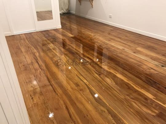
The Hall Space
Within the hall space, I am keeping the Rimu flooring, however, I am wanting to lift the polish and refinish them, that way the beautiful Rimu can stay, but look more refreshed and cleaner. I also think the color of the orangy Rimu currently isn't quite the color I want in the space, so lifting and sanding the floors, and staining it a different color will help portray the atmosphere I'm wanting to create.
FURNITURE
Material - touch, sound, durability
For the furniture within the library space, I’ve brought in seats that are rounded, to continue the movement I'm creating within the space. The reason for this is because I don't want to have blocky, harsh furniture, which can make for more of a formal atmosphere. Using rounded, curved furniture will help create the space to be more fluid and softer.


LIGHTING
I was unable to attend most classes from week 8-11, however I did recognize a detail for lighting, and I wanted to do a quick analysis of mood lighting/ custom hanging light fixtures within the space. On top of this of course is windows, and flat ceiling lights

Because my space is all about comfort, and custom areas for the public, lighting is extremely important to create ambience and mood. Just like how color in a space can determine a feeling to a person, lighting can have that same effect. When visiting the library I found the lighting was a perfect amount for reading and working, yet relaxing. Because of the large arched windows in the space, these smaller lighting fixtures would be plenty enough to further create a comfortable, yet modern and professional atmosphere.
0 notes
Link
This children’s library design by Muxin Studio, has also given me some inspiration and motivation to not be scared of completely transforming the space. It’s completely curved shape makes for a playful design, its almost as if there is no ending to its stories.
I also appreciate its simple design to it, having only few materials and colours. This to me interprets the idea of the books being the colour, and the intrigue, using its simple space to focus on the books.
The curvature of the doors, the ceiling, the bookshelves, even the pillows, give such a beautiful architectural element. Keeping it simple, modern, clean, but clever.
0 notes
Text
DESIGN CONCEPT ONE
Creating a space that utilizes material to divide, but not separate. I found with my design I started with materials. Since the site visit, it was the first thing I thought about, with layout the next biggest concern. My materials seem to be soft, organic, durable. Where my colour palette is again, soft and organic -greens, whites, blues, and light timbers. I feel this creates a sense of modernism, which contrasts with its historical shell. Colours also interact with people, these things can be physically and mentally calming. I played around with fluidity in the space, trying to give each individual activity its own space, but by doing it playfully using materials like fabric, that falls from the ceiling, perhaps similar to my ‘Moving Walls’ project.

0 notes
Text
CREATING A DIVISION - NOT A SEPARATION
MOVEMENT WITHIN SPACE
So far, the idea of movement within a still space has intrigued me. It made me realize that I actually had done something similar to this in previous projects. My Moving Walls concept - transforming a space that changes, that constantly moves, and creates a division, but not a separation. I played around with the idea of material, construction, and shape. I designed a curtain that moved by wheels, attached to curved steel beam, further attached to the ceiling.
I want to pull some inspiration out from my own work this week, and see how I can push these same boundaries within the library, or hall space. There is something about movement within a space that creates such a beautiful architectural element. This movement is based on the explorer and observer relationships with the built space and form.

This project explores the idea of fluidity within a static building. Although my practice focuses on the construction of the installation, my idea came from dividing a space through two completely different atmospheres - (harsh and soft).
This curtain makes for a change in scenery, and material. I explored the idea of a changing space, a thoroughfare of imagination.
The construction of this curtain allows it to move, open up, or be completely closed in. Although we were not focusing on whats inside, this is perhaps how I can create spaces within the library, and add furniture to these spaces. Although I would not have this curtain opaque, as spaces within this library should be open and transparent - considering the mischief that could happen in dark corners. Perhaps linking to Aalto’s glass work - these shapes and glass material. Or using sheer curtains, or an exploration of material like cardboard.
ARTICLE
https://www.cogentoa.com/article/10.1080/23311983.2019.1588090.pdf
An Article called “The experience of movement in the built form and space: A framework for movement evaluation in architecture” by Mosleh Ahmadi, talks about his bibliographical research methods with the aim to categorize different types of movement within architectural spaces. Ahmadi tries not only to address circulation in architecture and visual movements but also the physiological psychology of motion, pictorial representation, and natural factors.
I found this article really interesting. His opening line starts with - “Apparently, movement cannot be related to architecture because buildings are static, but there is an analogy between architecture and dance that would enlighten this relation.” I feel this is how I perceive this library. It’s a static building, but surely there is more to its build that can intrigued ones eyes.
0 notes
Text
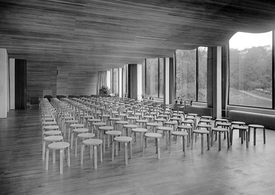
ALVAR AALTO
ARTIST MODEL
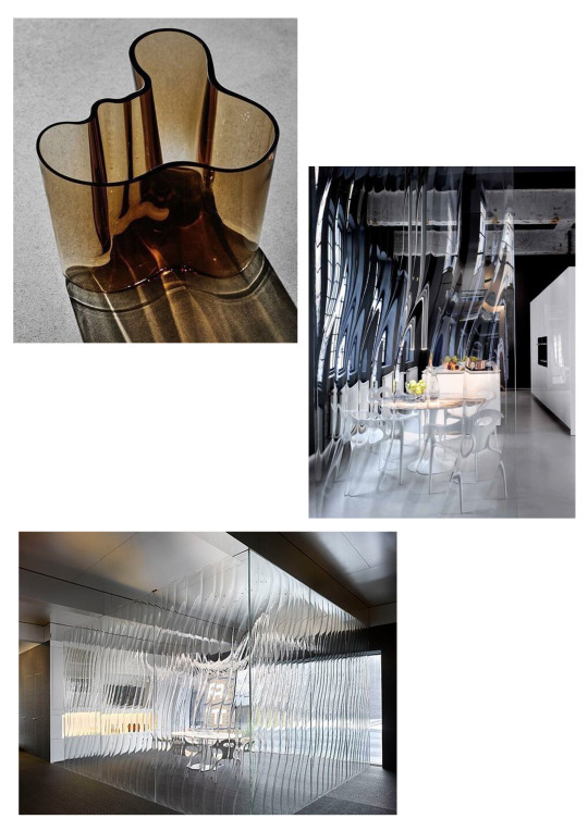
‘Hugo Alvar Henrik Aalto was a Finnish architect and designer. His work includes architecture, furniture, textiles and glassware, as well as sculptures and paintings, though he never regarded himself as an artist, seeing painting and sculpture as "branches of the tree whose trunk is architecture."
Aalto’s glassware and vase work interested me first. The incredible composition of his glass vases - they remind of of division of a space/multiple rooms within one room. However, researching into his work, I have found that his architectural work is even more fascinating. He worked with shapes within a space to create an interest in his work, some organic (like his vases) and some geometric. His work is sometimes simple, but its these large elements he places in his architecture that create a meaning to it, an atmosphere per say.


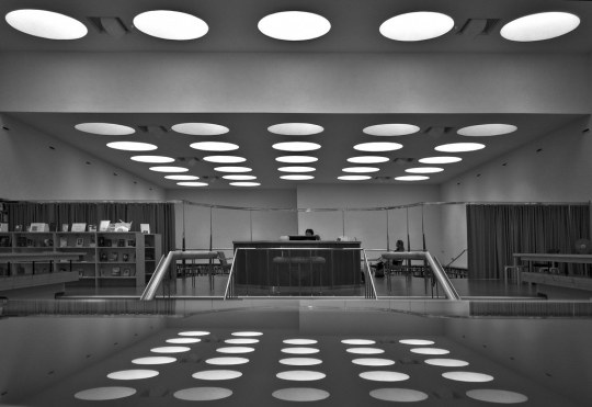
This piece below in particular reminds me of the hall space. I love the movement of the ceiling, contrasted with the straight glass windows. Its almost like being under a cloud. Again, I have noticed the timbers and earthy materials used, which seems to be a highlight in my research.
I like the idea of connecting these materials with the forest space behind the library. Playing with soft, warm tones in a space that needs to be calm, and tranquil. This is something I will explore in another blog entry.
2 notes
·
View notes
Photo

TRANSPARENCY


(Work by Alvar Aalto)
This weeks inspiration are from these glass sculptures by Alvar Aalto. What fascinates me about them are the capturing of light and its shadow it creates, as well as the shape/movement. I find that the library currently has no flow to it, no sense of guidance towards something, nor an atmosphere which makes you feel productive. The sculptures gave me an idea of flow and movement within the building.
A category 2 building is hard to work with, so I am looking at whats inside this space, and how I can transform such a small space into something interesting, yet purposeful (but yes I know, who isn't..)
I’m beginning my process through the transition of light through glass. When I think about the library space, I think of the lack of designated spaces, and also privacy. When the library has a group session, there is no space where they are separated from others doing work or reading. When I think about a good library, I think of a big space that can separate work, pleasure, and play. My visions start from using glass to create a space, but not necessarily divide the room completely. The glass acts as a vizard of space, the separation, but not the division. Using movement, flow, sound etc to create a productive space.


(Images sourced on Pinterest)
Creating spaces for all aspects is very important to me. A space for computers, for readers, for children, for workers, for those who want to study, or those who need privacy to sign documents. All these things need to be given an opportunity to work, but plastered walls don't interest me - lighting, depth, materials, storage - these are what I wish to use to create a beautiful space for the public.
0 notes
Link
LOCKDOWN MADNESS
It has been a tough 5 weeks in lockdown, thats no lie, however, coming back into design mode will be a breath of fresh air. I have struggled since day one on my design concepts - A Library. So much I can do, but have no place to start.
So, I brought it upon myself to research. Although, it hasn't done much for me yet on design ideas, but in saying this, I have found a very interesting library design in Muyinga, Africa. Made for the school of deaf children, this design evokes earthy materials, transparent doors, levels within the space which creates a great sense of depth and in this case, storage. I love the combination of timbers, and brick, paired with rope netting - also a great concept of interaction for children as well as adults. This space, although so very small, has been designed in such a way that there are multiple places to sit and read.
“This “hallway porch” is a space often encountered within the Burundian traditional housing as it provides a shelter from heavy rains and harsh sun. Life happens mostly in this hallway porch; encounters, resting, conversation, waiting - it is a truly social space, constitutive for community relations.”
0 notes
Text
WORKSHOP
Casting and Molding
“Recall something that you’ve lost.”
My object I brought was my grandmothers ring which was passed down to me. I wanted to see how the casting would show the beautiful stone details, and of course its a very special object, so why not have two!?
Because it is a hollow object, I had to fill it in with putty, but it still presented the essence of the ring. Because of the time frame also, I didn't have time to make a two piece mould, which is the proper way of casting a hollow object.


0 notes
Text
TAKING LEAD
This week I am wanting to take lead in where my project is going. To start with, there are only a few things that stand out to me so far, which is the materials in the building.
The hall flooring, wall colors, window finishings, curtains, furnishings, skirting, architrave, book shelving, seating fabrics, paint collaboration/contrast, the outdoor appearance — the faded and moldy concrete (stairs and ramp), metal handrails.
These are the aspects I want to start my design with, and to consider the material and texture in a purposeful way — thinking about what is used in the space and why it is important. For example, the wall colors/textures in the hall space. This is currently beaten, scratched, and ripped, from the constant and large amounts of groups in the space, I want to find a way to make the space adapt to its purpose, through material.
SUSTAINABILITY
I am wanting to start with sustainability. This is an important subject not only for me, but for our developing world we are in.
“Sustainability is made up of three pillars: economic, social and environment. These principles are also informally used as profit, people and planet.” -www.YouMatter.world


studio class insparation/moodboard week
0 notes
Text
SITE VISIT
SITE PHOTOS


My thoughts on the site was that it felt almost like a hidden treasure. The building was dated, tired, and not well looked after. It was sad to see the surroundings (a local aspect), as there was quite a lot of rubbish, bottles, clothing.. However, the walk from the very black and white parking lot, out to the walk way going into the bush, was beautiful. Viewing so much as the motor way, local streets, houses, and then the greenery and velocity of depth. This library seems to have an insight of such a small section of Auckland, however you see a lot of aspects of a community in one position, which I find quite poetic.
NOTES
Quick notes on site ideas, elements of the building, details, things to consider..
One thing that is sticking out to me, strangely, was the white walls in the hall.. They were so filthy that I immediately wanted to address the materials within the building first. The second thing I found interesting was how the layout was in the library. The positioning of the computers placed right in the middle of bookshelves and a shared seating space seemed so unnatural. I library to me means a sacred place. A library is where your thoughts are created.. or left at the door, a place where you can in some ways, meditate, reading a book, a quiet writing space, or a private computer distraction, any of these things have such a different atmosphere to the each other.


0 notes
Text
The Project
In partnership with Auckland Council, you’re asked to provide a concept proposal for refitting the Grey Lynn Public Library to improve the public service it provides, while acknowledging the building’s whakapapa. The Grey Lynn Library, built in 1924, is small (one of the smallest in Auckland). There are two parts: the library itself (264m2) and a hall which is available for hire (280m2). The hall is less well-used than the busy library, so one option is to extend the library into the hall. Another option is to keep the spaces separate, but reconsider how they are used. The library is a Category 2 Heritage building, so any changes we propose have to be completely reversible.
Who are the local people: age, culture, etc.
How do we accommodate the current demographics? How to we expand them?
How do we engage the history and stories of the library, and the surrounding area?
What are the implications and restrictions of working with a Heritage Category 2 Building?
How do we elevate customer experience to attract and retain members?
How do we future-proof this design?
What's lacking on the local community? What's well-represented locally? What is the local area well know for?
What makes a public space successful? How can you involve different sections of the community?
What makes a library a library?
What is the construction of the existing building? How does that limit us? What opportunities does it offer?
0 notes