
Don't wanna be here? Send us removal request.
Statistics
We looked inside some of the posts by nikolaszdomolki and here's what we found interesting.
Average Info
Notes Per Post
1
Likes Per Post
1
Reblog Per Post
0
Reply Per Post
0
Time Between Posts
3 hours
Number of Posts By Type
Photo
17
Last Seen Tumblr Blogs


Fun Fact
69% of Tumblr users are millennials.


Photo


CVL #19 Extension This is an extension of the data curration ive already done, I intende for these to go along side of the 3 other days, as sort of an overall wrap up in its most intense form.
0 notes
Photo


CLV #18 The final layout Here is the final layout of my data collection. Overall, I think they are quiet successful as they reach the aim of shouting the stuff that more prominent in my life, and really hiding the intimacies which if you want to fin out more about, you’re going to have to engage more with it. i cant fully show my final outcome because of tumblr length limitations
0 notes
Photo


CVL #17 Refinement Here, i just worked on refining the width of my text box, really looking the the additional length that comes with it, from all the compactness i receive as a reward. I also turned off hyphenation as i found it to be distracting and it was causing trouble with the type layout.
0 notes
Photo


CVL #16 Experimentation Here, I played more with all of the effects mentioned before. I have the alternating text sizes, different colours, different opacity’s and the block up, stacked vertically. I ended up liking the most keeping the opacity with the black and white and doping the colours as i just dont have a reason to justify the usage of any colour as it doesnt represent anything.
0 notes
Photo


CVL #15 Experimentation This time around, i played with the vertical format and i have to say, i think i way prefer it over the landscape stuff. I call this the receipt. With this, my vision is to have this very long printed out paper that is just ongoing, representing the flow of my day and the things i doing. With it being vertical, I played around a little with the width of the text box in order to try and squeeze in as many words into the most compact areas possible while not having jagged edges. This reminded me off of Kurt Champion’s work and the visuals are similar to what im going for https://www.creativeboom.com/inspiration/bin-ladens-hard-drive/
0 notes
Photo


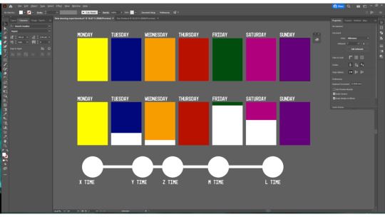
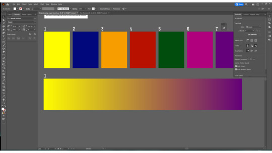
CVL #14 Experimentation here, I experimented with laying out the data i’ve collected. In this first approach i played around with blocks/ tiles, which would represent 1 unit of hour of my day. I experimented with the saturation of a colour, to represent each rating. (I made the colour decrease by 14% each time) To that same remark, I’ve played around with the size of the type eg if i rated it a 6, then it would be 60pt. Before that I tried out just having it all one size but i wasnt a fan of it. I also made every Hour and WUU2 section, the same formatting as the rating I gave to the Overall hour, as I thought they are markers which should also get looped in. These things helped me to establish rules and systems for consistency.
The what i call, “Calendar” layout using the tiles, was probably my favorite out of these all, however i just wasnt sure if it was the right thing to do. It did look pretty interesting with some bits being filled in and other empty as it did really look like a calendar. However, I just didnt think it looked too good in my opinion. When i spread out the calendar into a long stretch of a landscape, I imagined going into a room, where it just stretches all over the walls from left to right so it was definitely ambitious. In reality, the calendar approach was probably better though.
0 notes
Photo


CVL #13 giorgialupi research
I think I’ve stuck gold yet again. I dug through some of the stuff aswell, thought not as extensively as I did with Feltron, partly because there was just way more here to find and it was a little overwhelming.
Looking at their work, I actually discovered even more and cooler stuff, compared to Feltron. This seems way more exciting and alive and i love how each project is so down to earth and human. It gets people to be involved and cooperate. It shows creative ways of displaying and visualizing too. This stuff is just great. It works with grids and systems, all stuff i love.
Once again ive created 3 categories of usefulness
The Absolute best:
http://giorgialupi.com/incroci
http://giorgialupi.com/moleskine-foundation
The cream of the crop, the stuff that i found absolutely useful
The mid but good:
http://giorgialupi.com/happy-data
http://giorgialupi.com/the-digital-in-architecture
http://giorgialupi.com/the-room-of-change
http://giorgialupi.com/my-2020-in-data-so-far
http://giorgialupi.com/bullettin-of-the-atomic-scientists
These things were still good but just not outstanding,
The mostly irrelevant:
http://giorgialupi.com/giorgia-lupi-otherstories
http://giorgialupi.com/10-days-in-isolation
http://giorgialupi.com/mindworks
http://giorgialupi.com/plastic-air
http://giorgialupi.com/dear-new-york
http://giorgialupi.com/whatcounts
http://giorgialupi.com/bruises-the-data-we-dont-see
http://giorgialupi.com/rand-artist-in-residence
This is just the stuff that didnt really aid me well.
Here are the ideas that im inspired to explore:
different fonts for different stats
ongoing line of horizontal text
vertically stacked text
box text
size changing text
background colours changing based on rating
1 note
·
View note
Photo


CVL #12 Nicholas Felton BINGO! I think I found my guy! Initially when looking at his work, I felt as it if was too disconnected to what i was doing, but the more and more digging i did, i found better and better stuff, so i categorized his stuff from most to least relevant The best of his stuff: http://feltron.com/FAR14.html http://feltron.com/FAR09.html This is the stuff that i found the most useful out of his work, and i will draw the most inspiration from. I really like these info graphics because they are quite bold and simplistic, straight to the point, but they also cover similar topics that i wanna delve into so this can give me a head start on what to do. These things that i just described, essentially make up my visual identity so this is real exciting stuff to me. The good but not excelent: http://feltron.com/FAR08.html http://feltron.com/FAR07.html http://feltron.com/FAR06.html These were also strong pieces of his for my needs, but they just didnt excel to the highest levels. And lastly everything that was poor but somewhat relevant: http://feltron.com/FAR05.html http://feltron.com/Daytum.html http://feltron.com/FAR13.html http://feltron.com/FAR10.html http://feltron.com/Editorial.html http://feltron.com/FAR11.html http://feltron.com/FAR12.html http://feltron.com/B5B.html http://feltron.com/BikeCycle.html http://feltron.com/Skillshare.html http://feltron.com/Reporter.html These things were just simply not too relevant for me to look at them.
0 notes
Photo


CVL #11 - Tracking (almost) every hour of my year When doing my research about information design and curating data, I’ve stumbled across this persons article about them essentially documenting every hour of their year. I found it to be super interesting and useful to look at some of the examples that he’s done, and see what ways he went about doing them. After he collected all this data, he was able to map out his life in a year and see where stuff went well and not so well. He was able to make correlations and come to conclusions that he has hypothesized before and came to some interesting findings. He was also able to see improvements and regressions compared to last years data which is super interesting to look at. The work that he’s done is quite fascinating, not only did he record all this data, but he recorded the micro stuff too. Not only did he record the hours worked for example but also what type of work, where and when etc. He’s really gone on a full deep dive into this and its fascinating to look at all this observable information to be put down in written form. https://betterhumans.pub/lessons-learned-from-tracking-almost-every-hour-in-my-year-a71b8ea493d9
0 notes
Photo


CVL #10 Sarah Hyndman
Ive next looked at the work of Sarah Hyndman and how she works with typefaces. I found it to be super interesting on the surface however, there was not much more depth i could see that there was to dive into but what she does is a great representation of the examining of human psychology and their relation to type. Essentially, her work revolves around the significance of type and how each face can change the experience of the viewer. That may be precised value, texture, taste, luxury, smell etc. I think this might be very useful for my informational layout.
0 notes
Photo

CLV #9 Freakonomics Research As it was advised to me int the last tutorial, I went and did some research into Freakonomics and all its curious findings. I spent an ok amount of time researching and diving into this, unfortunately i didnt find it too particularly useful. However, I did appreciate its attempts and methods used to extrapolate conclusions and the usable, tangible data through examining history and information. For example how the legalization of abortion during though, crime full times, can have the effect of reducing hardship and crime by proxy of less people being born into the “badness” meaning that they were simply not there to do the crime. (which is most common in rougher and poorer areas) Sources I’ve looked at: https://www.youtube.com/watch?v=2UtdA0DiDaU https://www.youtube.com/watch?v=zk6gOeggViw https://www.youtube.com/watch?v=hABM20X0iZg https://www.youtube.com/watch?v=5UGC2nLnaes https://www.youtube.com/watch?v=um5gMZcZWm0 https://www.google.co.uk/books/edition/Freakonomics/kxsQhM4D8uIC?hl=en&gbpv=1 https://freakonomics.com/ https://en.wikipedia.org/wiki/Freakonomics
0 notes
Photo


CVL #8 Data Collected 4-8 Unfortunately, due to my circumstances as well as to my strength/willingness to do it during difficult times, I have fallen off drastically after day 4, and so instead of the hopeful 1 weeks worth of data collection, now i only realistically have about 3 whole days. I dont see this as too much of a problem however, as this will get me to cut down and narrow down on information, making my life easier. And the brief more on track, not getting derailed by all the side details.
0 notes
Photo


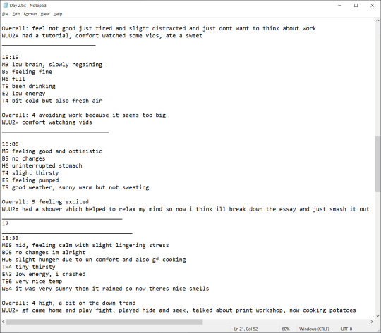


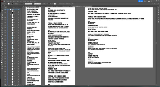
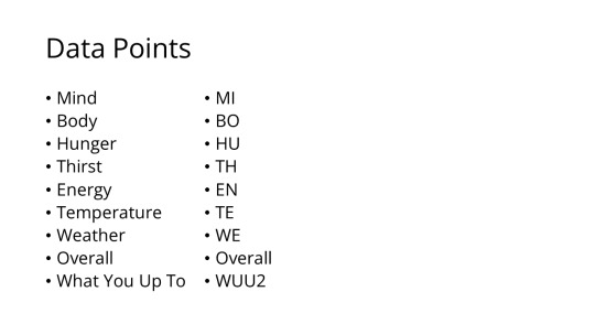
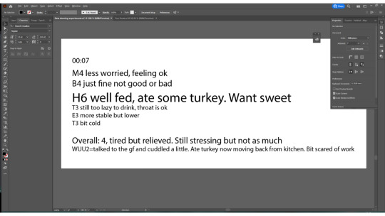
CVL #8 The data collected 1-3 Here is a compilation of all of the data that ive managed to collect throughout these few days. I called my data collection the Mood Meter, as initially that was its primary focus, but as i went along, the more i realized i should probably expand on these ideas. By the end, I was tracking these things on an hourly basis: MI= Mind - how well im feeling mentally BO= Body - hows my body doing HU= Hunger - how are my hunger levels and stomach TH= Thirst - how well hydrated I am EN= Energy - how are my energy levels TE= Temperature - how warm or cold im feeling WE= Weather - how is the weather outside O= Overall - how im doing all together WUU2= What You Up To - what ive been doing in the past hour Im not sure if all of it will be sued or not but the more data the better - can always cut down through selection
0 notes
Photo

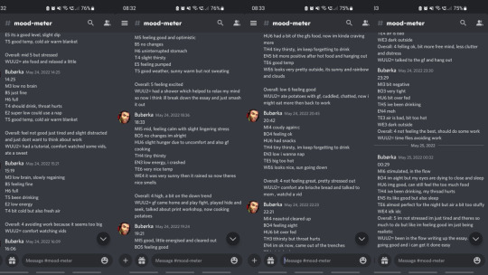
CVL #8 - Showcasing Data
Again, at this point i wasnt sure what to do with all this data so i kind of just threw everything out there seeing what sticks. Here is my initial attempts to figuring out how to display my data in various ways, which was tracked roughly every hour of a couple of days:
background colour of each day could be what i see - synesteshia, associations
dimensions could depend on th amount of data collected
Include hours slept too to complete the day
I considered ways of laying out data like the london underground style map - each circle is each hour of destination.
Different size text for different number ratings
Colours could work for the rating to, there could be a little key in the corner
A fading gradient could also work too
Every hour i would fill in the data points set out for myself. I would also rate it 1-7 with a description.
Now this gave me data on the ebb and flow of my day, so now i can have data to pin point to which things might be directly causing this and that if its a daily recurrence.
I noticed how waking up was relatively high ratings, throughout the day it was mid and then into the night it was very low then a spike back up to high during time before sleep. There were also spikes of positive bursts of everything when seeing people or eating.
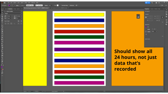
Here is the feedback that ive gotten and the things suggested to me:
use colours with opacity or vibrancy - show level or rating or environmental factors like the weather
keep the 24 hours that are constant
Hours of light
each hour could be the same “5 inches”
use type for ratings in terms of emotions
dont use all 7 days of data if theres a set of “3″ days that are superior
Look at Feltron -
http://feltron.com/ - he designed annual reports - breaking down big data
The worst type of info-graphic regurgitates information - an info-graphic should reveal something about the data that you previously didnt know
what if you had the 7 days overlapped ?
What are you trying to communicate?
Info-graphic always has a reason to exist - it always tries to prove or highlight something
What is your argument, what are you trying to communicate?
Where were you at each hour
Overlapping datasets reveals something new - Freakonomicks - plotting peoples decisions based on environmental and worldly happenings. I liked all this for the most part, so i decided to just go with it
0 notes
Photo

CVL #7 - Reset After that last crit, i wasnt very confident at all that i will be able to complete my mini learning agreement and i realized i set out for myself a bigger task than i expected and I dont think I would be able to complete it to great levels, especially not in time. Therefore, now i have restarted my project. I had a chat, and one of the ideas that was brought up was data collection which i had some fun with during term 1, so i thought i might as well give it an other attempt. Therefore, I started to collect data every hour of my waking day for as long as i could.
0 notes
Photo


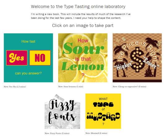
CVL #6 - Questionnaire time
Coming back off of last weeks feedback, I wanted to just throw everything out there of all the ideas i had and see what sticks.
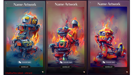
My idea here was to create some sort of survey or questioner for people to participate and interact with, and let the data collected dictate my outcomes. The questions in mind were to be almost, if not actually impossible, thus fulfilling the set criteria of my Mini Learning Agreement. First, i really wanted to tackle and so i drilled down on the visuals. I first thought of asking people of prompts that were used to create the art pieces. I thought this would be a great and creative way to get people to participate and have their imaginations fly off into the distance. It would be absolutely great creative and fun data to capture. Then, as the inspiration ran out, i needed to come up with more questions but they turned out to be more sterile. I was struggling to come up with questions. It started out great with the Ai generated stuff, but then the more i tried to force and find questions, the worse they became untill they were almost essentially like trivia questions - not the level of sophistication im looking for.
here is the rundown of the more fun, worth to mention ideas:
wombo https://app.wombo.art/
https://this-person-does-not-exist.com/en
what language? Gibberish elnglish
What's on this pic? Impossible nothing
What colour is this? Blue or purple
Yanny or laurel
What does this translate to? Something completely different
Find 6 differences in these 2 pics - there's only 5. Time it?
list of references i sued for the latter questions
What's the most popular board game? Chess
Whats the most popular grociery store item ? Carbonated drinks
What's the least? Baby food
What's the biggest impulse buy? Bananas
who is the most unsuccessful successful artist after their death? Vincent Van Gogh https://www.lifehack.org/articles/productivity/15-highly-successful-people-who-failed-their-way-success.html https://www.google.com/search?q=who+is+the+most+unsuccessful+successful+artist+after+their+death
whats the failure rate of arts, entertainment and recreation in their first year of bushiness by %? 11.6% https://www.freshbooks.com/hub/startup/what-percentage-of-businesses-fail-first-year
Which UK city has the wort five year buisness survival rate? bonus for number. Plymouth 30.73https://www.business-live.co.uk/enterprise/startups/bristol-businesses-best-survival-rate-17432097 best? Brostol 44.36
WHats the fastest Declining Industry in the UK by Revenue Growth (%) in 2022? Hard coal mining 50% https://www.ibisworld.com/united-kingdom/industry-trends/fastest-declining-industries/
What is the most broken New Year's resolution? get fit and lose weight
what is the most favorite food in the world? Pizza, pasta
what's the most forgotten item on a road trip? toothbrush https://www.minimus.biz/mostforgottenitems.aspx
what's the most memorable advertising campaign ever? Nike, Just do it
Most popular YouTube videos based on total global views? Baby Shark Dance https://www.statista.com/statistics/249396/top-youtube-videos-views/
whats Netflix's most watched show by the hour? Squid Game 1.65 Billion hours https://www.cnet.com/tech/services-and-software/netflixs-biggest-shows-and-movies-ever-ranked-according-to-netflix/
These are the notes ive taken away from the feedback: Is it a game that you can't win? Is it a puzzle that's missing its pieces Does the completed puzzle not add up to its completed form ? If you ask what do you see there's no failure coz it's up to interpretation. If you ask do you see a bare there is Look at how questioners are done Look at website dark patterns. Ui and how you make 1 option more click able over the other Make failure so addictive that you'll want to do it over and over again to succeed Never ending grind. Just when you thought you're close a new higher ending opens up Make a web page that goes against conventional Web usage Make people re do the whole test if they fail once
0 notes