
Hi hi! I’m Lauren; I like horror movies n slashers n humor! I’m tryna get more cozy posting my own original art on here too! Message me sometime💕 Etsy Shop here! https://www.etsy.com/shop/NixonsshadesCo?
Don't wanna be here? Send us removal request.
Statistics
We looked inside some of the posts by nixonsshades and here's what we found interesting.
Average Info
Notes Per Post
914K
Likes Per Post
563K
Reblog Per Post
351K
Reply Per Post
965
Time Between Posts
3 days
Number of Posts By Type
Text
17
Last Seen Tumblr Blogs


Fun Fact
Tumblr Inc. is funded by 13 investors.

Text
Vatican employee: oh hey u guys are back early
Cardinal: pope’s a yank
Vatican employee: what?
Cardinal: *loading a pistol and getting back in the Sistine Chapel* pope’s a yank
8K notes
·
View notes

Text
Once I "made" a custom emoji for my mum by crudely drawing a hijab on it and now whenever she wants me to buy a coffee for her I get a text like this

105K notes
·
View notes
Text
did u guys see the picture of the brazilian cardinals. theres a tiny diva in it
33K notes
·
View notes

Text
drunk and in love and full of food i think only the torturer eel could harm me
54K notes
·
View notes


Text
Once you start thinking about humans as a species in a biome, it affects your entire way of looking at normal things.
The other day I referred to female morning joggers as an 'indicator species' in that if you see women jogging in the dark it means that the environment provides migration pathways (sidewalks, clear signs) and doesn't have any known predators of female morning joggers (guy with knife, bear, BigTruck, male morning joggers).
Though, I think that people consider framing humans as animals reacting to their environment as rude.
66K notes
·
View notes
Text


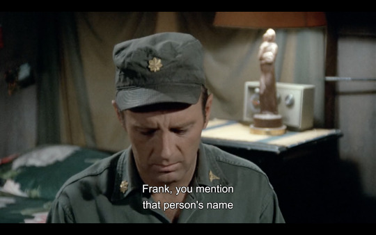
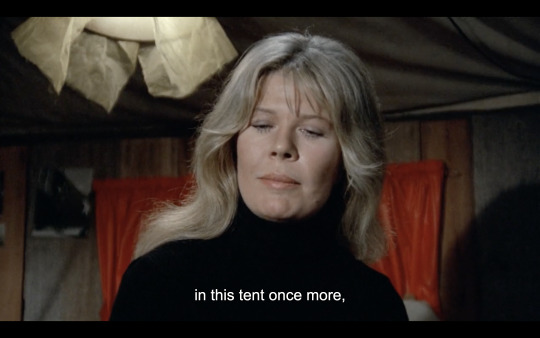
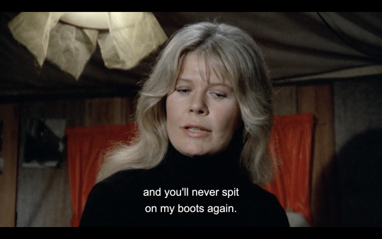
at some point margaret should've started shooting men in the head
3K notes
·
View notes


Text
bro doesnt even have the jennies (certain je ne sais quois)
95K notes
·
View notes
Text
I know whenever people rave about Pokemon's sprite era, it's usually about gens 4 or 5 (for good reason!), but maaaan does gen 2 have such a distinct visual identity that I adore, and I think a large part of that is how creative they get around their limitations
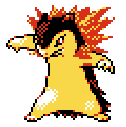
Like! Look at Typhlosion's Crystal sprite! See how many colors it has? There's yellow, there's red, there's black, white... and that's it! Most if not all sprites operate under a four color palette - and since they all have black and white, that means each sprite only really has two unique colors to work with. And man, MAN do they work with them so well. Look at how the reds aren't just part of the fire, they're used to highlight Typhlosion's fur, to give it the illusion of depth. See how the yellows scatter into the flames, how the whites of the legs spread out where the highlights bleed away?
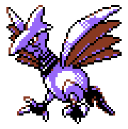
And look at Skarmory! The reds aren't just part of the wings, they're the outline of the eyes that make the sclera look more yellow than white (and I had to color pick to be sure! that's how effective color palettes can be, when it allows your eyes to 'fill in the gaps'). Most of the metallic shine comes just from how the purple and the white are applied- they made this bird METALLIC. on a GAME BOY COLOR. with TWO COLORS
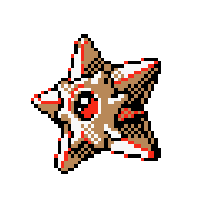
Staryu's shading is complex by design (shining gemstone center, geometric star shape where the light source hits the faces differently), but look how the face-covering-thing around the gem is lighter than the rest of its starfish body. They both use the exact same shade of brown, but one part uses it as shading and the other uses it as its base! And the reds?? Not just how the gem can look so shiny, but it's used so well to complement the outline!
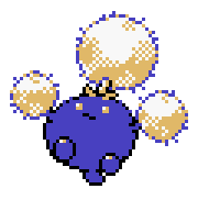
And look at Jumpluff! It's body is mostly a flat blue, but it helps accentuate the detail on its cotton puffs. Look at how scattered the yellows are, how specks of blue will poke out, making each puff look... well, puffy!
I had to size them up for readability in this post, but these sprites are only 56 x 56 pixels. That's so tiny!! And yet they're able to convey such key details for such a tiny game system, all while using such cozy color palettes!
gen 2's era of art design you will always be the moment of all time to me <333
5K notes
·
View notes