
nm3217-charmaine
NM3217
charmaine chong ∙ A0202754L
9 posts
Don't wanna be here? Send us removal request.
Last Seen Blogs
summerlimeismethebrony
A Big Nerd Who Makes Poor Decisions

hunnieknight
I draw reader with hoodie

gain-ajr
ألا بِذِكرِ الله تَطمَئنُّ القُلوب
theherstory
theherstory

labirintogrigioagain
Untitled
Text
Week 6 Lecture Exercise E
The first thing that looks the most glaringly off would be the choice of font. Using varsity font for the header is alright as it is a font that can stand out, and headers are usually short so reading something in that font would be alright in that case. However, using it for the body text makes it difficult for the reader to read the text easily as it is kind of “heavy”. One of the 8 text guideline is serif vs sans serif. In this case, maybe changing the body text to a font that is sans serif will allow it to have a little contrast and hopefully be easier on the readers' eyes. An alternative option is increasing the kerning, the letters right now are quite close to each other which makes it difficult for the reader to quickly skim through the text. The font choice coupled with white text and black outline is also a bad combination because it feels laborious read through the whole chunk of text. Maybe a less striking contrast in the colours will help the reader if this font has to be used.
0 notes
Text
Final Project Commentary
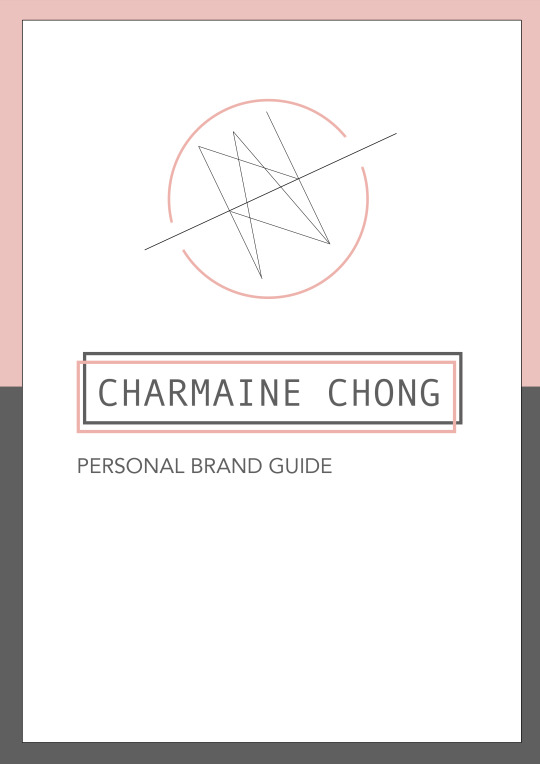
For the final project, I decided to go with the self-identity option. While brainstorming for ideas, I decided I would like to use the resume for job applications and decided to go for something more minimalistic. I am a fan of designs that are made of lines and shapes so I decided I would try out that concept.

During the logo ideation process, I wanted to incorporate my name into the logo. I tried playing with some curves and lines to see if I could spell out the letters of my name and turn it into a logo which can be seen in the first two sketches. The first two logos are similar in a way where they are both just made up of only curves and lines. The first one felt a little cluttered to me so I decided to try exploring a different way to present the lines in the second version. I tried something different for the third sketch and it is inspired by the meaning of my name - bountiful orchard and joy. I added a fruit tree to represent the meaning of bountiful orchard while the hearts and butterflies are meant to represent joy / happiness of a thriving tree.
Some of the changes I made from the previous week - I decided on using the logo that made up my names with lines and shapes. Among the two options, I chose the one that looked more balanced. From the feedback I received, I played around with the thickness of the lines and chose to thicken the semi circles outside, which represents my initials.
The final logo was done on Photoshop with the ellipse and line tool. I first did the logo on Procreate and used the tools to trace over on Photoshop.
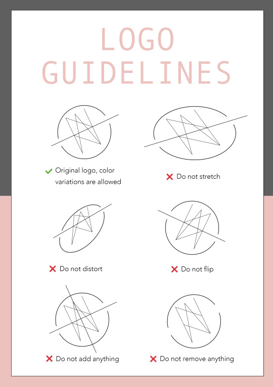
I also chose to have no fix color for the logo and will adjust it according to where I am using it (eg. the initials are highlighted in pink in my resume). This also means my logo can adapt to whatever future colour scheme I might change to. Besides the color change, no other variations of my logo will be accepted.
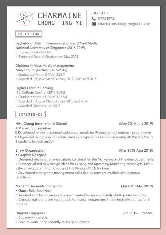
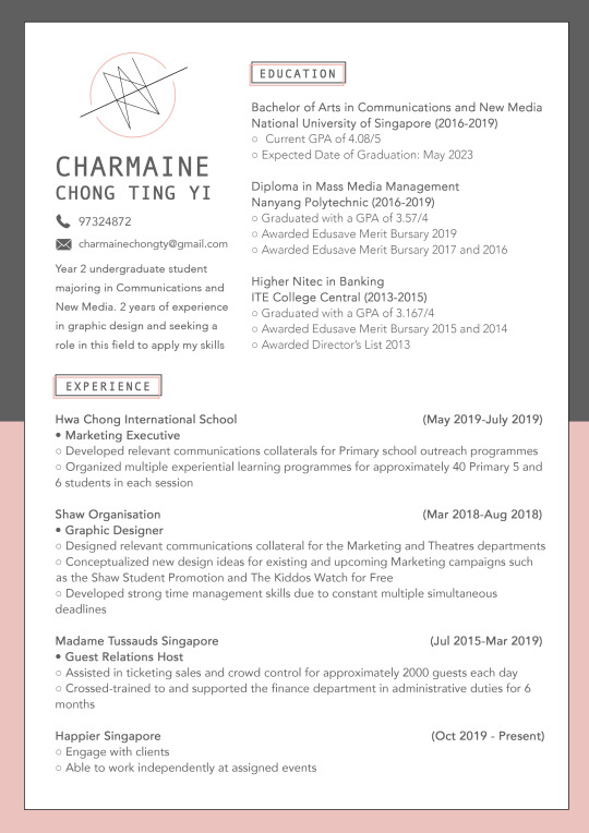
I made some changes from the feedback I got during the forum post. The above two pictures show the original version I posted during the forum presentation while the second one is my final piece. I received feedback about how there were white spaces in the first version and I thought about how to fill it without it looking too cluttered. I decided to rearrange the header and education so that it will fit nicely in the upper section.
The resume was done on InDesign since the final project had to be done primarily on it. I made sure to align all the elements and text using the ruler guide in order to ensure it looks aesthetically pleasing to the reader.
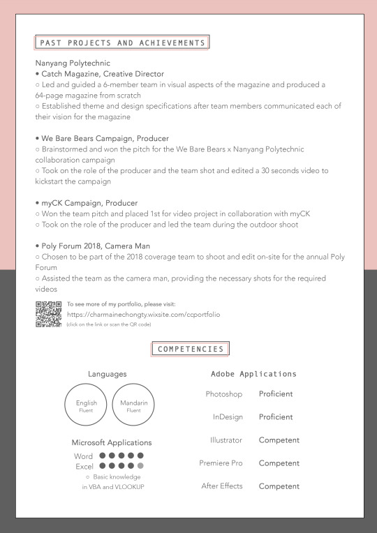
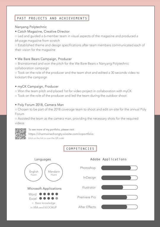
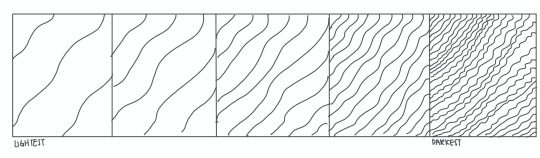
As for the second page, there were changes made according to the feedback I received too. I originally used text to explain my proficiency in Adobe Applications but a suggestion was made to make it more visual. I decided that a scale would look good in that case and changed it accordingly. I debated if I should have sorted them out by how proficient I am in them but I decided to group the design application as the top three and the video editing softwares below instead.
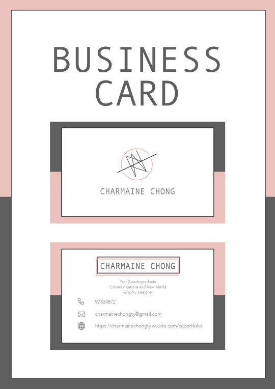
For my business card, I wanted it to match my resume so the background colors which are inverted are the same as the resume. I kept it simple with just my logo and name in the front, and again my name and some basic necessary information at the back. The colours and fonts used are consistent with the resume and everything I have chosen for my brand guide.
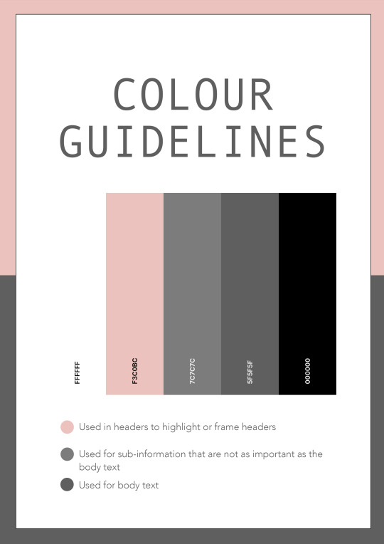
For the color palette, I decided on 5 colors. I initially chose colors such as beige, light pink and nudes for my colo palette, but I decided to scrap it because majority of the colors were really light and wouldn’t show up well on the resume and business card. The two main colors for my self-branding is pink and grey, which is used and seen in the headers and body text. These two colors were chosen because pink is my favourite color and I felt that it represented me well while grey matched pink well. White was used for the background while black, which I decided was a little harsh (and the reason why I chose grey, since it looked softer), was used for the frame for the white background.

As for the fonts, I decided on sans serif fonts as the lack of the letterheads will give it a cleaner look and and can better convey simplicity and minimalism, which is the concept that I am going for. The two fonts are chose were Andale Mono and Avenir. The former was used to header texts or texts I wanted to highlight while the latter was used for everything else in the body section.
My overall journey for this final project can be summarised in one word - chaotic. I tried so many different ideas and scrapped many of them due to various reasons. This was a great learning process because when I used to design in the past, I feel like I did not put much thought and meaning into the design I made. It worked for me as long as it looked good. This project gave me an opportunity to reflect on the design choices I make and I have learnt a lot from it. I also usually use Photoshop so this module gave me a chance to practise using InDesign, which was a little challenging initially before I got the hang of it.
1 note
·
View note
Text
Week 4 Lecture Exercise C
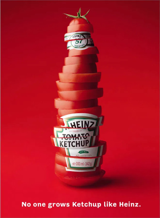
The signifier of this advertisement would be the tomato slices in the middle while the signified is a ketchup bottle and the freshness of the Heinz ketchup. As the ketchup bottle is made out of tomato slices (the signified), it signifies that the ketchup (otherwise known as tomato sauce) made by the company is fresh, authentic and without any other ingredient. The tagline also states that "no one grows ketchup like Heinz" which means that Heinz’s competitors' ketchup sauce cannot compare to theirs in terms of ingredients and the freshness of it. The tomato slices made into the shape of the bottle also can signify that the sauce is 100% made up on tomatoes without any other artificial preservatives or flavouring added, which signifies that it is healthy and taste good.
0 notes
Text
Week 2 Lecture Exercise B
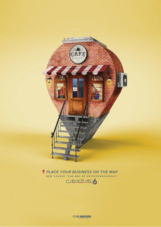
This is a design that is probably made for a company that teaches other businesses how to advertise or brand themselves, hence the tagline "place your business on the map." The first and main thing that the reader will see when seeing this design is the little cafe in the middle of the piece. The designer related it back to the tagline and purpose of the advertisement by designing teh cafe in the shape of a pin icon which also symbolises location - this relates back the the map reference. By placing the stairs in front of the cafe, it gives the meaning that entering the cafe will you give access to the knowledge on how to place your business on the map. Entering the cafe in the case would mean signing up for the course they are advertising here.
I would say that the shortcomings for this piece would be the size of the text. The text below the tagline is quite small and at first glance, I initially thought that this advertisement was an advertising company helping other business to brand themselves instead of teaching them how to.
0 notes
Text
Assignment 3 Commentary
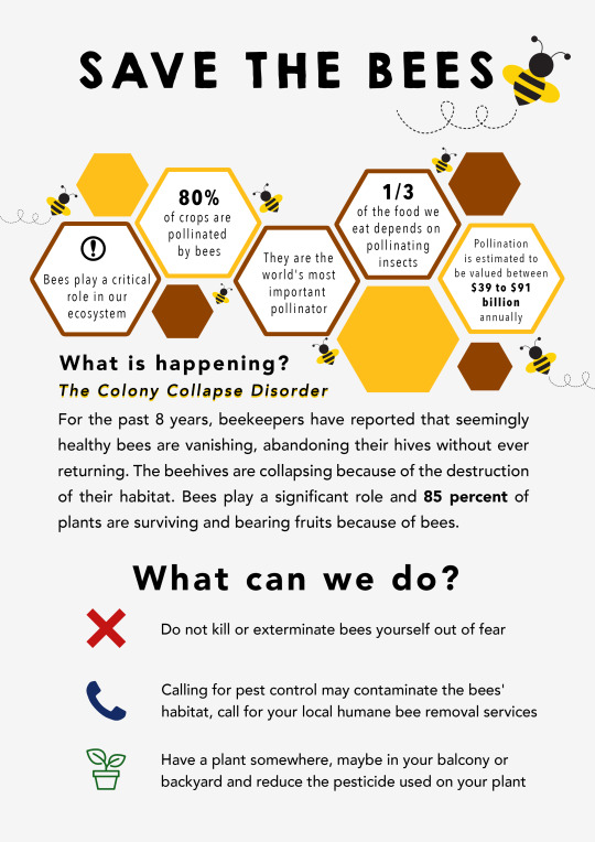
I chose to work on saving the bees for assignment 3 and this is the final export. This is a number and how-to infographic on what is happening to bees, their importance and what we can do in order to help save them.
The assignment was done on Adobe Photoshop and I made very good use of the ruler guides for this assignment in order to ensure that everything was aligned and not jarring to the eyes. The icons were traced with the pen tool and line / shape tools, and subsequently the colour overlay option to adjust and pick the colour that is most suitable. I wasn’t sure what colour to choose for the cross, phone and plant icons initially but eventually settled on red, green and blue as they are the primary colours. Red fitted the cross as it is the universal colour for stop, while plants are usually green, and so the phone icon was left with blue.
For the middle part with the hexagon shapes, it was supposed to mimic a honeycomb which is the bees’ habitat. The yellow and brown colour were colour picked from an actual honey comb so that it would be more accurate. I also tried to ensure that was a balance between the honeycomb and text below so the honeycomb is more bottom right heavy while the text below is more upper left heavy.
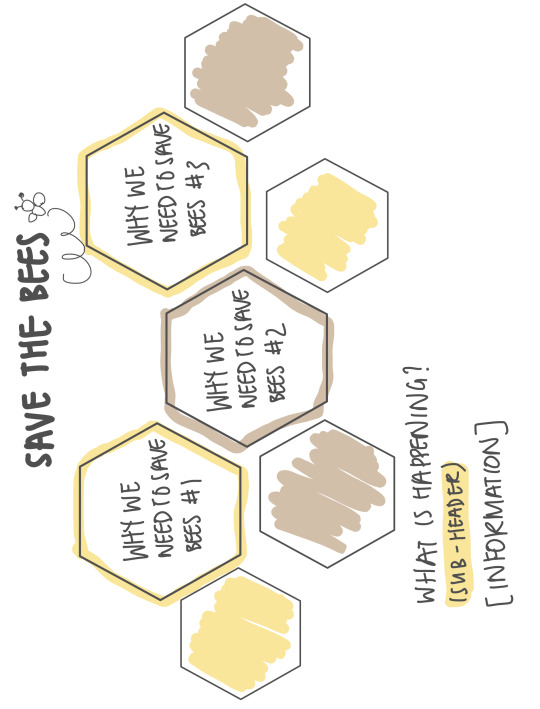
This is the initial sketch that I did when I was brainstorming for ideas. I wanted to have contextual emphasis and so I thought of using hexagons shapes to show a honeycomb, and using it to highlight facts about why we need to save the bees.
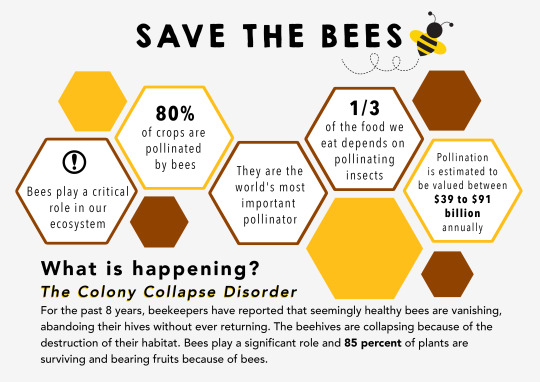
The biggest changes made from the first submission for critique is that I have changed to a portrait layout in order to fit more information. The feedback that I got was that while my initial infographic does inform the audience why we need to save the bees, it doesn’t let the audience know what they can do in order to help. More bees are added in the final version to show them interacting with the honeycombs. This will emphasise on how it is the bees’s habitat.
One of the feedback I received was on how I can maybe turn some of the information in the bottom text to visual form. I tried to play around and added a donut chart of how 85 percent of plants are surviving and bearing fruits due to bees, but ultimately removed it as I felt that it was neater to have that part in text. I felt that it was okay leaving it in text since it was a part that was more “serious”.
Another feedback I received was that the initial critique piece also lacked visual urgency so I added the last part on what people can do in order to help preserve the bees.
0 notes
Text
Assignment 2 Commentary
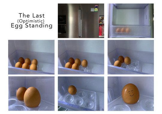
The story is based on an egg in my fridge. It starts off with an establishing shot of the fridge in the first and second picture. The subsequent pictures shows how the egg's friends disappear one by one until it is the only one left. The story is titled the last optimistic egg standing because the egg is oblivious to its fate and is happy that it is still alive.
The first picture is an establishing shot of the fridge where the egg lives. The second picture is an establishing shot as well with a glimpse of the eggs. The third shot is a top down view from the side to show all the eggs. Subsequent shots show the egg’s friends disappearing. The sixth shot is an over the shoulder shot to show that the egg is communicating with its last remaining friend. The seventh shot is an over the top shot again to show and emphasise on the egg being the last one left. The last picture is a close up shot to highlight the egg’s happy expression.
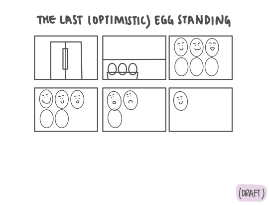
The first draft of my storyboard originally had very similar shots especially in picture 3, 4, 5 and 6. They were all shot from above the top to show the eggs’ expressions but it lacked variety and felt very mundane.
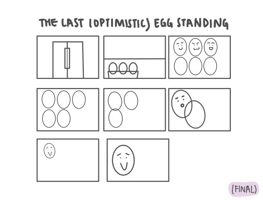
The improvements made from the critique can be seen in the final draft showcased different shots in order to bring out certain points that I would like to highlight, such as emphasising the expressions. This can be seen in the sixth picture where I wanted to show the egg communicating with its friend.
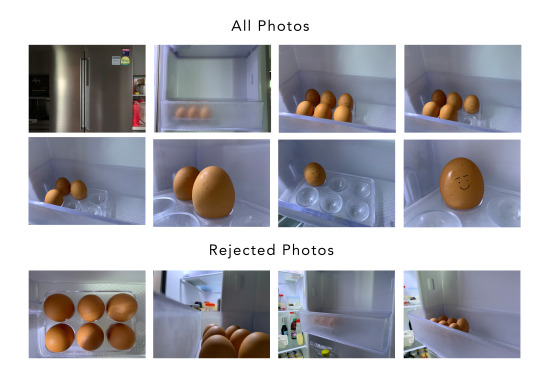
The rejected photos were not chosen due to various reasons such as lighting and being unable to fully showcase the objects in the pictures. The first rejected photo where I wanted to establish all of the six eggs was not chosen because of the shadow the camera would cast. This is inevitable as the fridge light is above. Other shots were rejected as well as they had messy background that could distract the audience from the main point or it was not able to fully show the eggs.

I made use of Photoshop for this assignment to arrange the photos and used the text tool to add in the title for the final prototype. In the first draft, I made use of the pen tool as well as the shapes and line tool for the egg’s expression as well.
0 notes
Text
Assignment 1 Commentary
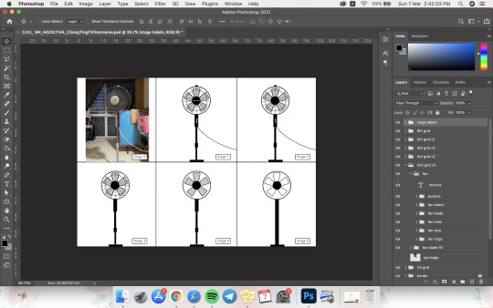
The object that I chose for the first assignment is standing fan in my living room. I chose this object as the fan is something I see and use everyday, especially after remote learning started. I did the assignment on Adobe Photoshop as seen in the above screenshot. I mainly made use of the shapes and line tools to achieve the final result.
In my first draft, I took the surrounding of the fan into consideration so the window, curtain and mahjong table beside and behind the fan was included. However, during the critique, I took into consideration the feedback from others that since my chosen object is the fan, I should just focus on abstracting that one object. Hence, in my final submission, I started with and only the fan.
The biggest change made from the draft to the final submission is removing the surrounding objects. I did not make any changes to the last stage except to ensure that the fan component were centered to one another. The major changes were made in the first two stages.
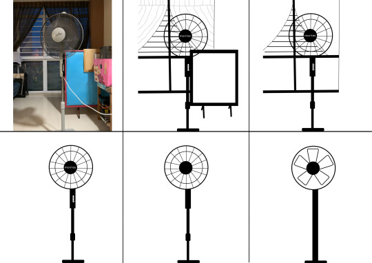
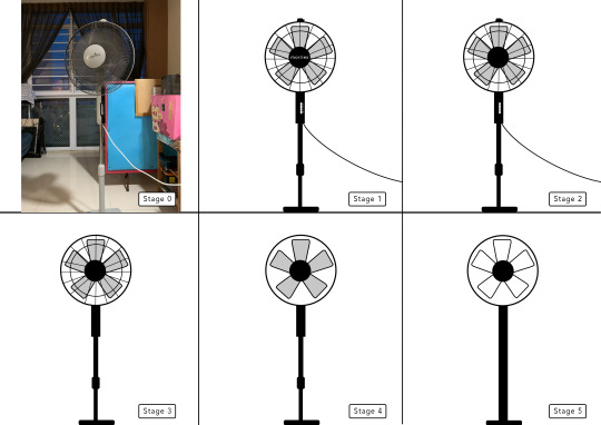
Abstracting to me means simplifying the object into its most basic form, but still ensuring that it is understandable at first glance.
I started off in stage 1 with as much details of the fan as I could include - the fan speed and off buttons, the fan clip that holds the front and rear guard together as well as the wire cord.
In stage 2, I removed all the text - brand logo and the fan speed - first as I felt that was the most unnecessary in representing the fan.
In stage 3, I removed more details such as the wire cord, the clip and the buttons. These to me are the little “extra accessories” that are not necessary in telling the audience that it is a fan.
In stage 4, I removed the front guard of the fan in order to see the fan blades clearer. I believe that seeing the fan blades only is telling enough of what this image is supposed to represent,
In stage 5, in order to simplify it as much I could, I removed the blade colour and only stuck to black lines for the final result. The fan stand was also modified to just a straight line without the original ridges.
0 notes
Text
Week 1 Lecture Exercise A
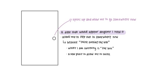
There are many times I feel stuck creativity-wise and I think that it is because I am in the same environment all the time with nothing to inspire me. The old saying of “think outside the box” is the reason behind this idea of a door that will allow me to explore somewhere new anytime I want. “The box” is the current environment I am in and being able to escape this place for an opportunity to enhance my creativity is my way of thinking outside the box.
0 notes