
Don't wanna be here? Send us removal request.
Statistics
We looked inside some of the posts by nm4259-personalblog and here's what we found interesting.
Average Info
Notes Per Post
0
Likes Per Post
0
Reblog Per Post
0
Reply Per Post
0
Time Between Posts
12 days
Number of Posts By Type
Text
6
Last Seen Tumblr Blogs


Fun Fact
The Tumblr app for Google Glass was released on May 16, 2013.
Text
Event Blog Post #2
The second event I chose was also hosted on ADPList. The speaker was James Babarinde, a system designer who worked at Microsoft and the talk was on mobile design principles, with the aim of helping designers make the transition from web over to mobile, and content covering the key areas necessary for accessibility and designing for devices.
James started off sharing about mobile thinking, in particular, navigation. He described the tab as the top of a flow tree and the beginning of the navigation tree. On desktop sites, it is usually the hamburger menu, while on mobile devices, it enables state retention, and the benefit is that the user is able to compare workloads between different sessions because mobile, unlike desktop, doesn’t afford users to quickly navigate using a mouse. James also shared about modals. Modals, which I understand as what I usually refer to as “pop-up messages”, appear as pop-ups on desktop, but in mobile, he said that while it is fairly the same, sometimes they appear as a sheet that slides up and maybe even a full screen. The main idea, he said, is that a modal is a temporary screen for a quick action such as checkout and the reason why it’s used on mobile is to keep the user on the context of their page and allow them to quickly complete an action. James said that while designing for mobile, we can keep in mind the goal and work back up. He said that drilling down is referred to as a push on mobile, and push experience is usually just for users to traverse across the app, typically with a back button, whereas a modal animates from bottom to top, and there are also cases where users have the affordance where they can drag it down so that it’s not full screen.
Next, James talked about mobile key factors, namely location and large text. I learnt that location is very important as it is likely to have customers in different locations and designers have to make sure that their apps will be localised in those different environments. Furthermore, localisation is not restricted to just visuals. One point he made was that placement matters as there may be button growth in different languages. He shared that when large text is applied, sometimes the UI breaks, so designers have to work beforehand with the content team to make sure that CTA is appropriate, perhaps even with warnings. As for pills, he said that content may have the space to expand, but discoverability may be at risk instead. If the feature is important, he warned that using a scrollable pill format may be inappropriate. He told us to always think about it properly, and consider whether to expand the tab so that we can avoid nesting using pills.
James also talked about accessibility in mobile design. He shared that the touch target is 48 on android, and 44 on iOS and mobile web. He advised us to take note of readability and to avoid abbreviations as much as possible, as well as to make things predictable with consistent navigation and input or button behaviour, which also relates to what we learnt in this module. He also talked briefly about making apps operable such as including keyboard assistance, screen reader and considering the orientation. Lastly, he shared some resources that designers can make use of, such as WCAG, Apple HIG and Google Material. Next, he talked about designing for multiple screens with adaptive layouts, with a focus on device orientation and multitasking. He shared that achieving pixel independence refers to keeping the UI in the right ratio for usability across devices with different resolutions. Display size refers to the physical dimensions, the total number of pixels in a display, while pixel density is the number of pixels per inch (PPI). He shared that as designers it is very important to collaborate with engineers to end up with the desired experience, and not accounting for PPI can result in very different outcomes. He said that there are more PPI in a higher resolution device but on tablet, even though the screen is larger the PPI may be the same. I also got a useful tip that on Figma, 1 pixel equates to 1 DP (density independent pixel) so whatever we design will scale across devices.
Lastly, James talked about the benefits of going native for apps. For one, designers can get a lot of OS controls for free if they go native. OS gives them a framework for tab navigation, and they can also get accessibility actions for free, such as focus order, and what gets read out by the screen reader. They can also get upgrades and support for free. Any improvement in accessibility, he shared, is an improvement for the app, which is passed on to the user. I learnt that both iOS and Android are making their apps accessible in a desktop environment. He said that when it comes to cross-platform, custom experiences are a heavy upfront cost and require higher maintenance resources and this may mean having two full teams for Android and iOS. Despite the benefits as aforementioned, the sacrifice however, is personality in the app in terms of customisation, and one of the drawbacks is losing accessibility when designing custom experiences. Ultimately, James said that this can be a business decision. He advised that we should always know the limitations because we have to account for accessibility in a custom experience. Finally, he told us to consider familiarity within industries, such as in the cases of WhatsApp, Instagram and Discord. He said that some consumer experiences have normalised certain UI behaviour, but for accessibility these applications may not be the go-to.
Overall, the talk gave me many interesting insights into mobile design principles, which serve as an extension of the content covered in this module. It got me thinking about the apps I use, and useful tips I can utilise in my own app design.
[Word count: 1000]
0 notes
Text
Event Blog Post #1
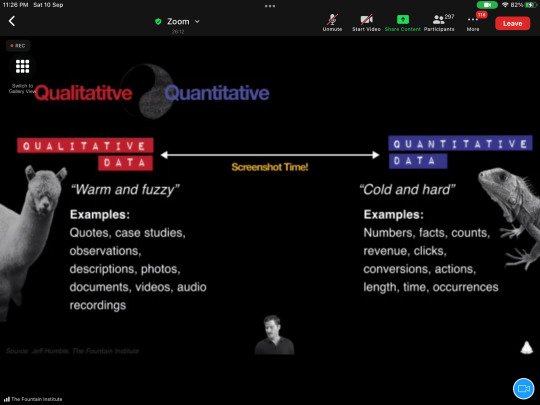
The first design event I attended was a livestream hosted on ADPList’s website. The speaker was Jeff Humble from The Fountain Institute and the talk was titled “How to Lead with UX Metrics”. During the talk, Jeff shared what UX metrics were, the different types of UX metrics, and how to utilise them in our design process.
Jeff said that a lot of research done during the design process tends to be for the purpose of finding out “why”, in other words, about qualitative data. For example, understanding motivations of users through the creation of personas, which we learnt about and tried in this module. However, he said that the problem then is that many designers find that they are not able to quantify their findings, and that’s where UX metrics fill in the gaps, allowing designers to gather quantitive data used to measure, compare and improve the user experience over time. Examples given include task success rate (TSR) which is calculated by dividing the number of correctly completed tasks by the total number of attempts, task completion time (TCT) which is the total number of seconds used for a task divided by the number of testers, and satisfaction measured by dividing the number of satisfied answers by the number of responses. All these are helpful to know, especially if we need to do usability testing.
Many of the points shared during the talk relates to usability testing. Jeff shared that UX metrics measure both people’s behaviour and attitudes, and behavioural data tend to be more reliable though attitudinal data can give interesting insights. A thing to take note of is that there is often a gap between what people say and what they do. Another tip given was that we should think about what our goal is rather than the kind of data we want to get when utilising UX metrics. I kept this in mind during my own user testing as well, whereby I first noted down my goals which guides what kind of questions I want to ask and what tasks I want to give users, so that when doing the testing I do not stray too far as time is limited. Jeff shared that goals are split into three main categories: performance, preference and perception. The first category, performance, makes uses of several measurements in usability tests, such as TSR, TCT and error rate, which is the total number of errors divided by total number of attempts. An important takeaway is that it can be hard to define what constitutes a successfully competed task, so it is crucial to standardise definitions when in a design team. Things that can be measured include efficiency, learnability, clicks and page views, findability rate, and disaster, which requires an attitudinal survey to measure. I learnt that disaster means the case when a user thinks that they have successfully completed the task but they actually did not, which is what designers perceive as the ultimate disaster. Lastly, he shared that usually 55% to 86% of problems can be identified with just 5 users per persona in usability tests.
Pertaining to preference, an advice Jeff gave was to avoid asking directly what users “like” for UX design. He also said that it is powerful to understand what users prefer from testing, as designers’ preferences are not the users’ preferences and through testing, we can truly realise that. I agree with this, as sometimes when gathering user feedback, I realised that a certain design I may prefer may not resonate with target users, so ultimately we have to understand what they prefer instead. As we have done in this module, Jeff said that we should start from lo-fi, with wireframes and prototypes, and do a concept test, before moving on to tests such as A/B testing which is high-fi, because the riskiness of our assumptions decrease while fidelity increases as we progress further in our design process. Like we have done in this module as well, Jeff advised that we make sure our sample is as representative of our users as possible.
Lastly, for perception, Jeff warned that users often tend to be self-reporting for user surveys. This got me thinking that observations during testing are just as important as users’ responses, because like what Jeff said, often what users say and what they actually do may differ. For surveys, he also said that it is important to be careful of the wording, as it’s often difficult to tell when a survey is bad. Jeff shared several popular metrics used, such as system usability state (SUS), net promoter score (NPS) and customer satisfaction score (C-SAT). However, he also shared that nowadays there is eye tracking, gaze recorder, emotion detection, and biosensors such as iMotion, which are helpful measuring tools because users may not be aware of their own behaviour sometimes. An interesting and entirely free way to discern how users are feeling that Jeff shared is to tell users to tap the table as they do a task, and if they slow down their tapping, it may mean that they are facing an overload.
Jeff also shared about the goals-signals-metrics process, whereby we start with a user-centric goal, then detect signals during testing such as the speed of task completion, and lastly move on to metrics, which usually involves percentages. Finally, Jeff talked about how to start using UX metrics. He told us to start scoring our qualitative methods, as qualitative data can also become quantitative data if we start quantifying it, and to do user tests regularly as the key to UX metrics is to collect data over time. He emphasised the importance of troubleshooting, and he said that ultimately quantitative data helps designers make decisions. Lastly, he said that UX metrics are good for presentations as it helps get people such as stakeholders and managers on board with the design project. Overall, this talk allowed me to learn more about UX metrics and useful tips in usability tests.
[Word count: 998]
0 notes
Text
Individual Reflection #4 (Week 6)
For the final week, my group focused on re-designing the McDonald’s application, specifically the mobile order portion. Each of us individually came up with ideas for the navigation flow and features/functions before meeting to discuss.
Contributing to the discussion, I suggested we place the timing selection for pickup at the front, along with the outlet selection. Considering that some outlets may not be available for pickup at certain times, it would be frustrating for the user to go through the entire process of browsing and ordering before realising that they are unable to place the order because pickup is unavailable at their desired timing and outlet. Furthermore, I suggested letting users view their order history, on top of having a favourite button (similar to bookmarks), as at the time of ordering they may not know if they will place the same order in future so it would be better if they can view the list of past orders and reorder at their convenience. I also suggested some references for the menu customisation screen, namely Oddle and Inline, which have accordion menus so that users do not need to scroll much, making it more compact and optimised for mobile.
Other than that, my group member wondered why the design and categories of the menu in the app differ from the kiosk. I suggested that this is because unlike the kiosk which has a larger screen where users can view everything at a glance, on the smaller screen of the smartphone, too many categories would mean users have to scroll a lot. Squeezing too many elements on screen would make the touch target of each very small and thus difficult for users to select, and the cluttered view may overwhelm users. My group member also suggested having a search bar where users can search a menu item which pulls up a list of restaurants that carry the item. However, I argued that this is unnecessary for the case of the McDonald’s app since the menu is more or less streamlined across outlets. This function would be more useful for food delivery apps with different restaurants (e.g. Grabfood, StarTaster) or for restaurant chains with vastly different menus for different outlets. Ultimately, we settled for an item search bar in the menu view instead. Additionally, we also redesigned various features to increase ordering efficiency. I realised that the need for this partly arises from the fact that users sometimes order on-the-go in a dynamic environment such as on public transport where their surroundings are always changing, so they may have other tasks that they have to focus their attention on and cannot spend too much time and effort on using the app.
Leading up to the final submission, I edited the persona and rewrote the scenario to better express the main pain points, looked into why the McDonald’s app does not offer scheduled pickup, as well as crafted slides and presented on the section covering our re-designed features.
[Word count: 500]

Screenshot of Miro board used for discussing re-design during group meeting
0 notes
Text
Individual Reflection #3 (Week 5)
This week my group consolidated our findings from user research on the McDonald’s app, and in the process I once again gained several insights.
Firstly, while discussing the main pain points of the app, we discovered that several users face issues when using the McDelivery tab due to the fact that it redirects users to the webpage and does not have an independent app interface. Since McDonald’s already has a separate McDelivery app, these issues discourage users from using the in-app McDelivery service and just adds on to the overall problems users face with the app. This shows that more thought has to be given when shifting from web to app. Secondly, the importance of visual hierarchy surfaced when discussing about the home page of the app, which many users found messy. Users of the app typically value efficiency — they prefer not to spend a long time on the app as their main incentive is to quickly get food from McDonald’s, a fast food chain. Hence, the lack of clear visual hierarchy (cards appear very similar at a glance, not seeming to have evident logic in how cards are arranged) puts them off as they have to spend more time deciphering the cards, ultimately resulting in some not using the home page altogether. Thirdly, some features lack consideration in terms of mobility, such as the mobile order tab. When users are on-the-go, outlets around them shown on the restaurant locator change constantly, which makes choosing an outlet for mobile order more troublesome. Lastly, I once again realised how essential it is to consider the perspectives of users, as McDonald’s may have made login mandatory in order to issue points for the loyalty programme to users, but many users actually found login troublesome. In this case, personalisation of the app, such as by saving their order history and allowing them to reorder easily, may better incentivise users to login.
My group also discussed which pain point we want to focus on for this project. During the discussion, my group mates were keen on designing the app for drive-through by allowing users to place an advance order and collect at the drive-through counter. However, I argued that on top of road-safety considerations, this will likely not be enough to incentivise users into using the new feature since unlike the experience of picking up food in-store, the cars cannot cut the queue and reduction in time spent on the whole drive-through process comes only in the shorter frame of placing a order at the counter, not the longer frame of waiting in line. Furthermore, there is no guarantee that everyone will use the feature so you still have to wait for those before you to place their orders and for the kitchen to prepare the food. Through this, I realised even the “mobile” experience is quite different in differing contexts, and we have to consider these differences and what they signify in the design process.
[Word count: 500]

Screenshot of the Miro board we used when sharing our findings from user research
0 notes
Text
Individual Reflection #2 (Week 4)
This week, my group focused on user research. Last week, while we identified issues based on hearsay and our personal experiences, we need to ascertain whether other users face similar problems to determine pain points. Firstly, we discussed about methodology. My groupmate first suggested contextual inquiry, but I argued that think aloud protocol may be a better method, as it is difficult for us to intrude into the target setting where they use the app, which may be their homes or on public transport. Therefore we decided on conducting think-aloud followed by an interview.
Contributing to my group’s progress, I conducted 3 one-to-one sessions with current users of the McDonald’s app. The main challenge I faced was that voicing all thoughts may come off as counterintuitive, especially for experienced users as they seem to go through tasks “without much thought” based on habit. However, I made the most out of each session by doing a mix of concurrent and retrospective think-aloud, as I wanted to understand not just the “what” but also the “why”. I also decided to do semi-structured interviews, and I tweaked the questions based on my observations and what they told me during the think-aloud.
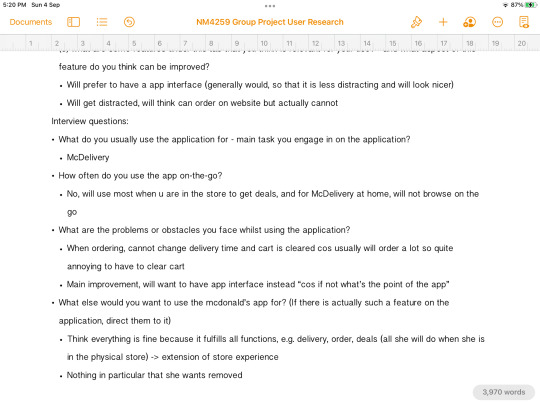
I gathered many interesting insights during user research. Firstly, I once again realised how differently each user interacts with and feels about the same app. There are features that some found interesting, while others found irrelevant, such as the nutritional calculator. Even the setting they use the app in varies; one user said she uses it mostly at home, one said she uses it on the go as she heads to McDonald’s, while one said she mainly uses it in-store to check on deals before ordering her food. Additionally, the user’s skill level also changes the way they use the app.
Secondly, user research gave me a better look into product ecology. Surprisingly, the McDonald’s app evokes social behaviour in some instances, as 2 of the users said their family orders McDonald’s weekly via the app. Using the app then becomes a social affair, as they discuss what to eat, look at deals and collate each family member’s order. This ties in to the emotional or symbolic aspect, where the app is associated with family time. An interesting thing one user told me was that she wants the app to be more personalised, for example, allowing for customised filters, and asking for her birthday so that she can have her birthday “celebrated” by the app. She said that she thinks that this affects how customers feel about the brand, and that a personalised, or perhaps more “human” touch, may promote customer loyalty and make them feel like they are valued. Another user brought up a point about aesthetics. Quoting her words, “what’s the point of making an app if you’re just going to use the web interface?”. This got me thinking about the fact that users also have certain expectations of apps beyond basic functionalities.
[Word count: 500]

Screenshots of part of my notes during think-aloud and interviews
0 notes
Text
Individual Reflection #1 (Week 3)
This week my group met up twice to finalise which mobile or web asset we wanted to choose for our project. To start off, all of us gave suggestions for possible assets we could choose, focused mainly on mobile applications. Our suggestions were primarily based off our own experiences with the app as well as feedback or complaints we have heard from our friends and family who use the app, all of which are coming from a user’s perspective. The rationale for choosing apps we have experience with or at least have some knowledge about rather than “niche” apps that few people use is that we can skip the process of familiarising ourselves with the app (since the experience for new users can be vastly different and in my opinion, it may be better if we are all more or less on the same page), and that it would be easier to gather the opinions of users if it is a more widely-used app.
I personally gave numerous app suggestions, including Twitter, Zoom, Adobe Acrobat, Google Drive, and Taobao. For Google Drive, the main issue I found was with transferring files in bulk on mobile, and exporting files one-by-one manually is far too time-consuming and frustrating. Meanwhile for Taobao, there were several instances I encountered problems with searching for shops as I had to type the exact name (which was case-sensitive) in order to find the shop. To this, my groupmate suggested that we instead focus on pain points we are able to tackle and redesign in this project rather than on aspects difficult for us to improve on such as the search engine. Other suggestions given included TikTok, Telegram, PayLah, Discord, and ActiveSG. All in all, through our discussions, I realised that a lot of apps we had issues with have room for improvement in terms of giving users what they want and need. Some apps show a lack of empathy (part of the design thinking process), and are mismatched with users’ skill level, behaviour and desires.
As we are only in the starting phase of our project, we did not encounter many challenges. The main difficulty we had was deciding which specific asset to choose. To tackle this, I suggested we each vote for our top 3 choices to narrow down our selection, and we ultimately decided on McDonald Singapore’s mobile app. We explored the app and discussed some issues, such as with the interface and in-app delivery ordering process. An interesting insight I gained this week from our discussions is that different users use the app differently, in line with what we have learnt about product ecology, and certain features one user may find redundant and consider as a “pain point” may be desireable or even necessary for another user. Overall, I also contributed by facilitating the flow of the meeting, taking meeting minutes, and writing the first draft of group milestone #1 according to what we discussed during the meetings.
[Word count: 500]


Screenshots of parts of our meeting minutes for Week 3
0 notes