
Don't wanna be here? Send us removal request.
Statistics
We looked inside some of the posts by nope36 and here's what we found interesting.
Average Info
Notes Per Post
4
Likes Per Post
4
Reblog Per Post
0
Reply Per Post
0
Time Between Posts
23 days
Number of Posts By Type
Text
4
Last Seen Tumblr Blogs


Fun Fact
Tumblr was created by web developers David Karp and Marco Arment.
Text
final reflection
I went in to this class with a big head expecting it to be an easy A for me simply because it was an intro class, but I was wrong. Even though I hadn't taken an art class since my sophomore year of high school (unless you include architectural design) I was still practicing my design skills and had advanced experience in Illustrator and Photoshop, especially since I wanted (and still kind of do) to work in advertising, and I feel like my work kind of reflects that.
I learned so much about myself in this class especially about my design process. I tend to overthink everything and constantly see the need for change in everything I make, and this class has let me kind of begin to grow out of that habit, but I still have so much more growing to do.
This class was also the right type of stress and break that I needed. The stress this class gave me was productive and creative where as the stress my accounting and finance class gave me just felt disruptive.
Overall I really enjoyed this course and very much appreciate all the feedback and help from Professor Kahlili and hope to have her as a professor again.
0 notes
Text

Like I mentioned in a previous post this project has also caused me so much frustration and stress but it’s funny to think about it now since I’m finally coming to a point where I’m starting to like my work but not really. I don’t know why I’m like this but it’s what has always worked. Usually, the last idea I come up with and produce is always the one I end up liking the most and have received good grades from. I did this a lot in high school too when I had to design a house or an apartment complex or like that time I designed a spa (that went through like 5 drafts). I always struggled until the last minute. Like it doesn’t matter when I start the assignment I always get angry and then I create something I like the day before its due.

And it’s that feeling I get when designing and my business acumen that makes me want to not really be a “practicing designer” and rather own an art studio or be an art director and manage people kind of like Véronique Marrier, except I don’t think design frustrates her.
CMA
I enjoyed the objects of design gallery because I love furniture design and if I’m being honest it’s probably the only design that doesn’t frustrate me.
Anyways, I enjoyed the “Componibili” Modular Storage Unit. One of the things I like and find interesting about furniture design is that with enough effort and creativity you can make basically almost any form into a functioning piece of furniture. And people will eat it up.
And the thing about the “Componibili” Modular Storage Unit is that, in my opinion, it looks cheap, but do I want it in my house ? YES, because I know it would look cool when its put in the right setting. And I guess furniture design does frustrate me because I often go through these thoughts of thinking something is dull and boring until I dwell on it. And I think that is what is happening with my design process. Like with the snippets my ethnic design looked awful before I decided to add the fabric texture to it. When I put it in the right place it all came together.
And when talking about its form the fact that it doesn’t have the basic drawer handles and slides also intrigues me because I almost instantly knew how it operated and understood the concept even though it wasn’t basic and that’s how I want people to think about my character logos. I don’t want them to look basic and plain, but I also don’t want them to be confusing.
1 note
·
View note
Text

I always start a project with some feeling of excitement and tend to go in headfirst, whether it be an essay, furniture, or something else artistic, but that all goes away once I get past the planning phase. That’s where I usually begin to struggle and panic. Even though the planning of pieces do come naturally like Marian Bantjes that doesn’t mean my execution does.
With this project I was immediately drawn to the quote “culture and education are the lethal weapons against all kinds of fundamentalism” (Marjane Satrapi), because I felt like I could do a good job at producing a piece that could indirectly represent the quote and showcased culture. Even though I had fun coming up with ideas, after sketching I felt like I didn’t really understand the quote and got too ahead of myself. But I’m stubborn and decided to just go with it.
After talking with my professor and coming up with a different idea for my poster I decided to go with it and make it, but I felt like it wasn’t really me, so I decided to finish the piece (bc I liked it), but also chose a different quote. Which again was a struggle because I had already filled my head with so many ideas for the first quote that I couldn’t really think of anything else.
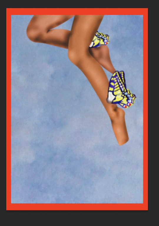
So I did what I usually do when I’m in a creative rut and scrolled through my Pinterest because I that’s where I keep everything that inspires me, mostly ads because I want to go into advertising and art direction and I like to study those, I also have a lot of pictures of fruit (mostly orange trees because green blue and orange are favorite colors). That’s why I decided to go with “Go out on a limb – that’s where the fruit is” (Will Rogers). But I hesitated because I didn’t want to make it literal so I struggled, because its an easy quote to represent literally, but it was that struggle that helped me come up with ideas that are little more fun but still simple (legs with wings in an orange tree, and an orange with a butterfly on it).
I always like to make sure what I’m making would be something I would like to see in my room and I think that part of the reason I had so much trouble with my first quote was because I ignored that rule and focused too much on the literal message.
1 note
·
View note
Text


I was having a movie night with my RM friends and I exclaimed how a lowrider is my dream car, after having seen one in the movie, to which my friend replied “That’s so ethnic of you” because lowrider culture is significant to west coast Chicano culture and Im from California. Which was hilarious because if he had not also been Latino I probably would have blown up on him, but it was something about how he said it in a way that wasn’t familiar to me because usually when some comments on my ethnicity they do so to demean me. So I decided to create a piece around it.
I knew I wanted to include a lowrider on it and I knew I wanted nopales.
I searched for like three hours for an image of a lowrider but couldn’t find any, so I had to settle for a regular red chevy impala (which I changed to green) which is my favorite model for a lowrider. At first I wanted to create a colorful kind of psychedelic piece that resembled a kaleidoscope, but I hated how the text looked on it, so I went online shopping to clear my head and saw a t-shirt with a race cars on it and I was “boom that’s what I want my snippet to look resemble”.
But like Michael Bierut my attention span and my tendency to go with the first thing that comes to my mind really hindered me when completing this assignment. I finished like three different versions of my snippet which sucked because I already wasted so much time on figuring out what text I wanted to use, and I had like no time or patience when making my second snippet, but I got it done.
I came up with the text of my second snippet (well more like my sister did) literally the day before the assignment was due. I was gonna go with an inside joke with a friend but that was kind of boring, and I don’t like my work to be boring or like basic. Like Alexander Isley said humor can help engage people with a piece.
As I was explaining to my sister about how I was having trouble she was like ���You’ve been saying “Good Soup” literally for the past week just do that”. So, I immediately thought about soup spilled on the ground in the shape of the text because good soup spilled on the ground is tragic. I found the perfect tile texture, the perfect soup, and the perfect bowl. I finished the piece but hated it so much because it looked boring all put together. The tile just threw everything off and I hated how the tile looked too realistic compared to the bowl and spilled soup. So, I rewatched the “Good Soup” scene and decided to mimic the look of a diner table. I still hated it because it looked like a cheesy and poorly made photoshop piece, but after looking at it more I felt like it made the piece a little bit more entertaining and added to the goofiness of the piece, so I added the coffee that didn’t match the lighting quite right, and the napkins that look like they’re lowkey floating.
2 notes
·
View notes