
Don't wanna be here? Send us removal request.
Statistics
We looked inside some of the posts by norgad-imaginaryworlds and here's what we found interesting.
Average Info
Notes Per Post
1
Likes Per Post
1
Reblog Per Post
0
Reply Per Post
0
Time Between Posts
9 days
Number of Posts By Type
Text
12
Last Seen Tumblr Blogs


Fun Fact
Tumblr’s reach among the 26-to-35-year-olds in the US is 11%.
Text
Week 12
Rationale:
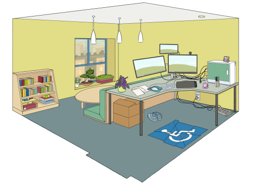
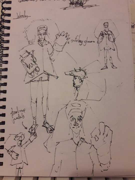
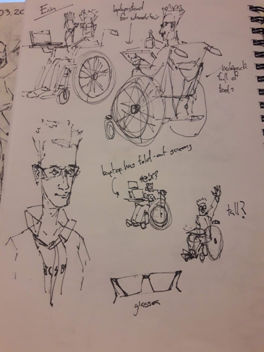
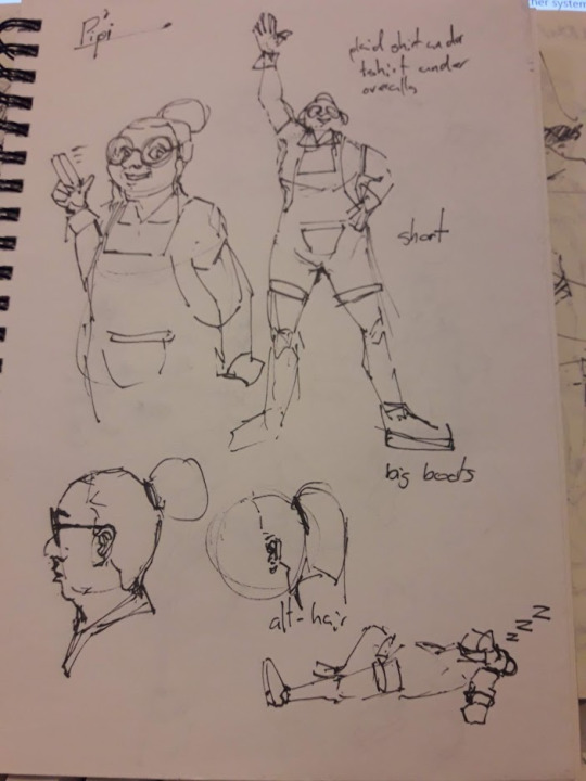
My group was ‘😳’ and we (Chai, Ira, Malachi, and Me) worked on ‘The Timberlyne Mysteries’. The show centers on four young-adult tradeswomen, who uncover and solve mysteries they stumble upon while working on jobs. We all collaborated on designing all the characters and locations, but in particular I had a lot of influence in the design of Wendy, and the design of the three locaitons. We wanted to show Wendy’s carefree, dreamer personality through her appearance, and so her design includes a lot of saturated colours, and not-too-well thought out safety gear such as long hair (a sure-fire fire-hazard), a protective jacket but only shorts on the legs, and steel-cap crocs. For the locations, we wanted to have the two character-associated locations (the workshop and study) reflect the character’s personalities. Wendy’s workshop is the physical embodiment of being carefree (perhaps even to a fault), whereas Erin’s study is very tidy and reserved, though it does show a hint of her caring side with a couple potted plants. Because of the overall ‘old mysteries’ theme of the show, we made the theming of the pitch bible in the style of old photographs, news clippings, and hand-written notes.


0 notes
Text
Week 11
I’ve finished off all three locations, and done some adjustments to the older ones.


I’ve also helped in preparing the pitch bible for next week’s presentation, in the backgrounds for the episode examples. It’s a small detail but it adds to the overall polish.

0 notes
Text
Week 10
I’ve finished two of the location’s linearts for Malachi to then color.


Me and Chai solidified the layout and structure for the pitch bible. Since the show’s about uncovering mysteries and history, we thought it would be thematically relevant to have the bible be in the format of newspaper clippings and photographs.


0 notes
Text
Week 9
We helped Ira solidify the designs of each of the characters with feedback from Hannah

We also all collaborated on the designs of the three locations for our pitch bible: Erin’s Study, Wendy’s Workshop, and The Depo and Decor Store.

We wanted the workshop to express Wendy’s chaotic and ‘head in the clouds’ personality, so the space has an angled roof and a crawlspace where she goes into to daydream. Erin’s study is a lot more organised and reserved - like erin - but there are some hints of her more caring and emotive side. For the store, we wanted a real sense of familiarity and community, so we made the store into a dairy that had been converted into a hardware store, with a real sense of history and community.
0 notes
Text
Week 8
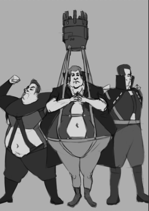
We decided as a group to bring together our character designs using the program Drawpile, which lets multiple users draw on the same canvas.


0 notes
Text
Week 7
After receiving our show for the second assignment, we decided as a group to each design the main four characters, and re-convene to see which designs we liked the best after.

0 notes
Text
Week 6


Rationale:
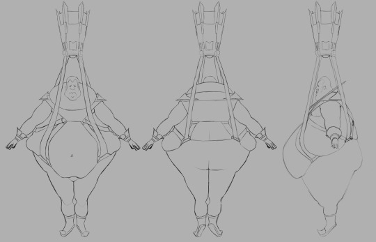
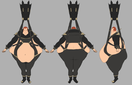
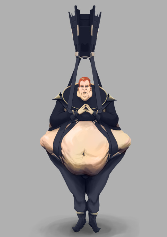
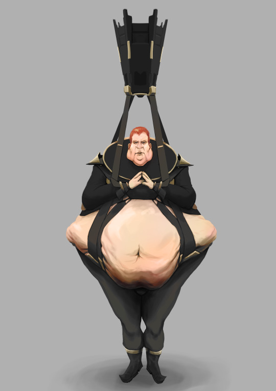
My character is Vladimir Harkonnen, Baron of House Harkonnen. I wanted to portray him as repulsive and petulant, but also deceitful and powerful. I made him rather immobile and obese, as his main method of influencing things is through manipulation rather than brute strength. The levitation device resembles a baby jumper in how it holds him, emphasising his immobility and short temper. The device also resembles a crown, signifying his leadership of House Harkonnen, and it’s blocky shape and dense structure emphasises the imposing nature of the house. Vlad’s clothing is inspired from german and french military officers, as well as the outfits of nobles of various historic periods. This is because of Vlad and House Harkonenn’s industrious and oppressive conquering of territory. His gold accents suggest wealth. The strapwork holding Vlad’s clothing together, as well as how it squeezes his body into shape signifies how he tries to change his appearance to better manipulate others; this is especially emphasised in his hands and head, which are completely isolated from the rest of his body by large ruffs and cuffs. To make Vlad look more revulsive, he’s covered in sores and lumps, and there’s a distinct oily/sweaty sheen on his belly and face. A lot of the shape language is triangular to signify both slyness and instability. The visual flow of his clothes and body all point toward his face. His black clothes emphasise the sinister intentions of his house, and also contrast with his sickly pink skin tones.

0 notes
Text
Week 5
Over the break I completed all the feedback that I got from last class, and started on my turnarounds.


0 notes
Text
Week 4
After getting some more feedback on my design, i’ve taken down some notes and am now ready to start the finer detailing on Vlad.
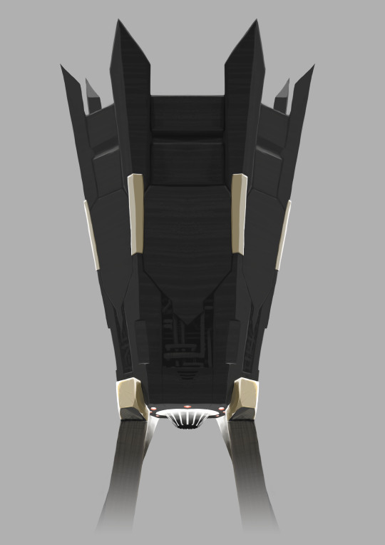
I’m want to further stress how Vlad’s clothing obscures and sculpts his body’s shape, and so I’m looking more at french and victorian nobles’ clothing, as well as bag-compression straps and neck elongation bands. I’m also working on how the suspension device will look, and so i’ve been looking at brutalist architecture, as well as Charlie’s ship design. I still need to retain the visual flow towards Vlad’s face though, and I also want to keep the resemblance to a crown.


0 notes
Text
Week 3
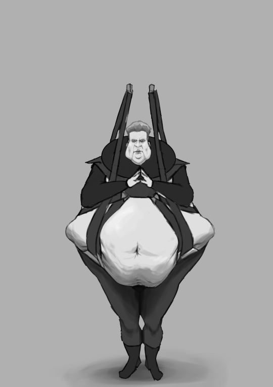
After the interim presentation, I’ve decided to take the general body-shape of design B, and combine it with the clothing of A and C. I also got some feedback to push Vlad’s appearance further, so it’s even more repulsive and less ‘cute’.


I’ve been rendering the design down to a grayscale shaded version, for more feedback at next studio.


The suspension device is still unfinished, as I’m still waiting to see what Charlie comes up with for the environment design. I’ll also figure out what specific materials his clothes will be made from.
0 notes
Text
Week 2
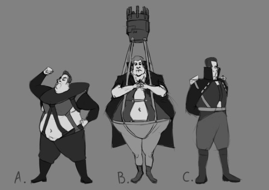

The character shouldn't look too physically intimidating, rather they should look like they have power through their influence (A bit like the characters Jabba the Hutt or Evrart Claire (Conniving, Petulant, Scheming, Deceitful)).
The clothing design is inspired from various high-class or militaristic groups (Elizabethan nobles, Nazi-German uniforms, napoleonic soldiers/generals)
His tight clothing shows how he changes his outward appearance in order to deceive others.
In design B, his suspension device is also mean to resemble a castle tower and a crown. The design of this can also tie into what Charlie’s designing for the Harkonnen cities/ships.
1 note
·
View note
Text
Week 1
In this studio we looked at the basics of concept design, were introduced to the brief for this assignment, and organised ourselves into pairs to work in.
At the moment, me and my partner have decided to look at the style of Ridley Scott, as we like the dark, gritty, and slightly off-putting/intimidating designs in his work; We think this could work well in our reimagining of Dune. We’re thinking of doing the desert-planet Arrakis for our environment, and Baron Vladimir Harkonnen as our character. I’m going to be working on the character, while my partner works on the environment.

During our initial discussion of the direction we want to take the character and environment, we thought about having a Harkonnen structure in the deserts of Arrakis. We want make the building have a strong contrast with the surrounding desert. The structure could be imposing and monolithic, towering over the buildings of the native Fremen. We also toyed with the idea of having some damage on the building from a sandworm passing through.
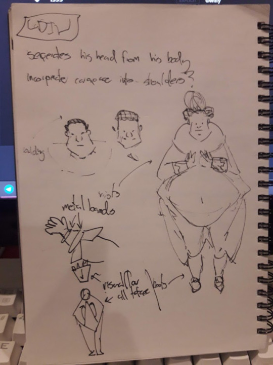
For Vladimir, we were really interested in how his weight and antigravity suspenders could influence his shape and how his character comes across. Possible ideas included having him in a baby-jumper type device, or having his fat be sculpted and formed by his clothing.

Initial Thumbnails for Vlad’s design

0 notes