Last Seen Blogs
bluerivea-blog
Too Many Elves

alfredod360-blog
Untitled

reportagesphotographiques
Charline Kirch - Reportages Photographiques
llilyrose
MOTH

afifqah95
Untitled
Photo
Placement:
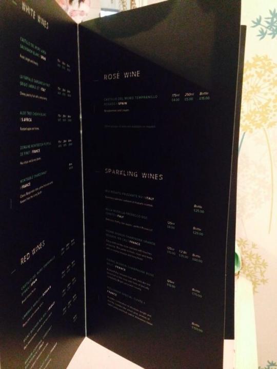
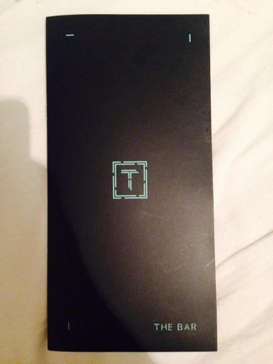
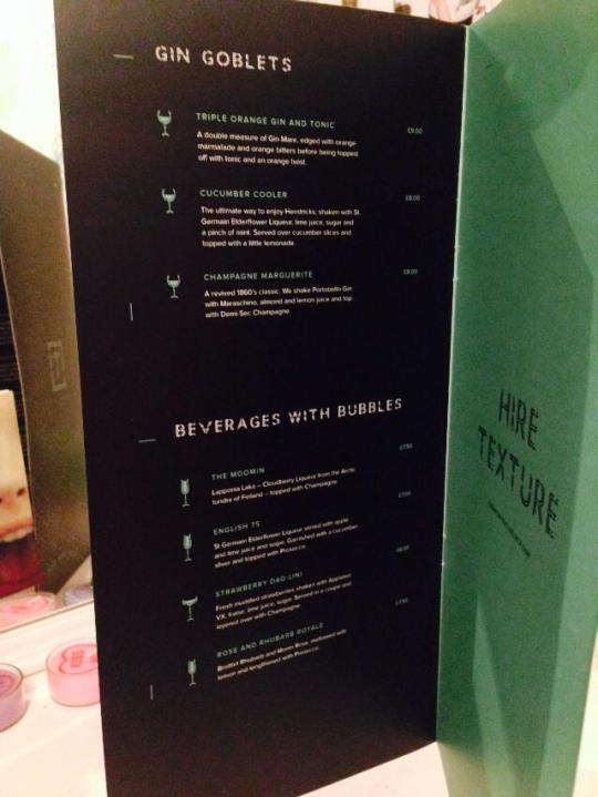
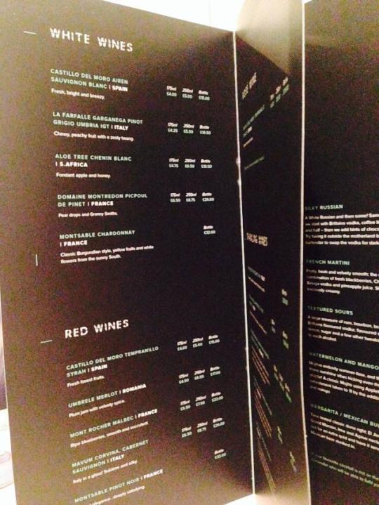
This is the menu I designed for a new bar in Northern quarter called Texture, It feels good to have my work out there!
0 notes
Photo
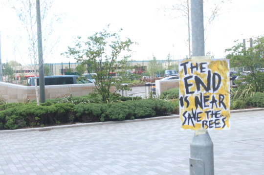
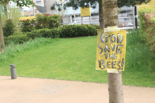
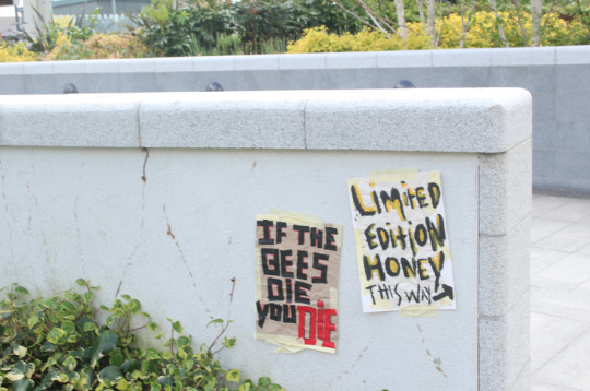
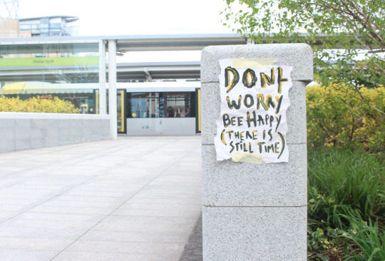
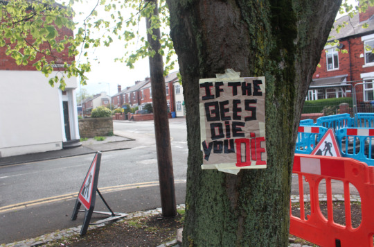
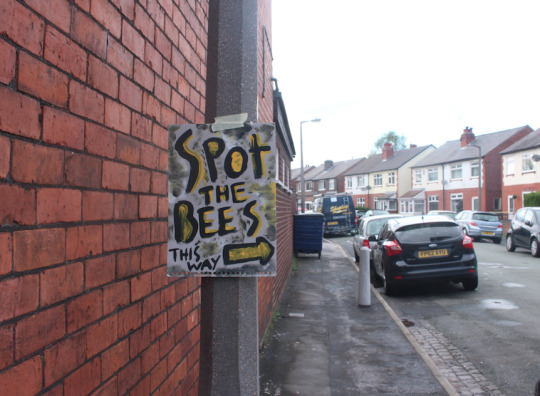
Type brut posters for my gurella campaign, I think these have worked out well as its feeling like a real campaign
0 notes
Photo
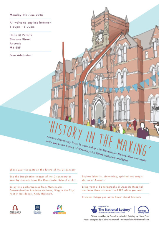
Freelance work:
I recently did some work for Ancoats dispensary trust and will be doing more work for them in the future, I designed this flyer for them for an upcoming event.
0 notes
Photo
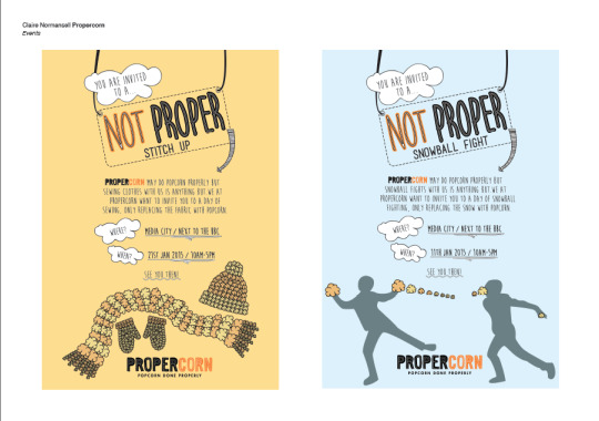
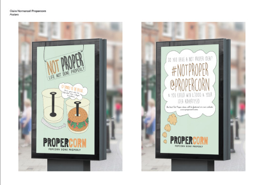


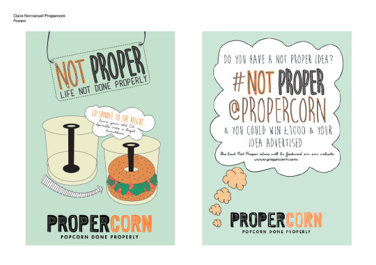
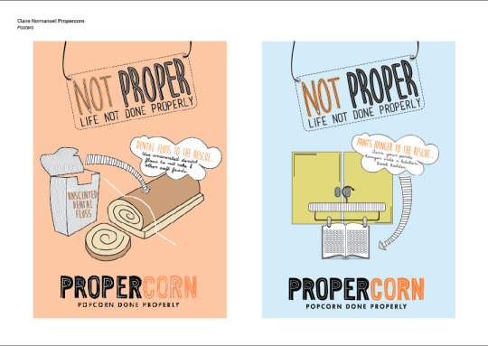
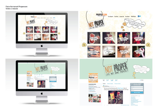
Submitted my Propercorn brief for YCN and sent these boards to them.
0 notes
Text
Procon 3 bullet point evaluation
Placements:
We Are Empire – I’ve been doing a 2month placement at we are empire and have learnt so much already. I have had the chance to design a menu for a new bar called texture in the northern quarter. I have also designed newsletter emails and web page designs for different clients. I am due to finish this at the end of the month. I was also offered a placement at another design studio at the same time but that was only a 2week one and have said if I am still looking for somewhere after this one then I am free to contact them and go in, so fingers crossed that offer still stands.
Exhibitions/ Talks:
· TATE in Liverpool
· Andy Warhol Exhibition
· Finishing school lectures and talks
·
Barcelona:
Las Rambles
, Sagrada Familia
, Zoo,
Gaudi
·
Designed a portfolio for good ship Salford
· Got the feedback from 9 different designers at good ship salford
· Competition entries:
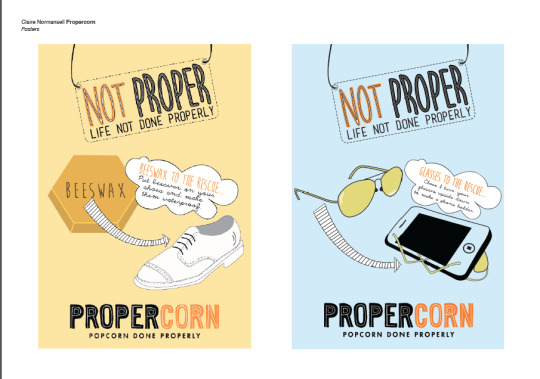
1x YCN Propercorn
· Portfolio tips
Workshops:
· Ipad training
InDesign
· CV writing lecture
· Good Ship Salford workshops & running blog
· Book making x2 with Hannah Frey
Online presence:
· Tumblr updated often: www.normoclaire93.tumblr.com
· Created my behance profile at: www.behance.com/clairenormansell
Freelance:
· Designed a poster for a band
· Designed a leaflet for Ancoats dispensary trust, more work to come from this and possible paying if it is funded
· Possible work coming up to design promotional items for a salad bar
1 note
·
View note
Text
We Are Empire Placement
At the end of March I was offered a two-month placement at We Are Empire, a digital design studio who also do print work as well. I am in my fourth week at the moment and already I have learnt so much on how important it is to align everything, how important kerning and spacing is etc. these are things I already knew but since being here it’s making me more aware of the importance of it.
Client - Purple Oval.
In my first week I was put on creating email newsletters, this is something I hadn’t done before, the jist of it was to match the current look but with still adding all the information needed. After I had designed this it was used as the Easter weekend newsletter. I was then shown how to word mailchimp to change this and update it.
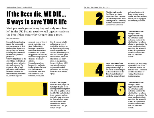
Client - Texture
Texture is a new bar opening in Northern quarter, like Purple Oval I also designed a newsletter that would be sent to people to let them know about the upcoming launch. I was also allowed to design the Menu for this! This was quite a long process as the client was taking a while to come back with what was needed to be on it and what didn’t so the design changed a lot as some pages was cut out and then more pages put in, this just showed me that being in a design studio sometimes it never runs smoothly. I can’t put this on at the moment, as the bar hasn’t opened, will upload soon.
Client - Matt HD Gamer
This is a popular YouTuber that We Are Empire are designing a new website for, I have currently been working on designing some of the pages for this website, this was already started so I was just following on from that. I can’t currently put any of this work up because this website hasn’t gone live yet.
Client - Rosso
Rosso is a restaurant in Manchester and I was asked to change all the pictures they currently had on there websites with new ones, this was done through word press, I had never used word press before so again this was a good experience to see how this works and why it’s used.
I will upload the work I have done at a later date, as the majority of it can’t be shown at the moment!
0 notes
Photo
Concertina book design development
I’ve started of with planning a consatina book but now i’ve started designing it I am not a fan of the size as it doesn’t give me much space to design, from that I am going to rethink how I am going to approach this book as this isn’t working. Plus I think it makes the design of the bees look a bit shit now and thats not what I want.
0 notes
Photo
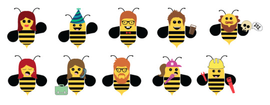
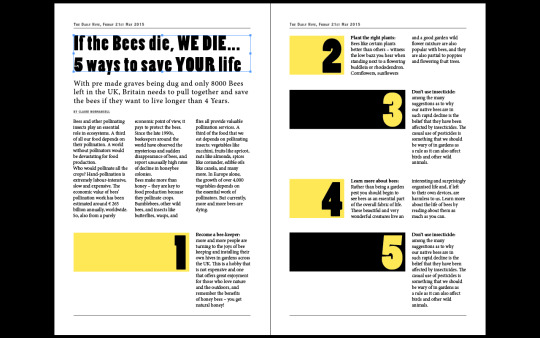
Final Bee characters
After a lot of trial and error with testing with either fat or slimmer bees I decided to go with slim as I think they work the best. The shakespeare one is to be the front cover of the book I am planning on doing, with this book I am going to combine humour about each bee so people will find it funny to read but also engage the reader with facts about saving the bees so I am still keeping with encouraging people to save the bees. I think these characters work as they are simple designs but still effective and you get an idea what bee is what without having a name with it.
0 notes
Photo
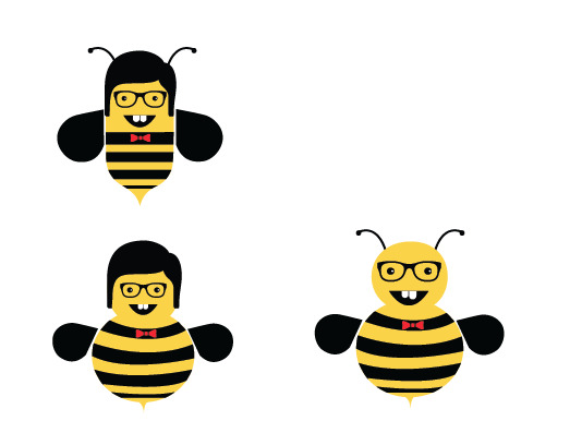
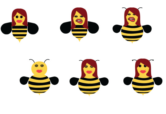
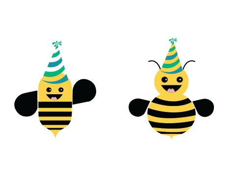
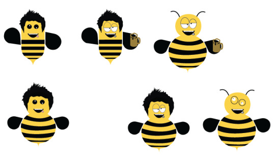
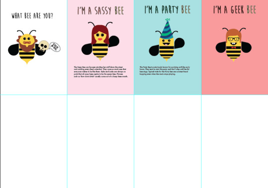
Character bees development
I’ve decided to created a set of bee characters but at the moment its still working process as I’m not sure whether to have them fat or slim? I prefer them thinner even though bees are known for being fatter. I have designed stereotypical people as funny bees such as:
Geek bee
Sassy bee
Party bee
Drunk bee
I plan to also design:
Hipster bee
Busy bee
Wanna bee
Worker bee - aka Manchester Bee
0 notes
Link
The website continues with this fun feel with added games, I like how this campaign has a serious message but with a fun illustrated style, that is something I want for the other half of my campaign as the first half is a guerrilla hand made campaign. Although this website is aimed at children its so well done illustrated wise that even the adult can appreciate it.
0 notes
Photo
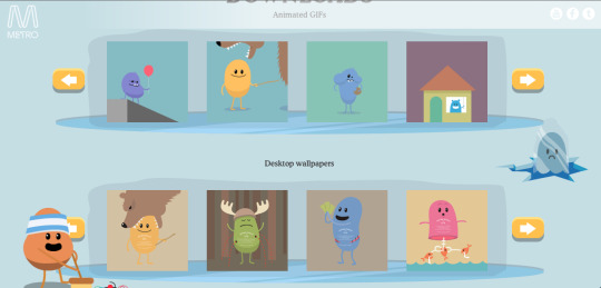
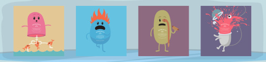
Dumb ways to die
This campaign sticks in my mind as the song in there advert is very catchy plus the illustrations for it are very simple but very effective, the colours used are mainly light colours and I think that seems to work well with illustrations so thats something I want to use when thinking of my designs for my bees.
1 note
·
View note
Photo

Character inspiration
Looking at illustrated characters as inspiration for designing mine, I like the light colours used here and the simplicity of them, these aren’t over complicated and work really well, less is more. This is from MS & Our story.
1 note
·
View note
Photo
Newspaper mock-up development
I started mocking up a newspaper but it was not working, it wasn’t looking like a newspaper and I was swerving away from my other campaign ideas and spending too much time on something that wasn’t very important for the campaign or that was working either, it was suggested by Joanne just to scan in a newspaper and place my type brut images in that and change the headline which I think will work better as it will make the campaign feel real.
0 notes
Link
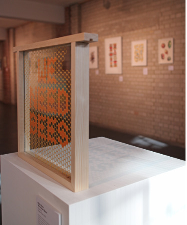
Lee suggested to look at this as its an exhibition about bees, I really like the top picture and wish I had thought of that! Really nice way to showcase typography.
0 notes
Photo
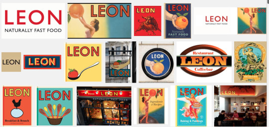
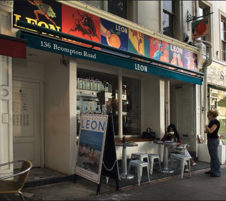
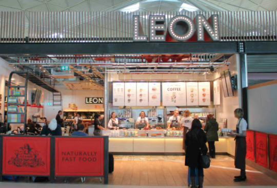
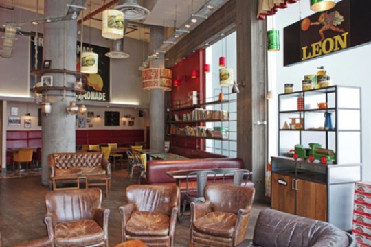
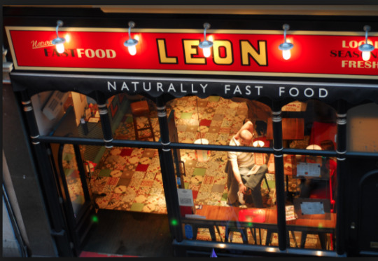
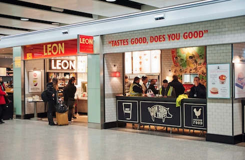
In a previous seminar with Lee he told me to look at Leon restaurant as this does not have just one logo but instead it had a fluid identity but you can still tell that its the same company as it all matches. I’ve not designed a logo for my work mainly because i hadn’t got round to it but after showing my type brut style in my seminar it was suggested not to do a logo as the campaign is more a urgent needs to know campaign and not a clean cut one. I really like how this restaurant hasn’t confined to the rules of having one logo and instead has a different look for each one but still all having a similar feel.
0 notes
Link
I’ve been looking at social media campaigns as that is something I want to bring into my work as I think it will tie it all together and make it feel like a real campaign. I like the campaigns on here where they seem to get everyone involved whether it be spotify’s birthday and reminding people to switch from twitter back to them was a clever way switching the users attention.
Another one I liked is the etsy campaign ‘At its core, social is about sharing. Etsy took that concept to heart by celebrating guest pinners on its Pinterest account. They invited pinners from different Etsy shops to curate their own gift idea boards, hosted on Etsy's account. There's no shortage of lovely gift ideas on Etsy, and this campaign allows even more visibility for niche shops.
This is a simple but nice way of getting everyone involved to showcase there gifts, with that in mind its given me an idea to create a campaign where everyone has to get involved whether it be creating something or finding something. Not sure yet...
0 notes
Link
Waggle dance isn’t a term I had heard of before doing this brief on Bees and I quite like the name of it. A waggle dance is a form of communication by which the bees tell their nestmates where to go to get the best source of food to bring back to the hive.
This has given me an idea to create an event from this ‘waggle dance off’ where people would be having a dance of with each other to raise awareness of the increasing dying out of bees.
0 notes