Don't wanna be here? Send us removal request.
Statistics
We looked inside some of the posts by notdrawingwaving and here's what we found interesting.
Average Info
Notes Per Post
0
Likes Per Post
0
Reblog Per Post
0
Reply Per Post
0
Time Between Posts
2 days
Number of Posts By Type
Photo
6
Text
5
Video
6
Last Seen Tumblr Blogs


Fun Fact
Tumblr has 411 employees.
Text
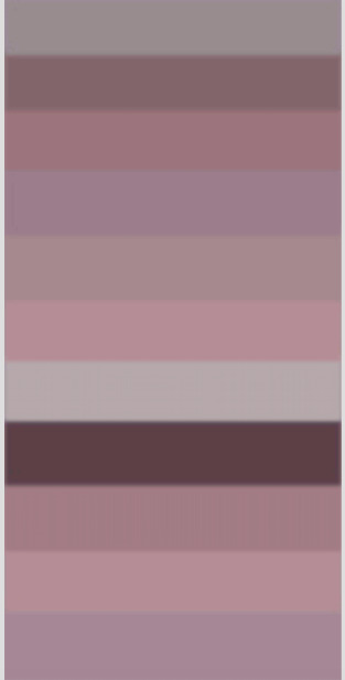
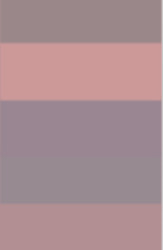
colour samples
i think the pigments taken out of the stretch marks is a strong idea and i could extend that idea,
The hues of pink has a very commercial aesthetic, together with the pigments origins i think it becomes some what funny.
the colours play on this commercial aesthetics of pop culture/ mainstream. within the mainstream, the idea of the stretch marks are labeled as undesirable, unattractive etc. Especially when its on a womens body. we have conditioned to hide these marks on our body instead of loving, embracing, accepting them
soooooo the colours i pull will act as paint swatches/ lipstick colours.
also references *insert art here*
0 notes
Text
Marks
Now i will print them out to an A3 size on good photographic paper
0 notes
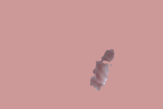
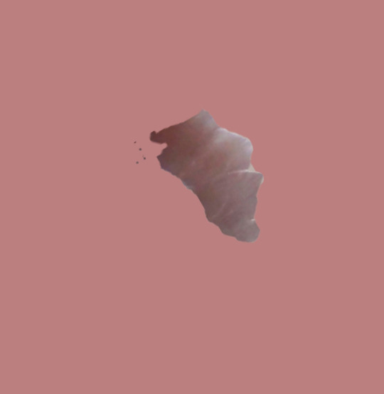
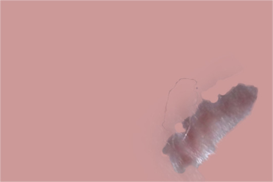
Photo
All of the marks in one image isolated, 1 with the mark pigment and the other white background
0 notes
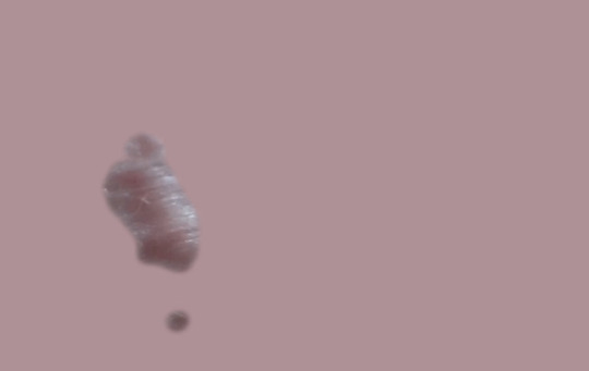
Photo
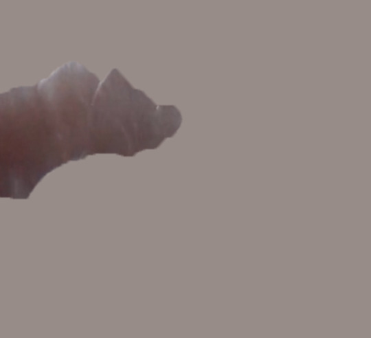
test trails
im not good at technology, so this is figuring out photoshop
the back ground colour an actually swatch taken from the stretch mark
tho i will try white just so the body is completely eliminated
Im also worried about the marks looking phallic
0 notes
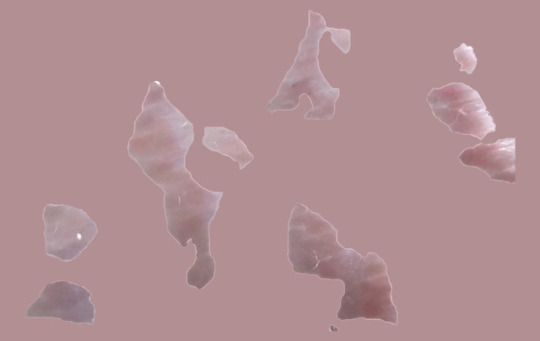
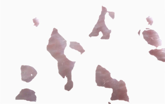
Text
body and context
What do i reveal and what do i conceal?
take the marks out of the body context and leave them to their own device, to stand alone, is their natural shape and colour, and see the reaction
Using photoshop, eliminate the body.
0 notes
Text
furthering ideas
Using more of my body as a tool for mark making, i really want to use the marks that are already on my body
0 notes
Video
tumblr
the marks my body made
the paint was only applied to the torso
0 notes
Video
tumblr
full frames on body and paint. this i stewards the end when i started to smear and cover my whole torso with this purple acrylic paint.
so by now, the paint is half drying, half wet, and my bodies texture is reacting with the paint
(this frame is upside down)
0 notes
Text
ideas
i really like the close ups of the starch marks... the close up, out of the bodily context can bee seen as something else, so I'm wondering if i can isolate images of stretch marks to make them into beautiful abstract, minimalist, artworks- aka socially acceptable
0 notes
Video
tumblr
my body with marks on it, with paint making marks on my body, and together making marks on the fabric
0 notes
Video
tumblr
the action of imprinted my body onto the material close ups of comparing textures raw/ naked body vs painted body vs painted material
what is the canvas? whats making the mark? the movement of both body and fabric
0 notes
Video
tumblr
the imprint of my body on the material vs the paint of my body vs the marks on my body that I'm transposing
0 notes