
Don't wanna be here? Send us removal request.
Statistics
We looked inside some of the posts by numberonedetectiveduck and here's what we found interesting.
Average Info
Notes Per Post
3
Likes Per Post
2
Reblog Per Post
1
Reply Per Post
0
Time Between Posts
3 days
Number of Posts By Type
Text
13
Photo
1
Last Seen Tumblr Blogs


Fun Fact
The most popular pages on Tumblr are about Minecraft, GIFs, and David J. Peterson.
Text
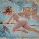
Final Exam
Title: Inspired by Greed
Medium: acrylic on posterboard
Date: June 2022


Are they people?
Yes.
Are they toes?
Yes
Make of it what you will, but this piece was a statement on human kind's folly being greed in a consumerist society. These figures turn away from the object they are fixed to(the world) in longing for another shinier object(the world in a future state). The blue and green object having no sheen radiates small wisps of gold. The metallic paint signifies value as what little radiates from the world below and how much the world above they pine for gives off. The figures radiate to signify self-determined value. Their grey-matter shriveled of what value might still remain after the atmosphere has dried them out. Blinded by greed the figures don't realize they are pining for a desert over the beautiful world that exists around them. I experimented with the story-telling capability of color and shape to create this piece.
0 notes
Text
Virtual Sketchbook 4 (Abstract Expressionism)

Title: (Unassigned)
Style: Abstract Expressionism
Medium: Acrylic on paper
Date: June 2022
0 notes
Text
Virtual Sketchbook 4 (Jackson Pollock)
Writing, Thinking, and Looking Critically: Jackson Pollock
Jackson Pollock is world-renowned for his artistic style of “action painting,” or “drip” painting. He went from genre painting of the American west to abstract expressionism with influences from David Siqueiros. He expressed Siqueiros’ desire to use new and innovative media to make art for a modern age. He used house paints, enamels, and aluminum paints and utilized their fluidity with phenomenal execution. His works appear to be slapdash works of splattered paint. However, they are controlled and fluid works of embodied energy. Pollock had developed his style over years utilizing different tools and techniques like sticks or simply pouring from the paint cans themselves. His artistic style appears as a culmination of self-identity and an interest in theosophical studies. He desired emotional expression through his art and technique was not the vehicle for him. His act of using energetic physical motion to express emotion was the ticket.
0 notes
Text
Virtual Sketchbook 3

Salman Toor - Construction Men (’No Ordinary Love’ solo exhibition at BMA)

Salman Toor: Construction Men
The title of this piece of art is Construction Men. It is a recent piece put on display at the Baltimore Museum of Art as part of the artist’s solo exhibit, ‘No Ordinary Love’. The contemporary artist behind this piece is Salman Toor. They created Construction Men with oil on canvas and it is sixty by forty-eight inches in size. There are geometrical and organic shapes used to depict a scene of a construction site. The main subject is the three men working on the street. One man is holding a long pole and appears to have his eyes closed as if resting in balance against the pole typical of our perception of construction workers sometimes being lazy or simply watching others work. One man with sagging pants wrestles with a long hose while the third is using a jack-hammer. Toor used orange cones in the foreground and background. An orange and white striped cylinder to depict a steam vent lies behind the three men. It is a scene one might see on the side of a downtown street. The wispy white brush strokes emulate steam rising from the sewers that is common in many densely populated urban areas. Two different trees enter on the left and right upper portion of the scene. I believe these present a scale between light and dark bringing me to believe this piece feels unbalanced with intention. It may even depict a deeper political view with the left represented as the light and the right represented as the dark due to many right-wing conservatives being strongly against LGBTQ culture. Lastly, there are two men walking away from the subjects with arms wrapped around each other’s lower backs in the upper left corner. Toor uses a rhythm of brushstrokes to create the unity within the composition across subjects and setting. The foreground cone and the construction worker in the foreground seem to use directional force to move your attention toward the receding couple in the background as to highlight the relationship of gay men. Toor’s use of strong green hues, tints, and shades across his works form an appealing dynamic contrast with the subjects. They also use a lot of fluid curving lines creating subjects that seem rubbery, soft, and depicted in a very harmless manner contrasting with the typical perception of gruff, rugged construction workers. I felt quite comfortable and enthralled with his work from the subject matter to the use of strong hues and fluid brush strokes. The work highlights Toor’s interest in men as they’re the main subject(s) across all of their pieces. His piece is a contemporary genre painting similar to works of the Baroque period depicting everyday life. Toor is trying to place gay men in the light that they are the same as anyone else and that they share virtually identical experiences. Toor’s work “upends art historical traditions to center on brown, queer figures and investigate outdated concepts of power and sexuality.” (Owrang and Naeem) This single piece embodies these characteristics written by the Baltimore Museum of Art very well. I believe this solo exhibition of contemporary art is very important for our society as much of the LGBTQ community needs safe places to express themselves and for their voices to be heard in an impactful way. I feel next to public speaking there is no better means of creating that than through art.
Work Cited
Owrang, Farzad, and Asma Naeem. “Salman Toor: No Ordinary Love.” Baltimore Museum of Art, 2022, https://artbma.org/exhibition/salman-toor-no-ordinary-love/. Accessed 5 June 2022.
1 note
·
View note
Text
ART PROJECT - Artist's Choice


I chose to start painting this reclaimed wooden statue. It's a piece I'm working o in dedication to my gracious new friends and hosts for my stay in Baltimore, MD. They are letting me stay here and watch their house and three-legged cat, Bon, and use it as sort of an artist's residency while they go on tour. They are the greatest kind of hippies and the bold complementary colors were my choice for this piece to give it a classic psychadelic feel to it and using soem directional forces to emphasize the heart as they are free-loving people with big hearts of their own. So this is my gift to them before I leave here. This piece also emphasizes the importance of utilizing materials that I already have at my disposal instead of using new products bought from a store. This statue I picked from a good will one or two years ago and I sanded some old paint down before priming and painting with acrylics.
0 notes

Text
Photo/Design:
Photojournalism

This photo depicts a protestor being treated after being pepper sprayed at a police blockade on highway 1806. This was in protest to the Dakota Access Pipeline construction that many believe to be a serious potential hazard to the region’s water supply and also threatened ancient burial grounds on the Standing Rock Indian Reservation. You can see the agony and irritation that defines the event of activists against corporation. It truly shows the civil unrest surrounding the conflict
0 notes
Text
Virtual Sketchbook 2
Connecting Art to Your World:
When it comes to color my relationship to them has changed quite a bit through growing up. As a kid I was fond of mostly primary colors. I was in a summer camp program where we built and designed our own model rocket and I chose blue and red to color mine. Both of these being primary colors on opposite sides of the cool/warm spectrum; perhaps that was my unknowing decision based on not wanting to pick sides that I attribute to the crumbling nature of our household. I eventually became more fond of secondary colors (green being a longstanding favorite). I enjoyed the connection to nature that I felt it brought me. Perhaps there was an underlying sense of greed that I felt in not wanting to share my feelings at the time, but still hoping others would share theirs with me. I still tend to prefer secondary colors for that mix of bold primary hues that in a sense to me dilutes their bold nature making it feel more like my own. I now lean toward less intense, unsaturated hues, or tints of purple (lavender), baby blue and the like. I occasionally choose deep shades of warmer colors that subdue their bold nature as well or even go with more neutral colors of black, white, and grey. If I were to pick a color scheme for my life it would likely be monochromatic as there can be a great depth found within one hue or overarching feeling often related to it since there is always a great depth to the feelings we give out in our surface communications.
0 notes
Text
Virtual Sketchbook 2
Writing and Looking:

Chapter 7: Painting 7.6: Oil figure 7.9
Madonna and Child with Chancellor Rolin by Jan can Eyck (ca. 1433-1434), Oil and tempera on panel. 26″ x 24 3/8″
There appear to be implied lines from the directions of the subjects gazes. Rolin looking toward Madonna and the child, Madonna looking toward the child, the child looking toward Rolin, and the angel looking toward Madonna and child. The portrait uses a single point linear perspective that vanishes off in the horizon as well as atmospheric perspective that gives the distant mountain range it’s hazy blue appearance. The lines of the floor tiles seem to gradually point toward convergence at vanishing point along the horizon and show a sense of rhythm and repetition through geometric shape and colors. Further repetition is seen in the glass windows to the far left and right of the middle ground of the composition, in the bas-reliefs of the pillars, and in the architecture as well. The architecture as well adds another layer of balance to the composition. The overlapping and perspective of the pillars to the left point to the sense of space and depth as well as the smaller figures by the rampart and the further, less detailed structures of the city and landscape that get closer to the horizon line. He uses strong bold colors and placed the cool, blue colors of the chancellor and angel to balance the large, warm, red color of Madonna’s robe. There is further color balance in the background of the land on opposing sides of the water. The highlight of the child’s skin and hair bring it in as a focal point further emphasized by the iconography of the child’s pose and held item (relating to “Salvator Mundi”) as well as Madonna with the angel crowning her from above. The iconography in conjunction with the bold red color makes this depiction of the Virgin Mary and the child Jesus a strong focal point.
0 notes
Photo


Virtual Sketchbook 2: Journaling
(Listed from top to bottom)
Unity and Variety:
This photo of ceramic vases shows both unity and variety. Unity is depicted in the forms for the vases with their cylindrical shapes and and curve of the lip/spout. Variety is present in the difference of height in each thrown piece and slight variation of the surface design and colors.
Photo by Tom Crew on Unsplash, @tomcrewceramics
Balance:
This photograph between two glass buildings demonstrates a compositional balance with both symmetry and asymmetry. The sky creates a symmetrical shape in the center of the photo, but the buildings have minor differences in detail and the reflections upon each other mirror those differences.
Photo by Alex Wong on Unsplash, @killerfvith
Emphasis and Subordination:
As if there isn’t enough inherent emphasis and subordination in our relationships with animals, this picture portrays them well through the lens of a camera and technical skill of it’s use. The focal length emphasizes the variegated colors of the fur, its texture, and the cat’s pose on the narrow ledge, while subordinating the wall and window through its lack of focus within the shot.
Photo by Frank Castro on Unsplash, @frankcastro
Directional Forces:
This photograph displays some simple directional force that comes from the subject of the photo. The young character looking up directs your attention to the structure the piece of art is supported by.
Photo by: Johannes Schenk on Unsplash
Repetition and Rhythm:
This structure shows a repetition of the stepped edges and curves around each level. There is also a rhythm to the diagonal movement of the concrete within the plant life growing over the ledges.
Photo by Danist Soh on Unsplash, @danist07
Scale and Proportion:
This photograph shows the scale of two different tunnel entries that are next to each other and both of these tunnels in proportion to the whole structure.
Photo by Vidar Nordli-Mathisen on Unsplash, @vidarnm
1 note
·
View note
Text
4. Art Project (Self-Portrait)
Photography.
Out of 59 self-portrait photos I selected this one to represent myself. I wanted to present a modest, humble, and introspective portrait. There are many things that intrigue me, yet I find beauty in simplicity over complexity.

0 notes
Text
3. Writing A Self-Portrait
My first creative process when I was little was through art and drawing. I believe I lost a bit of that to my own self-doubt as I got older and never sought it out as a means of expressing myself. When I was 12 I was handed a guitar and I took it upon myself to learn how to play. Since then I have been playing for 17 years. My only true outlet of creative expression. So when I look at art I pay attention to the expression within the piece and how it translates to me.
I am a 29 year old white male with a fraction of Korean descent. I was born and raised in Sarasota, FL. I love to play and listen to music, hike, spend time with my friends and loved ones, and work on my personal growth and enrichment of life. Not currently a part of any group. The last band I was in parted ways in 2014. I last worked for the Asolo Scenic Studio painting stage scenery and the occasional props. Currently I'm taking the summer off and staying/travelling between Baltimore, Dallas, Lubbock, etc before making my way back to Florida. I tend to have a hard time focusing on any one form of art for long. I bounce around from music, to 2D design, to 3D rendering software, to audio recording/engineering, to watercolor, to drawing. So rarely will I be doing the same thing across sequential days of the week. I find that embracing that rather than fighting it or feeling like it's a part of me that needs to be fixed is part of my process. I need more time to step away from a piece to "cleanse the palette" in order to refresh my perspective on it.
0 notes
Text
2. Art and Writing

This is a piece that I carry with me everywhere. I don't have a particular place or room that I keep art hung in since I've been moving about a lot since September of last year. However this is a piece that is always with me that a dear friend made at least a year or so ago now. It's a rough sketch of me playing their guitar with my sprit animal (a fox) lying next to me. It is a lovely and flattering piece. It was made with a grey/silver sharpie on a piece of canvas. Each line made deliberately and permanent. I adore the simplicity of the piece and how the lines create the forms and show the texture of the canvas within them. I believe they drew the fox in such a pose because they find some of what I play can be quite relaxing and that seems to communicate through the being's resting pose. The fluidity of the lines making up the guitar strings is another feature I appreciate giving a sense of the vibration that music comes from.
0 notes
Text
1. Writing and Research
Cloud Gate
I was assigned the work "Cloud Gate" by Anish Kapoor. The very iconic centerpiece sculpture of AT&T Plaza in Millenium Park in Chicago, Illinois. I remember seeing this piece ages ago in school and thinking very little of it. Simply a highly polished metallic bean at the time as I regarded it.

5 new facts of this artist/art work:
sculpted from 168 plates of stainless steel
Anish Kapoor was competing among 30 different artists
the work was inspired by liquid mercury
construction process was broken into 5 stages: rough cut, initial contour, sculpting, refining, and polishing
the seamless polish of the structure follows Kapoor's theme of removing "traces of the hand" from his work
My perception of this piece has changed greatly since the time of it's debut. I can truly appreciate the piece as it distorts reflections and breaks down our perception of reality in a very meaningful way. The concept of duality is also strongly present as it has been referred to symbolize both femininity and masculinity. This then mirrors tenets of Hinduism where "The experience of opposites allows for the expression of wholeness," which I find a wholly beautiful concept in the same way I prescribe to the ancient Chinese philosophical concept of yin and yang where opposites exist not just side by side, but reside within one another to create harmony.
1 note
·
View note