
Don't wanna be here? Send us removal request.
Statistics
We looked inside some of the posts by ogulster-blog and here's what we found interesting.
Average Info
Notes Per Post
0
Likes Per Post
0
Reblog Per Post
0
Reply Per Post
0
Time Between Posts
5 minutes
Number of Posts By Type
Text
12
Photo
5
Last Seen Tumblr Blogs


Fun Fact
BuzzFeed published a report claiming that Tumblr was utilized as a distribution channel for Russian agents to influence American voting habits during the 2016 presidential election in Feb 2018.
Text
Fiber Overview

Find below all relevant links to my major project and research
Dribbble - https://dribbble.com/ollie1358/likes
Prototype - https://invis.io/6QRY2AWGT75
Website - http://www.fibers.online
(tumblr heavily compressed my images so here is a link to a dropbox with all the wireframe images for easier viewing)
https://www.dropbox.com/sh/lft4ntsiabni6aj/AACWi8BLW-OhlowPGMYRtvfaa?dl=0
0 notes
Text
Business Model
Fiber will be a free to download app initially from the Google Play Store with iOS following launch. Through the sign up process a monthly plan can be selected to suit the needs of the user.
The OMsignal sensor will cost the user £139 with additional clothing options to added.
New customers will recieve their first month free with any purchase of OMsignal clothing.
Service costs-
Monthly fee - (£4.99)
Annual fee - (£49.99)
0 notes
Text
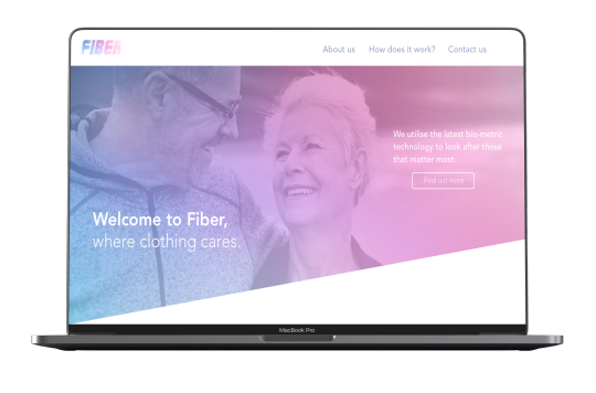
Website Inspiration
When considering the design of the supporting website it was important to keep the brand guidelines in mind, consistency in design is key. Initial inspiration I took from an advertising billboard I had seen during research.

The angled style of this billboards design was one I would further implement into the brand of Fiber. I decided firstly I would remake the billboard just to see how my design could work with the style.

After the remake I then decided to try and implement that design into the style of the website using the same coloured gradient throughout the branding
0 notes
Text
User testing
After the first semester and completing user testing from a select group, it provided me with several points that I could see needing improved, some issues I have mentioned in my App redesign post such as taking screen size into consideration when designing.
Some of the feedback provided included-
- “I like the style of the graph on the main menu page but I feel like I need more information on the data streamed from the clothing”
- “When connecting a sensor more options need to be provided on the status of the sensor, also the ability of adding multiple sensors”
- “Colours for the market group I feel are too bright and young looking, I think it needs toned down or a change of colour palette”

There is a drastic change between the initial prototype and the final high fidelity screens. It is clear to see that the feedback provided has been taken into consideration, from the colour even to the sensor settings
0 notes
Text
High Fidelity Digital Wireframes
After designing the general layout style of the application through the use of low fidelity wireframes and sketches, I then moved on to producing high fidelity wireframes whilst keeping the layout and target market in mind. Sketch was my main design tool of choice throughout wire framing.


0 notes
Text
Digital Wireframes & Site map
Following low fidelity wireframe sketches I moved then to sketch to begin the process of mocking up digital wireframes. I believe it helped provide a better visual representation of the layout of the app and sizing comparison other elements on the screen.


0 notes
Text
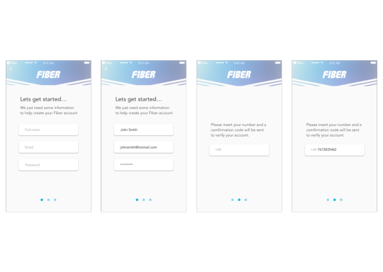
App Flow and Wireframes
The first step in creating Fiber is to map out the app flow, how the user would navigate through the app and the different features they can access. This will help when it comes to actually designing the screens and prototyping the application.

After completing the user flow I decided to move onto creating low fidelity wireframes, after having prototyped the first initial version of Fiber I had a good understanding of what needed to be adjusted and added to the new version.
It is also beneficial to have these low fidelity wireframes when it comes to further developing the application throughout the design progress as it provides a good reference on the functionality and layout of the app.
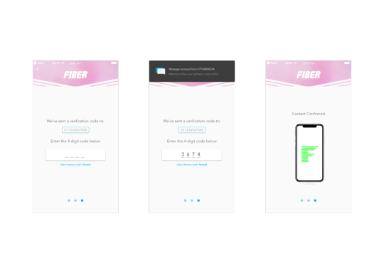
Initial login wireframes

New user signup process

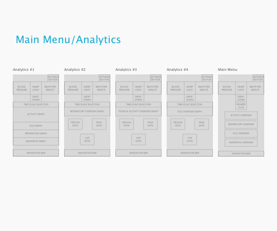
Main menu with drop down screen linking to analytics wireframes

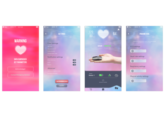
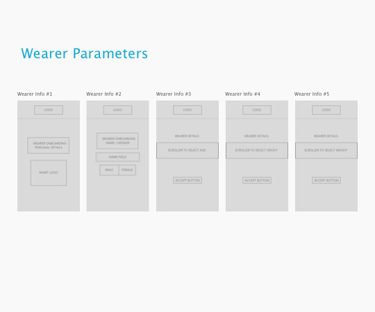
Settings and parameters wireframes

0 notes
Text
Market Research
Fiber utilises the emerging technology of bio-metric clothing, due to this there are no existing competitors to compare concepts to.
I decided to look at the research from a different angle with the use of fitness apps. In the same way fitness tracker apps display analytics on the users progress of for example, a workout, I planned to base my design on how that data is presented to the user in such a way that is easy to use, whilst also providing the user with sufficient information on the wearer of the clothing vitals.

An example of a fitness tracker app that I believe presents it tracked data to the user well is Google Fit. With an clean open layout, the data charts are easily viewed and can be understood at a glance which is important to consider when designing the user interface of Fiber. In addition a summary of the users data in the centre of the main menu is a good way of representing the data, as design has been considered to how the users progress increases as the day develops.

Another example of features I like is on an app called Health & Fitness Tracker with Calorie Counter. I like the way that on the heart rate tracker screen that there is an animated heart to the beat of the user, this is something I would like to consider for Fiber. Also feature in the app that I find could be useful is the ability to set medication reminders so that the user won’t forget to take their medication, this could be useful considering the target market of elderly users.

This is Samsung Health, an app also currently on the market for tracking activity and setting goals to achieve. The data graphs are well presented in the example of the steps graph, I find the clear minimalistic style suits the target requirements.

Also the wheel styled graphs representing the activity, calorie intake and sleep work well to provide the user with sufficient information on their current welfare and if any changes need to be made, for example, more steps need to be taken to complete the daily goal.
0 notes
Text
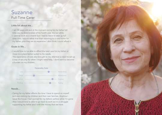
User Personas
I have created two user personas of potential users that I believe would benefit from Fiber. This provides a good guide line for the end users of the application, therefore design and functionality can be tailored to suit their specific needs and requirements.

0 notes
Text
Target Market
The aim is to address a large gap in the market that is directed towards users 45-65 years of age. At this age it is more likely that the user will have elderly parents that could be in need of support due to ill health.

Taking into account the target market allows for a more streamlined design process. The target market also plays a role in consideration of the user interface, it is vital that Fiber focuses on ease of use and accessibility in the the case of an emergency event. It is important to consider the target market when designing for the application as this will will make for more specific and effective marketing communication strategies.

0 notes
Text
User Interface Redevelopment

Following an initial prototype of the first design style of Fiber I believed a full redesign was necessary. After taking into consideration the first prototype testing feedback I began to take a different approach to the interface and how the user interacts with the application.

The Initial prototype feedback showed that more visual analytics were required. Also important to consider is how the data is presented, I wanted to ensure that the information was clear and concise as reviewing vital statistics on the wearers health, it is important that the user can make informed decisions on the data presented.

As a result an analytics page was implemented. This included a daily, weekly, monthly and yearly summary of the wearers historical health data. Additionally this section also provides the possibility of the user to present the recordings at medical reviews to allow a medical practitioner to make informed decisions on the wearers health prior to the visit.
0 notes
Text
Logo Redesign
After First semester I decided to complete a full brand redesign, Firstly starting with the logo.
I believe it is important to start with a good brand base and a strong logo i find shapes the style for the whole project. It is also vital to design with the target audience in mind.
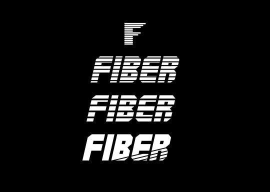
First semester I used the top icon but I felt that i wanted to stay with the lines style, as you can see I wanted to try and integrate the lines into the full app name but still ensuring that it can be easily read and identified.

After redesigning the logo I wanted to try and integrate the previous logo into my designs and came up with a loading animation idea using the lines from the F moving in a complete circle to signify that the system fully loaded.
When considering a redesign I found it helpful researching for mood boards, it provides more guidelines as such to base the design from. I think the new design really reflects that of the mood boards.


0 notes
Photo

Very similar style to my last post but this reminds me of RGB lighting say on a key board, same bright colours against a dark background. I like how the colour fades out from the lines of the graph.
0 notes
Photo

This would be my favourite design for displaying data in graphs. Great use of colour against the dark background. Would love to use this for Fiber but i feel it may not be the correct style for the target audience.
0 notes
Photo

I like the idea of this being a scrolling wheel for a menu. I could imagine the large circle off to the side a little as a tab that you click on to expand the menu over a home screen.
0 notes
Photo

Very similar style to one I had previously uploaded, soft flat design.
It would be an idea to allow both data charts to flow through each other when the other is selected. A phone shake gesture would work well with this too for example, reset your steps information, then the graphs would slowly fade to the bottom of the screen.
0 notes
Photo

Going to have to integrate a beating heart animation on the centre of the home page with the live data received from the OMsignal sensor. I also like the idea of having the slightly transparent overlay.
0 notes