
Don't wanna be here? Send us removal request.
Statistics
We looked inside some of the posts by oliverm-arcadegame and here's what we found interesting.
Average Info
Notes Per Post
1
Likes Per Post
0
Reblog Per Post
0
Reply Per Post
0
Time Between Posts
20 hours
Number of Posts By Type
Text
17
Last Seen Tumblr Blogs


Fun Fact
The Tumblr app for Google Glass was released on May 16, 2013.
Text
Final evaluation
What went well
I'm pretty happy with the finished product of my game despite not having as much time as I thought. Skills I developed further in this project included 3D modeling where I made more advanced models such as low-poly terrain and clouds - which I enjoyed and hope to do more of in future projects. In Unreal, I learnt to understand how loops and parenting work which helped me greatly when it came to developing an infinitely generating level.
Problems?
One thing that became quite irritating was unforeseen bugs/gameplay exploits and having to fix them. A prime example of this was the way of cheating score, which took multiple days to come up with a fix for. Therefore, in future projects I'll make sure to set aside some time so I can work on problems like these so they don't become as big of an issue.
I also felt like I didn't have as much time as I hoped with this project, and as a result I ended up removing two of the modes in my game (ship & hop) and focused more on just the platformer mode. Whilst I am certainly happy with my game now, who knows what I could've done if I had enough time to also work on those two other modes.
What next?
In the next project, I hope to further look into 3D-modeling in Maya so I can create more fully built environments to fill a level rather than just single assets. I quite enjoyed low-poly modeling so I might do more of that. In Unreal, I want to take advantage of some other systems such as map variables so I can potentially create some sort of inventory system to improve the quality of my next game.
Here is a link to the itch page of my game containing a download file.
https://otdx.itch.io/boombounce
0 notes
Text
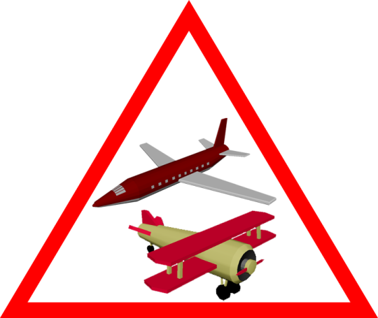
Feedback - Adding warning signs
I had a few people playtest my game so I could more easily find out issues with it. The vast majority of players were able to get a decent but not too crazy score, which shows that the difficulty curve is balanced.
However there was one thing that some people found misleading, and that was being able to tell the difference between moving platforms and moving obstacles. In my game there are planes which move across the screen which kill you on impact. There are also UFOs with similar movement, but these do not kill you and are instead platforms. Players didn't realize at first that the UFOs were meant to be platforms so it ended up becoming a bit confusing.
Warning signs
I had the idea of some sort of warning system to alert the player of any potential danger throughout the level - planes and planets. In Photoshop I made a warning sign to display dangerous assets.
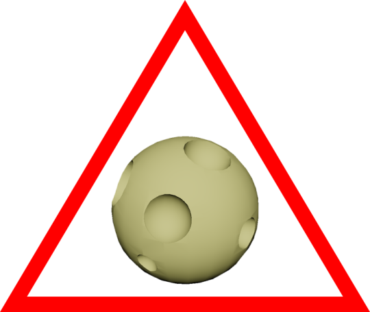
I added these images to my HUD blueprint in unreal and gave them a fade in animation. I felt like just above the center of the screen would be an appropriate position, as it shouldn't block the player's view of the character. The warning signs should appear just before the player meets the matching obstacle.
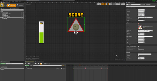
In the widget's event graph on tick, I casted to the character to get the value of 'Height' so I could determine when to display the warning signs. As the code is running every tick I used a do once node so the animation doesn't loop. The checked values of height are equal to the point in the level where their matching chunks spawn - 5000 is the height at which plane chunks can spawn, for example.

0 notes
Text
Fixing a cheat
You gain score in my game by jumping, and the idea is you will generally have a higher score the higher you reach in the level, and this will vary based on how many multipliers you get. However, there's currently a problem where you can just jump on the same platform an infinite amount of times to effortlessly gain score.
This ended up being a really annoying problem which took a long time to fix - I originally tried setting up a bunch of float variables to only increase the score if the player's height was their maximum reached height. This had issues too though, the apex of the jump was higher than the actual landing position so it just wouldn't work consistently.
The solution
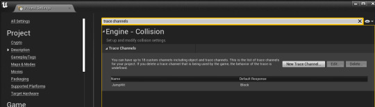
I first created a new trace channel called 'JumpHit' in the project settings.
I then used this trace channel to shoot a line trace. This line trace will go below the character and is going to essentially look for a platform the player is standing on. The code runs on input jump.
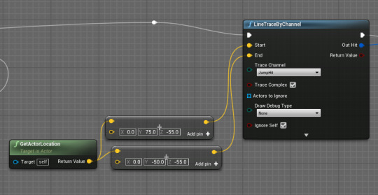
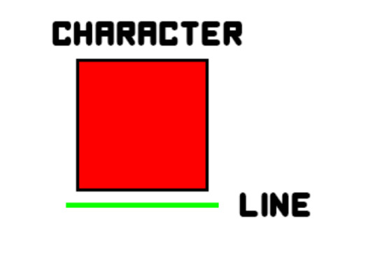
For a more visual representation of where this line trace will go, see the diagram below - the line will be where a platform would be. The line also goes slightly beyond the sides of the character incase the player is hanging on the very edge of a platform.
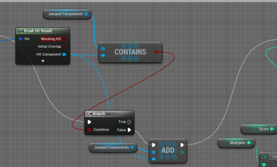
I wanted to use this line trace to determine whether or not the player has already jumped on their current platform. I did this by breaking the trace's hit result and getting the 'Hit Component'. I then created an array of component object references which will store every platform the player has jumped on. This will work because every platform will have a unique name - 'WoodPlatform17' or 'CloudPlatform2', for example.
A branch checks if the hit component is already in the array, and will add it to the array if it isn't. Score will only be gained if the branch returns false (if the player hasn't already jumped from that platform).
Result
The video below shows how score can no longer be cheated, and also shows the debug of the line trace and where the blocking hits are.
0 notes
Text
My attract screen
I wanted my game's attract screen to have some movement to make it more interesting, along with some sort of preview of the gameplay. This would let the player know what to expect, to an extent, before actually playing.
Storyboard
A rough idea would be something like this - the title text grows and shrinks so it stands out a little, and the play button flashes like you see in a lot of arcade games.

Spinning camera
I wanted to also add some sort of gameplay/moving imagery in the background though, so I settled on the idea of having a camera spin around the center island. The center island is an island with a platform which is where the player starts. It has a low poly style and I created it in Maya a little while ago.

To make a camera move around this island, rather than making it all complicated by actually moving the camera, I instead rotated the camera around a point. By making this point the center, I can simply add some actor rotation on each tick so that the camera pans around the island.

Particles
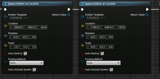
While messing around in Unreal, I came across some particles which came with the starter content. One of these just happened to be some smoke particles which I thought would be fitting for the explosive environment within my game, so I wanted these particles around the explosives.
I spawned in these particles by using a 'Spawn emitter at location' node. The smoke particles are a 'particle effect system' and can be spawned anywhere in the world with a given transform. So I spawned a few of them around the island.
There was also an explosion effect, so I decided to add this when the player dies because the character is meant to blow up on death due to the explosive inside of them.
Although none of these particles were made by me, I added them so that my game felt more themed overall.
Transition between attract mode and game
To make the game feel more polished I wanted to add some sort of transition between the attract mode and the actual game (which would run when the player clicks the play button).
I did this by giving the character a tag called 'begin' when the play button is clicked. Then, in the level blueprint, once the character has this tag the camera swaps to the scrolling camera, with a blend time to allow for a smoother transition. I also added a brief camera shake to emphasize the explosive feel of the game.
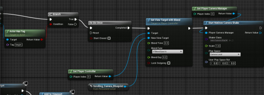
Result
Video of the attract mode, transition and explosion death animation:
0 notes
Text
Attract modes and storyboards
In arcade games, it's important to have a good attract mode so people will play your game. An attract mode is something that's being persistently displayed while the game isn't being played. This could be a simple as a title screen with a play button, or it could be turned into more of a story.
Examples of attract modes
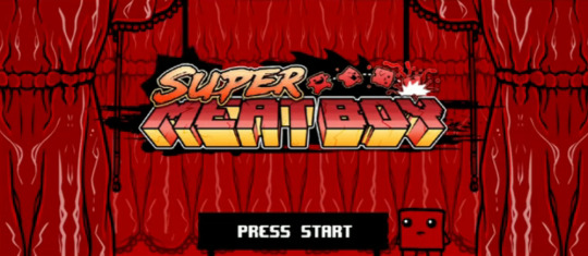
Super Meat boy has an great attract mode - it has this red-white meaty colour pallet which goes well with its overall theme. You then have a spinning saw in the background along with meat boy dying, which gives the player a rough idea on what to expect from the game. The title itself also fits in super nicely using the same colours, and the cartoonish blocky art style is also shown here.
Crossy Road's attract mode has some actual gameplay running in the background - which lets you see some real footage of what you'll come up against in the game. The title text also has a nice slide-in animation from the side. High scores are also displayed on the attract mode which I think is another good thing because it immediately gives the person something to beat.

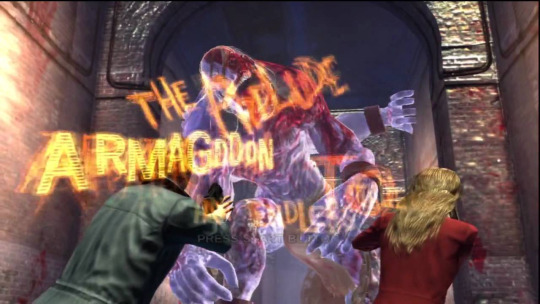
You can also have attract screens like in House Of The Dead where you have some sort of cutscene playing before displaying the game's title screen - and this would be looped. This cutscene may also tell a story which relates to the context of the game, so the player can get a bit of an idea of what to expect.
Storyboards
Sometimes it can be easier to plan out an attract screen by using a storyboard. A storyboard can be used to mark out key parts of a story, movie or just any occurrence. It's good for building on ideas as you can plan things out without having to fully do them.
A good example of the usage of storyboards is cartoon network - in the picture below we can see how the storyboard is used to show all the different important parts of this scene. This board can then be used as a foundation and can be built upon by transitioning between each of these parts.

Storyboards can be used in attract modes because you can use them to mark out angles/positions/sizes of different things to perhaps form an animation, without actually having to animate. You can also use them to tell stories for cutscenes for your attract screen.
0 notes
Text
Using game theory to improve gameplay
Game theory will allow me to create much more exciting gameplay in my game and I will do this in many ways. It allows the player to feel more involved with the game rather than just staring at the screen, plus it makes the game more attractive to newer players.
The level - flow state
To make sure the player is in a state of flow, I created a balanced difficulty incline throughout the level. Towards the beginning of the level, the jumps don't require a great deal of precision as they are large and fairly spread out. However, as the player progresses more and more through the level, the platforms will vary in scale, becoming smaller and more spread out.
In addition to this moving platforms make an appearance after a while to help the gameplay feel more than just jumping on a bunch of static platforms.
Once the player has advanced pretty far into the level, along with smaller and more difficult jumps, you are also greeted with moving obstacles such as planes which insta-kill the player on impact. By gradually introducing these different assets into the level it creates a good state of flow - the start is nice and beginner-friendly and more skilled players can get to the harder parts within about 45 seconds of gameplay.


Scaling the difficulty
In my parent chunk blueprint, I cast to the character to read the value of a 'Height' variable. This value is essentially used to check the height of the player, to see how far through the level they are, to determine what chunks should be spawned.
I then used branches to check the height - the higher the value of height, the more difficult the spawned chunks are. Chunks 1-6 go from easiest to hardest.
The chunks are set by creating an array of actor classes, and setting this made array to an actor class array variable. Actor classes have a purple colour. A random item (RANDOM node) from this array is pulled each time a new chunk needs to be created, and this will be the spawned chunk.

Risk vs reward - Collecting multipliers
The multipliers which randomly spawn within each chunk could result in the player having to take an alternate path if they want to pick the multiplier up. This introduces a risk vs reward factor - do you want to go out of your way and potentially perform a more risky jump in order to get a score boost?
Positive feedback loop - Multiplier
When a player picks up another multiplier before the previous one runs out, it will reset the duration and they can stack all the way up to 5x (4 multipliers). This is an example of a positive feedback loop as it gives players who are already doing well an even greater score boost.
0 notes
Text
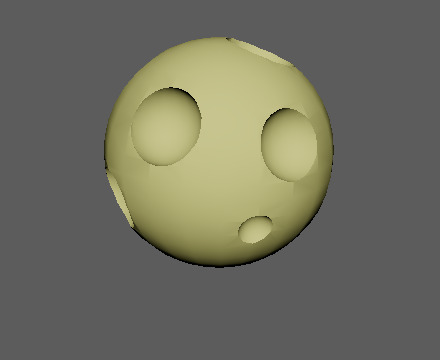
Character design
My game is themed around explosives, so I knew I wanted my character to look quite red. Also, I knew my character will be a cube as otherwise it will be hard to make it work with my gameplay. Because of this, my thoughts immediately jumped to Meat Boy.
Although it's not exactly a cube, it's by far the closest thing I could think of and I wanted to base my design off something similar to it. By basing my idea off something like this, it also allowed me to keep the design simplistic and free of heavy detail to match the rest of the designs in my game.
I came up with this cube who has a clear facial expression. There's somewhat a reference to meat boy with the face design, but I decided to add some eyebrows to make the character look a bit less blocky.

Glowing in game
To make the character look like it's explosive, to fit in my game, I had the idea of making it glow up from time to time so it appears to be ignited.
To do this, I firstly created a Material Parameter Collection. This allows you to store vector and scalar parameters which you can apply to a number of materials. I will need to create a scalar value - to make something glow up you need an emissive material, and the strength of the emission is a scalar value. In unreal, scalar values are floats.
I created a new parameter called 'Glow'.

I then opened up the red character material. I right clicked in the grid and searched for 'Parameter Collection'. After adding this node I selected my parameter collection in the dropdown menu and from there I got my 'Glow' parameter.
This parameter will be multiplied with the red base colour to create the emissive colour I want.

I used a timeline to adjust the scalar parameter for the emission. A 'set scalar parameter value' node with my collection as its target is used to set the value, and a lerp coming out of the timeline will be the parameter value.
The result - a flashing red explosive blocky character.
0 notes
Text
Level creation - More randomization
I used my recently created space assets to create some harder gameplay. The chunks containing this gameplay will feature randomized moving platforms - something I haven't included so far.
In the chunk blueprint's construction script, I set the start and end locations for the moving platforms (UFOs). To randomize these locations, I took the world location of the object, which is horizontally in the middle of the level. From there I added a random Y-axis value above and below the location so it's start and end points are randomized. The random float nodes range from 75-300 units either side of the middle. I did this code for every UFO in the chunk.
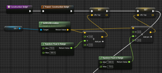
On begin play, a random Boolean will determine whether the platform will move left to right or right to left. Originally, I was going to use one timeline and play it forward/in reverse, but there was a problem.
The moving platform timeline goes from 0-1-0, and playing it in reverse would actually do the same thing. I hadn't realised this until now and was also the reason why previous things I've tried to make haven't worked either, so it was nice to finally figure out why. Instead of playing in reverse, I made a separate timeline which goes from 1-0-1. I did this code for each UFO, using the variables set in the construction script to set positions.

The result can be seen in the video below, the moving platforms have random directions and start/end points. Due to different starting points, this also means they have different speeds - making it even more random.
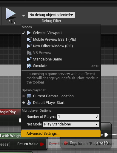
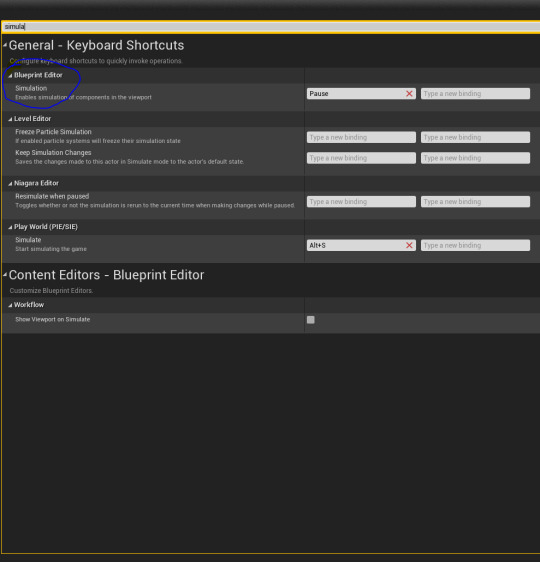
A neat tool I discovered in the blueprint editor was the ability to simulate within a blueprint viewport. This was especially good for chunk randomization as it meant I didn't have to play the game every time I wanted to test something. This option can be found by opening the drop-down menu by the play button and going to advanced settings. From here, search 'simulation' and bind the blueprint editor to a key.
0 notes
Text
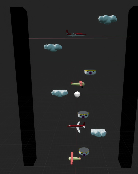
Asset creation - Space objects
Once the player is high up enough, they will appear to be in space - surrounded by astronomical objects.
I first made a satellite which will act as a moving obstacle in the level. For the body of a satellite I used solid whites and grays to give it some sort of spacecraft look. A reference image was used.


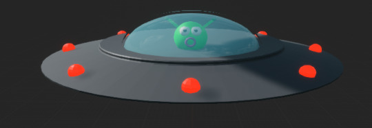
Next up was a UFO. These will me moving platforms in the level. I didn't use any reference with this and just kind of went where my mind took me. I also added an alien head inside so it doesn't look like the UFO is just moving by itself. In unreal I copied the preset glass material and made it blue for the window. As it's a moving platform, the player needs to be able to walk on it with no large bumps so I made sure the model was quite flat.
I then made a planet which will be a moving obstacle that's flying around in the level. To make the craters I used Maya's 'Difference' Boolean in combination with smaller spheres to dig out holes in the planet.
Finally I just made a very basic platform using the same grays as I did in my UFOs and satellites for a similar colour pallet.
I hope to combine these assets to create some cool space-themed gameplay. In the future I might create some more space assets such as large planets/stars which I could place in the background to fill in empty space.
0 notes
Text
Research - More game HUDs
Space Engineers
Space Engineers has a very themed HUD - set in space, you have to harvest materials and build a space base. You have to preserve your oxygen and other resources so you can survive. All of these are displayed in the engineer information on the HUD.
We can immediately see some sort of Sci-Fi theme with this HUD element due to the colour choices and shapes. In this single piece of the HUD there's 10 different things going on, and it's clear to tell the different between each of them ranging from a jetpack (2) to oxygen supply (6) to speed (9).

Similar to Fortnite, when building in this game there's a preview ghost version of the item you're about to place, so you can see how it will look without actually placing it. This affects the gameplay by making it more easy for players to make choices when building structures.

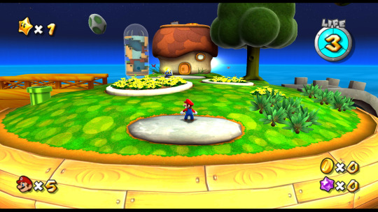
Super Mario Galaxy
Although this game has quite a simplistic HUD, Super Mario Galaxy displays everything that's necessary and important. It's not really a big deal that everything on the HUD is spread out because it's almost all statics - you aren't in any rush to look at most of it.
Instead of the usual bar, Mario's health is displayed on a dial with 3 segments. This colour will go to red once Mario is on low life, and with power-ups this can go up to 6, where it will turn green.
To make things even more minimalistic, at some points in the game HUD elements will only display if they are relevant in real time. By this I mean, for example, the coin count will only briefly pop-up if Mario collects a coin, at which point it also pulses so the player can more clearly see the coin count go up.
0 notes
Text
Research - Game HUDs
Game HUDs can have a very significant impact on the overall quality, interactivity and feel of a game, so it's important that they're well-suited to the game's environment.
HUD elements are split up into two categories - gauges and previews. A gauge would be something like a health bar which is otherwise invisible, but instead shown to the player. Previews are things which can pop-up when necessary to show what will happen.
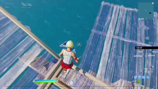
Fortnite
I think the main HUD of Fortnite is done really well - it shows a lot of information but is all relevant to the active gameplay. Despite there being a lot of information, it doesn't take up too much space on the screen.
The hotbar containing all of the player's weapons/consumables saves space by having the ammo count in the hotbar slot next to the gun. The health and shield bars are next to each other but clearly differentiated with small icons to the left of their bars. All hotbar and build key binds are also displayed in small text above/below their corresponding slot. The player's selected hotbar slot is slightly scaled and highlighted which also helps as it lets the player know what gun they have selected before shooting/looking at the character.
A compass is displayed at the top middle of the screen which can be useful for remembering POIs/enemy locations etc., and it can also be particularly useful for making callouts in team modes. One thing that looks especially nice about this is how it fades to either side - focusing more on the players current direction.
Fortnite is known for having a storm which will gradually shrink to random locations on the map. The map has a really useful feature which displays a line from the player icon to the storm circle in the shortest possible distance. This is a really nice touch as it helps the player navigate the map while not taking up any extra HUD space than a normal map would. A storm timer, player and kill count are also displayed just below the map as they are also relevant.

Fortnite also has some good preview HUD elements such as showing a translucent blue outline of builds after the build menu has been opened, before the player places the build. Also, if you want to throw a grenade-style item or consumables a trajectory is shown so you can more easily determine the accuracy of your throw.

Dead Space
Dead Space takes an approach which is quite the opposite from Fortnite - it has no actual on-screen HUD and instead has a diegetic HUD meaning it is part of the game world. The HUD is also themed extremely well with the rest of the game. By having the HUD actually in the level, I think it helps the player feel more immersed in the environment around them.
Health and stasis are displayed on the character itself. The health is a vertical bar on the character's spine and the stasis is a small curved meter on the back. The bright blue glow of both of these elements really goes well with the science-fiction theme of the game.
Rather than slapping the usual textbox ammo counter on a HUD, Dead Space uses their sci-fi theme again to create a holographic ammo counter which pops up on the character's arm when using a gun, displaying the ammo count.
There's also a reticle which helps the player see the accuracy of their gun before shooting. Again, this has the same light blue glow as the rest of the HUD elements.
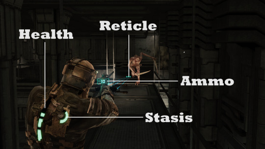
Other things such as an in-game store also have the same holographic style as the character's HUD elements - again showing how well-themed the game is as a whole.
Having a HUD in a 3D game be placed in the world rather than on screen is a nice contrast to the usual HUDs we see in video games, and is something I would consider in future 3D projects.

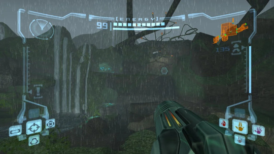
Metroid Prime
Metroid Prime is a 2002 3D action-adventure shooter game. It's HUD is similar to your usual shooter with player stats, ammo stats and the map are displayed on screen. However, one thing that stands out from this game is how the HUD is placed on the character's visor.
By placing the HUD on a visor, it increases the player's sense of connection and presence to the game as a whole. As well as just placing the HUD on the character, it also realistically jiggles and steams up as you would expect any real-life visor to - again adding to the level of presence.
The HUD can also have an impact on the gameplay. Players must occasionally 'reboot' their HUD such as when drones can shut down the player's armour. When this happens the player has no access to the interface - meaning you can't see valuable information.
It also has a similar theme to Dead Space with the light-blue holographic approach, but the visor HUD helps make this game's playstyle feel more unique.
0 notes
Text
HUD Test - Quick exercise
The task here was to position different HUD elements around this image to where we think they would be most suitable. The elements were a map, level name, HP and ammo counter, D-pad menu and magic meter.
Cognitive load refers to the amount of information the human memory can hold at one time. This plays an important part in HUD elements as you don't want to have too much junk cluttering up the screen. To prevent this, I decided to group things into categories to make the HUD look more organised. This will also help prevent the player's attention being diverted by having to look all over the screen. For starters I put the map and level name together in the top right corner. I chose this corner because games I'm used to like Fortnite have their map in this place.
I put the HP counter right above the character as the HP has a direct link to the character - it's responsible for its life. So I felt like it would be fitting to have the HP display move around with the player.
The magic and ammo count are pretty similar as they both are important stats for the character, but not as important as health so I don't feel like they should lock position with the player like the HP bar does.
The D-pad menu is just some informative stuff which helps guide the player through the level so placing it in the bottom middle of the screen seems like a sensible place. I chose here rather than the corner because there's already a map in one corner and I don't want too much UI to clog up the corners of the screen.

0 notes
Text
Asset creation - Multiplier pt. 2
How to display information
I want the duration of the multiplier to be displayed to the player so they can easily see how long it is going to last for. I had the choice of doing this either by progress bar or text. I went with a progress bar as I feel like it would be more visually appealing than some text counting down.
Widget bindings
I first binded the progress bar's progress to the multiplier duration by casting to the character, getting the value of the duration and dividing this by 8.

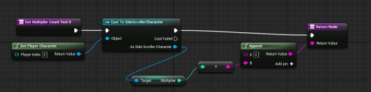
To make it more clear that the bar is for a multiplier, I decided that it would be a good idea to display the multiplier count within this bar. I created some text and used my Happy Bomb font to display this. For its binding, I appended an 'x' with the value of 'Multiplier'.
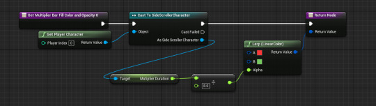
I also bound the color of the progress bar so that it would go from green to red. I did this by using a LinearColor lerp and using (Multiplier duration/8) as the alpha as this will always be between 0 and 1. This will let the bar smoothly change colour as the value of duration updates every tick.
One more thing I decided to do to improve the quality of this widget was only display the multiplier bar and count if the player actually had a multiplier. By doing this, it stops an empty bar being shown on screen whenever the player doesn't have an active multiplier.
I bound the visibilty of the progress bar. Visibilty is determined using an Enumerator value with some options, but 'Visible' and 'Hidden' are the only ones I will worry about for now. I casted to the character and checked if the value of 'Multiplier' was greater than 1. I then used this Boolean output with a select node to either hide or show the bar. I also applied this binding to the multiplier text.

Multiplier animation
I also added a simple pulsing animation to the progress bar. I created a new animation and tracks for the multiplier text and progress bar and used a transform track to change the scale. To express the fact that this bar is for the multiplier even further, I made the multiplier text grow more than the bar (1.5x rather than 1.15x).
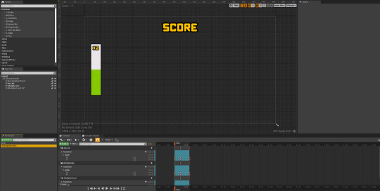
To play the animation, in the multiplier blueprint I got a copy of the HUD widget by using a 'Get all widgets of class' node and then just played the animation.

Result
Here is what this looks like in game, in the recording you can see how the animation plays once a multiplier has been collected, and the score gain changes in relation to the current multiplier.
Edit: Randomizing multiplier spawns
I also wanted to randomize the chances and positions of the multipliers throughout the level. To do this I opened up my parent chunk blueprint and got a Begin Play event. I used a 'Spawn actor from class' node to spawn the multiplier.
To randomize the location of the multiplier within the chunk, I took the world location of the default scene root, the center of the chunk, and used a '+ vector' node to move it to a random place in the chunk.
I also used a random bool with weight to only spawn a multiplier in a chunk 40% of the time.

0 notes
Text
Asset creation - Multiplier pt. 1
The concept
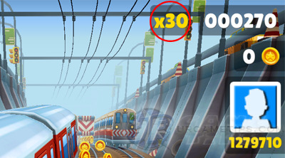
A multiplier would be a great way to diversify the way the player gains score. I like the way Subway Surfers do this - the multiplier is displayed in a text colour similar to the colour of the coins and is displayed as 'x(n)'. The mutliplier doesn't just stop at x2 either, it can stack up to much more if you find enough of them.
I think I will do something like this - the multipliers will be able to be stacked, and they will be temporary. I would display the duration of the multiplier on a widget.
Design
For the design, I wanted to keep it very simplistic while being obvious enough so that the player can easily tell what it is. So I used Maya's text mesh tool to create some text that displays 'x2', which should make it clear to the player that this is a multiplier.
I then surrounded this text in a sphere. To make sure the text was lined up in the middle of the sphere, I used Maya's X-ray tool.

After I imported this into Unreal, I made the outer sphere translucent and added some glow to the text. I also ended up changing the colours because I thought the emissive yellow looked really nice for this power-up. I also added a collision sphere to trigger the power-up.
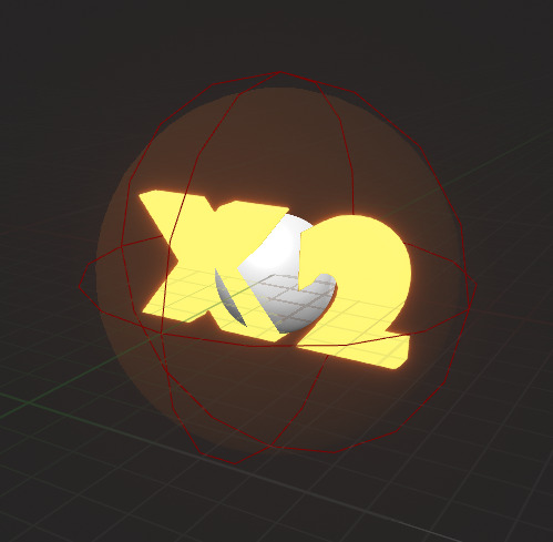
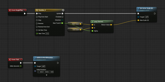
I also added some rotation and growing effects to the mesh so that it appears less static and boring. I did this by adding some Z rotation on tick, as well as a timeline which slightly grows and shrinks the actor's world scale. The vector values which the timeline lerps between are set in the construction script.
Code
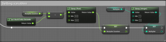
The first thing I did was create two new variables in my character blueprint - Multiplier and Multiplier duration. Multiplier duration will be to record how long the power-up should last. 'Multiplier' will have a default value of 1.
Scale score gain based on multiplier
I had to make my score gaining system scale with the multiplier. In my game, 100 score is gained each time the player jumps. To make this worth with the multiplier I need to multiply the added value by the multiplier. I did this by adding (100*Multiplier) rather than just 100 each jump.

Setting values
On event tick, the value of 'Get World Delta Seconds' will be subtracted from the value of multiplier duration. This will make the variable count down in real time. I also clamped this value between 0 and 8 because I want the multiplier to last no longer than 8 seconds (if player picks up another it will go back up to 8). I also clamped the value of 'Multiplier' on tick between 1 and 5 so that 5x is the maximum possible multiplier.
Applying the multiplier
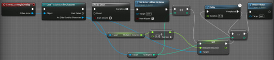
The collision sphere I added in the power-up's viewport will be used to trigger a collision. On actor begin overlap, I cast to the character in order to change the multiplier values. I used a do once node so the same multiplier cant be activated more than once, and I also set it to be hidden in game on overlap.
I used an 'Increment Int' node to increase the value of multiplier by 1, and I added 8 to the duration. After an 8 second delay, I decremented the value of multiplier so it would deactivate and destroyed the actor.
0 notes
Text
Game theory - Feedback loops
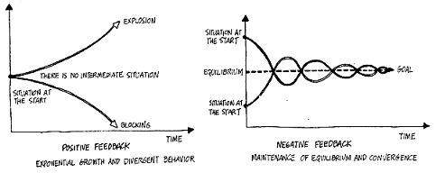
In games, feedback loops can be used to balance out gameplay and they produce outcomes based on actions. Feedback loops are divided into two categories - positive and negative loops.
Positive feedback loops are where growth is exponential and opposite. To put it simply, the winners keep winning and the losers keep losing - so there's not really any point where the two converge. The drawback with these are that losers who keep losing may end up rage-quitting the game.
Negative feedback loops are where there is a maintenance of equilibrium between two situations. Different gameplay mechanics and scenarios can be used to balance out the magnitude of the winners and losers - bad things happen to the winners while good things happen to the losers. The overall aim of these is to end up with a well-balanced goal.
Examples of positive feedback
Monopoly
Monopoly is a good example of a positive feedback loop. Getting more money means that it easier for you to buy more property and building upgrades, but if you end up losing money it's quite hard to work your way back up to gain more property and buildings - meaning you're likely to lose.

Fortnite
If you win a game of Fortnite, you and all your teammates receive a victory crown. While this has no direct impact on the battle royale gameplay, it does give you increased XP in all games for as long as you have it. This XP will then allow you to purchase more cosmetics from the game's battle pass. Another nice cosmetic addition is an emote which the player can use to show off how many games they've won while in possession of a victory crown. All of this is an example of how winners keep getting rewarded.

Examples of negative feedback
Mario Kart
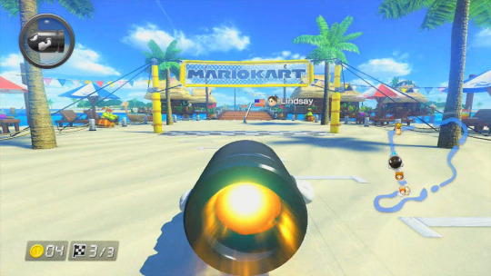
In Mario Kart, the game is greatly balanced out by the items inside item boxes. Items inside these boxes can give you speed boosts, debuffs to other players and much more. However, the loot pool varies due to negative feedback - players in the leading positions generally receive less powerful items such as bananas and the green shell. Players nearer the last positions on the other hand generally receive more powerful items such as the golden mushroom, bullet bill and the blue shell.

Terraria
Some accessories (upgrades which the player can equip) in Terraria only function conditionally. An example of this is the Frozen Turtle Shell - a rare enemy loot drop which reduces damage taken by 25% if the wearer's HP is below 50%. This gives players who are struggling more of a chance by giving them a defense boost to prevent/delay them from dying.


0 notes
Text
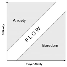
Game theory - Flow state
Flow theory in games in where you compare play ability against the level of challenge. Normally, the only way for a player to increase their skill level in a game is by putting more time into it. As the player becomes more skilled, you can gradually increase the level of challenge in the game to match their skill level.
A state of flow is where you want players to generally be - the level of challenge matches the level of player ability so the player is most immersed in the game as it's fun. On a graph, you'd expect flow to be a straight diagonal line from the origin.
However, on a graph if the player falls below the level of flow, it means the difficulty is too low for their skill level - meaning the game becomes too easy and the player is left bored. If the player ends up above the level of flow, the game is too hard and you risk players rage-quitting your game.
An experience with 'boredom'
For me, something that is too easy would be normal Minecraft. Despite my high playtime in online multiplayer, I've only beaten the normal game once as I find it too easy, repetitive and not really a challenge at all - meaning the idea of playing through it is not appealing. Plus, players have been able to beat the game in a matter of minutes which shows there isn't enough of a challenge increase throughout the game.

An experience with 'frustration'
Electronic Super Joy 2 is a difficult precision platformer where the levels start off difficult, and just get even more difficult. After getting around halfway through the game, the levels ended up taking me around 30-45 minutes each and just became more boring than difficult. As a result, I stopped playing the game regularly.
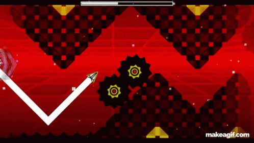
An experience with 'flow'
Whilst Geometry Dash is definitely considered a difficult game, I find that the level of challenge matches my skill level. As a result, I enjoy playing the game for extended periods of time regularly. With the huge variety of levels each different in difficulty, I find that there's always a challenge which isn't too boring nor frustrating.
1 note
·
View note
Text
Game theory - Risk vs reward mechanics
A risk vs reward system is a concept where the player has a risky decision to make in return for some sort of bonus. The reward could be anything such as score, health, game progress or just satisfaction. This sort of thing can help greatly improve the interactivity of a game by making the player feel more in control of what happens. One of the best things about this is by giving the player more control, their experience will be different each time - making it more replayable.
Terraria - The dungeon guardian
In each Terraria would there is a dungeon, but the player must kill the Skeletron boss in order to fully access the dungeon. If the player tries to enter before killing this boss, they will inevitably be greeted by the dungeon guardian who will insta-kill the player on impact. The guardian will spawn after the player goes a little bit into the dungeon.
However, there's a risk vs reward system in this because even the mere entrance of the dungeon can hold strong weapons such as the Water Bolt - a magical book. Therefore the player can risk entering the outskirts of the dungeon in hopes of finding a powerful weapon without traveling too far in to the point where the guardian spawns.
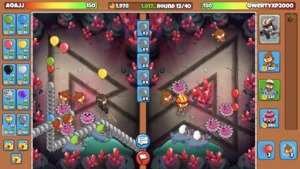
Bloons TD Battles 2 - Eco
In BTD Battles 2, a versus tower defense game, the player gains money in each game by building up economy. Eco is given to the player every 6 seconds and can be increased by sending balloons at your opponent. However, sending balloons costs money and there's a whole variety of balloons you can send.
The risk vs reward mechanic here is that you can increase your eco to permanently gain more money at the expense of immediately spending money on bloons, but in the long run you'll end up with more money. Different boon sends will cost different amounts and give different amounts of eco, and some more powerful bloons can even reduce your eco.
So this whole mechanic is about increasing your eco to gain money and sending different types of bloons to gain eco more quickly or to beat your opponent.

Fortnite - Hot drop locations
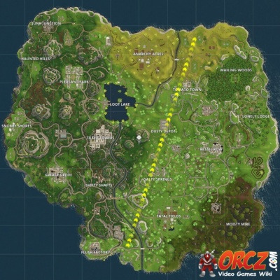
In Fortnite the battle bus flies across the entire map in a random direction from a random point, and players jump out and land at any location they chose. Hot drops are locations close to the battle bus' path - where more players will land as they want to drop and get into action more quickly, tilted towers is a known hot drop location regardless of the bus route.
This mechanic is about choosing if you want to land somewhere chaotic or peaceful. Do you want to risk dying sooner by landing at a hot drop, with the potential reward of getting much more loot and kills? Or do you want to land somewhere peaceful with less loot, and initially get less kills?
0 notes