
Don't wanna be here? Send us removal request.
Statistics
We looked inside some of the posts by olivermongervisualthinking and here's what we found interesting.
Average Info
Notes Per Post
1
Likes Per Post
1
Reblog Per Post
0
Reply Per Post
0
Time Between Posts
12 hours
Number of Posts By Type
Text
5
Video
1
Photo
11
Last Seen Tumblr Blogs


Fun Fact
Tumblr has a 66 index score for customer satisfaction in the US.
Text
Final
Overall this project was very successful, I am proud of everything that I have achieved over the projects run time. I believe that I have learnt a lot this project and I am looking forward to seeing how I can apply this knowledge into later units.
I was able to get everything I wanted done this project. I believe that I have improved from the first unit.
0 notes
Text
Final PDF Hand-in
For my final hand in pdf I had to take pictures of my packaging on a plain background. I laid these out on the pdf with some annotations just to better explain some things. I had also written an evaluation where I explained:
What informed and motivated my design decisions? (e.g. the breadth of my research)
What changes and developments has my project gone through?
Did I manage my time well throughout the unit?
How did I respond to feedback?
Are there areas of my design process that need more practice?
What have I learnt from this unit of study? (e.g. skills, theoretical knowledge, etc)
On reflection, are there any improvements that I would make to my final outcome?
These points helped guide my evaluation. I also had to add my Tumblr link into it I was able to add it as a hyperlink thus allowing easy access to my Tumblr.
After completion I extracted it as a PDF and improved the resolution so the images look better.
0 notes
Text
Bibliography
Below I have placed my bibliography which has been formatted within the Harvard format which is the requirement for it. Here shows the Videos, Websites and Books that I have used throughout this project.
Formatting these shows that I have explored a range of sources throughout the project in order to get a range of information.
0 notes
Text
Bibliography
Reference list
Websites:
a Fork, S. on (2021). Spanish Couscous with Aromatic Vegetables | Couscous de Ceuta Recipe. [online] Spain on a Fork. Available at: https://spainonafork.com/spanish-couscous-with-aromatic-vegetables-couscous-de-ceuta-recipe/ [Accessed 13 Feb. 2022].
barcode.tec-it.com. (n.d.). Free Online Barcode Generator: Code-11. [online] Available at: https://barcode.tec-it.com/en/Code11?data=5054070638149 [Accessed 8 Feb. 2022].
barkingside01 (2013). VW BEETLE: “THINK SMALL.” [online] theadvertisingreviewblog. Available at: https://theadvertisingreviewblog.wordpress.com/2013/06/11/vw-beetle-think-small/ [Accessed 7 Feb. 2022].
Caesar (n.d.). Pantone. [online] Pantone LLC. Available at: https://www.pantone.com/uk/en/ [Accessed 13 Feb. 2022].
Chitnis, C. (2020). Patterns of India: A Journey Through Colors, Textiles, and the Vibrancy of Rajasthan. [online] Amazon. Clarkson Potter. Available at: https://www.amazon.co.uk/dp/B07SSQ4DX6/ref=dp-kindle-redirect?_encoding=UTF8&btkr=1 [Accessed 15 Feb. 2022].
convertermaniacs.com. (n.d.). Convert 31.4 cm to px (31.4 centimeters to pixels). [online] Available at: https://convertermaniacs.com/centimeter-to-pixel/convert-31.4-cm-to-px.html [Accessed 31 Jan. 2022].
Dezeen. (n.d.). Aesop. [online] Available at: https://www.dezeen.com/tag/aesop/ [Accessed 10 Feb. 2022].
Ela Vegan (2019). Easy Red Lentil Dahl Recipe (Masoor Dal). [online] Elavegan | Recipes. Available at: https://elavegan.com/red-lentil-dahl/ [Accessed 22 Feb. 2022].
Emilija (2021). Cocoraw Chocolate Packaging Concept Design - Snacks & Desserts. [online] Package Inspiration. Available at: https://packageinspiration.com/cocoraw-chocolate-packaging-concept-design/ [Accessed 30 Jan. 2022].
Freepik. (n.d.). Freepik | Graphic Resources for everyone. [online] Available at: https://www.freepik.com [Accessed 10 Mar. 2022].
G.F Smith. (n.d.). Our Papers. [online] Available at: https://gfsmith.com/our-papers [Accessed 27 Jan. 2022].
maekan. (n.d.). Type-of-Graphic — Chris Ashworth’s Swiss Grit. [online] Available at: https://maekan.com/story/type-of-graphic-chris-ashworths-swiss-grit/ [Accessed 16 Feb. 2022].
mlk.global. (n.d.). About - Creative agency Moloko. [online] Available at: https://mlk.global/about/ [Accessed 31 Jan. 2022].
Monster Children. (2020). Under the (Ray) Gun: Chris Ashworth. [online] Available at: https://www.monsterchildren.com/under-the-ray-gun-chris-ashworth/ [Accessed 14 Feb. 2022].
Neasden Control Centre. (n.d.). Neasden Control Centre. [online] Available at: https://www.neasdencontrolcentre.com [Accessed 24 Feb. 2022].
Packageall.com. (n.d.). What are the benefits of cartons? [online] Available at: https://www.packageall.com/support/what-are-the-benefits-of-cartons [Accessed 7 Feb. 2022].
Package Inspiration. (2021). Heinz CHILLI SAUCE - Sauces & Oil. [online] Available at: https://packageinspiration.com/heinz-chilli-sauce/ [Accessed 31 Jan. 2022].
Package Inspiration. (2022). Idemitsu Towers - Cafe & Shops, Food & Gourmet. [online] Available at: https://packageinspiration.com/idemitsu-towers/ [Accessed 31 Jan. 2022].
Package Inspiration. (n.d.). Package Inspiration - Daily Inspiration. [online] Available at: https://packageinspiration.com [Accessed 29 Jan. 2022].
Pantone (n.d.). Pantone Color of the Year 2022 / Introduction. [online] Pantone LLC. Available at: https://www.pantone.com/uk/en/color-of-the-year-2022 [Accessed 13 Feb. 2022].
Roberta (2020). Sumo Citrus - Food & Gourmet. [online] Package Inspiration. Available at: https://packageinspiration.com/sumo-citrus/ [Accessed 31 Jan. 2022].
TechnologyHQ - All about Technology, AI, blockchain, Cybersecurity, Business. (2021). The Advantages of Carton Packages - TechnologyHQ. [online] Available at: https://www.technologyhq.org/the-advantages-of-carton-packages/ [Accessed 7 Feb. 2022].
The Design Files | Australia’s most popular design blog. (2019). Beatrice Preston Zly, Product Packaging Designer at Aēsop. [online] Available at: https://thedesignfiles.net/2019/12/dreamjob-aesop-packaging-designer/ [Accessed 8 Feb. 2022].
Twitter. (n.d.). https://twitter.com/clearchanneluk/status/743764499598020608. [online] Available at: https://twitter.com/clearchanneluk/status/743764499598020608?lang=hr [Accessed 7 Mar. 2022].
Wikipedia Contributors (2019a). Lentil. [online] Wikipedia. Available at: https://en.wikipedia.org/wiki/Lentil [Accessed 6 Feb. 2022].
Wikipedia Contributors (2019b). Quinoa. [online] Wikipedia. Available at: https://en.wikipedia.org/wiki/Quinoa [Accessed 6 Feb. 2022].
Wikipedia. (2021). Chris Ashworth (artist). [online] Available at: https://en.wikipedia.org/wiki/Chris_Ashworth_(artist) [Accessed 23 Feb. 2022].
Wikipedia. (2022a). Couscous. [online] Available at: https://en.wikipedia.org/wiki/Couscous [Accessed 6 Feb. 2022].
Wikipedia. (2022b). Dorset Cereals. [online] Available at: https://en.wikipedia.org/wiki/Dorset_Cereals [Accessed 7 Feb. 2022].
World, G.D. (2019). Adshel Live, the UK’s largest digital Out of Home network, celebrates the installation of its 2000th screen. [online] Graphic Display World. Available at: https://www.graphicdisplayworld.com/categories/the-digital-world/adshel-live-the-uk-s-largest-digital-out-of-home-network-celebrates-the-installation-of-its-2000th-screen [Accessed 6 Mar. 2022].
www.clearchannel.co.uk. (n.d.). Outdoor Advertising Mockup templates | Clear Channel UK. [online] Available at: https://www.clearchannel.co.uk/resources/mockup-templates [Accessed 10 Mar. 2022].
www.templatemaker.nl. (n.d.). MILK CARTON template. [online] Available at: https://www.templatemaker.nl/en/milkcarton/ [Accessed 21 Feb. 2022].
www.three.co.uk. (n.d.). Three | Phones, Broadband & SIM Only deals. [online] Available at: https://www.three.co.uk [Accessed 6 Mar. 2022].
www.woodlandstudio.be. (n.d.). Woodland Stories. [online] Available at: https://www.woodlandstudio.be/journal-28.html [Accessed 16 Feb. 2022].
Videos
4, C. (2017). Channel 4 | Idents. YouTube. Available at: https://www.youtube.com/watch?v=2Ei_XdwSghQ [Accessed 15 Feb. 2022].
a Fork, S. on (2021). The BEST Couscous you will EVER Taste | Spanish Couscous Recipe. [online] www.youtube.com. Available at: https://www.youtube.com/watch?v=EsinRf3nMU8 [Accessed 15 Feb. 2022].
Geek, T.D. (2017). 3 Healthy One Skillet Quinoa Recipes | Dinner Made Easy. [online] www.youtube.com. Available at: https://www.youtube.com/watch?v=WNTil0HbWmc [Accessed 15 Feb. 2022].
Vegan, E. (2020). Easy Red Lentil Dahl | Masoor Dal Recipe (Vegan Curry). [online] www.youtube.com. Available at: https://www.youtube.com/watch?v=Q6Cvv9ZZZbM [Accessed 15 Feb. 2022].
Visual Communication, A. (2021). After Effects 04 - Animated Poster. [online] www.youtube.com. Available at: https://www.youtube.com/watch?v=1vH8z1Pn3Aw [Accessed 12 Feb. 2022].
WITM7 (2011). Channel 4 HD Station Idents. [online] www.youtube.com. Available at: https://www.youtube.com/watch?v=6ADI1_4W-_A [Accessed 15 Feb. 2022].
Books
Fletcher, A. (2001). The art of looking sideways. London ; New York: Phaidon.
Leborg, C. (2006). Visual grammar. New York: Princeton Architectural Press.
0 notes
Video
tumblr
Final Animation
Here I have displayed my final animation. I am incredibly happy with the outcome of this task believing that I have created a strong animation that is successful in selling my product. Using the feedback from my flatmates as reinforcement.
I created this animation using Adobe After Effects, Where I was able to import in my design elements to place within the scene. When opening the scene I set the size to 1080 x 1920 and set the time to 10 seconds as that is the maximum length that the adshel animation could be however I had no intention in making it that long. In the end the animation got to 8 seconds which drew pretty close to the limit that was set.
The animation as a whole took me a day to create, revise, develop and complete this process really helped me see some issues with the animation within the first draft and giving my self time to revise on the animation and think about what could be changed to improve it allowed me to create a successful animation.
For the animation I wanted to take the approach that would allow it to be similar to the poster and be recognised as its ‘Partner’ this is why I have used the layout from the poster within this. This is the same case for the typeface using DIN within its Black form to make it a lot more bold and stand out. For the animation part of it I made the type drop from the ‘sky’ into frame - this was done to compliment the type as doing something like having it fade in would be too self to the type to work. I think that this is the better look for it. I made it so each line would fall down separate until the image of my packaging and the logo comes down together. The type and image then move across out of the frame when each individual package comes into frame with the accompanying name being placed under the logo. When they come into frame and hit the centre they stop for a moment allowing the viewer to see and understand the product. Lastly a white rectangle covers the screen having the logo and image of the packages appear one last time before disappearing allowing it to loop site nicely.
Once the animation was complete the addition of sound was required this initially led me in search for some sounds that I could use within my animation googling until I found a collection of sounds by Adobe that were free to download and use. The ones I got where ‘Impacts’ and ‘Cartoon’ using these sounds I believe that I have created a successful advertisement and I am very happy with it.
When creating I ran into some issues the most notable being that when the individual packaging appeared it would leave really quickly not giving the viewer any time to react and look at the product. I was able to fix this by adding an additional key frame to the position allowing it to stay in place for a longer amount of time. This drastically improved the animation and I am glad I took the time to improve it.
Overall I am very happy with the outcome of this task I believe it to be very successful.
0 notes
Photo

Animation Storyboard
I have created a quick sketch of a story board that I have done in order to express a design idea I had for the Motion graphic. Doing this helps me manage the time of the animation as it has to be between 5 - 10 seconds so checking this with the story boards helps and lets me remove some parts or add towards it. I do have some other ideas with how it can progress but these ideas are quite hard to put down in words so I will be trying them when designing.
0 notes
Photo


Adshel Mock-up in Context
Using the website Clear Channel (which is one of the UK’s leading Out of Home media owners.With over 33,000 outdoor advertising sites nationwide) I was able to find a mockup to place my adshel poster within context. This was actually much harder to do then expecting as I couldn’t find a mockup that would actually download without needing me to pay for it or sign up to their website.
After clicking onto the smart object and opening it up onto another window I was able to delete what was placed and put my final poster design in. I then applied onto the design ‘Inner Shadow’, ‘Colour Overlay’ which made the poster look and feel like it was actually there to make this a little more believable I changed the Hue/Saturation making the image darker fitting the mood of the image.
For the second mock up I used the same process without changing the Hue/Saturation as the colour correction was already pretty good.
I am happy with these mockups that I have created using Adobe Photoshop they allow my design to be seen within the wanted context and look like a professional advertisement.
0 notes
Photo

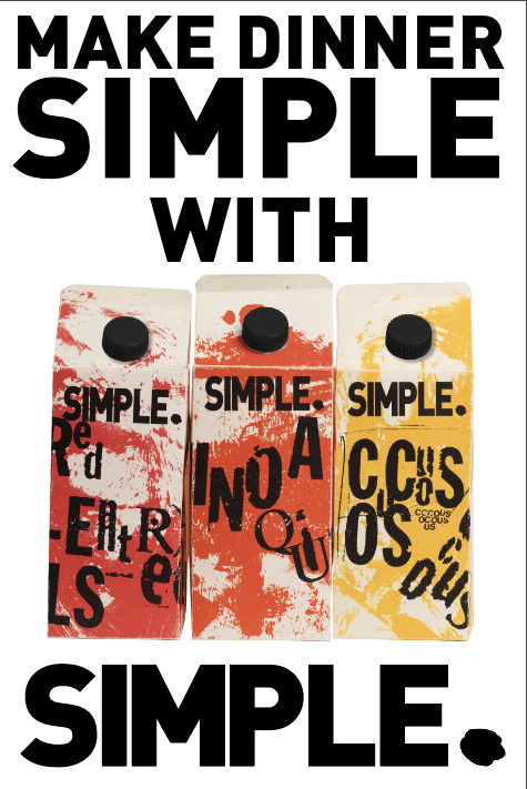
Adshel Poster Final
This is the final rendition of the adshel poster for my packaging. After speaking with people who fall within my target audience and asking them which of the three variations of this poster is the most effective in their eyes. This was the one the majority chose. I do agree with this also after taking some time to think about them.
For the adshel poster I wanted to contrast the grungy in your face packaging design by using a minimalist approach and I think it works well in allowing the design to stand out whilst still allowing the type to do its job.
I went for the DIN typeface in the BLACK form to keep it consistent with the packaging design. I have aligned the type centred so the eye flow is better used. Inspired by the name of the brand ‘SIMPLE.’ I used a minimalist design style and its very effective.
Within the development I moved the image of my packaging to be more centred on the poster design and reduced the size of the type so I could expand the packaging image, as it is the main focus of the adshel poster this made it more successful.
I am quite happy with the outcome of this. I believe that I have put In a lot of effort for this poster and its shown with the development of it and how successful the poster is.
0 notes
Photo


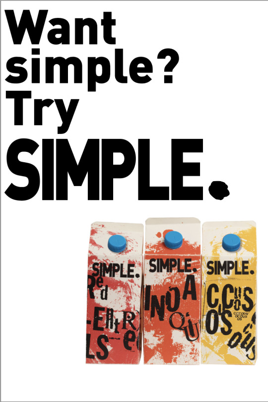
Final Design Visuals
Here are the three final design developments for my poster design using the feedback that I had received from my tutor and peers within the pin up critique. I believe that each of these designs works well and I am having a hard time choosing which design that I will choose to hand in. As my target audience is centred towards students I will ask about which design here works the best to grab their attention.
Developing my design within 3 ways shows that my design is quite vertical and able to work within a range of layouts.
The main thing that was changed was the lid of the packaging from the blue - which didn't work within the colour palette and stood out too much within the design.
Overall I am happy with these designs and I am quite looking forward to seeing what one my flatmates find the most appealing.
0 notes
Text
Crit for Posters
Within my Crit for the adshel poster that I have created I was informed how to develop my design further. The thing I need to think about first is the type and trying to sort it out to make it look stronger and more consistent. The layout was also mentioned as tweaking that could heavily improve the design. I should also possibly remove some elements of the design notably ‘Red Lentils Quinoa Couscous’. Lastly make the product stand out more on the design.
Due to the setting I forget to take down notes but I am righting this not long after so I remember what was said.
0 notes
Photo

Posters Printed for Crit
I have printed off my posters for the crit that I have for them. As I created these posters all together on a InDesign file when printing it off they all were printed. In order to get the posters at an a2 size I used a technique called tile printing. This was something that I could do using Adobe Acrobat within the printing settings. This printed two halfs of the poster design so doing a bit of cutting and sticking I can form the full poster at the correct size. Out of these four I have to pick one of them to present and after some thought I am going to present the one on the bottom right as I feel it has gone through the most development and I can see how it’ll flow.
0 notes
Photo


Poster Design Digital Visuals 2
Here are some other visuals for my adshel poster. These were done using Adobe Illustrator at the required size of 372mm x 558mm. The correct proportions for an adshel working at a reduced size. Using my thumbnails I was able to develop the designs within a digital form. Using the DIN typeface in the BLACK form to match the typefaces used within my design. Most of the designs use only capitals to keep the type tall much like the packaging. Also by keeping the type black and the background white it allows the product to stand out so much more whilst also relating to the design. This design aspect relates to the packagings name whilst contrasting the grungy messy design of the packaging.
0 notes
Photo

Test Print
As looking at the poster on screen really doesn't allow you to see how the design really works I printed off the design onto A3 paper. Doing this allowed me to see how it could possibly be seen within context and think about the sizing of the type that I am using.
I am quite happy with the look of the type and the layout of the design. However I think that the inclusion of some other elements is definitely needed in order to work.
This test print is without the product on the page as this was designed before the photographs were taken.
Making the type smaller and allowing that to work in space for another word will improve the design.
I am happy that I took the time to do this as it helped the development of my idea quite a bit.
0 notes
Photo

Final Design Analysis
Here is my final packaging design. I am very happy with this outcome. I believe that I have successfully created a strong design for Pulses and Grains. Using my contextual research into the product and my research into artists and brands I have designed a packaging for Red Lentils, Quinoa and Couscous.
With my design I believe that I have met the briefs requirements with designing a packaging that is individual whilst having aspects of the design that allows it to be connected.
Inspired by Chris Ashworth and his grungy messy approach that he takes with his work I created this design. The way that I apply texture and type was a very important thing that I needed to think about for this design. The type area of this design is mainly my experiments using letraset that I had scanned in and slightly edited to make it clearer. Using Adobe Photoshop and the threshold option to highlight the black further. Then cutting the type from the white background. The placement of this type was also very important as I wanted to make the design look free thus loosely placing it like so. For the texture that is seen within my design, I used paint marks that I did a couple years ago now, that I was able to apply colour too.
Colour and how it was used is something that I experimented with a lot changing what elements had it, after doing this I found that adding colour towards the texture and keeping the type back and white works best for the design. Using photoshop I was able to apply this colour.
The brand logo, which is something that I designed separately then applied to the design, this logo was designed using the typeface DIN in Black. The full stop on it is a silhouette of a Red Lentil.
Overall I am very happy with the outcome of my design. There are definite improvements to be made but within the timeframe and this being my first attempt doing a packaging design.
1 note
·
View note
Photo


Photo of my packaging
Today I was able to get my packaging’s photos taken within a professional setting allowing me to get a collection of clean photographs. This is a difference from last project as I had to take my final photos of my product in my kitchen so they really didn't turn out great but it was the best I could do with the time and restraints that we had.
However this time wasn't all great either as I was unable to get three bottle lids for my product and just had the one meaning I had to photoshop my photos in order to apply it to the other images. I was unable to get the caps as the one I used I got off a product from the shop and after purchasing the paper I was unable to spend the money to get 2 more of said product for the packaging in time. I will try to see if I am able to get them in time for the final hand in of my products.
Another thing is for an unknown reason the settings for the camera had changed randomly midway through the shoot thus making it so some images had a really high exposure making it really blend in with the background. I was able to retake some of the images but a lot of the images for the ‘Quinoa’ packaging had to be edited on photoshop.
Other than that I am very happy with the outcome of this photoshoot. Next project I do want to think about these elements more before doing the shoot so I am ready and can come out with no issues.
0 notes
Photo

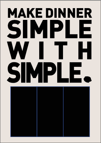
Poster Design Digital Visuals
Here are some digital design visuals for the poster. This is one design with two variations. The design definitely needs some development and I will be receiving that feedback soon at the tutorial. I have used black rectangles as the replacement of my packaging as I still need to print put together and photograph my designs. Once I have done that I can apply it towards my design.
I will possibly do some other designs to see what works best once I have all the elements for it.
0 notes
Photo


Poster Design Thumbnails
Here are some thumbnails that I have created for the Adshel poster. These posters. These designs were inspired by the posters that I analysed previously. I am happy with the outcomes of these posters thumbnails and I think that I have generated a good range of ideas that I could do for the design. For the font I am thinking of using DIN in order to match my design. and using photos that I took of my product.
I have drawn of the the posters up bigger as I liked that one the most out of all of them. I think after doing this that this design is the one I am going to develop and use within my animation.
0 notes