
Don't wanna be here? Send us removal request.
Statistics
We looked inside some of the posts by olivermviscomincontext2 and here's what we found interesting.
Average Info
Notes Per Post
0
Likes Per Post
0
Reblog Per Post
0
Reply Per Post
0
Time Between Posts
1 day
Number of Posts By Type
Text
8
Photo
9
Last Seen Tumblr Blogs


Fun Fact
Tumblr Inc. is funded by 13 investors.
Text
Final Thoughts
Overall this unit did not go great for me, it started off strong with the Why project and went down from there with an up with the Type Project.
A lot went wrong this unit, but mistakes happen and I will learn from them and hopefully not cause them again.
I will definitely improve the next unit and create work I can be proud of throughout the whole unit.
I am glad that I ran into these problems and learned from them now rather than later.
0 notes
Photo


Process Book Final
I was able to get my process book created physically and the process went well. The outcome was messed up with the margins being too small thus the type is very close to the edge. I am pretty upset with this happening however something was bound to go wrong. I am able to learn from my mistakes here and make sure this doesn't happen next time.
Despite the margins being too small I think everything else came out good. I really like the cover the black printed on black card came out very nice giving the glossy effect that I was looking for.
Once again I am very unhappy with the margins cutting off the type but next time I make sure not to push it as far as I did.
0 notes
Text
Final Evaluation
The Visual Communication in Context 2 Unit was made up of 4 different but related projects, these projects allowed me to develop my design skills and knowledge whilst giving me a range of outcomes to create. These projects being Why, Collection = Interpretation, Intervention + Interpretation and 15-Minute City offered very different outcomes thus allowing me to grow as a designer by looking into the different aspects of design. The first project ‘Why’ had us thinking up a Why? Question which we then answered that question within an outcome of our choosing. The second ‘Collection = Interpretation’ was a group project that required us to go out and gather specific data of our choosing and display this data within a collection of posters. The third Intervention + Interpretation was to create letterforms for each of the letters in the word ‘adhesion’ and to use this to create assets for Instagram and a poster – along with this we were assigned a letter, mine being ‘Y’, to do for the 36 Days of Type design trend. The fourth and final project for this unit 15-Minute City we needed to create a visual identity for a brand or service that would be found within a 15-Minute City.
Why was the first project back in the second year of university, this worried me a little as the project was heavily focused on our individual creativity as be pretty much do whatever we can think of, I thought that I would really struggle with this due to just getting back into doing the work however I found this project to be really enjoyable. The time constraint of a week was very bearable, and it allowed me to work quick and get a strong outcome that I am very happy with. My why question was Why can’t I be Prime minister of the UK? I looked towards American political campaign websites for inspiration and using Adobe XD I created a wire frame of a website. This website was built like a campaigning website where I parodied different aspects that would be seen by politicians. Also, within this website I compared myself to three previous PMs Boris Johnson, Liz Truss and David Cameron pointing out bad things that they have done and saying how I could do better. Overall, I am happy with this one-week project I believe that I created very strong work despite having a limited time.
Collection = Interpretation is a project that I did not enjoy, I found the group aspect of the project to be okay and I think that my group and I worked well together. I don’t think that designing for data is really what I am interested in, I struggled to think of good ideas / layouts for the poster which dampened the entire project with me. In the end I really didn’t like the outcomes that we had created so a suggested changing it, this change was absolutely needed as it was lacking massively but even then, I wasn’t impressed with the design. After the project had finished, we came back to it whenever we had the free time to improve it which I think we did in the end. I really didn’t enjoy this project but going through it I was able to develop my skills and learn what designing for data really is.
Intervention + Interpretation was such a great project I enjoyed every aspect of it, even though I did find it tricky working with the Glyphs software as it was the first time I had created with it going through that to have my own typeface is very rewarding. Most of my time I had put into Glyphs as I tried to create my letter forms within Adobe Illustrator first but that was very frustrating, I struggled with the thinner parts of my letter form. For the project I decided on creating a serif typeface as I thought it would be interesting to work on the serifs themselves, this made it a little trickier however I am very happy with the outcome and I would love to do something within this nature again.
The Last project for the Unit 15-Minute City was at first a really exciting project as I am very interested in branding and the creation of visual identity, however right at the beginning of the project I got really sick this lasted up until the end of it, which really gave me a very short amount of time to get the project done, this also messed with my motivation for the unit as I was really disappointed with what I had created for the project, even now after implementing the changes to the design I found that since I was unable to put the time in at the beginning of the project it was hard to develop it. This is absolutely the most disappointed I have been with myself within a project. I really did like my idea it’s that I found it hard to get the design correct.
In conclusion this unit was full of ups and downs for me, it’s unfortunate that the downs happened at the end of the unit as it has thrown me off with my process book and the outcomes, but I have full trust that I am able to do this in time of the hand in. I was very luckily able to get an extension on the unit which will support this too. The units ups though were very fun and I enjoyed the time that I had to create them. By next unit I hope that I can recover and put my all into it.
0 notes
Photo


Portfolio Sheets
For my portfolio sheets we had to pick out one of the projects and create a short portfolio explaining the project. I decided on doing my portfolio pages on the Intervention + Interpretation project as that is the project I enjoyed the most and produced the best work.
0 notes
Text
Conclusion to 15 Minute City
This project was really dissapointing to me, at the start with the briefing I was really excited to get this done as I think that creating a visual identity is really interesting. However I got really sick for the intirety of the project which really threw me off. After getting better and presenting what I had done within a very short amount of done I wasn’t happy. Everything that I had created felt like no effort had been put in even though I was working really hard on the project, even with the extension I done feel like I had enough time to develop and create something I could be proud of. I think that this project could’ve been really exciting and fun but unfortunatly for me it was the opposite.
0 notes
Photo


Updated Presentation Sheets
Here I have developed my presentation sheets using the feedback that I received whist presenting the initial draft. This is definitely an improvement, the original one needed to use space better and I think that I have done that here. For the first page I have used a starburst for the background which is often seen within the rubber hose style of design.
As much as it is an improvement I still feel like I could do much better with the presentation sheets I felt the limitations of just the 4 sheets to be a little tricky to apply everything I wanted to add however I think that I have succeeded in this.
With the other pages I tried applying a background to them however it didn't look right, I found the best way to do this whilst still adding interest to the sheets is adding the characters to the sheets.
0 notes
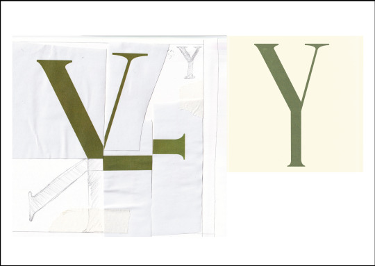
Photo

36 Days Of Type
This is what I am submitting for the 36 days of type part of the project I think that out of the 4 that I had done this one works the best.
I wanted to film my self doing this however I couldn't figure out how to set it up.
I am happy with this as I wanted to take a physical / traditional response to the 36 days of type, especially after looking at their instagram for inspiration and finding that most if not all of it was digital.
0 notes
Photo


36 Days of type
I have explored further with the layout of my 36 days of type to see if I could come up with something better, however I think that my first design looks the best out of these so I will be handing in that one.
I did want to record the process of the design as a time-lapse however I could not figure out how to set this up as an over the table shot.
0 notes
Photo
Notes - 15 Min City Presentation Critique
I presented my 15-Minute City PDF and got feedback on what I showed, this feedback was definitely needed as I was not very happy with the work that I had produced due to being ill the large majority of it was done the day before, I am not happy that I had to do this but now I can use this feedback to progress my project.
0 notes
Photo


Presentation Sheets
These are the presentation sheets that I had created for the critique, I am not very happy with the layout as that is something that needs to be changed before hand in however I believe that I have all the content that I needed in, its just being able to use the space better.
Also the second sheet has too much writing on it and needs to be cut down and reformed.
0 notes
Photo

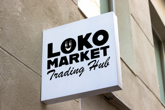


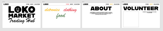
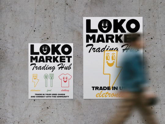
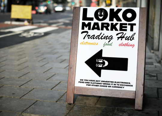
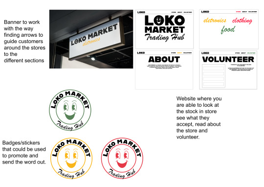
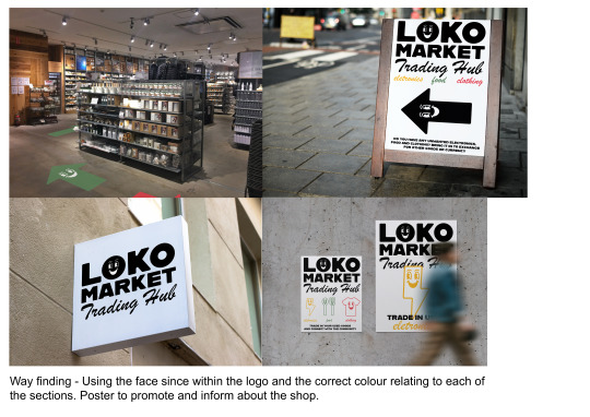
Mockups
Mockups for my designs, showing how they would work in my 15 minute city.
<a href="https://www.freepik.com/free-psd/mock-up-standing-poster_3384938.htm#query=store%20mockup&position=2&from_view=keyword">Image by rawpixel.com</a> on Freepik
<a href="https://www.freepik.com/free-photo/white-t-shirts-with-copy-space-gray-background_15667327.htm#query=t%20shirt%20mockup&position=49&from_view=keyword">Image by rawpixel.com</a> on Freepik
<a href="https://www.freepik.com/free-photo/white-t-shirts-with-copy-space-gray-background_15667327.htm#query=t%20shirt%20mockup&position=49&from_view=keyword">Image by rawpixel.com</a> on Freepik
0 notes
Text
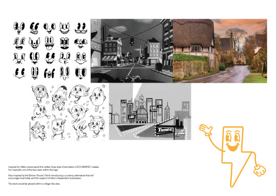
Cartoon References
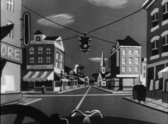


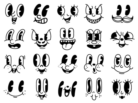
Some images that I have collected to help me with the art direction that I want to go with for the project.
0 notes
Text
England 1950s Illustrations
https://www.advertisingarchives.co.uk/en/page/show_home_page.html


I was asked to look at this type of illustrations after giving my idea and mentioning that I wanted to do vintage illustrations however after looking at these I don't believe that this is something in my skill set, This is far too complicated for me to do and I just don't think that it would fit into the idea that I have for it. I think it would be cool to do a collage of this kind of art however again this doesn't fit into what I wanted to do or the project itself.
0 notes
Text
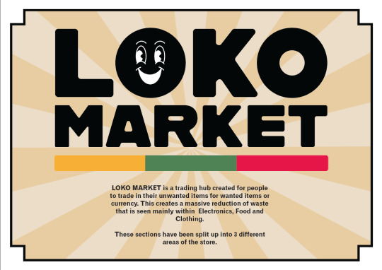
Currency Alternative
Much like the Brixton Pound I think introducing a currency alternative that will encourage local trade and the support of other independent businesses.
This would also allow people who don't want an item in return for trading in their waste to be compensated and able to spend that currency locally.
0 notes
Text
My 15-Minute City
To get a better idea to how I can apply my visual identity I think that defining my 15-Minute City will help guide this part of my project.
For my 15-Minute City I am thinking of applying my brand to fit more in a village like environment but more modernised.
This village is to be created to look aesthetically like it was created in the past 1900s however its a lot more modernised with the types of shops and how the whole city is constructed allowing space for cars and bikes.
0 notes
Photo

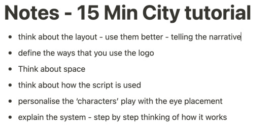
Notes - Tutorial
I had my tutorial on Microsoft Teams due to being very sick at the time, over this call I gave my idea for what I wanted my ‘brand’ to be and showed my tutor and example on the style I wish to use within my design. These are the notes that I had take.
0 notes
Text
Visual Identity Research
HATERK
https://www.behance.net/gallery/147275865/Haterk

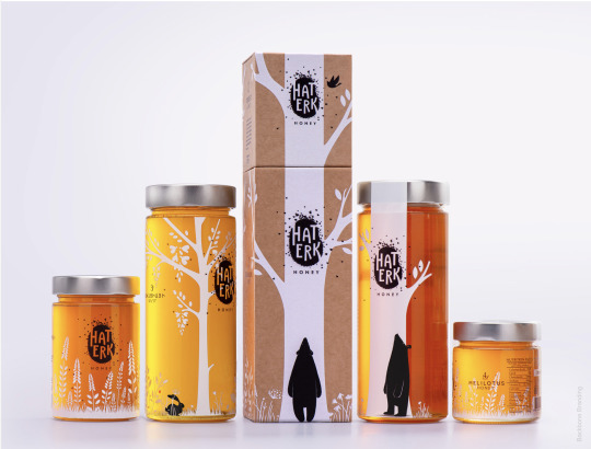

This branding is very pretty, once again using a illustrative style on the packaging and product. I love the look of it.
The black and white being utilised on the brown of the packaging and the yellow of the product works so well, it really adds to the magic of the design. Its very visually pleasing.
The packages (Bigger and Smaller) also can be connected together to create a story which really furthers the visual interest of the design.
Out of all that I have looked at this has interested me the most but its less related in a way.
This visual branding also expands to a range of other products however I thought it would be better to focus down onto this one that interests me the most.
0 notes