
Don't wanna be here? Send us removal request.
Statistics
We looked inside some of the posts by oliviap and here's what we found interesting.
Average Info
Notes Per Post
3
Likes Per Post
2
Reblog Per Post
0
Reply Per Post
1
Time Between Posts
5 days
Number of Posts By Type
Text
17
Last Seen Tumblr Blogs


Fun Fact
There are dozens of funny blogs to kill time on Tumblr.
Text
Reflection
Overall this course as taught me a lot of skills in all three programs. Coming into this course we were asked to rank our skill level in each app. My original rankings were:
Illustrator: 7
Photoshop: 3
InDesign: 0
If I was asked to reevaluate my skills now I would say my Illustrator has changed from a 7 to a 9.5, Photoshop has changed from a 3 to a 6 and InDesign from a 0 to a 7.
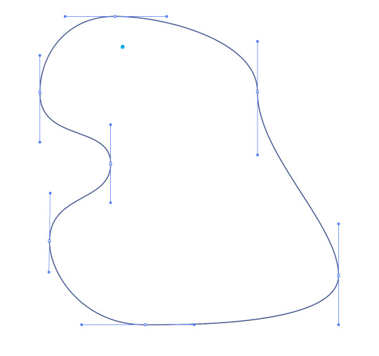
Even at the start of this course, I was already very comfortable with Illustrator as it was the main program I used for design in high school. I was familiar with most of the tools we learnt so that learning was really just developing and mastering them. At the start of the course I bezier lines were frustrating and while I could draw reasonably well with them, I avoided it at all costs. I now really enjoy using the pen tool and bezier lines. I used it in so many of the tasks through out the course and I found every time I got faster and better. One thing I wish I knew in high school was the short cuts for the selection tool (v) and direction selection tool (A). This would have saved me so much time!
I knew very little on Photoshop when we started this course. I had done some drawing and image manipulation in digital technology at high school but that was the extent of my skill. Even now I don't feel I know a huge amount of what Photoshop offers but I'm very comfortable with what I learned in this course. I have used the adjustment tools were learnt outside of class numerous times as it was so simple to understand. I also found selecting and mask images was really fun and easy to pick up. I missed week 5 originally so I had to catch up later so I didn't have the chance to do it before week 6. It was explained to me in class and I found I grasped it pretty easily. I admittedly did forgot some of the stuff I learnt but I was able to refer back to tumblr and it was easy to remember after a quick recap.
Before this course, I had never heard of or used InDesign before. We used InDesign in our graphic design class as well while learning it so this made it way easier to learn as I was using it for around 9 hours a week in classes. I found that InDesign was really easy to use and especially helpful for text layout. The columns tool was really helpful in creating even, balanced layouts in my graphic design class. This also taught me a lot about general text, like a lot of the terminology (e.g. kerning, tracking, leading).
I think the program I found hardest to work with was Photoshop. While I enjoyed fixing the images, I've never had a very good eye for photography so it took me a while to be happy with my results. It was also frustrating how a lot of the commands didn't overlap with Illustrator. In Illustrator you hold down shift to restrict when resizing where as in Photoshop it morphs and manipulates it. This pissed me off quite a lot. But with time this became more natural and I just learnt it and did it without thinking.
If I didn't understand something in class I was able to go back and find the instructions on Moodle or Teams. This really helped me keep up to date and properly process what I was doing. I also used videos on Youtube to help me if I couldn't figure something out. Often they were on older versions of the programs but they were still mostly the same.
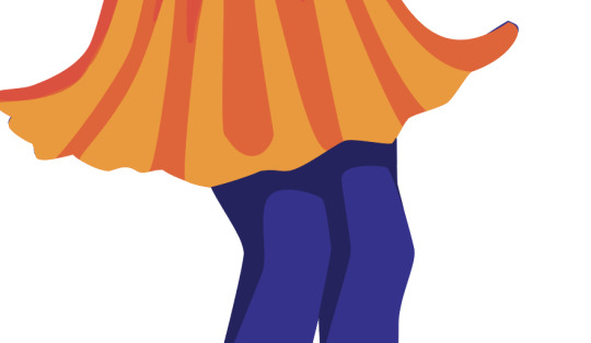
I think my favourite task was the two illustrations we had to make in Illustrator. For my first one I decided to make a bike. I used the pen tool as well as pathfinder to do this. Once I was done, I decided I wanted to add to it as I didn't really find it challenging. I decided to add two parrots to the bike because why not? To challenge myself, I didn't trace them from the reference I just tried my best to make the right shapes and then used the direct selection tool later to edit it after. I really loved my second illustration, I got quite carried away and just kept adding and adding to it. I decided to try recreate my original drawing as a challenge and I wanted to see what I could produce when using Illustrator.
Overall I was pleased with my final booklet project. To be honest I don't think it was the best display of my Illustrator and InDesign skills. I decided to procrastinate this booklet a lot as we had a lot of other projects due at the time. I started the booklet on Wednesday night which in reflection was stupid. I really should have chipped away at it over the days prior so I wouldn't have had to do so much work on Thursday night. But for the time period I did it in I'm pleased. I do like the actual book. I really enjoyed researching all about the different meanings behind common nursery rhymes. I decided to make my book a book for adults rather than children. I kept the cartoonish style of nursery rhyme books but added some much more disturbing imagery.
If I was to repeat this I would have liked to make some more vector images so showcase some more skills but I'm pretty happy. I definitely shouldn't have put it off. I really liked my drawing for 'Ring Around a Rosie'. I'll probably end up adding more detail to it once this course is finished.
0 notes


Text
Mockups
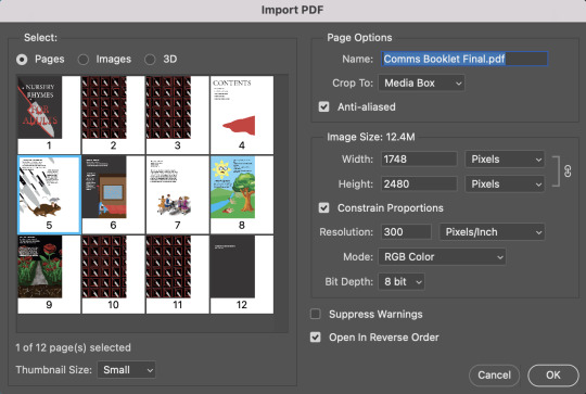
Today we also learnt how to export our booklet and make a mockup book. We first went command + e or file, export to open this page.

We called it whatever we liked (I called mine Comms Booklet Final) and saved it to where we wanted it (For me it was Week 11) and saved it as an Adobe PDF.
This then opened this screen:

We simply clicked export as we are not printing. If we were printing we would need to adjust the margins and bleeds.
We then downloaded two mockup files off photoshop: one being a cover mockup and the other being a spread mockup. This is what the spread mockup looks like.

This document contains two smart objects which are effectively a file in a file. I double clicked on the smart object and this opened up.

I then clicked command + o to open my exported PDF. This box popped up and then I selected what spread I wanted to be shown on the page. I also changed the 'crop to' to media box so that the whole page it selected.
Then this popped up.

I then clicked command + A (select all) and command + c (copy it). I then went back into the mockup file and clicked command + v (paste it). I then clicked command + T to transform and resize it. I then saved it (command + S) and this was the result.
I repeated this for my contents page and covers and this was the result.


I found learning how to create a mock up like this was crazy. The smart objects make it so easy to do this and it only took 10 minutes to do. We learnt that there are heaps of these for other objects on the internet and this is definitely something I'd like to play with again.
0 notes
Text
Booklet: Part 3
Paragraph Styles:
I made four different paragraph styles: one for the title, one for my contents page, one for the black body text and one for the white body text.
For my title I chose the font Minion Pro (Regular). I liked the look of a serif font as I remember it in the nursery book rhymes I read. The font size was 63pt and the leading was 75pt.
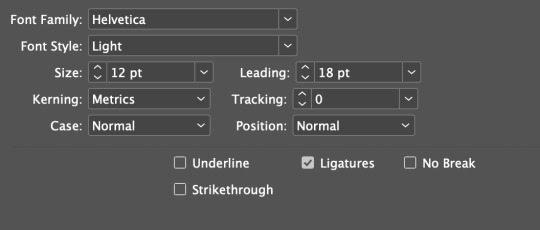
I then made my second paragraph style which was black body text on my contents page. I wanted to give the contents page a bit more space between lines than the other text in the book. I used the font Helvetica Light, font size was 12pt, the leading was 18pt and the space before and after a line was 1mm.

This was the result. I also added a pool of blood at the bottom so it was balanced.

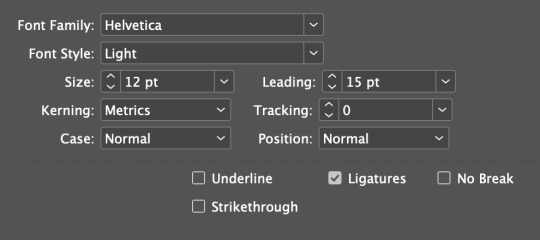
I then made my third paragraph style which was for my main body text. This was almost the exact same as the contents page but I changed the leading to 15pt and the space before to 0mm.
This is the result.
I then made my final paragraph style which was exactly the same as the previous one but instead the text colour was white.
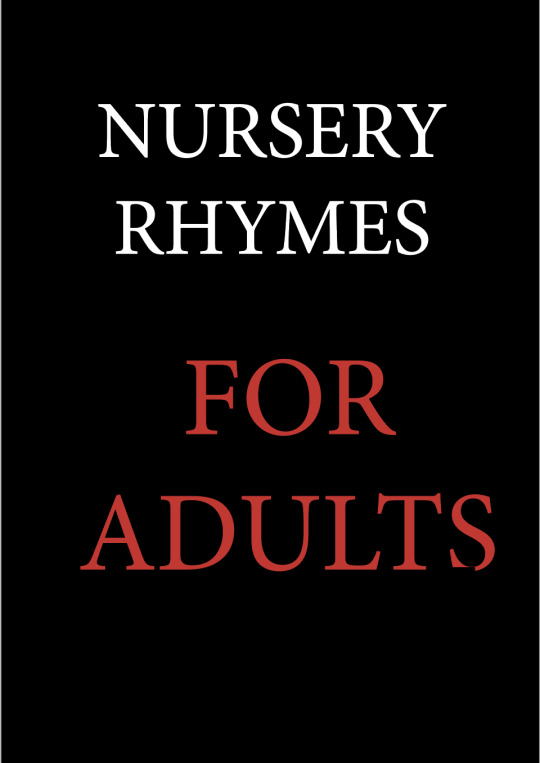
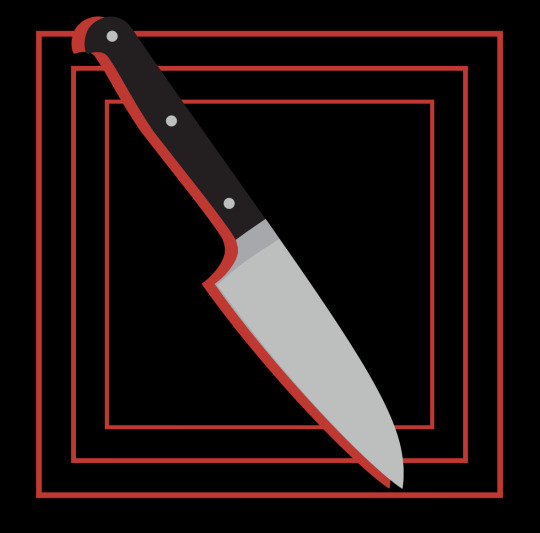
I then made my front cover. I decided on the title "Nursery Rhymes for Adults". I first added a black background and then added by title. I used my title paragraph style but made the 'Nursery Rhyme' white and the 'For Adults' red.
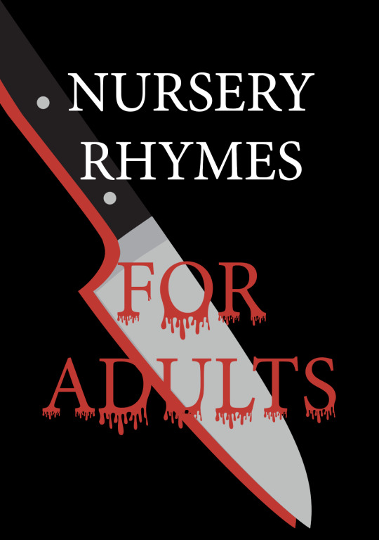
I then added a dripping blood off the bottom of the red text. I made a dripping pattern with the pen tool.


I then added a knife into the back ground. To make it stand out I added a red silhouette behind it.

I then duplicated the FOR ADULTS text and changed the bottom one to black and displaced it slightly to make it stand out.

This was my final cover. I think it shows the themes of the book well. I really like the dripping on the text but I would have liked to add some highlights.
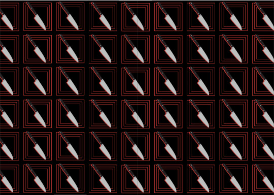
I then made by endpapers. I made a swatch of the knife shape I just made. I placed it on a black background and added three boxes behind it with a red stroke on each one.
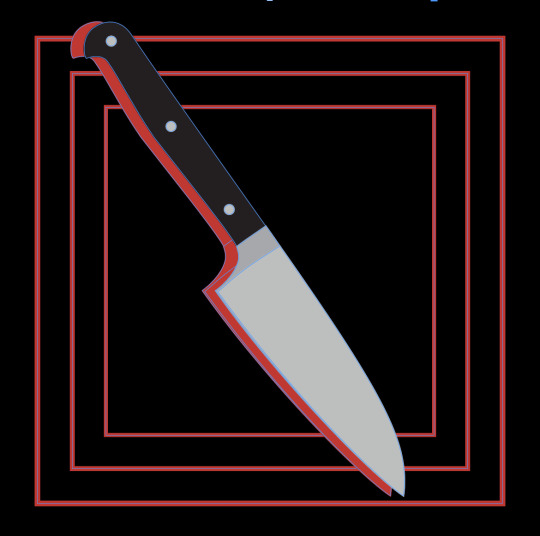
I then dragged this into the swatches palette to make it a swatch and I then put it into a rectangle for my endpapers.
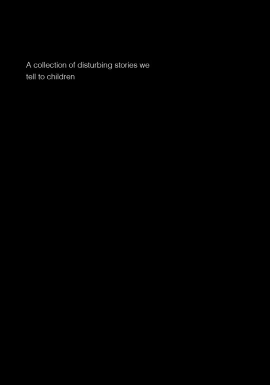
I then made the back cover. I kept it really simple, just giving it a black background and white text saying "A collection of disturbing stories we tell to children".

0 notes
Text
Booklet: Part 2
At this point I had two of my pages completed. I then moved on to Ring Around A Rosie. Ring Around A Rosie is based on the bubonic plague in the 1600s. Each line is referring to a different part of it. The line 'Ring around a rosie' is referring to the itchy rash that came with the sores caused by the plague, 'pocket full of posies' is talking about the flowers which plague doctors carried to lessen the foul smell of the deceased. 'Ashes, ashes' is about the ashes of the fallen relatives and then 'we all fall down!' is quite self explanatory, death!
In a lot of the drawings or images we see of this nursery rhyme we see groups of children twirling around in circles with their hands linked. I decided to recreate this but instead have each figure have something wrong with it. I drew the image on procreate and then exported it as a png into InDesign.


I then added the lyrics and the meaning behind the nursery rhyme.

I then moved on to Rock-a-Bye Baby. Rock-a-Bye Baby is about a baby's cradle falling out of a tree because the window pushes it and the baby dying when hitting the ground.
I started by making the landscape for the background. I used a mixture of the pen tool and rectangle tool. For some reason it keeps saying I am missing a link but the shape is not an image so I am not sure how to fix this but it has not affected the quality so I just left it.

I then made a sun for the sky. I started by making your stereotype typical cartoon sun with the ellipse and triangle tool.

I thought this sun was too cheerful so I decided to add a face to it. I used the ellipse tool to create two big eyes and then the pen tool to create a mouth, tongue and slight shadow.

I then opened Illustrator and made a vector illustration of the tree. This was the component that took the longest to make as it had a lot of layers and colours to make it look good. I used the pen tool to make this.


I then reopened procreate and drew a baby.

I then exported it into InDesign and then duplicated him a few times. I lowered the opacity on the first few so it appeared like he is falling out of the tree. For the baby at the bottom I had the opacity at 100%. I added a pool of blood underneath the baby and gave it Xs for eyes.

I then added the lyrics and a small paragraph about the meaning of the rhyme.

This is my least favourite page I made overall. It's just a bit simple compared to some of the others.
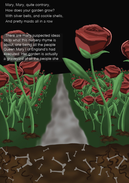
I then moved on to making the final nursery rhyme, Mary Mary Quite Contrary. This rhyme is about Queen Mary I of England as well. There are a few different ideas as to what the rhyme is about but I choose to do the one about all of the executions completed under her rule. In the line "How does your garden grow?" her garden is actually a grave yard of all of the people she had had executed.
I made this image to use as a background.
I then added some the lyrics and meaning on to the page.

Overall I'm pleased with the outcomes of these pages. I really liked how they turned out.
0 notes
Text
Booklet: Part 1
For our final assignment, we were tasked with creating a booklet. The recommended theme was children's nursery rhymes or songs. I decided to take a slightly different approach and create a book for adults featuring 5 nursery rhymes that explains the suspected meaning behind each one.
I first did some research and came up with my five nursery rhymes:
1. Three Blind Mice
2. It's Raining, It's Pouring
3. Ring Around the Rosie
4. Rock-a-Bye Baby
5. Mary Mary Quite Contrary
We also had to design a front and back cover, end papers and a contents page.
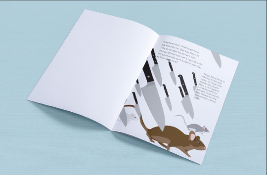
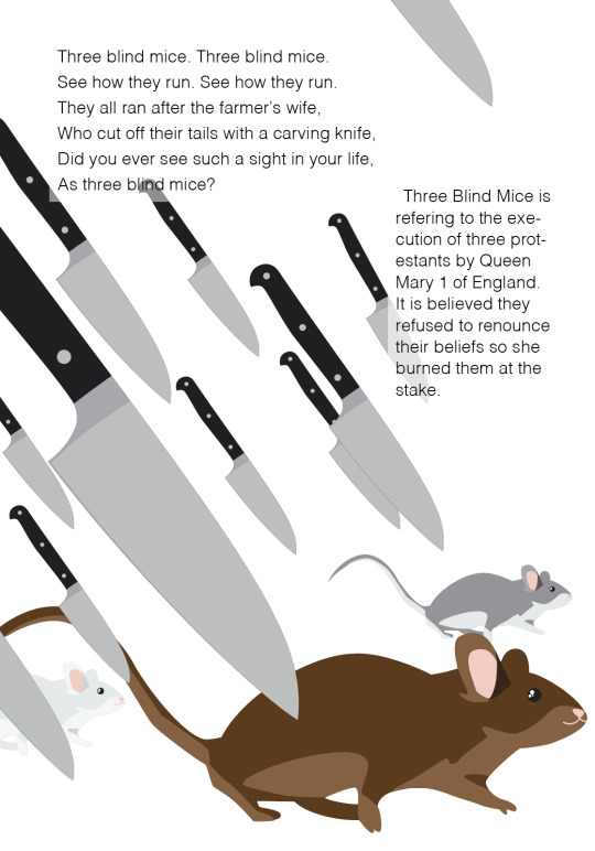
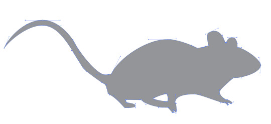
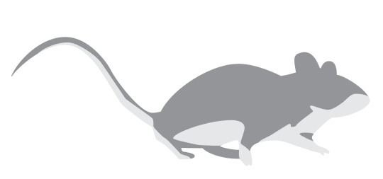
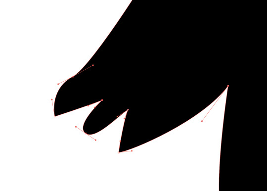
I started by creating a vector illustration for the Three Blind Mice. The Three Blind Mice is based on the blinding and execution of three protestant bishops by Queen Mary I of England.
I found an image of a mouse and made a rough outline of the mouse with the pen tool.

This used an array of anchor points but with all of the practice I have had in Illustrator and with specifically the pen tool, I was able to do this quickly.
I then moved on to adding the white under stomach to the base shape. This was a little bit difficult to map out the areas as I was using an actual photo as a reference so the fur blended in more than my vector but I'm pleased with how this turned out. I made rough shapes and then went back in with the direct selection tool to change the handle angles and lengths, and the anchor point placement.
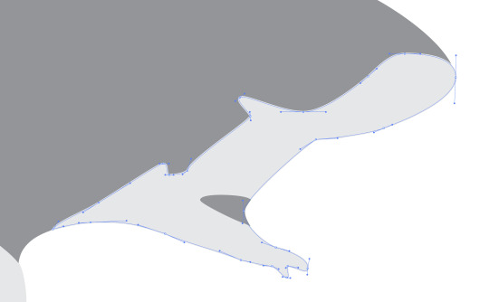
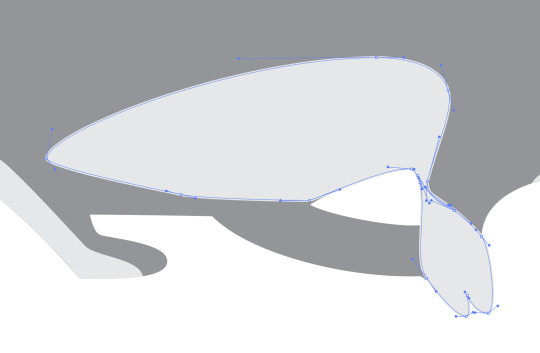
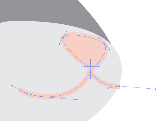
I then moved on to the ears. Since only one was showing in detail this was very easy. I made three shapes and layered them to produce depth. I kept my handles small while also trying to use an few as many.


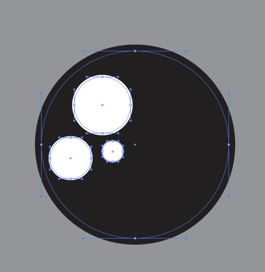
Next I made the eye of the mouse. Mice tend to have really beady eyes so I wanted to show this in my image. So I added no iris to assure the deep blackness look. I used the ellipse tool to make a large black circle, holding down shift while making it to constrain it to a perfect circle. I then made three more smaller white circles to use for highlights.
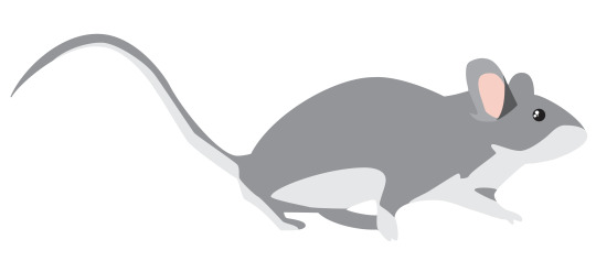
I then made the nose and mouth. The nose and mouth in the image were quite difficult to see so I most just freehanded this. I made a triangle shape for the nose and then dragged out the handles on each point to create a curved corner. I then used the pen tool to create two curved lines for the mouth. This completed my mouse vector illustration.
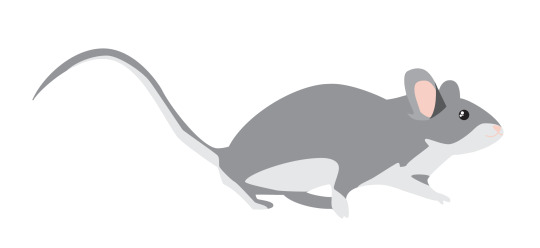
I then selected all of the components and then held down option and dragged across, duplicating it. I repeated this and it left me with three identical mice. I then changed the colours of two so there is a brown, gray and white mouse.
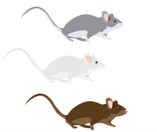
I then brought these mice from Illustrator into InDesign. I made them in Illustrator rather than InDesign as Illustrator is especially good at making vector shapes and illustrations and InDesign is better at text layout so it would ruin the quality and take too long.
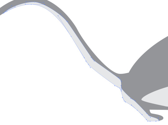
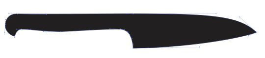
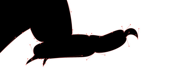
I then made a knife. I started by making a base shape in illustrator. I once again used the pen tool. I've found it is by far the easiest tool for this particular job in Illustrator.
I then moved on to adding the blade colour. Rather than retracing the shape, I duplicated the shape, then deleted some anchor points and changed a few handles on the anchor points to get this.
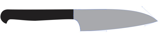
I then wanted to add a bit of a shadow on the blade so I drew a rough shadow on and made it a slightly darker shade of gray.

I then added a few more details onto the handle using the ellipse tool.
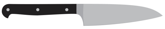
I then brought this knife into InDesign with the mice and duplicated it many times. I changed the size, layering and orientation of each knife slightly to make it look it was raining knives. I also added the lyrics of Three Blind Mice onto the page.
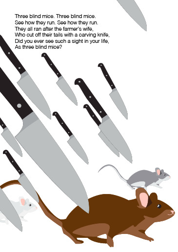
This was the final result. Overall it was pretty easy for the final product. If I have time at the end I'd like to come back and add some more details so it matches the backstory a bit more. I think giving the mice costumes or adding some blood onto the knives would work well.
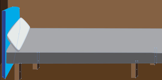
I then moved on to making the illustration for It's Raining, It's Pouring. This rhyme is about an old man who knocks his head and decides to try sleep it off. He dies during his sleep and never wakes up. I started by making a basic bedroom. I started by using the rectangle tool to make a room.
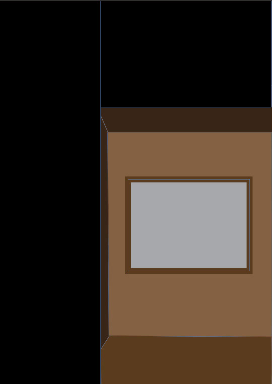
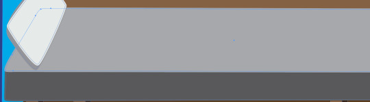
I then moved on to making the bed for him to be sleeping in. I made this with the pen tool. I started with the mattress and then made the bed posts, head board and then the pillow. This was a bit difficult as I wasn't using a reference. It took a lot of trial and error and changing the shape of the shapes. I also added some rain in the window to refer to the 'pouring' rain outside.
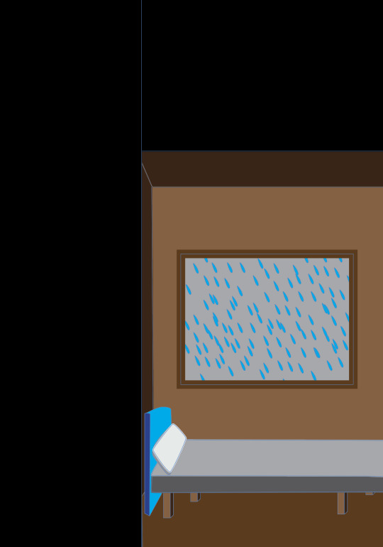
I then added a blanket and the man lying in his bed. I tried to make it look like the blanket was falling off the bed. I used the pen tool to create the shape. I then duplicated it, deleted some points, and then changed the colour so it appeared like the blanket was falling off the bed. I then made a rough shape of the man lying face down in his bed. I used the ellipse tool to create an oval for his head and then used the pen tool to create his hair, neck and pjs.
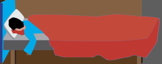
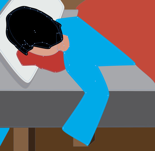
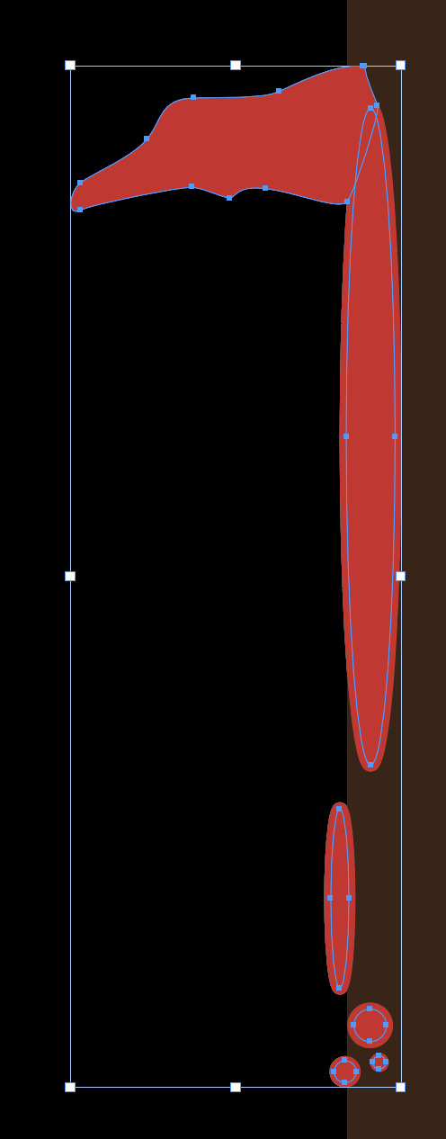
I also used the pen tool to create a blood of blood coming from his head.
I then added some more details like some wrinkles on the blanket and a cut on his head as well as some blood droplets.
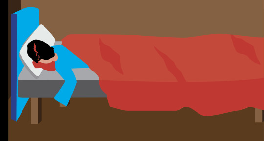
I then decided to add some blood on the wall to show where he knocked his head. I used the ellipse tool and the pen tool to create a dripping bit of blood on the door frame.
I then added some text. I added the nursery rhyme lyrics and a brief description of the story behind it.
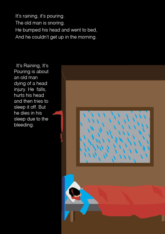
Overall this was a pretty easy page to make. It definitely took quite a while as it involved a lot of shapes but I was pleased with the outcome. I would have liked to redo the window and add some more details to it but for now this is fine. I especially like the blood on the wall.
0 notes
Text
Week 11: Illustrator Patterns
This week we were learning how to make a pattern so we potentially make one for our book cover or end papers. We started by making a black square with the rectangle tool and then made a bird out of the pen tool. I went back in with direction selection tool to move handles and anchor points to make smoother lines and curved some edges.


We then opened the swatches palette from windows. We then selected what we just made and then dragged it into the swatches palette. This created a swatch for the bird. (This image also has the other swatches we made later.
We then made a shape with the pen tool and manipulated the handles to make it all smooth. I keep my handles either vertical or horizontal by holding down shift. We gave the shape a black stroke.
We then switched to the fill and clicked our new swatch of the bird. This turned our swatch into a pattern.

In the image above the birds are laid out in a grid pattern but what if we wanted a different pattern. When we double click on the swatch we are able to change the type of pattern or Tile Type.

I changed by pattern from a grid to 'Brick by Column' and made the bird slightly smaller and this was the result.

In the Tile Type there was also an option for a Hexagon by Column or Row Option. We then made a hexagon and then placed the bird on it. Next, I then made two more hexagons and placed them underneath, making the ones underneath slightly bigger than the ones on top. I then changed the top hexagon fill to blue, the middle one to white and the bottom one to yellow.


We then dragged the image on to the swatches palette to make a new swatch. I double clicked on the swatch and changed the Tile Type to Hexagon by Row. We the changed the fill of the large shape from before to this new swatch and this was the result.

Overall, I was really surprised by how easy this was. I assumed it would be a lot harder but making the shapes and then dragging them onto the swatch palette was really easy and required little effort. I especially liked how it gave me the option to arrange the pattern differently. I'd love to make a pattern and use it for the end papers of my booklet.
0 notes
Text
Week 10: InDesign Booklet
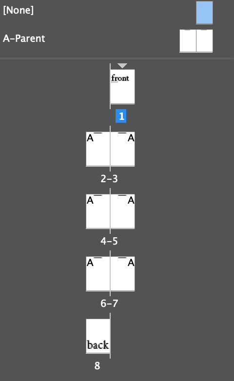
We first make a new single page document in A5 with facing pages. We then added 7 more A5 pages to create a 8 page document. Since our document has 8 pages, it would be printed as 2 double-sided A4 pages because each folded page has 4 faces.

We started by adding a text box onto the first page and put 'front' in the box. When creating a text box, I created it near the red guidelines on the page as it will automatically snap into place with the lines. This makes the box centred in the middle of the page.
We then enlarged the font by hovering over a corner point and dragging out while holding SHIFT AND COMMAND. It's important to hold SHIFT AND COMMAND when resizing anything (text or image) because otherwise the frame will just resize and the context inside will be cropped or lost.
We then added the work cover to that page. I layered two words over each other, one in black and one in white to create a cool 3D effect. I used the w key to toggle into preview mode to take this screen shot so the guidelines aren't visible.

We then repeated the same process but for the back cover with the word 'back'. We switched between pages by double clicking on the desired page on the pages palette.
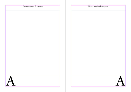
We then moved on to creating titles for every page on the document. It's very important that we went into the A-parent page. The parent page is a page that doesn't actually appear on the document but is applied to others to give them the same features.
We added a text box on the top of the page and typed 'Demonstration Document' inside. We then changed the alignment to centred and then copied it to the other page by dragging right while holding down they option + shift keys.

We then went back into the 8 pages and the text boxes were on every page because the A-parent page was applied to all 8 pages. But we then went back to look at the front cover and decided we wanted to remove the title on that page and the back cover as it didn't look good.
We were unable to simply delete the boxes as they are locked in because they are on the A-parent page. Above the A-parent page there is a page called 'None'. This page has nothing on it so when we dragged it over the cover page in the pages palette, it applied its properties (which there are none) and the title disappeared.

The next step was adding page numbers onto each page. Rather than individually adding each number onto each page, we are able to do this in the A-parent page.
We added the number 1 on the bottom of the left page and then used option + shift to copy it to the right page. Option copies the text box and shift restricts it from moving up and down, keeping it in line. We then selected the text on the right page and realigned the text to the right so it looked like this.

But since we put the numbers 1 and 2 on the A-parent page, they were on every page not just page 1 and 2. So we have to make it universal for all the pages.
In the parent page, we selected the 1 and then went to Type, Insert Special Character, Markers and then Current Page Number.

This changed the 1 to an A on the parent page. It is an A because it is in A-parent page. We then repeated this with the 2 on the right side. This resulted in the parent page looking like this and the 8 page document having the correct numbers.

Parent Page Document Pages (2 and 3)
But then we had to change the size of the page numbers because they were too big. So we selected both of these text boxes in the parent page, clicked the type tool and then reduced the font size. I changed mine from 94pt to 48pt (I later reduced mine further to 30pt).

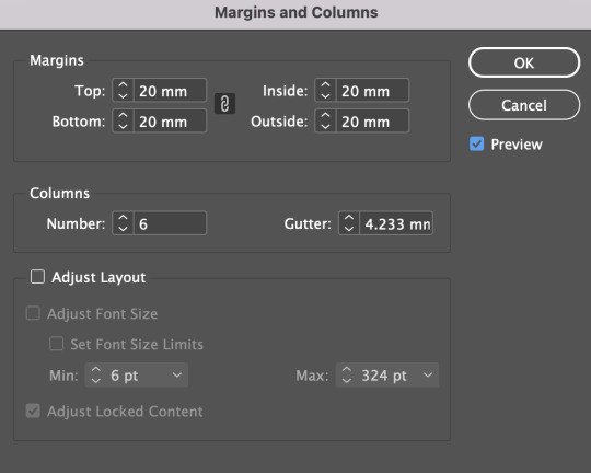
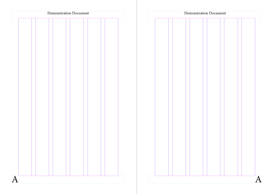
We then needed to add some text to the page. The best way to do this is by added columns to the parent page. We selected both of our parent pages and then clicked Layout, Margins and Columns. This allowed me to then experimented with changing the number of columns and the size of the margins.
The default settings have the columns at 1 and the margins at 12mm. I changed my number of columns to 6 and the margins to 20mm.
This creates a column grid so I am able to make text boxes that have are different widths (e.g. I can make a text box that takes up 2 columns or one that takes up 3 columns).
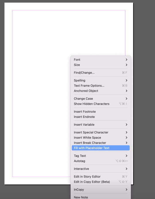
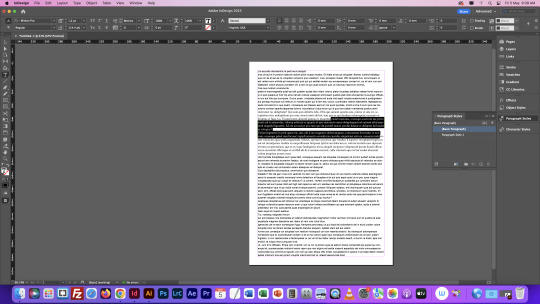
I then added some place holder text by control clicking the text box and selecting fill with place holder text. I changed the font size to 9pt and the leading to I didn't like the layout of the paragraphs so I made a paragraph style with a first line indent of 2mm, a Space Before of 1mm and a Space After of 1mm.
I also manually added some more paragraphs because the original paragraph size were very large, blocky and it made it harder to read.
This was the final result:

0 notes
Text
Comms Week 9: InDesign
Here are some InDesign shortcuts:
V=Selection tool
A=Direct selection tool
Z= Zoom
Space= Move
To exit the text box, click outside the box.
Command + A= Select all
Shift + Arrow Keys= Selection of text
Command + tab= switch between applications
Shift + Command= move image with frame
We first loaded up a A4 document and added a text box. We then filled the text box in with placeholder text by right clicking the text box and selecting 'Fill with Placeholder Text'.
We then opened Paragraph Styles and selected some text. We then changed the font to Arial Regular, the font size to 10pt and the leading (space between lines) to 14pt. We then clicked the plus icon on the tool and this created Paragraph Style 1. You can then switch between the Basic Paragraph and the Paragraph Style 1 to switch between the new font and size to the old ones.

We then added some headings by pressing enter. We then made our headings size 14pt, changed the font to bold and the leading to 16.
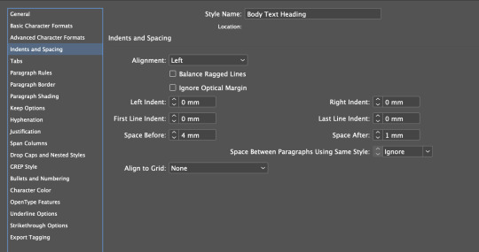
We then selected the headings and clicked the plus icon on the paragraph style palette. We then renamed the new style to Body Text Heading and the other one to Body Text.

We then double clicked on the Body Text Heading and changed the space after and before the heading in the Indent and Spacing tool. I changed my before text to 4mm and my after text to 1mm.
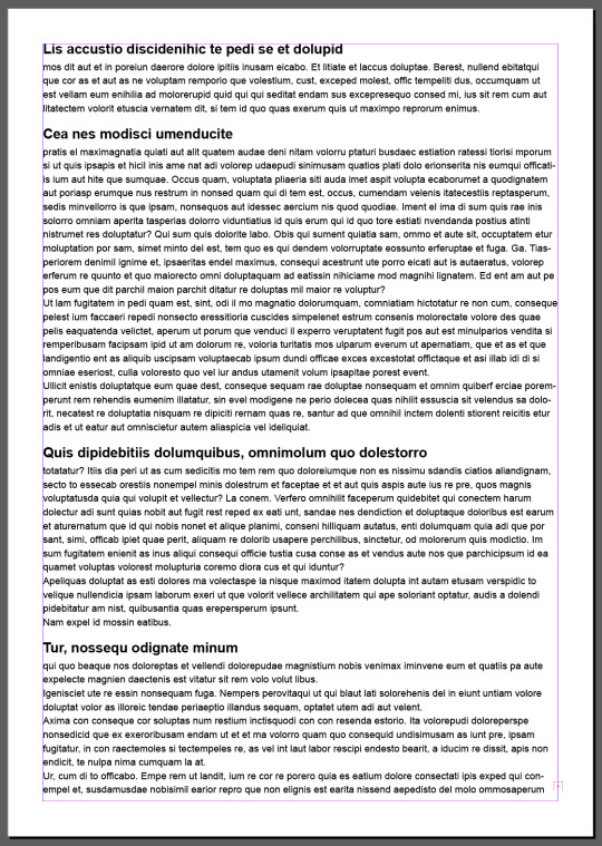
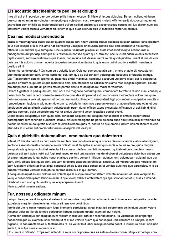
This made my page look like this.
We then moved on to character styles. When you try to use the paragraph styles on one word it changes the entire paragraph. This is because it is for a paragraph, not a single word.

So instead we use character style. We selected a word and change it from regular to italic. We then clicked the plus icon on Character Styles. This made a new style which we renamed to Italic.

We then dragged that style down to the plus icon to copy it. We then changed that style to Bold Italic and renamed it Bold Italic.

We then turned off the hyphenation in the body text in the Paragraph Style Palette. We double clicked the body text paragraph style and clicked on the Hyphenation tab and clicked it off.

We then added some columns to the page. We did this by selecting the text box with the selection tool and then changing the the column number.
We then opened Moodle and copied a piece of text called Bullet Point Text. We then pasted this into our text. We then created a new Paragraph Style called Bullet Point.
Then we double clicked on the style and went to Bullets and Numbering. We changed the list type to Bullets, the left indent to 3mm and the the First Line indent to -3mm.


We then went into indents and spacing and changed the Spaces Between Paragraphs Using Same Style to 0.5mm, and the space before and after to 0.5mm.


We then pressed ok and it looks like this.

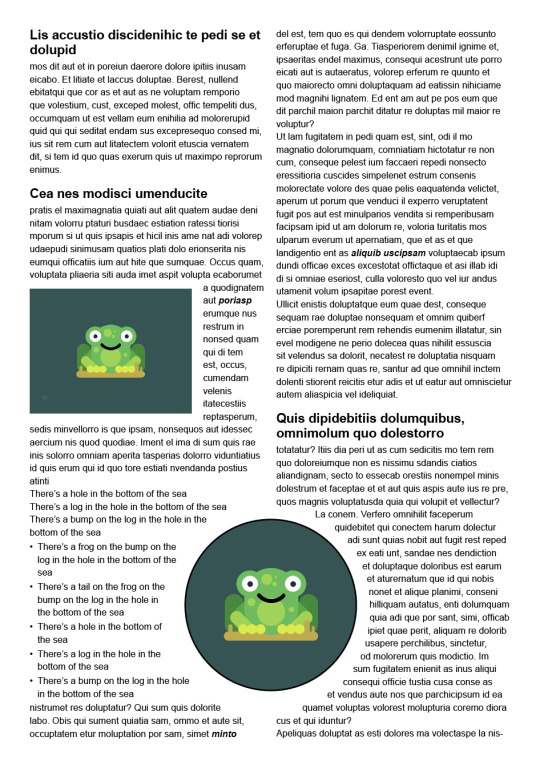
We then downloaded an image from Moodle and put it into a IMG folder in my week 9 folder. We opened this image in photoshop and put it into InDesign. I then added a top hat on to him in Photoshop and saved it. We then switched to InDesign but the top hat did not appear on the frog. We had to refresh the link by going into the links panel and pressing the refresh button and then it appeared.

We then learnt that InDesign automatically places an image in a frame and if you move the image out of the frame it will disappear. But if you use 'shift and command' you can move and resize the image and the frame at the same time.
We then placed the frog over the text. We then used the first wrap text option. This made the text go around the image rather than going underneath. But it had uneven edges around the text. To fix this we needed to open the properties panel in windows and change the offsets. I changed the bottom offset to -1mm and the right offset to 4mm to give the image an even border.


We then copied the image and this time we turned it into a circle. Using the ellipse tool and holding down shift key I created a circle over the frog.

I then pressed command x and this got rid of the image but left the circle. Using the selection tool we then right clicked on the outline of the circle and clicked Place into and this pasted the frog into the circle.

We then place the frog over the text and used the 'Wrap Around Object Shape' text tool. This made the text go around it and I changed the offset to 5mm. There is only one offset to change as a circle only has one edge.


This completed today's class and this was the final result. Overall I found this was the hardest program we have had to use before. There are a lot of steps to remember. The paragraph and character styles made the most sense to me as the names made sense as a paragraph style changes a whole paragraph. I got a bit lost when doing the bullet points and images. Changing the offsets was easy but I found putting the frog into the circle took me ages as I couldn't get the Paste in Place option to appear. But I think with some more practice this will definitely become easier as it was mostly just remembering the steps I struggled with.
0 notes
Text
Week 8: Illustration Show & Tell Part 2
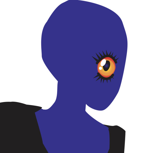
For my second illustration I chose to recreate one of my old drawings I made on procreate. I think making this on Illustrator will be a good challenge as there are a lot of complex shapes and details.

The original image originally had a colourful background so I roughly removed it so it would be easier to work with.
I started by creating a base layer of the general shape. This took a while as there were a lot of sharp corners and curves which took a lot of handle manipulation. I used the pen tool for this which I think was the best choice as it is a complex shape.


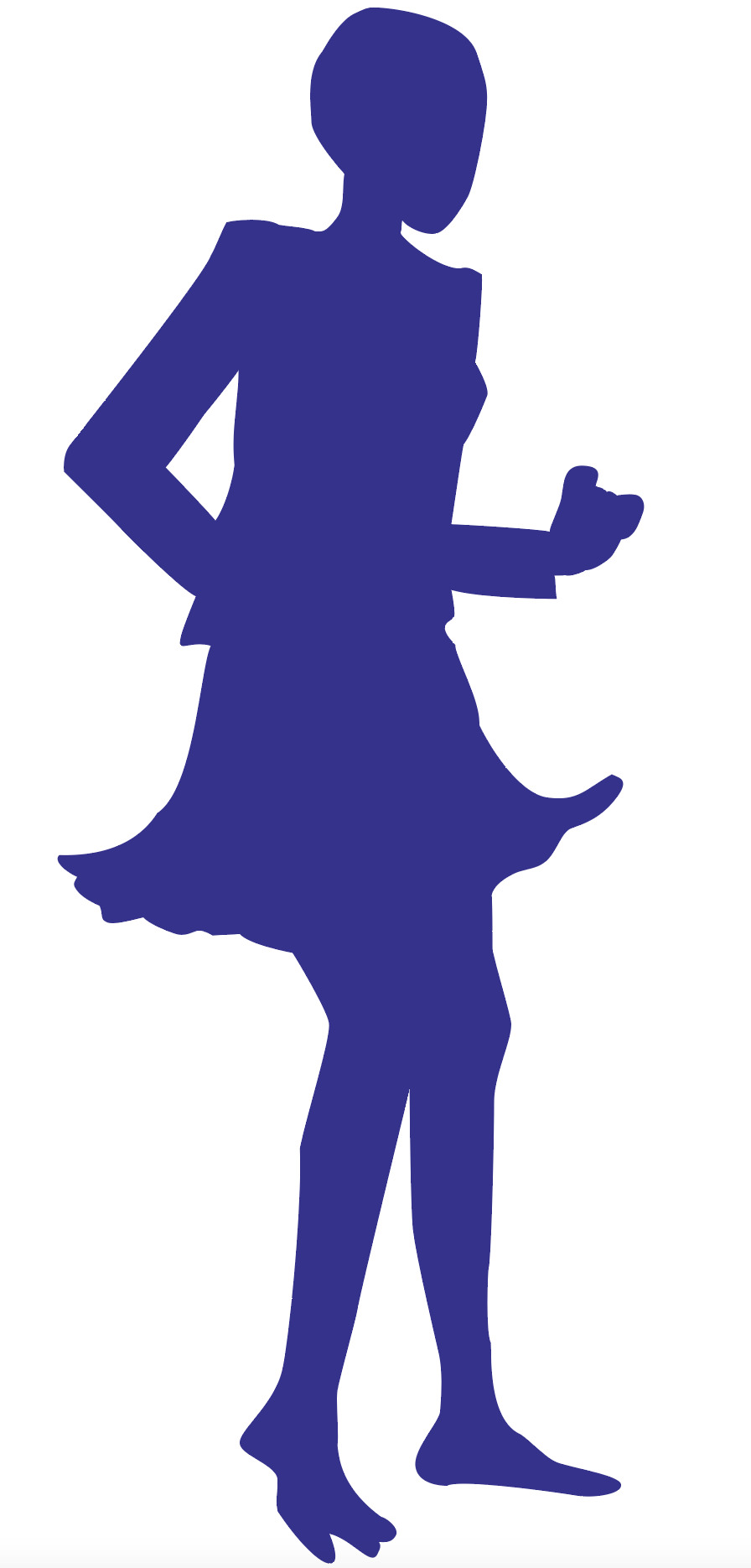
I then moved on to making the outlines of the blazer and the skirt. I did this using the pen tool as well. I traced from the original drawing to save myself some time.

As you can see it is still a bit rough around the edges as the base blue layer can be seen at some edges. But I'll fix this towards the end as there will be more examples like this.
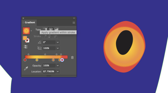
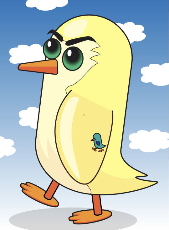
I then moved on to making her eye. Her eye has a lot of flecks in them and I don't think this will easily recreated in Illustrator with what I know so far. Instead I started with making the rough eye shape and making a gradient like in the penguin task in week 3. I played around with the placement of the reds, oranges and yellows. I ended up having a bold red outer edge and a mix of yellow and orange inner eye. I then added a pupil using the ellipse tool. I decided to add a small gradient effect in the centre using the same blue as her skin tone. I then make some highlights also using the ellipse tool.
I then began making her eye lashes. I once again used my favourite pen tool to make the curves to incase her eye and then used the polygon tool to add triangles for her eye lashes. When using the polygon shape tool, it originally drew a hexagon so I had to drag down a small point on the transform box. This removes points until it only has 3 left (becomes a triangle) as two would just be a line.

I then made her mouth. In the original drawing, her mouth had been sowed shut so I tried to make it as similar as possible. I used the pen tool to create the curved shape of her mouth and then made a stitch. I used two circles (ellipse tool) and a curved line (pen tool) to make the stitch. I then held down option to duplicate the stitch and continued this process until her whole mouth was sowed together.


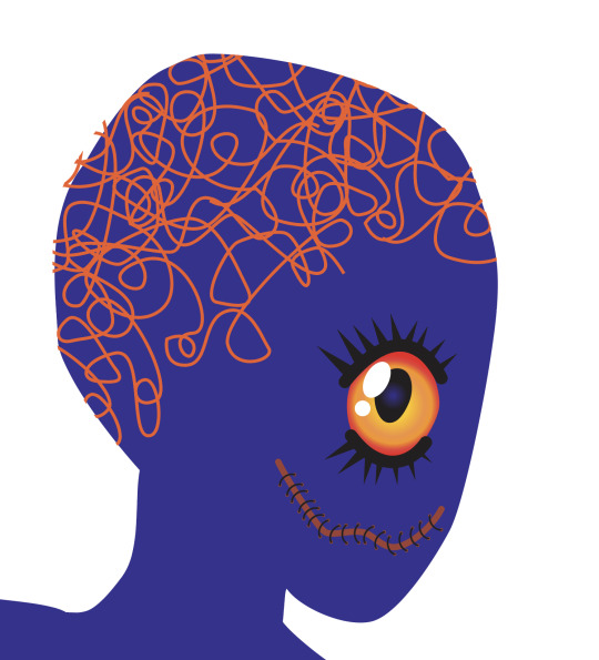
Next was the design on her head. This was just a random squiggle that went all over her head. I used the pen tool to make random curves and circles all over. The handles are a bit all over the place as the goal was to get it to look crazy, but I did keep them small.

I then used the rectangle tool to make the earring. I made one small square and then a much larger one and joined them at the point. To make sure they remained square I held down the shift key to restrict the resizing.

I then made the ear. I traced the shape from the original image and the colour a shade lighter than the base layer. I then made the darker section for the inner ear and finally the small piece to finish it.
I'm not sure why I made the earring first. In reflection it would have made more sense to make the ear first and then the earring but I decided to do the opposite at the time.
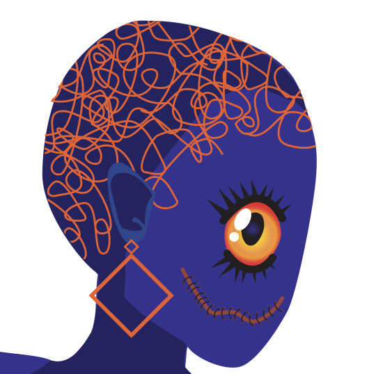
I also added a shadow on the back of her head and on the underside of her neck. In my original drawing, I had used an airbrush brush in procreate so the shadow was very smooth. But I think the line suits the style of the illustration in Illustrator.
I then decided that the front of the face was too flat so I needed to add some more highlights on her forehead and cheek. I used the pen tool to make play around with some rough shapes of the highlights. I used the same shade as the ear.

This pretty much finishes the face. I will tidy up some minor details at the end but for now I'm really pleased with how this looks. I think the hardest part was getting the shapes right as otherwise it would throw her face proportions off.
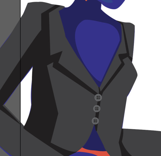
I then moved on to adding detail to the blazer. I started by adding shadows with the pen tool. I traced the shadows from the original image and then adjusted them to match the shape of the blazer. I found every time I traced from the image, the shapes didn't quite match up with the other shapes. I just used the direct selection tool to reposition some handles and anchor points.
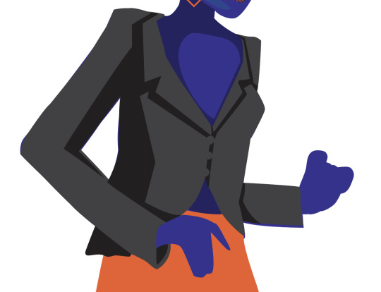
When I went to add the detail, I had to punch a hole in where the gap in the arm should be. I originally just had a white shape in there but I used pathfinder to clear the space. I used the 'Minus Front' feature.
I then added some buttons to the blazer. Used the ellipse tool making 6 circles: One large one, a slightly smaller and darker one and then four small ones in the middle.

I then duplicated it twice to make three buttons.
I then moved on to the skirt. I split the original skirt into three sections: highlights, medium tone and shadows. For the medium tone I used the base colour of the skirt which I has already applied to the shape.
I started with the highlights. I used the original as a reference and then used the pen tool to make them.
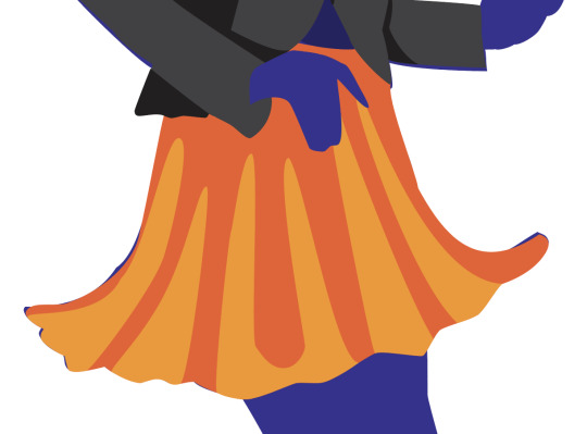

I then made the shadows. They weren't as defined in the original drawing so I made them up. I followed the shape of the arm and the sleeve and then dragged some sections down.


At this point this is what the illustration looked like so far.

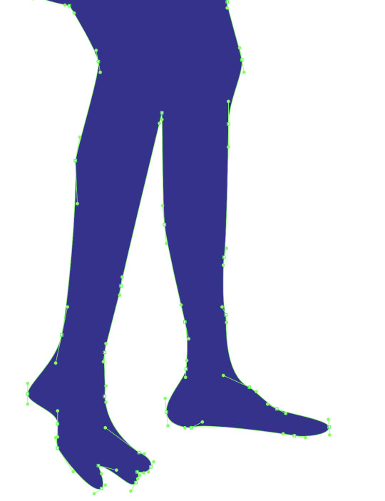
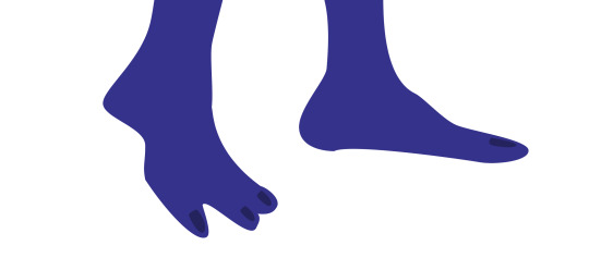
I then added the shadow on the legs and then the toe nails. I did this using the pen tool.

I then added the string on the blazer. I used a similar process to the stitches on the mouth. I made 8 small circles and then used the pen tool to create the string.

I then copied the base layer and changed the fill to green. I had to rearrange it and send it to back. I then made the background black and this completed the illustration.
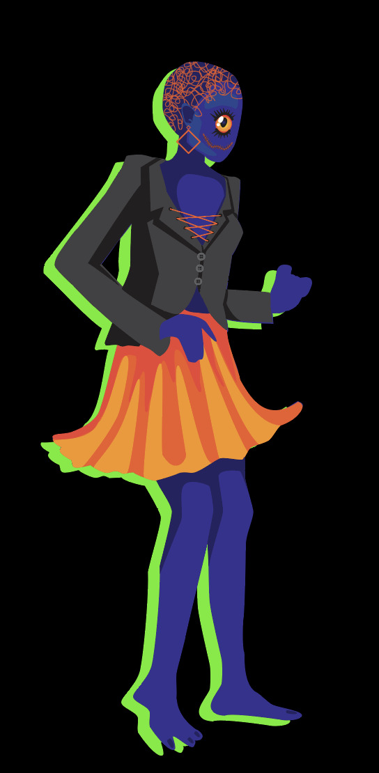
Overall I was really pleased with how this turned out. It used a lot of different anchor points and it was a good challenge trying to use as few anchor points as possible and trying to make the handles as small as possible. I used the pen tool, path finder, gradient tool, rectangle tool, polygon tool and ellipse tool. I think it was a really good and fun illustration to make. It took me quite a while but I managed to get everything done that I wanted to.
0 notes
Text
Comms Week 8: Illustrator Show & Tell Part 1
This week is our final week/task using Illustrator. We are creating two illustrations from drawings we made or images we found. The first illustration should be a silhouette and the second illustration should have an outline, fill and shadow (like we did for the penguin).
For my first illustration I am going to attempt a bike. I found a bike silhouette on the internet and refined it slightly and removed some extra details. I've found illustrator comes naturally to me and I can figure out most things with a bit of time so I really want to challenge myself.

This is the bike I am going to try and illustrate in Illustrator. I will make the main outline using bezier lines and then use pathfinder to make a lot of the cut outs and smaller details.

I have labeled where I will place the anchor points and handles for the main outlines. I also removed a few more details.


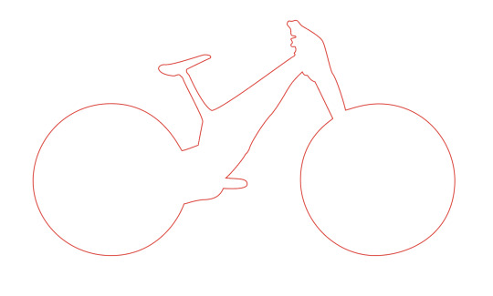
I completed the outline of the bike. I tried to use as few anchor points as possible. For sections like the tyres, it was very easy to use few anchor points but it was a lot harder to do the seat and handlebars using fewer anchor points as there are so many ins and outs.
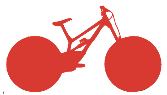


I then began using pathfinder to cut out the holes or gaps in the bike. I used the pen tool to create the shape and then used the 'Minus Front' pathfinder tool to join the two into one path.
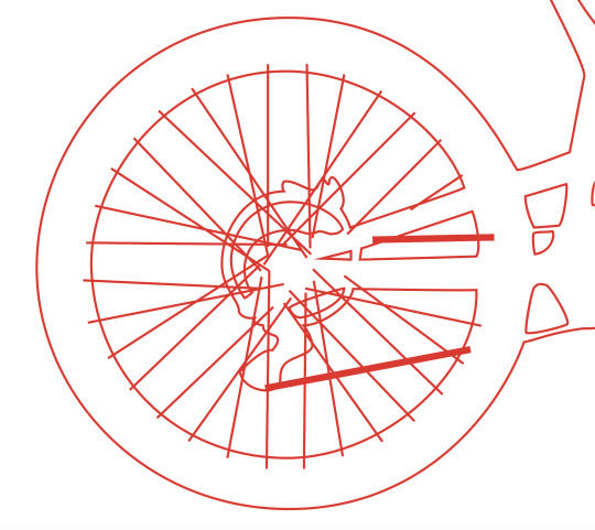
I then started adding all of the spokes into the wheel. I used the line tool and draw the lines over top of the image. This was a very easy and efficient way to create the spokes. I thought of continuing to use the pathfinder tool but it would have been harder to use than the line tool.
On the second wheel I continued to use the line tool but played around with copying the previous lines and rotating them.
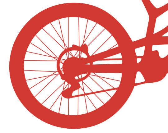
My bike ending up looking like this.

After completing this I didn't find it too difficult so I decided some more to it. I decided to add some parrots sitting on the bike. I found a silhouette of a parrot and freehanded the shape with the pen tool and then went back in with the direct selection tool to fix some of the curves, anchor points and handles.
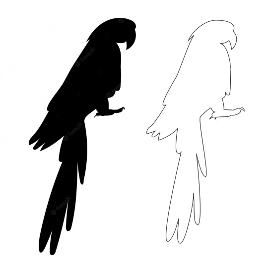

I then placed my parrot on the bike seat. To make him stand out I added a white outline to him. It looked like this.

I then added other parrot onto the handlebars.


Overall I think this was a really good effort and I'm happy with the result. It uses a lot of different anchor points like hybrid points and broken points. I'm really pleased with the parrots as I freehanded them without tracing so I think they look really recognisable.
0 notes
Text


This is what I have done for the homework. I changed the line curving around his body into dots. I then masked and added two cats into the sky like they're jumping. This doesn't look very realistic but it kind of suits the image. I then added a giraffe using the same method. I also added a different background to the image.
0 notes
Text
Week 6: Photoshop and Illustrator Combined
Today we started by loading up an image from last weeks folder. We then used the Clone Stamp Tool to remove a mark on the lemon. This was new but pretty easy to achieve. I just had to remove my curve adjustment before doing this.
We then practice using the option, space and command tool when using the pen tool. Then we used the pen tool to outline the lemon. This was relativity easy as there was no sharp corners or turns. I tried to use as few anchor points as possible while still doing a good job.
We then selected the lemon by control clicking on the icon on the path palette. We then changed the saturation and used the curve tool to change the brightness of the lemon. I also learnt how to apply an adjustment layer to only a sectioned section by pressing a small icon in the bottom of the palette.

I then tried messing with the colour of the lemon to see what I could do. I ended up intensifying the red and yellow by increasing the saturation in the Hue and Saturation layer adjustment and I increased the redness on the colour balance layer adjustment tool.
Overall this part of the task was really straight forward. I did miss last weeks lesson but I found it easy enough to follow along. With some practice I'm sure I can remember and 'master' this.
We then moved on to the composite image creation. In task we will use both Illustrator and photoshop and we are combining the rest of the skills we have learnt the past few weeks.
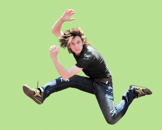
We first downloaded the image from Week 6 on Moodle. The first task was to select and mask the man jumping from the background. But when we tried to use the object selection tool, the selection missed half of the man jumping.

So after using the object selection tool, we then began selecting the sections missed and adding them into the mask. I wasn't 100% confident doing this as I missed this learning in week 5 but I think I did ok. I didn't find it particularly hard to do as we did a similar thing in Illustrator with pen tool. As well as using the pen tool to edit the mask, I used the polygonal tool to select large sections roughly. I used the lasso tool to do a similar task but this tool created quite a wobbly line so it wasn't well suited for the task. The magnetic lasso tool was really cool as it placed anchor points automatically for me. My favourite tool to create the mask was the brush tool. When in a mask the brush tool only has two colours: black and white. The white adds to the mask while the black minuses from the mask. I worked by way around the image, toggling between the colours to edit the mask. I used the X key to toggle between the black and white.
Here are some photos from the process:

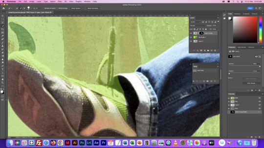
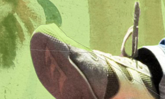

Out of all the sections the hair was definitely the hardest part. Using the normal tools created very spiky hair that didn't blend into the background well. I was shown how to change the opacity of my brush and to selected the darken brush to get rid of harsh edges.
After selecting and masking him successfully, we exported him into Illustrator. We then created a snake like shape overtop and underneath of the guy.

We then saved and put this back into illustrator by linking it to the original photoshop layer. At this point the shape was just in front of him. We then selected the area where the shape crosses his torso and then masked it. This erased the area in front of his torso so it looked like the shape is wrapping around him.
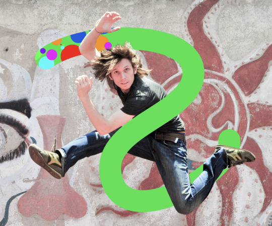
This was really cool and easy to learn. It creates a really interesting image and it was pretty easy to achieve. The hardest part will be remembering the steps to achieve this. For homework, we have to add two more images to the document. I'll also come back and replace the shape we created with something I make on Illustrator.
Overall this was a today's lesson was a success. Everything was straight forward and i think it looks good. :)
0 notes
Text
Week 5: Photoshop
This week we focused on layers, masking and selecting in photoshop.
This is the first image we were changing.

For this image, the task was to select and mask the boat before placing it someone where else in the image so that there are two boats. I started by duplicating the image layer by dragging it down to the plus icon. I then used the lasso tool to select the shape of the boat, smoke and the ripples caused by the boat. I then clicked the mask button to create a mask.

I found that the lasso tool was really good for getting a rough selection of everything needing to be masked but wasn't as good at making precise selections. So I then used the brush tool to be more precise. I switched between black and white in the mask layer to add and subtract from the mask.

Once I had done this, the outline of my mask was very harsh and did not match the background so I had to soften the edges. I did this by lowering the opacity on my brush and softening the edges the mask so it blends into the water. I then flipped the boat horizontally and ended up with this.

Overall this was really easy as it was just creating a mask and softening the edges until it blended into the background. The mask tool is very easy to use as I only had to click one button.
I then moved on to the next image which was this.

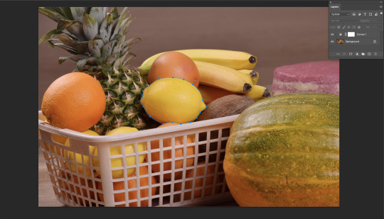
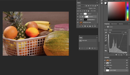
For this task we wanted to select some of the fruit and then manipulate the colours of the selected fruits. For this image I first duplicated the layer and then used the object selection tool to select some of the fruit. I selected the two oranges, the coconut and a banana.

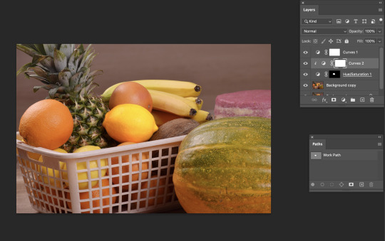
I then created a mask. I then opened up the colour balance tool to change and manipulate the colours. But when I tried to change the colours of the selected fruit, the colour of the whole image was changed. To fix this I had to create a clipping mask on the colour balance layer. Once this was done I was able to change the colour of only the selected objects.


I made my fruit a variety of purples by dragging the arrows all the way to cyan, magenta and blue. Overall this was also easy. Since I am catching up on this lesson, I had done a very similar task in Week 6. The only bit I struggled to remember was how to apply the colour balance adjustment to only one layer but I was able to go back onto my tumblr and find how. I think the object selection tool is a really good selection tool for areas of high contrast. I worked really well on these fruits as they were all different colours. It only required a little bit of refining. I think in the future this will definitely be a tool I use to get rough selects rather than the lasso tool.
For this next image, we are going to select the inner 5 leaves and change the colour.

Like before the first step was to duplicate the original layer and then on the top layer I used the pen tool to go around the outline of the five leaves. I find that the pen tool is really good for making a precise selection and is very helpful when trying to selected a complicated and curved object.
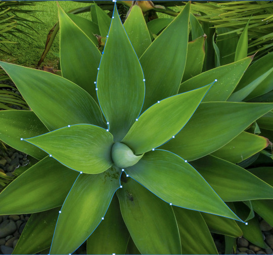
One I had gone around the outline, I made a mask. To remove the inner section of the leaves, I used the brush tool. This left me with this.

I then opened the adjustments layer and applied a colour balance to these leaves. I once again had to make a clipping mask as the adjustment was affecting the entire image. I changed my leaf colour to a red/orange.
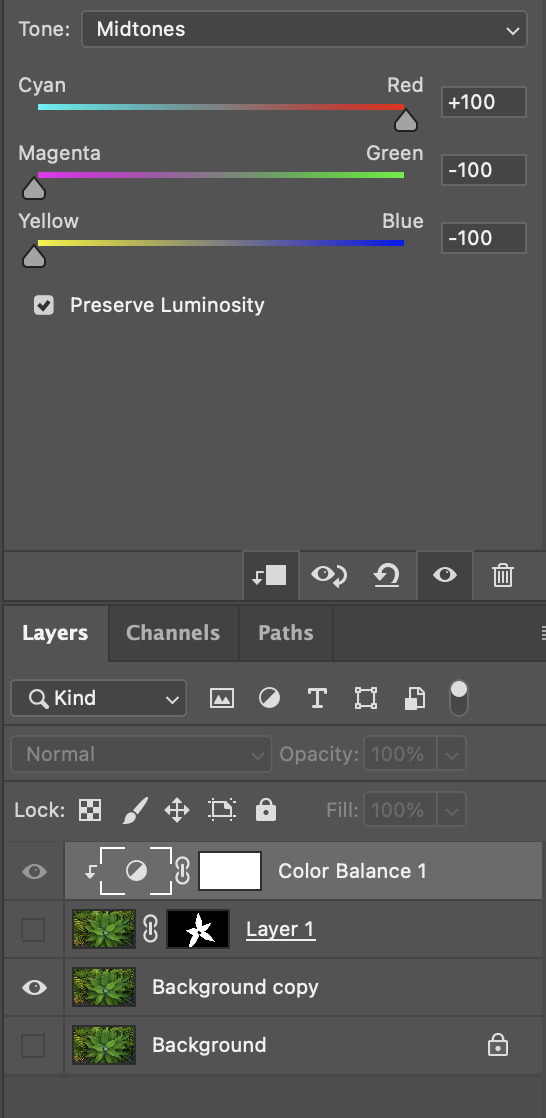

This was my final result. This was relatively simple as we have had plenty of practicing using the pen tool but definitely more time consuming than the lasso tool, object selection tool or the brush tool.
The last image we were selecting and masking was this image. We were aiming to select and mask the hummingbird before placing it onto the background (second image).


I started by duplicating the original layer and I used the object selection tool to get a rough outline of the hummingbird. This gave me a very good outline which I then dragged on to the background. But you can see the humming bird has a very harsh outline that didn't blend in with the background well.


I switched my brush to a softer opacity and then softened the edges of the outline. I especially focused on the wings so it looked like they are blurred from motion. I flipped the hummingbird horizontally so it looks like is drinking nectar from the flower.

After doing all of these selecting, masking and layer organising tool I feel really confident using all these different tools. I definitely prefer some to others as I found the object selection can be really good for rough selections and requires a lot less work than the pen tool or the lasso tool. But if I had to select and mask an object that had very little contrast with its background I would use the pen tool over the lasso as I felt I had more control.
0 notes
Text
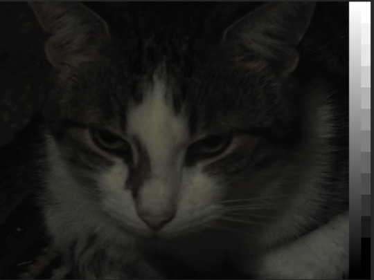
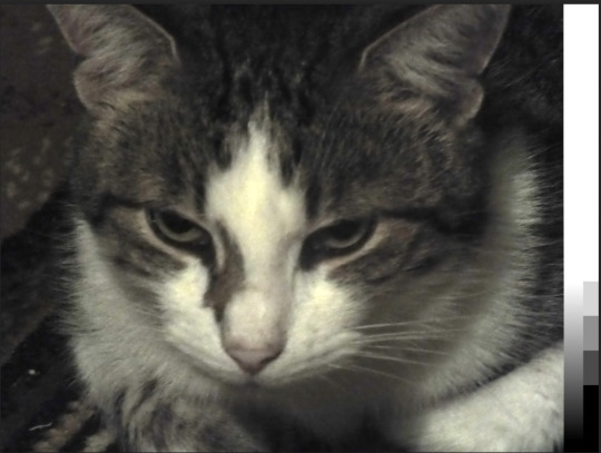
Comms Week 4: Photoshop
Today we began using photoshop. The main focuses were curves, hue saturation and colour balance.
Curves were used to add or subtract contrast from an image. This tool is fair easy to use as you just side around the points. The first image was underexposed so I used the curve tool to add more shadows so the image had more contrast.

The second image was very dark and lacked highlights. Once again I used the curve tool to lighten the image. I did this by dragging the left point to the right to align with the peaks on the graph. I then played with the opacity of the curve so adjust the darkness.


In the third image I also used the curve tool but this type I added multiple points on the line so I had better control of what was happening. This made it easier to adjust one section without affecting another. This came in really handy because when I made the image lighter, I lost a lot of detail on the nose.
Saturation is the strength of colour. A lack of saturation makes an image look dull and grey where as an abundance of saturation will add unnatural colours to the image.
I used this in the fourth image because after adding the curve tool, the image was still dull and lacked colour. I added some saturation and that added some more red and yellows to the houses and green to the landscape.


This fifth image was very red and a little too bright. I used colour balance to fix this.
Colour Balance is used to target specific colours in highlights, mid-tones and shadows. This was the tool I found hardest to learn so far as it took a lot of time to correct the colours. It has three scales: Cyan to Red, Magenta to Green and Yellow to Blue.
I dragged the Cyan and Red to -4, the Magenta to Green to +2 and the Yellow to Blue to -4. This got rid of the redness in his face. I also slightly changed the curve so the lighting wasn't as harsh.


We then used all three tools to adjust the last two images.
The sixth image had a blue tone to it and I really struggled when trying to get rid of this. I found every time I removed the over powering blue from the sky, the gravel would become very orange or the landscape became very green. I keep switching on and off the different layers until I found and fixed the issue.


For the seventh image I just continued playing with the curve, saturation and colour balance. I used the curve to add some more contrast as I thought the image lacked some. I used saturation to bring forward the colour in all the fabric on the fence. For the seventh image I just continued playing with the curve, saturation and colour balance. I used the curve to add some more contrast as I thought the image lacked some. I used saturation to bring forward the colour in all the fabric on the fence.


I found photoshop is a lot harder to use than illustrator. While I have used illustrator before, I find photoshop requires a lot more procession than Illustrator. I found the foggy day the hardest as every time I tried to get rid of the blue tone, the image would become too red. Overall, this was definitely a step up but with a bit more practice and homework I think I'd will become easier.
0 notes
Text
Comms Week 3: Penguin
This week we made a penguin. We used everything we've learned from bezier lines and some new tools like pathfinder.
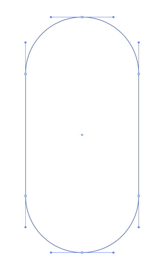
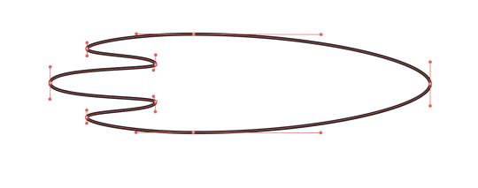
We first started by making the penguin body. This was done with six anchor points and dragging out the handles to create the curve. I dragged each handle out the same amount so it formed a perfect pill shape.


We then added a tail to the penguin. First, I added an extra anchor point and dragged it out to the left. I then lengthened the right handle on the lowest anchor point to maintain that rounded body shape. At this point I was keeping my anchor points vertical as it keeps the shape simple and clean. Then I added another two anchor points and dragged the middle point inwards. This created the tail feathers but for the middle anchor points I had to make the handles diagonal as otherwise the shape is too rounded.
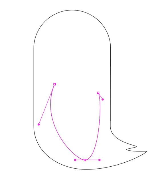

I then added a wing to my penguin. To create the rounded shape, I manipulated the handles in size and direction. For the beak since it is a small shape compared to the wing, I am able to keep the handles small making it 'cleaner'.
At this point, everything I had was really as it was just using bezier lines and making simple shapes and curves withe handles. I used as little anchor points as possible so if I needed to go back and edit the shape later it would be easy.
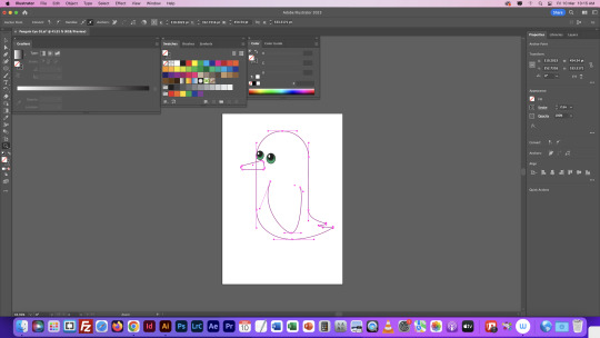

We then moved on to the eyes. We used a new tool for them called the gradient tool. We were able to select a colour and then change the gradient, whether is was having more black than green or the direction. We then added the white highlight to the eye as a small oval. This was slightly more difficult as it was a new experience but I found it really interesting learning all of the different options and fun messing with the colours of the eyes.


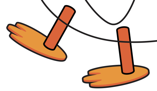
We then moved on to creating the feet. This was definitely the hardest part of the entire penguin. First we created the top shape and then duplicated it by dragging and holding down option. We then reflected it vertical and lined the two up. We then used the join tool or Command + J to join the two shapes into one symmetrical shape. We then added an outline and a 3D effect before adding a short leg.
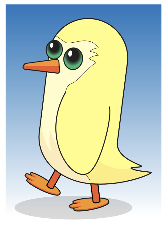
We then added colour and shadows to our penguins. I made my penguin yellow and gave him a paler yellow stomach feather colour. I created the shape of the stomach feathers with the pen tool and then placing the wing on the level above the shape to hide the part of the shape that should be under the wing. We created the shadow on the penguin by making the shape and then lowering the opacity to 10%. The shadow at the bottom was done by making an oval and I then lower the opacity of my oval to 17%.
I then added a few extra details like eyebrows, some highlights, some clouds and a penguin tattoo. Overall, I found this exercise relatively easy but it was very time consuming. The eyes and feet were definitely the hardest part of this task as it involved quite a few new tools like join, pathfinder, and the gradient tool. This definitely made me more confident with bezier lines and other simple tools.
2 notes
·
View notes
Text
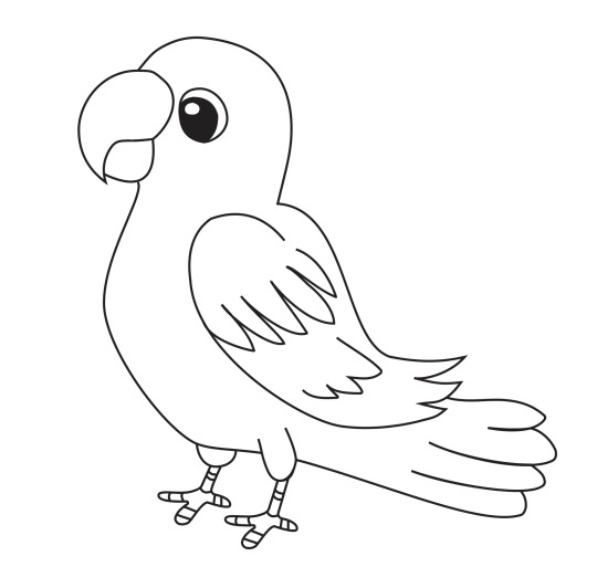
Comms Week 2: Homework
For homework we were assigned to create two vector drawings which our partner chose. The first image my partner chose a cartoon bird.

This was definitely more challenging than other shapes we have completed in class but I found it really enjoyable. The different types of anchor points came in very handy as I was able to create precise corners easily. The outline of the bird was really easy as it was smooth simple curves. The hardest part was the feather on the wing and the tail feathers. I drew this image without a reference behind it so trying to get the proportions correct was very difficult but I think I did a good job.
The next image my partner gave me was two flowers and a few leaves.

For this image, I placed my lines overtop of the original as it saves a lot of time. Knowing how to use the broken anchor points made creating the petals so much easier. It definitely required a lot of editing handles after the main shape was finished.
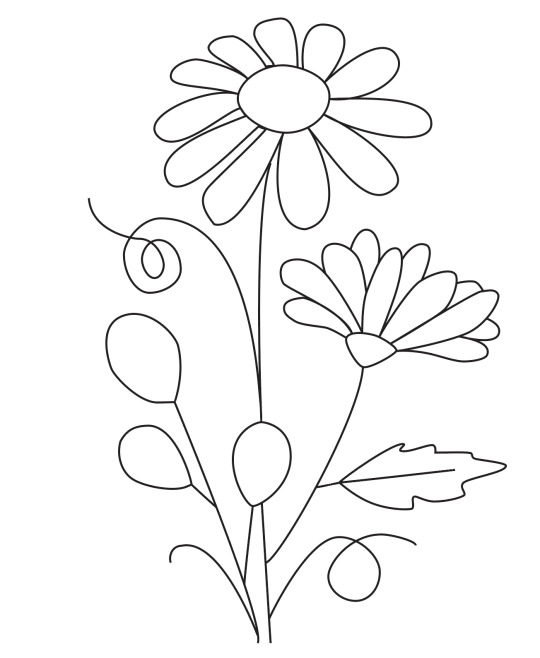
Out of the two images, I definitely found that drawing the bird with no reference was a lot harder. Both of these were great practice for the broken anchor points but they didn't have many hybrid points. After this I'm feeling really confident with the pen tool and manipulating handles to get the desired curve.
1 note
·
View note