
oliviascanestextiles-blog
OLIVIA SCANES TEXTILES
A blog about my work in textiles and the inspirations, influences and techniques I discover. I hope you enjoy the read
41 posts
Don't wanna be here? Send us removal request.
Last Seen Blogs

xmusiisms-a
xMusiisms

faith-marie316
Untitled

soyelpancho
Soy el Pancho
debu-neko-kun
Catboy Scribbles

foulgladiatorprince
Untitled
Text
Blog Evaluation - The end game!

so this is the last blog, and I feel with the amount of reflections I have written my final reflection should tip the iceberg! here we go..
How did it go? – Describe or write down what happened.
Writing a blog was quite an experience, one I haven’t experienced before. I've never expressed myself much through informal writing before, because I never had much of a desire to write. I always found I expressed myself, and preferred spending my time through creating something visual, like a drawing. I also never a had strong belief I would be any good at writing but reflecting back on the blog I believe my overall experience of keeping up a blog was surprisingly successful.
What went well and why? – document the good things.
My write ups of lectures I felt were my strongest aspect of the blog. I was always fully engaged in he lecture and always took note of important information, dates and opinions I create during it. This meant when writing my thoughts, even if it was a few days later, I’d know exactly what to write. It helped me that I thoroughly enjoyed every lecture, particularly the ones on male gaze and gender, as I’ve always had a keen interest in the influence society has on different genders, that in return affects the system of life. I also feel in the way of my press station in my blog, I like how I always made sure to include visuals and imagery of my work and gallery visits, to help with the amount I writing I did. It always helps having a picture to go with text.
What did I find difficult and why? – useful in order to improve.
I found it difficult to keep the blog up to date, if i’m honest. Particularly in actually making a post. I’d write up about my work, or an exhibition or whatever needed to be written about, but I’d hold back from actually posting it, because I was never confident enough it was any good. I also automatically went into writing quite formally, and that didn’t fade much, except maybe when I started talking about my personal opinion or writing this evaluation. It felt like a safety net to write more formal than informal because in a work space i’d always automatically write that way, and I didn’t want to go too informal, like I was texting a friend and embarrass myself. But now I have spent so long writing over the last few months, and I’ve come to learn this whole unit is about writing to benefit myself in my work in order to develop it, I think I’d do a much better job at writing in my own words, and not the words of academic book author.
What could I have done better?
By making notes of my work as I was creating it in the workshop, my reflection blogs would hold a lot strong to what I actually did. I was successful in making notes at the beginning, but this began to fade as I got further into the rotations. It was mainly the small elements of my making I’d forget sometimes, like whether drew a drawing first or after making a sample, or chose pink before yellow in my print. Small things, but things that still would of been useful when looking back on what I did.
What was easy and why?
The easiest part was including images of my work and process of work. I made sure to take photos as I worked, so I could include them in my blog to show my workshop experience. Therefore, it was the easiest part as I just had to upload them from my phone to the blog.
What did I learn?
I learnt how to write in an informal way that still well communicated myself and showed my intellectual knowledge appropriately. The skill of writing up my learning and work I did, on a regular basis was a very useful skill I improved. I became a lot confident in reflecting on work and using my own words that I understand.
When and how did I learn it?
I learnt throughout the entire process of writing my blog, and by also reading other people’s blogs, I improved my writing skill and altered my style of writing to suit the informal style. I particularly found it informative reading someone’s blogs on the same exhibition after writing my own blog, to exchange ideas and thought of our reflection techniques and process of evaluating an exhibition.
How could I learn more?
By continuing my blog in the rest of the work I do for the rest of the year, maybe even degree (which I think I will do)i’ll keep learning. For me to improve my informal writing all I have to do is keep writing, I may have to be quite disciplined to make sure I do indeed keep writing, but I know it will be worth I in the end game.
How could I improve next time?
Next time, id make sure I found interesting bloggers that I’d read of a weekly basis to aid my writing skill and that’s pretty much it.
0 notes
Text
Evaluation of my work

What went well and why? – document the good things.
My colour palette through my work, particularly my samples were very strong and suitably not just for my box but also myself, as my box was inspired by my childhood. My ability to translate elements of my swatches into my samples were successful because I kept my swatch book by my side when I was creating my samples, and in the weave rotation my windings were made in relation to the swatches colour and proportion of colour.
What did I find difficult and why? – useful in order to improve.
What I found most difficult was becoming inspired at first in my stitch rotation because it was so broad and I found my first samples to be less relatable to my drawings and lack complex skills. This is also because my first drawings I was working from were collages that I didn’t like the look of.
What could I have done better?
If I were to improve my work I could of drawn more analytical drawings of my objects in my box before going into the abstract/contemporary drawings I preferred to do, so I could understand the colours and textures within the objects further before simplifying the in the final set of drawings I used to make my samples out of. My technical book could be more imformartive and detailed in the new processes I learnt too, because sometimes when looking back on them I got a little confused, however I did find it more difficult writing out the processes I learnt because some were so complex and alien to me, I think next time I would make more videos of demonstrations I had so I can also watch what I need to do instead of read, because I’m a visual learner.
What was easy and why?
I found weave to be very easy, I believe because it was my last rotation and due to spening so much time being creative, I was in the right mindset to create samples. I also loved my colours and drawings I worked from in this rotation so I was more encouraging to get the work done and this led to the weave making not feeling like a task but a hobbie I enjoyed.
What did I learn?
What I learnt the most was how important visual aids are when making samples, if I don’t have something to look at when I work then my work goes on a tangent and never goes out as good as well I have visual aids to help. I also learnt how to thread up a loom and what peddles need to be lifted to create certain patterns; how to use the brush tool to make personalised brushes that can be used for repeat patterns; how to use a domestic knit machine and how to make acid dyes and use them.
When and how did I learn it?
I learnt all these things in my rotations whilst having demonstrations and group workshops, except I learnt how important visual aids are in my first drawing session when I didn’t have objects to work from.
How could I learn more?
By doing further research and watching videos I can learn more about knitting on a domestic machine, or visit lynda.com to improve my skills on photoshop.
How could I improve next time?
Next time, I will make sure I write up about any new techniques I learnt as soon as learning them so I have the best notes to reference when trying to use the technique again.
0 notes
Text
London College of Fashion Library- Archive Visit
Within LCF’s fashion library periodicals collection, the magazines that interested me the most were British journal of Photography because of their simplicity and focus on imagery. The cover photo of the British journal of Photography was pinnacle; the way the phot is so simplistic in composition and colour, but is then struck with yellow to disrupt the peace of the image. The opening of the curtains makes me want to open the magazine to see what more they have inside. It’s just beautifully done.

Included are some of the photos within the magazines I just adored.


The colour palettes in each magazine pages were what truly intrigued me to these two magazines.


The earlier fashion issue of a fashion magazine I found in the library was Vogue:, September-November 1975. It was so beautifully retro.
Textile samples!!


0 notes
Text
lecture 1, Term 2- How to analyse images and objects
Visual analysis covers both images and objects, leaving images as both bearers of meaning, teaches us about society and culture. Visual analysis places images and objects in context, showing they never exist in isolation, but instead woven into the broader cultural context.
Analysing images
Images have a representation of themselves, this is different to reflection. Representation is an active reconstruction by selecting and shaping. Through this construction images become ideological. It can be about decoding the meaning of the image, like in semiotics, where the signifier has a sign. Although, semiotics can over complicate the simplicity of images and objects, but turning it into a scientific experiment. It’s also believed reading an image can’t be a science as it’s too interpretive, sometimes art must be divided from science to refrain everything from having a one-minded meaning, a≠b. Interpretation can always also be questioned, using text as an anchor to guide you in an image would change your interpretation of the image if the text weren’t there. For instance, newspaper articles can manipulate an innocent image with a misleading title.
Meanings in things can become fixed due to a constant association with the object or image due to society and culture, so it is able to be a semiotic in the way science shows, for instance a traffic light’s meaning is universally known.
Reading visuals
This is done in three stages:
1.Denotation - description
2. Connotation - interpretation
3. Contextualisation - culture and history
Burberry Brand
A high fashion brand, that degraded in the late nineties-early naughties due to low key celebrities and WAGs, from working class families or who portrayed working class characters in soap operas, overwearing the brand and replacing their high luxury status. This created a rise in knock-off products bought by teenagers and adopted in the nineties rave culture (showing contextualisation of the brand too), giving the brand a “tacky” connotation. The brand recently were able to rebrand and bring back its luxurious British status with the help of “English Rose” actresses and models promoting the products, and well established male models and actors like David Beckham and Lily James. This study proves that connotation can’t be controlled in the world, the way society views something, has drastic influences on its meaning thus proving visual analysis can never be a science in a world of changing, opinionative views. There are more ways of analysing visuals other than denotation, connotation and contextualisation; representation (Hall) can be considered, as well as mythology (Barthes) in some cases.
Denotation is also spread into three further categories to get a true description of visual analysis.
Denotation
- observation: haptic looking; capturing information from artefacts e.g physicality, label, material, techniques, colour, shape, age/wear (in the case of a fabricated garment).
- reflection: considering embodied experience; after initial observation, what’s the initial interpretation based on your own knowledge and research.
- interpretation: linking observation and theory, academic and visuals = evaluations, and opens up new questions to ask.
Textual analysis
Can reference other parts of (pop) culture you wouldn’t consider in an image if the text weren’t there.
Questions to ask when visually analysing objects or images:
What is the cultural and historical significance of the object?
What do we know about how it was made?
How was it used?
Influence in society or history or how it was influenced?
Economical impact?
0 notes
Photo


Edward Burnes-Jones Exhibition: Tate Britain
I visited the Edward Burnes-Jones exhibition in the Tate Britain to learn about the artist who managed to become so successful in so many different media, like oil, gouache, glass and tapestry. His elegance in colour was fascinating and I learnt that he worked a lot in studying figurative drawing and the art of the body for long lengths before he started a large scale painting, to ensure he got the composition right. The amount of work he’d do before creating the final piece was intriguing and something I should take on board as a designer. Above are some of the paintings and weaves I was engrossed at looking at. I was incredibly drawn to the turquoises in the pieces.
0 notes
Photo


V & A Fashion in Nature Exhibition and Stacey Dooley Investigates: Fashion’s Dirty Secrets Documentary
Nature and fashion are always key themes I think of and use in my textiles work and visiting this exhibition I got a new fresh look at nature being explored through the fashion world, as well as how the industry drastically impacts our world. In a documentary by journalist Stacey Dooley, I learnt that the fashion industry is the second most pollutant industry in the world after the oil industry. Studies found that in the nearby rivers that clothing factories are, they dump their water, that’s filled with chemicals like mercury, lead etc and mercury damages and changes the function of the brain. Local people, including children, drink from the stream everyday and are hugely damaging themselves. 28 million people have regular contact with the Citarum River in Indonesia, all these people are drinking poisoned water due to fast fashion. Local activists protest against the companies by blocking the pipes that discharge chemicals into the river by cementing them closed. I learnt about how water-thirsty cotton and the rising demand for it led to the once beautiful Aral Sea, that was the fourth largest body of inland water, now being a baron waste land and being only a few percent of the size it was.
Clip from Stacey Dooley, on the reactions of shoppers learning about the amount of water used to make there clothing.
0 notes
Photo


WEAVE
some of my work I created over the two weeks learning about weave.
0 notes
Text
Weave Rotations
This was my final rotation within unit 2 of my first year studying textiles design. I feel that over the few months that I learnt about the areas of textiles, my abilities within the field grew stronger, so my weave samples are some of my favourite out of the whole unit. I had a strong colour palette by this stage and knew which colours I liked together (orange and turquoise and green and pink are strong). What I liked most about weave is the ability to create an entirely new fabric just from yarns; it creates a huge feeling of accomplishment knowing you made a whole new fabric, whereas in print or stitch you’re only adding to the surface of a fabric typically. I grew to love a particular loom that had half the loom warp orange and the other half blue. This created the two halves of my fabric to be different colours, particularly when using thinner yarns. I found that putting a bright green, fine yarn created dirty orange on the left and turquoise on the right. There are three weave structures a loom can be set up to, straight draft, pointed draft and block draft, the draft is the way in which the warp threads are arranged in the heddles. The lifting plan indicates the shafts lifted for each weft pick or peg plan and the weave plan is the result of the lifting plan and draft working together. Lowering different shafts pick up warps within the loom indicates the pattern amongst the weave, the warps that are lifted, sit on top of the weft, the more warps on top the stronger the warp comes across. I loved adding fine yarns as well as thicker yarns like felt wool, to contrast the texture of my weaves and create dynamic fabrics.


0 notes
Photo


Annie Albers Exhibition - Tate Modern
Here are some images from the Anni Albers exhibition I visited, I particularly loved her ability to turn weave into an art, each weave looked like an intricate painting and she really established a fame for the technique that wasn’t acknowledged before.
(click on image to see image caption)
0 notes
Text
Cultural Imperialism - Identity in Late Capitalism
Colonialism is the policy or praise of acquiring politic control over one country, occupying it with settlers and economically exploiting it. From the 1940s-1990s European states lost colonies. One culture can dominate through war but also ideas and beliefs. Americanisation, also known as homogenisation. The market driven globalisation doesn’t want diversity, the enemies are national habits. This new American superpower is trying to sell American ideals and consumer capitalism. Hit TV show, Keeping up with the Kardashians being a great way of pushing these American ideals into other countries, through indirect colonialism. An example of americanisation and ‘white washing’ is seen in India’s first Vogue magazine, where the middle model covergirl was white, the supremacy of a white, western world was placed in a countries magazine where it’s not the norm. In this magazine cover the symbol of vogue is the white woman, and for the magazine to suit vogues ‘look’ the Indian models are even whiter than most Indians.
“To be sure, there are now twenty-one national editions of Vogue… However, the content of these magazines (and associated new media) fits a pretty consistent pattern of a focus on local designers, shops and events, mixed with constant reference back to the established centres of fashion’s world order” (Gilbert, 2013, p. 11-12)
How does one represent other cultures? Is representing another culture in fashion cultural appropriation or a celebration of a culture?
Globalisation is not just about homogenisation, but also about heterogeneity and hybridity. Hybrid identities and the mix of western and all other cultures is shown in fashion so portraying a culture shouldn’t be seen as offensive, especially when worn by a white person, fashion should instead be accepted as a multicultural and diverse art form.
Whiteness- as a racial position it’s rendered invisible as it’s considered the norm. Race is typically only applied to non-white people which hence forth marks all other ethnicities as ‘other’.
Diasporia is the scattering of cultural populations of specific communities or geographical places of origin. The movement of people from their country of origin creates a strong blending of cultures and hybrid areas. Fashion is intersectional just like places around the world with multiple cultures, meaning there is not a single way of fashion, just like there not being a single way of cultures.
Binaries come with problems, by being a simple way of showing difference. For instance, someone being male because they’re not female, black because they’re not white. The world shouldn’t be seen in binaries but plurals, a whole spectrum of subject positions. Identity is also subjective to environment; you appear more or less of your identity in certain places or situations. With Brexit the force of intersectionality will fade when the opportunity of free movement interferes with ethnic diversity.
0 notes
Text
Francis Upritchard’s Wetwang Slack Installation – Curve Gallery, Barbican Centre Independent Study Visit

Sculptures convey notions of identity- gender identity, national identity and many other forms of identity. Many of the sculptures in this exhibiton had facial features or face-like sections, that typically would create an identity in them as they have become humanised, so therefore assume to hold an identity. I found there was always strong emotions in the faces, particularly all the sculptures have the characteristic of thinking. The ability in putting just simple holes for eyes and a suggested nose turns the vases in something that could almost start talking to you. The larger sculptures within the exhibition have a cultural identity in the style of the clothing on them. The clothing patterns and the colours in the fabric show eastern asian culture.
The exhibition is so accomplished due to the unity within each object. The colours and oddities of each item creates a whole identity of the artist as well as each human figure drawing, the sculptures are based off. The coloured wall and progression into less figurative pieces shows a transition of curation, without the context of the other work and the surrounding each piece of art wouldn’t hold it’s value of identity, as a collective it’s evident the pieces all are unique yet unified and the varying materials amongst all the objects show the diversity of the human race. The different cultures and ages are shown in the materials and the way they are transformed, for instance the first sculpture I see is a giant fluffy hand and my first instincts connects it to a child; playful, soft, juvenile and it’s the start of the exhibition as if the whole walk is through a lifetime. As the exhibition goes on, colour fades and materials harden, the relationship between the fabric is that each material as you go through, is slightly tougher than the previous; thin fabric turns to padded fabric which turns to clay and glass, which is hard, but still breakable, and finishes on stone and steel, unbreakable by the human hand. Their relationship is the small progression in one another’s strengths.
The curve of the exhibition encourages you to move as there is always a corner you can’t see round, that just encourages you to move forward. I thoroughly enjoyed this exhibition because the entire space felt like the artwork. The whole place had a colour scheme and the variety of small and large objects made me look at the work up close and from a distance, just so I could take it all in. I feel it’s so much more successful than other exhibitions in the way it pulls you through and doesn’t have the isolating, rigid feel of going from one room to the other.


0 notes


Text
Screen Printing Analysis
My overall view of screen printing was lowered due to not being able to create screen prints using the technique of exposing screens. however, I always enjoy the hands on process of squeegee- ing the dyes onto the fabric and its manual process. A new technique I learnt was creating acid dyes, I learnt how time consuming process and how incredibly careful you had to be when measuring out the powders to create the dyes. I also discovered how easy it is to make a slightly wrong measurement and how it changes a colour of a dye, particularly when creating smaller amounts, when my pale green fabric turned quite bright. This mistake led my prints on the green fabric to come out a sludgy brown colour. I learnt that I should probably dye a tester fabric before dyeing my final fabric to judge the length the fabric should sit in the dye. The acid dyes can only be used on protein fabric like silks etc. and the acid dyes sink into the fabric as appose to pigment dyes that rest on the top.
Our prints were made using paper stencils cut out by hand. It was sad that the stencils could only be used once, because they’d then have to be ripped off the blank screen and chucked away. However I made sure I used the most out of each stencil, considering how long they took me to cut out, I placed all my fabric on the table and pinned down paper to print onto as well, so I could print multiple papers and fabrics before having to chuck the stencil and move onto another one. The paper also allowed me to judge whether the colour was right, or the stencil looked good, or the layers fit well together before applying it to the silk fabric. If I were to redo my stencils I would’ve made sure I created bigger ones, because I found I had to add lots of layers to my fabric to fill them up and this meant waiting a lot for the previous layer to dry before I added another layer. However, even with considering all the difficulty I had, like my prints bleeding when washing the fabric, I still enjoyed the process of screen printing and I like the practicality of doing it by hand.

0 notes
Text
sections of my swatches I used to create brushes on photoshop for my final digital prints.


0 notes
Photo


first experiments with photoshop that didn't make the final cut due to the darkness of the prints, they didn't suit my drawing research.
0 notes


Text
Digital Print Rotation Analysis
The digital print rotation was hugely beneficial in teaching further ways of creating prints within the software. My favourite and most used technique was creating brushes. It allowed me to take aspects from my drawings scanned through to the computer and incorporate them into my prints. When setting the brush up, I preferred to not fill what I want my brush to be, in black, as this allowed me to show the texture I created into my drawing onto my print. It created my digital prints to have a strong natural brushstroke look to them. My four final digital prints were all created with the brush tool because I loved the technique so much. At first I felt the brush technique created harsh shapes because by filling the elected area black when saving the brush, it means no areas are textured and everything is solid like the filled black area; only the outer shape is reflected in the brush. The process of turning my designs into repeat patterns was tricky but once I learnt I pretty much just had to offset the design and fill in the spaces, it became a lot easier to handle. My favourite repeat process was offsetting the current designs, mirroring the design and having a repeat pattern through the mirroring process made the overall print look childish and not as professionally looking as offset. The offset process created a repeat that all merged together, and made the repeat unnoticeable. I learnt that when I made the first section that would become repeated, it shouldn’t be square shaped because the print becomes tiled when repeated and makes where the design is repeated too obvious. Instead, you should make the first part of the repeat an irregular shape so the eye can’t dictate where the print repeats itself. Being able to create a colour palette on a separate document and using the colour picker tool means my prints all had consistent colour schemes, which is better than screen printing where you’re never guaranteed a colour is going to be completely identical when having to remake it.
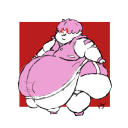
To display my prints in context, I drew three fashion illustrations that I scanned into the computer and using the selection tool and magnetic lasso, I filled the clothing areas and garments with my prints. The overall finish of these illustration were sharp, due to finishing them off on photoshop, I got to edit and redraw some sections of the drawings I didn’t like too much and enhance the black lines so they were as black as they could be. I feel digital printing creates very intricate prints because of its ability to back track and alter anything, as long as your photoshop knowledge is advance enough.


These are my three fashion illustrations I made and incorporated my prints into.
0 notes