Text
Refined version - Brand Guidelines (Final)

- Removed grained effect to show smoothe effect since I am making a brand of skincare I want to emphasize the smooth skin as my background colour


- Moved logo design to the first slide to introduce to the target audience the design and at the same time of explaination of Pado

- instead of repetiting the design this slide shows how to apply logo to the designs


- tried to fit a image of Hye Yeon however, since theres two paragraphs its hard to fit an image.

- too much negative space wasnt appealing therefore I insert an image of our target audience to show how would they looks like in real life


- Typographic choices were taking too much space therefore I put all the information in one slide


- to match to my colour palette I lighter the green area and removed the icon illustrations because it seems like it repeats.

- I changed one of the illustrations since it didn’t match with others.


- by changing the pattern colour emphasizes the tagline and the smaller boxes

- The previous mockups didn’t show the box well therefore, I moved the bottle on the right side to show both designs at once

-For all the box designs I removed white colour for the background to stand out the taglines and illustrations


- previous image didn’t work well and it wasn’t clear enough to see and pervious design was mundane and wordy. And with the current brochure design I added more images to give joy


- I made the white outline thicker and removed clouds to see clear for the taglines


- short text columns to read easily

0 notes
Text
Magazine advertisement

From the feedback, the tagline, “let the skin breathe”, due to the cloud the tagline cant be seen because of the white colour that blends to the clouds. in addition when looking from the distance you can’t really tell white line.

So I refined with a thicker stroke and removed clouds and now we can see the tagline clear and stands out
0 notes
Text
Final design Instruction design

Compared to the previous design this looks more appealing and enjoy to read
0 notes
Text
Instruction Guide refined version

Putting all the steps on one page doesnt look appealing and too much and too wordy
0 notes
Text
Instruction guide design
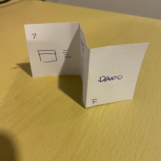
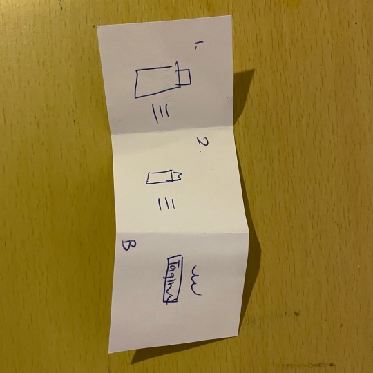
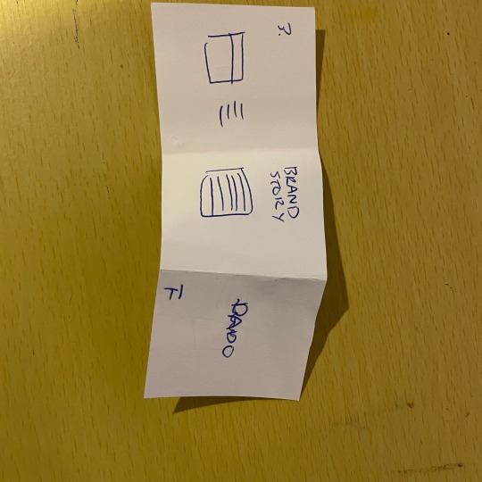
Z fold instruction template
I tested with a quick prototype and its not very satisfying cause of the numbers are randomly placeed
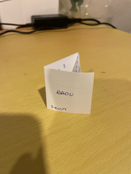
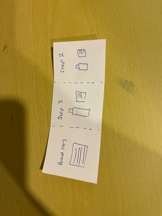
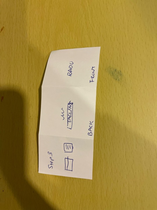
Gate open fold version
I prefer this one then z fold becuase when the target audience opens the instruction page it shows clearly in one side
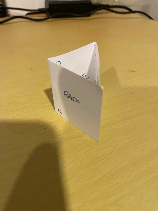
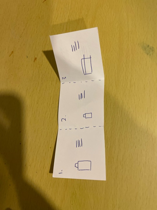
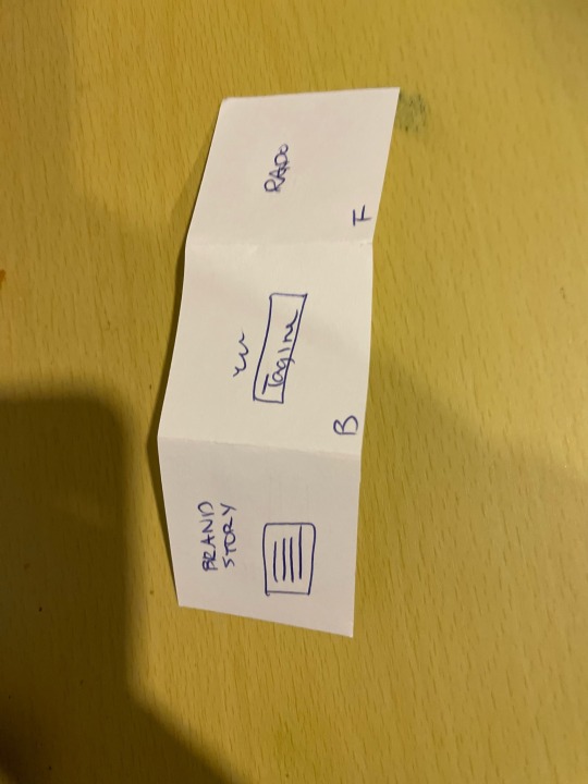
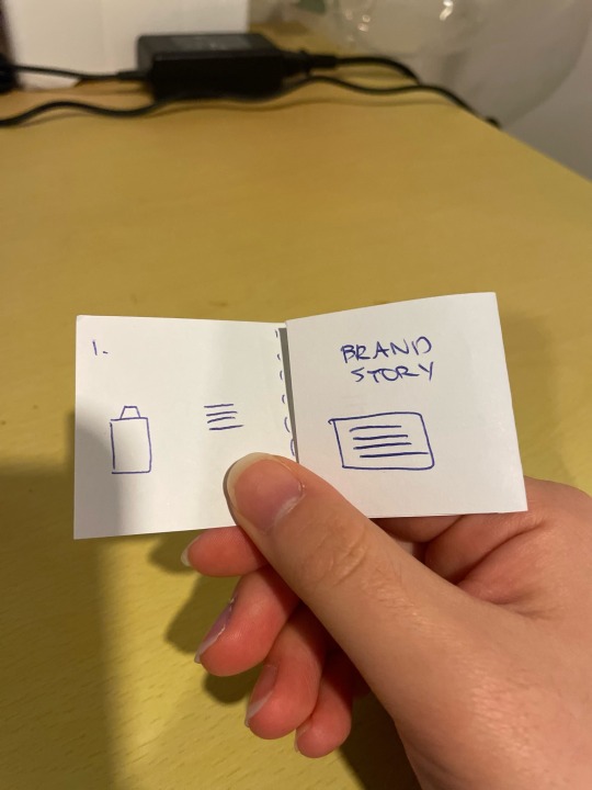
I rearranged the template so all the 1,2,3 steps would be on one side and when they open the instruction guide it shows brand story of pado
0 notes
Text
Instruction page Refined version

Wrong order but I tested out to see how would it looks like in real life.
- Too wordy
- Front and back aren’t consistnce
-Mundane
0 notes
Text
Refined ver

before

After
From the week 11 feedback the background colour is too light to see the icons and taglines therefore I tested with no white gradient and I can see clearly the whites
0 notes
Text
Smaller packaging

Before

After
Initially I use white colour for the taglines however, I tested out with black because I want to stay similar. But I wanted to keep the black to make a focal point and less focal points cuz it may create distractions so I want to keep it white for the tagline which also makes more appealing
0 notes
Text
smaller packaging refined version


After the feedback with Tatiana the previous pattern didnt match with others therefore I re designed the patterns therefore I had to changed my smaller packaging patterns. I am satified with the new patterns and it goes well with others
0 notes
Text
brand Guidelines title page

Before

After
Initially I like the grainy effect however since my design is about skincare and being pure and clean skin, the grain effect didnt work out therefore I removed and stay it is. This created more warm effect and clear.
0 notes
Text
Bottom view

Before

After
Through the feedbacks the bottom view seems like unfinish and I agree to that feedback not to ignore the bottom view. And the refined version created more pleasing look.
0 notes
Text
Top view of the main packaging

Before

After
Compare to the initial top design I wanted to keep it simple therefore I only added wave icons to feel like the tagline “let the skin breathe. And to give more elegance I made logo and tagline smaller because it creates distraction.
0 notes
Text
Illustration refined


Through the feedback section I realized the illustration was too random compare to my previous and colour palette because the green colour stands our too much however, I tried neutralizing the colour to fit in with others
0 notes
Text
Inside view refined ver

Smaller and paler patterns works to attract to the tagline however with the gibson font doesnt suit with the tradition korean patterns
0 notes
Text
Week 10 Prototype Feedback from Tatiana
- Detail view of brochure design
- Test out with different colour for logo design
-packaging images need to be smaller
- needs improvements on instruction page

- Compare to other icon designs too random needs change

-be consistence with logo white or black
-San serif headline?
-Not sure that the white is better. but make sure there is a contrast
- Gradient should be lighter it has a bit of black
- Dust/Grain
- Probs make it softer that represents smooth skin? or have the grain very subtle so it taken away blobs of gradients but not too evident
-Less black... give more a sense of softness

- Try with San serif logo font
- The icon with the right place?

- too close with the head, lower

- too much negative space, photos?

- photo of hyeyeon?

- maybe instead of black use slightly darker blue
- Taglines san serif
- more personality

- bullet points not in right position use spaces

- Make the image smaller so doesnt across the title
-packaging design- make smaller for the outline design
- make logo and tagline the same length

- Looks un finish, needs improvemtns
- make the lenth smaller so easier to read for the target audeince

- too much negative space

- wrong direction og the shadow
- don’t go over the title
- icons being too big and use blue or lighter maybe?
- shadow makes messy since

- instead of using black outline probs use white if works?

- illuistration random colour of green probs make it subtle
- don’t go over the image and text

- too long text columes make it shorter

- white and clouds? cant be seen clearly
0 notes


