Photo




30/05/19
g.r.a.c.e to PRINT
Update: Focus Group (*see appendix) was a success. Results were positive. And, I’ve added a contact page at the end of my doc, (obviously with made up workshop address, email and phone details), just to make the feel more professional.
That’s it for my launch pack.
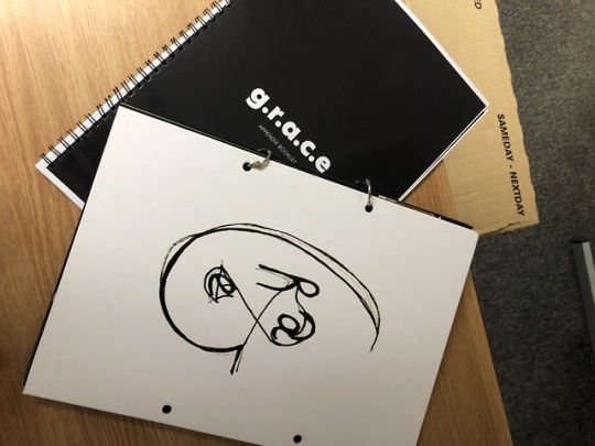
So, time for print. I decided to print at Print Quarter, as I was impressed by the large array of printing options.
Hopefully, it’s worth it, as it’s a hassle to get to. I will be collecting my book tomorrow, but you can see the format I’ve chosen, which will replace that cover with our logo and a spoiler alert at the back.
Now, I know what you’re thinking. g.r.a.c.e is all about sustainability, yet you're using metal?????????
Well, no. We are repurposing metal that was thrown away like we do with waste in our designing process.
We are also using 100% recycled paper.
The recycled paper bit is true. Obviously, the metal part isn’t. But, I thought it was a quirky detail that mirrored g.r.a.c.e.
Although I knew I wanted to print on recycled paper from the very beginning, the colour threw me off a bit, as the paper was more yellow rather than white, and it made the pictures look grainy (not in a bad way tho). However, I have to stick to what I support throughout my writing: environmental responsibility.
I have thoroughly enjoyed this project. It was definitely really eye-opening and challenging, as I immersed myself into a completely different side of fashion, developing skills like research, creative thinking and teamwork further, along the way: so that’s a bonus. And, after going to the taunting 3rd Year briefing, I feel that I am somewhat already equipped because of it, as I have had a good glimpse into the real world of brand building with this brief- which was definitely foreign to me till now.
I’ll let you know if I am pleased with how the pack turned out, when I pick it up later today, If you don’t hear back for me, that means everything is A-okay.
Update: Not really pleased with Print Quarter, as don’t think it was worth the hassel in the end- #1 they printed my cover upside down lol and so holes got punched both ways (eventhough in the end I did think it suited the quirky element of my brand) and #2 I caught a few pages being dirty (yes, I’m a perfectionist).
Also, I realised that I forgot to change the thickness of some writing, resulting to it being almost non-existent, unless placed under a microscope. Thankfully, it was not die-worthy text haha. But, it’s something I should add to my checklist for next year to ensure this doesn’t happen again.
Anyways, glad it’s done. I added my quirky details too with markers, as I never experimented with adding like marker in my book. Since I feel it fitted my brand, I wanted to try it out. I liked the result.
Not gonna lie, the highlight of my year was signing off my ethics clause (digitally too because I’m extra) and placing my books in the basket. :)))))))
On a closing note, thank you for keeping up with me throughout this journey.
BYE, SECOND YEAR.
Have a fabulous summer, whoever you are.
0 notes
Photo

27/05/19
QR Codes Update
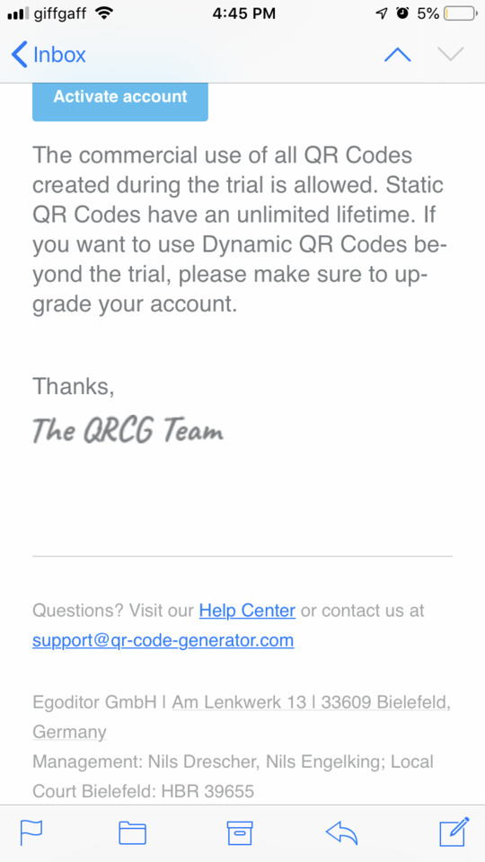
So, yesterday I got an email saying that if I want to keep my QR codes activated that I created for the exhibition, I need to pay £200 pounds for an annual membership.....
And that’s when I learned the difference between FREE static QR codes and PREMIUM dynamic QR codes. Unfortunately, I created the latter so I hope tutors did scan in during the exhibition to see that they did actually work then.
(Being the paranoid person I am, I checked them a million times and made my friends scan in too :))))))))))))
But, it’s all part of the learning process- at least I’m going into the third year knowing more about QR codes and not to trust sites that claim they are 100% free- I should sue.
Anyways, I used STATIC codes in my appendix. So, already applying my knowledge.
Word Count
So basically, just found out that the press release does not count in the word count. However, I did not know that.
I used my press release as a way of explaining my collaboration in depth to my reader, so it was nearly a page long.
So without it, I now have like 3369 words. But, my pack is currently in print, with the old word count on.
Also, I always hit the range limit, which is usually 4,000. So, this is really annoying me as I now feel guilty for not maximising the entire word count. So, again, out of my comfort zone. But, it might be an opportunity to see if I can convey what’s needed in a more concise word count than usual?
Today just keeps getting better and better... But, I will overcome it. I already have an idea of changing the count creatively- fingers crossed it works out when I try it out on Thursday when I collect my book.
Writing up an Introduction, Methodology, and Conclusion?
So, it’s come to the point where I would usually write a formal introduction, methodology, and conclusion.
But, since we aren’t going down that route today, I thought I’d just reflect on what I’ve done so far, to see if I’ve accomplished what I set out to do.
Part 1: What do I think I set out to achieve?
My launch pack will strive to explore my designer’s, Molly Grace Jones work and the influences behind them, with the aim of crafting a new brand inspired by her designs’ identity that can stand its ground amidst a competitive landscape.
To do so, I’ve focused on analysing their macro and microenvironment, which in turn allows me to present viable strategic, integrated and creative marketing and communication solutions that translate her designs into a brand with cultural relevance and unique anatomy.
Part 2: How did I do it (practically)?
How did I analyse g.r.a.c.e’s macro and microenvironment?
Primary Research: Designer Meetings, Shop Safari, Online Observation, and Consumer Interviews. Regular meetings were arranged with my designer, to delve into her design process, way of thinking, and visions for her brand, and derive feedback influencing and helping me shape my decisions along the way. The streets of Nottingham and the worldwide web were scouted to observe the shift to zero-waste in action, see g.r.a.c.e’s competitors in their online retail environment and stalk social media profiles for juicy insight into luxury brands’ social media strategy and the accounts I based my portraits on. Interviews were carried out with two luxury consumers with the aim of gaining key insight into their current customer journey as a luxury consumer, in regards to their buying motives and expectations.
*Considering my target demographic- affluent Millenials- I did not think it was appropriate to conduct an online survey in the beginning of my research as I usually do, to explore luxury buying behaviours, perceptions, and trends in this case, as it would be answered by just broke Gen Z university students (I do not have large groups of friends that are affluent or in their mid 20′s). The results would be clearly inaccurate.
Secondary Research: Secondary research was conducted using a varied range of resources. Provided deeper insight into g.r.a.c.e’s market, relevant industry trends, competitors, consumers, and future outlook. Market Research Companies such as Mintel, Market Intelligence Sites such as Euromonitor International, Trend Forecasting Sites such as WGSN, Online Magazines such as BOF and Forbes, Fashion Magazines like ID and DAZED, and Academic Books such as Marketing Fashion (Harriet Posner).
Part 3: Did I achieve it?
Yes, I believe so. I think it is pretty evident that time and time again, g.r.a.ce has been proven to be unique, relevant, and futuristic- from its designs to its core beliefs, to the way it communicates.
An ecosocial warrior we never knew we needed.
However, despite gaining feedback from my designer and friends along the way on all the strategic decisions I made throughout my brand development, I feel as though I need to enhance my primary research just a bit more with a focus group.
This will help me derive final qualitative feedback on my communication plan before I am ready to print and hand in, to get an idea of the impressions from Gen-Z, who might not be my target demographic, but are even more demanding and have a shorter attention span than millennials, so their opinions would be pretty helpful.
0 notes
Photo


24/05/19
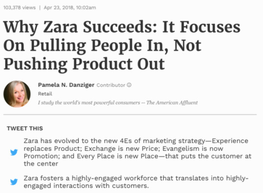
Delving into comms: The 4 E’s
Experience. Exchange. Evangelism. Every Place.
Coming across this article was really interesting.
From the 4P’s to the 4C’s to the 4E’s. It’s crystal clear that becoming customer-focused is the way to go in the competitive fashion industry.
So although I used the 4C’s in my appendix, I thought that critiquing my final communication plan considering this framework would help me recap and reflect on my previous consumer research and determine whether or not it will translate into ‘highly-engaged interactions with customers’ that will allow g.r.a.c.e build an army of ecosocialist fashionistas (that’s definitely a thing).
Doing so allowed me to add a few extra bits to step up my comms game:
Evangelism and Every Place: Add Macro and Micro Influencers @Trashisfortossers and @glacier996girl. We’ve established time and time again that millennials are buying into an activist mindset and into a lifestyle, with stats like “87 percent reported that the would spend more money on a brand that supports causes they believe in” to prove it.
But, we’ve also come across their fondness of influencers. So what if I combine both? After all, they are where are consumers are. Social Media.
Associating g.r.a.c.e with individuals who embody our brand and demographic, and reposting content by them we’ll successfully be increasing traffic to our accounts and boosting brand perceptions, usage, and likeability:
@Trashisfortossers is a well established millennial zero-waste icon, as she is known and loved by her followers who share her commitment to this lifestyle. Even though she is American, she often attends and advocates for events like Depop in the UK.
@glacier996girl featured in I-D for taking on her generations’ ecosocial fierceness and eccentricness would be considered a micro-influencer, meaning she would be cost-effective in uplifting engagement amongst our consumer base.
It was soooooooo hard to find these two. There were a lot of millennial activists online, however, they would not fit into g.r.a.c.e’s aesthetic, or vice versa.
Surprisingly, g.r.a.c.e’s competitors use no influencers nor do they have a strong social media presence. No wonder zero-waste is fashion’s best-kept secret. Platforms are not being utilised. We have to change that, obviously not bashing them along the way. Just show them how it’s done.
Experience, Exchange, Evangelism, and Every Place: Turn #ICONIC-ness into a community extravaganza. At first, I was going to just launch our collab in a typical pop-up featuring the collection. But, placing emphasis on Exchange in this instance, g.r.a.c.e should immerse consumers through an experience that echoes their brand promise and proposition- which obviously goes beyond just clothing. This will include collaborating with local emerging artists like Alexander James, and zero-waste collectives like Earth.Food.Love. Obviously, by collabing with a range of people who add value to the event and attract their target demographic, the event’s appeal and exposure will multiply.
It always takes me forever to fine tune my comms approach, but I can now say: case closed.
0 notes
Text
DEADLINE INCOMING


22/05/19
Final Push: Launch Pack
First things first. I am quite relieved that I was composing my piece along the way, alongside the relevant scale-ups. Like, right after the Press Release lesson on Monday, I sat my butt down to do it right after.
So, now, I just need to fine tune my information rather than do it from scratch.
So before I start designing my document a few days ago, I knew how I wanted it to look: conceptual, but at the same time include some overcrowded bits and have a black and white scheme that would be broken up by the colour palette in her designs. Lots of colours going on, but that’s g.r.a.c.e.
And I know how I wanted it to sound: cultured, formal, decadent with a dash of contractions, quirky remarks and witty plays on words (e.g. fair trade) and images.
This is also something I am trying to communicate through our social media presence e.g. on Instagram, by using playful location markers, and captions alongside the image posted.
It’s all about making sure I am reflecting grace’s contradictory nature through the layout and tone of voice throughout.
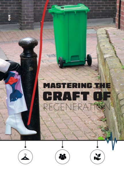
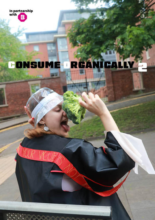
Also, by continuing to have subliminal/hidden messages throughout, if you can call it that. Like the pulse symbol and mastering the craft of regeneration by having a 3 in 1 image with the leg being regenerative design, background- social, trash can-environment and consume organically, to reduce C02 emissions.
The struggle I had so far, however, was getting the balance right to deliver a cross between a brand book and report. Sometimes I find myself either saying too much or too little. But I am currently working towards achieving that balance within my word count.
It’s soooooo weird not backing my work straight up with stats, citations, and arguments. I’m so not used to it but it’s also refreshing so can’t complain.
I’ll keep you updated, but so far I am quite confident in working towards the deadline.
0 notes
Photo


17/05/19
Fashion Show Fittings and the ACTUAL event
AAAAAAA, it’s finally here.
So this was a long day, but definitely rewarding.
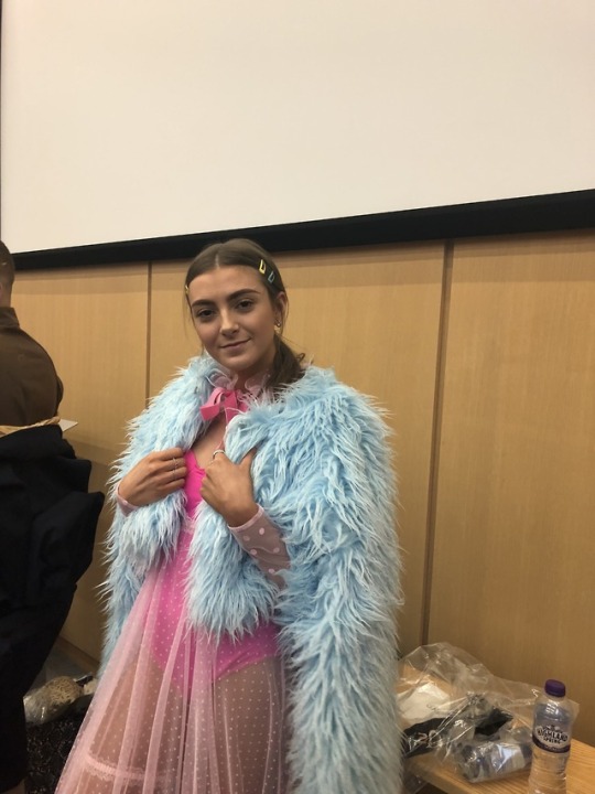
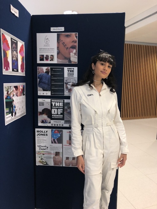
It started by hanging up my boards. Looking around me, I saw many of my coursemates had really interactive setups that encapsulated the feel of their brands like Dom’s tea infusion stall.
Personally, I feel dedicating the time to create my own content to communicate my brand’s unique creative voice, was a much better fit for my brand, as opposed to having an elaborative stall or music playing in the background just for the sake of it, without adding any value.
So, I am happy with my contribution to the exhibition (which is something I rarely say) and I do not feel that it was lacking appeal.
Sooooooo, fashion show time. 24 hour day, here we come.
Of course, we started with a little drama like missing name tags we had to reprint like 3 times, trying to hang up posters on wobbly easels, and failing to keep canvases stuck on stands.
BUT, of course, we dealt with it as a team. It was challenging at times to work with over 50 people to create this show. However, it was particularly evident today that all teams had grown to support each other when needed even if it was not part of our assigned duties. I’ve enjoyed working with people like Alex that I haven’t gotten the chance to over the past 2 years.
The majority of my role today is ensuring backstage runs smoothly. This started by attending the fitting yesterday. Where no joke, I fitted over 20 models in a very claustrophobic corner in a very hot room. But, it was worth it, seeing everything come together backstage today.
From the start of the backstage, I did suggest that each model should be assigned a fitter to ensure people know exactly what they are doing, instead of aimlessly walking around.
However, this was ignored until the production leaders realised that the lack of order caused mayhem backstage. Thankfully, Max stepped in and finally assigned everyone right before the final catwalk.
Unsurprisingly, this meant that backstage was in tip-top shape, and the show was a success.
I was specifically in charge of fitting 2 models with 3 outfits each, but of course, I lent a hand where necessary, as some outfits were really complicated.
I also got to see a playback of the show through our account’s live stream as I didn't get the chance to see it, and I can also say I am proud of what we achieved in such a short period of time for such a great cause.
I am also supposed to take a shift for overseeing the stands tomorrow, but Olivia mentioned that she wanted to delegate some responsibility to people that have not stepped up throughout the process. Which, sounds good to me, to be honest.
0 notes
Photo

13/05/19
Reconsidering Logo Variations
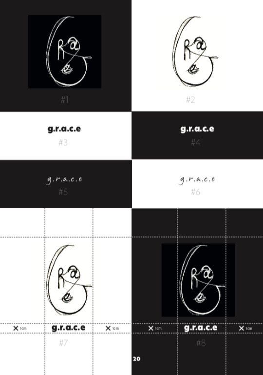
So, I had an eye-opening conversation with Anthony. He mentioned my layout was impressive and that he loved the contradictions in typography going on.
But, he pointed out, that this was not reflected in my logo. And that was absolutely right. How did I not see that?
I’m all about our dual identity, but then I have my hand drawn logo alongside a handwritten version of our name. So that’s not consistent branding.
Instead, now the handwritten name can be presented on its own. The only version of our name that can accompany our logo will be bold and sleek.
Now, that we got that over with, it’s time to work on those boards.
Visual Board Critique
Critique Time. Surprisingly enough, I am very pleased with the way my boards turned out, as I found it time-consuming and challenging navigating through all the information I currently have and deciding what goes in or out.
So, I will take you through my thought process when creating these:
Board 1
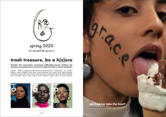
For my first board, I thought I’d introduce my brand as it would be introduced by ID magazine in spring 2020, the fashion season we are launching in.
Obviously, I’ve done so with g.r.a.c.e spin by replacing their logo with ours as it’s our ID and having a play on words that alludes to our zero-waste process and vision.
Of course, this issue stars glamour, regeneration, advocation, curiosity and eclecticism (so us), and fellow visionaries in luxury fashion, our market.
So this board will aim to set the tone of who we are and want to achieve, and give a glimpse into our playful creative/our i-D influenced vibe.
Board 2
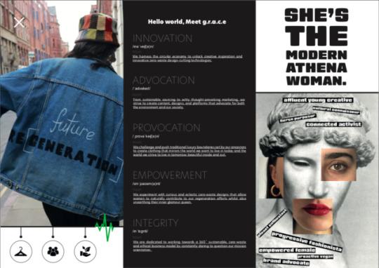
Then the second board delves in deeper by exploring our pulse, the core values we live by, and our ultimate primary consumer- the modern Athena woman.
Instead of using a generic consumer profile, I opted to highlight the psychographic characteristics our ultimate primary consumer posses, by reconstructing Athena’s face to connote that anyone who shares her mentality can be her, as well as humanize our brand as she is essentially the human incarnation of us.
Board 3
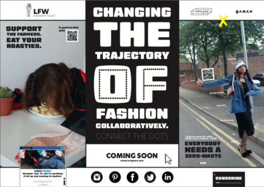
And the third board is our plan in action- which we believe can only be realized through an emphasis on cross and industry collaborations on both online and offline platforms.
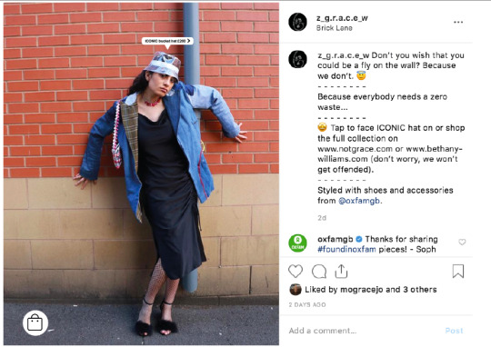
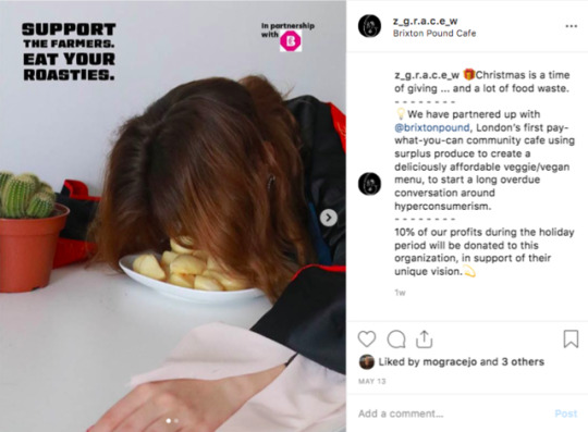
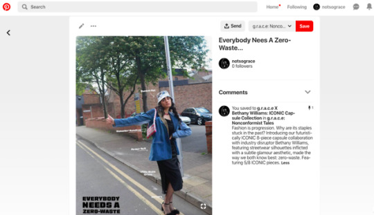
So it outlines some of our major comms moments including our LFW debut, our Christmas partnership with Brixton Pound which is a “pay what you can cafe” using surplus produce to create deliciously affordable vegeteration/vegan dishes, our connect the dots slogan themed campaign teasing our site launch, our trashy blog, and newsletter, and finally our ICONIC capsule collection with zero-waste streetwear brand Bethany Williams which we hope to be covered by sending a press release to magazines like DAZED and lastly, our social media channels.
Designing these, I put myself in the viewer’s shoes. This largely determined my decision to use as little writing as possible, and instead invest time in creating my own content that can communicate for itself- as they say, a picture says 1000 words.
This was pinpointed from Adele and Katie in this session, as a positive note, so I was very pleased to get validation on my creative opinion.
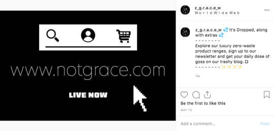
The only thing that was noted for improvement was adding a coming soon to my website link (which has been rebranded to notgrace.com, as inspired by our critique convo), and links to Instagram and Pinterest accounts for g.r.a.c.e.
(*Side note: I tried to name my Instagram account ‘notgrace’ too for consistency, but it was taken. So I went with z_g.r.a.c.e_w which stands for zero waste- still reflects us)
So, I went on to modify my last board accordingly and added QR codes linked to both the relevant Instagram and Pinterest posts shown, as a call of action- especially since one of them must be scanned to reveal our campaign partner adding to the “suspense” haha.
I’ve tested them out and we are good to go.
Bring on the exhibition.
0 notes
Photo



12/05/19
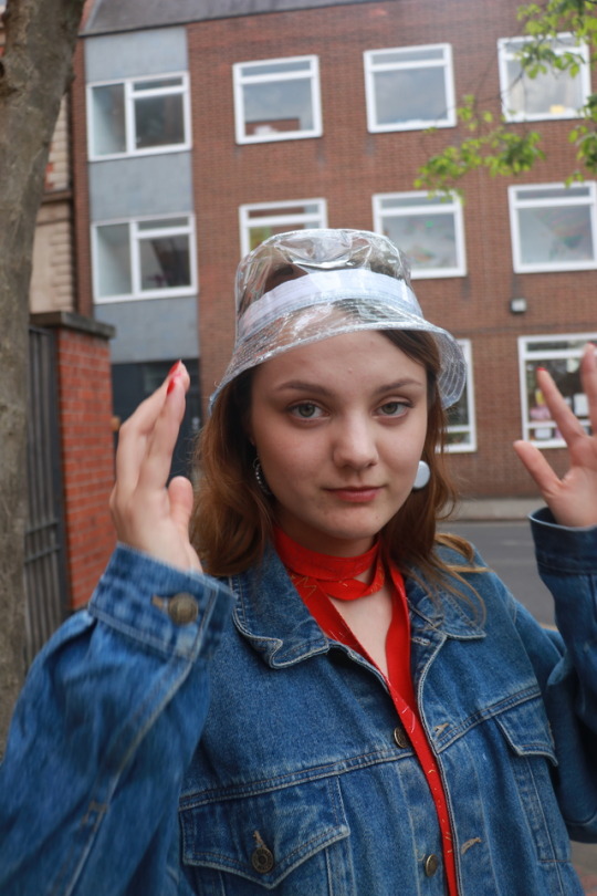
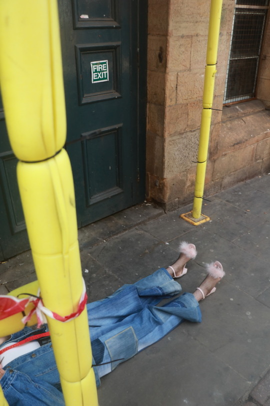
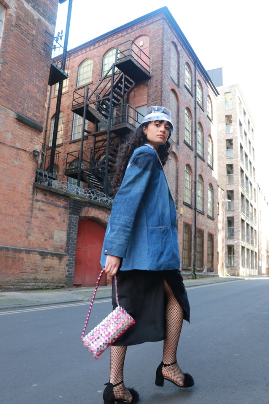
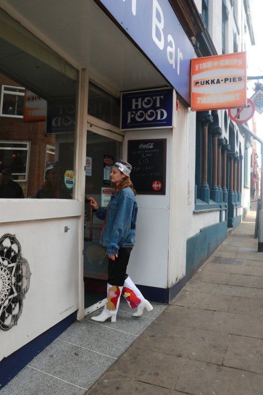
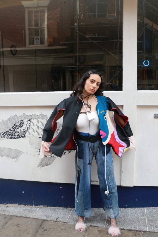
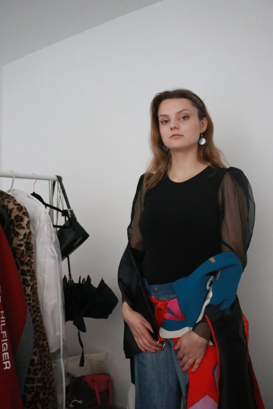
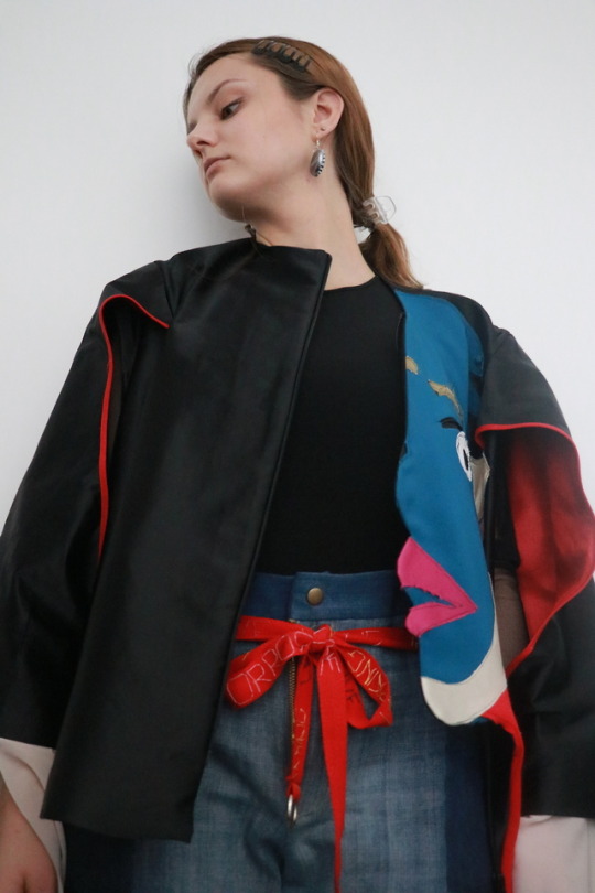
Final g.r.a.c.e Shoot
I wanted to get this shoot done yesterday, but I have no friends but one that works 24/7 and is only available on Sundays.
Thankfully, it was worth the wait. I am so pleased with the content me and Anete shot today. They definitely brought my vision to life, as I was also able to get behind the camera today.
As I said I would do previously, I styled the garments quite differently than yesterday- I wanted a bit of variation particularly in the styling, to make sure my launch pack would be engaging. And actually, I used Molly’s jean pantsuit from her Menswear Project to complement her designs- which was a success, even though they were absolutely MASSIVE.
But, we overcame that obstacle. For the first outfit, a casual yet still very vibrant look with luxury undertones. As, I had Anete wear a black sheer sleeved jumpsuit that complemented the jacket as it was peaking through, and the jeans held up by Molly’s belt. Her second outfit was a bit more fun and edgy, featuring her pants, the belt turned into a necklace and a bucket hat.
Similarly, my first outfit added an eccentric wire necklace (non-renewable energy, duh) alongside the jacket and jeans. My second one used none of her current collection, as it is part of my comms collaboration.
As I’ve mentioned time and time again, I went with the maverick approach. We are opting for non-posey, unflattering angles, and frankly weird, almost comical narratives. Which believe it or not, are more challenging, tiring and time-consuming to shoot.
But, I think I’ve achieved that so it was worth it.
So, I am quite happy to add in my imagery to my exhibition boards in time for my critique tomorrow. But, I am quite nervous to see if what I want to communicate is actually there. Wish me luck.
0 notes
Photo



10/05/19
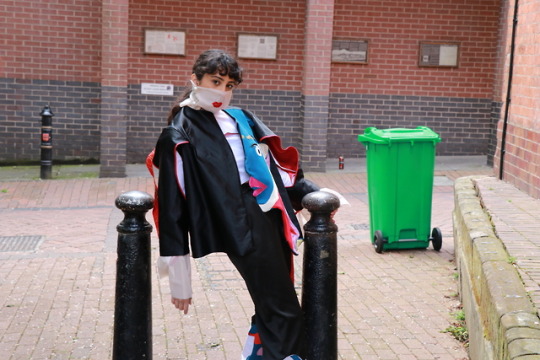
FMB/FD Collaborative Shoot
Finally, get to see my designer’s clothes finished and in person.
Honestly, I am not a fan of her designs. That’s why it has been a struggle getting inspired to create her brand until I made it my own.
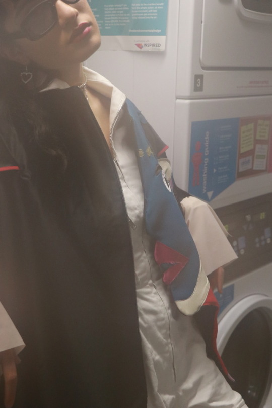
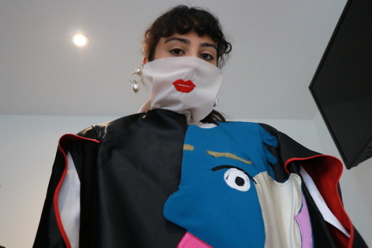
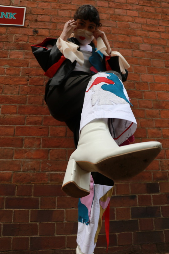
However, I was excited to see how this shoot would turn out, as Molly wanted to do it with me since she needed content as well. We both decided that this shoot would be focused on really capturing the intricate details and quirky spirit of her garments, amidst very ordinary settings like random alleyways, elevators and washing rooms.
So we did exactly that. And styling wise we both pitched in creating the first look with all her garments together, paired with a pearl/gold earring, whilst the second look we chose to style just her jacket with a boiler suit and ‘bling’ jewelry to create a stark visual contrast and add an underlying message about overconsumption.
*Oh side note: My model dropped out this morning. So, I had to step in.
In my opinion, I preferred the outcome of the latter. Looking back at all the pictures, pairing all the garments together was very overwhelming, resulting in attention being shifted away from the uniquely intricate details on each of her garments.
I thought taking one or two pieces and to style them differently, would much better highlight the garments. So, that’s what I will definitely do more of in my own time. Oh, and also experiment with different angles as Molly had never used a camera before so found it difficult to capture a wide variety of shots.
However, I am quite pleased with today’s outcome as I expected that my awkwardness with people I just meet would take the better of me. But, I felt really comfortable with Molly, and in the first time in forever, I can say that I’ve had a good group work experience.
0 notes
Photo
9/05/19
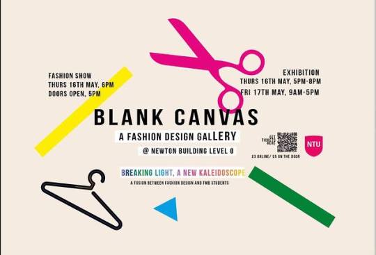
Fashion Show Update
The fashion show is fast approaching.
This last meeting was really productive. As, up to this point, I feel the production team had a more supporting role.
But now, it’s time for us to take control and take this thing to the finish line.
So far the responsibilities assigned by Olivia, my team leader, were to Kenny to find a DJ, all of us to help find models and brainstorm makeup looks and Chloe took control of the model list, and I was contacted by designers who wanted to be backstage on the day of the show to ensure there was no chaos.
It is actually so weird being under the leadership of someone. Throughout all of high school and university, I have always been group leader, as I always found myself in a situation where team members were unmotivated and had to take charge and delegate to get the work done- even if it meant asking for something a trillion times till I get it done.
So I was looking forward to working under very different dynamics as it would be a new challenge since I was out of my comfort zone and struggled thinking I would not have control- being a control freak I am.
So instead, to get involved, I made sure to check in if there was stuff to be done as there were no major responsibilities delegated at the moment, but the group response from Olivia and Chloe was always along the lines of ‘everything is under control’.
Although Olivia is a lovely girl, I feel that a leader should motivate and inspire. Although general updates were given, there were no ‘team-building’ activities (e.g. group meetings and delegation) that helped us bond as a team and work towards a common goal?
So, when it was time to discuss fittings, backstage and set up tasks, I made sure to intently voice my commitment to being present for all, as, from the very beginning, I mentioned that I’d be happy to deal with all production matters.
So, starting from Wednesday’s fitting, it’s gonna be really intense, but I am motivated to ensure that all the hard work that has been put in, is reflected on that runway on Thursday.
0 notes
Photo


8/05/19
Designing www.g.r.a.c.e.com
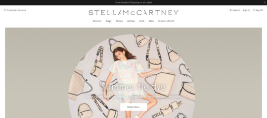
Meanwhile, I figured it’s time to consider how g.r.a.c.e’s website will be designed.
I struggled to find inspiration, as I know I wanted to create something really different from competitors- somewhat conceptual and visually seductive, with of course a black and white theme. I don’t know how to describe exactly what I’m thinking design-wise. But, I’m quite pleased with the aesthetic of the first prototype I made today (of course, I’ll keep refining along the way with appropriate pictures,etc.)
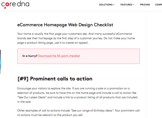
However, when making sure that my website ticked all the practical side requirements of a well-designed homepage, I skimmed through various checklists which reminded me to make sure that it had a consistent appealing layout that reflected g.r.a.c.e’s identity, was easy to navigate by adding stuff like a search button and subranges, and social/contact channels were integrated to ensure an omnichannel experience. Also, other boring yet legally and lifesaving essential bits I hadn’t thought of like ‘shipping and returns’, ‘terms of use’ and ‘privacy policies’. These inspire trust and add credibility.
I also added a quirky g.r.a.c.e touch with a blog pop up and a slideshow (currently featuring our newsletter) if you could call it like that, that will allow for extra calls to action and fresh content on our webpage.
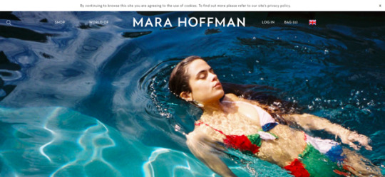
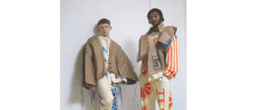
I was actually surprised when I was looking through competitor websites. Of course, Stella McCartney and Mara Hoffman’s site where picture perfect both visually and commercially.
However, despite Bethany Williams site being very informative in regards to their brand story, it was really weird and confusing?
I get that luxury brands who have a very strong mission orientation, prioritise that. But, they are still a business that must provide a seamless online customer experience- starting from the homepage.
For example, it was almost impossible to navigate, as there was no call to action, nor could I even find out information of where collections were sold on the site itself, only on their Instagram account?-definitely not ideal/commercially viable, as there is no omnichannel experience.
The homepage is the first impression, so I should make it count.
So, taking into consideration the good and bad examples I came across, I am fairly confident that despite designing a webpage for the first time, I am on the right track.
In my launch pack though, I don’t wanna blab on about I put sub-categories because it would help in easy navigation etc.... that’s report talk. I thought about writing keywords that would signify why each element on the homepage is there and their role.
I’ll insert a picture when I do it on my launch pack.
0 notes
Photo

6/05/19
Creative Endeavours [Part 1]
Specifically, today’s goal was to creatively communicate g.r.a.c.e identity: name, logo, tagline, typography, and colours.
I got down and dirty in pursuit of the perfect shots, experimenting with different angles and backgrounds.
Name and Logo
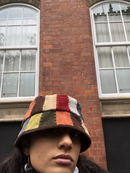
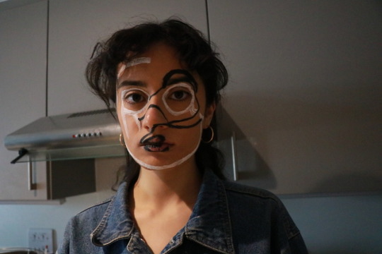
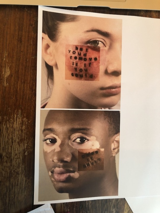
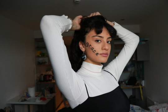
With the face acting as a reflection of who you are in both Pinterest sources and my designer’s research, I was inspired to have g.r.a.c.e displayed on my face, as the name itself and meaning behind it is the brand’s truest reflection.
I was looking to take close up shots but aware that even the styling story insight had to reflect g.r.a.c.e. And so it did. Next to no makeup as for future reference, we want all attention on the clothes/natural beauty, The coca cola caps: the idea of repurposing waste + the pearl necklace: opulent staple = alternatively glamorous. Oh, and did I mention the melting ice cream? brings me back to the good old days of a blissful childhood.
In contrast, the logo experiment did not work out as imagined. Instead, it looked clownish and just plain freaky- may work for Moschino, but it’s definitely not g.r.a.c.e material. But no worries, I will think of an alternative solution along the way (hopefully) closer to the clothing shoot where I’ll have a chance to reshoot or rethink it.
Tagline and Typography
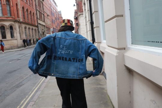
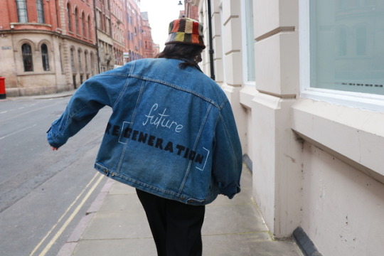
Starting with a good old oversized denim jacket which I thrifted on depop (as per usual) and some acrylic paint purchased in Poundland (student life), I decided it would be cool to have the tagline written in the dual typography applied by g.r.a.ce as well as play on the concept of the oversized element of the jacket to subconsciously communicate that we have some big shoes to fill when it comes to educating the future generation of consumers on a regenerative design/society/environment or just, making the future generation of fashion regenerative.
Quite frankly this phrase can be interpreted in many ways, but even so, they all link back to our key message/essence.
In turn, this was styled with a block colour bucket hat which encompasses g.r.a.c.e’s colour scheme and will be part of the ICONIC collection or not as not sure yet, but stay tuned...
Then, it was shot with the intention of having a pose that shows of the full tagline (which proved a struggle in many attempts until I finally got it), as well as having the expected raw and childish aesthetic discussed, as the final shot sees the model (me), like a child balancing on a narrow strip amidst a very normal city background.
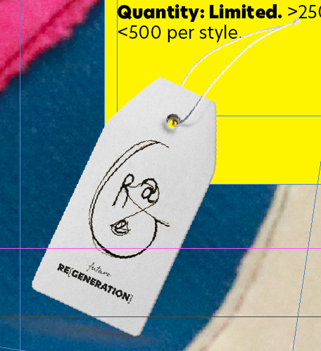
I’ve also created a price tag mock-up, to demonstrate how it would be used with g.r.a.c.e’s logo.
Colours
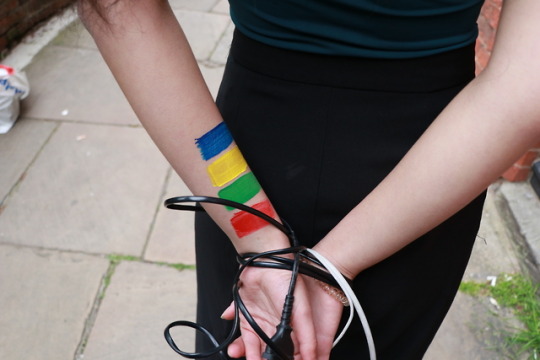
Power[less]: playing around with the colour scheme by having stripes of the primary block colours g.r.a.c.e uses on my hand which in turn is tied up with black and white wires, the wider issue it addresses is whether humanity’s hands are tied up when it comes to energy overconsumption.
I am pretty sure I can manipulate these to make my message come across. However, I think there is room for better execution.
I think the reason it didn’t turn out 100% as envisioned was just a case of having the restriction where I just wanted the hands to be on display, and it was actually physically impossible to do so. So, again I plan on re-shooting this in the next shoot to see where it goes.
Well, that was it for the day, and trust me when I say it was exhausting, but at the same time, exciting cause looking through pictures is so fun, especially playing around with different hues and angles.
Overall, I am quite satisfied with the results, especially with the way the jacket turned out. That was my main concern.
I’m looking forward to reshooting, and discussing with Molly how we will bring her designs and my creative concepts to life.
Exciting stuff.
0 notes
Photo

3/05/19
Developing a Creative Communication Plan
Drawing from my last blog post, the next step is to set appropriate SMART communication objectives that will allow g.r.a.c.e to successfully meet their objectives, and so realise their market entry/penetration strategies identified in the ANSOFF matrix (*see appendix):
PLEASE NOTE: DATES/TIMINGS MAY CHANGE SUBJECT TO DEVELOPMENT
To debut g.r.a.c.e first S/S collection in September 2019 in London Fashion Week as an “emerging designer”.
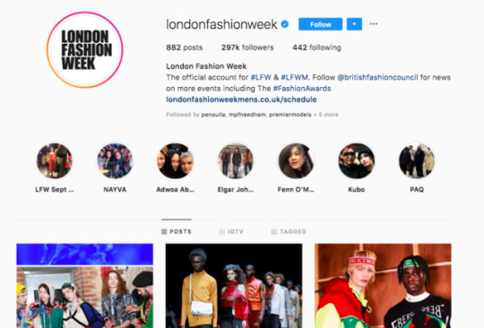
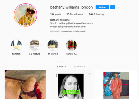
Considering g.r.a.c.e’s identity as a futuristic luxury brand that is the very definition of an “emerging designer”, this renowned platform would be ideal for introducing g.r.a.c.e’s vision to the world like it has done for fellow zero-waste designer Bethany Williams, as it has a wide PR reach, print/online coverage in magazines like ID seen by their primary consumers and so would be all around more cost-effective in comparison to hosting their own catwalk show. *think like there is no box type of brand*
?!?! Print Media: BOF opened eyes. “So, if luxury brands in particular, which ultimately trade on their cultural appeal, have the budget, why wouldn’t they advertise in top-tier print title knowing they will reach a highly valuable audience and curry favour for this kind of exposure?”
To drive awareness through a capsule collaboration with Bethany Williams in September 2019, increasing sales by 20% since its initial launch.
As explored in the appendix, Bethany Williams although a direct competitor of g.r.a.c.e presents an exciting opportunity for a capsule collaboration featuring items that encapsulate both g.r.a.c.e’s alternative glamour and BW’s unisex streetwear inflicted approach- they both are disrupting the zero-waste fashion movement in their own unique way, despite sharing the same young millenial target demographic. So, such as a collab would be ideal in so many ways-*think LV x Supreme, but way better and way more zero-waste*
Initially, I was contemplating if g.r.a.c.e should collaborate with known luxury labels like Gucci and Moschino instead, who are developing strong ecosocial brand purposes and share g.r.a.c.e’s quirkiness.
However, that would be unrealistic in the first year. Luxury Labels are careful with you they partner up and collaborate with- it is highly unlikely that they would collaborate with an unestablished zero-waste label despite being known for their bold and fun creative.
In the future? Quite possible. Such a partnership would capture g.r.a.c.e’s secondary consumer, by kickstarting zero-waste’s rise to stardom in mainstream luxury.
To successfully launch g.r.a.c.e’s e-commerce website in November 2019.
Noted in a previous blog post, launching their own website will be essential since it will be the main route to market. Obviously, ensuring a successful launch, they’ll need to raise awareness and generate anticipation prior. *hint hint*
?!?!?! Out-of-home advertising: attention span is short. be creative, or it won’t work.
To establish g.r.a.c.e as an up-and-coming, ground-breaking zero waste luxury label to its target audience, gaining a total of 20,000 Instagram followers by the end of the year.
Ideally, throughout this 1-year comms plan, g.r.a.c.e must communicate their identity and message clearly to establish themselves in the minds of their consumers, in turn starting to build a community on social media-particularly Instagram, the millennial favourite channel.
B2B Advertising is equally important- and LinkedIn is the way to go (93% of B2B marketers now consider LinkedIn to be the most effective site for lead generation.)!!!! We have to associate ourselves with industry professionals.
Obviously, these objectives outline the main activities set to take place in the comms plan, when considering g.r.a.c.e’s identity, their consumer and the ideal industry associations and routes.
To ensure these objectives have been met, they can be measured by simply observing consumer attitudes and reactions towards g.r.a.c.e, analysing social media statistics such as impressions and engagement rates, and monitoring and evaluating KPI’s such as the percentage increase in sales.
However, to ensure success, the challenge that lies ahead is to “make sure it's clear how they will be brought to life” and “drive brand engagement” at each touchpoint- including both B2B and B2C. As this was noted as an area of improvement in my last Boohoo assignment and I plan to pay attention to this time.
Currently, this will involve exploring potential campaign themes and shoot concepts over the weekend, to begin exploring different and innovative communication content.
0 notes
Photo

2/05/19
Building a Marketing Strategy
Because of the nature of this brief being more creative, I now find myself struggling to make sure that any direction I take should ideally be informed by my situational analysis findings and SMART objectives (even though the past 2 years have been all about constructing formal marketing reports!)
Stuart’s session was really helpful in helping me relook into how to begin developing a marketing and communications plan, in line with the business’ needs.
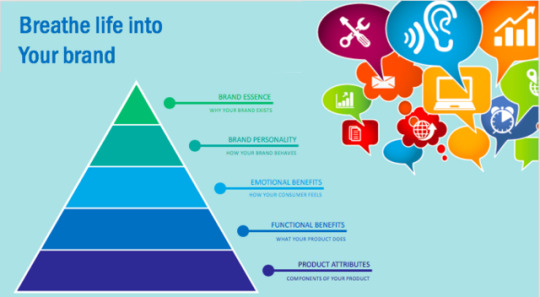
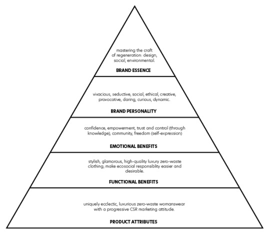
Obviously, I have brought my brand to life using the brand pyramid model suggested in this seminar, but also in my appendix using the brand identity prism and the Keller brand equity model (*see appendix). And, throughout my blog, appendix and launch pack, I analysed the macro-environment g.r.a.c.e seeks to operate in as a business unit. So, according to the SOSTAC model, I need to set SMART objectives in place.
But unlike past reports where I was working on giant companies like Boohoo and FatFace, this was particularly challenging as I am aware that as a startup g.r.a.c.e will have slightly different priorities and goals in an imagined 3-Year Marketing Strategy:
SMART MARKETING OBJECTIVES:
To launch g.r.a.c.e by the end of September 2019.
To increase g.r.a.c.e’s brand awareness, boosting PR reach and social media following by 40% since the initial launch by June 2020.
To establish g.r.a.c.e as a glamorous, disruptive zero-waste brand to its target audience, to achieve a net profit of £200,000 by the end of Year 3.
3-YEAR MARKETING STRATEGY:
Focus on Market Entry and Penetration.
Improve Brand Awareness.
Build Customer Loyalty.
As a startup, g.r.a.c.e must focus its first year of operation on successfully launching their brand and penetrating the market. Obviously, that will be executed through a robust omnichannel communication plan.
Of course, successfully doing so means in the future, they can continue building awareness which is vital in their competitive market as a new market player and ultimately focus on nurturing customer loyalty to build a fashion empire based on their strong brand identity.
Currently, unsurprisingly having gone through the same old, boring process, has helped me determine a pathway and so start brainstorming on potential communication strategies that will help me in realising these goals.
0 notes
Photo



29/04/19
#3 Designer Catch Up and Beginning my career as a Creative Director?
Update: Finally, my designer has sent in her progress as promised.
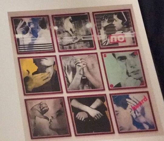
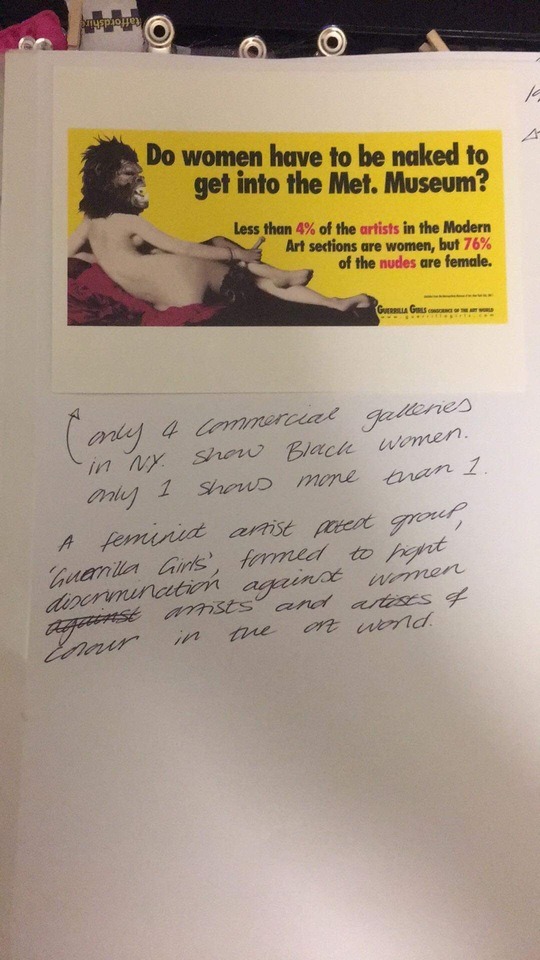
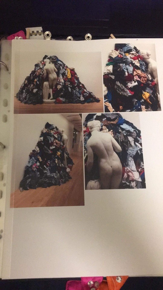
Thankfully, everything seems to be developing as discussed. She has not made any radical changes that have thrown me off guard. Instead, as she initially described, her line up has been coloured in with g.r.a.c.e’s colour scheme and her supporting research continues to explore the wasteful nature of fashion, its contradicting role as an advocate, and additional cultural influences on her work e.g. in this case, gender/race equality voiced through art.
So having completed my presentation and validated g.r.a.c.e direction as determined by Molly, I can now confidently define the creative voice of g.r.a.c.e. as a fashion maverick.
Obviously, I have established time and time again that g.r.a.c.e is not your typical sophisticated luxury brand, so naturally, it will not be bound by traditional luxury fashion photography standards- pretty girl posing with a pretty dress and prince charming.
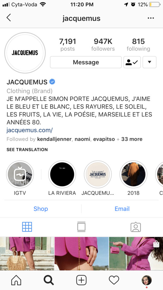
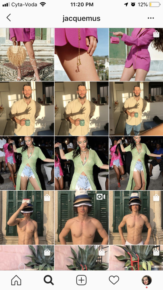
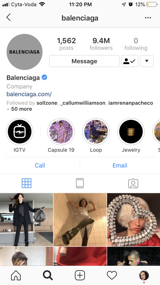
Instead, as seen in my Pinterest board, content created for and communicated by g.r.a.c.e will be inspired by the OG fashion mavericks such as Prada and Maison Margiela and harmoniously marry Jacquemus’ childish blissfulness with Balenciaga’s ‘undeniably seductive’ and ‘consciously ambivalent’ imagery.
I was pleased to see that I could still envision g.r.a.c.e harmoniously marrying all these elements from these iconic brands, to produce content that is uniquely seductive. As, prior to the presentation and designer update, I was worried that I might not have fully grasped the concept I was planning on executing.
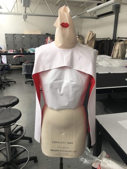
But seeing the development of the end product beginning to reflect my chosen aesthetic was a relief: for example, the added neck shear/mask detail that will cover the model’s face partially, further enhances the unique identity of her designs that hone in the dual face of fashion and is perfectly in line with the brand’s quirky creative.
I think it is easier for me to visually demonstrate this, to get a sense of what exactly I will try to achieve. So, I plan to begin brainstorming further on Pinterest with a clear mind and experimenting with a variety of creative mediums- ahhhh scary and exciting!!!
Stay tuned.
0 notes
Photo



26/04/19
Reflecting on Presentation Feedback
Today’s presentation touchpoint was great.
Adele and Parminder were really helpful. They pointed out my strengths such as my creative interpretation of traditional title labels like “essence”, strong brand and market positioning (story, values, consumer profiles, competitor analysis etc.), and trend analysis.
They also made further suggestions on how to improve some sections:
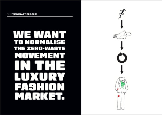
Making my vision measurable: Although I did expand in my writing about when our vision would be reached, I realised that by slightly modifying my vision statement as Adele suggested, I can make it even more clear: “We want to normalise the zero-waste movement in the luxury fashion market, making zero-waste synonymous to luxury.”
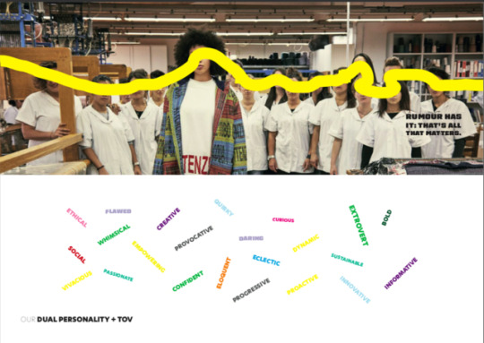
Differentiating between my personality and TOV: To ensure that these elements are not overwhelming my reader, I will separate these when presenting them in my launch pack.
Enhancing my USP: Adele mentioned that “distinctive fashion concepts” is not specific enough, as even if someone reads half of my USP, they should immediately be aware of what’s going on. So, my conclusion is that all parts that make up my USP statement should be a testament to g.r.a.c.e’s uniqueness: “Bringing distinctively alluring zero-waste fashion concepts with a progressive CSR philosophy into existence.” Hmm, I’m wondering if stating what I am NOT might be more powerful considering g.r.a.c.e puts emphasis on rejecting the stereotype of green fashion and CSR....
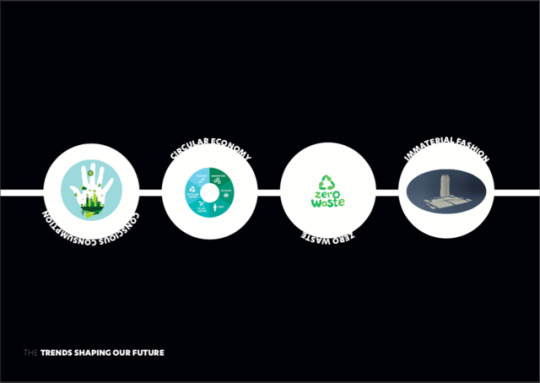
Relabeling my macro-trends: Although I did rename my micro-trends, Adele mentioned that I could also do it with my “umbrella” macro-trends. Reflecting on this, I renamed them in accordance with my brand’s personality + TOV:
Conscious Consumption: “Branded Breeds” (just because of consumer’s strong desire to brand themselves through their life choices-offline and online.)
Circular Economy: “Cyclical Rebirth” (just because product life cycles are extended as a result.)
Zero-Waste: “Trash Treasure” (just because what is usually thrown away, is now reused and restored.)
Immaterial Fashion: “Glamourised Digitalisation” (just because the fashion industry and the technology world collide.)
Evidently, this constructive feedback helped me refine my work by encouraging me to explore further ways to enhance my ideas and writing when it comes to going forward with my written work. As now, I have been given the green light to continue on.
So gaining approval, I was eager to share my presentation ideas with my designer today too, as well as get an update on her innovation brief and designs, to help me clarify the direction she is taking, and how this would reflect in the development of my work. However, she had canceled last minute- really frustrating, especially since I asked her to send me pictures of her progress instead, and she hasn’t.
However, as I pride myself in my CV, “I approach all situations proactively, with a positive, enthusiastic and professional attitude. I choose to view them, whether positive or negative, as a way of utilising and further enhancing my skills in new, challenging and fast-paced environments.”
Translation: I’ll be patient and continue on with my work.
0 notes
Photo


25/04/19
Exploring the “Information is Beautiful” theory and implementing a g.r.a.c.e checklist
Having completed my presentation and the brief requirements covered in sessions to this point, I opted to look over sources I knew were really useful in the past when ensuring I have covered all areas sufficiently before presenting and editing my final draft.
A favorite of mine is the Marketing Fashion book by Harriet Posner. Her marketing toolkit which I swear by has been used as a backbone for all my report writing, and in this particular case following the suggested structure for a marketing plan which I am basically putting together through this blog, my appendix, and launch pack, reassured me that I was going in the right direction.
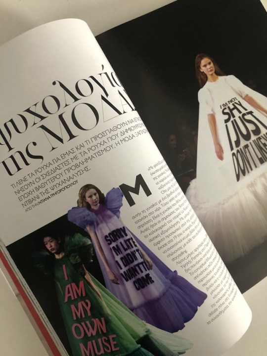
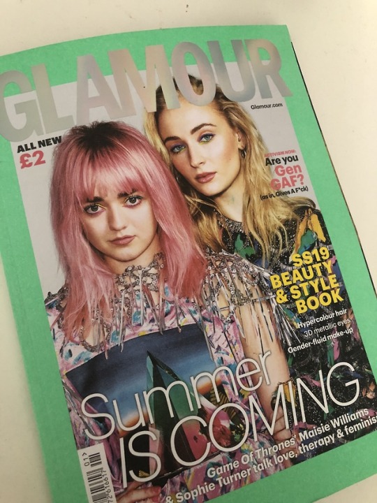
In regards to further evaluating the credibility of my ideas, I looked into additional academic sources, but also magazines from greek fashion bibles Madame Figaro to international fashion bibles Vogue and Glamour to sexually-charged Cosmopolitan that I guess could be considered as the old fashioned equivalent.
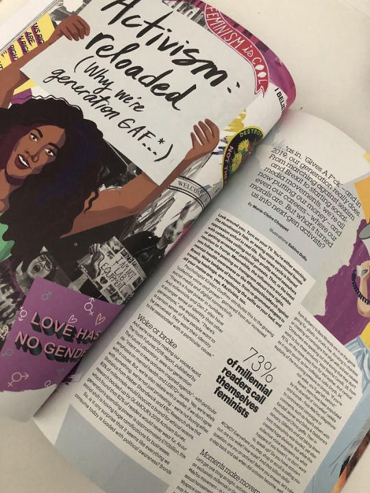
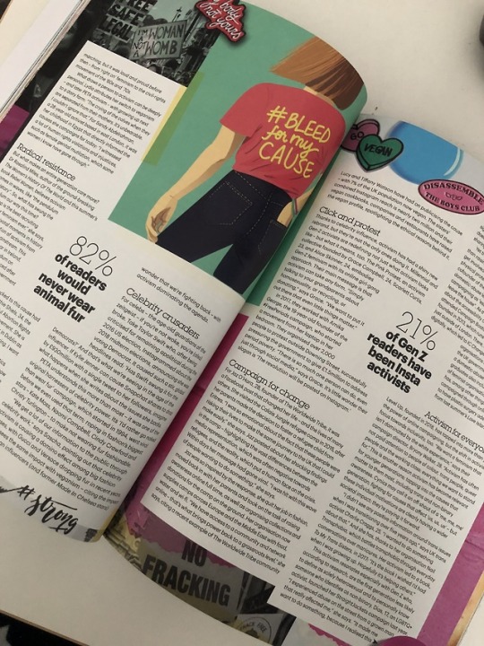
WGSN’s insight into the future of womenswear once again is proof that g.r.a.c.e possesses the traits of a futuristic luxury brand, fitting within the new sustainable and technologically advanced fashion direction that is led by millennials and Gen Z aka the GAF (Give A Fuck) generations as pointed out by Glamour magazine: they require inclusivity, transparency, authenticity and “techiness” to be embedded in modern retail.
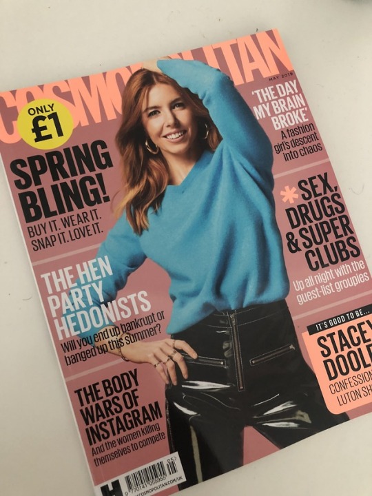
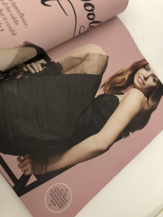
I mean, even greek magazines who are close-minded when it comes to the psychology of fashion are reporting on the feminist and advocate fashion movements and Cosmopolitan has Stacey Dooley, a self-proclaimed planet enthusiast that shook the British nation with her most recent documentary Fashion’s Dirty Secrets, plastered on the front cover taking part in a shoot solely shot with resale market clothes. Now that says a lot.
Back to the main point: I think Glamour perfectly captures why many retailers struggle to grasp who the empowered and woke millennial consumer.
Simple: “They want their identity to be associated with a particular cause.”
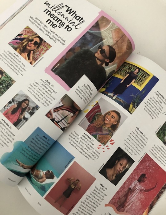
Obviously, these revelations completely resonate with g.r.a.c.e’s ultimate primary consumer. However, the tricky part? The millennial generation “comes in all looks… and outlooks.”
Glamour had portrayed this in a very insightful way, getting close and personal with millennials who are redefining what it means to be a millennial for themselves, as they are often wrongly stereotyped as a generation of narcissistic, entitled and selfie-obsessed individuals and are catered to accordingly.
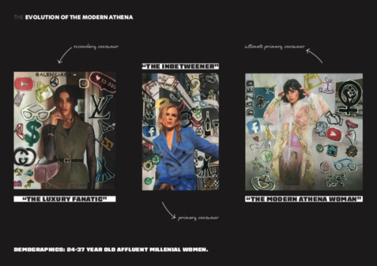
Seeing as I had done this during my consumer profile identification process through observing social media profiles and conducting interviews, I am quite confident I have a great understanding of all my consumer groups- whether its the Luxury Fanatic, the Inbetweener, or the Modern Athena Woman.
Having seen how interesting and helpful it was reading physical magazines for industry insight, it made me realised I should have done this sooner, as part of the idea generation process. So, I will be sure to do so when looking for creative inspiration in a later stage.
0 notes
Photo


19/04/19
Creating the g.r.a.c.e presentation and Establishing Creative Direction
As I mentioned previously, solving my questions regarding the assessment at hand meant that I was confident in starting to form my presentation today.
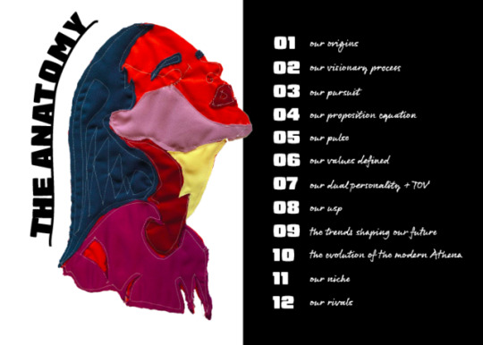
I began by creating my contents which I renamed as “the anatomy” of my presentation, to immediately allow for my audience to get a feel of g.r.a.c.e.’s eloquent TOV and their colourful facial feature inspired patch details.
Similarly, I replaced commonly common labels with more emotive and tailored titles to add a unique dimension such as “brand history” with “our origins”, “brand mission” with “our pursuit” and “brand essence” with “our pulse”.
To combat the fact that I still do not have Molly’s finished designs and have not done creative photoshoots with them, I tried embedding their identity throughout the presentation with a black and white layout and stripes of block colours.
I also took the chance to edit a few ad campaigns that somewhat resembled the witty creative direction I wanted to go in, adding my own cryptic text.
For example, similarly to this WWF advertisement I came across, the basketball serves to symbolise the earth.
The model symbolizes humanity. The text plays on a famous religious childhood hymn. Altogether, the way this shot is staged serves to call out mankind for choosing to act as passive bystanders despite having the God-given ability to change the world for the better literally in their hands.
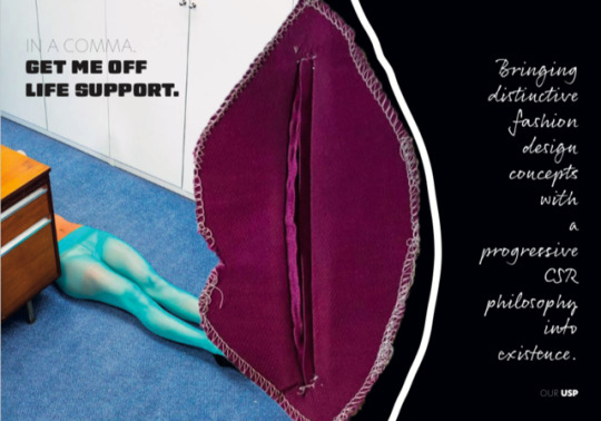
Another example is using a passed out model to symbolise the planet voicing its current poor state and the urgency for change. As it can go either way: either we’ll take action to revive it or continue living in ignorance to end it. But eventually, it will get off “life support” somehow.
You get the point. Each picture is subtly voicing a strong message around a certain ecosocial issue/dilemma.
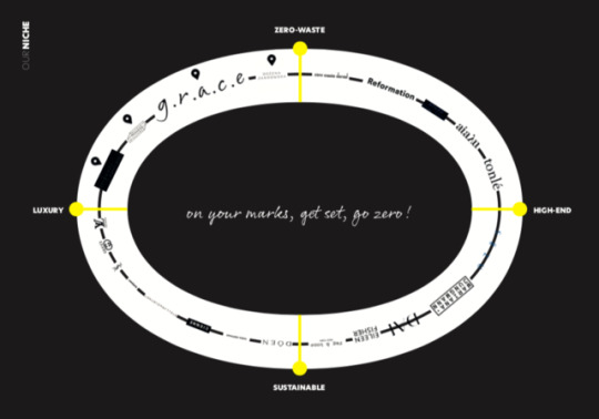
I can say now that even though I was initially reluctant on having full creative control in this brief, creating this presentation by combining all my research and “brand building” activities so far made me realise that it has been really enjoyable being encouraged to experiment and come up with my very own innovative take on marketing and branding e.g. creatively mirroring individual consumer attitudes, behaviours, media consumption, etc. and reinterpreting a traditional positioning map into a zero-waste race track.
So having made a strong start, I’ll take the next few days to finish my presentation, create my script, and time myself of course because I always seem to go over time.
0 notes