
omgspoopypepe-blog
Multi-fandom trash
I post any kind of fandom...--but right now,im currently obessesed with undertale and gravity falls, so please, bear with me * raises bear arms* and also, i post cute dog images or gif :D
71 posts
Don't wanna be here? Send us removal request.
Last Seen Blogs

travelbranyik
Travel Branyik ↠ China Adventure Specialist

tubbydri
Tubbydri
drawround
drawround

universalmediaa
Untitled

kpooop
Why Do I Do This To Myself?
Video
undefined
tumblr
See what Thor was up to during #CaptainAmericaCivilWar!
65K notes
·
View notes


Photo


@historyandhamilton said: sorry if you’ve already gotten this question but how did you make the header on your intro post?? it is absolutely gorgeous !!
ahhh you’re the first to ask actually! and thank you so much <3
i couldn’t just fit the whole explanation into words tbh so i decided to make a tutorial ;w;
i use the drawing program Paint Tool SAI. its not for free but its totally worth it tbh a really good program. you can also do this with photoshop too! c:
step 1: open your canvas. usually i choose sizes no more than 800x500 px which is usually pretty good for a header!
step 2: choose a nice font on microsoft word. if the given ones aren’t fancy enough for your taste you can search all sorts of fonts here on tumblr on @fontsource or @yourfonts they’re pretty good sources but i usually go on dafont since it has more choices. the font that i used here is called sunrise international demo.
after choosing a nice looking font go ahead and print screen it and paste it onto your canvas. cut the only part with words in it lmao so you dont have the whole ms word on your header. go to the layer options: layer >> luminance to transparency. with that you can color in your text. to do so though, choose the ‘preserve opacity’ option to color it in!
step 3: color it in whatever manner you want to! i wanted to do some sort of mixed watercolor texture. to make it have those crispy textures around it. if you want to have that kind of effect, add a new layer and check your ‘Paints Effect’ dropdown on your sidebar and go to effect and choose fringe. make sure the width of the fringe is only 1 aha. after that use the color pick tool and just experiment with it. you’ll see the effect on how it has sharper and darker edges. i just randomly placed it on mine.
step 4: to make it seem more realistic, merge the layers and blur some of them together. you can use the marker tool and experiment with the blending options or simply use the blur tool. for me though the marker tool works better in blending and you can decide how much it blends by adjusting the slides below.
step 5: for additional things you can add a light background behind it or whatever you prefer and some little objects floating around so it doesn’t seem so empty if you like. i repeated the process for the stars and the ‘by gallieleo’ line. you can also add textures to the canvas by going to the ‘paints effect’ dropdown and looking at the textures option. you can download many textures and brushes to cause more texture and variety to your headers too online. most i found on deviantart, which has lots of brushes and textures to choose from!
ahhh that pretty much sums up how i make headers c: i hope this has helped a lot of people. im not the best at explaining but ahh i tried. if any of you have questions feel free to ask me, i’d be willing to answer them all!
1K notes
·
View notes


Photo

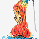
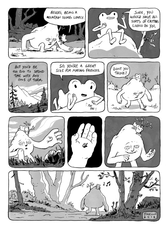
sketch on the back of my math notebook qwq A thing that i can be proud of...
0 notes


Video
undefined
tumblr
Otama de Chocobo | @h__mutsu
Otamatones are really fascinating, though.
Les Otamatone sont vraiment fascinants, n’empêche.
73K notes
·
View notes
Photo


Cup-hilted Rapier
Dated: circa 1650
Culture: Italian or Spanish
Measurements: overall length 137.5 cm
Source: Copyright © 2016 Hermann Historica
792 notes
·
View notes


Text
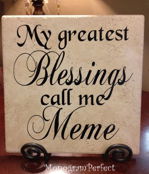
so apparently “meme” is an affectionate southern word for grandma an d i just
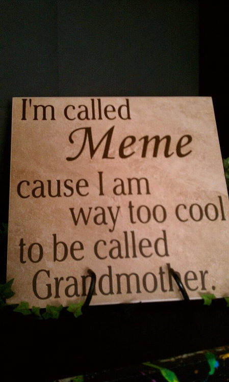
i just found these
100K notes
·
View notes
Photo


Join Tibba, an app where you trade skills, not bills. Get more information here
17K notes
·
View notes
Text
└( ° ͜ʖ͡°)┐Born too late to explore the Earth, born too soon to explore the Galaxy. Born just in time to post DANK ℳℰℳℰS └( ° ͜ʖ͡°)┐
311K notes
·
View notes
Photo

when you’re tired being smol
solution:were 3 inches or more heels
1 note
·
View note
