Don't wanna be here? Send us removal request.
Photo

In the end I only added the title that prompted this entire project for me and I was done with the book cover. I am really happy with how it looks I think the pattern on the left side really added some charm and made the whole aesthetic come together. I also think using brown tones was a great idea because it gives the cover an overall fantasy vibe and it works with what my story was.
0 notes
Photo

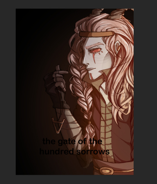


I repeated the exact same process of shading as I used drawing the dragons and the profile views of Veles in. my development phase and I really like the outcome especially on the hair. I also slightly shaded the background adding an orange hue where the character is. To make the design look more professional I took one of traditional slavic embroideries and added it to the side of the cover where nothing was going on but it took me a long time to clear out the white from the design but in the end it made the whole design come together so really it was worth it.
0 notes
Photo


I knew I wanted the shadows to be brown as if reflected off of a fire therefore I made the background match them and maddest a slightly darker brown that I would later shade. I moved on to shading the character like I said using brown shadows.
1 note
·
View note
Photo


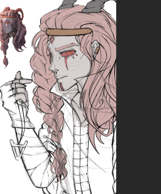

After finishing the sketch and line art I moved on to laying down flat colours which took quite a bit of time as this illustration was quite bigger than all my previous ones.
1 note
·
View note
Photo


Linking back to the start of the project after completing my final piece I decided to create a book cover of sorts for my comic . My basic idea was to again draw Veles holding a necklace with his symbol on it. I spend a lot of time perfecting drawing this character and I wanted to make the cover quite simple but not minimalistic so this seemed like a good idea.
1 note
·
View note
Photo

For my final piece I decided to make a Webtoon style comic strip, although I would most definitely not have time to do a full chapter or even enough to show some story going on I instead made what could be the first few pages of the prologue/ first chapter. I only made one strip of the comic but because webtoons are rather small in size this strip would make up 5 pages.
I’m really pleased with how overall this turned out as I drew a lot of things that are way out of my comfort zone. I strugle with backgrounds but here I drew plenty of trees as well as water which is definitely something I wouldn’t draw just for fun under any other circumstance. But to be fair I really like how the water did turn out sepecially the one in the bottom panel with the boat, it looks rathe realistic considering I drew it in the style the characters are drawn in. The shape I have it also matches the action thats taking place in that panel, it really does look like the water is crashing against the boat and I’m glad it turned out the way it did.
In this piece I wanted to include willow trees as in mythology Veles used to live in a castle made out of a black willow and Perun in one out of gold oak. Truly this was a coincidence on my part because I aldready drew the willow dress by the time I found out that Veles did in fact have a conection with these trees. In Poland willow trees are widly associated with funerals and ghosts so I subconciously drew trees for the underworld as willow trees. Also in my research I found that Slavc Underworld is mostly water and willows do tend to grow beside rivers so it was simply a good match. The hard part of this came when I decided I can’t just have normal trees that would be to simple and my brilliant idea was making them glow. I struggled with it for some time but I feel without the glowing leaves and just a torch or somthing along that way for lighting would just end up boring, this way the entire piece looks mystical and like it tkes place in a fantasy world.
1 note
·
View note
Photo
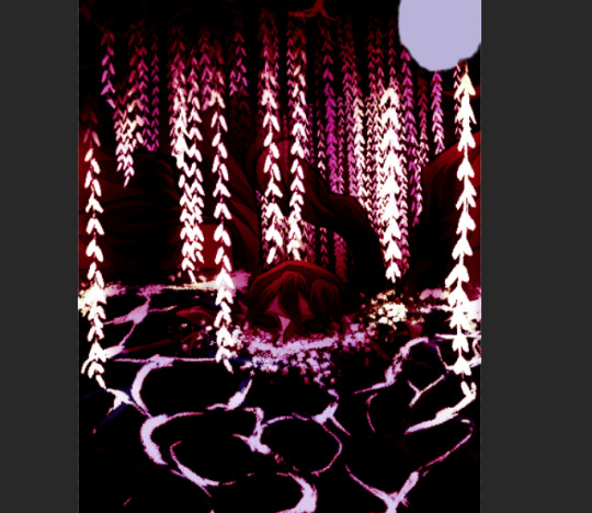


I played around with a few options and decided to make the glowing branches give off a purple light, I also liked how blue looked but in the end I decided to got with purple as the water already added plenty of blue to the piece and I wanted to make the lighting colour something that would pop out of the illustrations and draw your eye in.
1 note
·
View note
Photo
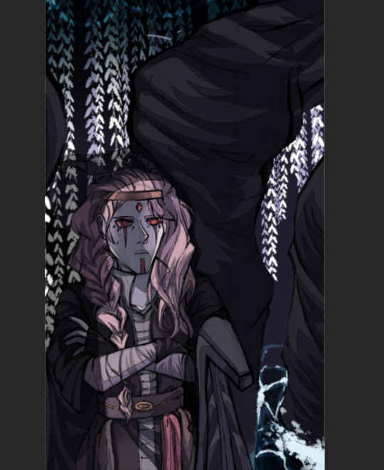


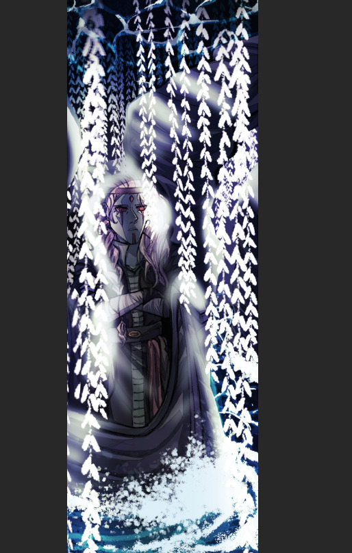
I started airbrushing more light onto the piece where the characters / trees are the closest to the branches. I think it will make a big difference when I end up adding colour to the light.
1 note
·
View note
Photo

Finished highlighting the areas the light from the leaves would hit and reflect off of especially on the trees and the characters. So far I am quite happy with how this looks already but I want to make the light look even better by adding a certain hue or colour to it, although this white light is pretty I feel some colour would make the entire setting pop out even more.
1 note
·
View note
Photo


I started adding in the highlights and light reflecting on surfaces around the leaves to make everything look as if it belongs in one piece. I also added the leaves to the other 2 panels by drawing in some new ones but also copy and pasting few old branches I already drew to save time.
1 note
·
View note
Photo

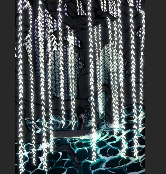

I started adding in the foam and brighter parts of the waves as well as a lot of splashing effects around the branches and especially the front of the boat to show the motion and the water hitting agains these things. I also added in the leaves and made the decision to make them glow, adding to the fantasy setting of the scene.
1 note
·
View note
Photo


I added a water ripple effect to the river, I think it turned out really well especially in the bottom panel hitting against the boat as it swims through it. I took some time looking up tutorials and ‘how to draw’ type of posts back in year 1 when I was making a sculpture of a siren and even though I haven’t revisited those tutorials I still managed to give the water that kind of effect and I'm really happy about it.
1 note
·
View note
Photo


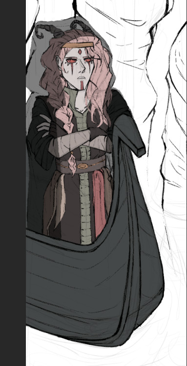
I started laying down the flat colours and I had the bright idea of making the boat and the trees in the same colour range. I originally wanted the boat to be a bright birch like wood so it’s easily spotted in the dark illustration but making the boat dark, deep blue and the trees a darker shade of that it makes the work a little rounder and everything in the piece work together. You can logically conclude the boat is made out of the tree and there’s immediately a little piece of lore or a story to be told.
1 note
·
View note
Photo

I completed the line work for this comic strip and I really like how I varied the line thickness so much because it really does give a sense of scale and weight to the picture and overall looks quite good.
1 note
·
View note
Photo


I finished most of the line art but I had an idea that for the trees I should make the line work have much heavier, thicker lines especially in corners and edges making the trees look much bigger and heavier than the characters shown. It also gives the trees an unnatural look bringing the underworld setting together.
0 notes
Photo


I refined the sketch in the areas where I needed it to show detail so I wouldn’t struggle with line art later. Then I started moving on to the said line art going from bottom up. I don’t know why I started working backwards but I felt the most comfortable with starting the line art where I can see the character up close so I can add all the details.
1 note
·
View note


