
Don't wanna be here? Send us removal request.
Statistics
We looked inside some of the posts by oncelucygathercole and here's what we found interesting.
Average Info
Notes Per Post
0
Likes Per Post
0
Reblog Per Post
0
Reply Per Post
0
Time Between Posts
9 hours
Number of Posts By Type
Photo
9
Text
8
Last Seen Tumblr Blogs


Fun Fact
Tumblr Inc. has $15.1M in annual revenue.
Photo


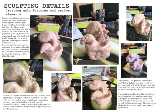
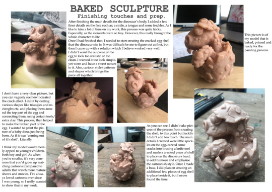


These are all of my completed A3 design sheets which portray my entire process of creating my sculpture from the armature, all the way to the finished photographs at the end. I included a lot of writing to make sure people understood what they were looking at and could recognise how much effort and time I put into it, regardless of how I felt about it.
0 notes
Photo

This is my A3 design sheet representing my finished outcome for my book cover of my model and other experiments I made during this process.
On the right, you’ll see my official cover of the book. I had many different titles to choose from, as I wanted it to be something that children would see and get excited. But, didn’t want it to be predictable or plain. I ended up choosing ‘BLU’S BIG ADVENTURE’ as I thought it was very sweet and matched my character very well. It turned out quite different than other covers i’ve seen.
I originally had just the title and logo, but as I looked at it more it began to look very boring and simple. Children’s book covers are not supposed to be that way. So, I added a small slogan below the title, which helps to entice the readers, hinting at the storyline. A bit of script at the bottom, stating what the book was based on, like many books have nowadays. I used a fun penguin logo, which is different to the original and lastly, I wanted to add something which many books have but genuinely seen more in children's books. ‘Free stickers inside’ label really relates to modern kids books and simply is a way to get children to read it.
Then, all of the other images are tests and trials of various, different books covers using the same title. I wanted to see which angle, shape and size I liked best, to make sure I chose the right one. I experimented with different fonts and sizes to see what worked and once I had found my favourite, I edited the titles by adding shadows/highlights to create the full effect. If I had the time, I wanted to create a back book cover with a blurb, a barcode and other finer details which would add even more realism to it, but I didn’t.
0 notes
Text


These are some simple examples of children's books and illustrations that I took inspiration/ideas from for my book cover. As young people tend to not be as able to read a lot of words or understand as much as when they’re older, many writers make their books small, with a few or more words on each page and include a lot of pictures. This then encourages the child to read more as the more academic they become, the more the books get harder resulting in them learning more. But to some, this isn’t whats important.
I just think children’s books are their first way of understanding their imaginations and feeling the magic of what stories can bring. They can feel excitement, love and joy when they read these books, whether they are real or not, giving them special memories to look back on. What they read can really have an affect on their future when they are older too.
Some people don’t feel this way, but I personally do. I get why others don’t like reading books which aren’t fact and all imaginative, as it’s not real life and it creates false expectations of what life is truly like, but I don’t see it that way. I’ve always loved books, from when I was very young and still do now, whether they are a true story or not.
0 notes
Text


These are the two comparisons of my book cover from what it originally looked like, to what I changed it too. As you can see, the design on the left is quite boring and doesn’t include much detail, but the one on the right does. I wanted my book to intrigue a young audience and look like a children’s cover. Therefore, I didn’t want to make it too complicated or difficult to understand. Overall, I think I accomplished what i wanted too and it looks similarly to what a real book cover would be.
In the first design on the left, I only added a big title, which I tried to edit to look 3D and more interesting than a normal plain lettering. Then, I found a sweet penguin logo that was originally black, but I changed it too white to stand out.
In the design on the right, I’ve made it a lot more detailed. I’ve added a smaller quote/headline underneath the title, to entice the readers. At the bottom, I wrote a small segment about what the book is based on, like they do in a lot of older books. Lastly, created a sticker that says ‘free stickers inside’, which hopefully encourages the child to buy and read it as it comes with something that makes them excited.
0 notes
Text


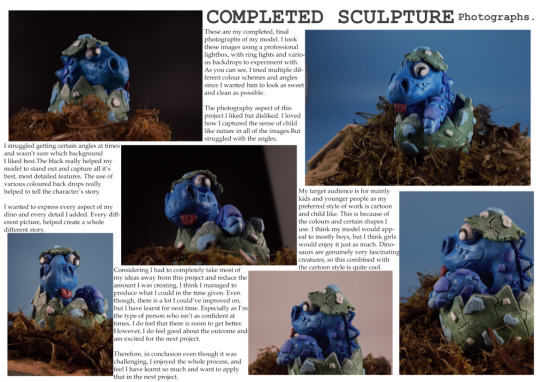
These are just a few pictures of my finished model, taken using a professional camera and light box setup. I used a small light box, with two ring lights either side.
I played around with various backgrounds to see which created the best effect and what I liked most. There were many colours such as; blue, red, black, white etc. I chose the black, blue and white and preferred the black by the end. It really helped bring out the detail in my model and give it so much more character.
Even though, the white worked well as it made the whole image look bright and full of colour. The blue worked well also as it literally was the colour of my dinosaur, so it all blended together and contrasted so nicely with my colour scheme. The angles were quite difficult to get too, I wanted to see every aspect of this dinosaur and make sure I captured it.
In conclusion, I think I managed with a bit of help I achieved what I wanted. As for my outcome, the model itself I felt wasn’t my best, but considering the time given, I did as well as I could’ve. However, I was really gutted that my original plan didn’t fall through and I wasn’t able to make as much as I wanted, as I lost out on time. I was really looking forward to creating many other models along with this one, but I think I set my expectations and goals too high.
0 notes
Text


These rough images are of my completed sculpture, which I took on my phone. They are nowhere near as good as the pictures on the camera, but I wanted to see what I could do and have something to compare.
I really loved the idea of the dinosaur in the nest as if it’s just been born, and it’s seeing the world for the first time. It just creates such a sweet nature about him and really adds to the cartoon vibe I went for.
0 notes
Text


The pictures here were purely to capture the base and what it looks like. It’s a simple flat piece of wood, with a small edge around the back. Covered in sand, various branches, leaves and other kinds of plant details. This really helped capture the idea of my dino being ‘newly born’ and all alone, which then helps the idea of him trying to find his mother, come alive.
0 notes
Text


This is my model completely done, other than a few finer touches, before I began taking photos of it. I forgot to take pictures of the painted inside of the egg where his neck and tail end, but I created a navy blue colour and carefully blended it all nicely together with the colours on his neck. Additionally, the elements on the cracked shell on his head and the smaller speckles on the base egg (parts that are still green). I ended up painting them white.
0 notes
Photo


I wanted to show off my dry brushing I did as on my previous project, I didn’t get a chance too. Whereas on this model, I had the time. I needed to make my sculptures look vibrant, but subtle at the same time and believe I managed to do that. My dry brushing skills aren’t as good as I want them to be, but I tried my best.
The first two images are of my dry brushing on the egg shell, I used various grey-green colours, from darker to lighter and then once I had finished that, I went over the deeper cracks and elements with a white to bring out all the detail. I think this worked quite well in my opinion.
Then, I dry brushed the tail. I added an ombré effect from the bottom to the top of the tail, dark to light. I brushed around each individual speck, wherever there was one to make sure that I really included all the detail I could. As the speckles were going to be a multiple colours on the tail, I didn’t want to go overboard with other shades. Therefore, I just stuck with dry brushing various blues and white to create this effect.
0 notes
Photo


Here I am showing you the completed base colours of every part of the model, with some dry brushing already complete. I chose a grey-green for the shell, as it wasn’t too in your face or too dull. I used a brighter, more vibrant blue colour for his entire head/neck and tail. I painted on the eyes, adding detail in the eyelids and nostrils. I made his tongue a pink-red colour and used different shades of blues for his spikes on his back. I had not yet painted the tinier details yet as I wasn’t sure what colour would work with the rest of it and without clashing.
0 notes
Photo


This is what my model looked like after applying a few coats of it’s base colour. It took me a while to figure out and to do, as the details are very compact and it’s difficult to reach sometimes. You’d think as it’s smaller, it may be quicker to paint, but I really took my time to make sure it looked as good as I could get it.
I tried to do this part of the process as fast as I could because I knew this layer didn’t have to be too perfect since I am going to be painting over it, adding shadows and highlights. Just as long as I chose the right shades and painted the majority of it how I wanted, I knew I would be ready to add the many smaller details I had in mind.
0 notes
Photo


These are the trials and experiments I made when I was in the process of deciding what colours I wanted to make the egg and certain details on the dinosaur.
As you can see, I firstly tried to go for a creamy, yellow colour as that was close to what a real egg looks like. However, I ended up making it too light and it was very garish. I didn’t like it at all, so I decided to stick with the blue theme and go with a green. I wanted a mint green, but it was still too bright, so I eventually created this really subtle green by adding grey. Forming a sage type colour. Essentially, a deeper green but not super dark. I thought this worked quite well.
0 notes
Photo


This was the first part of the painting process for me, I knew I wanted to use blue as the main colour for my dinosaur, as it isn’t very common as most dinosaurs were green and I didn’t think it would be as interesting if I kept that colour scheme.
I then began trying to paint the spikes on the dinosaur. The outer part of the spike I wanted to blend well with the blue, but didn’t want to use the same colour. So I thought navy blue would be a really good choice, specially as it’s very dark and helps to show distinct detail. After that, I added a bright yellow to the other elements on the spikes and thought I liked it at that point, but looking at it now, I’m very glad I didn’t stick with that.
0 notes
Photo


This is my model fully finished when it comes to the making and baking process. I really wasn’t sure how I felt about this project or sculpture as I had such high hopes to create more than just one model but couldn’t as I didn’t have the time. I felt quite let down about it, but I knew I had to complete this one to the best of my ability and that’s what I did.
0 notes
Photo

I struggled with my previous project when it came to the painting process. As I was rushing a bit, I chose the complete wrong colour scheme and never had the chance to dry brush. Therefore, I knew my piece wasn’t as good as it could’ve been.
That’s why in this project I wanted to allow myself enough time to learn from those mistakes. I wanted to be able to look back on them and improve. I managed to find ways to make this process easier for me.
For example; this is a primer which you spray on your desired material, that helps to prep the surface and create a smooth layer, so it isn’t as difficult to paint on top of. I had never really used anything like this on my work before and I wasn’t sure of what would happen. But as I got closer to finishing the painting process, I did realise that the primer did help the model to look a lot smoother and not as messy, you could say.
0 notes
Text


This was my comepltely model before it was baked and was painted. I’m the type of person to keep adding things onto my work and find it hard to stop. The longer I play around with it, the more time I lose. At this point, that was what I kept doing. I kept trying to find things that I could add or that I didn’t like. Eventually though, I had to stop.
I said to myself, this is the best you can do and you just have to carry on to finish. Specially as at this time, I didn’t have long left to complete it. Therefore, I placed the model in the oven for about 10-12 minutes as it was quite thick and it was completely hard when it came out. Despite how I felt I should’ve created more, I was happy with what I had.
0 notes
Text


This was my sculpture before I added the cracked effect on the shell and the egg on it’s head. Creating an egg shell that looks cartoon, but also has to look realistic was quite hard. At first, I wasn’t sure about how I was going to do it, but I think I managed to find a way that worked quite well.
The picture isn’t the best, but you can kind of understand where I was going with it. Essentially, I rolled out a piece of sculpey, thick enough to attach to the egg but not too big so you can’t see the dinosaur behind it. After I had the sculpey, I cut triangular and rectangle pieces which would all connect together easily and tried various shapes/sizes to get it right. I then used excess sculpey and certain tools, to attach each individual piece on together. Blending each line into one, just like I did with all the smaller elements on the neck/tail. Lastly, for an extra touch I added extra indentations and lines which look like smaller cracks all around the top.
0 notes