onclouddesign
On Cloud Design
Everything begins with an idea
10 posts
Don't wanna be here? Send us removal request.
Last Seen Blogs

sorcererimogen
my baby
sixteencrows
sixteen crows in a trenchcoat
sixteencrows
sixteen crows in a trenchcoat

130anarchy-blog
130 Years of Anarchy

titanium-and-testosterone
Tony Stark
Text
Week 10: Tutorial (11/05)
This tutorial enabled us to explore key approaches and methods used in this field of practice. In Communication Design, it is especially important to find a method that works well for you, so that an active audience can identify your work, through your individualized sense of character and identity. However, it is always important to try new things in order to bring in different audiences and diversify our work, to include all people in our community. By exploring different methods you are able to develop concepts, however, you must select methods that are relevant to your brief and communicate in a way that satisfies your audience. This tutorial focused on collaging and manipulating imagery to create letterforms by bringing together visual elements and exploring their commonalities. Collage as a process, allows the designer to explore the characteristics of shape and placement, colour palette, the overall composition, intended meaning or interpretation etc.
Andy shared his infatuation of the works of M/M Paris, a design agency that is recognized by their expressive, highly visual graphics that are produced by fashion photographs. This agency creates their own visual vocabulary and dominate the playing field with their strong typography and experimentation of visuals. Looking closely at their work, they follow the formations and lines of imagery and position this in a way that can be legibly read as characters. Their work normally features editorial photographs of models and the human silhouette. I commend Andy for sharing their work, as by observing their formatting it widens my scope of the possibilities of presenting type, posters, graphics etc. Their primal use of greyscale against a white background allows room for strong contrast which to me, speaks louder and is bolder in its visual impact.
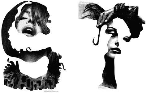
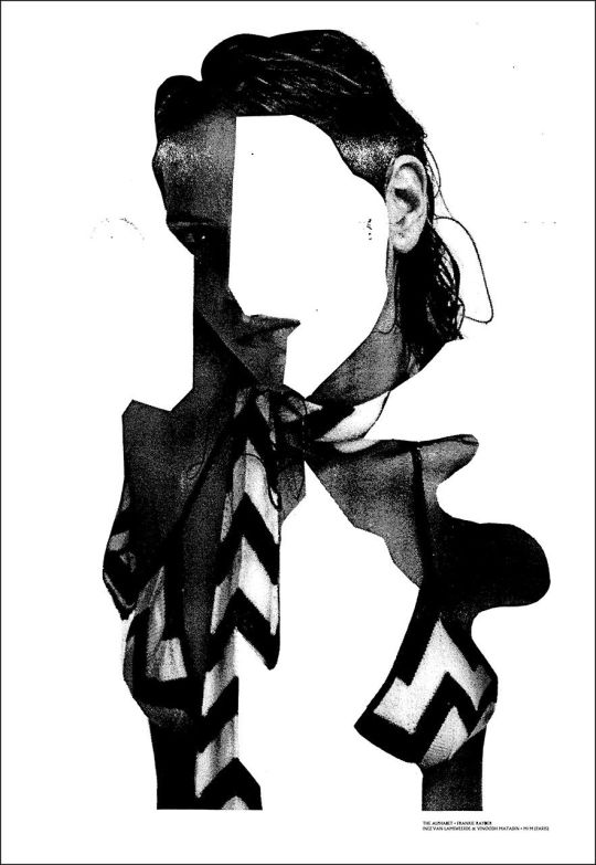
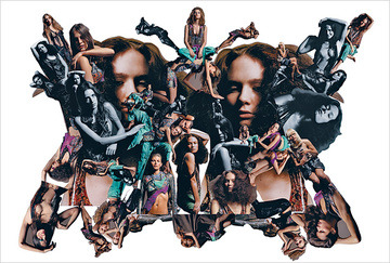

Following this discussion, we were then placed in breakout groups where we could generate letters by cutting up elements in magazines. By rotating, shifting on the page and cutting we were able to form legible characters. We then captured our individual creations by sharing them to the rest of the group, where we could pick the most powerful and hence include on our dedicated page on google docs. To this tutorial, I used the fashion editorial ‘Harper's Bazaar,’ which inside showcases luxury fashion, beauty, runway and trends with extravagant imagery of garments belonging to top brands and models positioned in different poses. This magazine made my tail wag and inspired by M/M Paris’ work I wanted to produce original silhouettes that conveyed type in a legible manner.
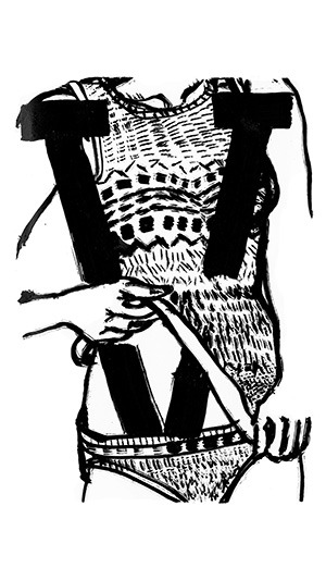
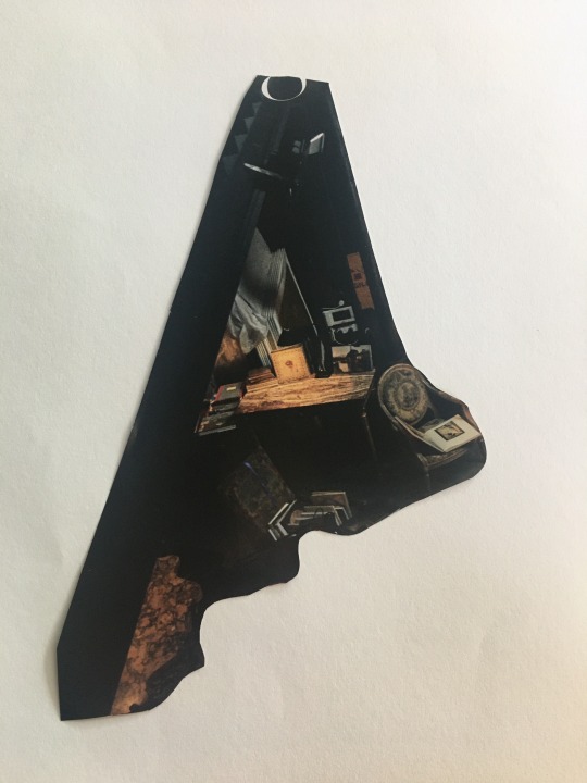
Personally, I didn’t have much experience with the process of collaging to begin with, so I was uncertain how I would go about it. I started by cutting out elements that I admired, such as: the glittery, feathered fabrics and materials depicted in the promotions of the designer brands and diverse shapes of dresses, as well as eccentric shapes that attracted my eye. Without knowing what they would become, I gathered my cuttings and began to change their orientation and try and configure them in a way that would present a letter. I was satisfied with my production of the Letter ‘A’ derived from a shelving unit, the Letter ‘E’ made up of Hollywood runway dresses and the ‘Y’ made up of materialistic goods and delicate hands curving the sides of my letterform.
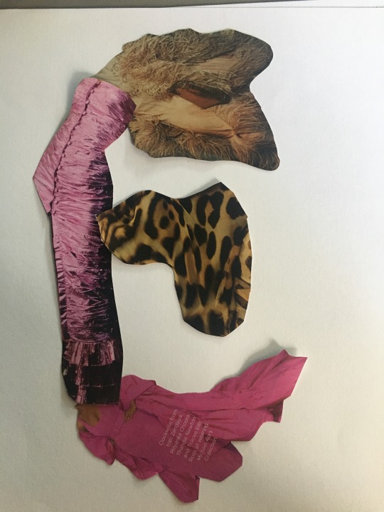
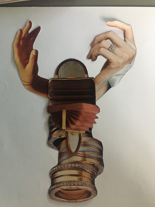
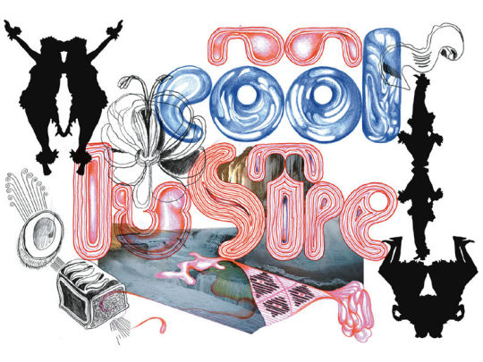
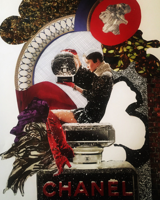
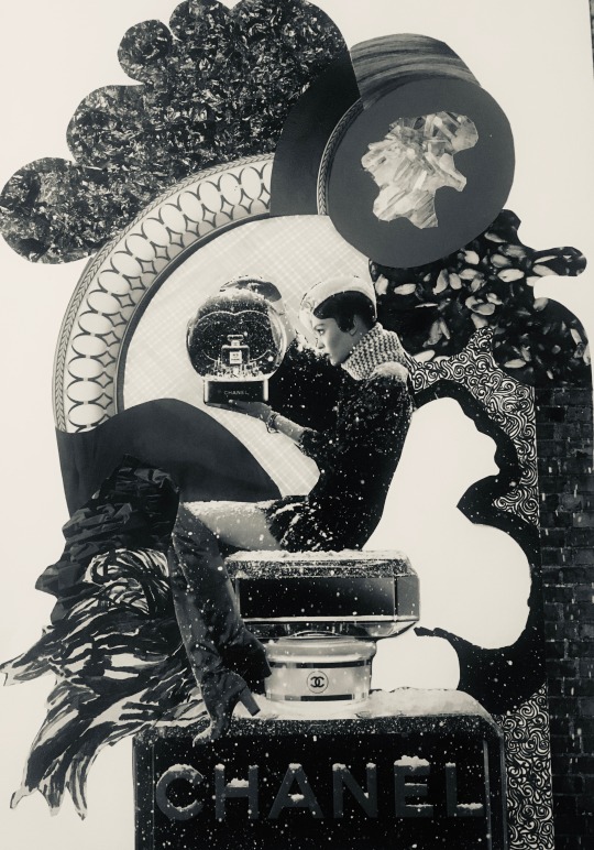
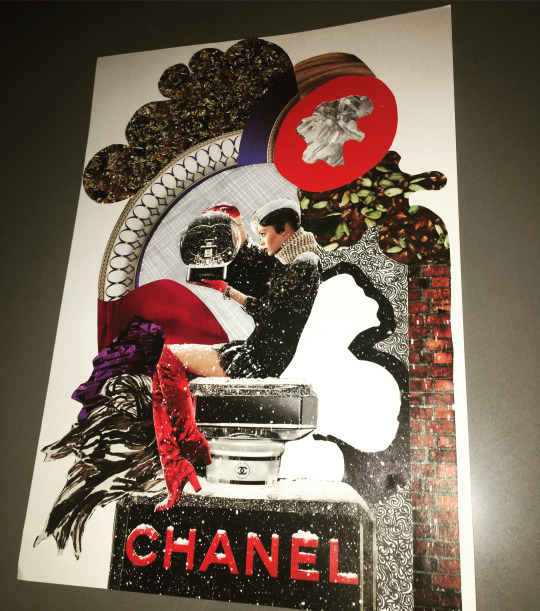
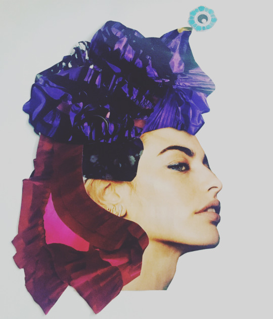
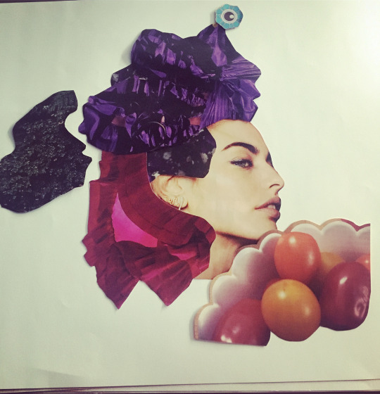
This class broke open the seal for my creative enthusiasm, as I spent the rest of the day until nightfall producing collages. I was fascinated by how different shapes can come together to form another level of dimension. I explored how gaps in collaging allow me to add my own touches mechanically; through cross hatching with a copic marker or detailed, intricate patterning with a fine liner. The first collage of the Chanel snow globe, peaked my interest of working with layers and how cutting out whacky shapes and backed with a contrasting texture can dominant visually. I wanted to create a wintery aesthetic by using festive cooking visuals along with speckled plant life and rich reds and vibrant purples. I used a plate to frame my work and create a sense of enclosure. I found that collages like these can merely be created by cutting out the boundaries of existing forms and placing them in a logical and fitted way. The second collage of the model with the headpiece furthers my understanding of fitting elements together and the importance of layering your work and showing only the desired parts and hiding areas that are not necessary. Heavily inspired by this medium, I was convinced that I wanted to use collage for elements within my second brief ‘Ask Me Anything.’ With lots of digging, I was able to find within my mum’s chest of drawers a collection of magazines from the 90’s. This gave me pleasure by exploring the shift of graphic design style from the contemporary period and how advertisements sought different approaches and visuals.
0 notes
Text
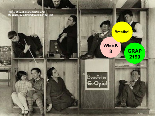
Week 8: Tutorial (27/04)
Conversing about the online teaching experience, Andy shared an image of a group of people wedged inside individual pigeon holes, however in spite of this, they seemed to be connecting. He offered that multi-tasking during classes seems to be the norm, and while I agree that this is true at times, I try my best personally to filter out the distractions that surround me and try to maintain the headspace of being present in a classroom. This lead to the discussion about the merits and challenges of online learning.
For me, the transition to online was difficult initially, in that, we had only had 2 face to face classes and the relationship that I shared with my peers was very premature, and communication was hard to facilitate without a platform. This issue was resolved when a google doc was created, so that we could communicate outside of class hours effectively and share our issues, advice and feedback; and by sharing work it was a way of getting to know our peers personal style and made me feel more connected and calibrated to what was expected from our work. Along with this, sharing our Tumblrs with one another was a fantastic way to view the progress of our peers and reflect creativity against the class. I also found that this transition enabled me to save time traveling to and from uni, although it was a downfall in that, I couldn't come up with inspiring ideation while using public transport as I would typically admire my surroundings and take note of my experiences. In spite of this, I went on daily walks and used nature and urban hubs in my community for stimulus, which advanced my generation of ideas. When learning off campus, it was hard to navigate through instructions that were given to me in order to resolve issues, as I didn't have someone actively looking at the same screen as me. When attending an online class, problems can be resolved immediately through communication, however, when faced with an issue out of this time, conversing via email is delayed. By having classes online, I felt as though most of the time was about learning content, however if we were in a face to face class we would spend most of our time working on our projects. Although we dedicated some time to work in classes, it was hard to balance listening to the commentary and feedback of others work while doing our own. If we were in a physical classroom, people would seek help by going up to the tutor and the conversation wouldn’t be heard by everyone. Although this was the case, it was also helpful as people asked problems that were similar to my own or ones that I hadn’t faced yet, so it was helpful in avoiding those issues. My experience of participating in breakaway groups was binary, as it was a personal way of sharing and you could relate to others in the process, however, at times people would turn off their microphone and communication was not facilitated so it became an idle experience.
Our tutorial then resorted to reflecting on our “Hello, my question is …” assignments, where we looked at the diversity of the approaches within the classroom. I described that my idea was about utilizing fixed objects that couldn’t be manipulated easily, as in class I only had pens with me so it looked a but monotonous and bland if you physically built the letters. I also found that working in my dad’s workshop, it allowed me to create a sense of individuality in my design as I didn’t go in knowing what I wanted to use and there was so many random bits and bobs.
Continuing on, we explored the idea of is design needed? I interpreted this in the way that we need design to pass information and convey emotion through depiction. Andy furthered this by saying “even a doctor after saving lives goes home to read a well designed book.” This comment really resonated with me in that design is so much more than type, imagery, layout, etc. It is the way in which it changes society for the better or the worse. It has power in the response it can generate and it is used in all aspects of life. As a designer, I find that every corner I turn I notice design - whether it is from shop windows, street signs, colours, city planning and layout. Why is it the way it is? How do tastes form? By employing that type, what job do you want it to create? How do people grasp that certain designs show that they are one thing e.g.: the casing for toothpaste - can this be used for another product? without the brand information, would people know what it is used for.?
Andy proposed that if we were to swap around the objects used within the class, what questions would better match these objects? Perhaps for what moves design, stamps could be used instead of transport - or a less physical way of conveying this idea could perhaps be more powerful, suggesting that design moves through time, between cultures, shifts understandings etc.

(Produced by Millie Purtell)
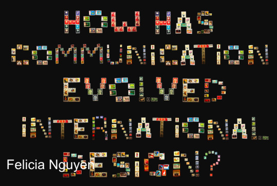
(Produced by Felicia Nguyen)
Dela’s project sparked an interesting conversation of how designers place and set their values; extending that in some instances it is wiser to use free designs for charitable purposes at the cost of setting a price according to the value. The question explores the notion that designers from across the world work in environments that is not appreciated as much. Dela then shared her past experiences as a graphic designer. Her question “How does free design cannibalize the creative industry? used irony and conveyed layered meaning within the words: free design was crafted out of money. Cannibalize was crafted out of meat - ingenious. Industry is made out of knifes which shows that it can be cutting and turbulent. With this idea swarming, Andy shared his experiences of the 80’s and 90’s of when he was doing work in Milan and wasn’t payed accordingly. He reviewed that it is your own discovery, it can be considered as cannibalization - think of it as what you are doing to help someone? Can it be improved and what impact is it making? Has to be from yourself, and it is okay for social purposes. Andy hypothesized that you must be careful of disaster capitalism and we need to watch out for opportunism.
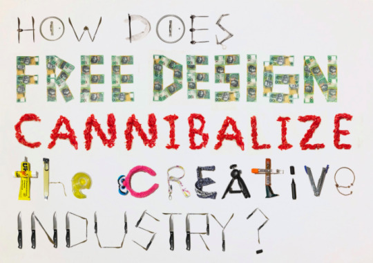
(Produced by Adelista Widjaya)
Andy emphasized in this tutorial that it is essential in helping our peers, in order to perspire our efforts and to build value. If you have built a community, you must work within your community and be aware of value and the potential to build value. Value can be measured differently and how we measure value is our intended outcome - value could be helping others, or it could be money, it could be a network / friendship. Each will have your own way of measuring that.
How can ‘we’ ensure diversity in design? Media, newspaper, articles - reflects this idea of privilege - Very much a 19th century media.
Who is the ‘we’? When saying ‘we read from left to right’ - who is the ‘we’?
‘We’ representing all designers - the programs we use are full of biases / programed into this software. UX designers will create facial detecting software - but there are issues with people with darker skin, emerging from hegemonies / power and status comes into play.
1 note
·
View note
Text
Assessment 1: “Hello, My Question Is”
This assignment allowed us to disencumber an uncertainty that we had about communication design, based on our experience that we have lead within this course. With the regulation to be an open ended question that didn’t require a certified answer; I explored my options by researching objects to start with and then drafting questions that could relate to these objects. I immersed myself by researching physically manipulated type on Pinterest, and this enabled me to spread my perception of the task. I then generated questions and lightly explored ways in which I could present them.


GENERATION OF IDEAS
Idea of growing ideas, and nourishment. Could be worded like: How do artistic juices run wild / flourish? Or how do you nourish creativity in design? How can ideas be plentiful? Food for thought. What fuels creativity? By using the key words ‘nourish’ and ‘plentiful,’ this gives me the opportunity to use food to build the letterforms. Specific ideas under food include:
-Using 100’s and 1000’s scattered and drawing letter with finger (figure ground)
-Donuts for O’s, this can add colour and playfulness
-Spaghetti as a way of producing a cursive, free flowing, organic aesthetic
-Broccoli, can be cut up in different ways and with the stem and the top it can variate the width within the letterforms
-Coffee cup from a birds eye view can create the letter ‘O.’
-Each letter is on a plate, this helps establish a unique composition and create a background context.
Idea of travel. Could be worded like: Where can design take me? When do good ideas lift off? What moves design? How does design shift between cultures and location?
-This could be interpreted inside of a suitcase by arranging objects such as Toiletries, money, keys, shoes, charger, sunglasses, etc.)
-This could be difficult as it is a restricted size to present a question with lots of characters.
-Where will design bring me?
-Where can design take me?
-Made out of clothing items (socks, shirts, skirts, long sleeves, bra)
How can designs be sustained? This can be made out of green objects and make a depiction through the symbolism of this colour. Or I can used recycled items to build the letterforms such as cans, bottles, cardboard, magazines, etc.
How can I stand out as a designer?
-Flamboyant colours used
-Objects that convey individuality - use items that mean something to me to create a more personalized and intimate version of the question.
How can design advance learning and education?
-Context of the coronavirus
-Books, rulers, stationary, etc.
What is the future for design?
-Electronic wires and gadgets to form type
-Tin foil
How can I grow as a designer?
-Can use plant life to support this question. Flowers, leaves, natural elements, food scraps etc.
How can design sway emotion?
What is it to be human?
How do you measure success?
How can I improve lives?
What stories will I tell?
Who will build the future of design?
- This could be built out of tools, string, blocks etc. Can focus on materials and methods within design and the physical act. Tape measure for letter D.
My finalist questions after my exploration were ‘How do you nourish creativity in design?’ and ‘Who will build the future of design?’ The first option was made of 33 letters and the second was made up of 29 letters. It was appropriate to choose the question with the least amount of characters as it needed to be scaled to fit within the one photograph. I also thought that the idea of using food had been over-exploited and didn’t want to orchestrate this idea alongside anyone else in my class. The accessibility to food at this time was critical as supermarket stock was declining with people over-purchasing and stocking up on goods, while it seemed to be an expensive to create 33 letters out of different foods. I also thought that by chopping, breaking and forming food to suit each letterform, it took away my creativity within the task and I was set on creating letterforms with fixed objects. By doing this, I was challenging myself at a more extensive level and I wanted to prove to myself that I could do it. This is why I chose the question ‘Who will build the future of design,’ and I planned that I will use tools from my dad’s workshop.
CREATION DAY
Upon entering my dad’s workshop, I didn’t have any pre proposed ideas of what I could use, I would just create with my findings and try to make them work as I went. I began by opening up each draw and digging through rusted nails, bolts, collections of spanners, brushes, clamps, plumbing utensils, tapes etc. With a creative mindset, I tried to visualize how each object I picked up could be used as any of my 29 letters. Some objects immediately lent themselves to certain letters such as the G clamp for the letter G, or the tape measure pulled out to create a D. For others, it was harder to facilitate a shape that could be recognized and was legible within my composition. This process was carried out by arranging the formed letters on the floor in the order of the question and paying attention to ways that I could make it appear individual yet bold. I used objects inside of other objects to decorate the letters, and give them a more stylized edge instead of a minimal appearance. Eg: I used a sink drainer in the centre of a curved edge to form a D.
When creating my letters, I had to pay attention in differing the appearance of same letters. While objects of the same family e.g.: rulers of different lengths and colours were often good for creating ‘L’s’ I had to make sure I only used that object once for each letter. This was at times difficult.


After hours of building my question, I was happy with the visual appearance and was ready to take it to the next level. There was not enough surface area on the floor of the workshop to lay out all of my tools in the correct sequence with spacing to ensure a balanced page layout, so I carried each tool inside to my room.
In my room, I placed a drop sheet on the floor in order to relate to the context of building and construction, while creating a visually dominating composition. By referring back to the photos that I had taken of the tools set out on different areas on the floor in the workshop, I was able to recognize the placement and type of tool used for each letter and within certain words. I then played around with the paragraph style of my question and the vertical and horizontal distance of the words. Originally I placed the “Who will build” on the first line, with “the future of” on the second line and “design” on the third line; however, it was too horizontal and I wanted my question to be more grouped together. I then rearranged the tools, so that there was less words on each line and it created an overall square shape in its spacing. I then framed the letters inside ruler edges on opposing corners and placed an outdoor glove on the top right hand corner to show a sense of craftsmanship and the idea that the process of building the future of design is never completed and it is an adaptive and ongoing process.

It was then, that I didn’t like the way the drop sheet reflected light as it is plastic and the colour of the dark blue took away the contrast from the tools. It was illegible and the dimensions of the drop sheet made it hard to photograph without my floor getting photographed. I then reverted to using a clean white sheet as a background, so the tools could be easily seen and cast shadows were visible.
When setting up the white sheet it came with it’s own set of challenges. The sheet had many wrinkles in it, so I resolved this by ironing it out on the floor, which was challenging as when crawling over parts on the floor, it became wrinkled again, or the material gathered in places. When placing the tools on the sheet once again, I wasn’t certain of the exact placement and when shifting them around the white sheet got dirty in places from the oil bathed tools, dust and dirt. This was resolved by editing out those spots on photoshop and smoothing the colour of the sheet. I chose my room to take the photos in as it has the most direct sunlight, however, as the window is on one side of the sheet, I used my LED makeup mirror to shine across the other side and brighten up the dark areas. As the tools are large in size, I then found it difficult in capturing the question in one single photo, so I stood on top of a high chair and hovered my phone high above the grouping of objects. This took a few trials and errors but eventually I got some even, well balanced shots, of which, I took onto Photoshop to edit and manipulate.

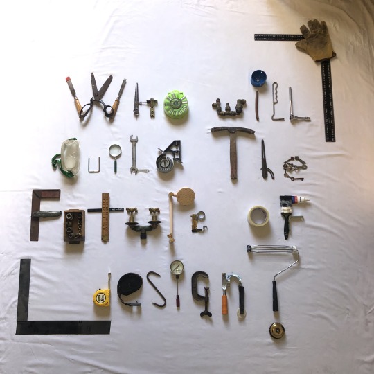
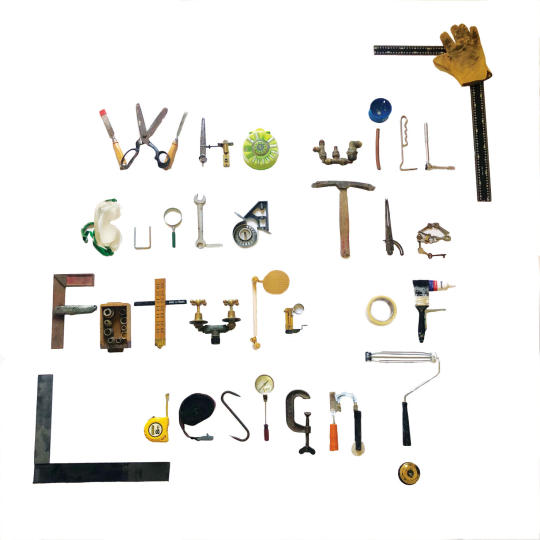
This assignment allowed me to extend my knowledge of how typefaces can differ and how humans perceive them. It allowed me to think outside of the box and use different materials and methods in aiding my idea development and concepts. It furthered my understanding of the raster-based program, Photoshop and how I can edit my photos. These skills can all be used in my future assignments and my other courses.
1 note
·
View note
Photo
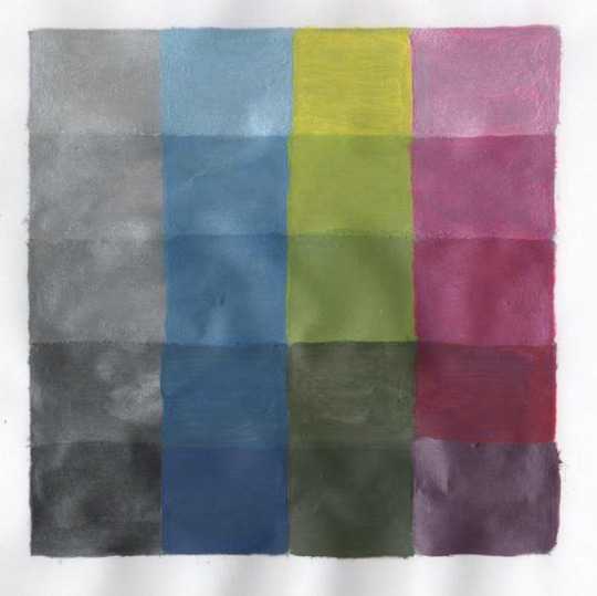
Week Three: Colour and Information Design
During the third week, we focused on painting with colour. The following is a CMYK values chart. I began by dividing a square into 5 rows and painting the shades of grey right across. This created a reliable foundation that indicated the placement of the the 100% cyan, yellow and magenta hues. The true cyan was estimated to be in the third row, the yellow was the first row as it is a very bright colour and the magenta was in the fourth row. By adding the grey to all the squares at the beginning it made it easier to layer the differentiating shades and tints on top.
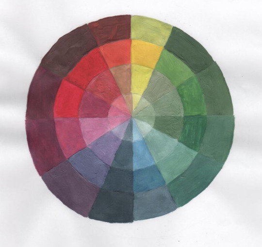
The following is a hand generated CMY colour wheel using acrylic paint. The tints were produced by adding white and the shades were achieved by adding a tiny bit of black or a mix of the colours compliment.
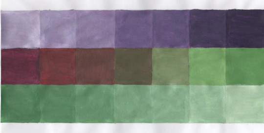
The following is the exploration of neutralizing complements while also differentiating between tints and shades. By adding white to both the purple and green the colour was tinted and from there it gave me the ability to generate a spectrum by lessening the use of white and finally adding blacks to darken the colours. When neutralizing both colours, the centered hue formed a musty brown colour and developed into an individual hue on either side.
On Cloud Design ♡
0 notes
Photo
Week Two: Colour and Information Design
With focus towards colour harmonies, I went on an expedition around Melbourne city in search for monochromatic, analogous and complementary schemes. These photos seemed to resonate with me the most. By understanding colour harmonies and the historical context of colour, I am able to use this knowledge in my other courses and create visually impacting compositions.
On Cloud Design 🌀
1 note
·
View note
Photo

This street artist’s work really gets my tail wagging, so I decided to interview her on her studio and working practice. So inspiring . . .
✭ SARAH MASSON INTERVIEW ✭
Recount on how you have gotten to the point that you are at now / your background. What influences (people, life events etc.) have lead you into the creative industry?
Graduated communication design at RMIT 2009
Worked as a graphic designer & creative director for many years
Started painting around 2014 & exhibiting straight away
Started spray painting, doing street art painting murals 2015
Quit my job in design worked as a an artist exhibiting and selling works independently both nationally and internationally whilst doing different commissioned private and commercial work in art, design, photography and performance.
Curated indépendant gallery spaces in VIC & NSW
Why did you choose to become a solo practitioner rather than working in a group environment?
I enjoy going deep with a project idea and seeing a piece from beginning to end I prefer to work alone because it is less messy with too many cooks, also more money if you do it all yourself. I prefer to work alongside artists from other disciplines like musicians. I lived and worked in a recording studio, art gallery, creative space called Lupine Studio last year. That was good for me to collaborate with artists coming and going and maintaining my own practice and keeping my own space.
How does the urban environment help you to generate ideas?
If I am painting a wall I have to really consider the surface texture and surrounding environment. Always returning to the art elements & principals colour, contrast, composition etc to find the best result in the space because my original concept or sketch may not work.
What types of paints, instruments, materials and tools do you use to facilitate your work?
Spray paints, acrylic paint, texts, charcoal, pastels, scrap paper for sketches, brushes, rollers, sponges, sometimes projectors, a mask, ladders, milk crates.
To produce your work, do you have readily available resources and is it cost efficient?
It is more cost effective if you use similar colours and explore a colour palette across a few paintings/murals. Getting on the tools and stretching your own canvas or going to the hardware store and buying a sheet of $12 plywood to cut my own round canvases instead of buying one for $150 at deans art. I also reuse canvases and paint over them if they have been sitting around for a while its good not to be too attached to your work.
In what way do you focus on sustainability?
I try to use as much recycled materials often at the moment I am painting on recycled plywood boards that used to be festival gallery walls, they have holes in them etc but I like that they aren’t perfect it adds character. I use my computer to collage up ideas and trial colours and only use scrap paper for sketching. I mostly sell prints to order these days instead of getting a bunch printed.
Who is your main target audience and demographic, and how do you attract them individually?
I don’t make art for anyone in particular. I have exhibited & live painted at a lot of bush doof festivals over the years young earthy conscious people seem to resonate with my work. They often don’t have any money so they support my work by buying prints and small pieces.
What clients seek your finished creative work?
My main demographic who buys my bigger canvas artworks are fancy housewives and people 30+ often in the queer community.
Are all your paintings completed in the studio? Or are they taken home on some occasions?
Over the years I have gone between working in studios and from home. Because I use spray paint I need access to an outdoor space for ventilation. I have a good work ethic so working from home isn’t really a problem. I have been mostly creating minimalistic works on paper the last few years so I haven’t had a need for a studio I can just work from my kitchen table.
How does your individual design process differ from other artists? Describe how your culture enables the public to recognize your work?
All of my visual art is accompanied by a long title story or poem, I feel the written work is as important as the visuals. I try not to over work my pieces even if they are messy and layered I want the piece to have as much movement and emotion as possible. Most painters I know work on pieces for days or months and thats great but it is not in my process I prefer to keep my work as expressive as possible.
Describe the stimulus for ideas? How do you find and develop concepts?
I keep a notebook and write down ideas and quotes from conversations with friends everyday. In my work I am exploring what it is to be human and what it is to be human in relation to others it provides me with an infinite amount of stimulus for concepts. I develop concepts when I am doing yoga, meditation, walking or in conversation with people.
Pick a project - what problem were you trying to solve? Barriers? Successes? Failures? What is your most well-known piece of work?
My solo exhibition ‘Oxytocin’ for Melbourne Fringe Festival was one of my favourite bodies of work exploring love, sex, gender and queer relationships. Intimate themes
Timeframes and constraints - as an individual do you work in a fast-paced manner or do you focus primarily on detail?
I work very fast. I come from a graphic design, creative direction background so I have skills to develop ideas, make decisions quickly and usually paint a canvas or a mural in a day. Or for the last year I have mostly been selling minimalistic black and white continuous line drawings which take a minute or two. Quicker doesn’t necessarily mean better or easier. Most of the time I don’t plan what I will paint so to create something on the day I need to have a clear mind, and clear space to get in the zone. My painting style is quite expressive and often quite layered, I am not really interested in fine details more interested in the mood that the lines, shapes and colours create.
Do you prefer working in an outdoor studio or indoor? How do these differ and what challenges do they project?
If I am using spray paint I will work outside. I often use mixed media on pieces so I may alternate between spraying and bringing the piece back inside if the weather isn’t great and add different elements with paint, pastel or charcoal and keep alternating between inside and outside until I feel the piece is finished.
What is the key to success when communicating with the public? How do you distinguish a successful mural that you painted in a public setting to an unsuccessful one?
Taking your time. I paint quickly sometimes maybe too quickly because painting live or on the street the public is talking to you, telling you their opinions on what looks good, what looks shit, judging you, being sexist assuming you can’t do street art because you are a girl etc so it is best to stay true to your art and trust your own process and don’t speed it up if you get nervous. I really love the process of creating and sometimes I get too carried away with it I don’t take a literal step back, to view with a critical eye and consider what works and what doesn’t. Marking up the wall first even just loosely because pretty much every I do is free styled probably with no sketch maybe with a few printed out photos for reference so the murals are always a million times better if i draw up a simple grid first even if its just a 9 square grid on a 3m x 6m wall it still helps, there is nothing worse than a big piece of art on a wall thats out of proportion by accident.
How do you decide which colours to use for each project? Are they randomly selected, or do each convey a meaning?
There is always meaning whether I am conscious about the meaning before I begin the painting or after I am reflecting on what the piece means and how the colours relate to the meaning of the piece. If I am working on a commission especially if it is a commercial job I or the client may want to chat about relevant colours to their business or the mood we want to create, or the way we want people to feel when in the space with the artwork.
Who are your competitors?
I don’t really have competitors it is not how I see it. The art communities I am involved in we mostly try to lift each other up. I have friends in the industry that have similar styles or themes like: Doug Bennett, Hera Wing, Roy Wilkins, Miss Darq, Unwell Bunny, Heidi Valkenburg, Mimby Jones Robinson.
What are some things you do to ensure quality work?
I will post photos on social media of works in progress or send to other artists, get some opinions, share ideas. I have too much pride to exhibit average work. I make sure I don’t leave creation to the last minute. The actual drawing or painting takes about 20% of my creation time the other 80% is conceptualizing.
On Cloud Design ✥
0 notes
Photo
🗿TOM GERRARDS INTERVIEW 🗿
In the midst of researching studio practice models, I stumbled upon the work of the solo practitioner, ‘Tom Gerrards.’ This artist gets commissioned to do street art, while he also does paintings. Unfortunately, I already completed my Studio Practices assignment before he replied back to my interview questions, but I felt as though his answers are inspiring and are applicable to young, aspiring designers/artists, and shouldn’t go to waste. Below is his interview ⬇️
Recount on how you have gotten to the point that you are at now / your background. What influences (people, life events etc.) have lead you into the creative industry?
That's a big one. Here it is in a nutshell.
I started out as a graffiti artist back in the mid 90s. From there I knew that I wanted to work in a creative field. So I got a degree in Communication Design at Swinburne. From there I got a job as a graphic designer in a small agency in Collingwood called Street Ink. They do work in the film and music industries. I worked there for 6 years and then set off to South America where I travelled around and painted for 2 years.
South America was a developmental time for me as I painted using only two or three colours on each piece. It helped me develop a graphical look to my art. I had a lot of crazy adventures in South America and painted in a lot of amazing locations.
I made my way to London and got a job working as a graphic designer at Christie's auction house. I was laying out their catalogues which were like big art books. It got me sparked to really want to be an artist. During that time I started drawing every day (which I still do). After a year of doing that I freelanced around London and ended up working for a large branding agency called Brand Me. I liked this job. I had a chance to design a lot of packaging for well known brands.
In 2014 I took off to India for 4 months. I did a lot of painting over there and produced 36 murals. It was a productive trip and I feel that my art grew a lot during that time.
After India I moved to Barcelona where I got my first studio and also worked for an amazing design agency called Mucho. This was the best job I ever had as a designer. They were all about the creativity of design and was always thinking outside of the box.
After a year and a half I returned back to Melbourne where I freelanced for a year before deciding to go all in with my art. I haven't looked back.
Why did you choose to become a solo practitioner rather than working in a group environment?
I work in a studio with other artists. But we are all doing our own thing. This is just how it is as an artist. You work alone and then begin to employ people to help bring your idea into a reality.
How does the urban environment help you to generate ideas?
I take in my surroundings the best I can and base a lot of my artwork on what I see. Being that I live in an urban environment it naturally appears in my work.
What types of paints, instruments, materials and tools do you use to facilitate your work?
I use a lot of acrylic paint, spray paint and I also run ink through an airbrush. But I draw with pen a lot too. I use whatever is around me.
To produce your work, do you have readily available resources and is it cost efficient?
I have a lot of paint left over from painting large murals. With these leftovers I mix new colours to be used in the studio. I also am very fortunate to have paint given to me by paint companies such as Ironlak. It is a big help.
In what way do you focus on sustainability?
Working in packaging throughout my design career I always thought of the environment. It's hard when the client doesn't want to get on board. But designers are in a very important position when it comes to the environment. I also have minimal waste in my studio.
Who is your main target audience and demographic, and how do you attract them individually?
I don't really have one. I know it doesn't sound very business like. But I'm happiest when I get to paint freely. So I paint what I want, how I want and it seem to be working.
What clients seek your finished creative work?
It depends on what they want from me. A lot of people buy my art from galleries or my studio. I also work with brands who want to collaborate with me on projects. Some recent clients are RVCA, Attica, Bailey Nelson and Bellroy.
Are all your paintings completed in the studio? Or are they taken home on some occasions?
I never take my work home unless it's to hang it on the wall. But I draw every morning while I'm having breakfast.
How does your individual design process differ from other artists? Describe how your culture enables the public to recognize your work?
Every artist works in their own way. I like to use flat colours and layer them. I use a limited colour palette and the same elements pop up in a lot of my paintings. I feel that it has helped my art be more recognizable.
Describe the stimulus for ideas? How do you find and develop concepts?
I take lots of photos and draw every morning. A lot of the time the drawings are based off the photos. Some of those drawings become my paintings. I also paint freely out of my head in the studio.
Pick a project - what problem were you trying to solve? Barriers? Successes? Failures? What is your most well-known piece of work?
My most well known piece is probably the mural I did for Bailey Nelson on Chapel st, Prahran. It's large, has stand out and is in a prime location.
There were some issues getting this mural under way. The client wanted the whole building painted but only wanted to pay enough to get the bottom section done. So I proposed to them that if they pay for the scissor lift hire I will space out the elements to the piece and paint the upper level for free.
This worked for both of us as I knew that the piece would be a lot stronger with the whole wall painted. I see murals as billboards for artists. So when an opportunity arises for me to paint a mural in a prime location I usually say yes.
Timeframes and constraints - as an individual do you work in a fast-paced manner or do you focus primarily on detail?
I work in a fast paced manner. I don't rush. But my style is easier to paint than others. I usually paint between 1 to 10 paintings per week. But some paintings take me months to finish.
Do you prefer working in an outdoor studio or indoor? How do these differ and what challenges do they project?
It depends on what I'm painting. If I'm painting with spray paint I'd prefer to be outdoors. But I love working in the studio. It's good to mix it up. It usually comes down to scale. The only time I paint outside is when I'm working on large works or a mural. The downside to working outside is the elements and weather. Sometimes it's to hot, cold, windy, wet etc.
What is the key to success when communicating with the public? How do you distinguish a successful mural that you painted in a public setting to an unsuccessful one?
When painting in public I've found that people love to come up to tell you what they think. Not everyone likes my work but I tend to get a lot of positive feedback. Social media is also a good way to gage weather the general public like your work. I usually gage weather something is successful by how I feel about it. I'm aware that the public will be viewing my work and I try to give them something they will like. But it's impossible to please everyone so I focus on self satisfaction.
How do you decide which colours to use for each project? Are they randomly selected, or do each convey a meaning?
I spend a lot of time thinking about colours and doing colour tests in my studio. I will theme certain colours together such as autumnal colours or sunset colours. But They don't have a lot of meaning behind them. I'm just looking for something that works for me at the time. The right colour combination can make or break a painting. In 99% of my paintings you will find black, white and 2 or 3 other colours. Choosing the 2 or 3 colours sometimes takes a long time.
Who are your competitors?
Nobody. I paint for myself. I prefer to work with other artists than compete against them.
What are some things you do to ensure quality work?
I read art books and draw a lot. I also paint over paintings that I don't think are my best work. Some of my paintings have 4 paintings under them. I also live a healthy lifestyle with good food lots of exercise, yoga and meditation. I find it much easier to make decisions with a clear mind.
On Cloud Design ✍🏼
0 notes
Photo
Week Two: Communication Design Studies Lecture (13/03)
Gathered among the rest of the design cohort, I attended my first CDS lecture. Heavily revolved around the power of ‘communication,’ we were taught the importance of conveying intended meaning within design and how people can mutually understand each other through signs and semiotic rules. Combined with design, communication becomes multi-dimensional as components such as aesthetic, function and economics must be considered. Hence, the course ‘Communication Design Studies,’ means to be able to share, shape and dedicate. Embedded in this course is the ability to criticize design historically, socially and culturally without being subjective. The lecture placed emphasis on the fact that it is very easy to colonize design, but together we must decolonize design and attempt to work out how we can look at a shared design.
We were then asked to formulate a personal objective that we want to pursue in this course that will aid in heightening our skills as designers. By reflecting on my existing skillset, I came up with the goal to ‘express my work in different ways, and to extend my knowledge of what I understand design to be.’ I chose this as my objective because as an 18-year old girl I still possess a very narrow view of the world and understand it in only the way in which I have experienced it. I intend to branch out with my interpretations and methodology as a designer, which ultimately will widen my knowledge.
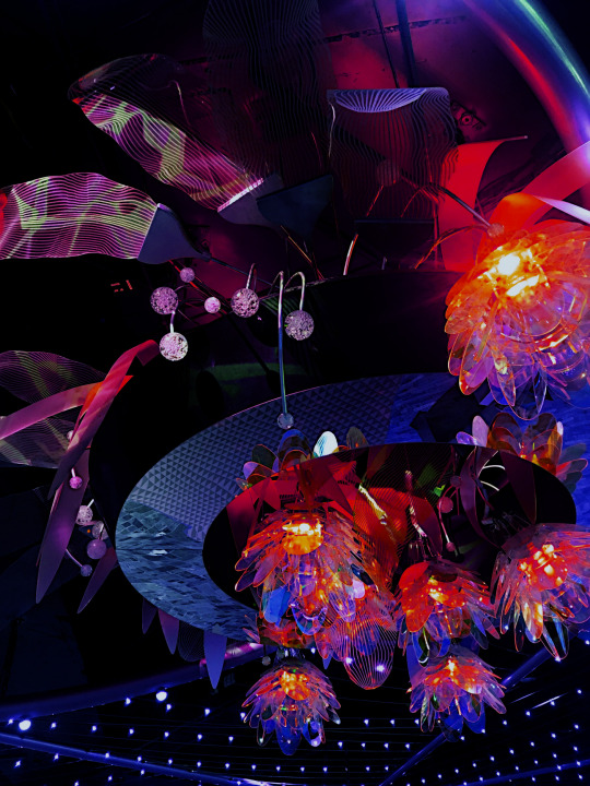
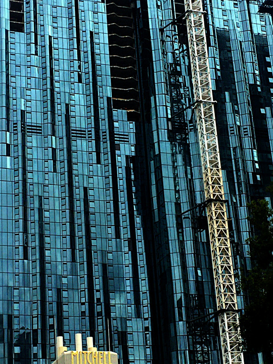
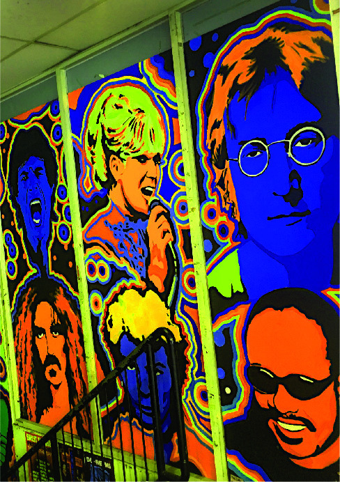
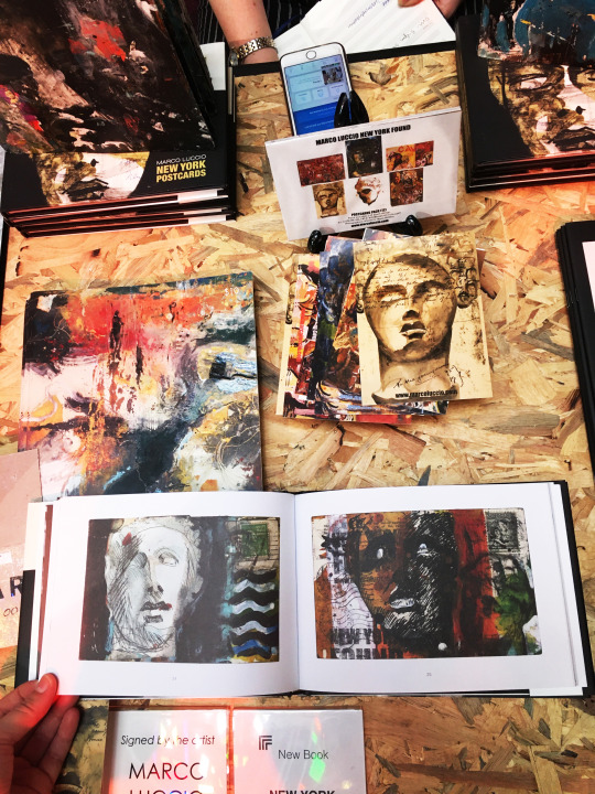
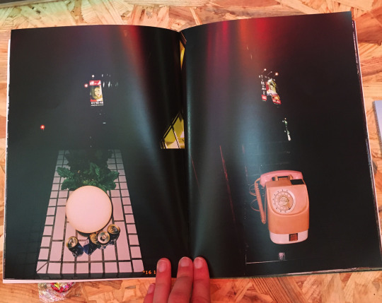
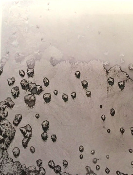
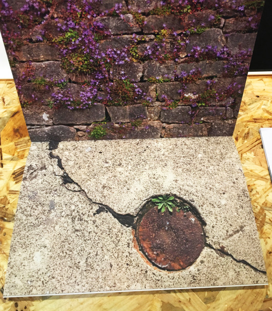
Melbourne Art Book Fair
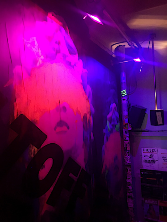
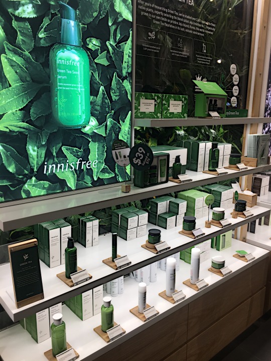
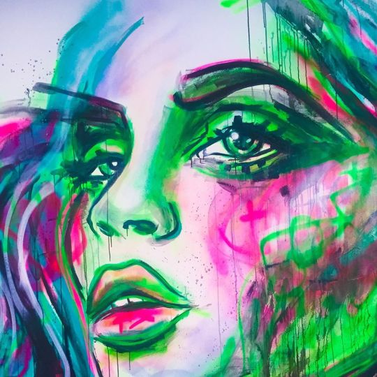
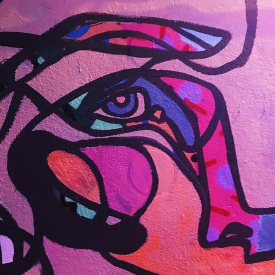
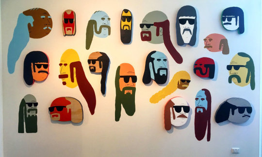
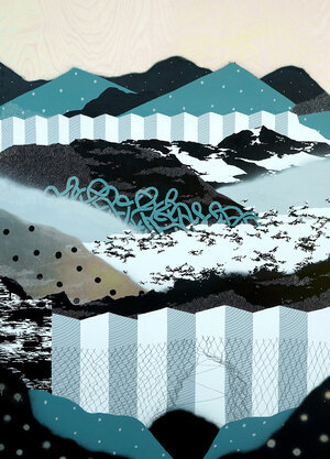
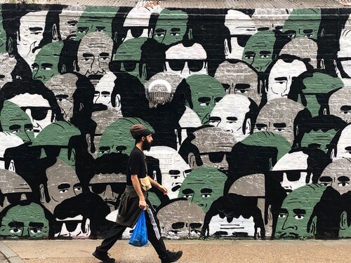
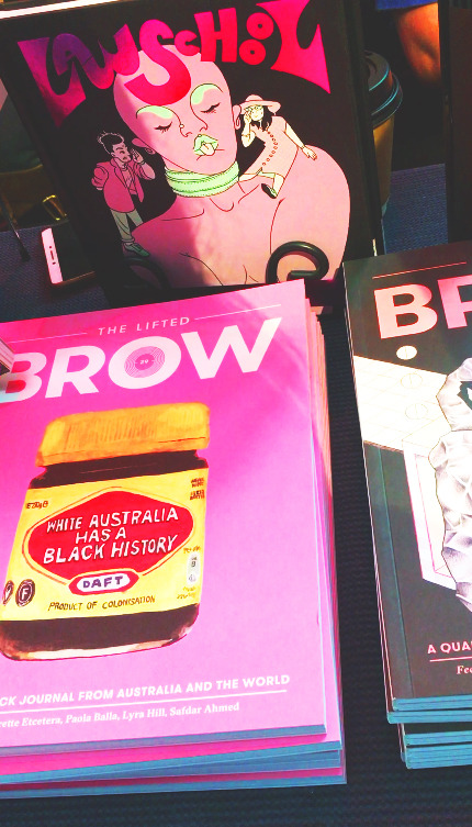
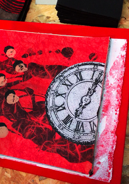
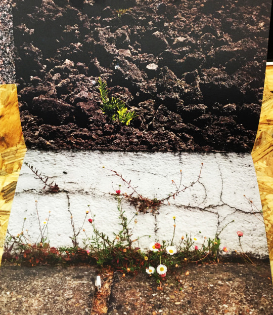
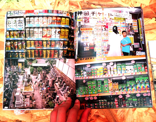
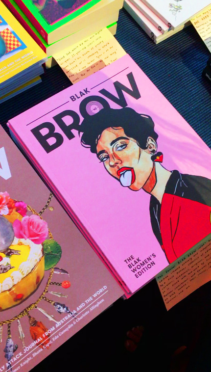
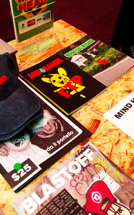
After the lecture, I attended the ‘Melbourne Art Book Fair’ at the National Gallery of Victoria. Set up in the Great Hall, numerous creative practitioners showcased their work, of which, the general public could admire and ask questions. This fair was particularly helpful for the RMIT first year students because it enabled us to see the wide scope and breadth of what design can be and how different people interpret it. By attending, I was able to form connections with previous students from the university that have gone on to pursue their design career, as well as other specialists in the field. I was able to make face-to-face inquiries about each artist/designer’s practices and studio setup, as well as the different materials and media they use.
I took the following images at the fair as I was heavily inspired by these practitioner’s work.
On Cloud Design 🎨
0 notes
Photo
Week One: First Colour and Information Design Tutorial (06/03)
Our first ‘Colour and Information’ tutorial began by following admin procedures in order to set up as a class. Presented with a slideshow, we were given an overview of the course yet to succeed, as well as the fixture for Brief One. We learnt RMIT’s protocols in reference to emergencies, plagiarism, academic integrity as well as standards for attendance. We were then channeled through the educational program ‘Canvas,’ which allows us to view all of the information regarding our classes and our assignment details.
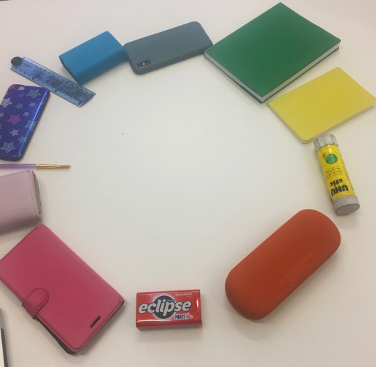
Deeper into the lesson, we looked at the basics of colour, colour families and the different theories around how colors interact with each other. We familiarized ourselves with the different types of colour wheels such as the RGB and the CMYK; as well as colour terminology: complementary, analogous, monochromatic, tints and shades. To break the ice among our peers, we were then instructed to gather objects in order to form the traditional colour wheel. Continuing along with this practice, we then arranged monochromatic and analogous schemes, to enhance our knowledge of the terminology we learnt earlier.
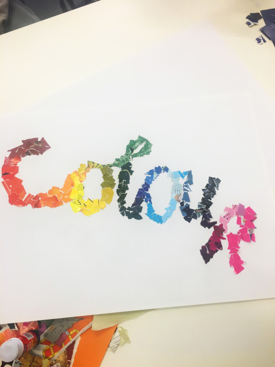
Our teacher then handed a magazine to each table group, which we were to use in order to generate shapes that showed harmonious colour schemes. My table found that by tearing up pages that featured vibrant and saturated colours, we could create a mosaic composition of the word ‘colour.’ We started by drawing out the outline for the word ‘colour’ and then layered the paper on top of the pencil and gave it a consistent line weight. Beginning with the ‘c,’ the cursive shape enabled us to transition between the hues on the colour wheel, which furthered our understanding of the placement of colours. This composition deemed to be visually effective, however, it was very time consuming as well as strenuous for the hands.
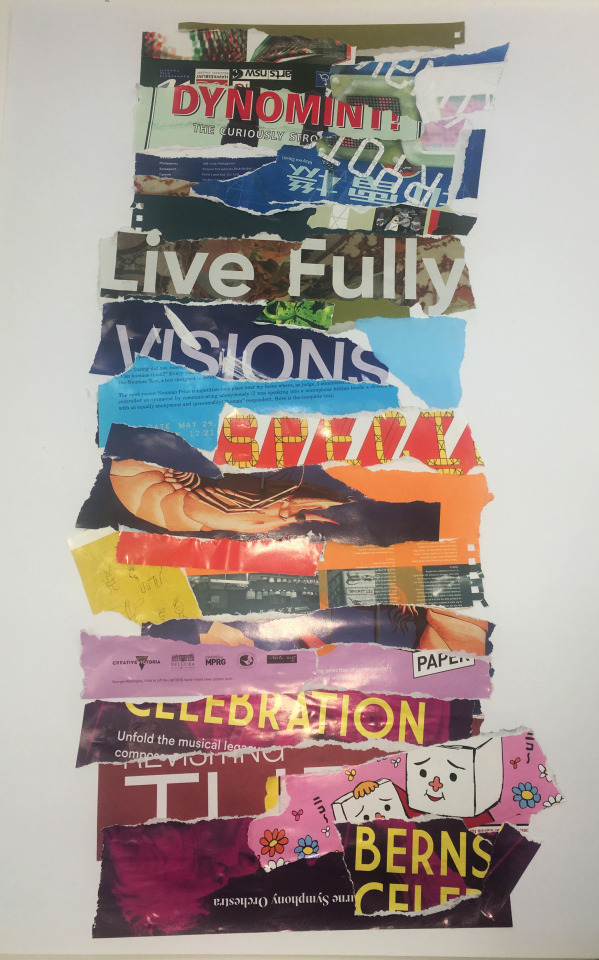
With time to spare at the end of the lesson, we then produced another colour harmony page. This one differed in that we ripped larger strips from the magazines: like headlines and imagery. Each strip of paper was placed accordingly next to the coloured strip’s compliment or analogous neighbor. The end result was also visually dominating but in a different way to the first artwork: the combination of type and colour made the composition appear more urgent and bold.
On cloud design ✧✸
0 notes
Text
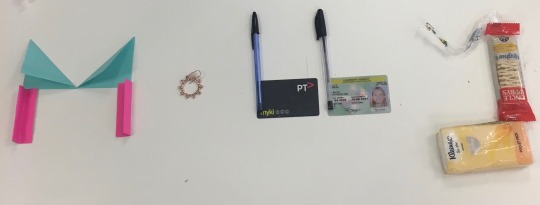
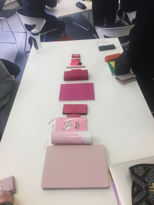
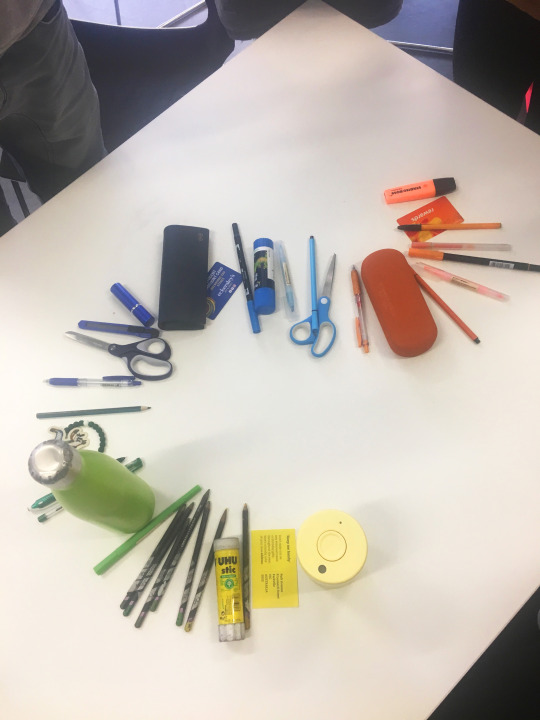
Week One: First Communication Design Studies Tutorial
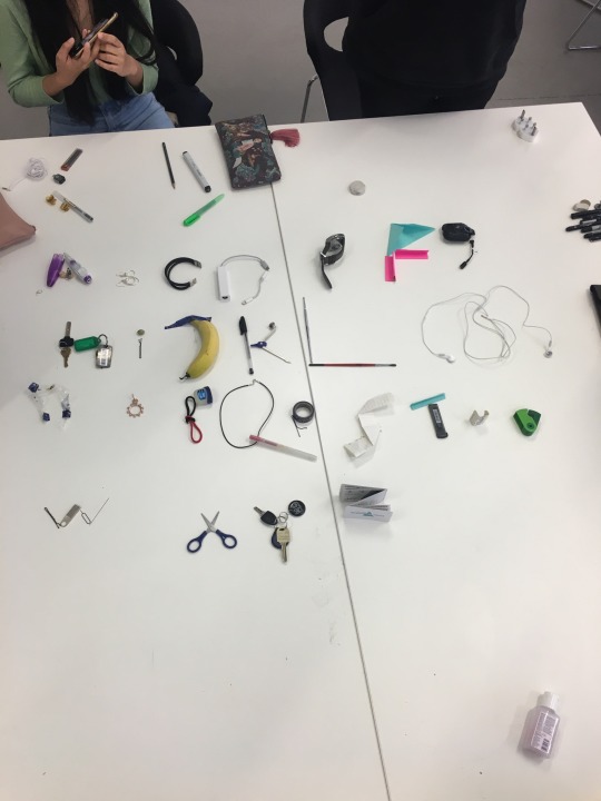
The first workshop commenced with everyone in the room sharing their name. As we went around the table and introduced ourselves, we were then instructed to form our name using only objects that we had brought to class. Some of us brought an entire bag, some only a phone, while others brought in trinkets from all walks of life. After manipulating these objects to form an identifiable typeface, we communicated our findings with one another and explored our options as to what works best. It was at this point that it became apparent to me that this personal 4 letter word shows great significance in our society. A name not only appoints you directly but it establishes your existence and marks your individuality. Names give insight into people’s culture, they suggest something about people’s age or grouping. They shine light on your character. They lead people into finding more about you. They give us a reputation of who we are; our history, our intentions, our relationships ... the whole kit and kaboodle. This activity was purposeful in that it helped us remember each other’s name in a visual medium but by using personal objects we carved our identities and how we were perceived by others in the class. Following this, we joined forces in table groups in order to create the 26 letter alphabet. With an increased number of goods to work from, the task was less challenging. However, it nudged us to look through the designers lens as to what dominates the most visually and how we can create type in various ways; without simply joining pens but using an existing shape such as scissors to form an X for example. This class proved itself to motivate our first assignment “Hello, my question is ...” The assignment extends this idea of creating type from objects, whilst it challenges us to form an open-ended question about design using relevant objects.
On cloud design ☁️🦋
1 note
·
View note