
Statistics
We looked inside some of the posts by orixi-389699 and here's what we found interesting.
Average Info
Notes Per Post
568K
Likes Per Post
369K
Reblog Per Post
198K
Reply Per Post
902
Time Between Posts
3 days
Number of Posts By Type
Text
17
Last Seen Tumblr Blogs


Fun Fact
Tumblr was created by web developers David Karp and Marco Arment.
Text
annoys the fuck out of me that i can only ever see a small number of hibden unlock tasks instead of just being able to fill them in from the whole list, like fuck off with this bullshit
392 notes
·
View notes
Text
you're allowed to say "sex" on the internet. See? I just did it. Sex. Sex sex sex. You don't have to say s*x or smex or Adult Fun Times or s3x or "spice" any other variation of self-censorship on tumblr dot com you can just spell out the word SEX i am going to scream until the heat death of the universe
102K notes
·
View notes
Text
“Fatherless behavior” stop giving my DAD credit for all the work my MOM put into making me a terrible person!! Stop erasing women in history!!
78K notes
·
View notes
Text


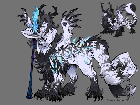


A compilation of my Flight Rising dracotaurs I drew this year :-) Check em out early on my Flight Rising side blog @darkfrare
2K notes
·
View notes

Text
Dragon that was breed changed from a guardian but they kept their charge. A mirror violently protecting a ruin from tomb raiders. A tundra standing guard over their library. A fathom lurking around a single tide pool. A gaoler looming over another dragon. A coatl shivering through snow storms for their wolf pack. A fae sleeping on the lip of their stained glass window. A wildclaw braving the acrid sprays of burning water to ensure their volcanic geyser is left alone. An aether keeping one scroll safe despite their newfound habits. A spiral sleeplessly watching over a sculpture
Just the unconventional, scary and sometimes even sad concept of trying to escape your very nature and becoming even better or worse equipped for the one trait that may never be physically changed.
1K notes
·
View notes

Text
disco elysium is kafkas metamorphosis for the modern age. no one is scared of becoming a bug anymore. the true nightmare? waking up one day and finding out your a cop
34K notes
·
View notes


Text
A goblin and an elf have decided to defy tradition and get married. Their ceremony will be held in the magical forest in accordance with elven tradition.
43K notes
·
View notes
Text
Why did the irony of hoarding in Skyrim just occur to me?
Like. All the jokes about using Lydia as your pack mule- a house FULL of cheese wheels- that one girl who stole so many books her game kinda turned into Fahrenheit 451
And the PC is the dragonborn. DRAGONborn
You’re a dragon.
Dragons have hoards
Almost every Skyrim player has hoarded something at least once.
Something about the game just encourages hoarding.
WE ARE LITERALLY A HOARD-HUNGRY DRAGON
3K notes
·
View notes
Text
A Collection of My Favorite Parenthetical Asides in Disco Elysium:


17K notes
·
View notes
Text
Sometimes I remember that "I'm so fucking normal right now" is a line from disco elysium. like that's such a sentence from a tumblr post to me but no. harry du bois said that. out loud. he would do numbers on here
89K notes
·
View notes
Text
Already, I see them in my dreams.
It's approaching...

474 notes
·
View notes