
Secondary blog for my bookbinding adventures:CatsPawBindery.tumblr.com
Don't wanna be here? Send us removal request.
Statistics
We looked inside some of the posts by overlyenthusiasticfictionreader and here's what we found interesting.
Average Info
Notes Per Post
180K
Likes Per Post
98K
Reblog Per Post
82K
Reply Per Post
196
Time Between Posts
6 hours
Number of Posts By Type
Text
15
Note
1
Photo
1
Last Seen Tumblr Blogs


Fun Fact
The KCSC sent more than 20K requests to delete posts related to prostitution and porn to Tumblr from January to June 2017.
Text

Bound: Far From The Tree by aideomai
Typeset and bound by: me, @phoenixortheflame Ft. art by: mims bindery
The arrival of Harry Potter’s children—snapped back in time, the children themselves guessed, twenty or so years—was the most interesting thing to happen at Hogwarts for years.
Wheres my Soup-pocalypse bind came together in a mere few days, this one I agonized over for months.
You win some, you lose some.


I made this bind for @maleekamolscreates as part of our twins exchange, which we set in motion the day we found out we share a birthday.
I didn't plan to make another sci-fi themed Drarry bind, the chiyogami endpapers kind of dictated the direction. And I couldn't not use these endpapers. I mean... come on.


I opted for a nearly entirely monochrome exterior, save for the title which is layered offset HTV. If you look closely, you can see a wavy texture on the bookcloth mimicking the pattern of the endpapers, which is just matte black HTV.
I don't love the way the HTV turned out, and if I had to do it again I would have left the cover entirely blank. Maybe include a black-only title on the spine. But conceptually I dig it, and hopefully Mally does, too.

The edges are painted with black acrylic ink and the endbands are hand-sewn with black silk thread using DAS's Two Colour Front Bead Headband tutorial.


I finally managed to find short-grain cream paper in Canada (ty, Canada Papers!), which really elevated the typeset in my opinion.

Typeset art is by mims bindery (ty, mims!).
There are two pieces for this bind: the twins and a second piece (so avert your eyes if you don't want any spoilers!)


I opted to use red thread for the text block because, uh, it looks cool?


I was a big baby during this whole bind, so I must thank my emotional support crew who helped me troubleshoot and talked me off the ledge more than once: @citrusses @epitomereally @sits-bound @jtimu
I also DM'd a bunch of other pals with cupped hands begging them to feed me morsels of praise throughout the process, so ty @faiell @its-the-allure @smehur @edieblakee @the-forbidden-forest. ILY ALL VERY VERY MUCH.
56 notes
·
View notes
Text
Statues by Rounderhouse and Snapdragon133


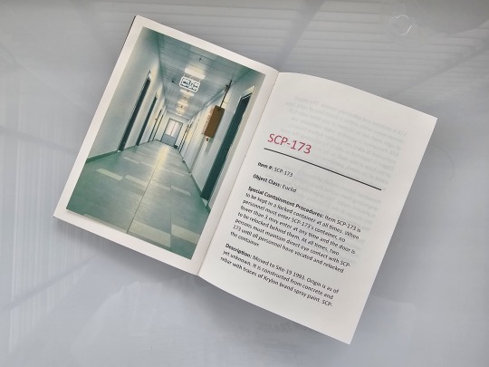

This is a record, a new bind just a week and a half after the previous one!
I have always been a lurker fan of the SCP Foundation. Over the decade, I have dipped in and out of the site to read the tales and articles that lie within. So when I heard that there was a story in another form—Statues—that links to the earliest SCP ever written, and that one of the writers is @rounderhouse, the man who wrote the REDTAPE series, I just had to see and read.
This bind is a celebration of one of the oldest articles in the SCP Foundation archives, as well as to a story that humanizes the statue that made the universe possible.
(Extra: I further experimented with pasting images into this book—as per the last bind—by gluing them at the top and spine edges, but leaving the bottom + foreedge glue-free. Result: a much sturdier connection with less chance of creasing, yet still with enough freedom for the printed images to breathe and bend without buckling or bubbling. Yes!)
40 notes
·
View notes
Text
Fanbind: Do Every Stupid Thing by thepartyresponsible
This was an already-made typeset generously shared with me by someone on the Renegade server (@runawaymarbles). I used their beautiful design element for the cover as well (although I cannot recommend doing interlocking elements in different colors if you are visuospatially-impaired like I am!). It was the perfect baby-step into my first actual text bind, whereas up until this one I had only bound blank notebooks or done rebinds of already-printed books. I was worried it might be too over the top with reflective foil used for all four colors (even the top, which photographs looking a little white, is reflective silver foil), but I ended up liking it. It's a nice contrast with the matte gunmetal bookcloth, and echoes the quote that says, "Don't let 'em break your heart. That small one's kinda flashy." (Rosa, my dearest, you were only there for a few pages but you live forever in my heart). This copy was meant for me, but ended up being timed just right (with a little doing-this-instead-of-work on my part) to send to my amazing beta and fandom bestie, @kangofu-cb, so the next copy will be for me! The fic is Do Every Stupid Thing by @thepartyresponsible, a.k.a. the fic that got every single one of us into the Jason Todd fandom. @thepartyresponsible, I sent you an ask, but if you want a bound copy of your fic I would be thrilled to send you one!


161 notes
·
View notes
Text


Flight Rising provides lineart of all their dragons, so I made a coloring book!
28 notes
·
View notes
Text


joining in on making a physical copy of Theseus' Guide by @stump-not-found which you should definitely go check out?? if you haven't already? it's so so great i swear???
this was my first ever expierience with book binding but overall i'm pretty happy with how it turned out? it was definitely plenty of fun :]
375 notes
·
View notes
Text
A Man of Honor by @astolat
I continue in my quest to bind all of Astolat’s fic in the fandoms I read! This is another GOT fic, but a Regency Romance AU.


The cloth jointed endpapers and cover inset are hot foiled, but the spine text and my logo are HTV because it turns out this Japanese book cloth does not take foiling well! I modeled the title page after the 1697 edition of Dryden’s translation of Virgil (yes, I’m that kind of nerd), hand painted the red because I still don’t have a color printer, and I used IM Fell as my primary font. The images of swords and pistols come from public domain photos of appropriate weaponry that I digitally traced and edited. Endbands are a simple bead on front with silk.
As always, Astolat, if you would like a copy let me know!
26 notes
·
View notes
Text
58K notes
·
View notes
Text
bbcarts Expert bookbinder Emma - @thebinarybookbinder - captured the magic of Philip Pullman's #TheSubtleKnife and @jordanfstephens' memories of reading it so beautifully... we are in awe 🥺
Big fan of the book, of Philip Pullman, and of this rebinding.
36 notes
·
View notes
Text
Bound: O Come, All Ye Faithful by me (@toomuchplor)


Another bind I gifted to @sits-bound when I sent her my bind of First Watch of Night!
This one is just a quickie legal quarto paperback. I was inspired by how @citrusses made her version of this fic (bound for meeeee) look like a tiny hymnal, so I did my own take with a red letter Bible or psalter aesthetic. I loved the big red drop caps and the red cross scene breaks (which I forgot to photograph, whoops).
For the cover, given that this is a paperback, I decided to do more of a "progressive church book of the month selection" vibe. (If you know, you know.)
It was a swift little typeset for this shortish fic, but it was really fun to assemble and I was so happy to gift sits something else new alongside the epic tome that was FWON.
38 notes
·
View notes
Text


A legal quarto sized bind of The Superfluous Man by peu_a_peu! I made this one for @arminaa8 and peu will be getting a copy in the next week or so.
I was going for a tarot-card vibe, since the fic was written for @hd-tarot last year with the card The Wheel of Fortune, which is featured in the cover and the title pages. My guillotine even cooperated with me to trim this for the full color, full-page title pages!
32 notes
·
View notes
Text
🌈 Behold the Stucky Fanfic Rainbow! 🌈
[@zenaidamacrouras1 edition]


Look, everyone, look!
So... I knew that there was something in the mail for me making its way around the world. However, I certainly wasn't expecting this: a veritable treasure chest filled to the brim with gorgeously bound copies of @zenaidamacrouras1's complete Steve/Bucky works. I am honestly still speechless in the face of all this generosity.
Please click the the 'Keep reading' for many more pictures of lovely details such as chapter headings, title pages, illustrations, beautiful end papers, etc. These are gorgeous, gorgeous objects, as are the words printed within them:


I was lucky enough to be asked by Zenaida to beta many of these stories and it was indeed a great privilege and joy to witness the process of them being written—sometimes literally watching the words being typed in the doc in real time. Seeing them bound now and holding these beautiful books in my hands, makes me feel some kind of way. (Weepy, I'm feeling weepy! Absolutely no one is surprised, I know.)
I'm grateful for all the joy and beauty (and the tears) this fandom has brought me over the years, and I'm especially grateful to Zenaida for being such a wonderful friend, for sharing your immense talent(s) with us, and of course, for sending me this incredible gift.
From one sappy person to another: Thank you, my friend! 💛
118 notes
·
View notes
Text
Quick and dirty A6 pamphlet binding; remember, you too can slowly dismantle a corrupt and evil system from the inside!


145 notes
·
View notes
Note
Upsizing clothes! There are a million upcycling tutorials for clothes that are too big, but so few on how to make too small clothes you still love bigger!
Thank you for your suggestion! We all go through weight fluctuations in life, so it stands to reason our clothes should be able to fluctuate with us.
Resizing your clothes used to be a very common practice before the advent of fast fashion. Fast fashion sizing is extremely flawed, especially when it comes to plus size fashion, and we're stuck with a lot of vanity sizing, so it's a good skill to have regardless of whether you're looking to mend something old or buy something new.
How to upsize clothes:
Introduction:
There are many different ways to make a garment larger. The following list is not exhaustive, just a few ideas to get you started.
Grading patterns:
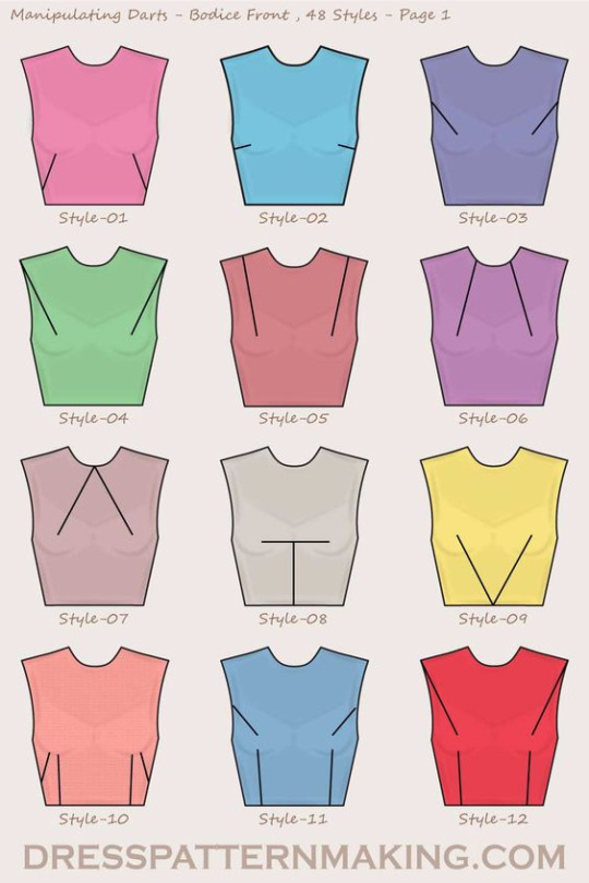
If you're making your own clothes, it's always useful to know how to modify a sewing pattern. The easiest way to adjust a pre-existing pattern to your size is slash and spread grading. First, you need to define which spots on the pattern need extra space. You then cut your pattern in that spot, and slide the resulting pattern pieces away from each other until you've got the size you need. Use paper to fill in the gaps. To ensure the resulting pattern makes for well-fitting clothes, make a mock-up and add, move, or remove darts where necessary to adapt it to your body type.
The image below shows potential slashing lines on pattern blocks for an AFAB body. Unfortunately this was the only diagram I could find, but know that other types of patterns use similar line placements. Each line is a spot that allows you to add extra space. To read more about this process, check out the corresponding article by Threads Magazine.
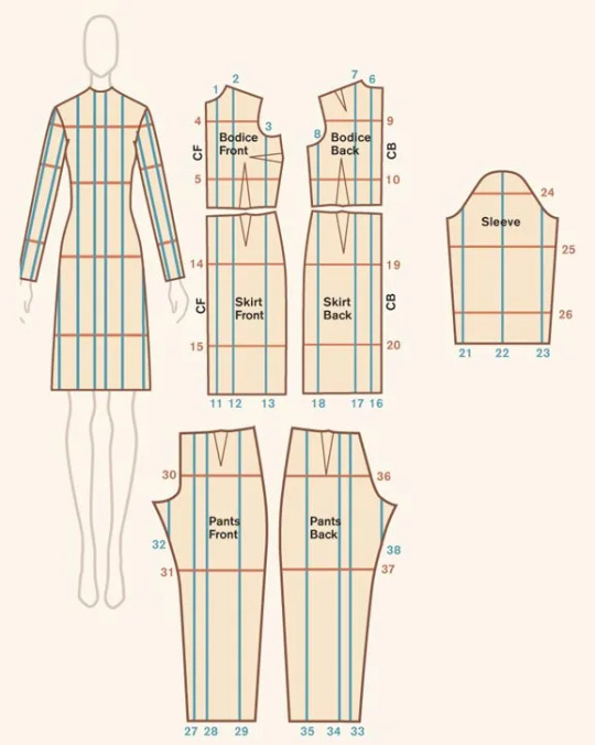
(Image source)
To make your clothes easier to let out in the future, make sure to provide ample seam allowance when cutting out your pattern pieces. This surplus fabric has several different uses, including giving you some wiggle room for when you need to size up your garment.
Now, let's take a look at pre-made garments.
Lengthening clothes:
A garment that's too short on you is easy to modify. Just add more material!
If it's a skirt or a dress, add ruffles to the bottom. Ruffles are easy to make by hand or with a sewing machine. You could also add lace, or wear the item with an underskirt.
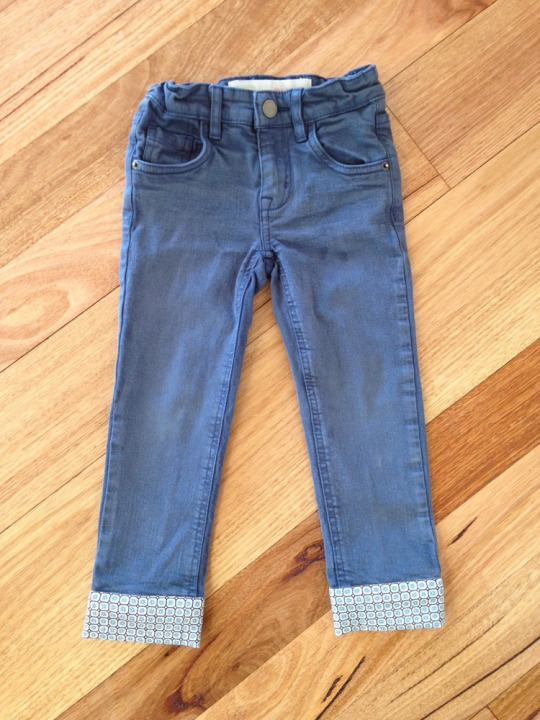
For pants, let down your hem or sew on a new cuff. If this isn't enough, maybe consider turning your trousers into capri pants or shorts.
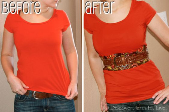
As for shirts, sewing an extra layer to the bottom edge is the easiest way to go, too. You could even combine two shirts into one to get an extra long shirt.
Another option is to cut your item in two and insert extra fabric between your separated garment parts.
(Image source)
(Image source)
Letting out seams/darts:
Remember how we made sure to have ample seam allowance earlier? When a garment has surplus fabric in the seams and you only need a little extra space, you can undo the seams of your garment and sew them back together again, this time with a smaller seam allowance than before. The Spruce Crafts has a pretty good tutorial on how to let out seams. You won't be able to make major size changes using this technique, but if you only need a few centimetres, this is a good way to go.
A lot of garments also have darts. Darts are fabric folds that are sewn down in strategic places to help the fabric follow the body's curves. If a dart doesn't fit you the way you want it to, then unpick the dart and try on the garment. Either leave the dart open, or pin the dart in place however you want it, then take off the garment again and sew the dart back together.
Be careful not to rip the fabric when using a seam ripper. Also note that removing entire darts may change the garment's fit.
You can also add custom darts to achieve a better fit, but that's a topic for another time.
(Image source)
Adding extra fabric to your garment:
If we need to add more room than seam allowance or darts can provide us with, we need to add extra material. Remember those slashing lines we looked at earlier? If you're working with a pre-existing garment rather than a pattern, those are the perfect places to chop up your clothes and add in extra fabric.
Check your sewing stash for fabric that's similar in weight and material to your original garment, or go thrift shopping for an item you could use to upsize your garment. Long skirts and maxi dresses are a great source of fabric for alterations like these!
Lace inserts are also a fun choice to add some room, and if you're working with a knit item, you could even knit or crochet your own custom insert.
Define the area where you want to add extra fabric on your item, and measure how much you need. Draw a straight line on your garment with chalk/soap. Make sure the line doesn't cross any important structural or functional parts of your garment like darts or button holes: refer to the slashing diagram we saw earlier if you're not sure what spot to pick. Cut the line open (or unpick the seam if it's situated on a seam), and add in your extra fabric. Finish off your new seams so they don't unravel later on, and you're done!
You can add straight strips of fabric for extra width or length, or you could use flared panels or even godets to make your item flair out.
Want to see this technique in action? Check out this video by Break n Remake:
youtube
Some ideas:
This Pinterest user cut a straight line down the front of a t-shirt and inserted a lace panel to add extra width in the front of the garment.
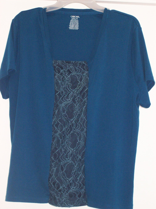
(Image source)
Busy Geemaw cut open the side seams of a shirt and used flared panels to add some extra width in the bust and hip area.
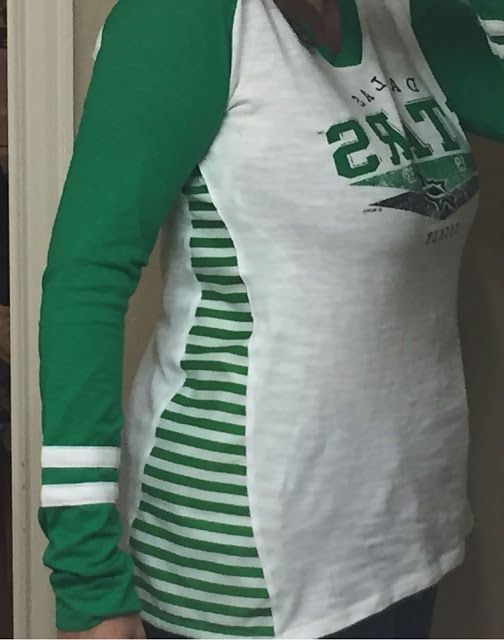
(Image source)
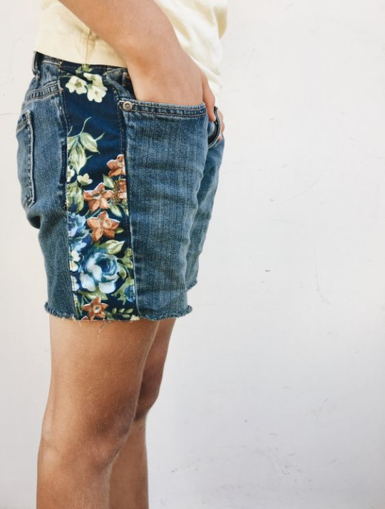
This person added a panel to the sides of a pair of jeans to give them more space in the hip area. You could easily use a long straight panel or a panel that flares at the bottom to resize the entire garment instead of just the hips, or use a wide piece of elastic for extra stretch.
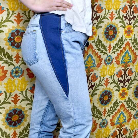
(Image source)
This person added a godet in the back of their shirt in order to get more space in the back.
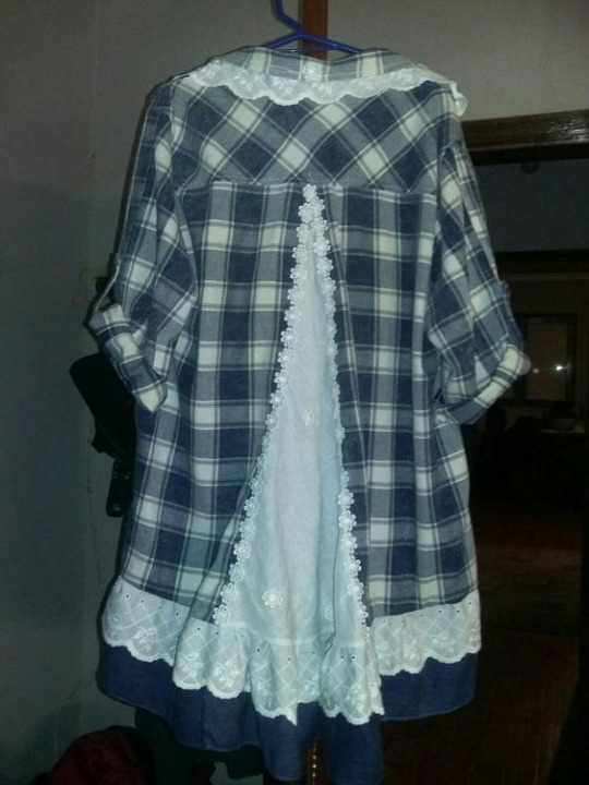
(Image source)
Blue Corduroy enlarged a pair of shorts by opening up the side seams and adding in strips of fabric.
(Image source)
You don't need to resize the entire garment if you don't want to. For example, One Brown Mom turned this ankle-length skirt with a too small waistband into a well-fitting knee-length skirt by taking advantage of the skirt's flared shape.
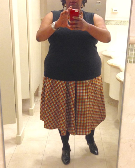
(Image source)
Conclusion:
Throughout our lives, our weight will fluctuate and our bodies will change. There's no shame in this: it's just a fact of life. Therefore, knowing how to upsize an item that is too small for you is a useful skill to learn.
If you want more inspiration, check out these projects by Confessions of a Refashionista, One Brown Mom, and Thriftanista in the City.
48K notes
·
View notes
Photo


Art Nouveau in Brussels
1904
6 Rue du Lac, Brussels, Belgium
Architect: Ernest Delune (Belgian,1859-1947)
39K notes
·
View notes
Text

Waterlily Dreams, the first of my Summer Garden Mini Collection. Beautiful yarn inspired by the colours of a summer garden, capturing the vibrant essence of blooming flowers and lush greenery. Soft strands dyed in speckles of radiant floral hues. This collection evokes warmth and joy, reminiscent of sunny afternoons and gentle breezes. Its rich, natural palette invites creativity and each skein tells a story of nature’s quiet splendour.
100 notes
·
View notes
Text
I've been having a lot of fun with bookbinding, and I decided to make the Hope Is A Skill poem into a couple of pamphlets!

I ended up replacing a few of the images that I wasn't able to find in a high enough resolution. I also included at the end a short essay from @mylordshesacactus that I feel is on a similar theme. I'm real happy with how these came out!
Tagging @mumblesplash and @wonderwyrm in case they're interested!
172 notes
·
View notes
Text
Being demisexual and bi is funny to me. Anyone can hit it but you must suffer The Gauntlet first
34K notes
·
View notes