
Don't wanna be here? Send us removal request.
Statistics
We looked inside some of the posts by owainconceptideaandtype and here's what we found interesting.
Average Info
Notes Per Post
0
Likes Per Post
0
Reblog Per Post
0
Reply Per Post
0
Time Between Posts
13 days
Number of Posts By Type
Text
13
Link
1
Video
2
Photo
1
Last Seen Tumblr Blogs


Fun Fact
70% of Tumblr users say the Dashboard is their favorite place to spend time online.

Text
HISTORICAL AND CONTEMPORARY DEVELOPMENT OF TYPOGRAPHY
The invention and impact of the printing press
A printing press is a device which used plates or rolls to print onto an inked surface. Before the printing press was invented, any writings and drawings had to be completed by hand. Additionally not just anyone could do this job. Mainly these jobs were for people who lived and worked in Monasteries. Most Monasteries has a special room called a 'Scriptorium'. First, the scribe would work, doing the measurements and outlines of the page layouts, then the scribe would copy the text from another book. The illuminator would take over to add designs to the page.
In the olden days, books were usually only owned by monasteries, educational institutes and the extremely rich. The books were mainly religious.
During the 1300s to the 1400s, people had developed a very basic form of printing which was 'woodblock printing'.
Around the late 1430s a German man named Johann Gutenberg wanting to earn some money. Gutenberg had previous experience at a Mint ( an industrial factory which manufactures coins) and he realised that if he could use cut blocks within a machine he could make the printing process much faster and could create a mass production of books. Instead of using wood he used metal. This machine was known as a 'Movable type machine'. Gutenberg made the very first printed book in 1455. This was a reproduction of the Bible.
Gutenberg's invention made a huge impact when it reached the public. At first, the noble class ( a social class, normally ranked immediately under royalty) looked down on the printed book because they believed hand inked books were a luxury and that it shouldn’t be cheapened down. It was much more popular with the lower class as it was something brand new which they could afford, which was very unlikely in those times.
More print shops opened, politicians started to inform the public's interest through printed leaflets and pamphlets, etc. The most important impact was that people could start to read and increase their knowledge more easily, this increased discussion and development of new ideas. From this onwards communication and ideas increased hugely. It was getting much harder to control people through restricted information, today there as peoples opinions everywhere, in books, online, apps etc. Even in the last 10 years technology has changed, before you would have to take a photo on your camera, then upload it onto a computer, to then log onto facebook on the computer and upload the pictures saved on your computer; these days you take a photo on your phone then upload it straight to the facebook app which is constantly running, it is so much easier to access information these days and that is purely due to people's knowledge increasing and people experimenting more.
The development of typefaces (Serifs and Sans-serifs)
In typography a serif if a small line attached to the end of a stroke in a letter or symbol. Sans-serif is a typeface without serifs. (Sans stands for without in French).
In the Middle Ages books were hand lettered in Gothic Style, which was developed by scribes, until the invention of the movable type press by Johann Gutenberg. The first type carved by Gutenberg was based on the handwriting style at the time and was used to print the first books in Europe, including the Bible. This was Blackletter - the original calligraphic style, with tall, narrow letters and sharp angular lines.
As movable type printing became more standard across Europe, different typeface styles were developed, but these early typefaces were still based on early written scripts, so they kept the characteristics of brush/pen lines and serifs on the entry and exit of each stroke.
Humanist style (the 1400s) which included all the same characteristics and had an angled crossbar. Modern fonts in this style are Centaur and Jenson.
In the 1500's - 1700's Old Style came into fashion. With typefaces now being carved to form printable fonts, typographers began to experiment and design their own typefaces. Type became more upright and used straighter crossbars, as well as more variation between thick and thin strokes. Modern day types in this style are Garamond and Goudy old style.
In the 1700's, Transitional became popular, this was the Trent of more upright letters and greater contrasts in strokes. Modern day font today is Baskerville (this is much more elegant with broad strokes becoming thinner within the character and the stress is perfectly vertical.
Fonts from the 18th Century were known as did one or modern. These typefaces have extreme contrast, with very broad stone and then reducing to very thin hairline strokes, as well as unbracketed serifs. Modern fonts in this style are Didot and Bodoni.
In the 1900's Slab Serif was used in newspaper headlines and product advertising. This was because they wanted a type which was more attention grabbing to the audience. This lead to typefaces being more robust and thick. Slab serifs have thick block/square lines at the end of the stroke. A modern font today would be Rockwell.
SANS SERIFS
It is clear to see the development of serif typefaces over the years, but the 19th-20th century saw a huge explosion of type design, where many fonts used today were invented. New Sans serif designs stripped away the handwritten characteristics completely to create a modern typeface that could be easier to read at longer distances.
In the early 19th century, Grotesque was the first Sans serif typeface, this was called Grotesque (as in 'Ugly') due to the rejection of the type. This type included a double story layout for the letters g and a. A modern font in this style is Franklin Gothic.
In the late 19th century, Neo-Grotesque came into fashion. These fonts completely abandoned the traditional characteristics to make them simpler and minimalistic. There is no contrast in the strokes and the terminals (ends) are perfectly straight. A modern type would be Helvetica, which is one of the most common typefaces today.
Finally in the 1900's Geometric typefaces were the result of taking the design Trend to the very edge. Geometric fonts go a step further than Neo-grotesque fonts. Geometric fonts are incredibly simple and the letters are based on geometric shapes. This typeface is ultra modern, but their structure makes them very awkward to read, especially in lowercase. A modern type would be Futura.
ITALICS
Italics were originally designed in 1500's or earlier. However, the first notable use of italic type was in an edition of Virgil, created in 1501 by Francesco Griffo. He wanted to bring bag the look of the handwritten style.
Italic is a typeface that is at an angle. Originally italic letters were not designed to complement a Roman typeface. When introduced in the early 16th century, they were created as an independent font. Only containing lowercase characters, no capitals, no numbers and no punctuation.
It wasn't until the 17th century that italics became a legitimate part of a type family, which is when slanted capitals and numbers were added as an offering.
Contemporary Typography
Computer technology revolutionised typography in the 20th century. Personal computers in the 1980s like the Macintosh allowed type designers to create types digitally using commercial graphic design software. Digital technology also enabled designers to create more experimental typefaces and designs for typefaces could be created faster with the new technology.
The cost for developing typefaces was drastically lowered and becoming widely available to the majority. The change has been called the 'democratisation of type' and has given new designers more opportunities to progress in the design world.
Choice of typography today has become a huge decision. When creating something digitally you have to make a choice into what type suits that style. For example writing a letter for a new job, you will need to use a plain, easily readable font. Whereas if you're creating a poster promoting a gig you would use a large bold text, which is fun and attention grabbing. This can be quite hard especially because there are hundreds of fonts and some are so similar.
To Digitalize your typeface today you can use loads of different software, however, the ones I have used and found good are Birdfont and Calliphr which are both free. Calliphr uses more of sketching technique, where you hand draw you type and then scan it into the website and it draws it for you. Birdfont is similar to Adobe Illustrator, it gives you each letter and you draw it from blank digitally using either the pen or brush tool.
Modern software timeline
- 1951 = Jay Forrester and Robert Everett of Massachusetts Institute of Technology (MIT) produced Whirlwind, a mainframe computer that can display crude images on a television monitor.
-1959 = General Motors and IBM develop Design Augmented by Computers (DAC) and computer aided design (CAD) system to help engineers design cars. (CAD is still very popular today).
-1961 = John Witney Sr. uses computer graphics to design a captivating title sequence for the Alfred Hitchcock thriller 'Vertigo'.
In the same year MIT student Steve Russell paragraphs 'Spacewar!', which was the first graphical computer game on a minicomputer.
-1963 = Ivan Sutherland, a pioneer of human-computer interaction (making computers easy for humans to use), developed 'Sketchpad' which is one of the first computer-aided design packages, in which images can be drawn on the screen using a light pen. Later, Sutherland developed virtual reality equipment and flight simulators.
-1966 = NASA's Jet Propulsion Laboratory develops an image processing program called VICAR, running on IBM mainframes, to process images of the moon captured by spacecraft.
-1972 = Atari released 'PONG', a popular version of ping-pong placed by one or two players on a computer screen.
-1970s = Ivan Sutherland's student Edwin Catmull becomes one of the pioneers of 3D computer graphic animation, later playing key roles at Lucasfilm, Pixar and Disney.
-1982 = The movie 'Iron' mixes live action and computer graphic imagery in a story that takes a man deep inside a computer system.
-1990 = The first version of Adobe Photoshop ( one of the world's most popular professional graphic design packages) is released. A simple, affordable home graphics program called Paint-shop is launched the same year.
-1995 = Toy Story, produced by Pixar demonstrates the impressive possibilities of CGI graphics in moviemaking.
- 2007 = Apple launches its iPhone and iPod touch products with touchscreen graphical user interfaces.
0 notes
Link
DIGITALLY DRAWING MY FONT
To make my font digital I used a website which is free called www.calligraphr.com. This website is great for drawing up your own font! I printed out the template which you could download of the website, and the draw each letter in the box allocated, as seen below.

You need to make sure that your drawings are very neat and not very thick because then when you scan in the templates it makes the typeface look untidy and wobbly. When I scanned mine in it didn’t look amazing but it still looked neat, legible and easy to read. However I do believe that my font has a handwritten look to it and makes it look more quirky and interesting.
I would recommend this website if you enjoy hand sketching more than digital sketching, but if you prefer to do it digitally a software called BirdFont is very good too, and this would probably be much more accurate than Calligraphr was. Calligraphr is much more suited for illustrators who hand draw their work, whereas BirdFont is much more suited to graphic designers who mainly work digitally.
BEHANCE LINK =
https://www.behance.net/gallery/54088227/BUBBLES-FONT?

On my Behance blog I animated my font, I did this on photoshop. I created a new layer for each letter, then by clicking window - timeline a timeline pops up at the bottom; I then pressed create video timeline and then the three squares in the left hand corner. I then created a new layer for each letter, making sure only the letter I wanted was on view for this layer. Finally i changed the timing to 0.5 seconds and kept it on loop. I saved this as a Gif and uploaded it to my Behance account.
This animation is good to show off my work because it shows all the letters in a different and more interesting way instead of just written out. It is much more eye catching on a page rather than a plain heading. I will definitely use this effect a lot more when publishing my work in the future.
0 notes
Text
UNIT 39 - CREATING OWN FONT
MOOD-BOARD OF TYPEFACES

From my research, I have decided I am going to sketch up several ideas but focus mainly on making a typeface which has a bubble writing effect but in a more slender way.
DEVELOPMENT & SKETCHES

First I drew some rough sketches of several typefaces which came into my head at the time. I tried to use some variety by using italics, capitals, lower case, square, etc. However, the four circled where my favourite so I took this four and developed them slightly.

Then I put all four of the typefaces on the same page, apart from I changed the forth typeface to more of a bubble writing instead of a typeface with serifs on as this appealed to me more. From doing this is helped me see what I could use from each one into my final typeface.
In the end, I decided I wanted a bubble writing effect but wanted it sleeker and so it could be used as a popular daily font. I used typeface 2 for the base of my typeface as I liked the curves used. I then added small detail similar to typeface 3 into my typeface but also made it look as though each letter was an actual bubble.
FINAL DESIGN

EVALUATION
I really like what I have created. However, it is a bit too fun and probably wouldn’t be used for an everyday font but more likely to be used as a heading. My font is very unique and could possibly be used to brand a small individual business to make the menu’s or posters have a bespoke look, for example a small cafe which makes unusual drinks and cakes etc. It is a lot like the font Century Gothic, but more rounded. I love how the little effects in each letter have made the typeface look like a bubble but still keeping it neat and not childish like bubble writing can sometimes look like.
0 notes
Text
UNIT 4 - COMMUNICATION THROUGH ART AND DESIGN
PROPAGANDA
WHAT IS PROPAGANDA?
Propaganda is information which is used to promote a political cause or point of view. Propaganda is usually promoting information of a biased or misleading nature. Propaganda uses a different type of Art and Design, using bold titles, bold/sharp shapes and bright colours.
Propaganda was first invented to be used for political points of view during the war, however, it is now used in media, in advertising and promotion of brands and products.
The reason behind Propaganda was to look at a political view in a different way, making it look like it's a better path to choose. For example below are posters which were created when America was choosing their next president in 2012. The posters promote Obama as bringing hope and progress to the country and makes him look strong by using the bold colours and shapes.

ALEXANDER RODCHENKO
Alexander Rodchenko was a Russian artist, sculptor, photographer and graphic designer. He was one of the founders of constructivism and Russian design.
Constructivism began in 1917 alongside The Russian Revolution, constructivism questioned the fundamental properties of art and asked what its place should be in a new society. It challenged the idea of the work of art as a unique product and looked at how it could contribute to everyday life through design, architecture, theatre, film and industrial production
How did this artist use shape, colour, line and form?
Rodchenko used bold colours such as red, blue, black, orange and green in all of his constructivism work, this made the work seem a lot stronger and stood out. Additionally, the shapes are all very sharp and usually rectangular and square, again this makes the posters seem a lot more forcing. The titles and wording are all in line, very straight and all in capitals.
What media did he use to create his art?
There are lots of different mixed media techniques, such as paint, ink, photography, pen, pencil, felt tip, collages etc.
From analysing Redchenkos work, it looks as though he has painted the majority of his images, I can tell this purely from the wish washing of the paint, he also used very minimal photography, however back in the 1910′s and 20′s there was no digital software so he would’ve had to print the image of and cut around the image to stick this onto his poster. The letters were probably painted or ink was used.
For mass printing Redchenko could have used wood blocks, this is a printing technique which can be used over and over again, the wood is carved into a shape or letter which can act like a stamp and be pressed onto a poster, painting etc, this can be used over and over again. Additionally, there are many other mass printing techniques such as letterpress, flexography, engraving etc.

From this image, you can see that it has been painted and that the photograph would’ve been cut out to fit into the circle.
How did he use typography?
Redchenko’s typography is hard to understand because it is in Russian, however, from looking at his work he uses very short phrases, which can sometimes be a lot stronger than a long phrase. His wording is all in capitals and the font he uses is used in all of his constructivist work is very square and tall/narrow.
What was his message behind the constructivists work?
Rodchenko’s message behind his work was to make simplistic posters to support the Soviet state throughout the Russian revolution to let the illiterate audience understand the published information. Another way Redchenko attracted the viewer's attention was by using arrows, diagonal arrangements and big exclamation and question marks, similar to the poster below.


This poster which was created by Alexander Rodchenko, is promoting Russia’s industrial development, This is an advertising poster for the state airline Dobrolet which was invented in 1923. This poster uses Bold and bright colours, black is a very strong colour just like orange is. Additionally, all of the writing is in capitals and very square.
SHEPARD FAIREY

About Shepard Fairey’s visual art.
The majority of Shepard Fairey’s art work is very similar to Alexander Rodchenko’s work. He uses very simple colours, usually red and black. His typeface is usually very square and bold and making it stand out more by using capital letters. It isn’t as simple at Rodchenko’s work however it is a lot more simple than most artists work. His posters very aligned and symmetrical. Some of his work which shows these characteristics are below -


However Shepard Fairey has done other work compared to posters, he has produced some fine artwork, street graffiti work, which obviously doesn't have the same characteristics as those in his propaganda work.

INITIAL IDEAS AND DEVELOPMENT


Above are some of my initial idea drawings which I sketched out after researching propaganda posters.

Above is my first rough sketch which I produced on illustrator. I then developed this idea which is shown below.
PRODUCTION OF FINAL PIECE
1. First, on illustrator I made a new file and created my text which is in the typeface Poplar Std Black and is 186pt, I placed my text in the place I wanted.
2. On photoshop, I uploaded my image of my cat. I then made the cats face symmetrical on both sides. ( I did this by selecting half the face, using the select tool. Copying it and then flipping the image horizontally. Moving it into the correct position then merging the two layers together). I made the face symmetrical because when I was researching animals in propaganda posters, they all have symmetrical faces and look quite bold and unusual.
3. I duplicated this layer several times. I edited one of the layers by clicking image, image adjustments, threshold. I then played around to find a good amount of threshold where the eyes looked good and clear. This was a low threshold. I copied the eye using the select tool, then pasted it into illustrator to use later.
4. To get the whole image of the cat, I did the same adjustment using the threshold tool, finding a clear, defined image. I liked this edit purely because it looked as though the cat had been drawn, but also kept it looking realistic. Additionally, it looked as though ink had been used, I also liked how parts of the face are missing - this made it look more propaganda. I copied half the face and pasted it into illustrator.
5. On illustrator, I placed the face and the eye on the left of the page and removed any access background from the eye.

6. I then saved this file as a PSD, to edit in photoshop.
7. I opened the file up in photoshop to edit the colours. First, I filled the background layer with an off white colour, this is because most propaganda posters don’t use bright white but use off white colours, this is so the poster looks older and drags the attention to the image/writing instead of the crisp background.
8. I changed the text colour by selecting each letter with the magic wand tool and then filling it with the paint bucket tool. Usually, lettering on propaganda posters is red. However, I did mine all black apart from the word ‘NOT’ because this word is the main word within the text.
9. I then deleted the background of the cat image using the magic wand tool. Because of the small gaps, I had to spend a bit of time touching up the image and deleting the little white parts which hadn’t been deleted. I did not delete all of them, as it gave more texture with another colour in the face.

11. On illustrator, I created a new document and made some red lines using the line tool. All of the lines are diagonal and are all in line with each other.

12. On a new layer, I copy and pasted these lines onto my photoshop document. I removed the stripes from the cat's face using the paint brush tool (Using the off white colour) so that it looks as though the lines are coming from behind the cats head. I added these lines as they feature a lot in Russian propaganda posters.
The lines are behind all the layers apart from the off white background.

FINAL PROPAGANDA POSTER

First copy

I edited my poster slightly by making the background lines aligned, this looks a lot better and makes it look as though it is a propaganda poster, because majority of Propaganda posters are very aligned and ‘perfect’.

I then added a red border to my final poster, this again gave it more of a propaganda view to it. However most of the propaganda posters use the same colour border as the background. I did try this with the off white colour, however it didn’t look as good as the red border.
EVALUATION
How did you use your research into constructivism and the Obey brand to influence the colour used in your final design?
My research was very useful to create my final design. As you can see i used similar colours to other propaganda posters, black, red and an off white. Additionally, I added a border which is very common in propaganda posters, as well as background lines. I also used research into Obey branding for my poster. I used a similar typeface to Obey, and stuck with the bold large writing. Furthermore, a lot of Obey branding uses images which look as though they have been drawn, this is what i have done with the image of the cat featured in my poster.
How did you use colour in your final design what was the meaning behind the colours you used?
I used only three colours - red, black and off white. The reason for using these colours is that they are very common in propaganda and obey posters. Additionally the colours red and black are very strong colours, and make it look more bold and stand out, which is the main purpose of the poster, to attract people and convince them not to obey cats. The off white colour is used instead of white because from research all of the propaganda posters i looked at never used a crisp white, but always used a yellow/white colour.
How could you improve your use of colour within this project?
I think 3 colours is a good amount for this type of design. However, I could’ve tried more colours, or less colours too see what the poster would’ve looked like.
How did you use your research into constructivism and the Obey brand to influence the use of geometry and composition in your final design?
From my research into constuctivism and the Obey brand i found that everything was very aligned and square. I tried to use this theme in my final poster, with the straight lines and the square typeface.
How did you use composition, geometry and visual imagery to help enforce the meaning behind your poster?
I used very aligned and bold shapes in my poster, as i believe this gives a stronger look and makes it look fierce. This makes it look as though this is what it is and there is no way around it.
How could you improve your use of composition, geometry and visual imagery within this project?
I could’ve added more shapes and images into my poster.
How well do you think your final design worked as propaganda? Justify your answers using your research into the meaning of propaganda.
I think my poster fitted the theme of propaganda perfectly. Propaganda is information which is used to promote a point of view, I have done this in promoting not to obey cats. Additionally propaganda uses bold titles, shapes and bright colours, I have included all these into my final poster. I could’ve made my poster more complicated with more images and shapes, however it also needs to be simple and get straight to point.
Overall what went well during this project what areas would you want to improve in?
I think my poster went well overall, however If i were to do this again, I would try out more colours and look at other ways to position my text or my image.
Give yourself a specific target to aim towards to make you an even better designer.
To make myself a better designer, I would mainly focus on the digital side of my work, spend more time digitalising my work rather than sketching more than i need to. I would teach myself more tools and new methods/shortcuts to make my designing quicker and easier.
0 notes
Text
JOB ROLE RESEARCH
Find out what kind of salary a Junior graphic designer or animator could earn?
£13,913 - £22,841 - Salary for a Junior graphic designer £101.37 - £2,466 - Bonus for a Junior graphic designer
£18,000 - £25,000 a year - Salary for a Junior Animator
What kind of qualifications and software skills would a junior graphic designer or animator need?
From the website Howtobecomeananimator.com the qualifications usually wanted to be an animator or graphic designer is:
A Bachelors Degree in Computer Animation, Fine arts or Graphic design, or a higher apprenticeship in one of these fields. Some employers require on the job training in using company specific software and sometimes training is necessary for example - 1 year for entry-level positions; 3 or more years for mid-level or advanced positions. The Key skills include = Creative, artistic, communication, computer and time-management skills; ability to use animation and video editing software
What does the term ‘freelance’ mean in relation to graphic designers, illustrators and animators?
Freelance stands for self-employed and hired to work for different companies on particular assignments. Therefore it means alongside your job or no job you can work separately taking on small tasks in your own time and getting paid under your own salary.
What would be the hourly pay rate for a freelance designer and what would that rate be based on?
After researching this there is a lot of different answers. Obviously the minimum wage is £7.20 per hour, so you could go off this. However people are writing on blogs that they charge £10 per hour and the more experienced creators are charging £20-£30 per hour.
0 notes
Text
SKETCHBOOKS
3 Points why sketchbooks are important!
- Good for developing your work from your first initial sketch, can just jot down anything and ideas just keep coming.
- inspiration can come whenever, you could be sat down watching TV and something comes to mind, its best to sketch it as soon as possible so you don’t forget it or change it in your head.
- Makes your drawing better and improves skills.


I Really like these Sketchbooks off Pinterest because they use two pages for one image.

I Love how this sketchbook has used other resources such as newspaper to give more of an effect to the pages. Using resources gives more inspiration and also looks more creative.

This sketch work is in an actual book with writing, this is a great idea as it gives creativity and something unusual.

I really like this sketchbook as well due to there being extra pieces of paper (resources) and the sketches are actually drawn out of the sketchbook as stuck in, again it gives an effect and makes it look more like a collage which i think is great.
0 notes
Video
tumblr
FURTHER DEVELOPMENT ON MY FINAL IDENT
I decided that my ident was quite boring with just the claw mark going though it, so i added a wiggle to my text and also scaled the type face from small to large. This makes it more interesting and makes you want to watch it more.
0 notes
Video
tumblr
FINAL FILM IDENT
This is my final film ident of the typography Kittens. I produced this by drawing my writing on illustrator using the paint brush tool on a wacom pad. I then drew the Claw marks using the pen tool to get the right curves and angles.
Finally i exported the writing and claw marks separately as PNG’s and placed them onto a new composition on After Effects. To make the claw marks look as though it is happening right then and there, i used the transition - linear wipe effect.
The typeface in this logo is sans serif, the tracking is different between the letters, for example the space between the I and the T is quite big, but the space between the E and the N is very small and in fact touching. Additionally I have used upper and lower case in my type face, the I and the T's are lower case, whereas the other letters are Uppercase, I believe this makes the writing more creative and imaginative, where as when all the letters are exactly the same it makes it look quite boring and too neat, for me that doesn't express a horror film, but an unusual, messy type face does.
0 notes
Text
‘KITTENS’ A TYPOGRAPHY ASSIGNMENT

Above is a mood-board of several horror film logos. There is a common theme in these logos and colour scheme which is predominantly black red and white. Apart from the Goosebumps logo which is bright green, this is because this horror film is aimed at a younger age and in a way not that “scary” compared to the others and in a way it looks more of a mimic.
These logos are quite simple but very effective such as the ‘SPLIT’ logo which is just a simple bold font but a background has been added to make it look slightly broken. Additionally the ‘ANNABELLE’ logo is very plain but looks like an old fashioned font, but by changing the colour to a deep blood red it has given a horror effect.
Another effect which has been given to some of them is a shiny reflective look which has been faded out in parts, these include ‘the woman in black’, ‘the ring’, and ‘the visit’. I really like this effect.
I really like the Orphan typography which looks like it has been scratched into something. It is also a mixture of lower case and upper case which makes it more unusual and strange which is exactly what a horror movie is.
MOOD-BOARD OF DIFFERENT LOGO TYPES.

DEVELOPMENT
From sketching up several ideas, which are shown above. I asked people in my class which one out of the best 5 they liked the best.
The most favored one out of the five was the large one which has ‘claw marks’ through it. I asked 10 people and 7 people chose this one.
Therefore below i have developed this idea and some others on one page of sketching.

From sketching and developing some of the original sketches i had, i chose the middle bottom design and i thought this was the most creative and scary looking as i really liked the ‘scratch’ effect.
I actually chose a different design instead of the one that the class chose. I did this because I felt the design they thought was the best didn't look much like a horror typeface and in my eyes abit like a zebra print, which doesn't shout out horror. I also found that this design was very bold, which is good however I thought the scariest looking type faces were unusual and had a variety of tracking and included both uppercase and lowercase, and the actual logo design I chose includes these effects.
0 notes
Text
LIFE AS A TOOL BAR
The Brief for this project was to create a tool bar for a character which already exists. The tool bar has to be associated to that character and help identify the character. Additionally we had to create a graphical representation of the character. The final image of the character and tool bar then had to be produced onto an item, for example on a poster or a t-shirt.

Above is my first brainstorm of Ideas, it includes different characters which i found interesting and also different types of graphical representations in which the character could be drawn.

Above are the characters I chose and described more in detail and what would be included within their tool bar.


Above are mood-boards of the different characters i chose. I narrowed down the characters to four and these were, Elvis, Woody, Snow White and Wallace and Gromit. I printed several images that were all associated to the character, as well as images of the character, i then did a rough sketch of how the tool bar would look and what i would include within it. Additionally I drew the character and the main clothes and accessories which are associated with that character, for example Wallace’s green jumper and red tie. From doing these mood boards it helped see the different colours associated with the character. Out of the four characters, I chose to develop Wallace and Gromit further as they had more that could be included into their toolbar's.

After choosing Wallace and Gromit, I looked into different graphical representations of the characters, which i found online. Above include, a Pixelated version, Sketched version, Cartoon digitized version and a pop art version. From this research i decided to go down the path of the cartoon digitized graphical representation as this is the most clear and quick to do on Adobe Illustrator.

Above is the final image of the characters and their tool bars. I Drew it all on Illustrator using the pen tool. I added gradient using the gradient mesh tool onto the characters and some of the ‘tools’ to add more of a 3D effect.
FINAL T-SHIRT DESIGN

In this project i have learnt more tools and it has made me better at using tools which i wasn’t that good at. If i was to do it again i would focus more on the colouring and getting the gradients just right as well as the light reflection angles. I found this task quite easy and was fun looking into characters and drawing little icons.
0 notes
Photo

CARTOON STRIP
For this task we had to design a cartoon strip which didn’t have any wording, just facial expressions to express the mood of the character.
I drew this strip up on paper and scanned it into photoshop and using the paint bucket tool and paint brush tool I cleaned the character and the present/box up so that it looks cleaner and brighter.
0 notes
Text
CREATING CHARACTERS WITH VISUAL LANGUAGE

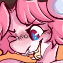
For this task we had to create a character and change the emotion on the face to represent Anxiety, Anger and Boredom.
To get these different emotions by using colour it can help express emotion, for example the colour red is portrayed as danger just like rage. The blue sweat drop being blue explains anxiety, however the main colour which is expressed with anxiety is yellow, therefore if i were to create a body i could input this colour into the clothing. Additionally the shape of the mouth and eyes helps as well, the eyes on my angry face are sharp and square as if they are wide open, where as on my bored face they look tired and lame.
0 notes
Text
COMIC BOOK ART THAT SHOW MOVEMENT AND MOTION

This comic strip uses different effects to make the character look like it is skipping through a forest. The bounce lines help show this as well as the different scenes that the character is set in. Additionally the character is floating slightly above the ground, therefore it portrays he is mid skip.

The main two motions shown within this comic strip is the motion on the left man’s face and the movement of the right hand man’s arms. Both these two movements portray anger towards the end, this proves that slight movement can change the whole story from a single movement.

This Marvel comic is full of motion and movement. Colour helps see movement, for example the top image of the hulk, who has white lines coming from his hands show fast sharp movement like a flash of light. The stance of the different characters also shows movement, the images of captain america on the left are stand still however because he is in a running stance it portrays that he is running, the lines also help showing speed.
0 notes
Text
UNIT 4 - FACIAL EXPRESSIONS

Above are the 3 faces i created on illustrator. Eyes, mouths and eyebrows can change the facial expression of someones face drastically to how they are feeling.
0 notes
Text
UNIT 4 - SYMBOLS
A light bulb symbol portrays an idea, when we see this symbol we automatically think of an idea is being made and it gives excitement.

A tear drop symbol can portray many things from, sweating, crying, crying with happiness, water elements such as the sea, shower, river etc.

A Heart symbol portrays love and warmth. A Heart logo with a crack through it conveys broken love etc.

0 notes
Text
UNIT 4 - PSYCHOLOGICAL PROPERTIES OF COLOURS
RED - Red is a powerful colour which can convey many things. For example Danger, aggression, strain, which are all negative connotations. Some positive examples are love, strength, excitement etc.
BLUE - Blue is the colour of the mind and is essentially soothing. Negative connotations of blue are coldness, lack of emotion etc. Positive connotations portray trust, logic, intelligence.
YELLOW - Yellow can either be soothing and calm or it can portray anxiety. It is known as an emotional colour. Negative connotations of yellow include depression, fear, anxiety, suicide. Whereas positive connotations include confidence, self esteem, friendliness, optimistic etc.
GREEN - Green is the colour of balance and is a restful colour. Positive examples of green are Harmony, refreshment, reassurance etc. Negatives include boredom, blandness etc.
0 notes