
Don't wanna be here? Send us removal request.
Statistics
We looked inside some of the posts by packagingbytigist and here's what we found interesting.
Average Info
Notes Per Post
2
Likes Per Post
2
Reblog Per Post
0
Reply Per Post
0
Time Between Posts
6 days
Number of Posts By Type
Text
12
Photo
1
Last Seen Tumblr Blogs


Fun Fact
In 2020, Tumblr had 29.4 million users in the US.
Text
Final

Reflection
This week is the final stage in which the pristine prototypes are shown.
Refinements
I plan to re-print mine for better/heavier paper quality, colour, and possibly invisible embossing. I made changes from last week’s crit from Fired Guns (a beverage company). I found their insights helpful and interesting, even for other students. It felt specialized and as if we were working for a packging company.
I may add a ziplock seal near the top of one of the packages to show how the “foil” bag would close.
Process
In the begging, I wish I had chosen a poorly designed product. This would allow for more of a challenge for the visuals rather than just the form. I also wish I chose an easier shape or went with a normal one. Eventually, with the last critique, I was able to explore visual challenges more and improve the form.
The illustrations were a bit time consuming, which is partially why I don’t do them unless neccesary. But I think they help represent the brand visually.
I had planned to finish refinements last Thursday so it could be sent to the printer and cut by Monday. I got backed up with work and other projects, but I think this image shows the main direction.
0 notes
Text
Prototype
Challenge
The main challenges for this package are the form and material. I was able to get a solid form down last week. Based on this week’s critique, a good point was made that too much material was used for the sides and took up interior space.
As for materials, the printer said they could print on foil, but it came out as a thick vinyl (right). Although all pannels had solid colours, it was printed transparent. This takes away from the design, intention of a coffee product, and portable form.
Approach
This week I plan to make more iterations based on feedback. Once I have a solid form, I will move onto visual design critiques. From there, I will search for material options that will work based on my current time and budget.
Outcome
If the final option for materials is not eco-friendly or realistic, I’ll pretend it is for the purpose of the deadline. My main goal is to have a pristine prototype that serves strong form and design visuals, rather than have materials I don’t have access to.
0 notes
Text
Visual Brief
Unique

Portable

Fun & Vibrant

Challenge
I chose a package that had strong branding, so my focal point will be creating another product line. My coffee bags will be smaller than normal ones so that people can take them on the go.
Fitting the main content on smaller packages will be difficult, as well as the right materials. Making sure content is readable for all ages and in all light settings will also be a challenge.
Approach
I created a portable coffee bag by decreasing the size. Since the size is smaller, it allows for creating something more fun. The package takes on a coffee bean shape, which will have an interesting colour or pattern on the sides. The inside will have foil and a seal to ensure freshness.
Outcome
The current mockup is made of Bristol board paper but will be done using regular foil. The size works as a portable package, but not a regular-sized one. The branding will need some work so it’s not too similar to the original and works with the new shape and size.
0 notes
Text
Project Brief
Ethical Bean
Brand Positioning: To better the lives of the farmers and families living and working in the Guatemala coffee industry.
Brand core value: Social responsibility, global awareness, & environmental accountability. Brand characteristics/emotional attributes:
Canadian-based company
Ethical (social, env, organic contents)
Charity outreach (donations & international non-profit)
Product Description:
Roasting is determined by coffee expert
No chemicals or preservatives
Organic
Product Line Description:
Medium, dark, French, etc
Package deals
Flavour intensity and budget options
Marketing Objectives:
Organic ingredients
Informative
Different story on each flavour
Scholarships and charity donations
Fair-trade > ethical labour laws
Eco-friendly
Recyclable Packaging
Free bag exchanged for 12 empty bags (free coffee if returned in person)
Can be sent to specialized recycling company
Compostable coffee pods
Coffee production in carbon-neutral facility
Bags flatten > large quantities transported at once (cuts emissions
Package Design Communication Objectives:
Logo comparable with app > allows for scanning (view content about farmers, coffee, & story of coffee purchased)
Sealed for freshness & easy use
Attractive on counter
Graphics and colours communicate flavour & roast level
Communication Hierarchy:
Coffee type (lush, bold, etc)
Brand name and type (grounds/beans)
Fairtrade/org certified
Target Consumer:
Departments stores, online shopping, trading, wholesale
Coffee drinkers > students & professionals
Male & female
16+
Busy lifestyles
Environmentally/socially conscious
Organic product consumers
0 notes
Text
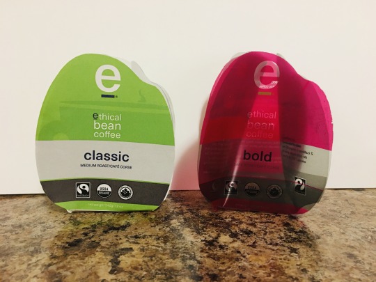
P2 - Comparing Brands

Ethical Bean
Brand Consistency Layout: A grid is used to ensure all contents have the same size, placement, and margins.
Typography: The same typeface, font, and paragraph styles are used. Hierarchy is used to help customers understand what the product is, the flavour, and the quantity. It is used to convey other information, but these three things are looked for the most.
Illustration: Illustrations are faint and vary based on the flavour. They are flat outlined shapes that consist of a tone from the colour palette of the flavour.
Design differentiation amongst flavours Colour: Colours represent the look and feel for each. For example, the dark roast consists of black and brown. Black represents dark, and brown represents roast and coffee.
Illustration: The illustrations also apply to the look and feel. For example, the decaf package has a lawn chair, which provides a sense of relaxing. When people want a simple coffee that won’t keep them up all night, they go for something calm such as decaf.
Brand and/or concept The brand is pushing ethics in its name. There is info at the bottom to let people know their coffee is made in an ethical way. They mention fair trade and organic ingredients, which is all the more reason to purchase despite the expensive price.

M&M’S
Brand Consistency Layout: A grid is used to ensure all contents have the same size, placement, and margins.
Typography: The same typeface, font, and paragraph styles are used. Hierarchy is used to help customers understand what the product is, the flavour, and the quantity. It is used to convey other information, but these three things are looked for the most.
Illustration: Illustrations are dominant and placed in the center since they are iconic and recognizable for most. The expressions on the faces add to the brand personality, which is being sold more than the product itself.
Design differentiation amongst flavours Labels: Labels in the top left corner easily allow people to see which flavour is which. Although it may be obvious that green is mint, it’s not as obvious that blue is almond. These labels are visible at first glance, avoiding frustration.
Colour: Colour shows that each one must be a different flavour. As mentioned earlier, it’s hard to know which is which. The accompanied labels really help to avoid confusion.
Brand and/or concept I feel like the concept here is that each M&M has a different personality and that is reflected in each flavour. They are obviously selling flavours, but also characters with specific personas. Some people may purchase just based on their favourite M&M’s personality, as opposed to the flavour.
0 notes
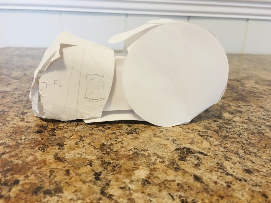
Text
Almost Final


Attempt
The main goal here was to create a pristine prototype of my package from last week.
Process
I added content from the original package, created a keyline, and printed it on card-stock paper. The paper is light enough that the shape will be able to fold while maintaining a sturdy form. I added a texture image of wood to the die-line that will be printed for the display in a gallery. This will create more visual contrast and interest to the package while adhering to the brand style.
Outcome
This package was a bit wide and had areas that could have had no stroke for die-lines, or at least a grey .5pt stroke. The panels also needed to be rotated 90 degrees to be read upright. Aside from these slightly frustrating issues, I’m pleased where the package is so far in this stage.
Discovery
I was sure this would be my final as it was supposed to be. I double-checked measurements and placement, but it did not turn out that way. Luckily we have one more week, in which I plan to do a test print at school. When the test print is perfect, I will send it to the printer and finish the final prototype for the next class.
0 notes
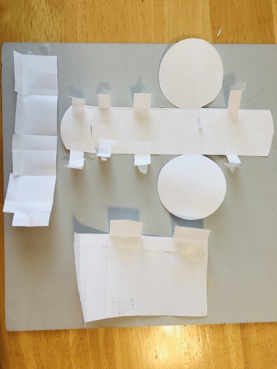
Text
Refined Mockup


Attempt
After receiving feedback to simplify my design, I tried a few concepts. These concepts geared toward a more sleek and clean design.
Process
I focused on the earbud part that goes in the ear. I tried creating a mockup with tabs that crossed over inside the circle. My other mockup consisted of slits near the parameter of the circle, in which tabs would slide into. I also added a separator at the bottom for extra earbud pieces and instructions. A thin piece of paper with holes to display the product was also added inside; wrapping inside the package shape.
Outcome
The second mockup was the most successful, the tabs on the other created awkward lines around the circle. The second one allowed for smooth edges, minimal materials, and simple design.
Discovery
Simplifying a complicated design further helped with better direction for the next stage. Not having to focus too much on branding will also make things easier. Now that the design has a stronger foundation and needs some tweaks, I can focus a bit on user interaction with branding.
0 notes
Text
P1 - Mockup
Attempt
My main goal is to create a unique package for earbuds that will make people want to keep it. The package also needs to use as little materials as possible, all of which are eco-friendly.
Process
I began sketching various shape concepts that would create interest and reduce wasteful packaging. I chose to go with a package that would resemble the shape of an earbud. This involved many simple ideas by cutting regular paper and taping pieces together.
Outcome
My final choice was based on the basic forms of ordinary shapes with adjustments. The main half is a horizontal rectangle with an earbud shape covering 1/3 of the end. The box extends into the lid so the package and hold together. The lid was inspired by a dome-shaped package, which takes on a slightly different shape. The lid has a box a bit larger than the box that extends from the body, nestled inside the end.
Discovery
The begging 3-D concepts were difficult when I tried to make the literal shape from cutting shapes. Looking at other simple forms with similar forms helped simplify my base. From here, it was easier to come up with realistic possibilities in which the package could open with ease. This also allowed for pushing conceptual design, such as the ear perceived detaching.
0 notes
Text
Rationale - Rough Draft


Problem
The issue with earbud packaging is an abundance of plastic is produced only to be thrown away. Little pieces, such as extra earbud covers, are also wrapped in plastic. Instruction manuals are also neglected, especially when the internet can provide consumers with the same information. Aside from being economically responsible, the package needs to give buyers a reason to keep it. The re-designed package will function by acting as a tool for the consumer. It will be conceptual and standout by taking on the form of an earbud. Restrictions and limitations for this package include possibly keeping the manual (which may be mandatory), creating compartments for extra pieces, and following brand guidelines. Another restriction is containing a shape that will fit among other products, as well as a hanging tab that will work with the concept. Based on my budget, these materials need to be affordable and available in my area. Based on the time frame, all decisions need to be doable and realistic to ensure the best outcome. This product is designed for the majority that uses earbuds; teens and young adults. Since this is a cheaper form of earbuds, hence the cords and common brand, it also applies to middle-class consumers.
Solution
One solution for producing plastic that is going to be thrown away is to substitute it for sturdy cardboard. As for containing smaller pieces, dividers and or flaps will allow for similar organization and limit plastic. The unique shape will differentiate the product among surrounding rectangle packages as well as fit nicely. A simple solution for content display is a cutout window without a plastic protector; maintaining visual interest and cutting down on waste. Lastly, an extra item such as a tool for wrapping cords around will encourage buyers to hold on to the package.
Intended Result
Using cardboard as an alternative for plastic will allow for eco-friendly products, and even waste if the consumer chooses to toss the packaging. The sturdy and organized package with accompanying pieces should persuade the consumer to keep the package.
These decisions were based on straying from what similar products look like, use, and contain all while adhering to the company brand guidelines (type, colour, word-mark, and mandatory info/contents). Decisions were also determined by shelf display, such as hanging and proximity to surrounding products.
0 notes
Text
Before & After

Today we finished Activity 2.
The image above is the sketch mockup, original, and reproduced version.
Attempt: I had run out of time to have my mockup sent to the printer, so I used an adhesive to create the final product. Process: When I finished on Thursday, I knew it was too late to go to the printer. I had to print at the library on 8.5 x11 and photocopy an enlarged version on an 11x17. From there I mounted the print on Bristol board with spray glue. Outcome: The final had poor-quality print due to regular printers and being enlarged by a photocopier. The type and pattern came out fuzzy, and the colour a bit off. The paper didn’t stick well, creased, and had white edges and frays. I ensured the frays were cut off and edges were as pristine as possible before folding. Discovery: I need to overestimate how long things will take. This will allow for more leeway time with the printer. This will also allow for test prints with design (colour, type, imagery/illustration) and paper choices.
0 notes
Text
Reproduction

Today we continued Activity 2.
After re-creating the package digitally, we printed it.
Attempt: I printed my template on thin card stock to assebmle the package. Process: After doing so, I realized the package was much smaller than the original. This was because I read the measurements incorrectly. I re-did the keyline to the correct measurements, and printed a proof to ensure the size matched. Outcome: The second print was a bit smaller in size and off based on tab placement. This was because I had shifted shapes to close together when using them to create a keyline with the Shape Builder Tool. Discovery: It was good to know why my measurements were off at first, and now i know what to do in future projects. Printing out the keyline and making sure it’s correct before going forward will also save time.
0 notes
Photo


Today we began Activity 2.
We were assigned to switch our activity 1 with a classmate and create theirs digitally. We switched our outline with measurements, panel content, and a final 3-D package.
Attempt: I scanned the package and used it as a template for colour, type, size and shape. Process: I made shapes based on measurements and used the shape tool to create a keyline. From there I used typefaces, graphics, and colour similar to the original. I used placeholder text for the small copy and exact words for important text. Outcome: The final screen design looked quite similar to the original in terms of typefaces, colours, and artwork. The artwork was a bit off, but similar enough in shape and weight. Discovery: This was tedious and more time consuming than I thought, especially as I tried to get everything more exact to the original. Spreading out the work out over a few days made the task more managable.
0 notes
Text
Packaging Activity


This week I began my packaging design course. I always thought this course looked very interesting. I’ve heard it’s a lot of work, but I think it will be worth it.
I began my first activity replicating a package with bristol paper. The final result was very satisfying since I have not done this before. I always wondered how design students made these mockups since they look expensive. Now I know and look forward to learning and creating more.
2 notes
·
View notes