
Don't wanna be here? Send us removal request.
Statistics
We looked inside some of the posts by patakapublicationworkbook and here's what we found interesting.
Average Info
Notes Per Post
0
Likes Per Post
0
Reblog Per Post
0
Reply Per Post
0
Time Between Posts
33 minutes
Number of Posts By Type
Text
16
Link
1
Last Seen Tumblr Blogs


Fun Fact
There are dozens of funny blogs to kill time on Tumblr.
Text
Written Text References
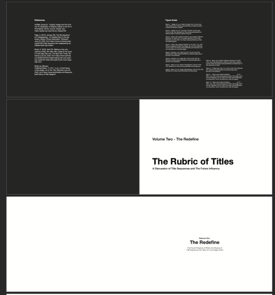
References
Holifield, Kacey B., “Graphic Design and the Cine- ma: An Application of Graphic Design to the Art of Filmmaking” (2016). Honors Theses. 403. https://aquila.usm.edu/honors_theses/403
Page, A. (2018, January 29). The title sequence isn’t disappearing – it’s headed back to the big screen. Motion Picture Association. Retrieved June 20, 2022, from https://www.motionpictures. org/2018/01/title-sequence-isnt-disappearing-its- headed-back-big-screen/
Boxer, S. (2000, April 22). Making a fuss over opening credits; film titles offer a peek at the future in more ways than one. The New York Times. Re- trieved June 20, 2022, from https://www.nytimes. com/2000/04/22/movies/making-fuss-over-open- ing-credits-film-titles-offer-peek-future-more-ways- than.html
Writer Ian Albinson Published March 14, 2011. (n.d.). A brief history of title design. Art of the Title. Retrieved June 20, 2022, from https://www.artofthetitle.com/feature/a- brief-history-of-title-design/#
0 notes


Text
Binding Style Research - Coptic

Since I have chosen to produce the book myself and bind it, I had to think really carefully at the sort of style that would suit the book the most. For the binding style, I chose coptic. I felt like this would be the best choice since the book would be a flip book, I would need extra flexibility from the pages. The binding style would still be well put together and efficient for functionality purposes. I did some study and trial/error before moving onto the final book. I decided further down the track that the slightly exposed edge when you opened the book would create a nice design effect to showcase the binding.
0 notes
Text
Final Book Production
The final outcome of the book was definitely a lot better than the first initial book series as it was a more quality made and I feel as though the quality of the entire project was bumped up a bit with solving the initial book fails. I am happy with the results considering the resources and situations given to me.
0 notes
Text
Initial Book Fails
From feedback, the thing that I originally failed on was the production quality of the book. Taking this into consideration, I decided to print of the pages in varying paper weights so that there was a distinct outline between title and book. I also used a different trimming method that I feel worked better with the resources that I had. The title pages I printed at 200GSM and the book pages I chose to be printed at 120GSM, both a step up from the original 100GSM. Another thing I improved upon was the quality of the images I had chosen, I noticed they didn’t quite work for the way I was printing out. I then chose bright, and high definition photos so that they came out smooth and stood out from the page in printing. The final thing I noticed that could have some improvement was my colour printing. Originally the colour printing didn’t work quite as well as I had hoped so I chose a different printing setting and went from there.
0 notes


Text
First Page Layouts
I unfortunately lost my original page layouts due to a computer error. However, I was not happy with them. The layout felt sloppy and the writing didn't feel cohesive toward the designs, they felt like two seperate themes. Another thing I didnt like was that I originally had the paper colour all white and it didn't have the cinematic style that I was going for in my page layouts. I wanted the pages to have a direct correlation toward the theme and for these pages, I just wasn’t seeing it.
0 notes
Link
Main inspiration for idea. The Art of the title was one of the biggest things that not only inspired but also completely helped develop written ideas into bigger picture designs.
0 notes
Text
Written Aspect Reflection
Becoming editor of my own design project was a bit of a challenge, but was overall a really fun experience. I found that throughly researching a topic I was interested in and then piecing together a well written pataka article. Not only making it a design journey as you read further into the book, but also a written journey. I was really happy with how the written content ended up c coming out. I was able to tell a story in more than just a design way.
0 notes
Text
Design Aspect Reflection
When it comes to the design aspect of the project, I am not completely happy with the final outcome and feel as though there is room for improvement. Specifically when it comes to using the thumbnail layout technique, I felt like I had a strong layout using this technique, but getting a page layout to go from the thumbnail design into a strong page layout was quite difficult in my eyes. In some cases I didn’t change anything on the page layout. Maybe some more experimentation would work well for that. Going forward into future projects I want to be more experimental with my layouts, instead of playing it safe. Even though I wanted it to have a very structured grid to resemble a movie screen, there was definitely some more development that could’ve been done in terms of breaking out of the box.
0 notes
Text
Project Reflection
Overall this project was very fun to experiment with design and written styles that I have never looked at before. From beginning to end there were so many new things that I learnt. Specifically when it came to the technical forms of book production as well as learn how to collate articles and information for the written aspects. There were a lot of hurdles when it came to this project and I noticed that when I hit these blocks, speaking to peers and researching online helped get me out of them. Another thing that also helped was not becoming attached to my designs, with this I was able to let go of things, rework others, or completely change things since I wasn’t too attached to my designs. This overall helped me created more quality work. Another thing I found that I really improved upon was my printing skills, understanding GSM, the printer and getting documents completely printer ready helped move things along, but also completely elevated my designs, something that I haven’t had a massive chance to look at due to some covid restrictions in the past.
0 notes
Text
Volume Two Text
Volume Two’ – The future prospects to where the influence of title sequences can take us in the design world.
Intro - 200 words
Volume Two, ‘The Redefine’, touches on the future prospects of where the influence of title sequences can take us in the design world. This volume focuses on how the industry is developing and changing, and how using title sequence design in the entertainment industry can promote and convey the mood of the entire movie before you even watch the first scene. This sort of design power can be used to contribute to more than just the entertainment market, but further developments into the future, such as AI (Artificial Intelligence) and HCI (Human-Computer Interactions).
Body - 1500 words
2b. (Connection between design and technology)
One of the most recognizable traits of humanity is the ability to create art. The creation of aesthetically pleasing artifacts has the ability to connect each human being together with nothing more than a few brushstrokes or strikes of the chisel. The artistic quality of humankind furthers our understanding of each other and can ultimately take imagination to its greatest height.
All of the arts build upon one another. The relationships between the visual arts— such as painting, drawing and photography—have been apparent throughout their respective historical beginnings. For example, during the nineteenth century, photographers employed compositional techniques of painters as an artistic influence for the foundation of their photographs. Without the development of photography, painters like Edgar Degas would not have experimented with new visual perspectives in their works. 2 This evolution of technique and creativity resulted in different forms of artistic thinking and tools for artists to express their new ideas. Among the most recent practices of art produced from this progression are the modern arts of graphic design and filmmaking. Graphic design and filmmaking are considered modern approaches to the arts. This is due to the advancing technological era in which both came to fruition. Both graphic design and filmmaking are often viewed as two separate entities within the arts, but they are not. Visual arts affect one another. In its most basic form, the effect of graphic design on cinema is found in film titles or promotional material such as posters; however, this limits the effect of design on film to print or typographic sources only. Though it is true that graphic design contributes to the complete package of a film, one can also examine the influence of design principles further into the creation of a film itself.
2c. (The Downfall and Uprise)
It appeared quietly, in the right corner of your Netflix screen a few months ago: the “skip intro” button. A translucent shortcut customized by the streaming service built to work both with any series, cold open or no, meant to allow binge-watchers to expedite their viewing experience. In the past, new features and redesigns have come and gone on the site without a word, but the button almost immediately created quite a stir. Most notably, the AV Club called out Netflix for “killing” TV title sequences by easily allowing viewers to opt out, and The Guardian took issue with Netflix for allowing the feature to extend beyond their originals and into their collection of classic films. Using the button on Do the Right Thing, could mean you’d entirely miss Rosie Perez’s defiant, “Fight the Power” dance sequence. Clicking the button at the start of Forrest Gump might send you speeding right past the iconic (if lengthy) floating feather montage and barrel you straight into Hanks’ iconic chocolate line. And while The Simpsons is one of the few series Netflix doesn’t host, the feature could potentially cause you to miss the ever-evolving title sequence. Still, users love “skip intro”: so much so that Netflix has begun to take out intros automatically when users rely on their autoplay feature. But is Netflix’s latest innovation a harbinger of doom for the title sequence as we know it? Certainly not — it’s just making its home back on the big screen. GLOW creators Carly Mensch and Liz Flahive even ditched their title sequence entirely after the first episode of their show, allowing the full length sequence to appear on the pilot before replacing it in subsequent episodes with a dynamic title card to save time and prevent those who decided to consume the series all in one go from having to watch it ten times in an afternoon. In a conversation with Art of the Title about the decision, GLOW’s title designer Richard Kenworthy insisted that, “There’s really nothing to gain from putting it on every show.”
The resurgence of the title sequence isn’t just in the art film scene: M. Night Shyamalan’s Split uses its as a visual representation of the fractured and disturbing psychology the film will introduce, all while providing audiences with a voyeuristic look at the action unfolding before the film begins in earnest. James Gunn’s Guardians of the Galaxy Vol. 2 features what’s likely the year’s most bombastic sequence, as the maddeningly cute Baby Groot toe-taps along to ELO’s “Mr. Blue Sky” during the first ten minutes of the film. As he narrowly avoids certain death during a neon-lit fight scene, the film’s credits appear in the screen wherever there’s room around his flailing limbs. And while it’s clear 2017 marked a cinematic spike in artful introductory sequences, perhaps the most unmitigable sign that the title sequence is still very much a part of the lexicon is in Marvel and DC’s interconnected universes and their obligatory post-credit scenes, demanding audiences remain in their seat until the last credit rolls. This year, Wonder Woman, Spider-Man: Homecoming, Thor: Ragnarok and the aforementioned Guardians 2 all took the opportunity of a rapt audience to construct dynamic title sequences at the film’s end. And with the release calendar stuffed with more titles of this ilk, it’s clear the trend won’t be gone from cinemas anytime soon.
It’s unclear what the future of television title sequences are in the digital age: it seems equally possible that creators will continue making titles that uniquely evoke the spirit of their show (and even occasionally transcend it) as it does Netflix and it’s future creators could deem them unnecessary. But if television titles are in decline, 2017 stands as a ringing reminder that cinematic title sequences are on their way back up. You might just have to look a little harder to find them.
2d (The future; by Patrick Clair )
"Title sequences are in some ways more important than they’ve ever been."
Patrick Clair
When asked if he has any idea where title sequences are headed next, with all the big changes that have occurred in recent history, Patrick notes that in the four years since he’s been making title sequences for international content, he’s witnessed “a shift from it being probably laughable that Netflix may be a serious player in the original content business, to the point where, no exaggeration, most of my work is for Netflix or Amazon. And the most recent film that we did with Netflix just got nominated for an Oscar”.
“I tend to think that financial limitations drive creative innovation and that pressure is actually where we get cool new ideas, and cool new approaches from."
Patrick Clair
Patrick sees us headed into “a really exciting phase of experimentation and diversification”. With diversification in the types of shows and their formats, he says traditions “are going to go out the window”. “It’s going to be a really great time where the visual language of things like the Internet and magazines and printed books and all the sort of graphic design that goes with that merges with the storytelling of dramatic live action screen content. And for people like me that like to sort of play with melding both of them I think it’s a really cool time to be in the industry”.
2e. (conclusion)
As we have seen, in the contemporary media landscape the opening title sequence continues to provide its traditional, paratextual function by connecting audiences to media content and introducing a storyworld. More importantly, it consolidates other functions while nevertheless assuming new ones. It is able to brand content powerfully, providing it with a strong visual identity which makes it clearly recognisable in an increasingly crowded mediascape. Also, it potentially connects viewers with each other and contributes to the building of networked communities, thus reinforcing the idea of content as ‘a medium for interaction between people’.[44] In this sense the multiple ways in which main titles work can play a key role in the ‘shift from an appointment-based model of television viewing toward an engagement-based paradigm’.[45] Rather than ‘consumers of preconstructed messages’,[46] ‘engagement-based models see the audience as a collective of active agents whose labor may generate alternative forms of market value’[47] – or, in other words, ‘as people who are shaping, sharing, reframing, and remixing media content in ways which might not have been previously imagined’.[48] In this renewed framework main titles become a very interesting platform for ‘meaningful participation’[49] and provide useful insights about ‘the roles that networked communities play in shaping how media circulates’
0 notes
Text
Volume 1 Text
Intro - 200 words
Volume One, ‘The Adaptation’, involves the widespread influence that title sequences have on entertainment pop culture. It touches on the use of graphic design in films, specifically with title sequences. From there, Patrick Clair, graphic designer for Elastic, speaks on many different developments and avenues that have been taken from existing title sequences to show how we got to where we are today. Clair also speaks to the way that an audience responds to film and how it can sway entertainment, pop culture, and the feel of a movie.
Body - 1500 words
1a. (Intro) When the public considers different art forms such as painting, drawing and sculpture, it is easy to understand the common elements that unite them. Each is a nonmoving art form that begins at the drawing board. Using line, color and shape to evoke a particular response from audiences is what ties these fine arts together. Graphic design, however, tends to separate itself from the fine arts. Because of its later development in the art world, as well as its operation within modern technological developments, graphic design is driven by the idea of communicating to large audiences. In this way, although design finds its base in fine art practices, it is more easily related to filmmaking in many aspects. Both graphic design and filmmaking are particularly unique in respect to their reliance on technological innovation, communication and public consumption. Even though the mediums operate in different manners, it is important to note that they share basic design principles such as color, composition and image systems. These elements of design help build a solid foundation for a successful piece of design or film.
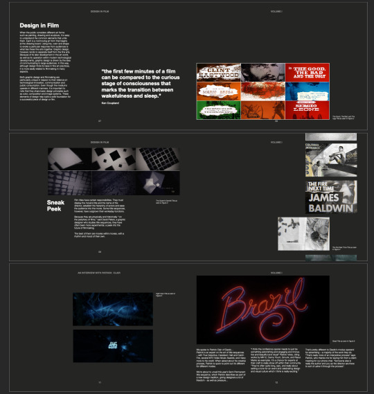
1b. Film titles have certain responsibilities. They must display the movie's title and the name of the director, establish the hierarchy of actors and ease the audience into the movie. Some title sequences, however, have outgrown their workaday functions. Because they are physically and historically ''on the periphery of films,'' said David Peters, a graphic designer who studies title sequences, they have often been more experimental, a peek into the future of filmmaking. The best of them are movies within movies, with a rhythm and mood of their own.
If you compare a movie to a dream, said Ken Coupland, a design writer, then ''the first few minutes of a film can be compared to the curious stage of consciousness that marks the transition between wakefulness and sleep.''
1c.(Interview with Patrick Clair)
We spoke to Patrick Clair of Elastic…
Patrick is an expert on the art of title sequences – with True Detective, Daredevil, Halt and Catch Fire, several MTV Video Music Awards, and many more to his credit. When asked about his creative process, Patrick is quick to point out it’s different for different modes. We're about to unveil this year's Semi Permanent title sequence, which Patrick describes as part of a new design tradition, giving designers a lot of freedom - as well as pressure...
“I think the conference opener needs to just be something astonishing and engaging and innovative and beautiful and visual” Patrick notes, citing works by MK12, Danny Yount, Gmunk, and Raoul Marks as examples. It’s a chance for experts at their craft to really show off within their community. “They’re often quite long, epic, and really about setting a tone for an event and celebrating design and visual culture which I think is really exciting.” That’s pretty different to Elastic’s modus operand for advertising – a majority of the work they do. “That’s really more of an interpretive process” says Patrick, who thanks me for saving him from a client meeting for our phone chat. “Someone else is really the author and you as the director are there to sort of usher it through the process”.
“I think the conference opener needs to just be something astonishing and engaging and innovative and beautiful and visual” Patrick notes, citing works by MK12, Danny Yount, Gmunk, and Raoul Marks as examples. It’s a chance for experts at their craft to really show off within their community. “They’re often quite long, epic, and really about setting a tone for an event and celebrating design and visual culture which I think is really exciting.” That’s pretty different to Elastic’s modus operand for advertising – a majority of the work they do. “That’s really more of an interpretive process” says Patrick, who thanks me for saving him from a client meeting for our phone chat. “Someone else is really the author and you as the director are there to sort of usher it through the process”.
"There’s no visual in the world that’s interesting enough to sustain people’s attention for more than 60 seconds.”
Last but not least there’s opening titles for feature films, and serialised content, wherein, the parameters often dictate Patrick’s approach. “If you’re looking at a 30 second sequence like Hold and Catchfire? You can kind of get by on just a visual gag”. Patrick explains that sequence of theirs did have a bit of a story arc, “but y’know, you can sustain 30 seconds just on visuals and visual poetry for want of a better word”. Patrick notes when title sequences reach the 45 or 60 second mark, they need to have a more sophisticated metaphor, be a bit more clever. “And once you get past the 60 second mark, you’re getting to the point where you really do need a sense of narrative, a sense of evolution to kind of unfold over the sequence. There’s no visual in the world that’s interesting enough to sustain people’s attention for more than 60 seconds”. Patrick cites HBO for their generous openings that sometimes clock in at what he calls, “a pretty epic, indulgent 90 seconds. “Then you really need something that’s going to take you on a journey,” Patrick observes. “And it’s figuring out what that journey can be, how that can relate to the show, and how that can be something that has some value in being watched again and again.”
Much of Patrick’s work - like True Detective or Halt and Catch Fire - is for series content, which is “really about story” he explains. So Patrick tries to immerse himself in the developing world as much as possible. “That means watching whatever rough cuts are available to view, reading whatever screenplays are available to read, and really getting as much time with the showrunner as you can to understand their vision for the world they’re bringing to life”.
Next, Patrick and his team work to distill the director’s embryonic world and the tone of the show into something that’s, “just devilishly simple”.
“I think about my favourite title sequences and they always come back to something that can be summed up in a single sentence: Mad Men, you say it’s a man in free fall. For Dexter, it’s the brutality of cooking breakfast. And it always relates to something kind of very true about that world”. Once Patrick and his team hone in on that one thing, the last step is to bring it to life with design visuals, and “end up with something that sort of evokes the world that people are being brought into”.
“I think about my favourite title sequences and they always come back to something that can be summed up in a single sentence: Mad Men, you say it’s a man in free fall. For Dexter, it’s the brutality of cooking breakfast.”
The research involves lots of reading and referencing gathering, sometimes done by Patrick on his own, though these days it’s usually a team working together. “We trawl through blogs, the Internet, art books, photography books, and try to get together mood boards that we feel evoke something related to the show”. With references in hand, the team work on visual executions in the form of style frames, often bringing in a storyboard artist and identifying an arc for the sequence.
The ways in which people are engaging with visual storytelling have changed dramatically. So is Patrick now approaching his job as title designer differently?
“I think what’s interesting about the fact that we’re now primarily working for [online viewing] is that title sequences are in some ways more important than they’ve ever been,” Patrick notes. “Because people aren’t watching the show in the kind of walled garden of a network, where it’s surrounded by branding and promos and all sorts of little idents and things. They’re watching it cold, coming off a menu. So having that signpost, that moment of reflection to act as a bit of an airlock from everyday life – that’s really important”.
1d. (Impact)
Computer technology revived the art of title design in the 1980's. As Steve Heller notes in ''Design Literacy (Continued)'' (Allworth, 1999), in 1982 ''Richard Greenberg landed in the annals of design history'' by creating an airborne infant for the opening of ''The World According to Garp'' with the aid of a programmable camera.
The latest trend, Mr. Hall writes, is grunge title design, the descendant of the distressed typography of print graphics. And the king of grunge is Mr. Greenberg's former associate, Kyle Cooper, whose best known title is for ''Seven.'' Mr. Cooper used the tabletop shoot pioneered in ''To Kill a Mockingbird.'' But emotionally the two sequences are worlds apart. Mr. Cooper said that his fetishistic survey was a view of a serial killer assembling a diary ''documenting the murders he'll execute during the film.''
The degraded typography, jittery jump cutting and ''twitching, hand-hewn type'' ushered in a new era in film titles, Mr. Hall writes. And it had a democratizing effect. Everyone with a computer began thinking, hey, maybe I can do that.
That could explain why title designers are now writing their history. With desktop filmmaking on the horizon, the very notion of auteur title designers seems quaint. The writing of history begins when an era is ending.
0 notes
Text
Formative - Main Idea


From the formative feedback, I realised that I need to narrow down my research into only one of the chosen contents page options. I really resonated with the future prospects of design in the film world, but I felt like I couldn't just use that, I decided to create two smaller books within my one larger book. One being a preface to the future prospects, focusing on the current and past designs that have lead to the innovation of todays impact titles sequences on the entertainment industry.
0 notes
Text
Research 2


Doing research from books in the library on different page layouts and design that I wanted to take inspiration from.
0 notes


