
Don't wanna be here? Send us removal request.
Statistics
We looked inside some of the posts by peachyprincipessa69 and here's what we found interesting.
Average Info
Notes Per Post
3
Likes Per Post
3
Reblog Per Post
0
Reply Per Post
0
Time Between Posts
14 days
Number of Posts By Type
Text
6
Last Seen Tumblr Blogs


Fun Fact
In February 2021, Tumblr had 518.6 million blog accounts.
Text
CHANGE AND GROWTH


When I was thinking of creating this I really wanted to dig deep on what it means to be human I went through multiple different ideas from religious ideas to mainstream ideas but overall if we really think about it what it means to be human is to change and grow throughout our journey and experience. I really didn't know how to portray this at first because I thought of maybe drawing a book and flipping the page would be a good idea but then when I really thought about it I also thought we as beings are connected to Nature. Even though many may not think of that I know I do so, I wanted to portray a tree as woman like myself and many others. Just like a tree it grows and changes with each new experience that it lives just as we do. Change and growth throughout our journey and experience is what it means to be human.
0 notes
Text
Many thought of Pollock’s art as a mess or just random but Pollock would use his brush strokes wisely and let certain parts of his work show and some be hidden. Pollock told stories throughout each painting. Pollock happened to struggle with alcoholism during his life. He used paint dripping as a movement saying to viewers to not look passively. He wanted others to enjoy his art as one does music and stating if you like it, you like it if not then you don’t. Through his paintings he made energy and motion become visible. Thinking of being Pollock it seems like he was having fun during his creations. Pollock wanted to make sure others couldn’t tell that there was a beginning or end in his paintings. The flow in these pieces seems like he was conveying consciousness and unconscious unmeaningfully. With this art it’s really like a mirror into ourselves, looking into our own emotions and experiences reflecting back at us. Pollock forced his viewers to confront their own perspectives. Pollock didn’t start off with this kind of work a lot of his older work looks as if it was inspired by Salvador Dali, but his newfound interest was piqued by a woman named Janet Sobel. He went to her exhibit and ran with the new inspiration leading Janet to fall off the face of the art world it seems and for himself to rise to fame. A lot of the time people ask why? Why do artists do what they do in their art but why does it matter art isn’t always supposed to be black and white, right, and wrong. Art is a form of expression; art tells a story a story we as a viewer must pick apart and put together.
I'd love to know your thoughts and perspective on my piece below.

0 notes
Text
Medea painting

The return of the holy family

Vicent Van Gogh Mr. Peabody

Starry Night Van Gogh

Gertrude Stien by Pablo Picasso

Young Mother sewing by Mary Cassatt

The Musicians by Caravaggio

Venus and The Lute Player (Titian)
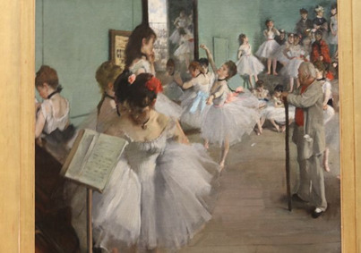
The Dance Class (Edgar Degas)

The Gulf Stream (Winslow Homer)

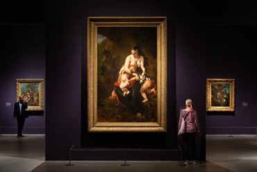
I have decided to pick the art piece titled “Medea about to Kill her Children (Medée furies) by Eugène Delacroix (French, Charenton-Saint-Maurice 1798–1863 Paris). This piece caught my eye due to the innocence and violence held within it. When looking at this piece I first thought it was a mother trying to protect her children but in further research, I found that wasn’t the case. This piece is an oil painting with the dimensions of “8ft. 63/8 in x 64 15/16in (260x165x) To explain this piece there is a topless woman with dark brown hair wearing a crown and earing with jewels. She is holding two children, one with blonde hair and one with dark brown hair like the woman herself. She is holding both children on her lap with the blond hair child hanging by her arm and the other child face down in her in what looks to be a skirt and his bottom is exposed. They are all placed on a rock that seems to be in some sort of a cave while the woman is looking out into the opening of this tunnel. The colors in this painting are mixed with darks and lights such as green, brown, tan, some black added for shading, a bit of blue and red for a pop of color as well as pink which helps things blend together. There isn’t an overwhelming amount of colors or dark shades, everything flows together so nicely. The subject that came off to me when first seeing this piece was innocence and violence. The balance between light and dark brings a tone to the painting. Eugene Delacroix gave this painting contrast by the high low hues of the colors he used. Proportion is highly emphasized in this painting. You can see the unity and variety of, colors, and shapes within the piece itself. When I look at this painting, I feel like there is some kind of battle between the innocence and violence I stated before. Medea herself doesn’t look as if she is feeling any rage but the dagger being clutched in her slices the child’s thigh. There is a disorder in her hair and the cloth she is wearing but her face only reveals sadness. The children in the painting give off a sense of innocence as well as the woman’s face, she is so softly painted in this piece, but the dagger is the only sense of violence. Her pose is very elegant but definitely shows signs of distress. I thought to myself why would she have knife so close to the children? Maybe for protection, but when I continued my research, I found that to be far from the case. The way she was holding the children did throw me off a bit because she wasn’t coddling them like a mother would, they were sort of just hanging under her arms. When doing my research, I found Medea comes from Greek Mythology having relations with Jason who had left her for another woman. Before he left Jason had used Medea to find the Golden Fleece. They were married for ten years and had a total of fourteen children. Medea started her revenge by poisoning Jason’s new lover. The story of Medea killing her children is a bit controversial and many of the stories either agree that it’s nothing but a myth or to others an accident. Eugene Delacroix was a French Romantic artist, and he built his career as the leader of the French Romantic School. In 1838 Delacroix exhibited Medea about to kill her children which then created a sensation. Eugene Delacroix was one of the best French Romantic painters whose use of color was inspiring.
2 notes
·
View notes
Text
Virtual sketchbook 2
Journaling: Principles of design

Unity and Variety: Unity is the structure of the artwork that makes it seem whole and complete. Variety is the use of different visuals that are implemented throughout the artwork.

Balance: The are four types of balance in art: symmetrical, symmetrical, radial, and crystallographic. Each balance in art is what gives art composition its “visual weight”.

Emphasis and subordination: These are the focus and importance of a piece of artwork. Emphasis is giving the artwork more attention and subordination is to make something less attention.

Directional force is the paths created within an artwork.

Rhythm and repetition: Rhythm is the visual flow and repetition is the duplication of certain things within the artwork.

Scale and proportion: Scale is the size of a subject compared to another. Proportion can be set for the base or beginning of your artwork.
2. Writing and Looking:

Recipe for:
“I saw the Figure Gold by Charles Demuth. Chapter 4 page 2
Ingredients: Pan size: 90.2 x 76.2 cm
Rectangles Temp: 555
Triangles
Repetition Time: 19:28
Colors
Grey Directions: give your viewer a taste of
Black the story.
Highlights
Perspective
Variety
Mystery
Abstract
Indication of sound or motion
3. CONNECTING ART TO YOUR WORLD:
If I had to pick a color scheme for my life it would consist of brown/tan, green, and black. The intensity of each color would be very light almost nonexistent except for the black. The reason behind this is that in all light there is darkness, just like life itself, we may have our moments of light, but we can forget about the darkness. This doesn’t mean letting the darkness rule over any other colors in your life and don’t let it define you. With green, I would have to make sure it comes across with great value. The reason behind this is that green comes in various hues, which can really tie in and or bring a different vibe to what you are trying to convey. I find green connects itself to nature and I see myself as a very down-to-earth person. I enjoy the natural elements that are provided around us. Which also connects the brown and tan colors in my color scheme. When I look at why color has played such a large part in my life, I look at the growth in my journey of life so far. When I was younger, I struggled with depression and still do, my color scheme was very dark, mixes of blacks and greys mainly. I gladly have had time to heal and work on most of the hard times. But throughout my journey, I’ve noticed when I become more open-minded and added statement pieces in my day-to-day life, be clothes or decorations I begin to brighten up on the inside as well as the outside. It wasn’t right away and definitely took some time but it has helped me find myself and heal myself bit by bit.
4. ART PROJECT

0 notes
Text
Good layout design

Bad layout design

As you can see a good layout design is an illustration that is easy to understand and is very minimal in its approach. The example I used for my good layout design is a representation of protesting, using the bold red letters to spell "our turn to talk" and keeping the "our" on the forehead to resemble how loud our minds are and how we are connected and the "turn to talk" in the mouth to show how our voices are powerful. In my bad layout design, it is very difficult to understand what the illusion is trying to tell us. I believe that the first layout design shows exactly what it is trying to address in the illusion and the second layout is very jumbled together making you lose the real purpose behind it.
0 notes
Text
1. My name is Kira. A little known fact about me is my love for creating. I've always enjoyed making something that was in my mind, body and soul into a work of art and reality.
2 . 1.) Christo attended the fine arts academy and Sofia, Bulgaria. He left to go study more broad and landed in Paris, where he began to exhibit his work. ( Britannic. Early life)
2.) while working as a portrait artist he meant Jeanne-Claude. They ended up marrying in 1959.( Britannic. Early life)
3.) In 2005 the couple worked on a project called "The Gates" located in Central Park New York this project was seen by more than 4 million people and visitors. ( Britannic. Early life)
4.) The gates were believed to be seen as a complex testament between the two controversial topics in contemporary art, these being; to create a meaningful public art and how art responds and impacts our relationship with it. ( Khan academy Christo Jeanna-Claude the gates).
5.) Jeanna- Claude had died November, 2009.Even so, Christo continued to carry out their projects until his passing May 31st 2020.( Britannic. Early life)
2. When I had first seen "The Gates" by Christo and Jeanna-Claude I believed it to be a ceremony or tradition somewhere. The picture looks like something out of a movie. It seemed so surreal. The way light highlights the trees in a way that makes them look painted. The pop of orange fabric and polls definitely caught my attention before anything else. I had seen people in the buildings in the background which brought life into this artwork of art. Now that I've looked at the gates a second time after researching I thought why?, where?, how?. Now, I look at this piece of art as a statement piece on how this couple displayed how to create such meaningful art for the public in an area they started building their careers together. Breaking the boundaries in the art community to see how responds and impacts our relationship with the built environment.
3. A piece of art in my home would have to be the 2 demon slayer hoodies that I have above my desk, I know you may say that they are not art, but to me they are. Neither one of them has been worn the reason behind that is because, to me they represent balance, as you can see one is black and one is white symbolizing yin and yang. They are both made of cotton and have pictures of an anime that me and my best friend loved to watch together, they serve as a symbol of balance. When I get in over my head, I believe they are beautiful because of what they symbolize to me the memories that they share that I now can share with you.

4. I am 21 years old, my name is Kira and I identify as female. I was born in Philadelphia, but raised in Florida, I am African American from my dad's side and Italian on my mom's side. I enjoy playing video games and making art when I have the time. I am not part of any organized group, but I do work at a little family owned bagel shop. I would say something that makes me uniquely me is the way I love. Strange question, because just being me makes me uniquely me, but I am also very spiritual.
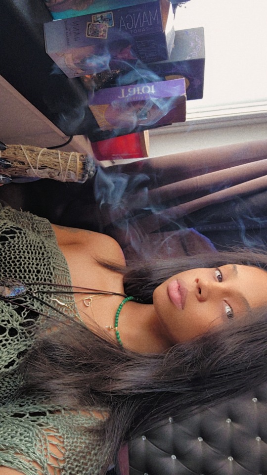
In this photo, I am cleansing my space and my cards before I do a reading.
1 note
·
View note