
Statistics
We looked inside some of the posts by pepsiarchive and here's what we found interesting.
Average Info
Notes Per Post
1M
Likes Per Post
715K
Reblog Per Post
523K
Reply Per Post
816
Time Between Posts
1 month
Number of Posts By Type
Text
12
Photo
3
Note
2
Last Seen Tumblr Blogs


Fun Fact
Tumblr.com rank in the US is 25.
Text
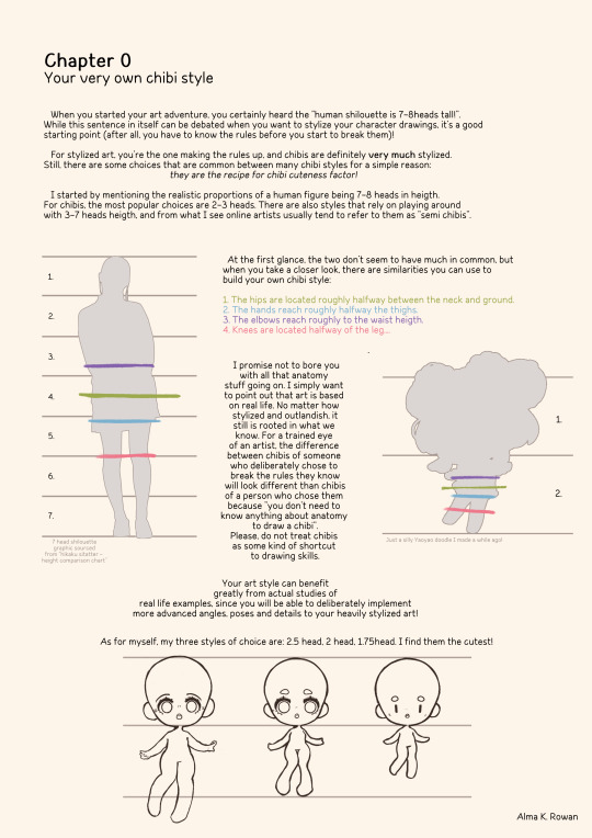
Hello, friends!
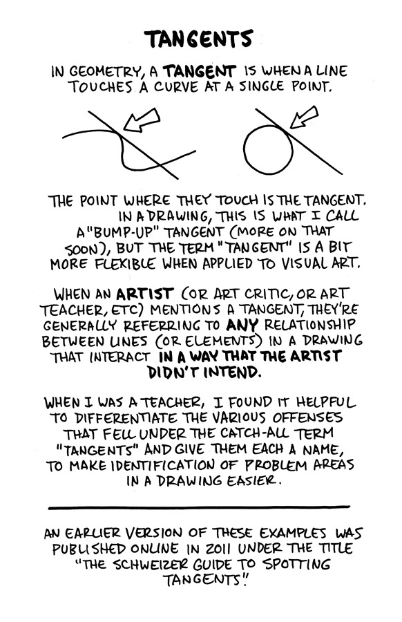
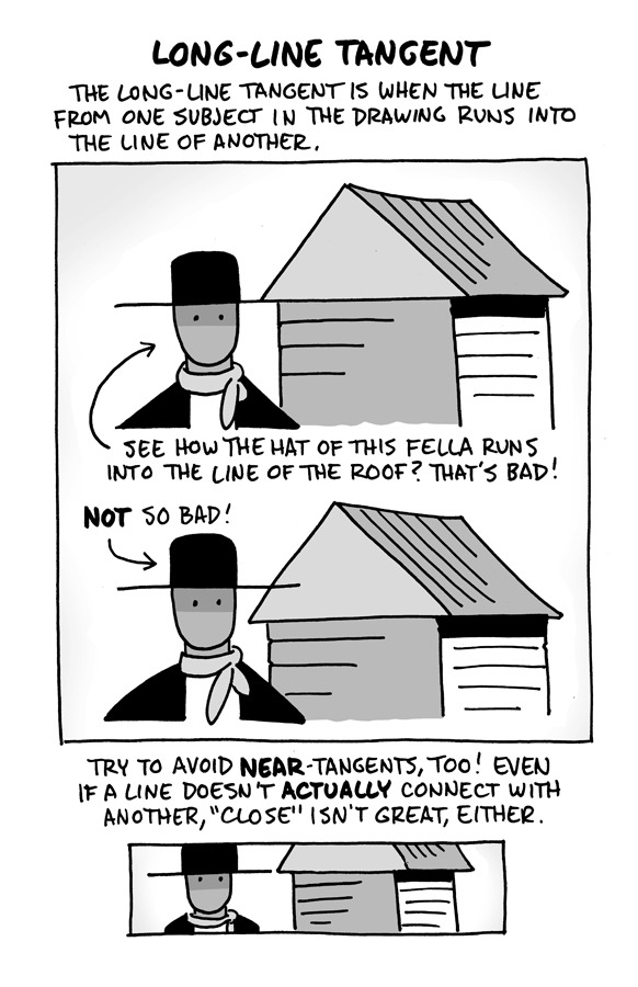
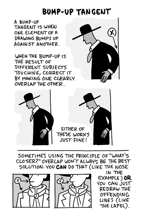
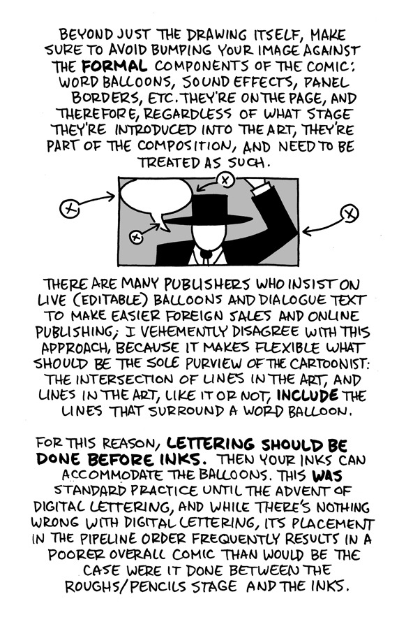
I reworked the ol' "Schweizer Guide to Spotting Tangents" lecture from my comics-teaching days, figured I'd share it here. If you want a free, printable PDF for yourself or to share (especially if you're an educator), you can find it at the bottom of this same lesson on my website.
-Chris
14K notes
·
View notes
Text


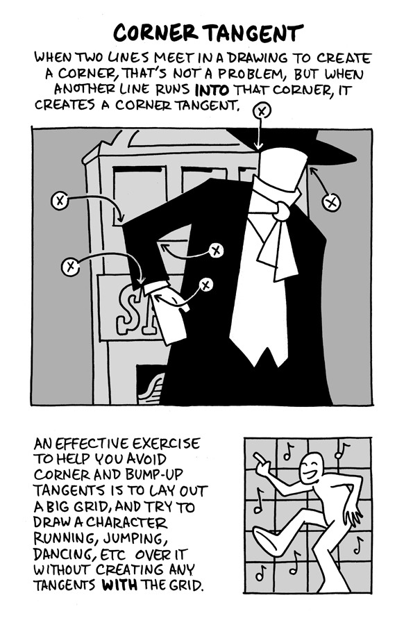
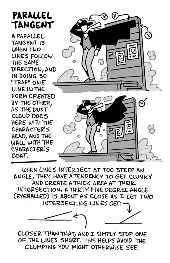
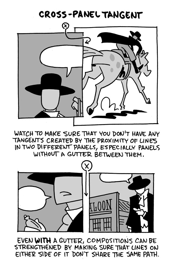
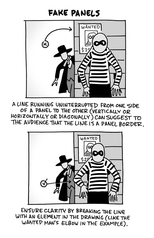
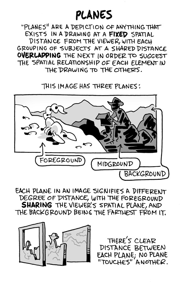
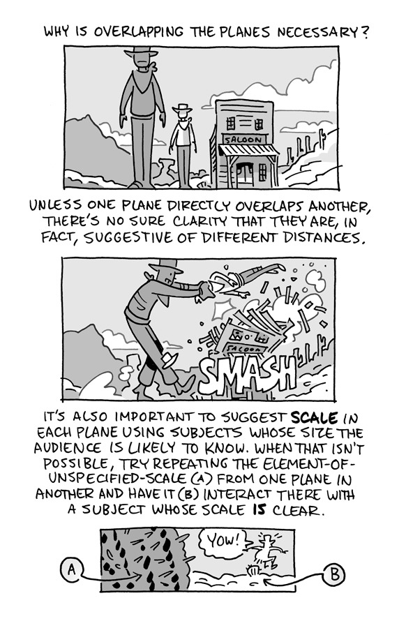
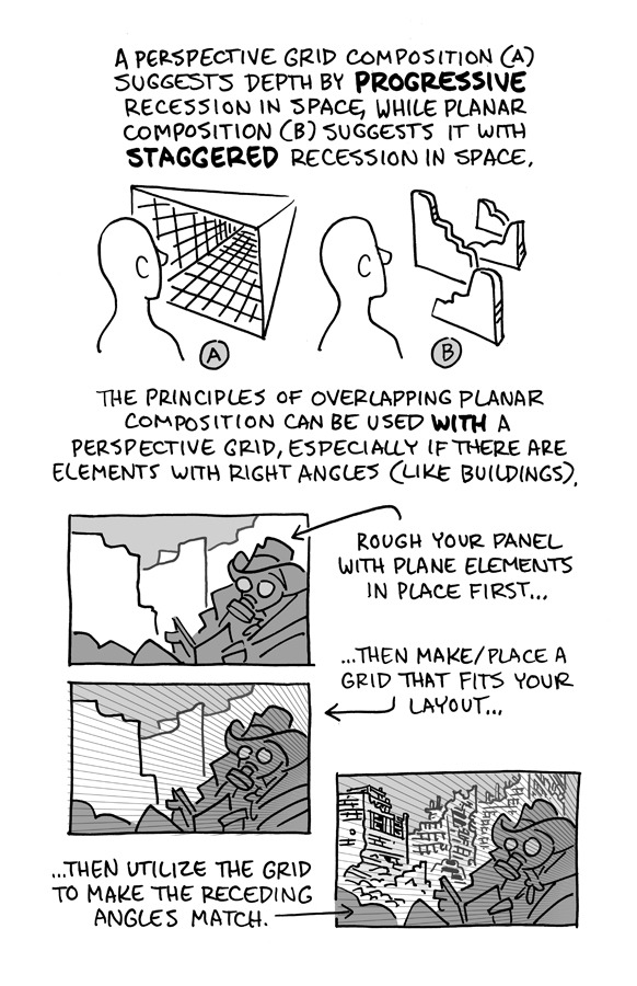
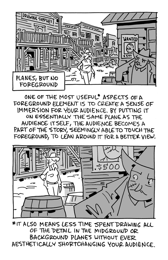
I was asked by a friend yesterday if I could offer basic tips about comic paneling. As it turns out, I have a lot to say on the matter! I tried breaking down the art of paneling using the principles of art and design, and I hope it helps you out!
31K notes
·
View notes
Text
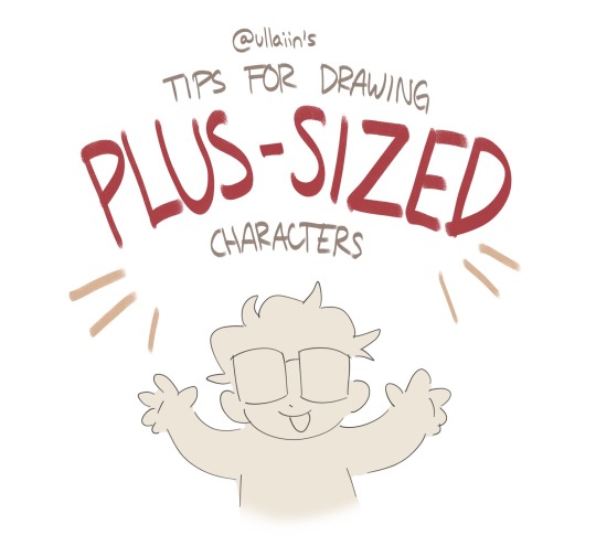
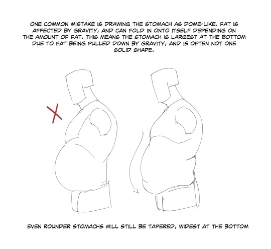
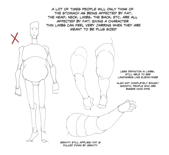
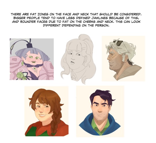
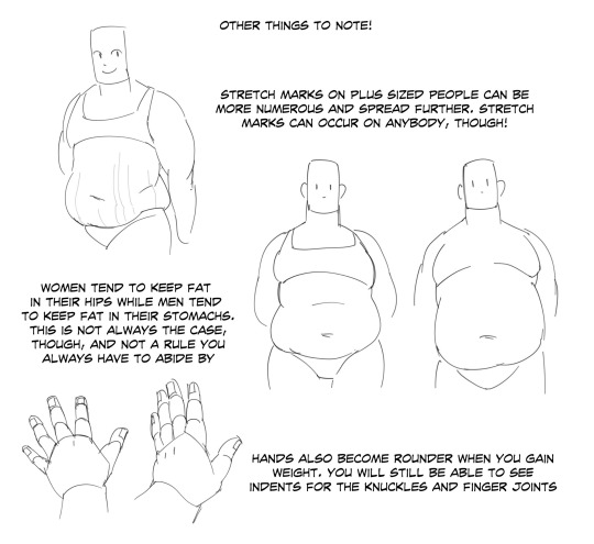
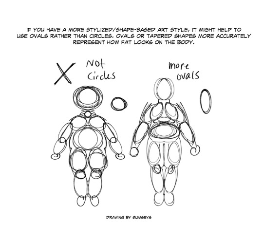
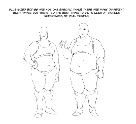
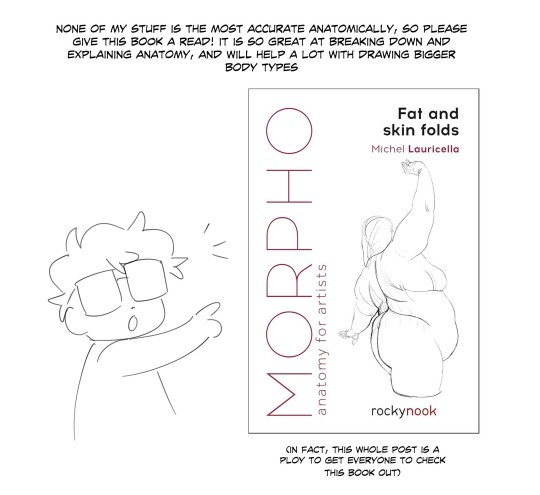
“small thread on drawing plus sized characters!”
Source: Ullaiin on Twitter
20K notes
·
View notes
Text
Something I try to keep in mind when making art that looks vintage is keeping a limited color pallette. Digital art gives you a very wide, Crisp scope of colors, whereas traditional art-- especially older traditional art-- had a very limited and sometimes dulled use of color.
This is a modern riso ink swatch, but still you find a similar and limited selection of colors to mix with. (Mixing digitally as to emulate the layering of ink riso would be coloring on Multiply, and layering on top of eachother 👉)

If you find some old prints, take a closer look and see if you can tell what colors they used and which ones they layered... a lot of the time you'll find yellow as a base!
Misprints can really reveal what colors were used and where, I love misprints...
Something else I keep in the back of my mind is: how the human eye perceives color on paper vs. a screen. Ink and paint soaks into paper, it bleeds, stains, fades over time, smears, ect... the history of a piece can show in physical wear. What kind of history do you want to emulate? Misprinted? Stained? Kept as clean as possible, but unable to escape the bluing damages of the sun? It's one of my favorite things about making vintage art. Making it imperfect!

You can see the bleed, the wobble of the lines on the rug, the fading, the dirt... beautiful!!
Thinking in terms of traditional-method art while drawing digital can help open avenues to achieving that genuine, vintage look!
68K notes
·
View notes


Text
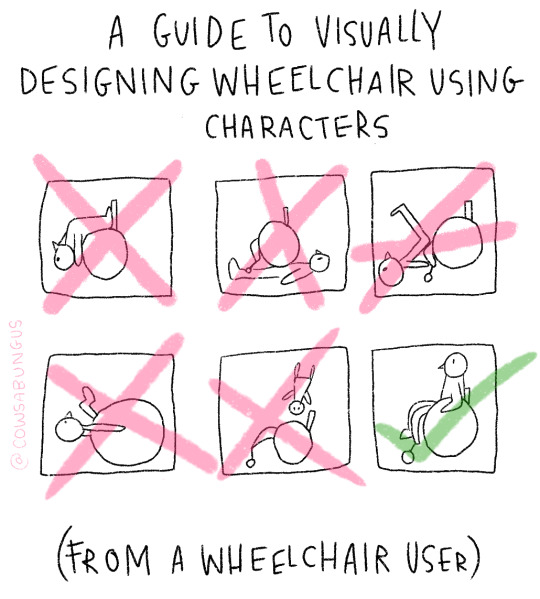
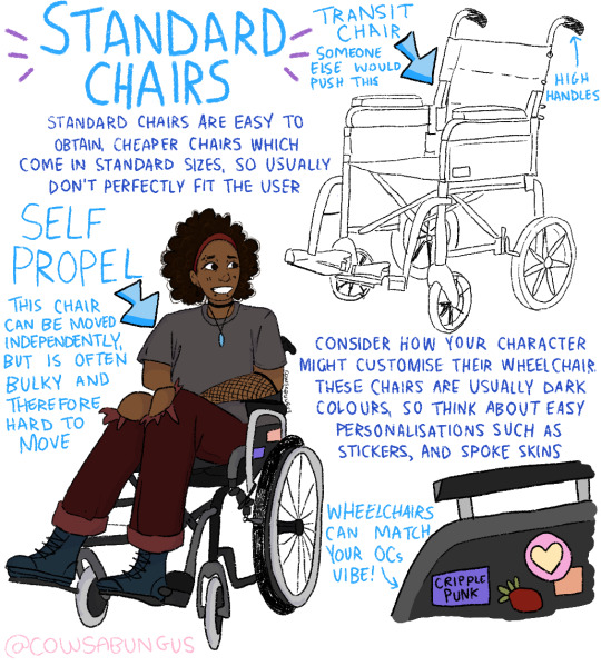
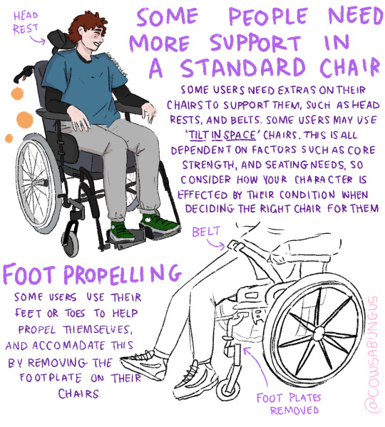

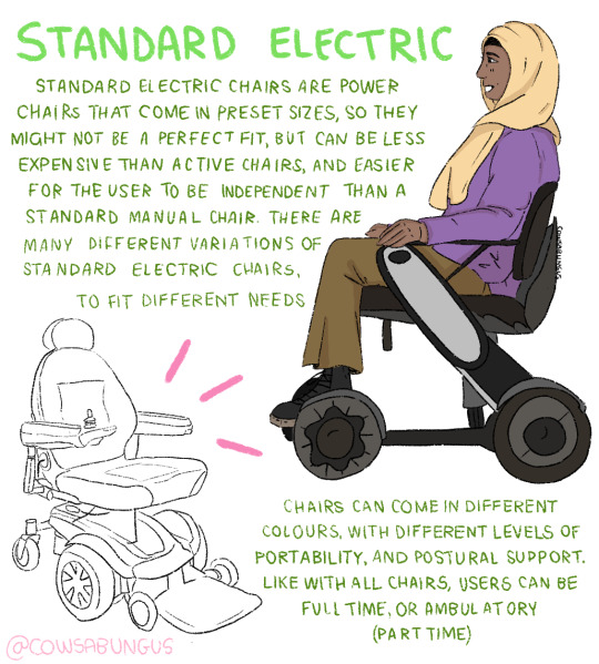

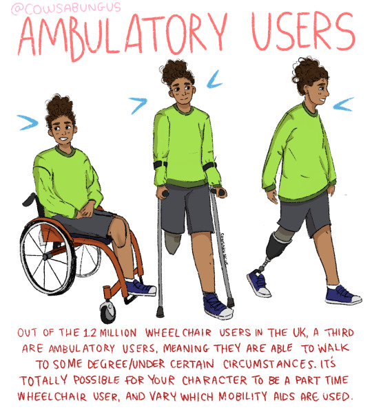
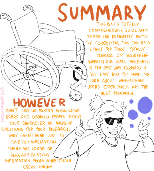
A guide to designing wheelchair using characters!
I hope this helps anyone who's trying to design their oc using a wheelchair, it's not a complete guide but I tried my best! deffo do more research if you're writing them as a character
116K notes
·
View notes
Text
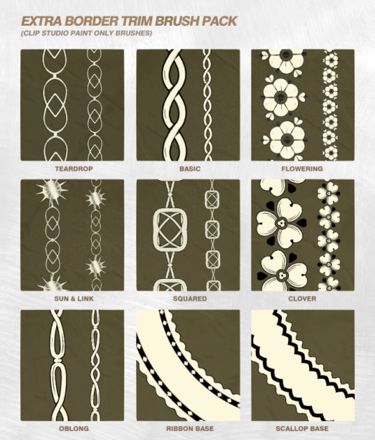

It's the last brush drop of the year: the Extra Border Trim Brush Pack is live and alive (and free!) over on Patreon.
For posterity, here's a roundup of all this year's freebie brushes:
Border Trim Brush Pack | Flying Flags Brush Pack | More Daggers Brush Pack | Beads & Bracelets Brush Pack | Bloody Bloody Brushes Pack | Starry 🌟 Firey 🔥 Bubbly 🫧 Effect Pack | Texture & Clothing Decorations Pack | Tails Tails Tails Pack | Galactic Brushes | Super Bokeh Brushes | Rainbow Burst Brushes | Shiny Sparkly Jewelry Pack | Grunge Brushes (Krita) | Valentine's Lace Brush Pack | Twiggy Patterns & Brushes | The Pack With Cracks
3K notes
·
View notes
Text
being a self-taught artist with no formal training is having done art seriously since you were a young teenager and only finding out that you’re supposed to do warm up sketches every time you’re about to work on serious art when you’re fuckin twenty-five
402K notes
·
View notes
Text
hello gamers i made a second, cooler art blog
3 notes
·
View notes
Text
I have officially closed the kofi membership, at least for now, so… nothing holding me back from sharing the chibi tutorials (so far, I'm going to be updating it in the future~) 🤗 ENJOY! INTRO

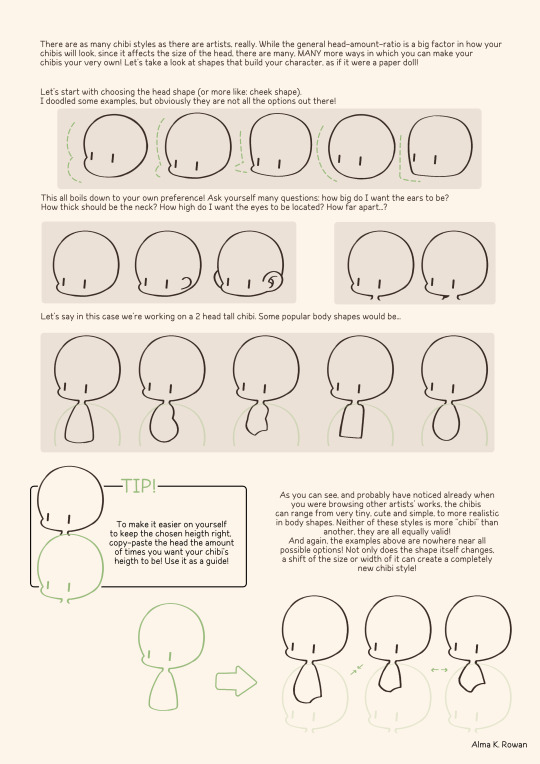
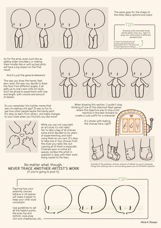
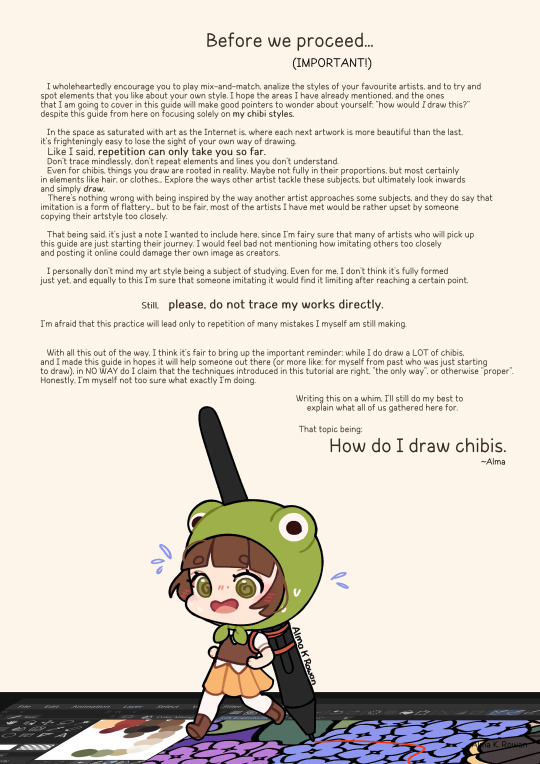
PEA CHIBI
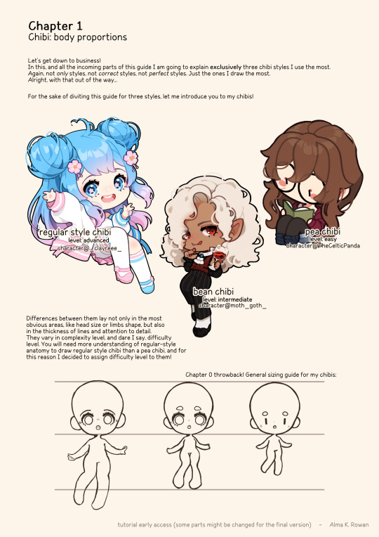
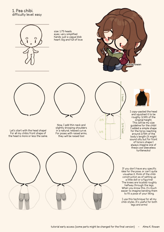
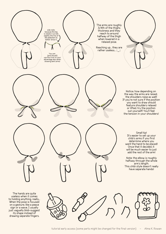
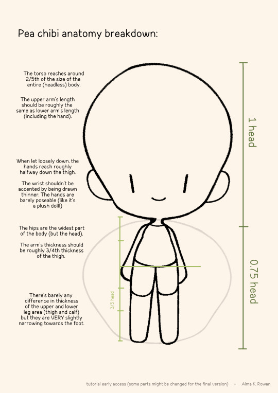
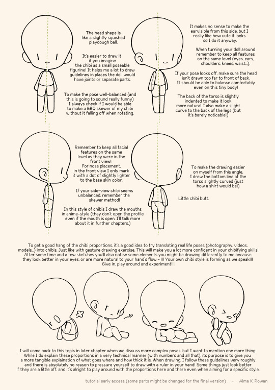
BEAN CHIBI
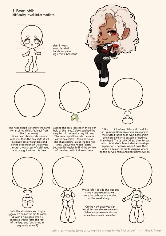
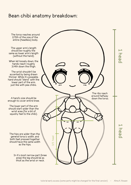
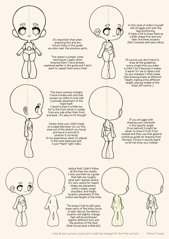
(tbc...)
4K notes
·
View notes
Text
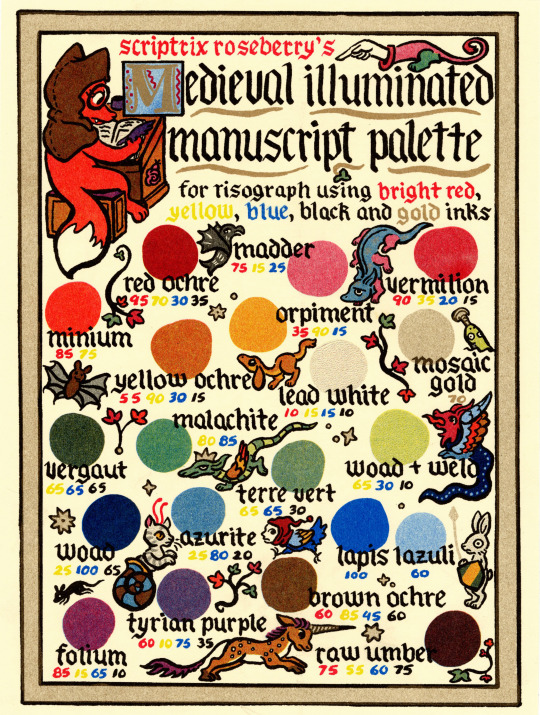
Everyone liked the color charts I test printed for Basilisk so much, I felt compelled made a nice version! Great for anyone that has an interest in Risograph printing, historical pigments, or weird medieval marginalia.
(buy it here)
21K notes
·
View notes
Note
HELLO I am deeply n irrevocably in love w ur art I was just wondering if you have any colouring/choosing colour palettes tips ? Hearthands
thank you sm!! i really adore color theory its like a mean wife to me. the way shes my everything but she never collaborates. anyway i made a little diagram. kindly note this is just how i taught myself color theory:
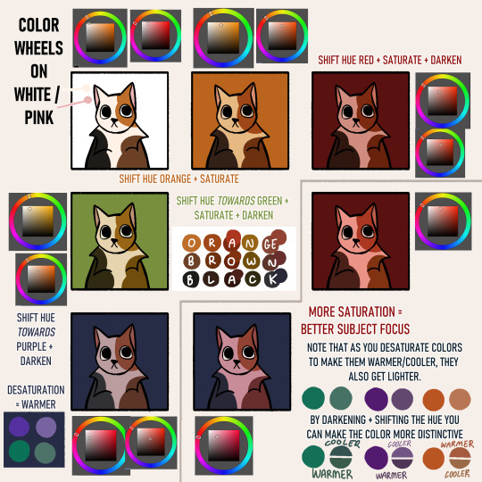
im not fond of pre-choosing a color palette mainly because im not sure where to place the colors, so in my head i determine what colors i want and shift them to match the background. this is usually why you can see most of my sketches having a tan bg - id rather have some color to affect my palettes rather than a plain white. its also easier on the eyes
to summarize: "i want an orange against this purple background" 1) pick an orange 2) shift it a little towards purple on the color wheel (this would put it in the red area) 3) is it too bright? darken it 4) is it eyestrainy? desaturate&darken it 5) still looks out of place? shift it more towards purple. heres the process in effect:
so much trial and error. i also use csps hue + color filters to shortcut this very often
73 notes
·
View notes
Text
Something I try to keep in mind when making art that looks vintage is keeping a limited color pallette. Digital art gives you a very wide, Crisp scope of colors, whereas traditional art-- especially older traditional art-- had a very limited and sometimes dulled use of color.
This is a modern riso ink swatch, but still you find a similar and limited selection of colors to mix with. (Mixing digitally as to emulate the layering of ink riso would be coloring on Multiply, and layering on top of eachother 👉)
If you find some old prints, take a closer look and see if you can tell what colors they used and which ones they layered... a lot of the time you'll find yellow as a base!
Misprints can really reveal what colors were used and where, I love misprints...
Something else I keep in the back of my mind is: how the human eye perceives color on paper vs. a screen. Ink and paint soaks into paper, it bleeds, stains, fades over time, smears, ect... the history of a piece can show in physical wear. What kind of history do you want to emulate? Misprinted? Stained? Kept as clean as possible, but unable to escape the bluing damages of the sun? It's one of my favorite things about making vintage art. Making it imperfect!
You can see the bleed, the wobble of the lines on the rug, the fading, the dirt... beautiful!!
Thinking in terms of traditional-method art while drawing digital can help open avenues to achieving that genuine, vintage look!
68K notes
·
View notes
Photo
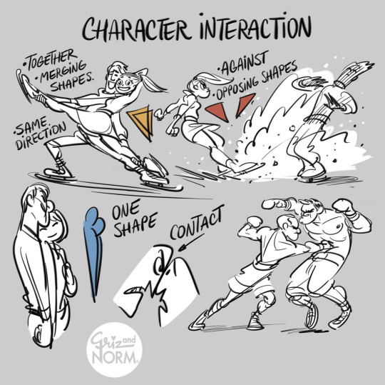
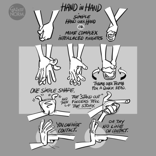
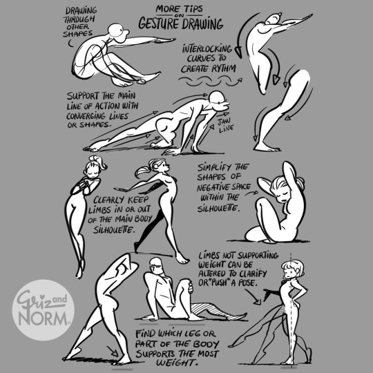
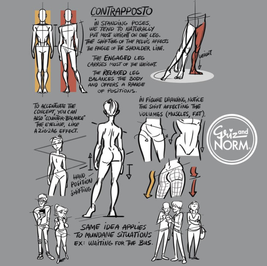
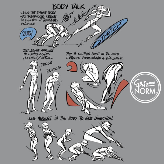
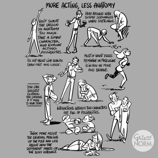
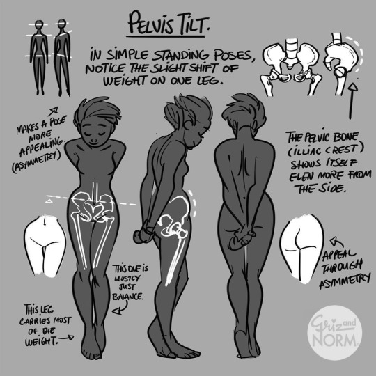
More art tutorials by Disney artists Griz and Norm Lemay
49K notes
·
View notes
Photo

So it occurred to me that ‘grawlix’ is sort of an obscure and specialized word, but what I didn’t know until I was googling around just now is that it was actually invented by cartoonist Mort Walker in his 1980 book The Lexicon of Comicana, in which he categorizes (and invents terminology for) all kinds of visual cues and shorthand commonly used in comics


In other news, this is now right up there with The Meaning of Liff as ‘books of made up words I desperately need to own”
86K notes
·
View notes
Text
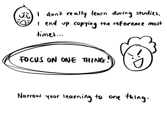
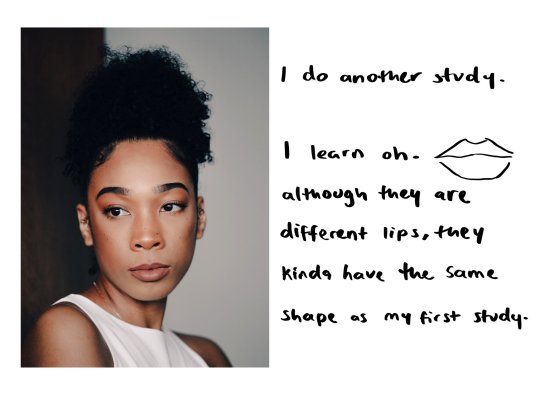
Was trying to figure out how folks could understand studying art more 🤔
I wrote more stuff down for patrons!
Posting part of it here tho cuz ik Tumblr rly likes my tutorial stuff 🫶


265 notes
·
View notes
Note
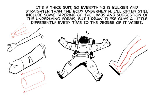
Hello!
I was recently inspired to draw an astronaut (specifically in the Apollo 11 Spacewalk suit) but since can’t draw astronauts or human anatomy in general I had to give up. My point being, do you have any tips on how the draw astronauts? Btw I really love your art! You’re one of the first few people I followed on tumblr!
Aw thanks! First off:
Drawing is just making marks. If you can make the marks you want and you know where you want to make them, there's nothing that you can't draw.
Sorry that's not very astronaut-specific, but the way I think about it there's not much difference between drawing an astronaut and drawing, say, a steam train. It's all the same process of studying the real thing to understand first its basic forms and proportions and then its more complex details and then applying that knowledge. The more you understand something, the easier it becomes to play with it.
If you want to draw humans and humanoid things, start by studying the scaffolding, how the bones connect to each other, how they move, and what their relative sizes are. Don't worry about replicating the literal appearance of every bone, just think of it like a stick figure with a box for the ribcage and a box for the pelvis. Then you can layer muscle groups on top of that, skin overtop of muscles, and clothes and astronaut suits on top of it all. Will Weston's figure drawings are my favorite to study for this kind of thing.
There's basically nothing that's off limits when it comes to studying. You can draw from life, draw from a photo, trace the basic shapes on top of photos to get a feel for the proportions, draw from another artist's drawing, etc. It's generally best not to post stuff you trace or otherwise copy (and definitely don't claim it as your own) but it's all fair game for learning. The only thing that won't help you learn is drawing without any reference, since you won't have anything to evaluate your drawings by to see what you're doing right or wrong.
If it helps, here's some stuff I think about when I'm drawing my astronauts:
452 notes
·
View notes