
a collaboration of two communication design students for the un-essay arleysportfolio.tumblr.com disegnidipetra.tumblr.com
Don't wanna be here? Send us removal request.
Statistics
We looked inside some of the posts by petraandarleysamalgamation and here's what we found interesting.
Average Info
Notes Per Post
18
Likes Per Post
18
Reblog Per Post
0
Reply Per Post
0
Time Between Posts
11 hours
Number of Posts By Type
Text
11
Last Seen Tumblr Blogs


Fun Fact
28.6 is the average number of monthly visits per US mobile user.
Text
Arley's conclusion of Communication Design Studies
Since taking a gap year during 2020 after graduating in 2019 I was anxious to get back into studying. Sick of sitting and lazing around I was dreaming of assignments and classes pretty much all day every day.
Since opening up a new tab to start my first lecture of my program CD studies only further enforced how right this program felt for myself. Karen Anne and Andy’s presence through the computer screen felt like I was witnessing an astute conversation between colleagues while simultaneously teaching me about the nature of communication design. I feel as though the varying learning experiences, workshops, lectures and assignment work helped me grasp a wider comprehension of the program and its concepts.
At the end of the 13 weeks, I have come to the belief that this course should continue throughout the whole program as 24 lectures and workshops isn’t nearly enough time to learn as much as I desire. Thank you Karen Anne and Andy for the sharing of your knowledge, you have lit a fire under me that only creating and researching feeds.
0 notes
Text
Discussion Videos: folder
https://drive.google.com/drive/folders/1QfNixHFqz1cjZezJxtwW35ob4lZLIV6c?usp=sharing
2 notes
·
View notes
Text
Discussion Video 3
https://drive.google.com/file/d/1wVEG46LbRoN7hjBzhLtba0kmaaB-LPpx/view
2 notes
·
View notes
Text
Discussion Video 2
https://drive.google.com/file/d/1IQaSCxVPVStC6Kx2JNGa8jcXGXEME8HT/view
2 notes
·
View notes
Text
Discussion Video 1
https://drive.google.com/file/d/1yn7fdwqx7nU7fZnu0YXB_yLawOFGmy-R/view?usp=sharing
2 notes
·
View notes
Text
PETRA’S COLLAGE: Experience
messy. collaborative. clean. isolating.

Reference for RMIT library pic:
Bennetts, P. (2018). One of the project’s many vignettes - an informal study space, complete with rocking chairs, designed by NMWB architecture studio. In ArchitectureAU. Retrieved from https://architectureau.com/articles/new-academic-street/#img-7
2 notes
·
View notes
Text
PETRA’S RESEARCH: Bauhaus and Black Mountain College
Poster made by myself reflecting similarities and differences between bauhaus and black mountain college

Stoll, D. C. (2019, September 26). A Very Unusual School: Bauhaus, Black Mountain College, and Today. Retrieved June 1, 2021, from Burnaway website: https://burnaway.org/magazine/bauhaus-and-black-mountain-college-today/#:~:text=Black%20Mountain%20was%20a%20liberal,that%20they%20could%20be%20most
Ellert, J. C. (1972). The bauhaus and black mountain college. The Journal of General Education, Vol. 24(No. 3), 144–152. Retrieved from http://www.ezproxy.lib.rmit.edu.au/login?url=https://www.jstor.org/stable/2779632
2 notes
·
View notes
Text
PETRA’S RESEARCH: Tibor Kalman
https://drive.google.com/file/d/1teBJVZJ11OLXQq9-d_2hpHVjJtogEE1n/view?usp=sharing
Perverse optimist, the documentation of Tibor Kalman’s works and thoughts, seems to be a cornerstone in post modernism.
His commentary on consumerism and the idea that design is a means not an end is something I completely align myself with. His approach to design being ‘anti-design’ and rule breaking is clear in his work.
By flicking through the pages of said book, his use of photography as well as variety and placement of text is a unique identifier of Kalman. The shock imagery he uses during his time at colours magazine are raunchy explicit and made to illicit a reaction from the audience.
His time at M.&Co. and Colours Magazine solidified his presence in the post modernist spaces.
Tibor Kalman. (2000). Perverse Optimist. Ny, Usa: Princeton Architectural Press.
2 notes
·
View notes
Text
ARLEY'S RESEARCH: The Guerrilla Girls

Poster created by myself but heavily influenced by the Guerrilla Girls own artworks.
The Guerrilla Girls is an anonymous all women's art group that formed within the mid 1980s in New York City that is dedicated to fighting sexism and racism within the art world. Their designs frequently portray classic artworks reimagined with direct statements about the inequality of racism and women's rights followed up by researched statistics. Key elements used within Guerrilla Girls designs include bold, all capitals, sans serif typefaces that contrast against the solid yellow background. When not using this formal typeface Guerrilla Girls often use handwritten notes where the typeface features a joint, cursive writing style.
Through my research I created my own poster that represented an issue I find unfair within the art world. I then chose classic Painting by William-Adolphe Bouguereau which features both a nude woman and a man holding her up. I chose this artwork for a multitude of reasons, one being that the women in subject is painted in a nude subjective way and it also depicts a man holding her up. I felt this connected well with my issue of women art directors earning 71 cents to their male counterparts dollar as it highlights the hierarchy of man over women . I also employed the Guerrilla Girls technique to highlight important pieces of information by using red text colour to contrast against the regular black.
2 notes
·
View notes
Text
ARLEY'S RESEARCH: International Typographic Style


Artwork created by me but heavily influenced by International Typographic Style
Bigman, A. (2016, August 23). What exactly is Swiss Design, anyway? Retrieved May 7, 2021, from 99designs website: https://99designs.com.au/blog/design-history-movements/swiss-design/Budrick, C. (2020, January 31). Swiss Style: The Principles, the Typefaces & the Designers. Retrieved May 9, 2021, from PRINT website: https://www.printmag.com/post/swiss-style-principles-typefaces-designers
2 notes
·
View notes
Text
"A memoir of the semester" Arley
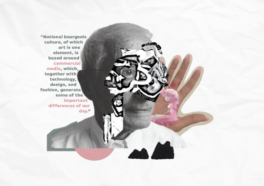
Text is from "Dispersion" by Seth Price, 2002 (The use of pink to highlight specific moments is in reference to Guerrilla Girls)
Photograph of Alessendro Mendini from https://www.zanotta.it/en-us/heritage/designers/alessandro-mendini
Hand photo of Petra taken by myself during week 4 workshop
The letter P collage created by myself through a collation of different magazines done again in another workshop
All other illustrations done my myself and reference my zine development
0 notes