
Last Seen Blogs

nicoodersooo
NICO ODERSOO


docmcjohnson
Doc McJohnson

europeclub
europe club millionaireceoclub.com
europeclub
europe club millionaireceoclub.com
Text
More Photos :)
Yesterday I posted about the guides and their stitching as well as the exhibition statement poster. Here are the photos of the final results:


Was super proud of my classmates for coming together and binding all the books! They turned out SOOO good in my opinion and made the whole graduating experience all that more exciting. I was also really happy with how the exhibition statement and “sticker” logo turned out. Originally, I was envisioning the whole wall as a “piece” and have the statement more flush with the wall, but I understand that we weren’t allowed to do certain things. That’s fair.
Overall, I was really happy with how my team came to solving certain issues and how we decided to use up the space we had provided to us :)
0 notes
Text
Final Guide Layout
Here are the final spreads for our guide :)


Also forgot to mention that we included all the teachers, which I was really happy with as a class! We made sure to include all of our shows unique features in the guide (colour, handwritten effect, headshots, and an artist bio). We also tied in how social media did our headshot photos.
Really proud with how these turned out given how much time we had to work on them!
0 notes
Text
Grad Show Reflection
Wow. Crazy to think we’re done grad show. Being on the Graphic Design team was a crazy, busy experience. I fell quite a bit behind my process blog with this class, but here’s all the process we did for all our responsibilities.
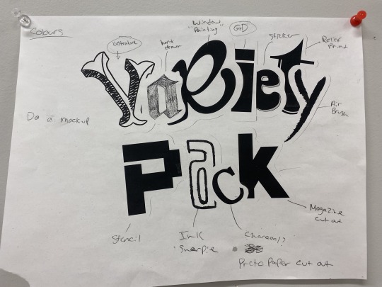
So the logo was the first thing on the to do list. We discussed, after seeing everyone's mood boards, about having all the students make a letter for the logo. The class loved the idea and we got right on it. We had all the students pick a letter out of a mug and design it in any way they liked.
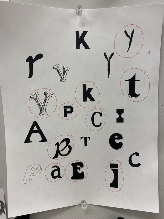
After we got all the letters back, we realized that some people created them in different mediums (Jaiden drew hers, Alyssa made a sticker, and Katie was much more digital). So, after seeing these few letters, we felt inspired to make all the letters into different mediums showcasing the “variety” of our program and the different classes we take. Some issues we came across when making the logo were the random bright white spots (the outline of the sticker and the K’s ripped paper background) and felt that they stood out too much against the other letters. Another issue we encountered was the flow of the letters and how they should work together. Luckily (not sure how it happened) but the letter R and I perfectly had that movement that we needed, so once we saw that I feel like the rest just came to us. Took a while to take all the letters and make a nice, cohesive logo out of them but I’m really happy with how the final logo turned out.

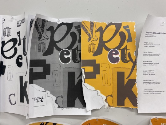
Next up was posters. So with the posters, we also had to figure out what colours we wanted to use, the context on the posters, and of course the layout. This took much longer than it should’ve in my opinion. There was a lot of back and forth when it came to ideas, and when I thought we were close to finished more new ideas came to. Unfortunately, I had to leave for a week but when I was gone it seemed my team did good and we settled on colours (thanks to Jorden) and with that finished the style guide (thanks to Chelsea). Once we figured out the colours and sent them to other teams, social media and web got to work on their content using our colours (yellow, red, black) and fonts (agenda).
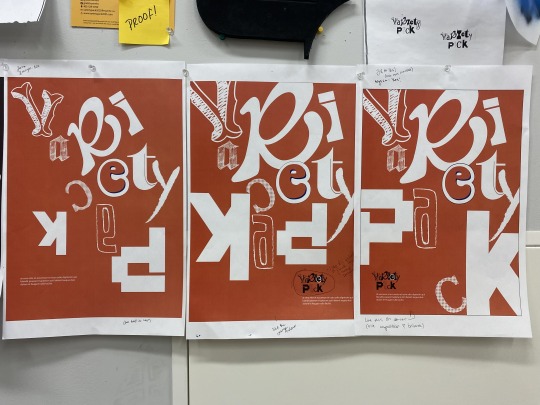
I think we figured out pretty early in the game that the poster would just consist of the letters all the classmates made, slowly spelling out “Variety Pack”. It was tougher than I thought with how the letters should align and move with each other on the poster. After sharing a few concepts and poster layout ideas, the class gave great feedback and we kept moving!
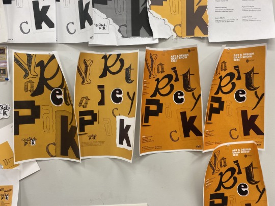
Final poster to the right! I thought it was so cool seeing how our posters kept changing (but for the good)! I was really happy with how our final poster turned out. The letters were placed randomly, but there was still the sense of the grid with aligning the additional context with certain letters and spacing. It was also kinda weird seeing how our colours kept changing. For some reason the codes kept getting funny on us and the printers kept changing the colour, but it all worked out!


Invitations! After a bit of research and just discussing ideas we came up with one right away. These we kept pretty simple, but I’m really happy with how they turned out. Chelsea thought of using the R and E for reception and exhibition which I love! The front side was our logo printed out on a sticker placed on top of the rip to give that idea of the sticker holding the paper together. We also decided to write “You’re Invited” with marker and once we did that, we kinda kept that theme going in a few others things from then on. The digital version was the same, but we just included the Variety Pack sticker look on the same side as the info.
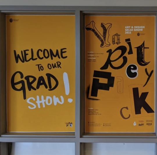
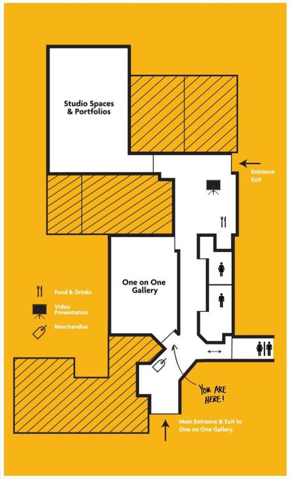
More posters! These posters we hung up in the three window displays by the gallery. When we were doing a walk around a couple weeks before the show, Jorden, Chelsea and myself felt that we needed to use these windows somehow. We thought it would be nice that when you first walk into the cultural center and see posters that explain and showcase our show would be nice.
We definitely new about the map poster and our show poster, but we didn’t know what to do for our third poster. We thought back to our handwritten feature we have around the show and decided to do something with that. Initially it was going to be “Thank You for coming to our show”, but we ultimately decided on “Welcome to Our Grad Show”. The map Jorden and I worked on together, and the Welcome poster I wrote but Chelsea designed. I was very happy with how these posters turned out :)
Next up, guides. These were by far the biggest headache makers. We were cutting it close on time so the three of us got these done up and finished in just a couple days. Our initial design had type go across the spread with all the graduates a little over the center. Unfortunately, however, when it came to printing there were a few issues. None of the pages aligned and the headshots for some reason came out looking really “greasy” and not good honestly. We were not happy with this, and given how close it was already to the show we decided to redesign it without spreads and just do the information on pages.
The new and revised version printed out much nicer. Also, on top of things we decided to hand stich the books together. I personally struggled a bit with this but really enjoyed learning the process of it! I also loved the aesthetic it gave to our guides. It connected it more to us rather than just having some store do everything for us.
Just a few days before the show as well, we hung up our exhibition statement and a giant “sticker” in the main entrance of our show. So the first thing people see when they walk in is our logo and can read about our show. (also shoutout to Chelsea for writing a killer statement).
Aside from all this, we also made stickers for all the letters, trading cards for all the students and social media posts. I don’t have any photos on me right now like I thought I did so I will post some tomorrow morning!
I should’ve been on my process more, but things just got away from me - which is no excuse, sorry. Overall, I am super proud of my Graphic Design team. We did A LOT. I never felt so much stress before but it was well worth it. Our show turned out so good and so us as a class. There's a few things I would do differently now knowing everything, but wouldn’t change anything about the show.
0 notes
Text
Final Colours

And I almost forgot, these are the colours I used for my app. I knew I wanted to use the green, black, and grey, but thought it needed a different colour to add more “flare” and more eye-catching features. Took a while, but I settled on this peachy orange colour. Not only do I think it looks nice with the green but it contrasts it just enough that it can really capture the viewers attention. I used the green, grey, and black for the overall look and feel of the app, with the peachy orange colour for buttons.
0 notes
Text
GoFo App


GoFo the app! I created an app that can scan artwork or architecture and tell you in descriptive detail what style it is created in and/or what artist made it. I decided to go with a peachy orange to match with my green. I think it stands out enough that it catches the viewers eyes and makes them want to press it. I kept the overall design of the app very simple (almost similar to instagram). I thought this would be smart with my app since everyone already understands the basis of instagrams layout so doing something similar already makes it all that more easier to follow along.
The logo is very simple using just type spelling out “GoFo”. The opening page has a small descriptive of “your photo app for on the go info” which I thought would help people understand “GoFo” more fast and right away.
There were a few bumps in the road when making this app. Some things never came to and some others weren’t doing what I had hoped. I was thinking about doing a “history” button, but then I realized if all your history goes to your profile, do you really need a “history button”? So I decided to scrap it to make the space less cluttered.
I also wanted to include a more educational feature. I button that offers quizzes and/or tests. Since this app is suppose to be more educational, I wish I included more of the cliches when it comes to education (apples, bookworm, quiz, grade, etc.). Not super cheesy, but icons or features that helped the user understand that it’s a educational app.
For the blog/comment page, I moved the camera button off to the side where the blog button is on every other frame. I did this because I thought when typing, it might be annoying having the button right underneath in case someone accidentally pressed it. That being said, the consistency is now off BUT the button is still as easily accessible like every other frame. Furthermore, with the comment page, people can share their posts/photos which you can like and save to your profile.
The camera button is placed in the same spot on each page right in the middle (expect the blog/comment page) because I want the button to be as easily accessible as possible so people can take a photo as fast as they can. There is a home button on each page, however, the logo GoFo also brings you home. I thought it might be nice having a home button at the bottom just in case, because not everyone knows that the logo normally also acts as a home button.
Probably the page I struggled with most, design wise, was actually the login page. I didn’t really know how to make it more unique or interesting for new users who just opened the app. So, if I had to go back in, that’s one of the things I would spend more time on.
Overall, I’m not super proud of this app and wish I could’ve played with the colours more or pushed the envelope a bit more with context and info you can get out of it. I let my exhaustion get the best of me and could’ve pushed this more, definitely. I did enjoy learning Figma and about UX/UI though :)
Oh and lastly, when recording my screen recording for some reason many of my texts in buttons weren’t showing up. However, when looking on my edited version everything is there. Not sure what was happening, but I included some images of what it should’ve looked like above.
0 notes
Text
Typefaces

Here are the typefaces I’m thinking about using: Chaparral Pro and League Gothic. League Gothic would be for more headlines, and Chaparral Pro for body text. I’m not sure if Chaparral will read nicely on a small surface and I might have to look into more of a sans serif font. But I do like League Gothic and think I’m going to stick with that. Catches the viewers eyes, and is easy to read.
0 notes
Text
Wireframe Studies


Finally thought of where to start with my app! I’m trying to make it very easy to follow and navigate through (obviously). But I’m also trying to make it very personal and provide some involvement with the community. I want people to be able to customize their colours of their profile as they want, they can insert a photo for their profile, and there will also be a chat room where people can share thoughts and/or exciting discoveries!
The scanning part will be very similar to a regular camera app set-up, but I want the whole screen to be the camera. No portrait, square, etc. formats.
Also, thinking the name of my app is going to be “GoFo”. Not sure yet. I was playing on the words “Go Photo” (taking a photo on the go) and “Go Info” (getting information on the go). BUT, some people said it may sound too much like “GoPro” so... And I honestly don’t think that’s too bad because it may catch peoples eyes faster -- thinking it says GoPro but realizing it doesn’t, leading them to clicking it to find out what it is...? Could be a possibility.
I’m hoping to start punching this into figma soon and see if these ideas can really work!
0 notes
Text
Personas


When researching for my personas, I focused a lot on my app specifically. I tried to ask relevant questions that would be useful in creating my app alongside maintaining an educational function.
Asking for their favourite apps, told me what they look for in an app and what they are most drawn too. From there, I’m thinking I’m going to look into their favourite apps more and try to familiarize myself with why they classify them as their “favourite”. I also asked very blunt questions like “would you use my app?” because I felt it would be helpful to see where I stand in the app world.
From the information I’ve collected, I think I have a good solid bases on where to start and where I’m going.
0 notes
Text
Assignment 3 Creative Brief and Moodboard


For my Assignment 3, I’m creating an app that is able to scan artwork, designs, and architecture and tell you information about the piece. Furthermore, the app will tell you different locations where you can find similar art and architecture and give you credible resources about the piece.
Being completely honest, I had a rough time thinking of an idea. I don’t use a lot of apps on my phone and only have the basics. But, thinking of the app Adobe Scan, I thought “why not be able to scan other things too for other purposes?”
My idea around this app was that having schooling in both art and architecture, sometimes I still get stumped as to what style I’m looking at. So, I thought it would helpful to have an app that could tell you all you need to know about the piece. The app is more educational than anything else I would say, but acts as a nice travel app as well. The idea is that once you scan something, there will be an option to view a map that will tell you locations that have similar pieces (with images). So, say theres multiple pieces that you’re interested in somewhere else in the world, you might put it on your bucket list to visit.
This app can be for anyone of any age. Although, I would assume my main target audience would be a little older of age since this age group is able to travel and might have a broader interest in art and architecture.
0 notes
Text
Assignment 2 - Refection
For Assignment 2, Package Design, I decided to design a eco-friendly, sustainable bag that came with reusable coffee filters. Not only is this bag used for coffee, but is intended to act as a ‘stylish, vintage, day-to-day bag’ for anyone and anywhere. I’m really happy with how the final outcome turned out. I think the name ‘Your Coffee Bag’ is straight-forward for a coffee brand, but also has a nice ring to it for a casual day-to-day bag. I do wish I added some unique factors about the company/brand and gave the company a logo or label for the bag side, as well as more facts about the eco-friendly aspect.
I’m glad I decided to add the cotton inside piece. I think it will hold the coffee better and keep it more sealed. Also, it makes it smoother inside to reach in and grab accessories and/or loose change.
I like how simple my design is, I don’t think it’s eye-catching enough. Initially, I wanted the viewer to be stopped in their tracks and see this coffee and have to buy it. Although the bag itself would be nice to have afterwards, I think it needs something extra to really entice the viewer to stop and buy it (again, tying into the eco-friendly facts on the back -- would be helpful for this).
The pocket is a bit hard to open and close, and is a little floppy when opened, which would need to be fixed, but I think the concept of the bottom pocket and the sturdy structure of it was a success. I can definitely see something like this working and being very handy.
I ended up using spare scraps from the cotton material for the filters. Obviously, in real life this would be made from a more reliable material. But, coincidentally, I do really like how they match the bag. Although this isn’t a very important factor as it would have coffee stains after a few uses, I think the aesthetic of it is nice.
To close, there are a couple constructed elements I would go back in and fix, and I would decide against the white lines on the front design. However, overall I think I achieved my overall goal and final outcome. It is a fully sustainable, eco-friendly coffee bag that can act as a casual bag afterwards. :)
Oh, and too add, I wish I had found a old burlap potato sac or something. After talking with Ian about possibly using one, I thought it would look so cool and interesting to have all the old designs of the potato sac underneath the new design. However, I couldn’t find anything. I asked around to friends but no one had anything. So, if I had the chance, I would like to of used something worn/used for the burlap portion. -- this would have really pushed the whole eco-friendly, sustainable, reusable factor of the brand.
0 notes
Text
Final Coffee Bag Design


Here is my final coffee bag. I’m really happy with the construction of the bag and the overall simple design of it. However, I’m not sure how I feel about the line design I put on the side. I think I liked it better without the white lines. For some reason, I think it looks more cheap and/or cliche with the white. I used a dark grey for the type’s colour, but thinking about it now, grey has a blue hue to it. So, although the colour is grey, it looks dark blue which I am really happy about. I like the greyish blue colours with my pattern and brown burlap colour.
I’m really happy with the ‘Your Coffee Bag’ title and the placement and size of it, as well as the ‘roasted hazelnut’ type. I wanted to write ‘eco-friendly’ and more sustainable facts on the back but ran out of time. It wasn’t really a necessity, but would have been nice to explain to the viewer why this brand is different and better than others. I added the ‘est 2023′ on it because, thinking about the concept and material I used, I could see this being ‘vintage’ one day. So, including the year will have a big impact on the bag a few years down the road.
I think if this was put into the hands of an expert sewer and pocket maker, it could really be something (lol).
0 notes
Text
Bottom Pocket of Coffee Bag and Coffee Filter Progress


Yesterday, I finished sewing up my bottom pocket and making two coffee filters. I made one a little smaller than the other, giving the impression of a kerig sized one as well as a coffee machine sized one. I used some scraps I had left over (because I have a lot) to make the coffee filters. For the bottom pocket, I sewed around cardboard to give it more stability and sturdiness. I thought this would help the bag stand up by itself better and be more reliable holding valuable things. For the coffee filters, I sewed around a wire with the cloth to give it more stability.
I’m pretty happy with how these pieces turned out, I just wish the bottom pocket had cleaner lines, and fit nicer in the top portion of the bag. I also wasn’t sure how I would attach the pocket to the bag, as my initial idea didn’t really look that good or work as nicely as I’d hoped. I ended up just sewing the back portion of the pocket to the bag. When opened, it just hangs which could be an issue and would have to be resolved.
0 notes
Text
Coffee Bag Design

Thought of a design! I think I’ve settled on the name ‘Your Coffee Bag’ because once you buy this coffee bag it’s ‘your bag’ — so I think it’s a fun idea :) and then in the bottom corner will be where the flavour of coffee is and some facts about the brand and it’s sustainable, eco-friendly factors. The back is where the company logo and name will be. I want to keep it simple enough so if it does act as an everyday bag, it doesn’t come across as so much of ‘product’ rather an accessory.
0 notes
Text
Coffee Filter

For the coffee filter, just to give an idea of what it could look like, I’m going to use some of the cotton material scraps I have left over. I think it will generally give the idea of what the reusable coffee filter would look like and have a nice matching factor with the bag. I had some of these wire things left over from a few years ago and plan to sew the fabric around the wire to give it that sturdy factor for holding itself up in the coffee machine. This will be placed in the bottom pocket of the bag for when the customer buys the product.
0 notes
Text
Continued Assembling Coffee Bag


My bag is almost complete! I started sewing the inside portion first and made my way outwards. Initially, I had planned for the bag to be sewn very clean and orderly, but, having sewn everything by hand, I found it a little tricky. However, as the sewing marks became clearer and more apparent, I started to fall in love with the idea of the viewer seeing all the markings of how the bag was created. I think it ties in nicely with the ‘organic’ feel the brand is going to portray.
Also, originally I had planned to have the bag be made up of zippers, but, over the weekend, I found some buttons that came with coats and/or shirts that I had bought in the past. So, rather than using zippers, I’m going to use these buttons. They don’t match, but, again, I think that depicts the brand nicely. Secondly, buttons are very easily removable, so if someone did want to get rid of the bag, they could keep the buttons for future purposes if they wanted. Buttons will also be used for the bottom portion of the bag to close the pocket.
Thinking about the front design of the bag and keeping with this ‘hand-made’ feel and ‘organic’ image, I think I’m going to hand paint the design. Originally, I was going to create a stencil and print the design on the front, but I don’t think that would make much sense with the brand now looking at what I’ve created so far. And thinking about colours, at the moment I’m leaning towards using dark grey and white. Very basic but I think it would read nicely and be visual pleasing.
All that’s left to sew is the bottom pocket and strap, then all done!
0 notes
Text
Assembling the Coffee Bag


Took a while, but I finally figured out a design stencil to cut my bag in. I couldn’t find anything online resembling what I envisioned my bag to look like, so I ended up making my own stencil. I knew I wanted the bag to have more of an oval shape because I find it more aesthetically pleasing for a ‘small everyday bag’, and thought it would also suit the coffee brand nicely.
Originally, I planned on having the bag 12″ x 8″ x 4″, but after printing out a few stencils and comparing them to the fabric, I realized that may be a little larger than I wanted. So, I slowly shortened it down one after the other and settled on the bag being 9″ x 6″ x 3.5″ (there is a 2″ gap for where the bag will be closing).
I made a small paper mockup mainly to figure out the bottom piece. I decided to do the separate pocket that’s connected to the bottom holding the reusable coffee filter and the bag’s strap.
0 notes
Text
Materials

I ended up going to Mook Fabric to buy some burlap. While there, I saw lots of cotton patterned materials (100% cotton material to be specific) and thought it would be nice to add some to my bag to make it more aesthetic. Also, if the cotton material was used for the inside of the bag, I think it would be easier to hand wash and hold objects more securely. I decided on this pattern because I love the organic feel of nature, and I think the blue and off white colour match nicely with the burlap material. In total, I think I spent about $24. I got way more cotton material then needed (I wasn’t aware of how they cut it down) and took what they had left of the burlap (which was the perfect amount).
Originally, I had stated that I wanted to use the colours brown and blue for the exterior design of the bag, but after taking into consideration about how it may not be as easily read by older people, I’ve decided to change up my direction. I’m thinking about using more contrasting, dark colours against this subtle colour palette I have going on. I think it would catch the viewers eyes better and show the boldness of the coffee brand.
Still struggling on the design, but working on it! I’m still interested in my ‘circles to lines’ concept, just need to put it into format on the bag and figure out what information I want to include on the front, and possibly back.
0 notes