
Don't wanna be here? Send us removal request.
Statistics
We looked inside some of the posts by platformerprojectfm and here's what we found interesting.
Average Info
Notes Per Post
0
Likes Per Post
0
Reblog Per Post
0
Reply Per Post
0
Time Between Posts
1 day
Number of Posts By Type
Text
17
Last Seen Tumblr Blogs


Fun Fact
BuzzFeed published a report claiming that Tumblr was utilized as a distribution channel for Russian agents to influence American voting habits during the 2016 presidential election in Feb 2018.
Text
A very very long catch-up blog post
So I missed the day after EGX after getting sick at the event, this caused me to lose ALL of my rhythm and pretty much stop doing work as my motivation was shot too. My fault but here is my big long catch-up post to post everything I've been working on (through the hours of 12-5am every night). As of writing this it is 19/10/23 on the last day of the project, and i've been awake since 12am trying to do college work.
SECTION 1: ART PAIN
I can not stress enough how much I HATE doing art, it pains me so much because I'm not too much of a creative type, but we ball anyway. I've been doing ALOT of asset making (for my standards) Finishing up a tent as a "win zone", a few extra blocks to make corners look less weird and an animation for throwing a vial, which is my new form of score and ammo and a bit more.

this looks weird, but trust me when i say it works in-game,there will be videos further on showcasing it :)

This was my third tilemap, it's pretty simple but was necessary for a win-area, here is also my updated 2nd tilemap, now with a few extra things.

Overall i'm pretty happy how these came out, I have the artistic skills of a 6 year old usually.
SECTION 2: PROJECTILES, ANIMATION AND BLUEPRINTS
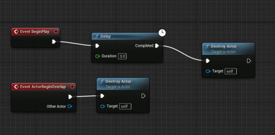
I don't really know how to explain this here, so i'm just going to send screenshots of my code with small explanations. A) Projectile go whoooosh

A projectile movement is added so the projectile can move, it contains this code to make it be destroyed after impact or some time.
B) Animations and projectiles.
This is the meaty part that took most of my time, i rewrote a good portion of my score system since it was stored inside of the level, when it was also ammo so it had to be stored inside of the player. I made an integer called "vials" in the player to track ammo. This meant i had to update it from casting from the level to the player in the UI, so it got the accurate number of vials to display on screen. Here is the code for the new vials ammo block, which is what you pick up to get ammo

I wanted to make a throwable that has an animation, because I thought it was a bit weird that i'll just fly out of my character's front, so here is the code for it.
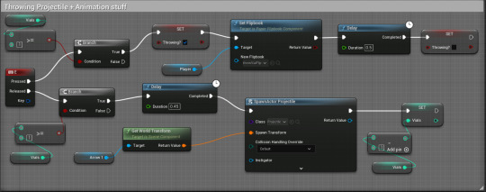
I'm pretty proud of it to be honest, the code detects if there's any vials before playing an animation, and if there are vials then it updates the "throwing" boolean variable which is used to pause all other animations until the vial is thrown (apart from the death animation which overrides the throwing animation), this then plays the animation with a small delay to make it look like the character is throwing the vial.
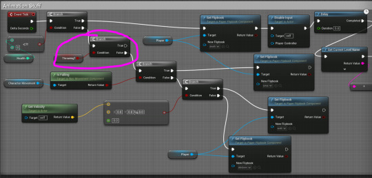
This is my updated animations code, the branch that is circled is the one that denies any animations playing if the "throwing?" boolean is yes. This was really fun to figure out overall, I think my programming experience from last year in college helped alot since I end up having the same thought process I had in that class to overcoming problems, which I think helps make more efficient outcomes.
0 notes
Text
Making a Game Over screen in Photoshop
Using the warp text tool:


by pressing this button, it will open the warp text tool

Applying effects:


0 notes
Text
Overlays??
So I had a bit of free time and I decided to see if I can get a kind of "overlay" where my character is hidden behind an area but can still walk around. By experimenting on my own I put a tilemap over my existing one as an overlay, which works surprisingly well when i set everything perfectly.
(and sorry for my music in the background lol)
0 notes
Text
Creating a Wandering Enemy
First I had to create a new character blueprint and a new actor that's a sphere.

I then used this code to make it wander between two patrol points

I also added in extra code to make the enemy fling me and take off health when the player is hit.


Here is a video of it working
0 notes
Text
Creating a HUD / UI
To start, we have to make a new widget.

This is done by right-clicking in the content drawer.
Then we need to add a canvas.

After that, text can be added, to bind it to code we need to add a new binding, this is done in the details panel.

Once the binding is added, we can make code inside of it. In this example it is HP and the HP is bound inside of my character.

After that we display the content, this is done in my BeginPlay inside of my character. I just add this code to the end of the existing code.

Make sure the class is set to the name of the widget, in this example the widget is called "UI"
Health Bar
To add a health bar it's fairly similar, first you have to drag in a progress bar.

The binding must be specifically the bar's progress section

The final code is similar, although with a few differences that are shown in the image.

0 notes
Text
Research: Player Characters
Mortal Kombat In the first Mortal Kombat game, the characters' images were created using a process called digitized graphics. This involved filming real actors performing various actions and then turning those videos into digital images that could be used in the game. The actors' movements were captured on film, converted into digital pictures, and then put into the game, allowing players to control the characters on screen. This technique gave Mortal Kombat its unique appearance, making it seem like real people were fighting in the game. Limbo In the game Limbo, using only black, white, and grey colors makes it harder to create detailed characters. Facial expressions and intricate designs are challenging because there are no vibrant colors. Characters are often in silhouette, making it tough to show specific details. Despite these limitations the game designers get creative, using shapes and animations to make characters interesting and expressive within the game's visual style.
Backbone In "Backbone," anthropomorphism is achieved through a combination of visual design, animation, and narrative depth. The animals in the game are meticulously crafted with human-like movements and expressions, allowing players to empathize with them on an emotional level. Through facial animations and body language, these characters convey a wide range of emotions, enriching the player experience.
Shovel Knight Shovel Knight is the courageous protagonist of the game "Shovel Knight." Wearing blue armor and wielding a sharp shovel. His mission is to rescue his partner, Shield Knight, from the evil Enchantress and her Order of No Quarter. Shovel Knight's abilities include precise attacks and agile movements.
0 notes
Text
Research: UI Design
Dead Space The user interface design in Dead Space is intentionally immersive and dietetically integrated into the game world to increase the player's experience of fear and tension. The player's health status is indicated by the glowing bar on the character's spine. Ammo and inventory management are handled through holographic displays projected from the character's suit, allowing players to access these details without interrupting the game. The UI elements react to the game world, for example when the player aims their weapon, the health and ammo indicators move to their weapon.
Persona 5 Persona 5's UI is sleek, modern, and stylish, featuring vibrant colors, anime-inspired art, and dynamic transitions. The UI includes visually engaging menus for managing Personas, battle displays, and a creative calendar system.
Mirrors Edge In Mirror's Edge, the limited HUD and UI is a deliberate design choice that improves the game's immersion. Rather than cluttering the screen with traditional UI elements, the game uses minimalistic visuals. Vital information, like health and momentum, is integrated into the character model, displayed through visual cues like changes in Faith's (The playable character) breathing and the blurring of edges when running.

Cristales Cristales features clear and straightforward menu layouts, allowing players to navigate settings, inventories, and options effortlessly. Important game information, such as health, resources, and objectives, is displayed prominently without overwhelming the screen, maintaining players' focus on the gameplay.

Dead Cells In Dead Cells, the UI design is unobtrusive, allowing players to focus on the fast-paced action. Important information, such as health, weapons, and abilities, is neatly displayed on the screen without cluttering the gameplay area. The UI provides quick access to inventory management, allowing players to switch weapons and items without issue. the game's map and level progression are presented in a clear and clean manner out of the way.

0 notes
Text
Further Tilemap design
I needed a few more things due to my level looking kind of...bare (and a bit weird) So I made a few more assets to make another tileset.

I couldn't really think of many other ideas, so I made a small and big mushroom for bounce pads, a corner piece for underground, some wooden spikes, a few grass pieces and a poor attempt at a thorn bush. Doing pixel art reminds me of how much I hate art.
0 notes
Text
Research: Widgets in Unreal Engine
In Unreal Engine, a widget is a visual element used to create menus, HUDs, and interactive interfaces in games and applications. They are designed using the Unreal Motion Graphics editor and can display images, text, buttons, etc. Widgets can respond to inputs and be integrated into games using Blueprints, allowing for the creation of both dynamic and interactive user interfaces for 2D and 3D games.
0 notes
Text
Research: Tilemaps
Super Mario Bros. Series Classic games like Super Mario Bros use tilemaps for almost all of it's assets, from the blocks on the ground to the clouds in the sky. Many of the asserts in the game are the same but recoloured, like the blocks in 1-2 or the clouds being just white bushes.
The Legend of Zelda: A Link to the Past Much like Super Mario Bros, The Legend of Zelda: A Link to the Past is mostly entirely made up through tilemaps, they help the game's performance remain good while also allowing for seamless transitions.
Stardew Valley The entire game of Stardew Valley is built on a grid, and this makes the game much easier to develop when using tilemaps. The farm especially is built on one massive grid with each part taking up a tile, and using tilemaps allows the game to easily swap out tiles when needed. The seasonal changes in stardew valley also make it easier to transition with tilemaps, as they can be recoloured or slowly swapped out.
0 notes
Text
First Level Playtest
So for my first playtest I found many things wrong, such as not being able to reach the end and the slopes. I will fix this as well as some of the ugly textures in a the next update.
0 notes
Text
Bringing Tilesets into Unreal
This short video shows how to bring tilesets into Unreal Engine and add collisions
0 notes
Text
Super Mario Bros 1-1
The key part of Mario Bros' 1-1 is that all of the mechanics of the game are taught in under 5 minutes. Approaching this problem myself by trying to make a good tutorial or a good level on how the mechanics work.
youtube
0 notes
Text
Research: Further Pixel Art
Saint11
Saint11 is ran by Pedro Medeiros, an artist who worked on Celeste and Towerfall, he is currently the art direction lead at Extremely Ok Games. The site shows his newsletter, art, some tools and some educational resources that Pedro Made himself. His tutorials are on 512x512 canvases that teach how to do something in pixel art on just one page.

Paul Robertson
This is a blog ran by artist Paul robertson. It shows his work on multiple different projects, including his work on the cartoon JIMMY AND BABY and an art exhibition he did. As well as this, there is some "dreamlike" art that seems rather video-game inspired. Kind of like a pixelated version of something from Rick and Morty.

Ivan Dixon
Ivan Dixon's website has a specific project called "SIMPSONS PIXELS", it is a short 1 minute 52 second long animation with many chaotic and a few comedic scenes. The animation is surprisingly fluid for how blocky it looks.

Waneella Pixel Art
This blog is ran by a creator who goes by Waneella. It shows many individual pixel art pieces that they have made. The art, although technically "pixel art" is incredibly high resolution and doesnt really quality as pixel art, many of the peices are also animated.

0 notes
Text
Research
Eadweard Muybridge Eadweard Muybridge was a 19th-century English photographer and pioneer in motion photography. He is best known for his work in capturing motion through a series of still photographs (what is commonly known today as stop-motion). His most famous work includes the study of a horse's gallop, which helped settle a debate on whether all four of a horse's hooves leave the ground at the same time while running. His had a significant impact on various fields, including photography, cinematography, and animation.
Stephen E. Wilhite
Stephen E. Wilhite is the creator of the GIF (or Graphics Interchange Format) in 1987. He created it to compress, store and share images for easy sharing on early computer networks. It uses lossless compression, which means that the quality of the image is not degraded for barely at all during compression.
0 notes
Text
Research: Comparing walk cycles
Mega Man 1 The art style of Mega Man 1 was very pixelated and simple due to the limitations of the NES hardware. The walk cycle had to be designed within these limits. With only 4 actual frames in it the animation still seems fluid enough to seem human, whereas some walk cycles with low frame amounts look weird.

Mega Man 8: With the improved hardware of the PlayStation and Saturn, Mega Man 8 had more detail and colorful graphics. The walk cycle shows this off perfectly with a much smoother animation in a higher resolution than mega man's usual 24x24 pixels. The higher framerate of the animation makes it seem alot more human-like then Mega Man 1's bobbing up and down which sometimes looks like it's switching between 2 frames.

I actually prefer Mega Man 1's walk cycle, as i feel like when scaled up the Mega Man 8 walk cycle is quite hard to track, although i feel like it would be much better in actual gameplay.
0 notes