
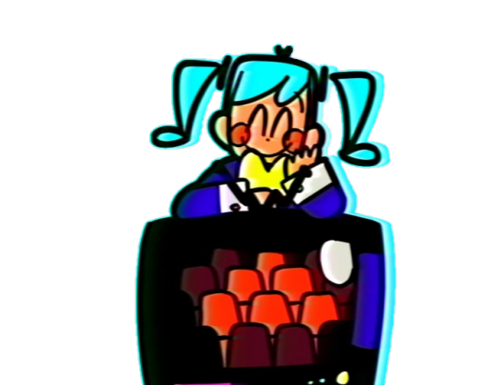
Statistics
We looked inside some of the posts by playitcool1963 and here's what we found interesting.
Average Info
Notes Per Post
12K
Likes Per Post
10K
Reblog Per Post
2K
Reply Per Post
16
Time Between Posts
3 hours
Number of Posts By Type
Text
15
Note
2
Last Seen Tumblr Blogs


Fun Fact
Mobile US users spent an average of 115.8 minutes on Tumblr app monthly.
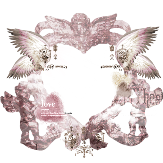
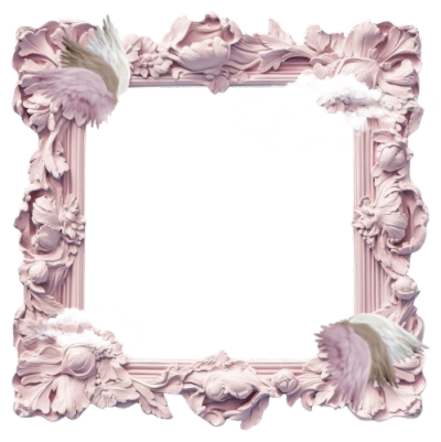
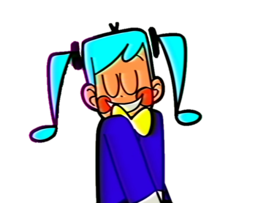
Text


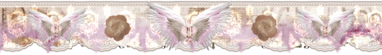
͡ ㅤ𓈒 blue dividers ( again ) ! .
₊ reblog & like to use . ㅤ۫ 𓏏𓏏
₊ ˘ not requested ༢
3K notes
·
View notes
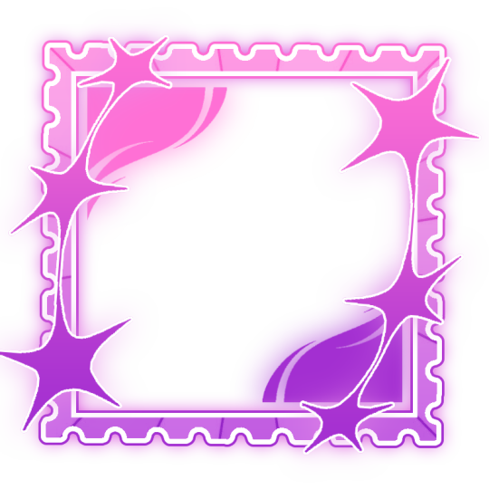
Text
【 ✦ 】 Monochrome Dividers
┄ F2U。 Credits not required ┄ Self〜Indulgent。 RB2USE (preferred) ┄ Recolours → Encouraged( ̄︶ ̄)


732 notes
·
View notes
Text

“ May the peace be with us. ”


꒰੭. ゜⠀⠀·͙⠀ ⠀۪𓏼ㅤ ׅ⠀ ⠀⦂ ⠀⠀builderman/hatred blocktales lyt ⌣⌣
⠀ ᡣ𐭩 ⠀ ⠀ ┈─★ ⠀ ⠀ ゜ self-indulgent
།† ‧̍̊ ི ꒰𝒢℘꒱ ♡/↺ ⌣ f2u w/ credits 2 me and the artists
❝ ⠀ 。 ˚ ac⠀⠀⦂ ⠀⠀ pfp 1, pfp 3, banner ⠀⠀𓎟𓎡

138 notes
·
View notes
Text


❥⠀⠀ luka ( alnst ) renders
f2u⠀𓈒⠀no creds needed⠀|⠀reposts⠀+⠀recolors permitted
no id/me/kin tags | self indulgent⠀𓈒
660 notes
·
View notes


Text


⠀⠀❥⠀⠀various icon frames
⠀ mbm⠀⠀―⠀⠀rb2use ⠀can recolor,⠀no reposts 3 more goodies in my serv !

170 notes
·
View notes


Note
um.. more winged kittys maybe ? :3 (different from last winged cat anon)


49 notes
·
View notes
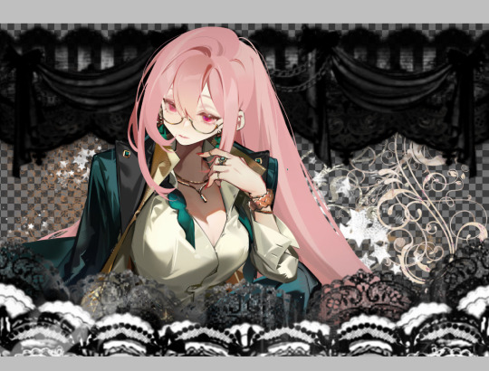
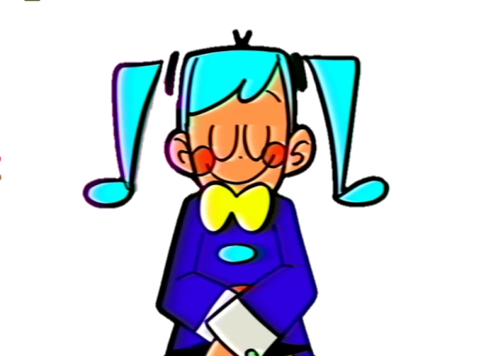
Text
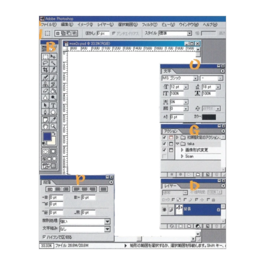
Graphics Tutorial
I've gotten asked a few times on discord how I make graphics (since I primarily share my works there), so this is a lil' tutorial post :p
╳ This is the way I make graphics. Others might do it differently and thats okay.
Images provided!!!
Here's what we'll make for the tutorial:
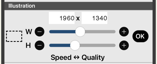
Okay so, I use ibisPaint X, and my canvas size is usually 1960x1340.
Theres many different ways you can "frame" your graphics (see my [The Herta] and [Acheron] graphics) but I usually use a divider on the top and bottom.
╳ You can find dividers under various tags on tumblr, and there are many Rentrys/Carrds with resources that have dividers (I LOVE the blogs [lavendergalactic], [selysie], [laylaplush], and [lucentmaiden], and the rentries [lavender-resources] and [border]).

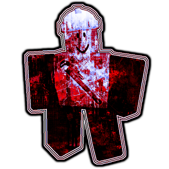
Then, get your character render - Theres tumblr blogs and other social media accounts that do primarily make and post renders of characters (Like [hoyo-transparents] I LOVE THEM SO MUCH they are also where I got the Yanagi render from for this example), you can even look around online for renders by search, but sometimes you WILL have to erase and cut renders out yourself (I usually use the background removal tool, then I go in and erase the closer parts myself)).
╳ If your character has any accessories on their head that make it hard to fit them on the canvas, you can change the height or width dimensions of the canvas to have them pop out of it more (See my [Miku] and [Nicole Demara] graphics).
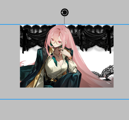
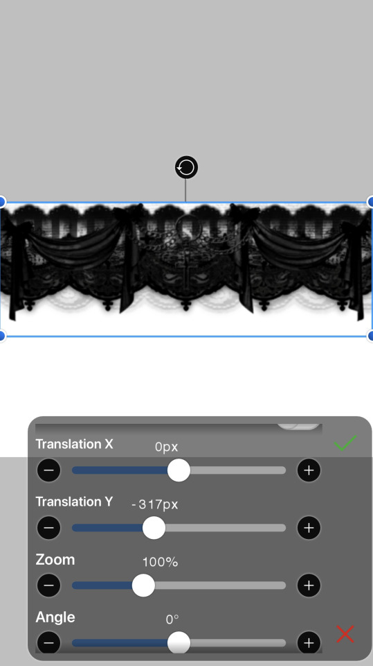
Now, duplicate the render and put the dupe under the dividers.

(Optional in some cases) - Hide the top render, and erase parts of the bottom render that are showing underneath the renders.

Go back to the top render and erase the lower part so the bottom divider appears to be in front of the render (As if it was a 3d space).
╳ If the render has (a) body part(s) going over the dividers that you'd like to keep, you can erase around it (See my [Agaela] and [Yae Miko] graphics).

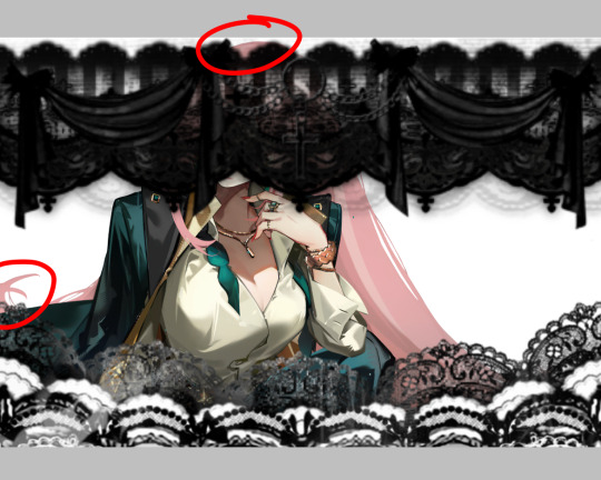
Time to add background elements (if you want)!!! I usually add patterns(?) in the background (I also usually merge them and make them all the same color but you can do whatever you wish).
OR you can add pngs! Its the same way to find dividers I mentioned earlier, I love the ones [adjpngs], [suturical], and [pngblog] post, but I usually search up keywords like "flower png" on tumblr to find some.
╳ You can also get pngs off of Pinterest and remove the backgrounds either manually, through ibisPaint X's "Clear White" functions (Three dots on the lower right when in Layers tab), or through background remover websites (of which there are MANY).
╳ You can also put pngs over the render or on the dividers, they don't just have to be background elements.
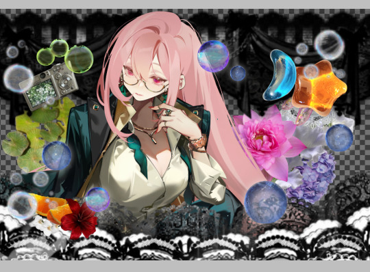
OOOR you can mash them together (And thats what we'll be doing with our example graphic)!

Now… COLORING!!!!!! Move EVERY part of the graphic into the folder (make sure to keep every layer in the same place).


╳ You do not have to do this step, but I usually press "Add layer from folder", which mashes everything in the folder together in a NEW layer- so you have everything on one layer, but still have all your other layers in the folder. then, I hide the folder. I do this to keep things clean AND in case I want to change anything.
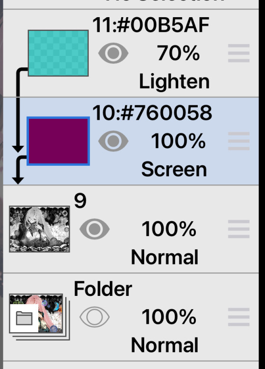
╳ This is also an optional step, but I usually use the "Grayscale" filter on our "almost-finished-product". Some colors might clash or not work with the filters and colors I'm trying to use, so I grayscale it all so I dont have to deal with that. BUT, you can absolutely keep things in color and still be able to work with it (See my [Mulani] graphic)!

Now, we want COLOR! there are many ways to do this, but I usually use the Overlay/Lighten/Screen blending modes.
╳ There is a Gradient Map filter in ibisPaint X but I don't use it since I don't have premium. I've heard of a few websites (Including Photopea) having gradient maps and whatever else, but they're confusing for me to use so I don't know how to use them- theres probably tutorials out there for those programs though. Photoshop probably also has a gradient map but I don't actually know I don't have it.
╳ Theres also some users out there who make color combos for ibisPaint X that you can use (I don't have any recommendations though)!
You'll definitely want to explore and mess with colors to see what you want.
I chose this:

Now, textures. OOO DO I LOVE TEXTURES. Usually I use textures through overlays, but ibisPaint X has an ENTIRE PAGE dedicated to patterns, textures, and presets. I CANNOT EXPRESS HOW MUCH I LOVE THIS FUNCTION!!!

I usually use the paper/old paper textures when I use ibisPaint X's materials, but you can scroll around and use what you find!
╳ An optional step I do is duplicate the grayscaled layer, blur it, and make it a clipping layer- then adjust the opacity to my liking. It makes the graphic look a little fuzzy and I love it.
I ended up with this:


(I also realized midway at this point that I did not color the background patterns so I went and did that)
Last step is to add your watermark. I HIGHLY. HIIIIGHLY recommend watermarking your works, because there are snatchers everywhere on the internet. Too many times I have seen people steal other peoples stuff. You do not have to watermark your stuff, but its probably recommended by every version of artist there is on our Earth. Plus, people will probably want to know who made the work! I add my watermark by putting the grayscaled layer in a folder, making a new layer IN the folder, and putting my watermark in there- somewhere on the graphic. This makes it so both the watermark and the graphic are affected by the clipping layers (But you can always merge the watermark and graphic together. I usually don't incase I want to move the watermark elsewhere).

Then, we have our finished product!
(Remember to enable "Transparent" when you download it!)
62 notes
·
View notes
Text

…make reply icons?
reply icons (or as i call em, replycons) are a weird kind of edit. they’re in the same genre as rentry or carrd graphics—i.e., that you can do whatever you want with no real rules. that said, these are some guidelines i follow
i. make your canvas much wider than it is tall
there’s no exact measurement for this. my reply icons for this blog are 600x150, but they’re fairly uniquely small. the general consensus at least amongst my peers is about a 4:1 or 3:1 ratio will work best.
the reason why your replycons should be wider than longer is because it keeps them from taking up a lot of space. here’s mine as an example:

enough space to be visible, but not so much as to be obnoxious. that should generally be your goal.
ii. collect a wide variety of expressions
this’ll be limited depending on your characters, but it’s best to have a good variety of expressions. i also save my files with whatever the expression is to me for easier searching but you don’t have to do that LOL
also, i feel obligated to mention it, but you don’t have to stick with just one character. you can use a whole group, either an in-game group (i.e. leo/need) or a visual group (i.e. blonde characters.) they don’t even really need to match, though it’ll look better if they do. with this blog and my old ones, i used a variety of characters with the same color palette so i could get the expressions i wanted.
iii. just make the damn thing
ah, the worst part of all editing—actually editing. god fucking damn it. now that you’ve got your canvas and your character(s) it’s time to grit your teeth and make some replycons
first thing i usually do is narrow down a theme. this can be as simple as a color or as complex as something like “cybercore” or whatever -core scratches your brain. for these replycons, my theme is just attempting to match the rest of my blog layout. god fucking speed.
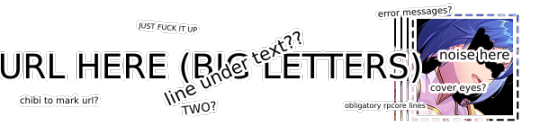
it can sometimes help to make a thumbnail like this ^ but that’s 100% optional. i like to do it for tutorial purposes and it helps me to get my thoughts from my brain and into photopea. your thumbnail need not make sense nor be cohesive. it’s just for you to know
a good way to start is to make a shape and make it interesting—i usually make a shape and give it a border and some fun lines, rp style, but you don’t have to do that. all of those things can be done with just the shape tool. you can also find existing icon masks on tumblr or resource rentries (make sure you credit properly!!) and you can find some templates, like mine!
once you’ve got a theme and a base, start adding shit.

^ pretty easy base. i pixelated the lines around her eyes and added eyes, and added a stroke and drop shadow to the shape to make it easier to see! if you’d like, you can stop there. but i think it needs a background and some details so i’m going to keep going
background complete! for this i just used a color fill and went rasterize > filter > noise > add noise but you can add whatever you like—patterns, wallpapers, solid colors, etc. it’s up to you! i also added a small stroke around my character png so as to distinguish her from the background a little further :)
this one is a little blank on the left side so i’m gonna add some text and details!!

there we are. i added the cd png to break up the monotony of my base, added text because it’s my personal preference, and added a chibi so the text is distinguished! if you do add text, make sure it’ll be readable in any modes—light and dark. i typically add both a black and white stroke for this, and a drop shadow can help a lot, too!
an important thing to note here is any extraneous images of the character you add can’t be too distracting to the main image. if i had, for example, done this:
the new png is obviously too distracting, right? it takes up too much space and completely draws the eye away. this is even more true when the base and the png have conflicting expressions, like so:
because now i can’t tell what emotion you’re conveying—is the replycon happy or sad? what part do i focus on??
so it’s best to keep any extraneous decals pretty simple, for the sake of clarity. it’s also best to remember that english-speakers read from left to right, and native speakers are conditioned to interpret most things that way. you’ll want to draw the eye in that direction as you work, and not the other way around. hope that makes sense lmfao
iv. save as a psd
once you’ve got all your layers and details situated, make sure that you save your replycon as a psd. this is imperative, because it enables you to make new reply icons as the occasion arises, or you can recycle the basic components for a new theme!
if you’re unsure on how to save as a psd, click file in the upper left-hand corner and then ‘save as a psd.’ i recommend labeling it so you can file it more easily; i’m naming this file cobaltpegasi replycons, which is an easy template—just stick your url in instead.
once you’ve done that, keep adding expressions until you have a suitable amount of replycons! i usually made about five to ten to start with and then add new expressions as i see fit, but you can do whatever works best for you.
also, when saving your replycons, it helps to sort them by what emotion you think they convey. for example, my canarysage replycons are sorted by character and then by emotion—so this one is labeled “len smug” because that’s how it seems to me

you don’t have to do that, but i find it helps a lot when trying to find specific ones, especially if you have a lot.
v. go forth and use them
now that you’ve got your replycons done, you can use them! go forth and clear out those week old requests in your inbox (🤨) or whatever it is you want to do with them. that is all. canarysage signing off <3
…so that’s how you do it.
95 notes
·
View notes
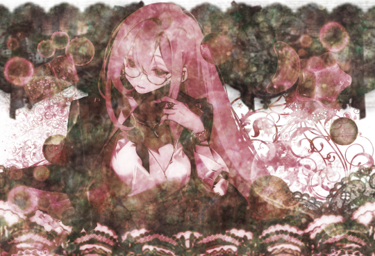
Text
Static PNGs part one
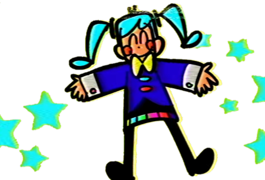
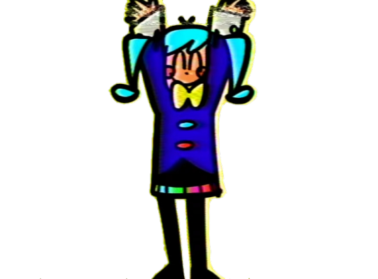

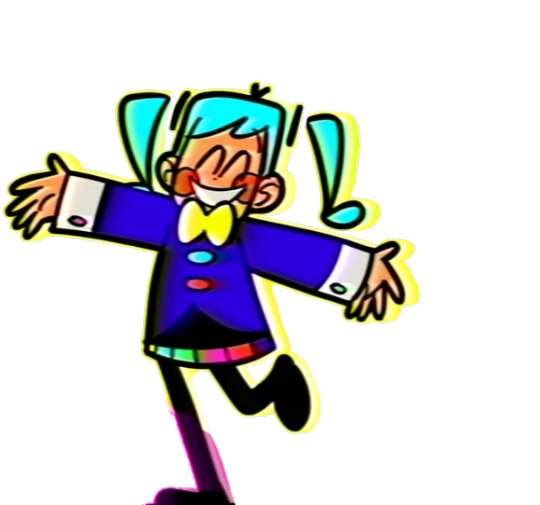
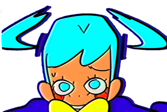


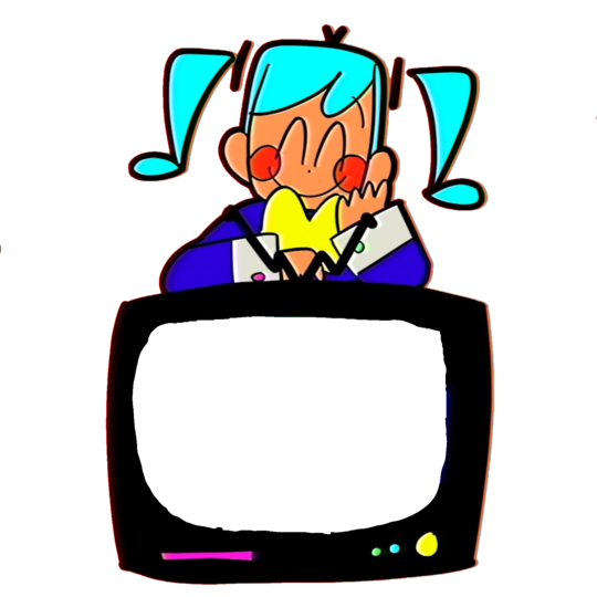


Obviously I had to make pngs of her! Free to use no credit needed, but reblogs always appreciated
713 notes
·
View notes
Text
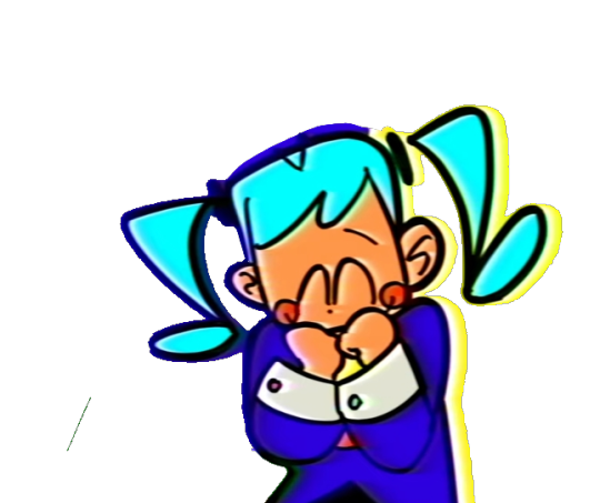
hey i like you have muse dash rin and len sprites


you can find the rest of the non-gif + gif sprites here. i couldnt upload them cuz tumblr said no
i didnt make the google drive btw, it’s on the wiki.
2K notes
·
View notes
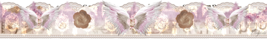
Text


WEBCORE FRAMES DUMP . sourced from picsart . f2u w/o credit
2K notes
·
View notes
Text


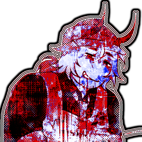
𓏏𓏏 ·͙ ᧔♡᧓ . ۫ · “shush, little one.”
◞ (🗯️ᓀ‸ᓂ)﹒ f2u ibis paint coloring ^_^
630 notes
·
View notes
Note
how does one make graphics (i need to . improve)

Well, the Princess' methods are very simple! She would be glad to teach you.
A bit long graphic tutorial under cut ^_^ (all art by Iinquint on twitter)

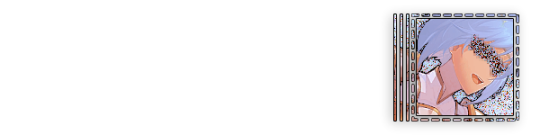
First, we import the frame or mask you will use. You can find these by searching "rentry frame".

Then, we will import our picture and erase any excess outside of the frame.

Then we usually add a chibi, You can do this by finding chibi art and erasing the background.

And now we will add any PNGs to the graphic. We chose circle laces for this.

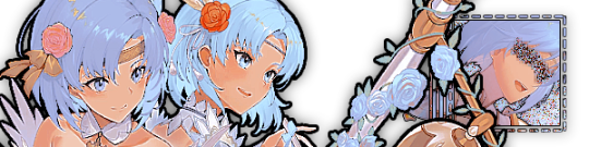
Now we will duplicate the layer of our chibi.

We then use the Stroke Outer filter to find dots that weren't erased, we will go to the top original later and erase where all the exposed dots are.

After that, we delete the layer & reduplicate it. Then we use stroke outer for a white outline, and then a black one. If the chibi or whatever you are using is white or very light already, feel free to reverse the white & black.

Then we add glow outer (usually around 1-2px)

Continue this process for everything

Save it

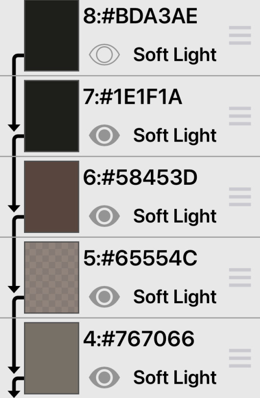
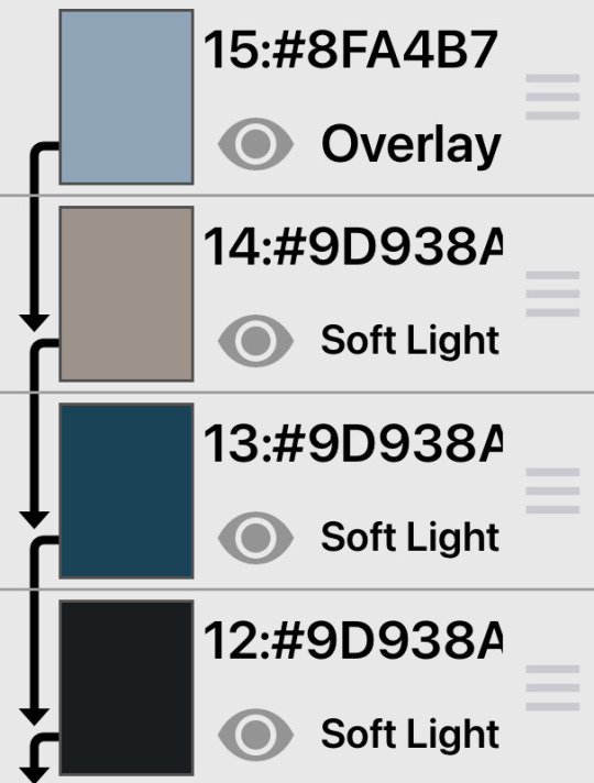
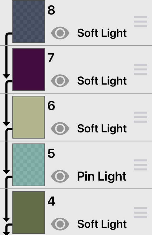
And then we will import it into a new canvas through 'import picture' & then use the grayscale.

Now, We do not always use a gradient map. But feel free to try out gradients to see if it looks nice on the graphic. Either of the 2 top sites work.

Find a gradient that looks nice. If none fit your vision, feel free to skip it.


Now, import the new image and then add textures. Play around with blending modes & opacity until it looks right.

Boom! You've made your very own graphic.
Now for animated graphics...
(No visuals) If you'd like one where the small chibi moves, move it to be angle -5, save it, and then angle 5 and save it. (Also adjust angles if the 5 looks weird.)
Import the images into ezgif gif maker and turn on "Don't stack frames" and adjust delay time. (I usually use 80ish)
--
Animated graphics 2

Import your graphic into capcut. Add a green background or whatever color is not present on your graphic at all. Add the gif you want on the graphic. Adjust for all the images to go on for equal times so it works.


Ezgif > Mp4 to gif > Remove Background > Select hex code of background > "Replace hex with transparency" > Adjust Fuzz > Optimize

And voila, your graphic is completed! Feel free to adjust in ezgif effects if needed.

463 notes
·
View notes
Text

⠀ ⠀ ⠀ ⠀ ⠀ ⠀⠀ ۫ 𒋲 ⠀ ׁ ⠀⠀ ꓄𝑦𝑝𝑖𝑛𝑔 . .


⠀ ‿◞| ͜͝ | ͜͝ ⠀dark ibis paint colourings
F2U ⠀ ノ ⠀ creds appreciated

layer opacity depends on the photo used; that is why i haven’t included it here o_0
1K notes
·
View notes
Text

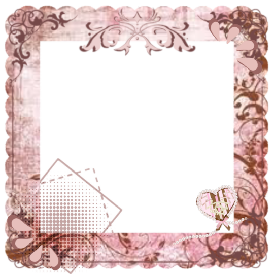
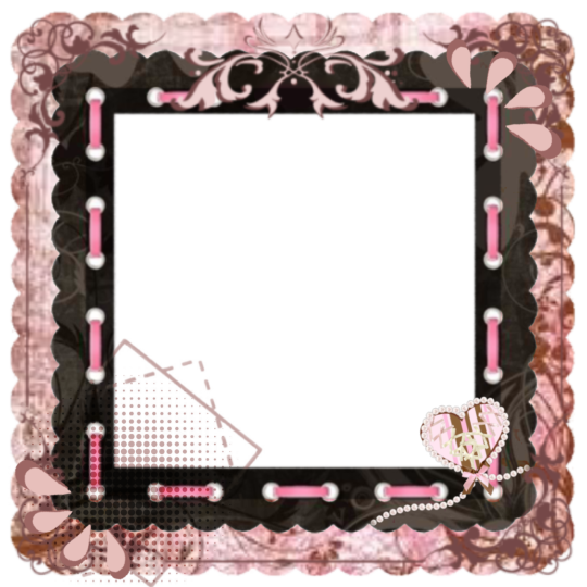
Frame + colouring/coloring
f2u, credits appreciated ! example of this can be found here
Dividers nf2u! ︱︱ 4 RENTRY / OTHER


233 notes
·
View notes