pleasantboatpress
pleasantboat press
binding books since november, 2020 | my books | main | insta | member of Renegade Bookbinding Guild I do not take commissions
86 posts
Don't wanna be here? Send us removal request.
Last Seen Blogs

durasunofficial
Durasun Solar Solutions

goatsbian
Untitled

trevorusrex
In The Boy’s Room

number1cleaning
บริษัทแม่บ้าน นัมเบอร์
denofdreams-writerblr
Den of Dreams
Text
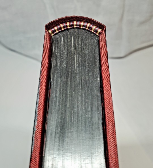
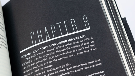
Fanbinding: Dirt and Ashes, or: The One-and-a-Half Body Problem by @tozettastone
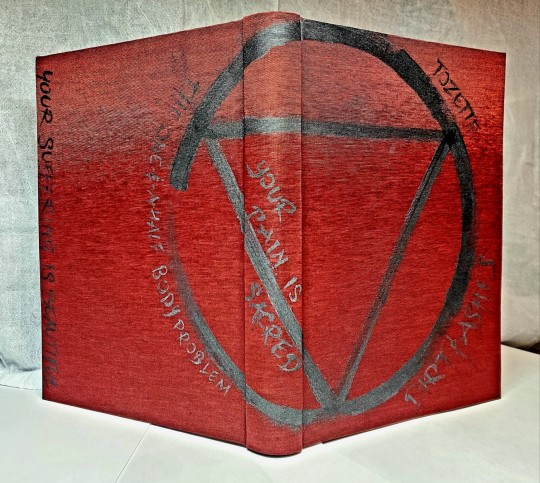
In which Sakura carries half of Hidan across two countries, leaving a trail of blood, bodies, and other people's legs.

I made this book for @aetherseer as part of an exchange we did, and I had such a great time making it. I saw this fic on their list and remembered reading it ages ago and was like I CAN DO SOMETHING WITH THAT! and here it is.
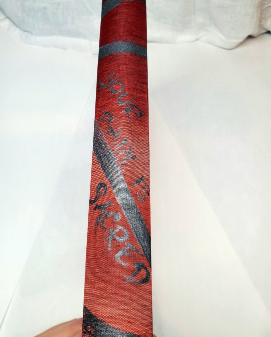

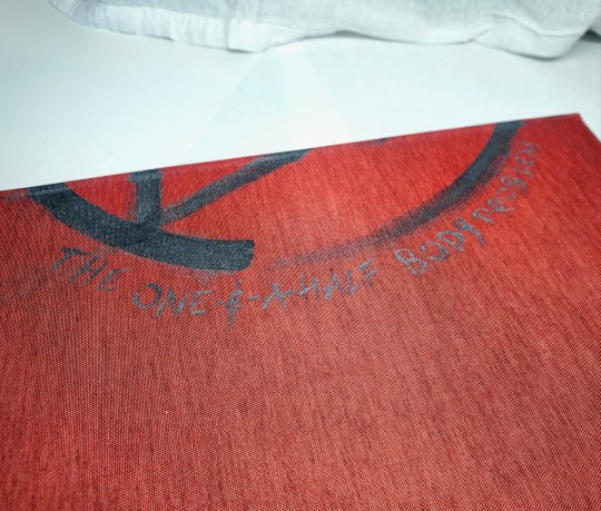

The cover is Colibri bookcloth, handpainted with acrylic (all of the lettering is freehand- easy when the font you choose is irregular). @pleasantboatpress suggested including a quote on the spine since the title wasn't working there, so I got to add the absolutely banger quote from this fic "Your pain is sacred. Your suffering is beautiful."
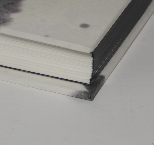
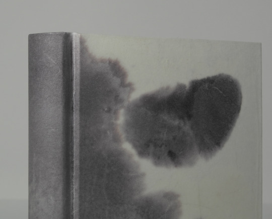
For the edges, I used fluid graphite and polished and waxed them. On the endbands I used my Japanese silk thread for the first time (its a dream tbh).
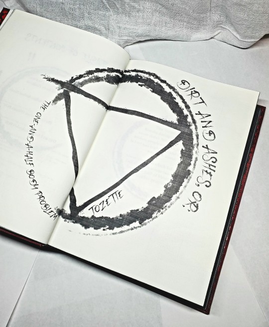

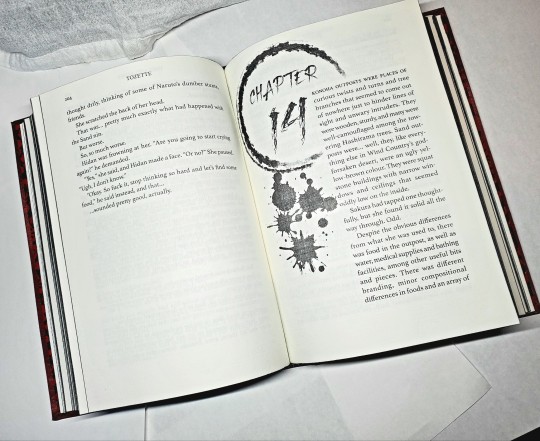
For the typeset, I leaned in hard on the blood sacrifice aesthetic, creating the Jashinist symbol for the front page (and also the cover) and using a font aptly called "Bloody Scratch." You can't see them here but for paragraph breaks there are little scythe.
@tozettastone, if you would like a copy I would be happy to make you one!! (I think my ask to you got eaten, feel free to dm).
159 notes
·
View notes
Text
I decided months back that when we eloped I wanted to give B a hand-bound book of poetry and journal entries I’d written about him from the beginning of our relationship until now, ending with my vows. @a-gay-old-time helped me make this desire a reality and executed it with so much care and attention to detail. It is perfection from the color scheme to the ocean/anchor motif. I am enraptured and I hope B loves it as much as I do.


652 notes
·
View notes
Text
to those of you booping me here, just FYI I boop back from @desmothene haha
10 notes
·
View notes
Text
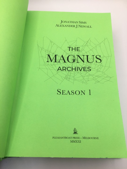
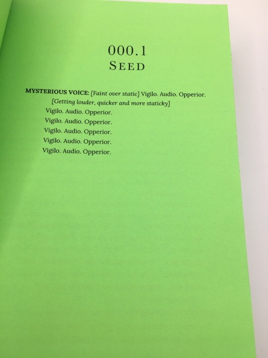
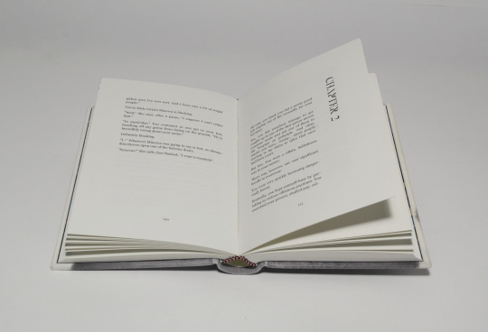
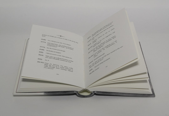
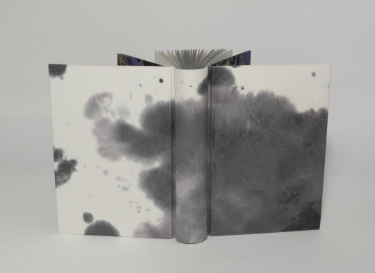
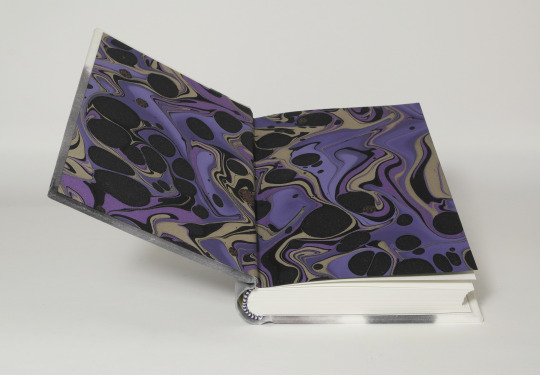
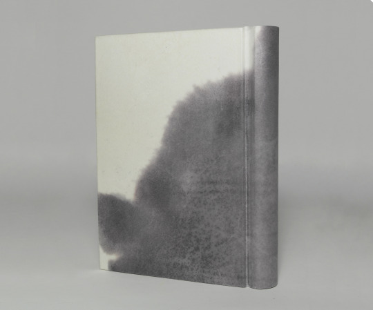
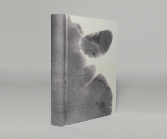
My last book on my poor little finishing press (rip) a lovely typeset by @pleasantboatpress of The Magnus Archives season 1 transcripts. My daughter picked the color scheme and really wanted to see it on green paper.


88 notes
·
View notes
Text

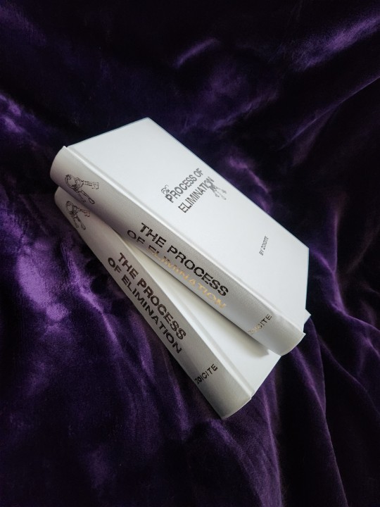

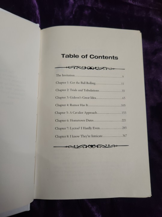
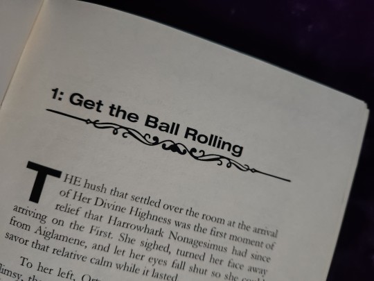
The Process Of Elimination, by zoicite/ @enechelon
The Emperor calls for eligible heirs to compete for a chance to marry his treasured progeny, Her Divine Highness, First Born of the First Reborn. Each week one House will be sent home until only one remains and the winning heir shall ascend to stand beside Her Divine Highness, hand in hand, with House replenished and legacy secured.
Harrow does not intend to compete.
or: THE bachelor AU!! This has been a longtime favorite fic of mine and it was such an honor to be able to bind it!! Sending out a massive thank you to the Zoicite for writing and sharing it with the world
Fandom: The Locked Tomb
Pairing: Gideon Nav/Harrowhark Nonagesimus
Title font: Neue Helvetica Bold Extended
Body font: Garamond
Pages: 471
Case: Arrestox Bookcloth White with hand-embossed gold foil
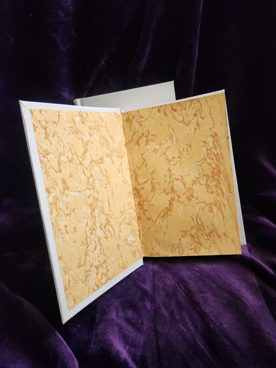
Endpapers: French Marble Pastel Goldenrod
Progress pictures/process under the cut!
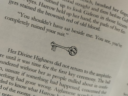
For the cover/title I went directly to the Bachelor logo for inspiration, replacing the classic wedding band with, of course, the ring of keys used in the fic!

The cover is heat embossed by hand, in the same way as my previous bind of Between the Devil and the Deep Blue Sea. For that bind I went pretty maximalist, and for THIS one I wanted to aim for a really clean looking, simple but elegant look. I think it turned out pretty good! I ended up going for the white and gold look to match First House Gideon vibes

I also tried rounding and backing here again, which turned out somewhat mixed. I'm still working on my technique for that, but peep the nice yellow headbands to match the endpapers!

Overall, this was SO fun to do, and a great excuse to revisit & spend good time with a fic I love.
220 notes
·
View notes
Text


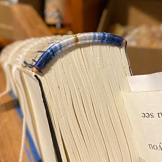
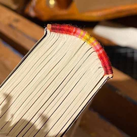

Love a good endband
82 notes
·
View notes
Text
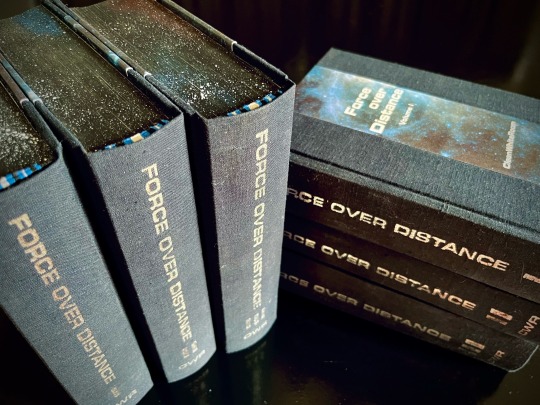
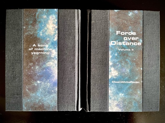
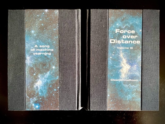
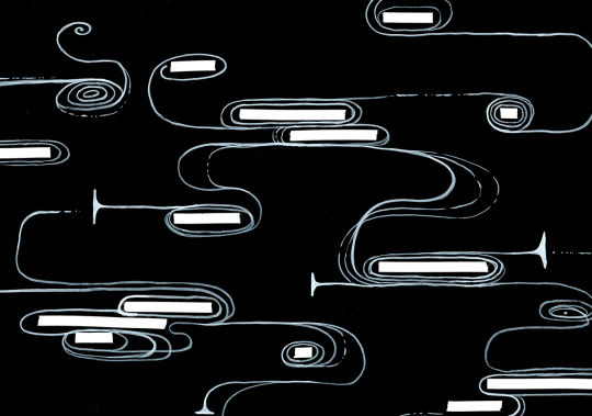


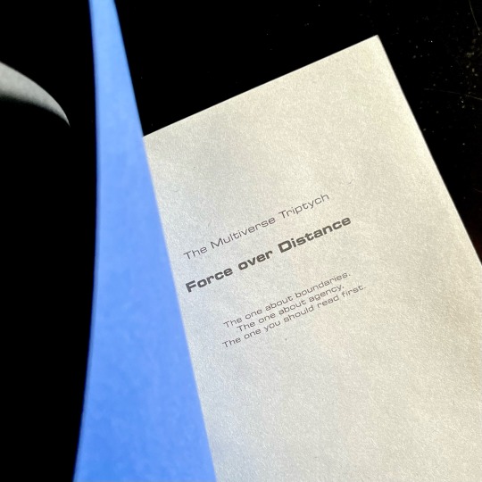
My magnum opus, the jewel of my Binderary round-up, the result of four months of hard work (that is to say, a lot of force applied over distance), the project affectionately known as The Motherfuckers (because it was rather unclear if I was going to finish these books or if they were going to be the end of me).
Force over Distance by cleanwhiteroom. It is currently also on AO3.
I was first introduced to this incredible story by a dear friend, who first sold me on actually watching SGU, and then said that they remember this fic since like 2011, which is always a promising sign. I went digging and found out I was in luck - the story was being rewritten and reuploaded on the author's blog. The next two weeks are described by the same friend as "one of the scariest moments in our cohabitation" as I'd spent literally every waking moment injecting the story directly into my eyeballs, and let me tell you, I'd not been doing a lot of sleeping at that time.
Then I gathered up my courage and reached out to CWR re: my burning desire to bind this story. And the rest, well. Let's dig into it, shall we?
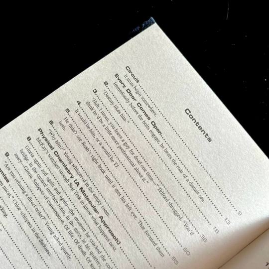
This was my first time typesetting 540k words. Considering I tend to prefer larger font sizes for increased legibility, it was immediately obvious that this was going to be a multivolume project. I settled on three, as it's the relationship between three individuals that forms the core of the story.
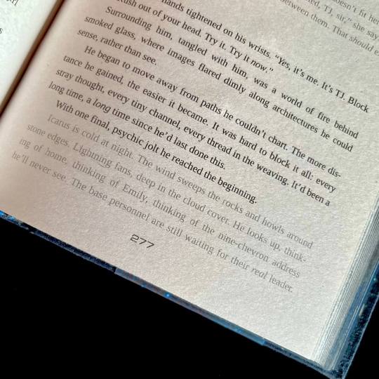
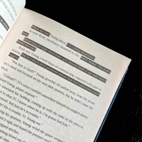
I also knew I wanted to keep the typeset in black and white, but play around with light and dark a lot. So I did. One of the first design idea I actually had was the way I wanted to handle projected speech. Mental link between Young, Rush and Destiny is THE most vital part of the story, and I wanted to make it immediatly obvious. I also wanted to be able to take one glance at the page and tell how much of the action is actually just two guys staring each other down :) Hence the blackout effect of thoughts being represented as light over darkness.
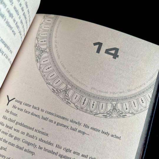
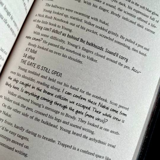
I also wanted to preserve as much of my reading experience as possible. So I saved all the chapter quotes/summaries in the TOC, and hid the chapter content warnings in the frame of the gate that marks the beginning of each chapter. For most of the chapter the warnings stay the same, so after a while you stop really noticing them, but then you open a new chapter and see that the familiar shape of the words has changed, and get this UH-OH feeling. Which, I think is very much how it works in my design, because when the warnings change there's usually another line of text added.
For flashbacks and dream sequences I switched from italics to a lighter shade of gray. I woudn't say it's more legible per say, but it's in keeping with the overall light/dark theme.
There are instances of people using handwritten notes in the story. I collected more than a dozen of assorted handwriting fonts, with each character having their own "handwriting". So when, for example, someone begins writing in someone else's hand, you immediately know it.
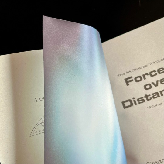
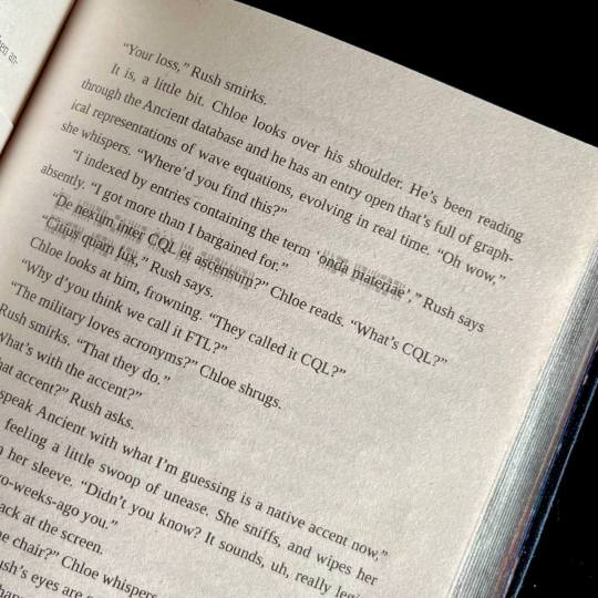
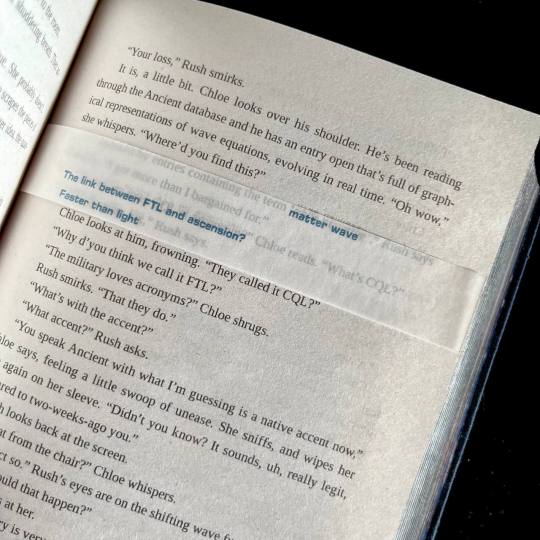
The most insane, labor-intensive part of the typeset, however, was the way I decided to handle the Ancient translations. CWR's gone through the trouble of setting up hover-to-discover for it, which gives you a very different reading experience than, say, having the translations in the endnotes. So, naturally, I said to myself that I want to replicate that, and footnotes just won't do the trick. So. Every instance of Ancient in the text has an underlay of light gray Ancient script. And an OVERLAY of paper vellum with the translation printed in blue. Now, not to toot my own horn too much, but if looks SICK AS FUCK. You also MAYBE SHOULD NOT LIVE LIKE THIS. For the two copies of this work I had to cut up 10 sheets of vellum into strips, and then spent from 20 minutes to an hour per volume tipping the strips in their proper places. I then had to wear kinetic tape on both my hands to help with the joint pain. (It was worth it.)
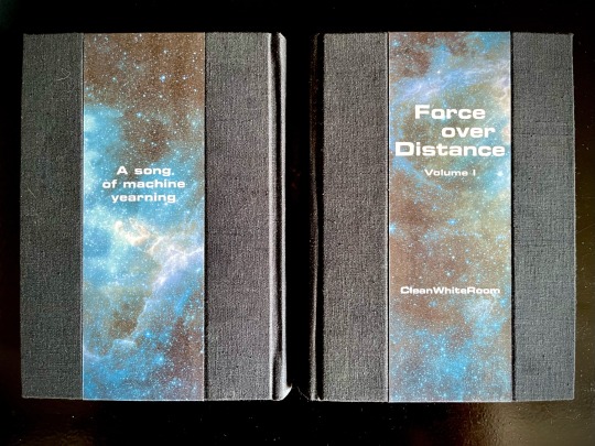
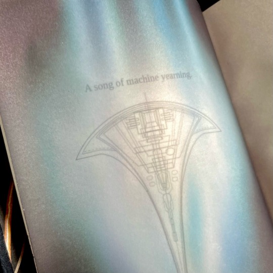
Now for the title spread. It is also paper vellum that you see as soon as you turn the first page (the half-title), and see it covering the title of the book and author's name. And then you turn it. And the shields sing the matter wave of Destiny through the black. And yeah, I think that's very, very clever of me, actually.
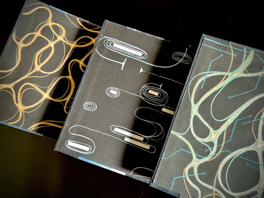
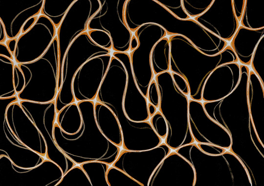
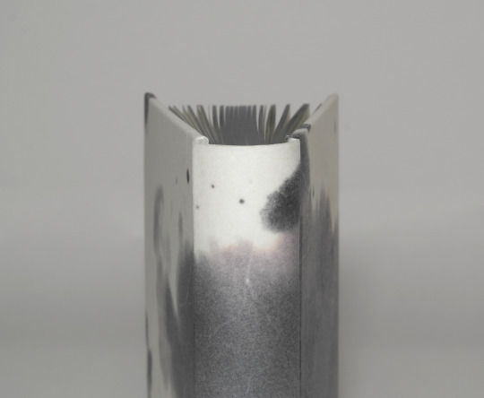
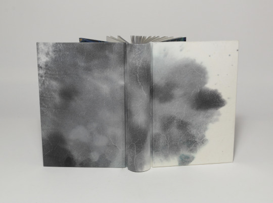
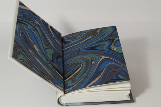
Then, of course, were the endpapers. All 12 of them are unique abstract paintings done on black cardstock by hand with brush pens and correction tape, I scanned a sample of each set for posterity. All of them are my interpretations of characters' midscapes. For volume 1 I went with the fire wind of Rush's thoughts. Volume 2 was for Young, and I went for the reverse blackout poetry effect (because for all the mental talking they do, the unprojected thoughts are opaque to their counterparts) and all the loops, hairpins and blocks he does. Volume 3 is for the combination - Rush's fire wind, changing its color to match the circuitry pattern of Destiny's AI.
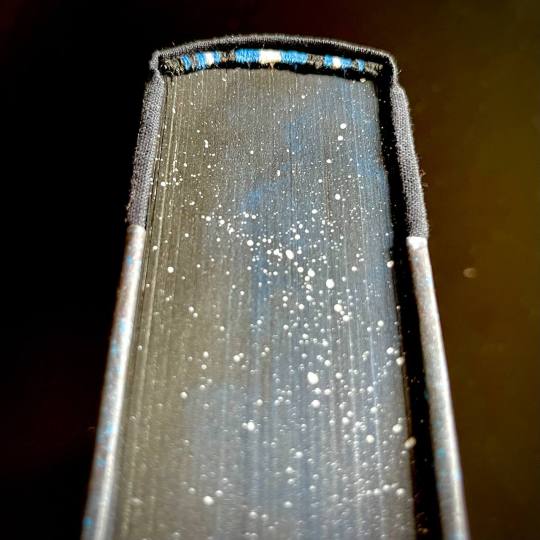
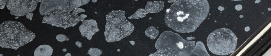
The rest, in comparison, is easy. All volumes are stitched with 3 strands of embroidery floss, a combination of black, blue and silvery-gray. The French double-core endbands are sewn in the same color scheme (though with a different shade of blue and gray switched for white for added contrast). The edges are painted and splattered to look like space.
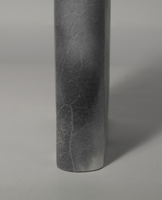
The covers feature my (signature at this point, I guess) half-cloth river pattern, with the base being dark blue linen and the printed parts being Spitzer telescope images of the W51 star forge, Jack-O'-Lantern Nebula and the Eagle Nebula (courtesy of NASA), waxed by hand for added sheen. The spines are foiled in silver with a foil quill.
Each set is 5 pound of solid hand-crafted book, with one set being my personal copy, and the other sent as a gift to the author.
And that's it, folks! This has been an incredible project to work on, and I'm very proud of what I achieved with it.
#god the details and the sexiness in these books is just so so gooooood#my god#SEXY BOOKS I STILL CANNOT EVEN. AND THE PHOTOS?? RIL??? IM DYIN#THE EDGES#THE ENDBANDS#THE EXQUISITE USAGE OF THE TRACING PAPER I JUST WANT TO EAT YOUR BRAIN. STILL#all to say: it's very sexy hello hello helloooooo#i want to monch on these books hehehehe
429 notes
·
View notes
Text
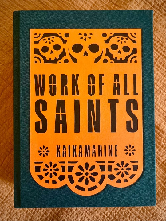
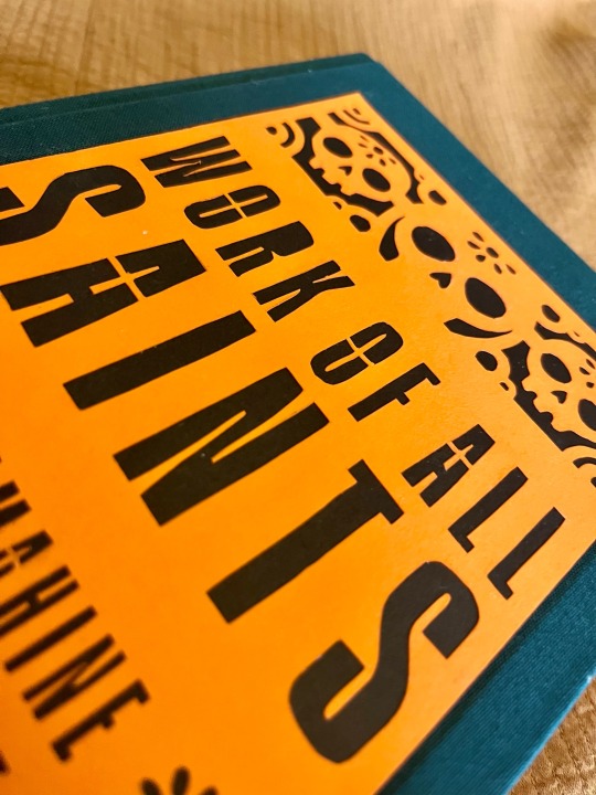

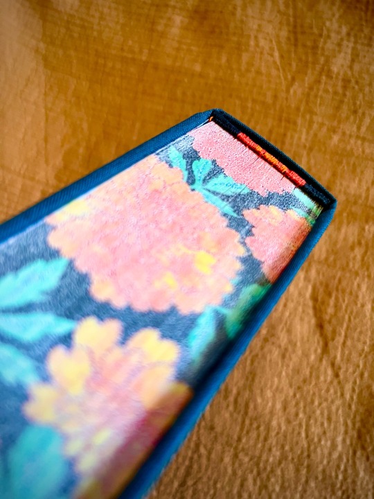


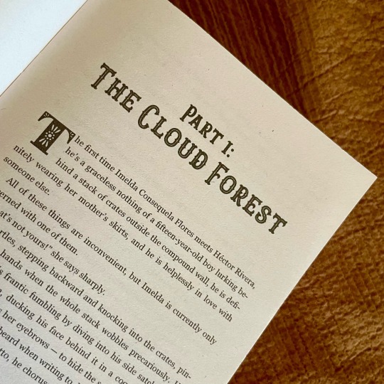

Work of All Saints by @kaikamahine
What is fanbinding if not an elaborate system of fic recs? A while back my esteemed colleague @pleasantboatpress recommended this story, and I really wanted to try my hand at binding it.
🏵️ I knew I wanted to give the typeset an old-fashioned vibe with some fun twists, referencing both el Día de los Muertos and Mexican culture in general; hence marigolds used for endpapers, frontispiece portrait frame, and scene dividers.
🏵️ Choice of drop caps was inspired by papel picado, and then I decided to just go apeshit on it, and cut out actual an papel picado banner for the cover. So I did! By hand! With a modeling knife! And backed it with black paper for added contrast.
🏵️ I need to maybe back off of foiling for a bit, because the tip of my index finger is loosing sensitivity, but! Still used it to title the spine (note two more marigolds).
🏵️ I actually decided to try a new method of edge decoration on a whim, and I couldn't be happier with the result. Transferring digital prints on the book edges has its limitations, but it's also quick, easy, and relatively mess-free and painless when compared with my usual adventures with acrylic paint.
237 notes
·
View notes
Photo

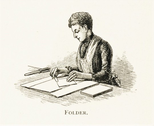


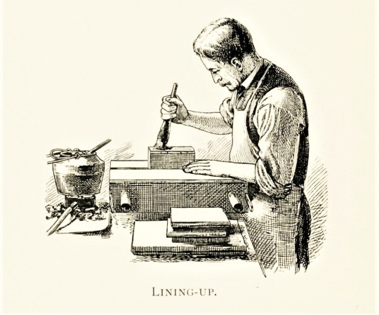


Wood Engraving Wednesday
Here are a few delightful wood engravings from a recent gift showing the various processes that go into binding a book. This little pamphlet is entitled A Short History of Bookbinding and a Glossary of Styles and Terms Used in Binding … .printed in London at the Chiswick Press for the bookbinder Joseph William Zaehnsdorf in 1895.These images were probably printed from metal plates that were made from the original wood engravings. The engravings are not attributed, as was the case for most commercial engravings.
Click or tap on the images to see the definitions for these activities as provided in the booklet’s glossary.
View more posts with wood engravings!
2K notes
·
View notes
Text
As promised! I wrote about the illegal fanbinding that's led to writers deleting their works recently, how that connects to the current pull-to-publish wave, and what happens when the rapidly expanding sphere of fic readers starts to get disconnected from *fandom*:
The ever-increasing reach of fanfiction has inched the practice away from text-written-in-community to a more traditional author-reader relationship—and the context collapse that’s come with viral works being treated like any other romance novel has spurred clashes between different types of readers with different sets of expectations.
In the past few years, fic authors across all corners of fandom have increasingly complained about shifting attitudes from readers who treat them like any other content creator, demanding the next chapter as you might demand your favorite influencer’s next video. But unlike on creative platforms like TikTok and YouTube, the fic writer doesn’t get revenue from their new installment.
We'll also talk about this in some capacity on the next episode of @fansplaining! (In contrast with today's episode, on the non-monetized, gift-economy practices of many fanbinders, whose hobby is also imperiled by the people selling and buying fic.)
7K notes
·
View notes
Photo

Practical Results by anonymous
This isn’t his bedroom - not the one at the compound, or the suite in Milan. Definitely not the penthouse in New York. In all honesty, it looks like the inside of the fucking Spaceship Earth ride at Epcot.
For design info / materials / binding process, read below the cut.
Keep reading
#friend book#SPACE THIS IS SO SEXY WTF#damn dude i am just. hello#you come up with such cool ideas god damn
183 notes
·
View notes
Text


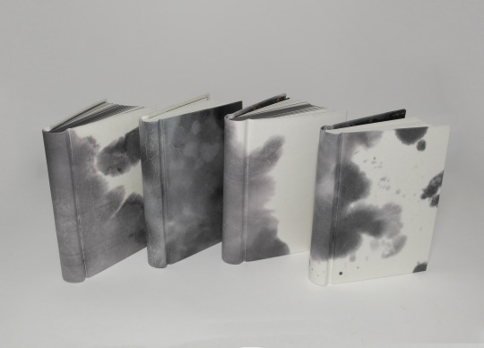
Detail pictures of my bind of Call Me Menace & Villains Never Retire by wingedcat13
I tried for a shadowy design since that felt most fitting for Synovus. It is not as dark as I had liked in some areas, but I love how dying the vellum brings out the different structures in the skin. The small veins and sometimes even the pores. All depending on what part of the hide the material was cut from and so I just kept it as it is.
Thing is, one never quite knows what comes from dying vellum, but despite all it's finickiness and surprises it holds in stock, there are things parchment can do incredibly well. Like having really nice corners where the edges of both turn-ins blend almost seamless into one another.
68 notes
·
View notes
Text
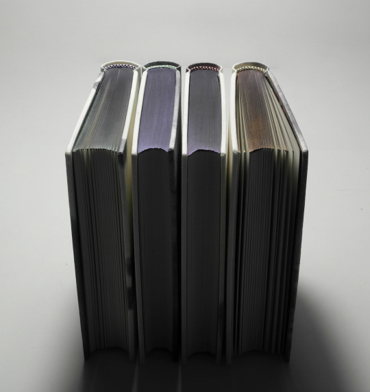
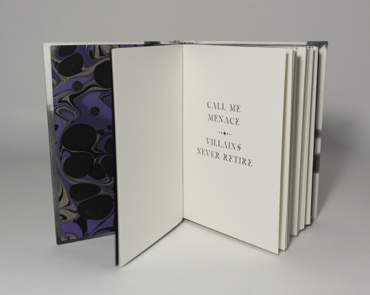
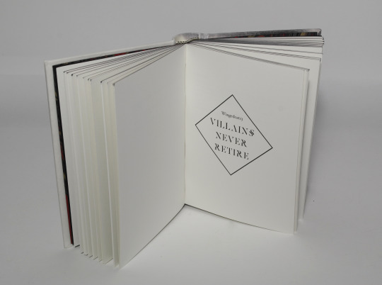
Call Me Menace & Villains Never Retire - wingedcat13
Four alterations of the same book that I had the joy to hand over in person as a surprise gift to @desmothene, @pleasantboat, @finalfrontierpublishing and @fantailpress on a meet-up this January.
Many thanks to @wingedcat13 for the permission to share her work.
Read the Call Me Menace here
and Villains Never Retire starting here.
Materials used
book case
boards - museum board (white)
counter pull layer on boards- museum paper (white)
spine stiffener - photo cardboard (white)
vellum (calf parchment) coloured with alcohol based stain - cover material
inner book
textblock paper - Schleipen fly 05 115gsm
endpapers - marbled paper by Renato Crepaldi
endbands - buttonhole silk
coloured top edge - chameleon acrylic ink


#friend book#they are SO BEAUTIFUL#and wonderful to touch. it was so thoughtful and wonderful zhal#thank youuuu
198 notes
·
View notes
Text
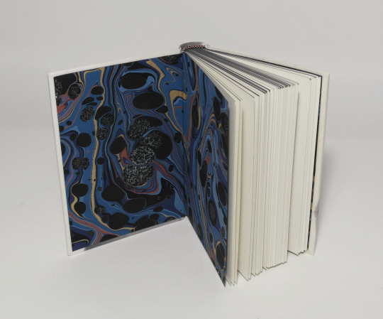
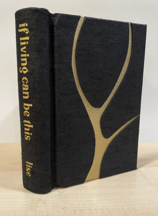
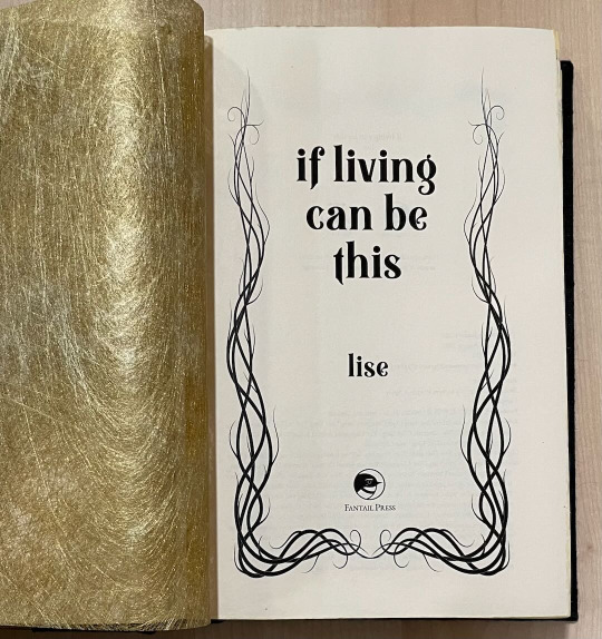
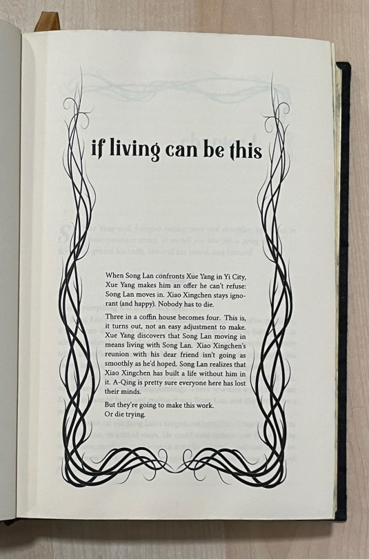
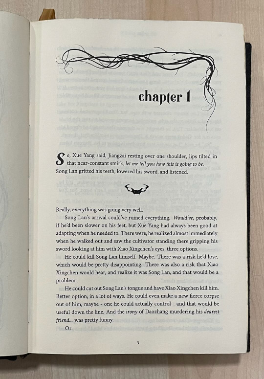
If Living Can Be This (MDZS)
If you asked me last year, after having bound a MDZS fic without knowing anything about the show/books, whether I would go ride or die for the fated main pairing with decades of pining, or a poly trio featuring a sadistic mass murderer and the two people he tortured the most, well... you can guess what I would have answered. But within a week after finishing CQL, I blithely ignored all the WWX/LWJ fic recs people had lovingly curated for me and instead read every single Yi City trio I could possibly find.
While there are many, MANY righteous sandwich fics near and dear to my heart, the one I keep coming back to is If Living Can Be This by @veliseraptor. She took those glimpses at what Xue Yang could have been and shifted the story just a little to the left and looked at how the Yi City arc could have gone in a very, very different direction, and all without "redeeming" Xue Yang or ignoring how dangerous he was and still is.
So when I got wind that @misanthropiczombie had requested it for this year's Renegade Exchange, I engineered my way into being her giftee (ie, begged the mods).

This is a chonker of a series; while the main story is around 74k words, with the sequels it was about 180k, which translated to 572 pages! Originally I was going to do a typical rounded andbacked cased-in binding, but then a fellow Renegadee mentioned springback designs, which have a "spring" mechanism that forces the book to lay very flat when open. For such a big book that is unlikely to be read while lying down in bed (I mean, do what you want but I am not responsible for broken noses), this seemed like a GREAT time to learn an entirely new binding technique in less than a month. :D But as you can see, it lays VERY flat.

This is also the most complex cover design I've done so far - I used a vine motif for the typeset and wanted to emulate that in the cover, so after consulting with @celestial-sphere-press on her river bind cover, I cut out pieces of cover board for a moderately difficult onlay design.
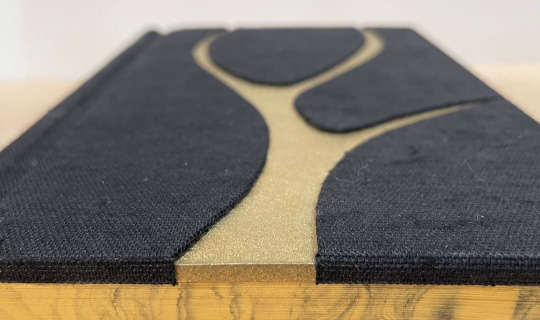
I went with black and gold as the overall theme and also did some suminagashi for the edges to match the marbled endpapers and because It's What Xue Yang Deserves. At the same time, the book cloth is very nubby and textured to reflect the austere life they're living in Yi City at that point.
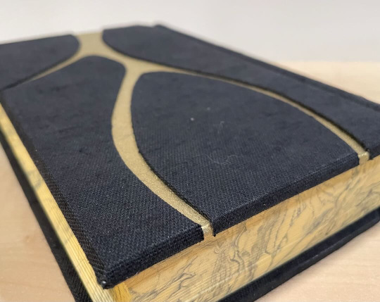
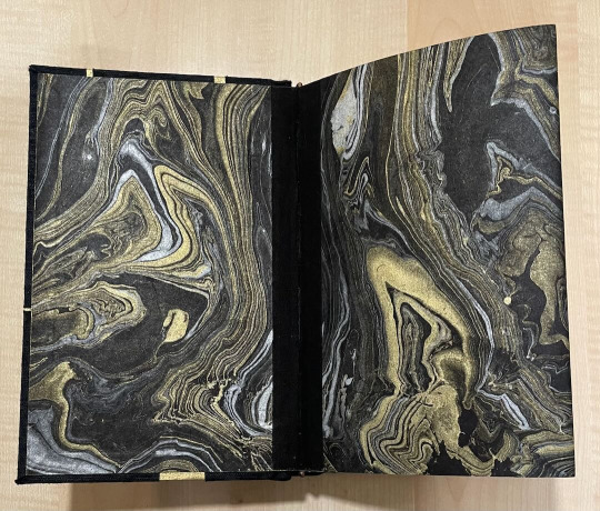
Because there clearly wasn't enough gold in this book, I added a fibrous gold flysheet to partly obscure the title page.

In one of the additional stories, Song Lan compares Xue Yang to a strangling vine that is aware that it could be ripped out at any moment. I used that as inspiration for the title and chapter ornaments. The text dividers are Jiangzai's hilt from CQL.
While the springback design was looooong, I did enjoy making it and may even do it again for mine and/or the author's copy! Or maybe I will cop out and just do rounded and backed cased in, we shall see. :D
Many, many thanks to the Renegade crew for supporting me during this bind. This one truly took a village and I would not have been able to do it without them!
391 notes
·
View notes
Text
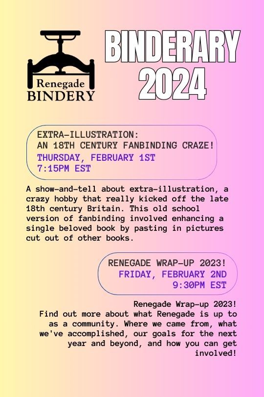
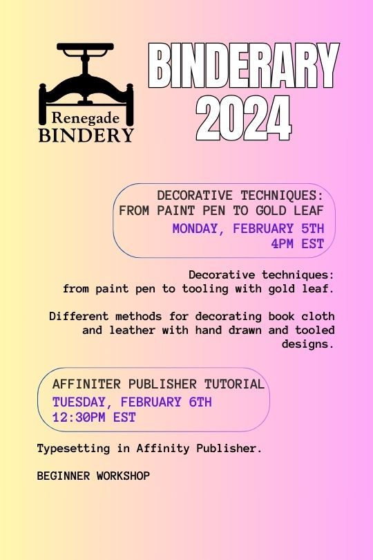
Binderary 2024: Week 1
In the Renegade Bindery Discord Server, we are once again running Binderary during the month of February. Attendance is free, and a link to the 18+ Discord Server can be found on our carrd.
Whether you’re new to the world of bookbinding or an aged veteran, join us for a month of binding fun! This event is all about community & learning, be it trying something new or refining existing skills.
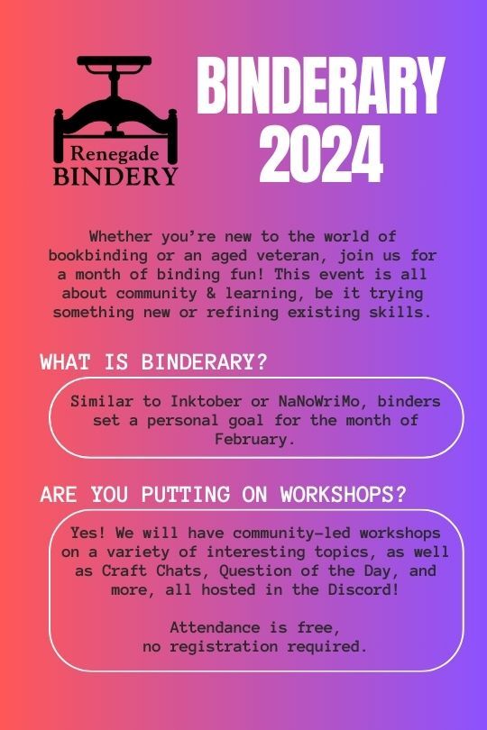

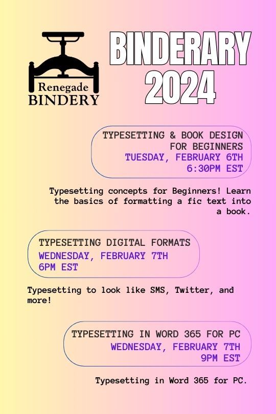

All our workshops are run by members of our fanbinding community, and some of them are even on Tumblr!
Here's the list of who's running the week 1 workshops:
Renegade Wrap-up 2023!: @robins-egg-bindery, @fanboundbooks, @celestial-sphere-press
Split Board Bindings!: @misanthropiczombie
Decorative techniques: from paint pen to gold leaf.: @blackoakbindery
Affinity publisher tutorial (Beginner Workshop): @kate2kat
Typesetting & Book Design for Beginners: @bearclubbooks
Typesetting Digital Formats: @sayornispress
Typesetting in Word 365 for PC: @no-name-publishing
528 notes
·
View notes
Text
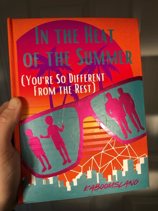

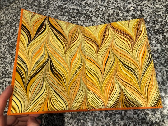

so!!!!! the incredibly generous and talented @whimsyquill contacted me a few months ago asking permission to bind a copy of my IT/reddie fic to then send to me as a gift. And here it is, and I am BLOWN AWAY by how beautiful this is!! (Tumblr’s image upload function isn’t working properly so I can’t arrange the photos but LOOK) The hazy orange 80s vaporwavey theme works so perfectly with the vibe I tried to achieve in the story, I’m seriously in awe that people can just make a beautiful book by hand. I had very little input on the design, so this is all just her creativity that I was wholeheartedly on board for, and I’m very grateful that anyone has ever put effort into making something for a fic I finished over 4 years ago now. Thank you so much, J!
Now, alongside this copy that sightetsound made, I have two whole books of my own writing 😅 very surreal
33 notes
·
View notes