
Don't wanna be here? Send us removal request.
Statistics
We looked inside some of the posts by poecatherinek-g and here's what we found interesting.
Average Info
Notes Per Post
0
Likes Per Post
0
Reblog Per Post
0
Reply Per Post
0
Time Between Posts
1 day
Number of Posts By Type
Text
17
Last Seen Tumblr Blogs


Fun Fact
The KCSC sent more than 20K requests to delete posts related to prostitution and porn to Tumblr from January to June 2017.
Text
Puzzle lid design
I started by cropping my illustration into a square. Luckily, nothing too integral to the design got cut off in this process.

To the newly cropped illustration I added the text that would be on the lid however I didn't worry too much about the placement and font I used as I would be changing those details later on anyway.


The font I ended up picking was the one I had used in the last project for my book cover. I was originally was going to start off using this one and go form there as I had no clue what to use but it actually worked so I kept it.


Once I had changed the font and the colour of the text it was time to add the finishing touches. I didn't want to add too many effects and details onto the title so I just opted for a simple drop shadow and stroke which I think suites it very well.


Finished design:

0 notes
Text
Why do we do puzzles?
I personally don't do puzzles all that much though I do remember doing them when I was younger. I think I'm not a fan of them because they can be so tedious and time consuming so I would have to be really into the illustration/ theming of the jigsaw in order for me to do it although I can see the appeal that they have to people as they can act as a distraction or just something to do to pass the time when the weathers bad.

Puzzles have been shown to help people with dementia when it come to cognitive stimulation and dexterity as they have been specially designed for people who may not be able to hold standard pieces.
0 notes
Text
History of Puzzles
The first "Jigsaw" was produced by engraver John Spilsbury in around 1760. It consisted of a map that had been glued onto a flat piece of wood which had then been cut following the borders of the countries. Since then, jigsaws saw some rapped growth especially nearing the end of the 18th century due to the rise in Lithographic printing as well as the invention of the Tredle jigsaw meant that puzzle makers could now create even more intricately shapes pieces which aren't as common in modern puzzles seen today. The shape of the pieces isn't the only thing that has changed over the years. For example, the material used to create puzzles evolved from plywood to paperboard and now due to new technology/laser cutters, acrylic.


0 notes
Text
Manufacturing puzzles
Both of these companies advertise being able to manufacture bulk orders however I can't get a price range because that requires getting a quote. I imagine that the more you order the lower the price is as it's normally cheaper to mass produce something than have it be a one-off thing however if your product isn't marketed well you could end up losing a fair bit of money. These manufacturing companies offer a good range of options when it comes to the material your puzzles is made form and now its printed.


0 notes
Text
Working on the poster
I thought this poster was lacking some visual interest so I decided to add some weathering /texture. All I did to achieve this effect was find an image I liked on the web, copied it into Photoshop and then enlarged it to fit my canvas. The last thing I did was set the layer to overlay and lowered the opacity. I tired this out with another texture just to see if I would like it better than the first one but I didn't.


Another thing I had to do was change the font I had originally used for my text as it apparently didn't exists on the Photoshop I was using at college. To look for an alternative and better font, I went onto Dafont to hopefully find a handwritten looking one. I wanted a this type of font because I wanted to make the poster look like it had been created by someone. This was the font I ended up choosing:

Whilst working on the poster I thought about adding some of the sketches I drew a couple of days ago to it. I didn't want to make full illustrations out of these little drawings so I tried to keep their sketchy quality whilst still to giving them some level of detail and texture through the brush I used.


This is what the poster looked like after I added the two drawings I had just done. Because of these additions I had to change the composition around to make sure all of the elements fit nicely on the page which meant I had to scale down and move the text and the colouring page. With the sketches now in place I was left with quite a large space going down the side of the page. I didn't know what to put in it so I spent some time creating more ruff ideas of what could be put there but none of them looked right. In the end, I settled on re- drawing a sketch I had done back when I was making the sculpture of my rat and needed to figure out what position to put him in.


Overall, I'm pleased with how this poster turned out despite it being thrown together quite last minute.
Finished poster:

0 notes
Text
Starting on the box
This is a brief design for my puzzle's box.

I started by making the first mini version of the box. In this trail, I was figuring out the net of the parts I would need. After getting some advice on what would work the best for the design, I got to making a full sized mock up version.


The first pattern I drew out wasn't to scale and was far too small so I had to redo it. For both parts of the box, the lid and the base, I used A3 paper and just slightly adjusted the measurements when working on each part as I wanted them to slightly differ in size so they fit together easier. The end product turned out well however I may change the size of the smaller box just because it's a little too small now compared to the lid so it looks a little awkward.


0 notes


Text
Making the puzzle
The first thing I did to prepare my illustration for the last step of the process was print it out on A3 paper. I cropped the illustration around the outside just to be sure that it would fit nicely on the board I would be gluing it to. Using the spray mount was pretty straight forward as all I had to do was give the back of the image a good coat then line it up with the board and smooth it down. One issue I did have with using this fixative was that some areas of the image (like the corners) didn't get as much spray on them so they didn't stick.


After the spray mount had dried down, it was time to get it cut. When it came to using the laser cutter, one of the main things I had to keep in mind a try and find a solution for was it burning my puzzle. To try and negate as much of the burning as possible I decided to have my puzzle be cut upside down so the laser went through the thicker board and then the image instead of having the laser go directly onto the drawing and potentially ruin it. After the machine had finished cutting the pieces, it was time to take it out. Originally, the puzzle would of remained intact however, the paper that was put under it that would of been used to pull it out on had also been cut through so it ended up having to be broken apart and taken out that way.
As for the quality of my drawing after the laser cutting process, it still looked noticeably burnt despite my effort to stop that from happening however having my puzzle be a little burnt added some indirect weathering and aging to it.

These are just some extra doodles I did to further play around with the dynamic between the Great Pirate Rat and the Albatross. I think they turned out quite sweet.

0 notes
Text
Operation
Since being published in 1965, this game has had many different designs as well as collaborations with franchises like The Simpsons and Despicable Me. Some of the main changes this board game has had over the years involve the font and composition of the box as the illustration itself hasn't really changed much between the different iterations of the game. Giving the game unique graphics and font really helps it stand out amongst other board games and the versions that are based on other pieces of media open the board game up to bigger audiences.


0 notes
Text
Starting on the poster
I was inspired to add this alongside my puzzle by Adam Simpson as his puzzles, especially his Dracula one, are accompanied by a poster of the full illustration on the front and information about the story its portraying on the back.
I originally tried adding a black and white version of the drawing on the back but I didn't like how it looked so I decided to change it to just the line art and make a colouring page out of it.


I then moved onto writing a bit of story/context about the characters. I wanted the text to go in a "L" shape but what I wrote ended up not being as long I thought so I had to play around with the position of the text.

This is the composition I ended up with. I like how it looks but it does look a bit plain so I may go back in and add or move some bits around.

0 notes

Text
Playing around with Layer modes
To add a little extra flare to this piece, I asked my friend what they would do and they recommended making a gradient on top of the whole piece and then experiment with different layer modes.
Illustration and gradient before I adding lighting/ layer modes:


Soft light 68%:
Although this mode gave things a subtitle yet even glow, it didn't give the intensity I wanted in certain areas however I liked how it slightly altered the colour of the sea.

Linear light 43%:
This one looks quite similar to the soft light filter however the areas in the darker part of the gradient look a little too shadowed compared to the environment/lighting acting on the subjects in the piece.

Luminosity 51%:
This was the mode I ended up choosing out of what I tried. What I liked about this one is how vibrant and saturated it made the colours look which reminded me of Polaroids. The change in vibrancy especially when looking at the blue, made the tones used for the sea and the sky look different from each other which helps make the composition easier to follow.

Luminosity 31%
For this trial instead of using the gradient, I put a layer of orange over everything to see how it would look compared to using black/grey as well as the luminosity mode. Although I like how bright the colours are with this filter it made the image look weirdly hazy.


0 notes
Text
Working on the background
Next, I started working on the things on the horizon of this piece. I didn't want to give the islands and ship a lot of detailing as it wouldn't necessarily be easily seen when looking at the whole illustration but I gave them just enough for them to not look out of place.

Originally, the sky was going to be clear with a slight gradient around the edges of it however after getting some feedback I decided to add some clouds and see how they looked. I started the clouds by making some lose marks then once I was happy with the placement I fleshed them out. One of the last things I did to the clouds was add a slight blur to them with the Gaussian blur filter.


After I was finished with the majority of this illustration, the last thing I had to do was finalize the lighting. Most of what I did for this was just building on what I had previously done and making the highlights on things like the waves and pirate ship more exaggerated. Whist doing this I had the idea to draw some sun rays just to add some visual interest and dynamics to the lighting.

0 notes
Text
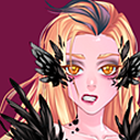
Starting the great pirate rat!
Once I was happy with how the Albatross looked, I moved onto adding some other details to the saddle and then got to shading the rat. First, I added on his beige markings and then built up his fur texture using and layering different shades of browns together. When it came to his fur I wanted it to look messy and disheveled so I tried to imitate that through the of lines and brush strokes I used.


Once I was happy with the fur, I moved onto adding depth to the rest of my rat being sure to add bright highlights onto the bits of the design that will be caught in the sun. After that, all I had to do was colour over some bits of the line art to make it look smoother as well as adding some small details (like extra bits of fur and his earrings) which I did on a layer above everything else.

0 notes
Text
Continuing the colouring process
Developing on the progress I had made last time, I continued to work on and refine the sea however as I was adding to it I noticed that it looked quite flat and calm looking so I decided to draw in some bigger and more dynamic waves. From there, I was able to blend both layers quite seamlessly just by adding more and more colours onto each other to build up the shadows and highlights on the water. After working on this part of the piece for a while I thought it was time to take a step back from it and work on another part as I didn't want to finish the sea and have it look drastically different to the rendering style I use for the rest of the illustration.


Moving away from the sea, I decided it was time to work on the albatross. I started by doing the initial shadows using a multiply layer and then adding depth by using a range of mid tones and dark tones as well as adding the most recognizable part of an albatross, the back tipped wings and feathers. With the black added to the bird, I think it gave the drawing some much needed contrast especially between the two blue sections in the drawing.


0 notes


