
Although I have not taken an Photography class before, I am interested in learning about it.
Don't wanna be here? Send us removal request.
Statistics
We looked inside some of the posts by poki234 and here's what we found interesting.
Average Info
Notes Per Post
1
Likes Per Post
1
Reblog Per Post
0
Reply Per Post
0
Time Between Posts
6 days
Number of Posts By Type
Text
15
Last Seen Tumblr Blogs


Fun Fact
Tumblr was the first site to host the blog for President Barack Obama in 2011.
Text
Week 14 Artist Research Blog Post
Rohina Hoffman is a fine art photographer who specializes in capturing photos about portraiture and the natural world to describe a variety of themes such as identity, home, women issues, and adolescence. Hoffman was born in India and raised in New Jersey growing up with a family of doctors of three generations. Hoffman was an undergraduate student at Brown University, Hoffman also studied photography at the Rhode Island School of Design and was a staff photographer for the Brown Daily Herald. Eventually all of her education experience has led her to becoming a neurologist gained from Brown University Medical School and the UCLA Medical Center. There, Hoffman has developed a unique experience between gaining trust from both the doctor and the patient. Hoffman’s apperciation for developing personal connections with other patients had led her to her first monograph called “Hair Stories” at Brown University’s Alpert Medical School. Another one of Hoffman’s creative projects also include a nutrition and pandemic theme based project called “In Gratitude.” In Hoffman’s Artist Statement, she talks about capturing her own photos about herself, her husband, and her three children showing the viewer what food products they use to provide fresh meals for each other. Despite the adversity of Covid-19, Hoffman thinks about her family by cooking meals for them and balancing her work schedule as well. Hoffman also talks about Covid-19 changing her own approach to preparing meals for her family to be safe from the pandemic. Hoffman clearly describes that the human being is not always perfect to see the simplicity between the food products displayed in her portratures as it is enough for her to be satisfied with life everyday. One piece of work that Hoffman has shown to the viewer is a cut off photo of either her husband or one of her three children holding a group of avocados in their shirt. In this photo, Hoffman’s husband or one of her three children is wearing a maroon shirt in contrast to the vibrant green avocados. The way that the figure is holding out the avocados in a way where Hoffman’s family is offering their advice and opinions about what viewers should do when they come across these different food products. There is a good control of diffused frontal light on the figures’ hands surrounding the vibrant avocados as the figure is facing the viewer without showing their face. Pershaps the photo being taken took place on a cloudy day with less harsh lighting directly shining on the figure being present here. The way that the hands are positioned does create some diagonal lines leading from the shoulder of the figure to the hands holding the avocados. What appears to be a green and yellow leafy background, Hoffman wanted to have a smaller depth of field by lowering down the aperture from her camera to make the figure holding the vibrant avocados stand out, almost bringing the subject into the viewer’s space. Hoffman also provides a process list below the photo labeled “avocado toast” which shows a step by step process on how to use complex food products such as avocados to create delicious avocado toast.
2. Based on this specific photo, I would say that I like this photo because Hoffman told a story of her family managing to survive throughout the hard reality of when the pandemic striked down food products. I admire the complementary colors of red and green being combined together to create unity in her story: red from the maroon shirt of the figure and green from the vibrant avocado. The choice of blurring out the yellow and green leaf background was a great choice to make the subject stand out from the background, though I would think that keeping the leafy background would help to add on as a reminder of how hard our local farmers push into growing fresh crops for the world to consume. She included a member of her family to give the viewer context about how much Hoffman will do anything to support her family despite her busy work schedule. Her main idea of simplicity is key becomes a powerful statement that creates some type of theme in her project “ In Gratitude. Complexity does help to give variety and a chance for artists to experiment with different materials to create something memorable that has some meaning to them. Though due to the hardships Hoffman has mentioned about in her story, Hoffman has provided a new perspective for the viewer to not think about “More is better”, instead it falls into the range of “Less is more.” If I was to produce something similar to the creative approach of Hoffman’s projects, I would capture individual photos of my mom cooking dinner similiar to the photos taken from my theme project revolving around why my family is important to me. If I was creating this potential project, my thought process would be to find particular moments of my mom preparing different food products in their raw form and then show particular moments of her cooking the food products with some seasoning to make the dish taste better. Additional ideas are to capture my mom tossing the food or take close up shots of the food without showing too much of the kitchen since the food products being cooked would be the focus of this project. I am aware that my previous photos from my theme project may have came out too yellow because I did not control my white balance properly and I used tungsten lighting instead of adjusting the actual color temperature meter in my camera settings. After I make my adjustments as needed and capture photos of my cooking, I would like to show the after effect of presenting the delicious dishes in a container to give dishes their own shine for presentation before my family members consume it because I would need to capture the finished dishes on the table quickly before to prevent my family members from being impatient with me.

Avocados For Avocado Toast by Rohina Hoffman
Avocado toast
Crisp the whole bread
Crush avocado, refresh
With a squeeze of time
Paint onto base
Eclipse With Sliced Radishes
A fried egg sunrise
4. Covid Projects: Rohina Hoffman In Gratitude:
0 notes
Text
Week 12 Artist Research Blog Post
Kannetha Brown is an Cambodian-American photographer who focuses on capturing photographs of her own family or other family that have gone through the similar to her family. To give some context about Cambodia, between 1975 and 1979 Cambodia went through a deadly genocide under the rule of Pol Pot and the Khmer Rouge Regime. As a result of both the actions of Pol Pot and Khmer Rouge Regime, approximately 1.5 to 2 million people of the country’s population were killed. Kannetha Brown’s mother, Sara had endured that trauma when she was five years old and was separated from her Kannetha Brown’s grandmother, Simone, who later received an opportunity to move from the hardships of Cambodia to the United States for the entire family to start a new life. Nine years later, Sara and Simone would be reunited again when they both moved to the United States. Despite all of the pain and suffering Brown observed from her family’s history, she would later conduct projects dealing with ideas such as migration, generational trauma, and displacement. Some of the projects include “Familial Stranger” where photos are captured in Hilton, New York where her grandmother lives and another project called “Two Oceans” is about capturing photographs of Cambodian-Americans' existence in Rhode Island to show their potential similar struggles as what her family has gone through. Brown was emotional at first to take photos of her family as she had a hard time accepting and moving on from the traumatic events, but it gave her motivation to tell her family’s story by showcasing their faces to determine what kind of role they play in her projects. One piece of work that Brown has captured from one of her projects called “Familial Stranger.” There, a photo of her grandmother, Sara, in a balanced lighting bedroom sitting down with her legs crossed over. In this photo, it is clear that Sara is the main character of the composition as Brown wanted the viewer to focus on the actions her grandmother is doing. There are two symmetrical lamps on both sides of the bedroom with an imaginary line between Sara’s neck to create a chain link. Pershaps it can be interpreted as a chain link between the family relationships of Brown and the emotional experience with her grandmother or it could be a painful memory of when Sara’s daughter was once separated fromher during the genocide under the rule of Pol Pot and the Khmer Rouge Regime. It could also explain the reason why Sara’s facial expression can be seen as concerned or worried for something happening in Cambodia as she is looking in the direction of where the window is. Even though Sara was given the opportunity to move to the United States to start a new life with the whole family, the traumatic event she has endured will never be forgotten from her mind no matter how many years pass by. Brown not only makes her grandmother the main focus of the composition by only placing her in the center, she also uses a variety of lines to point out “Observe the pain and suffering that my grandmother went through” to leave a powerful impression after the viewer was done looking at this specific photo. For example, the black pole of what appears to be a light pole on the left side of the composition is tilted diagonally to move the viewer’s eyes back to Brown’s grandmother; the triangle shape of where both the lamps and the flower painting in the middle ground help to connect Sara’s story with the objects ; and the diagonal lines on the ceiling all create imaginary lines pointing back to the main subject of the composition.
Based on this specific photo, I would say that I like Brown’s creative approach of choosing her grandmother as the main subject of the composition because Brown clearly stated that she had an emotional experience while creating this project with her grandmother. I can tell her grandmother holds a deep place in heart. Perhaps Brown did not spend as much time with her grandmother as she may have had her own problems to worry about and she wished that she would balance more of her time with her family than her own problems. All of the objects in the composition were nicely done by Brown, no objects seemed unclear to mask away the objects in her grandmother’s room as they helped to support her story. As I have mentioned before, Brown had an emotional experience in approaching this project. She even stated herself “I’ve always avoided taking photographs of my family because it hurts… and it’s extremely difficult to photograph. Photographing my famly tells my truth, and it's a way to accept it and memorialise it” (Brown para. 4). In this case Brown’s truth was for the viewer to remember how war and hardships from foreign countries can help to cause a positive tranformation. Brown may have been uncomfortable to share her story with the viewer at first, after she created this project about her grandmother it gave her strength to tell a unique story of other Cambodian-Americans who can connect back to her grandmother’s story of why she came to the United States. If I was to create something similar to what Brown has made for her projects, I would capture pieces of photos with my family members because they have helped me before in this journey of life and I want to show the viewer a positive side of my family rather than the negative side because sometimes I have trouble balancing my academic life and my personal life that I have the tendency to favor one life over another. To make my message clear to the viewer, I would like to capture different things my family members are doing in the moment without having them to pose for the camera to create a natural scene of characters interacting with things they enjoy doing or activities that they interact with each other. Also, applying myself in the photos would help to make my project more meaningful to the viewer instead of questioning “Why are you showing different members of your family?” I am aware that I have a large family though some of the moments I plan to create such as the photos from Dog House Grill, Pine Flat Lake, or special moments during my mom’s birthday pass through very quickly. Once my camera is pointed at the main subject, I have to be ready to capture the picture that I want to take otherwise the memorable moment might pass away and never come back as the same moment.

Familial Stranger by Kannetha Brown
Kannetha Brown explores family, trauma, and survival:
0 notes
Text
Week 10 Artist Research Blog Post (Book Report)
For this book report, I have decided to write a review from a book called “River of Colour: The India of Raghubir Singh. Some information about Raghubir Singh are he was born on October 22, 1942 in Jaipur, India and he died on April 18, 1999 in New York, and he had lived abroad around the world from Hong Kong, Paris, London, and New York yet Singh traced back to his home country, India. Singh was known to be a color street photographer in India who combines a mix of western modernism and traditional South Asian photography techniques to see the world from a different perspective.
2. I believe that the subject matter for the book: “River of Colour: The India of Ragubir Singh” is about learning the lifestyle and traditions of how people in India survive in their country compared to other parts of the world. Culture in India or any other part of the world makes each country special through their own cultural values and traditions that they hold deeply to their heart as it is the spark where no one can take away their culture. Singh makes his message clear to the viewer by using color to connect back to the miniature paintings of the Mughal period. To give some context about the Mughal Period, it was a time where a blend of Persian and Central Asian traditions acted as a fusion of cultures to the existing Indian culture. This fusion led to particular aspects important to Indian culture such as art, architecture, clothing, language, literature, etc. I think Singh wanted to capture photos of people from India who are going through rough times yet they do not give up easily because of their struggles with the economy and they manage to find ways to cope with their problems. One piece of work Singh has provided in his book is a photo of people bathing in water. As I have mentioned in the previous paragraph, I believe that Singh’s purpose in publishing this book is for the viewers to learn the lifestyle and traditions of how people in India survive in their country compared to other parts of the world. In this photo, there are several groups of unclothed men who are moving around the water to clean themselves. Proof of this can be shown by one of the men in the middle ground on the right side of the composition having a splash of water on his face to clean any dirt off his face. Due to India’s economy in this scenario being not the greatest, the people in India do not have easy access to water by having technology to turn on the tub of water letting out a fresh trickle of water ready for the person bathing in it. However, in this case, the lake that the group of men are bathing in may be the only resource they have to take a proper bath since they have to be creative based on what they currently have right now rather than wishing what kind of resources would be best for them. In the foreground, the man with the white beard holding a red orangish scarf piece of clothing is maybe shot at that particular pose to represent the overall temperature in India for this photo and that they were working hard at their jobs eventually to cool off by taking a bath in the water. In the background, Singh captured a group of men who faded away walking towards the center of the sunlight to show some sense of perspective from the diagonal lines from each side of the composition converging into the center of where the sunlight slightly blurs out some of the figures.
3. When talking about the visual design, layout, and creative strategy of the book, first I looked at the title to see if Singh’s color choices were appropriate to foreshadow similar color schemes that he is going to show the viewer throughout the book. The color choices he added below the title of the book helped to support his main idea of what the book will be about such as the colors yellow, orange, and red or a combination of warm colors to create a consistent rhythm starting from the yellow side of the book to the maroon side of the book also. It reminds me of a division of different chapters taking place as each section of the rectangle has their own mix of color creating a potential guide for the viewer to figure out how warm colors relate to Indian culture. The Title of Singh’s book: “River Of Colour The India of Raghubir Singh gives the viewer clues about some characteristics of what Singh has in common with the subjects in his book to show he has solid connections with his people. The written text on the top center of Singh’s book is all capitalized and is filled with only one color instead of a variety of colors which I think fits with the warm color palette he used for the pattern below the title. When I flipped through the pages of the book, I noticed that some of Singh’s photos were in a landscape layout just like the layout of the title cover to keep some consistency in his book rather than choosing to change the book layout as Portrait mode instead. One of the photos I have looked at was a portrait of a figure wearing a yellow mask on their face with a crowd of other people in the background to back up their traditions. The photo made me focus on the figure wearing a yellow mask as they are the person who leads the dance and story of their culture while the people in the background are there to support the yellow masked figure. Lastly, Singh wrote down multiple pages talking about his extensive process in creating this book by pointing out details without giving away too much information if the long pages were the exact same information as the captions labeled below the photos in the book. The lengthy pages at the beginning of the book gave an explanation of what to expect while reading Singh’s book and the brief captions he added below the photos were there to help tailor his main message to the viewer.
4. After I was done reading Singh’s book: “River of Colour The India of Raghubir Singh”, I think that the construction of the book was well done because the color palette choice he added to the title cover was a great choice to guide the viewer from the beginning to end. At the beginning of the book, Singh provided an extensive summary of what his book will be about as well as his thought process in making the book for the viewer to understand how much effort he put into this book. Singh’s book made me think about how lucky I am to have fresh water to take showers in while people in India rely on lakes as their water source to take baths in and clean themselves up. I can compare the United States’ source of taking showers and India’a source of taking baths. I did not know how many people in India do not have automatic water trickling down from the water tap. I believe that it is one of the reasons why Singh took that specific photo of people in India taking a bath in lakes. I think this work might influence my own approach and ideas in photography because I was always interested to see different artists using color in their own creative production. Throughout Singh’s book, he has done a successful job at capturing the hardships that India is going through while also showing the viewer some of the traditions performed from Indian culture such as the yellow masked figure about to tell a story to their audience through performing a dance about Indian culture. It seems that Singh’s subjects were comfortable with having their photos taken otherwise his photos would come out as blurry or the figures in taking a bath in the lake would show some expression disapproving Singh to not take their photo. For me, I would want to have a similar creative approach based on what Singh has explained in his book. But instead of comparing the lifestyle of how people survive in the world from the United States to India, I would compare the lifestyle and traditions of the United States to the traditions from China as the United States is ranked #1 in the world in economy while China has the second highest GDP in the world.


6. Modernism On The Ganges Raghubir Singh Photographs:
0 notes
Text
Week 8 Artist Research Blog Post
Ricardo Miguel Hernandez is an Cuban visual based artist who specializes in working with archaeology to craft historical yet memorable moments through the creative approach of using photographic collage and black and white photography to fulfill his creation. Hernandez focuses on showcasing an idea of what kind of historical imaginary would be produced if he placed his subjects of interest and specific time periods by location. Hernandez sees his photographic collages as more than just a black and white photograph, instead he labels his work as “artifacts.” His series called “When the memory turns to dust” plays around with the symbolic meaning of his visual collages to recontextualize new photographic memories through juxtapositions and possible interpretations using his cultural heritage. Hernandez has studied at the Catedra Arte de Conducta. He has attended several solo exhibitions from America, Europe, and Cuba such as ESMoA El Segundo Museum of Art in Los Angeles, Foto Museo 4 Caminos in Cuba, and PHotoEspana 2019 in Spain. In addition to Hernandez’s solo exhibitions from around the world, he has gained recognition by the awards given to him such as Temporal Lapses and Artistic Translation, Chicago’s Center for Independent Dance and Performance Arts, 21 Creation Study Scholarship “Discontinous Project”, and many more! One piece of work that Hernandez has created here is black and white split reflection of figures being represented. There are approximately 25 figures in this photographic collage. For some reason, the figures have their heads removed from the collage pershaps Hernandez removed the figures’ heads on purpose to make enough room for him to fit a similar pose of the next figure only placed updown compared to the previous one. Some of the mirror reflections in the collage have different image quality, there are a variety of black and white portions of the figures while some reflections have a bold black and yellowish white to add some contrast to the collage. Hernandez has created a puzzle-like composition by combining pieces of both the black and white portions of the figures and bold black and yellowish white portions of the figures together to perfectly seperate portions of the next transitioning image quality without choosing to make the whole composition as only one image quality. Hernandez somewhat gives the viewer a clue of where this photographic collage is taking place by showing them portions of the mirror reflections having the figures stand on grass or a sidewalk. One unclear detail Hernandez does not express to the viewer is who these figures are as the viewer cannot see their faces and only observes their professional attires which could mean they are professors of a college or citizens taking a nice photo on a flat surface.
2. Based on this specific photo, I would say that I like this photo because it is not something a viewer would expect and say “I knew the artist was going to create their artwork exactly like this.” At first glance, I waa thinking about keeping the individual’s head intact to their bodies yet Hernandez filled up the postive and negative space of the collage by adding a variety of different image qualities with the same pose updown to replace the figures’ below as their “heads.” I think Hernandez managed to create a symmetric balance between the four figures on both in the foreground and background because I can see whatever he places a bold black and yellowish white version of the photo facing at the viewer’s perspective. He repeats this pattern by adding a photo portion of four figures with a similar pose in a black and white version facing updown to divide the other mirror reflections giving the viewer more space to look at the other figures. If I was to create something similar to what Hernandez has created, I would first conduct some research on the photos I want to capture for my collage. This can be observing the placement of the objects in the composition, understanding the historical significance of the objects, and having a decent connection of how the object will play an essential role to the characters being presented in the collage. Second, take photos of things that have a type of meaning to me such as my family and my favorite video game franchise. Now there is a saying “No risk, no reward” that means if people never took any risks despite any conditions given then they would not receive any rewards they desire to achieve. Hernandez was not worried about what other people would think about his artwork, he wanted to produce a collage that is based on experimenting with different pieces from different photos. The risk part may be tricky to handle, but the reward part of the collage will make the artist proud of how much hard work and dedication they put inton their creative production. For me, I would want to have the same approach by third deciding on where I should place my photos at for my viewers to clearly identify some type of connection to the other photos.
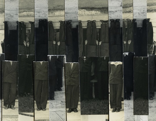
Ricardo Miguel Hernandez, from When the memory turns into dust
4. The Artist Intervenes: Ricardo Miguel Hernandez:
0 notes
Text
Final Theme Project
Here is a embedded link taking you to my final theme project presentation:
0 notes


Text
Theme Project Proposal
Here is a document of what my plans are for my theme project.
0 notes
Text
Week 6 Artist Blog Post
A conversation happens between Brad Feuerhelm and Victor Cobo. Victor Cobo is a Spanish American photographer who lives in San Francisco known for his own style of black and white photography. Many subjects he has taken surround ideas of life, death, isolation, love, and most of the time, escapism. During his time in San Francisco, Cobo collaborated his efforts with another photographer named “Larry Fink.” Both of these photographers met each other at a photography exhibition in Chelsea. Over there, Cobo took the first stance by showing Fink how talented his photos are despite the lack of color shown through his production. Years later, Fink was so impressed by Cobo’s portfolio that Fink shared Cobo’s work with Italisn photo book publishers named “L’Artiere Edizioni.” Cobo believed that taking photos in color may seem natural and realistic at first, however it masks away the personal feeling of how an individual sees the world from their perspective. It’s the reason why he chose to create his own style of black and white photography. Cobo first became interested in doing his own style of black and white photography when he was a child growing up in Spain. Cobo saw the inspiration in using light in his photos to create a sense of personality through the subjects he takes. Cobo also talks about his toxic relationship with his abusive father from the trauma he has faced to expressing his desires of sharing his stories with others. Some of Cobo’s incredible works include “Forever In Dreams”, “Remember When You Loved Me?”, “Exit Pleasure”, “Behind The Smoke Colored Curtain”, and many more! One piece of work Cobo took is an untitled photo of an unidentified figure raising one of his hands parallel to his masked face. The mystery figure’s form takes up the majority of the composition giving some attention to them. When talking about the background around the silhouette of the mystery figure, there is a building slightly to the bottom left corner of the composition. The setting of where this photo was taken is not clear though the viewer could interpret the setting as a house. Similar to the use of light and shadows present in the mystery figure and the cut off building, there is a nice graduation of balanced values, each application being important to create texture in the clothing of the mystery figure and the building behind them. The dotted pattern gives an impression of a holy person who worships their god. It could be the reason why the photo is taken as a masked figure raising his hand since there is a wrapped book complementing the hand raise. It is unclear who the masked figure is because Cobo did not include a title that corresponds to this specific photo, the viewer will not know if the masked subject is someone Cobo has a strong connection with or it is a self-portrait of the artist himself. The only clues the viewer can infer is the slight transparency of the masked figure’s nose and lips sticking out of the black cloth. Although the viewer does not know who the masked figure is, one key thing to notcie from this photo is the masked figure engaging with the viewer by direct eye contact. Though it is not clear if the masked figure is looking directly at the viewer or in another direction.
2. Based on this specific photo, I would say that I like this specific photo because normally when I take photos myself, the outcom of my photo comes out colorful, full of life, and a clear theme. However when I look at this photo, it may seem that the photo is drained from life, a lack of color being used, and an unclear motive for taking this photo. Cobo’s own artistic style of using black and white photography has a clear transition yet harsh transition from the light values, to the middle values, and lastly to the dark values have some three dimensionality in the masked figure. It appears as Cobo has a strong relationship with this person as the hand raising acts like a stable link to the untitled book. Though it is most likely a book of the bible, otherwise I do not observe any reason Cobo included the mystery book in the first place. Cobo’s idea of taking photos as he walked along the street stood out to me because I take photos when they are in front of me, staying still in front of the camera. However, there are some moments where photographers need to prepare their camera settings ahead of time before taking a single photo or else the moment they figure out what camera setting fits best with the environment. The short event may pass away quickly if photographers are not prepared. In this case, Cobo had his masked subject directly in the center of the composition keeping in mind the positive and negative space before he takes the photo. I really like how Cobo’s photos stay true to his personal experiences with negativity, but the darkness was a way for him to experiment what type of lighting will create interest and drama Cobo visions his photos as. To improve this photo, I would say for Cobo to zoom out the camera a little bit just enough that the viewer can see the whole form of the masked figure because the masked figure appears as it is compressed down sinking more towards their forehead than their whole head. This photo may influence my own creative production because I observed that Cobo’s photos revolve around his personal experiences based on the stories he has shared with others. I always thought about black and white photography as two colors being combined together compared to applying a variety of colors giving the photo some sign of life. Cobo used either hard frontal lighting or hard bottom lighting since the direction of the shined light on the masked figure’s face shining directly at them or below them. If Cobo used soft light instead of hard light, then the masked figure’s face would be more transparent than having individual organic shapes placed on their face. If I was taking photos on my own time, I would need to observe where the light source comes from because knowing where the light source will come from determines the main focus of the subject and how I could plan ahead of time what lighting type fits the situation I’m in. Colored photos may seem appealing at the start, however I can see Cobo’s photos having some kind of theme or multiple themes if possible through the black and white approach. Without any type of light source, photos will appear as flat and solid filled similar to a black background in digital art. I could attempt to use the similar black and white approach to create some contrast in my photos through which direction the light source is coming from. Once I can gain an idea of where the light source is coming from, then I can determine how information or parts of the photos will be present giving the viewer some information about the subject and which distracting parts I would remove sending more attention to the main subject of the composition.

3. Unknown Photo by Victor Cobo
4. Black and White Photographer Victor Cobo's Website:
Victor Cobo Interview: There is No Darkness Without Light:
0 notes
Text
Week 4 Artist Blog Post
A conversation happens between Douglas Breault and Jordan Eagles. Douglas Breault is an interdisciplinary artist who manipulates a variety of media such as photography and painting to create a comparison of spaces that are both realistic and imaginary. On the other hand, Jordan Eagles is an American mixed media photographer and artist who specializes in working with blood of all forms since the late 1990s. Eagles originated from New York and is an activist in standing up for LGBTQI+ equality. Eagles' blood works will often show visual images of blood screens on stained glass windows. Instead of spilling blood over the stained glass windows, Eagles scatters blood particles all over his canvas to send a message to the viewer stating that blood is an essential part of the human heart and body. Eagles' blood works surround ideas of birth, death, healing, and pain. Eagles published some of his best works with one of them being a collective project called "blood mirror", created by Eagles himself and 59 LGBTQI+ blood donors who were glad to be a voice of Eagles' life changing project. Its purpose was to give the viewer a visual description of how many civilian lives could have been saved if the FDA lifted the discriminatory ban on blood donation. Eagles' incredible works are displayed in many private and public exhibitions including the Addison Gallery of American Art, Everton Museum of Art, Peabody Essex Museum, Princeton University Art Museum, and many more! Before Eagles started to paint out his blood work, he ethically collects human and animal blood with which he will apply some resin to preserve the samples (a semi-solid or a natural compound that can turn into plastic material, it is often used for art and craft applications. First, Eagles applies layers of the subject he has taken previously to display them on life sized blood screens. Second, Eagles marked the images on translucent substrate panels and preserved it with blood and resin. And third, Eagles focusing on creating dark silhouettes without too much detail by using photography techniques and abstraction that reduce the amount of light shined on his blood work through multiple layer applications (some of Eagles' blood works will appear abstract, but not all of them). One piece of work that Eagles has created is called "Portrait of Andres Serrano." Andres Serrano is an American photographer and artist known for his artwork called "Piss Christ", a display made from cibachrome, silicone, plexiglass, and urine to symbolize a split comparison between the spirit and human form of Christ's torture. It was believed that bodies were political signs related to Christian belief systems, Christ being one of the primary examples. Serrano is wearing a casual suit perfect for portraiture as seen in the image below. Around him are different ranges of value in red with the left side absorbing more light compared to the right side which absorbs very little light. An organic pattern is on Serrano's face showing a demonic look, yet an appealing combination of shapes that make up his whole face. The focal point Eagles could want the viewer to look at is Serrano's designed facial features that add a new layer of skin, different from what viewers will observe at other people. The direction of where Serrano's body is turning towards is a third quarter pose looking directly at the viewer. Also, the slight smile on Serrano's face could give the viewer clues about the torture and discrimination LGBTQI+ members were forced to deal with back then.
2. Although I do not like seeing blood because I cannot stand by looking at it, for some reason Eagles' "Portrait of Andres Serrano" seems to be interesting to look at because the techniques Eagles used to create a powerful message just by looking at Serrano was only adjusting the intensity of red orange lighting or warm colors. It is amazing how realistic the new appearance of skin on Serrano's face does not distract the viewer from observing other parts of the composition. The same organic pattern applies to Serrano's suit and neck, but his neck has some areas where the lighting was set at a high temperature yet it does not affect Serrano's portrait being taken. It is surprising that Eagles did not choose to apply red orange lighting where it would display geometric shapes, otherwise his face would not match up to Eagles' experience of being a blood artist. Eagles deciding to use organic shapes rather than geometric shapes has set a serious tone and almost indirect aggressive anger on his portraits from the past. It helps to strengthen Eagles' cause of why he wanted to do portraiture of LGBTQI+ members because he has a personal connection to what happened to them and what he can do to make a difference. If I was taking inspiration from Eagles' blood works, his blood works may influence my own creative production not in portraiture but for creativity because Eagles' choice of using repeated organic patterns that have contour lines flow through the subject's face and body. It is a pattern in artistic style Eagles has emphasized for other portraits who are part of the LGBTQI+ community. As I have mentioned before about Eagles creating his blood works to raise awareness of LGBTQI+ equality, he gave the viewer many examples of his incredible works for them to understand that this is the audience he is displaying art for. He made his message clear through historical content in which members of the LGBTQI+ community were restricted from donating blood to other people who needed it to survive. I could use Eagles' similar imagery to pursue a purpose or a cause in the Fresno community by becoming an advocate in addressing major issues that still have not been resolved yet. One example is food hunger. Just like Eagles' cause of focusing on equality for the LGBTQI+ community in blood donation, I could potentially take photos of the Bulldog Pantry, a nonprofit student run organization that addresses food insecurity in the Fresno community. It would help for people to understand that food is not something people can simply afford at a grocery store. Since it is hard to find a job in this world, many people struggle with providing food for themselves, not just for themselves but for their family members as well. Looking at Eagles' portraits made me realize that there are people who go through serious issues every day and they lean on people like us to help them out of their situation. With that being said, I could one day let people know about who the Bulldog Pantry is and why it is a meaningful organization to volunteer at.
3.

Portrait of Andres Serrano by Jordan Eagles
4.
Blood Photographer and Artist Jordan Eagles' Website:
Jordan Eagles In Conversation With Douglas Breault:
0 notes
Text
Refined Light and Design Presentation
Definitions for Elements and Principles of Design:
Point: The starting mark or dot made to connect lines, shapes, or forms together.
Line: A path that is formed by two points or more though multiple applications of using points.
Shape: A 2D flat figure consisting of length and width compared to the qualities of form.
Form: A 3D figure containing length, width, and height compared to the qualities of shape creating some type of dimension.
Texture: The appealing surface quality of an object through a sense of realistic touch or imaginary touch.
Color: Absorbed pigments of light that create an appealing design through creative decoration.
Value: A measuring scale of how light or dark an object is.
Space: The amount of distance defined between two objects or more depending on the size and contrast of the composition.'
Balance: Two sides of an artwork have an equal amount of weight, completely covering or majority of both sides are covered.
Emphasis: Putting special attention on a particular area of an composition.
Movement: The flow or motion of an object traveling in a specific direction.
Pattern: A repeated use of elements to create copies of a sequence.
Rhythm: A repetition of elements through a well organized structure to create flow and movement.
Proportion: The relationship between different parts of an object through size.
Variety: A combination of different elements for creating complexity and visual interest in an composition.
Unity: A sense of achievement through a combination of different elements for creating a harmonized composition.
Attached is a refined version of my Design and Light Scavenger Hunt Project:
0 notes


Text
Attached is a link taking you to my Design and Light Scavenger Hunt Project.
0 notes
Text
Week 2 Artist Blog Post
A conversation happens between Sierra R. Aguilar, an individual interested in learning about color, light, and composition in photography and Rob Hand, a famous photographer who focuses on road trip photography. Although Rob created his unique photos located most of the time in Western America, his powerful influence on photography has shaped the way other people view and interact with photography, defining him as one of the greatest American road trip photographers in history. Rob was born on a farm located in Southern England. He started to be interested in doing photography at the age of 31 which convinced him to travel more from London to the United States to make his road trip photos appear interesting and dynamic to the viewer. Rob wanted to capture moments of his trip by the natural landscape of how the figures in the image are positioned. Some of Rob's accomplishments are he has 7 photographs displayed in the National Portrait Gallery in London and he created his first book coming up with a creative title called "Diesel Fried Chicken." One piece of work Rob shot is a photo taken in Palms, California where the photo appears as a building with a green vent on the roof and under the vent is a slanted plank labeled in white lettering, "LAST COLD BEER." There are two rectangles in the orange building, inside those rectangles are a separate color side of warm and cool colors. The bright blue on the left is shining brighter than the hot orange on the right. A similar case applies to the floor lighting, in the middle ground on the left is an alien like green gleaming towards the green crate far away from the orange building. On the right side, a combination of the bright blue and hot red are used to create a minimum purple light. Finally, the composition was taken at an imaginary diagonal line. If we cut down the line holding the left side of the building and follow the diagonal line connecting the two colored light sources, the green and purple light would enter into our space.
2. If I ever saw this photo in real life, then I would like it because I noticed how Rob took this specific photo at no angle since he probably knew a changed composition of the objects listed here then the original photo would give the setting and mood a different impression. The variety of cool and warm colors are perfectly balanced out, having a photo that contains asymmetrical balance is more interesting to observe it's physical qualities then a photo being 50/50 on both sides of the composition. The sizing of the green crate in the middle ground on the left side is smaller compared to the sizing of the orange building as it stands out, the building takes up almost the entire middle ground leaving me to wonder what is behind the alien like green crate? This photo might influence my own creative production because a common element of design I observed Rob applied in this photo is color. For example, let's say Rob decided to take the same photo as the original posted below. The only difference is Rob sees a different approach of focusing attention on the main subject by using the classic black and white. Now this method would have a little effect on the photo as the viewer will only be able to observe a mix of black and white over the entire space. The black and white approach would take attention from the time of day the photo was taken, the actual appearance of the objects shown with life, and how the objects connect with each other. In this case with color, I can identify what objects are what they are by their color such as the orange building in front of the photo and playing around with the concept of color in my own photography will affect the story and purpose I want my audience to feel.
3.

Palms, California by Rob Hann
4.
Road Trip Photographer Rob Hann's Website: https://robhann.com/
Photographers on Photographers: Sierra R. Aguilar in Conversation With Rob Hann:
0 notes
Text
My Weekend Project
https://docs.google.com/presentation/d/1wCOelElwsaYp57_2sezCiSeR7uZ3nK2FpDEgBdOc6ro/edit?usp=sharing
0 notes
Text
Hello everyone, my name is Kyle Mark and I'm in my freshman year at Fresno State majoring in Animation. Although I do not know what type of Animation I want to do, attending Fresno State gives me an opportunity to explore my options and possibly finalize my decision of what Animation type suits me the best. Some details about me are my favorite color is green as you can on my main page with the Luigi plush toy, I like the Super Mario Bros, I'm an Esports Gamer (Pro Controller and Nintendo Switch), I like spending time with my family, and I do not have my driver's permit yet which I'm still working on. As I take Art 30 Intro to Photography, I will find a connection to the techniques from the different softwares used for enhancing photos that I can use in Animation. Though I do not create a lot of animations in my spare time which is the downside.

1 note
·
View note