Statistics
We looked inside some of the posts by pose-references-i-guess and here's what we found interesting.
Average Info
Notes Per Post
775K
Likes Per Post
461K
Reblog Per Post
313K
Reply Per Post
532
Time Between Posts
26 days
Number of Posts By Type
Text
15
Note
1
Photo
1
Last Seen Tumblr Blogs


Fun Fact
Tumblr was created by web developers David Karp and Marco Arment.

Text


Some older artwork, I still reeeally like these sketches 🥺
282 notes
·
View notes
Text
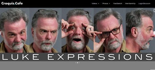
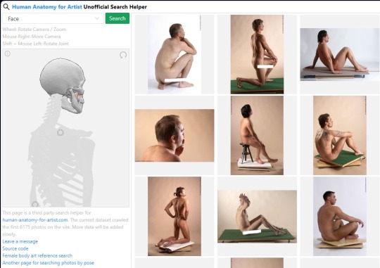
RESOURCES FOR POSES
Line of Action

JustSketch.Me

PoseManiacs

Human-Anatomy-For-Artist.com

MagicPoser
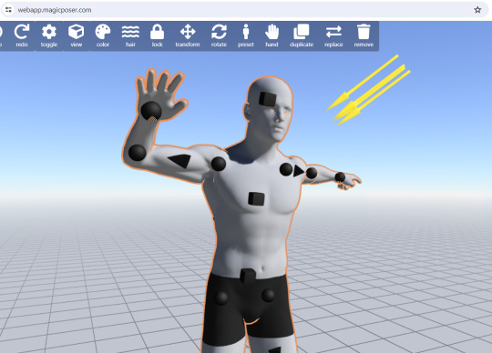
MIXAMO

Pose Archives

Bodies in Motion
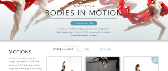
Posemy.art
ReferenceAngle

CroquisCafe
29K notes
·
View notes
Text
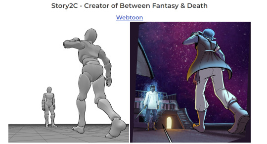
I’ve never been great at drawing super realistic art, and I think it’s because it never really held my interest. I just love stylized characters which is why I’ve been drawing them obsessively for over 20 years! Because of that, I’ve got a lot of ideas about how you can approach stylized anatomy - here’s a snippet of a longer video I made on this topic ✨
You can watch the full video here!
20K notes
·
View notes
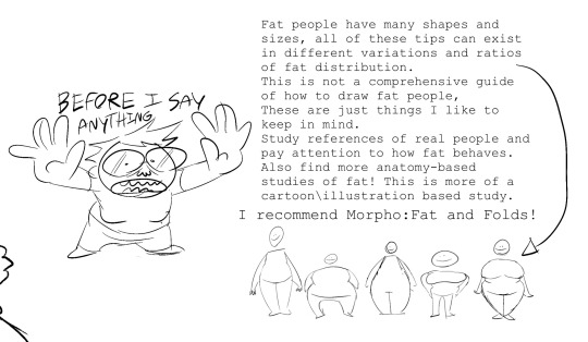
Text


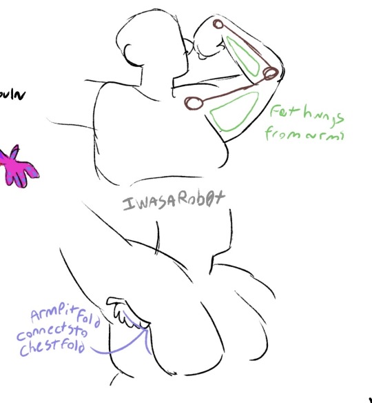
Compiled some basic information I know about drawing fat characters for beginners since I've been seeing more talk about absence of really basic traits in a lot of art lately.
Morpho Fat and Skin Folds on Archive.org (for free!)
123K notes
·
View notes
Text
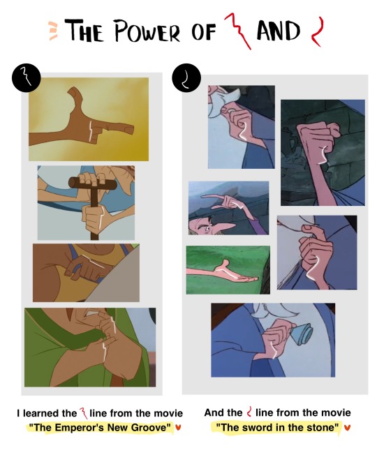
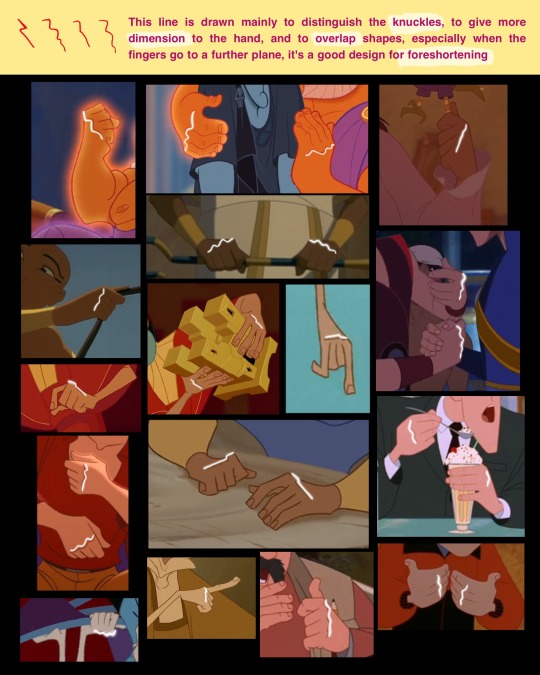
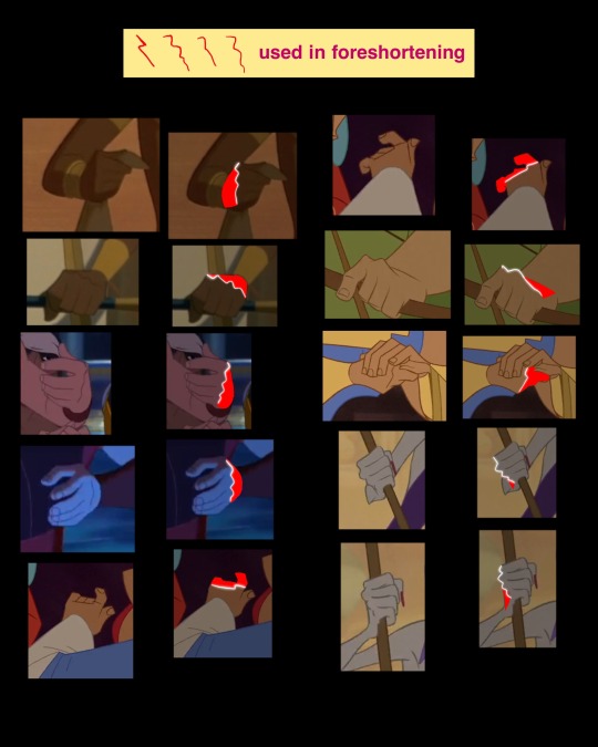
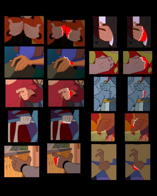
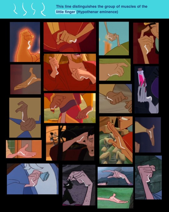
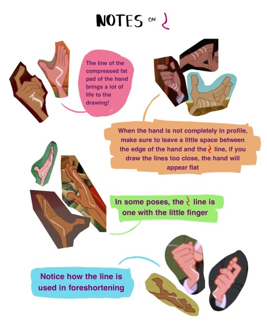
i watched one (1) video on how to draw hands that changed my life forever. like. i can suddenly draw hands again
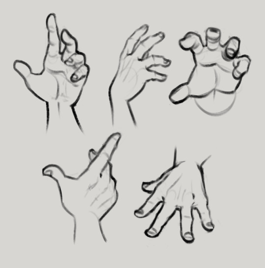
these were all drawn without reference btw. i can just. Understand Hands now (for the most part, im sure theres definitely inaccuracies). im a little baffled
140K notes
·
View notes
Note
Dont know if you were joking about needing catboy references a couple of weeks back but here ya go


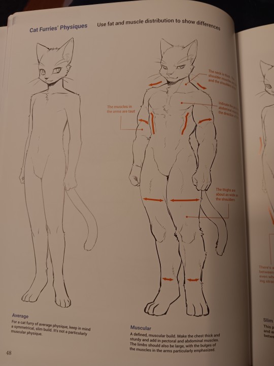
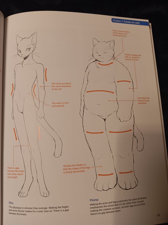
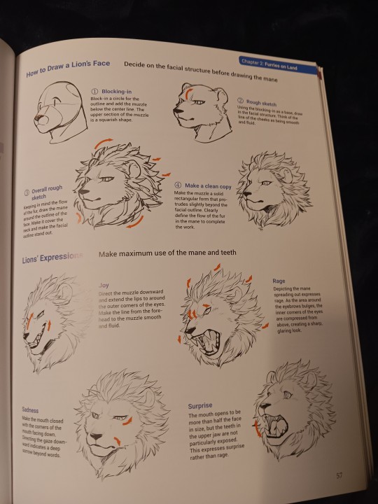
Theres one for sheep too if you need that
the sacred texts.... thank you for bestowing it upon me
34K notes
·
View notes
Text

Know your horns!
(From Keith and Clothilde Sutton’s Pictorial Dictionary.)
28K notes
·
View notes
Text
They also have an animal one that I linked a whole back on the same site !
26K notes
·
View notes
Text
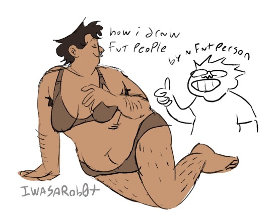

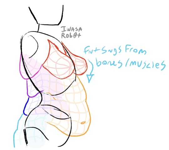
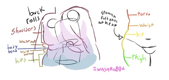
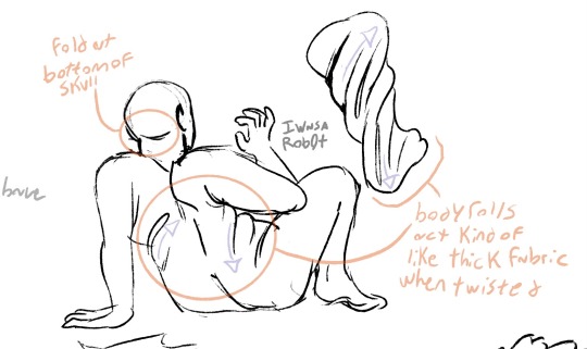


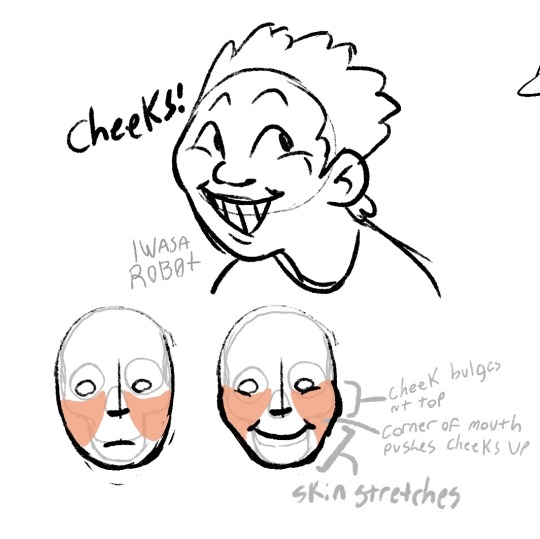
hey these are some tips for some of the little details in drawing fat folks that some people might not know!
everyone has fat on their bodies so its a worthwhile skill to have, but most art tutorials leave it out. heres some other good tips from artists!!
38K notes
·
View notes
Text

Male nude (c. 1870), Gaudenzio Marconi
466 notes
·
View notes
Text
Something I try to keep in mind when making art that looks vintage is keeping a limited color pallette. Digital art gives you a very wide, Crisp scope of colors, whereas traditional art-- especially older traditional art-- had a very limited and sometimes dulled use of color.
This is a modern riso ink swatch, but still you find a similar and limited selection of colors to mix with. (Mixing digitally as to emulate the layering of ink riso would be coloring on Multiply, and layering on top of eachother 👉)

If you find some old prints, take a closer look and see if you can tell what colors they used and which ones they layered... a lot of the time you'll find yellow as a base!
Misprints can really reveal what colors were used and where, I love misprints...
Something else I keep in the back of my mind is: how the human eye perceives color on paper vs. a screen. Ink and paint soaks into paper, it bleeds, stains, fades over time, smears, ect... the history of a piece can show in physical wear. What kind of history do you want to emulate? Misprinted? Stained? Kept as clean as possible, but unable to escape the bluing damages of the sun? It's one of my favorite things about making vintage art. Making it imperfect!

You can see the bleed, the wobble of the lines on the rug, the fading, the dirt... beautiful!!
Thinking in terms of traditional-method art while drawing digital can help open avenues to achieving that genuine, vintage look!
52K notes
·
View notes

Text
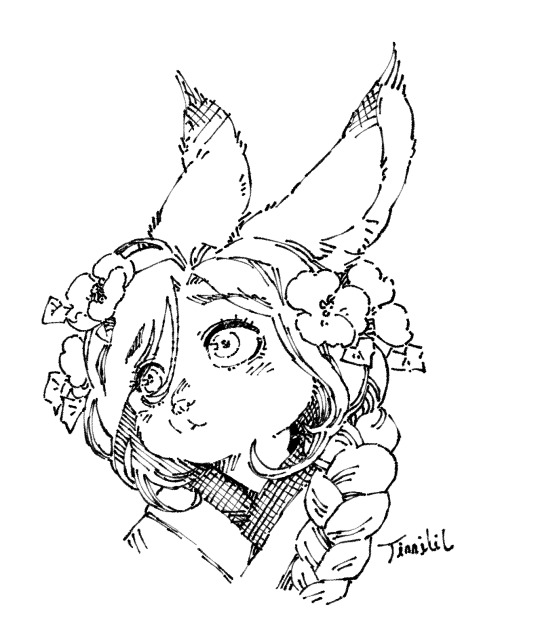
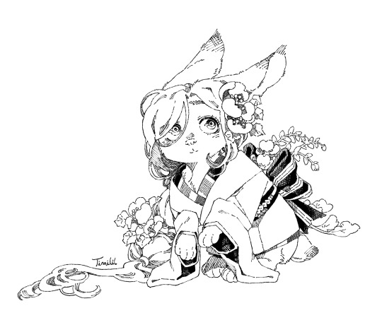
Bunny Shiemi doodles from art streamingg :”D
267 notes
·
View notes