> A collation of all preparatory and developmental work related to Project06_
Don't wanna be here? Send us removal request.
Text

> The excerpt from the site research document presenting my poster
The page has a 100 word description of the ideas and themes that my poster explores.
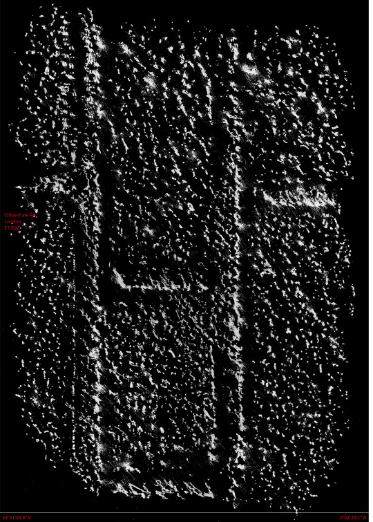
A key aspect of the design of my poster that I preserved by creating a second design specially for the format of the research document is the halftone effect applied to the frottage texture.
If the original image were to have been resized, the spots that make up the halftone would have become too small to be properly appreciated and would have just made the image appear blurred. There was a careful balance to be struck between having the spots of the halftone too small that the individual points could not be seen and having it too large that the image was abstracted into a series of dichromic spots beyond all recognition.
This is an essential part of my design as it relates to the texture of the poster itself and highlights the materiality of the medium as the image highlights the materiality of the subject.
0 notes
Text

> A fragment of poster 1 for submission in the collaborative document made by the 3rd year BA architecture cohort
I opted to create a new graphic for presentation within the site research document that we, as a year group, created. I chose to create a new graphic due to the differing formats of the documents; the poster itself is A2 while the document is A5 and the space allocated for visuals is square.
The image is a detail from poster 001 of my finished posters. I digitally created the look of the texture being a torn fragment from a larger poster by layering the frottage texture on top of a scanned torn square of paper that I created. Through a mistake in the changing the tolerances whilst using the lasso tool to cut the shapes out in photoshop I cut the two layers slightly differently which only added to the impression of the graphic being torn from a larger whole.
0 notes
Text

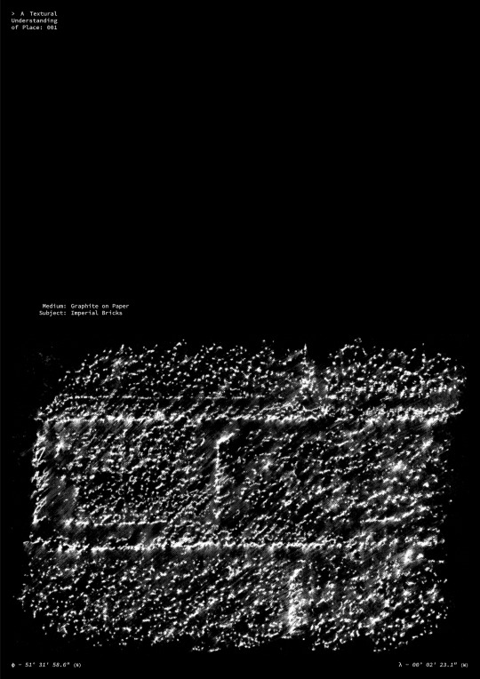
> A Textural Understanding of Place: 002
The poster above was my choice for submission. It shows a detail of the brick structure of the Chisenhale factory building with its unique pattern of weathering and erosion.
I chose to remove the text that communicated the medium and subject as I felt they didn't add anything that couldn't be communicated by the imagery itself. There is some ambiguity as to what the imagery shows and I wanted to play this. By having a description of the image's subject this sense of mystery and intrigue would be removed.
When the frottage images' colours are inverted, they undertake a transformation from a drawing showing a small piece of texture to an image showing an imagined piece of terrain; akin to the scans that NASA does of the surfaces of other planets. This is due to the creation of 'valleys' where there were 'mountains' and vice versa making it look as if the 'mountains' are catching the sun.
0 notes
Text


> Finalising poster design
After experimenting with coloured typography and mapping diagrams I settled on white source text (sans serif) to lead the lack of ornamentation to its logical conclusion.
The text outlines the the poster title: A Textural Understanding of Place 1-7, the media used to record the texture, the subject of the frottage image and the latitude and longitude of the texture's location.
0 notes
Text


> A selection of digital poster designs
While this isn't an exhaustive display of the sketches that I created for my final design, it does illustrate the process that I followed. I wanted the textures to be at the forefront of the design with little to distract from the intricacies of the texture itself.
I also wanted the texture itself to be situated in its geographical location. I experimented with a few methods of communicating this; a map of the local area with a red mark to show where the frottage texture was recorded, the more general address and postcode of the approximate location and finally, the best of both worlds, the use of latitude and longitude coordinates to provided a pinpoint accurate position of the recorded texture.
The text based format of latitude and longitude coordinates means that they do little to distract from the graphic texture of the frottage image on the poster.
1 note
·
View note
Text


> A selection of preliminary collages using the frottage texture
Despite the promise I made to myself to not create a hand collaged, physical poster, I did begin my design process by hand. Due to the textures and materials of the site being essential to our experience, I wanted those textures to be the focus of my poster design with minimal elaboration or needless decoration; a direct communication of textural information.
I have also been reading a book on the Swiss design style which was influential in my design. Swiss design follows similar principles to the International Style in architecture with a belief that 'Ornimentation is crime'. This often leads to pieces of Swiss design being very direct in their approaches communicating ideas in as simple and direct a way as possible; something I wish to emulate.
0 notes
Text

> Scan of the current exhibition brochure
On the day of our visit (13.01.2022) Rindon Johnson's piece: Coeval Proposition #2: Last Year's Atlantic, or You look really good, you look like you pretended like nothing ever happened, or a Weakening (2021) was still being exhibited within the gallery's main exhibition space.
The work consisted of a video projected from the ceiling onto a horizontal screen on the floor. The video was a 'live rendering' of data relating to the ocean that was collected by the artist from March of 2020 to January to 2021. The videos are all procedurally generated and differ day-to-day as the weather data for the same date of the previous year is used to develop a unique video for a specific date.
The work was visually interesting as well as conceptually deep. The videos themselves were often vast sea and sky scapes and were so slow moving there were often moments when it appeared to not be moving at all; communicating the enormity of the weather systems that Johnson recorded.
The concept appealed to me personally as I am fascinated in creating work that relates back to itself or its position in the world; something Johnson's video piece did very successfully.
0 notes
Text


> Scans of a pair of brochures from the Chisenhale Gallery.
These brochures outline how the gallery itself is funded and managed. As a registered gallery it is funded entirely by donations and grants; especially as all their exhibitions are free to access. The gallery itself is "one of Arts Council England's National Portfolio Organisations" (yellow brochure). It also produces limited editions of prints by artists that exhibit at the gallery.
Currently, the gallery is producing prints by established artists: Richard Deacon, Cornelia Parker and Racheal Whiteread.
All commissions from sales of these editions go back into maintaining the gallery.
0 notes
Photo


> Initial brainstorming poster ideas.
I have a love of hand-processes and physical collage which, for as much as I love it, can hold back the scope of some of my complex design concepts. My initial idea for my poster was to create a physical collage of a variety of textural frottage drawings, photographs and maps showing the position that the photos or frottage images were taken/recorded from.
This textural mapping of the site would provide a unique view of the site as no one else had endeavoured to record this unique aspect of the site.
1 note
·
View note
Photo


> A collection of frottage drawings taken from textures on, or around, the Chisenhale Factory Building.
Though not often used as a method to explore a site, frottage is a useful tool for recording textural elements of a structure and accurately replicate small portions of the unique patinas of material; especially buildings with storied histories like that of the Chisenhale Building.
What frottage goes some way to capture is the material experience of space; a fundamental element in our appreciation of space and place, but one that is so often overlooked and brushed off as afterthought to form and structure.
2 notes
·
View notes