
Don't wanna be here? Send us removal request.
Statistics
We looked inside some of the posts by professionaldevelopmenttara and here's what we found interesting.
Average Info
Notes Per Post
0
Likes Per Post
0
Reblog Per Post
0
Reply Per Post
0
Time Between Posts
2 days
Number of Posts By Type
Text
17
Last Seen Tumblr Blogs


Fun Fact
Tumblr was attacked by a cross-site scripting worm deployed by the Internet troll group GNAA on Dec 3, 2012.
Text
Evaluation:
As with all of my modules I like to round them all off to recap on all what I’ve achieved within this semester, the challenges in which I faced and what I would do differently if I had the time.
I feel it’s important to start off on a good note, January up to March was a good few months where we were able to develop our branding further, work on writing to agencies through templates and the help off Kat finding out how to best approach agencies asking for future opportunities. I feel all of this has really helped push me for when I am out in the world of no University. We also had the opportunity to visit Sigma in Macclesfield to be briefed on the two briefs we had a choice from for this module. I really enjoyed going down to that agency as I feel its very pro UX and UX heavy which is really up my street of interest.
However March then came around where the COVID-19 crisis got worst and prompted the nationwide lockdown meaning all teaching had to be moved remotely and the prospect of getting a graduate job like normal was proving to be more and more difficult as the weeks went on. This also meant that presenting to Sigma was now not an option however I did really value their feedback in which they gave on my work when we handed it in remotely. I feel the links and ideas they shared with me are something in which I will definitely take on board and read more about once I am out of University and need to keep my UX Head on until I find a graduate job.
I say this at the end of every module but I did really enjoy this module, my love for UX just keeps on growing as the modules go on and these don’t really feel like Uni work to me but more of a hobby in which I just genuinely like doing. I really loved that we were able to have another live brief and then get feedback from an agency and hear other peoples thoughts on our work.
In terms of what I created for my branding, I re did my whole UX Portfolio as the previous one in which I had I felt strongly that it didn't really show off my UX Skills to their full advantage, therefore I needed to change the structure of this portfolio in order to show off these skillsets for the type of jobs in which I will be applying for. Further, I created my online portfolio within Adobe XD following the wireframes in which I had previously created, this will at the minute be shared as a Adobe XD online link in which people can access, however in the future I will aim to pay a developer to code all of it or maybe even if I do end up with a lot of time on my hands still then I may actually attempt to code it myself and then host it as a website. I decided to keep my branding the same, I feel it is still relevant to the person I am today and was last year when I created it, as well as the Showreel. I am still to this day really proud of the showreel and therefore feel it is left best untouched as it shows off my 3D modelling skills. However now as time goes on, I feel showreels may not be the best output of my work for UX Design but my PDF portfolio and website will be as I can go into more depth rather than just showing the final products.
For Mind, I did extensive research for the project whilst also developing the full user journey and wireframes for the urgent care page. Looking at how people tend to use these platforms, what people feel works best and what they don’t like as much but also what existing materials are out there. This then lead onto making the final prototypes for both the home page and urgent care page.
I'd also like to use this evaluation to thank Kat for all of her help since first year all the way back in Media City in the maker space for the Design Fundamentals brief up until this point.
0 notes
Text
Hand-In File:
Hand in this time will be a little different, it won’t be the usual passing over the pen drive and copying over work and feeling safe that everything is there. This time we are having to complete a digital hand in through blackboard which somewhat makes me feel uneasy as it’s like heading into the unknown on that day.
Therefore I feel this post in which I have previously done in other modules will be more important than ever to ensure everything is there.
Below I have outlined all of the materials in which should be within the hand-in file:
Blog:
PDF output
Blog Link (HTML)
Branding
Brand guidelines. (PDF and Mockups)
Business cards.
CV.
PDF Portfolio
Showreel
Stylesheet
Website (Adobe XD file, Online Link, PNG Outputs)
OLD Coded Website:
Mind:
Final Prototype (PNG Versions and Adobe XD File)
Mind Personas (Adobe XD)
Mind Presentation Full Version (Video version, Adobe XD File, Presentation annotation descriptions word doc, PDF Version)
Mind stylesheet (Presentable and flat image)
Mockups
Files for mind review (smaller PDF Presentation, word doc of annotations, two PNG images of prototype).
All of these I will try to upload to Blackboard however they’ll be a backup Dropbox or One Drive link.
0 notes
Text
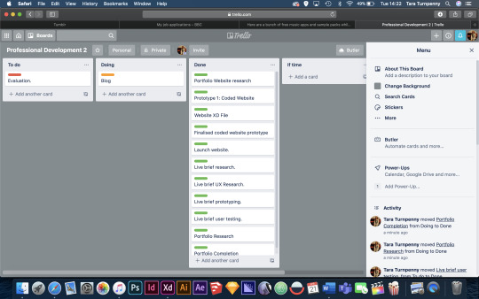
Final Update to Trello:
Below you can see the Trello board for Professional development. As you can see everything is now within the ‘done’ board whilst remaining in the doing board is this blog which I will eventually be rounding off after this.

I then have a separate board for Mind and that project, again everything is now safe within the green section of ‘done’ with just this blog to complete.

0 notes
Text
NN Group: Feedback Research
I was really happy to see the NN (Neilson Norman Group) as a link to look into within the feedback, I used this website when writing my dissertation last semester as well as UX Theories by Neilson himself, I feel like this really confirmed to me that I was on the right track.
https://www.nngroup.com

When writing my dissertation previously, I enjoyed looking at the different articles that were wrote in relation to UX Design and I really feel they have helped me update and expand my UX skills as a result.
Articles such as this one about Empathy Mapping:

Empathy mapping he defines as a collaborative visualization used to articulate what we know about a particular type of user. It externalises knowledge about users in order to 1) create a shared understanding of user needs, and 2) aid in decision making.
I feel these articles are definitely something in which I will look more into when I have more time once I have completed the final semester deadlines to keep improving my skillset when I’m no longer in University.
0 notes
Text
A Summary of this Module:
Update to Portfolio:
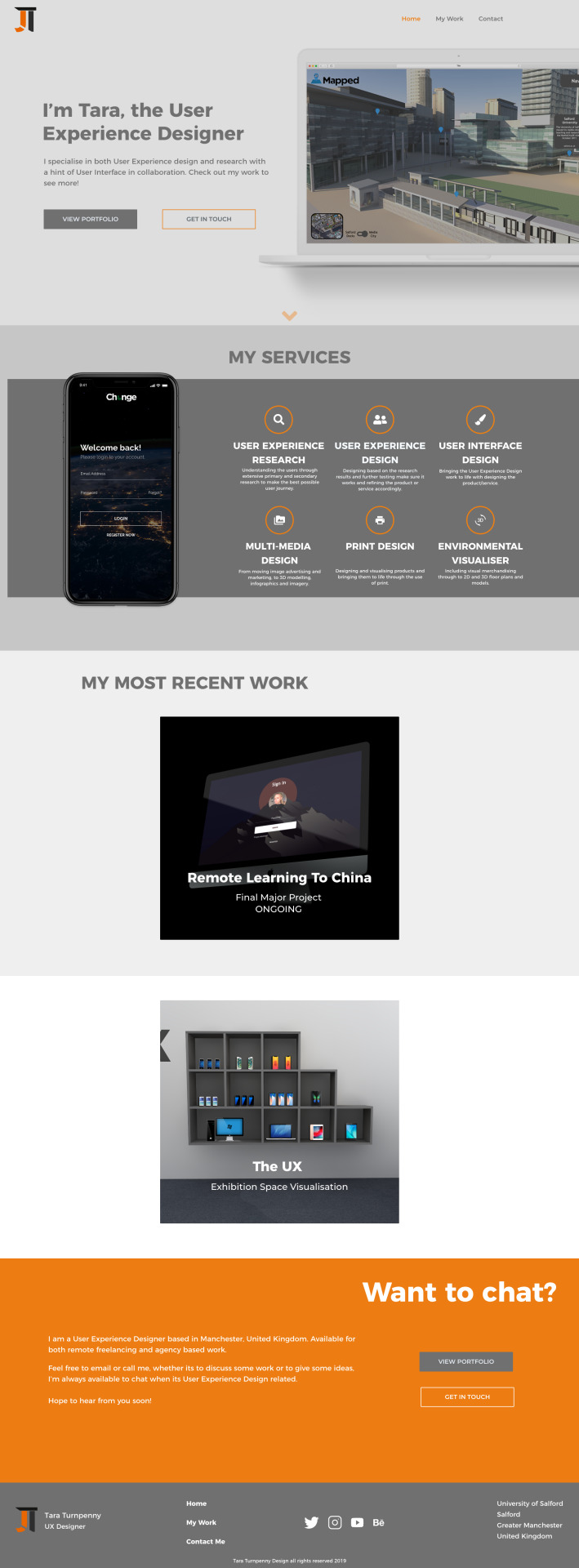
At the start of the semester I went ahead and redesigned my whole portfolio to incorporate my UX Journey more within it rather than just the UI elements. You can see a snapshot of this here:
Online Platforms: Behance
I also began the process of uploading my work onto outlets such as Behance:

Using illustrator I created a detailed page which was then placed within Behance. This is something in which I will use as a template for when I upload all of my Level 6 work onto the website.

Website Portfolio: Abobe XD Link:
For my portfolio, I still have the HTML in which I have previously created for my portfolio. However this semester I recreated the whole website following on from the wireframe stage. This was then uploaded as a link in which I can share to companies in which they can easily just access portfolio using the Adobe XD online service. This can be seen here:
https://xd.adobe.com/view/52e9ff8e-f548-4484-55a3-e9c58b9267d1-24d8/?fullscreen
I do actually have hopes of one day paying a developer to develop this website into a coded website in which I can host.

The home page for the online portfolio:
Looking for Jobs:
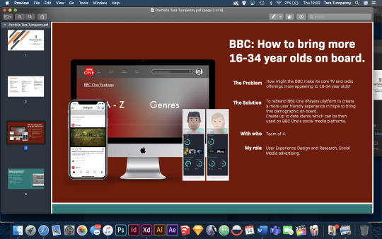
I also spent a lot of time searching for future opportunities for when I graduate. As well as applying to ones including the BBC and Code ComputerLove.

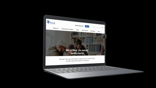
Mind Brief:
This semester I have also done the brief for Mind to recreate the urgent care page for the website. This involved extensive research, UX roles such as wire framing and site mapping all the way to the final prototype:

0 notes
Text
Current Job Searching Status:
Finding a job in UX has been proven difficult as a result of the current circumstances within the country.
All of the roles were posted 30+ days ago and when going no the agency websites they have stated they are not recruiting in the present time.
More so, the ones in which are recruiting are for Senior roles with salaries of 40k+ and requiring years of experience. Therefore meaning they wouldn't be suitable for me. (As much as I’d like them too).
Currently, I have been looking on LinkedIn, Indeed and Freelancer.com for jobs on the daily to see if anything does arise. I have also actually applied to a BBC Trainee programme which closes at the end of this month. As well as a role at Code ComputerLove earlier this year.
In terms of my freelancing that has been ongoing since 2017, this has been put to a hold as a result of the furlough scheme.
0 notes
Text
Design Better: Books
https://www.designbetter.co/books

Another recommended website in which Design Better, which provides unprecedented access to the insights that power the world’s best design teams.
I did actually find a book in which would help me with my final major project whilst looking through this website:
https://www.designbetter.co/remotework
0 notes
Text
User Experience Stack Exchange:
https://ux.stackexchange.com
One website in which Sigma recommended me looking into was the UX Stack exchange.

On this website it’s basically a site dedicated to UX Design where people can ask questions in relation to UX and other professionals and designers will answer it, prompting basically a discussion about it.
One in which is trending today is the topic about whether the floppy disk icon being used as a save button and whether it's dead.

Some thoughts on this:
“The floppy disk icon is an idiom, not a metaphor. It doesn't matter that we're no longer writing files on 1.44MB 3.5" disks. It doesn't matter that many users don't even know what a floppy disk is. What matters is that users associate the icon with saving.”
When reading this I wasn't sure what an idiom was so I went ahead and googled some more about it and found this definition: “a group of words established by usage as having a meaning not deducible from those of the individual words”.
There was another interesting thought on this which was similar to the previous one but had me actually thinking more about the broader picture.
“Send e-mails, and your browser's home page is an actual house?
Look past the pedantically literal and you'll see value in a metaphor that has survived, near-unchanged, for decades with no confusion and no ambiguity. Why change it now?!
Next you'll be proposing we don't even call it "save" any more; with auto-save, and auto-backups, what are we saving our data from, exactly?”
I remember when I was previously doing my dissertation proposal, this was something in which I was looking into when I found the topic about is Skeuomorphism dead? This is where for example Apple took their old icons which were quite literal in terms of they looked exactly like a calendar, youtube film reel etc. and took a more modern flat icon twist onto it.
0 notes
Text
Sigma Feedback:
We recently received feedback from Sigma regarding our Mind projects, below you can see this:

I was really pleased with this feedback and the additional links in which they added within the feedback is definitely something in which I can further look into.
To summarise this feedback:
The presentation showed the journey of the project and it was good that I looked into different outlets of emergency care buttons.
Personas: the ones in which I created were Proto Persona’s because they were based on a high level of research, if they were made through actual users then these would be personas.
Next time I could give more justification as to why I paired two font types together.
It was good that I included hand drawn sketches within my project.
The could be in a danger showing clients the visual design straight away and make them overlook the process in which went on behind the scenes: to show this I could keep it greyscale as a first draft to get feedback on the structure, content and flow. This was much like my wireframes.
Flat work works best for interviews.
Presentation shows my understanding of the brief and how I approached it.
Primary research on real users could be implemented next time.
0 notes
Text
Creating the Casebook for Mind Review:
Although I have already created a full length presentation with annotations, I have made a condensed version of this to convert into a PDF in which can be sent off to Mind for review.
I decided to take snippets from the presentation in which are the most relevant to showcase my work in a time efficient way.

I then like the presentation created a word document with the relevant descriptions for each page, but also placed these within notes on the PDF file.

0 notes
Text
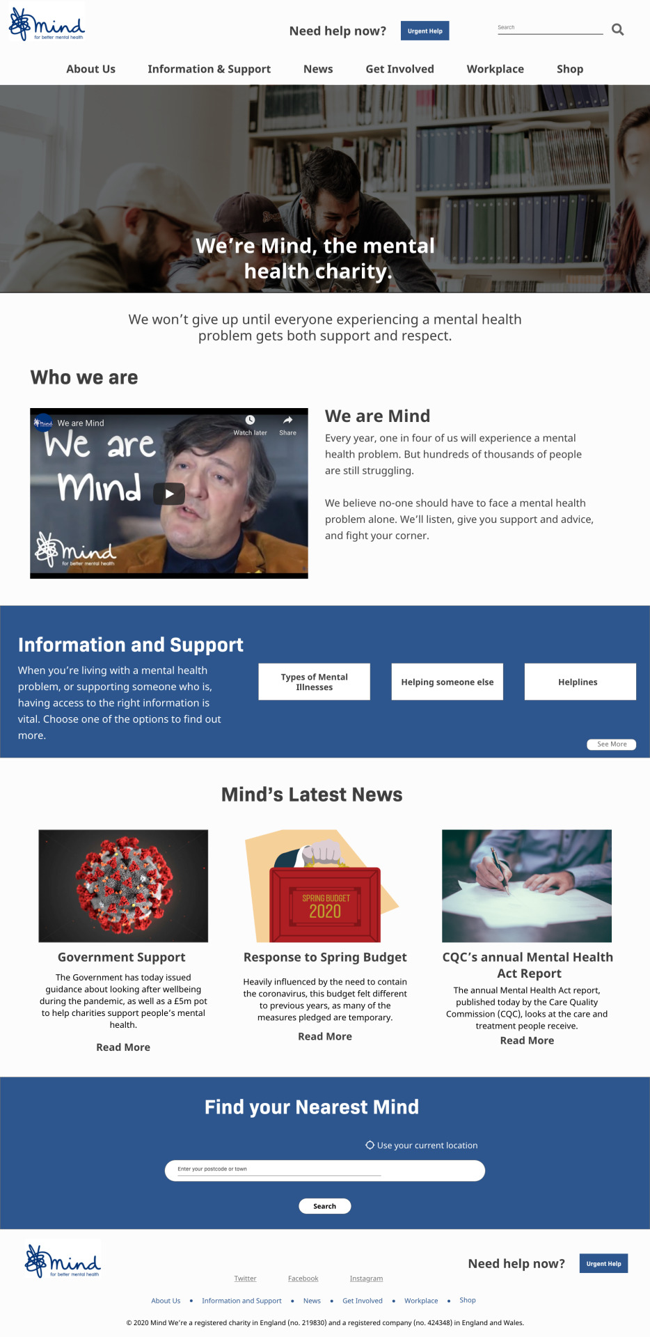
Mind Website: Seeing them in full
I feel especially within the blog it’s hard to see what has actually been created when its just through software, presentation and Adobe XD.
Therefore I have rendered out the pages in which I have created and placed them within this blog (although LQ due to Tumblr restrictions) and also within the hand in file.
Below you can see the Home page in which I have re-created:
Below now is the information page for the urgent care button.

0 notes
Text
Creating an Online link for the Mind Presentation:
As with my portfolio website and other presentations in which I have done for modules, I have shared the presentation via an online link:
https://xd.adobe.com/view/7e2ff758-ee74-4e37-584b-5474ee304011-081e/
This also allows people to make comments and give me feedback for the project.
I feel it’s important in the midst of this crisis more than ever to have multiple ways on accessing information and therefore this is just another one in which allows people to view the presentation.

0 notes
Text
Update to Trello
As I am nearing close to the completion of this module this is the updated Trello page for this semester. As you can see all products are now completed along with the live brief.
All in which needs to be completed is an evaluation of the blog and the relevant hand in files being organised.
This now allows me to concentrate on my other modules such as the Final Major Project.
0 notes
Text
Creating a Script for the Mind Presentation:
As a result of the current COVID-19 crisis, the normal way in which we would present our projects is no longer possible because of the lockdown which is in place currently. This means we have had to find different ways in which we have to present the work in which we have done.
I therefore, began producing a document that runs through each slide of the presentation with the relevant information in which I would talk about if I was presenting.

Below you can see this final detailed script for the presentation. This has been attached within the relevant hand in folder.

0 notes
Text
Using Adobe XD Publisher as Website Portfolio Link:
One way in which you can make Adobe XD files via the web is to publish it within the software itself, I have done this a lot in the past and also have these links within my portfolios to show off my proposal presentations.
For my website portfolio you can find it at this link:
https://xd.adobe.com/view/79231428-a87a-4dab-4e97-28b3294d720d-0f12/?fullscreen

0 notes
Text
Linking up the Adobe XD File:
After completing the website I then jumped into the prototype section and began linking up all of the pages together so it’ll work like a working website as you can see below:

0 notes
Text
Completing the Adobe XD Prototype of my Portfolio Website:
Below you can see the process in which I took to make the wireframes for my portfolio website and convert them into Hi-Fi prototypes.
Firstly I began completing the home page and the portfolio work page, adding imagery and the relevant text within them:

I then began adding more images within the designated area first indicated by the wireframes before starting the portfolio content pages.
As you can see on the far right image, you can see me adding the relevant information and images to give a better visualisation of what the information is trying to portray, trying to split up the text as best as I could to make the page still look interesting.

I then repeated this process for all 8 projects in which I want within my portfolio. Trying to keep them as visually consistent as possible, but also not being too repetitive in terms of how the designs are for each page.
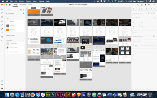
Below you can see a closer up version of 4 different projects:

I then decided to change the layout of ‘my work’ page within the website, I felt the slanted buttons didn’t look right in the website although they did follow my branding. I therefore decided just to opt for squares, since my branding is all about shapes including lines I feel this is still on my branding:

0 notes