
Welcome to my blog of Professional Practice III, here I will be posting weekly updates on the projects and updates I complete throughout the Professional Practice III course at VIU.
Don't wanna be here? Send us removal request.
Statistics
We looked inside some of the posts by professionalpractice3 and here's what we found interesting.
Average Info
Notes Per Post
1
Likes Per Post
1
Reblog Per Post
0
Reply Per Post
0
Time Between Posts
6 days
Number of Posts By Type
Text
13
Last Seen Tumblr Blogs


Fun Fact
Tumblr posted its first advertisements in May 2012 and subsequently earned $13M in revenue.
Text
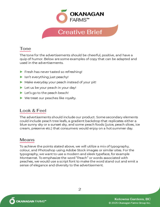
Project 2: Proof #3


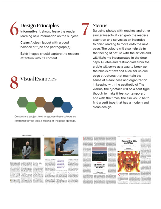
Following our proof session from last week, we talked about changing the keyword of the ads taglines to have a script font to highlight that it is the keyword of the tagline. Other changes to Proof #2 that were discussed were replacing the peach in the banner ad to not include a leaf, to include more of the beach and put the horizon more in the centre of the ad. The logo in the full page ad was also to be moved to the left of the ads to follow the same structure/layout as the other ads.
This weeks proofing session led us through the revised ads and the changes that came along with this weeks proofs. We discussed some of the challenges that were felt during this week's proofs and one of those was the process of masking the wheel spokes of the bikes in the half page ad. I was able to share a useful resource to make the process of selecting and masking the bike wheels and spokes.
For the changes to Proof #3, we are changing the script font of the keywords in the taglines to be more rustic and have more imperfections to the strokes themselves, as well as adding more shadows on the peach in the half page ads. Another change that is being made is removing the bottom half of stripes from the pin wheel sunrise in the banner ad as well as cutting off the half of the peach that sits below the waters horizon to make it appear as if the peach is rising from the horizon.
Apart from these changes to the ads, the series of ads are coming along very nicely and I cannot wait to see what proof #4 looks like.
0 notes
Text
Project 2: Proof 2


our weekly meeting with Ashley and myself was a very productive one indeed, Ashley ( my graphic designer) brought the first printed proofs of the ad series and they are coming along quite nice. From last week, we discussed the options for the banner advert as well as what to do for the half page advert. The printed version have developed significantly with some small modifications to be made.
The full page advert was done really nicely and only required the logo be moved to the left as well as changing the keyword of the taglines to be a script font rather than the italicized version of the normal typeface.
The half page advert has progressed quite well, and some adjustments are to be made going into Proof #3, some changes included the logo being a bit bigger, replacing the sky with a pinwheel style sunrise, adding the beach to the photo to indicate that it is a beach rather than an open body of water, as well as changing the keyword of the tagline to a script type.
For the banner advert, we discussed the option of using a Tandem bicycle rather than two different bikes to minimize the workload, but this would only be done if there is an acceptable photo of a tandem bicycle. The second option would be to find another photo of a bike to add to the scenery. The glow around the peach will also be removed moving into Proof #3, and finally, the keyword in the tagline will be replaced with a script typeface to indicate it is the keyword of the tagline.
I was very impressed with Proof #2, and I look forward to seeing the changes Ashley will implement into the Proof #3 print outs.
0 notes
Text
Project 2: Proof #1

For proof #1, Ashley and myself went over the sketches she created for the different ad layouts (banner, half page, and full page).
We discussed the potential taglines and layouts for each of the ads which included the placement of the peaches and the different visual elements for each ad. In addition, we talked about what to do for the banner advertisement and settled for a comedic approach to the ad, this comedic approach will also be incorporated into the other advertisements of the series.
For the changes, we agreed to keep the logo of the business on the same side of the advertisements in order to keep things consistent with each ad created.
For next weeks proof, we agreed to have a digital draft of the advertisements as well as, if progressed enough, print versions of the advertisements to have a sense of scale and proportions. We will also have the typeface and taglines selected for next week.
0 notes
Text
Heading to Proof #1
For proof one, my graphic designer and myself have agreed to work on the first draft of advertisements, this will include rough sketches for potential designs and content for each of the adverts. Colours, photographs, and taglines will also be narrowed down and chosen for this weeks drafts.
0 notes
Text
Make It Matter
During project 1, I learned how to handle a dual role project. Adapting in the role of the art director and graphic designer all at one time. I was able to learn how to direct and point the design style of the project to its intended outcome and I learned how to produce professional and appealing magazine spreads.
Moving into project 2, I would like to work on my ability to effectively communicate ideas and thoughts to whom I am working with, as well as how to properly streamline the communication between graphic designer and art director. It worked well in Project 1 but there is always room for improvement.
0 notes
Text
Project 2 - Creative brief


#design#graphic design#magazine#digitaldesign#layout#advertisement#peach#creative design#creative brief
0 notes
Text
Proof #3
Our final meeting before the reading break was a very productive. Me and my graphic designer, Matt, were able to go over all of the changes that were noted from the previous session and it all turned out amazing. The photographs appeared crisp and did not lose detail in the quality, the small appearance changes such as the title placement, date and year placement, page numbers and article subject were all corrected.
In this proof session we noted some orphans still remained but this issue would most likely be resolved as the image on Page 2 and the pull quote on Page 3 will be moved up to remove the orphan surrounding these assets. Another tweak to the title page is the spacing between the drop cap and the four lines to the right of it. The top border line on Page 7 is also being fixed and will span the whole page.
Apart from these slight changes, we are on track to have the final proof for submission very soon.


0 notes
Text
Proof #2
the discussion with Matt this week on the article was very good. We discussed some more options to layout the photos and pull quotes, as well as how to format the last spread and its content.
For the adjustments, We went over the page number and publication date format and where the contents should go on the top of the page. We also discussed some subtle adjustments regarding orphan words and line lengths. In addition to layout adjustments, photo boxes will be aligned with their respected columns, and the title text box will be centred to the space it occupies.
For next week's proof, we aim to have all four spreads complete with all its photos and pull quotes inserted and cited/sourced properly, the final spread complete, the top of each page having the necessary content organized in the proper way that The Walrus does it, and correcting the orphan issue with the text.

0 notes
Text
Proof #1 Summary
This week's draft discussion session was a very productive one. Matt and myself discussed the changes that would need to be made for next week's draft such as inserting the article text into the four spreads to ensure the text boxes would be filled completely.
Other areas of the article we discussed involved the placement of page elements such as the title image, the title text box and its size, the addition of placeholder image boxes, quote boxes, publication date placement and page numbers, as well as curating a folder of potential photos to be used for the article.
For the upcoming draft, we aim to have the four spread layout selected and at least one visual element per page, this will provide the reader with "reading breaks" in-between the text heavy article.


Here are this weeks drafts for the title spread layout. The digital version has spread #2 and part of spread #3.
0 notes
Text
Heading to Proof 1
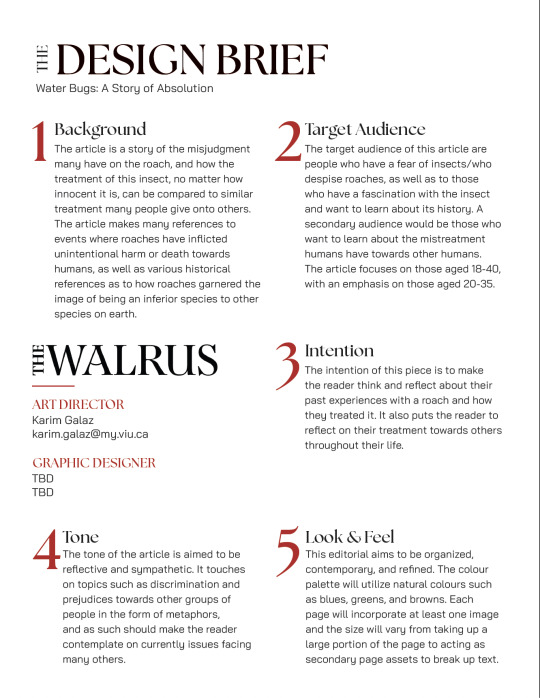
Our brainstorming session if you will was very proactive and we came up with a lot of good ideas as to how the title page/first page of the magazine spread will look like in terms of layout. I was paired up with Matt Pollock as my graphic designer for this project and right away we were talking about the look and feel that this project would take on. We felt that this was a topic/article that we both found interesting and unique, the article & publication in question is "Water Bugs: A Story of Absolution" and we are making it in the style of "The Walrus". We agreed that we would work in layout drafts for next week so we can nail down how we want the pages to look like, from there we will be focusing on content placement and curation of images and placements.
0 notes
Text
Creative Brief

0 notes
Text
File Structure


This is my current file setup for Professional Practice III. It follows a similar file structure that I have grown accustom to working with in past classes and projects.
As seen in the photos, there does seem to be a handful of folders within the Art Director and Graphic Designer folders, however, this works better for me because then this way I am able to have a more effective sorting and filing system.
I see more folders with more sections to be more effective because that way the main folder that is being utilized is not full of files that may or may not be related to the folder it is housed in.
1 note
·
View note
Text
What is an Art Director?
An art director is an individual who spearheads a creative narrative handed to him by their overseeing individual. I believe an art director is/are the minds behind a popular advert or a successful brand redesign who envision a new approach to how a product or service is perceived by the general public. They are the ones who ideate the look and feel of what it is that they're creating, as well as who they work with.
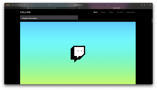
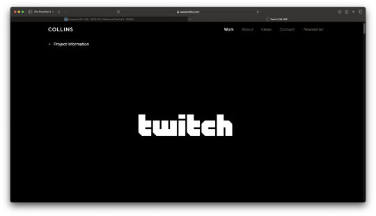
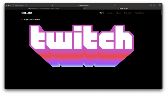
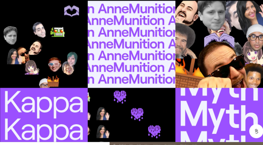
Inspiration
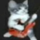
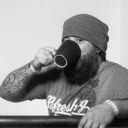
I chose to pick projects of Twitch and BOSE from COLLINS. The reason why I chose these projects is because they are able to effectively communicate the directed audience for each of the brands. For Twitch, they use bold and vivid colours to represent the RGB lights many popular and up-and-coming streamers have hung or displayed around their rooms during heir streams, as well as the computerized font to make the logotype feel like its written in a games code. Another aspect of the Twitch project that stood out to me is the manner in which they include the use of meme-type photos of cats and faces of people. This stands out to me because it serves as a node to the unhinged personalities and experiences twitch streamers usually have and use to develop their unique gaming personalities.

Guiding Principles
The three guiding principles I chose for the project selected are;
Digital - Keep the design of the site oriented towards tech-savvy individuals.
Eye-catching - Provide a clean and colourful layout for users
Informative - Keep the crucial information easily accessible for users to quickly know what they want to watch.
0 notes