
Don't wanna be here? Send us removal request.
Statistics
We looked inside some of the posts by qiffin and here's what we found interesting.
Average Info
Notes Per Post
2K
Likes Per Post
2K
Reblog Per Post
288
Reply Per Post
6
Time Between Posts
3 months
Number of Posts By Type
Text
11
Last Seen Tumblr Blogs


Fun Fact
Tumblr is available in 18 languages.
Text
RÀAAAAAAÀAAAAAWWWR

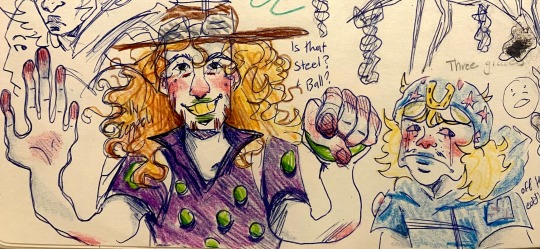
I saw @zwm8604’s Gyro version of the volume 13 cover and was so captivated that in a daze I made a Johnny version
90 notes
·
View notes
Text

this photo has me spiraling. one hand on each the greed they talk about in bible. she’s so fucking real tho
2K notes
·
View notes

Text


Yesterday was a religious experience to say the least
(some old doodles from my sketchbook)
25 notes
·
View notes
Text

Josuke probably ran out of hair gel
Drew this in June but totally forgot about it
28 notes
·
View notes
Text
The Soft Sabbath
A piece on Edward Hopper
By Griffin Gibson
502-120-VA Visual Literacy And Culture
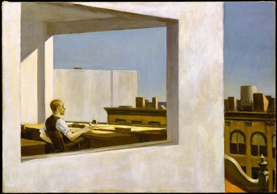
Pull the plug, Cut the cord, Disconnect. That is Edward Hopper. Born into a well off bourgeois family, by the age of five Hopper had a clear intuitive talent with art and was signing his work by 11. Throughout this time, his family was providing him with the materials and books to educate himself with. After highschool, Hopper went off to college for design and began freelance painting with moderate success. He went on to date and soon marry a former friend from college, Josephine Nivison, a very important person in his life. In that same year, with a couple decades of experience painting, he had his first breakthrough at a show his wife helped set up. For the next few decades, his work was a soft wave of success flowing across him. He had won. Everyone has an inner and outer story, and Hopper’s outer story was very boring in a sense. Pain is always on the inside. Hopper worked with a few different types of art. He was very adept with charcoal from a young age and was talented with watercolor, though a majority of his pieces were rendered and paved in oil paint. As a young adult in New York City, he fell in love with the concrete and tarmac around him and had a fascination for the scenery shown everywhere, sometimes with a few people shown in his work. In “Office in a small city” there's just one. Hopper has a tendency to depict people voyeuristically, he shows flawed people in the places he makes. They're never happy, never complete, they smothered in contemplation. You’d be lucky to see the average set of lips Hopper makes move 3 degrees from the last. In ‘Office in a Small City’, Hopper portrays an office worker in a solid yet sedated state, the man is completely relaxed leaning back, but he's aware. He can hear and see but he's melting into his chair and staring into his own head. Hopper paints and paints and paints different colours and people, but in the end, it's all him. “I think the American Scene painters caricatured America. I always wanted to do myself”.
The standout feature in ‘Office in a Small City’ would be the smoothness of it all, like a steam roller drove up the side of the buildings. That sort of texture is commonplace in Hopper's work. The space and form of the picture is another highlight, the paneless windows letting you into the lives of others. Hopper's buildings are made in a personified way. He has a usual spacing, a common feature being a hollow window set in front of and behind the focal figure, this being done in Office in a Small City as well. Your eyes pierce through the concrete being seeing its insides and outsides with the binoculars and vantage point Hopper made for you. There's an interesting use of color in the piece, as while the lighting and sky would make you think there's happiness involved, everything around the man is dry. It's a completely unromantic view of the time of day, showing the complexity of what's inside someone's cranium to be more important than simply the mood. In this painting, and many of his others, he transcends traditional melancholy and other gray emotions. He's able to represent loneliness even when surrounded by others or even a sense of unsatisfied boredom in his art. If we are to assume this is part of himself, does an apathetic reaction mean something? In the time he was living in, this grandiose level of infrastructure in metropolises was considered an achievement of man so im able to see this as Hopper in his studio, looking over his life's work, his success, though the satisfaction, the flag in the mountain, it eludes him. He's still relaxed, at this point in his life he would be 72 with a path of success paved behind him but this doesn't mean he's happy. The message is one of the human condition. I think this painting, and alot his work, is about people. In a concrete jungle it's easy to step on the insects. I think it's about the inner. Objectively, this painting is made up of a person and a building. Subjectively, both of those things are man. What you think are solid atoms melt back into the heart, not the brain. It's worth mentioning at this point that Hopper's marriage with Josephine Nivison did not have a happy ending. As time marched on they grew entangled with flaws, ending with resentment. Most of the women in Hopper's paintings were modeled after his wife because of her very strict demands. This later failed relationship put Hopper through a soft hardship. The kind you can't sleep through. The cultural impact of Hopper's work is immense. Though many of his pictures do not have any sort of readily clear message or political view, they've regardless been a massive inspiration for many artists. His ability to animate a landscape was something admired by many people, myself included. The colours he chooses to use are always thought out, much like the other aspects of his work and with his poetic depictions of people that are stuck in a workers world yet still resonate deeply with many despite the images’ context, it makes for something to be inspired by. Beyond even technical skill, sapped inspiration from many were yet derived from Hopper’s paintings because of their cultural significance in their depictions of jaded people molded through the world. Growing up in the start of the 20th century and late 19th century, Hopper was witness to the effects labor had on people and that time-period-specific experience more than bleeds through his art. I'd argue it's the metaphorical heart of what he paints, the core that builds all around it. As mentioned before, the framing of the piece is important, it shows us both a behind and frontal view of this man. We see how he sees the world. Another key factor would be that Hopper’s paintings rarely have an entry point that's not a window. Our only way into these peoples’ lives are through a hollow window, a peak, a skewed view through an honest one.
Hopper's work is extremely subjective. I've brought up many things that could have been represented, or were instead completely unrelated and are a wild guess. Yet that's the thing, I don't think there is a concrete message to Hopper’s concrete jungles, I think because he's always strived to paint himself, when you look at a piece of his, your eyes show you what you have inside. In that way, Hopper’s paintings are able to be seen by anyone and understood at least in some way, though I don't think they were meant for anyone, he made them for himself. I personally adore Hopper’s work, many of his paintings capture this sort of essence of being I can't seem to find anywhere else. When I look through the paneless hollow windows of Edward Hopper’s work, I always just end up seeing myself again. Pull the plug. Cut the cord. Disconnect. That is Edward Hopper.
Bibliography :
Nochlin, Linda. "Edward Hopper and the imagery of alienation." Art Journal 41.2 (1981): 136-141.
“Rather, Hopper, a realist, works with the rhetorical device of synecdoche, the substitution of a concrete part for an equally concrete whole.”
Levin, Gail. Edward Hopper: an intimate biography. Univ of California Press, 1998.
"I think the American Scene painters caricatured America. I always wanted to do myself."
Appendix
Office in a Small City (1953)
2 notes
·
View notes
Text
Empty Hallways
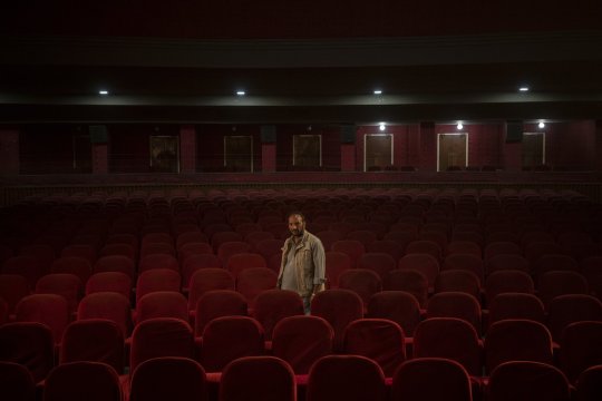
In August of 2021, the Taliban took over Afghanistan. There's no way to ease into that sort of conflict. When theres a discussion held about terrorism, casualties are brought up, international relations the possible future regulations. Something that goes slightly less noticed is the cratering cultural impact terrorism can have on a country or society. Of course, this isn't to undermine the horrible lasting effects on people and families warfare can have, but it's worth looking into the scope of effect warfare can have. In August of 2021, in Afghanistan, many, many theaters, including the cinema of Kabul, were closed. The male employees of the theater continued to go to work, just to see nothing as they were told nothing of the state of the theater. The director of the cinema, though, was not allowed back in. This was because she was a she. She later moved to pakistan. Amidst warfare and discrimination, culture is shot. These sorts of wounds can take decades to heal, and in this example, has literally put artistic human progress in a regressive stasis. Three months after the takeover, a humanitarian photographer journalist named Bram Janssen, came to document this stasis and took a series of photographs in an attempt to represent this issue to a public audience. There are a total of 10 photographs in the series though for clarity il focus on just a few. The most striking photo in the set would be the epitome of the conflict, the photo of the employee standing alone in the theater. There are rows and rows of red fabric empty seats with dim white lights in the back and in the dead center of the photo stands a single employee. The hollow limbo the employees are put in is apparently represented in the photo, as there's so much space for so few people to actually be there. They come into work day after day hoping to get paid. Another photo is of an employee walking alone through a wide empty hallway. The light of the photograph is again quite dim, the only light in the picture coming from an arrangement of lights on the wall. In a different photo of the set, a vase of fake plastic roses lay in an empty waiting room.
The set of photos is interesting to analyze as in a way its subjective and objective aspects are the same. The objective is, or represents, the subjective. It's a photography collection of images depicting an empty theater, the unbothered lights, the untouched red seats waiting for people who won't come. It's of all the workers for the cinema who are choiceless in what happens to their job and finance. Those empty objects and people represent the whole of the situation, subjectively, it's of a worn battlefield with culture and the livelihood of its people as the victims. It's a cultural photographical representation of what loss. Despite not having influence over the other, this set of photos shows the relationship between discrimination and culture, that theyre antithetical to eachother and cannot advance simultaneously. As soon as a healthy part of a society is condemned a little bit of cultural progress is condemned with it. This is why these pieces have international importance, they're a tale of warning for what happens to the arts in the face of warfare and discrimination. It's noticeable how in the photo of the single employee standing amidst the rows of seats and long empty movie posters that there's no one else there. The choice of having only one person could represent a missing culture or sense of art, as a culture isn't a culture with just one.
I think this image very effectively communicates its message. It's a show of a real modern issue, something that needs to be dealt with. It communicates and represents its context very aptly and I think is a soberly beautiful way of showing it. I think the demographic for the article and photographs would be young people. Of course, this is the sort of thing that should be seen by everybody if possible but I think is especially important for youth. Not only is it a cautionary tale of gender based apartheid but as an important global issue its something the people of the coming generation should be knowledgable about. Personally, this sort of thing inevitably hurts. With the conditions the employees are under it feels like a tragedy, of which I'd say it is. But in the end i'd say it's certainly a good thing this article is not only out there but was featured in the world press. It's of utmost importance for this to be known.
Appendix
(p.s. i don't know how to change fonts or format it exactly like you would've liked, sorry.)
1 note
·
View note
Text
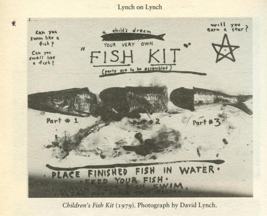
To preface, I just want to apologize, I wasn't able to find an MLA citation of the fish kit image as its a pretty old and info about it online is scarce to none. I hope you can understand.
Fish Oil and Iron.
In 1979, loaded up on what i can only assume were creative paint fumes from crafting the film Elephant man, david lynch published a piece of photography titled “fish kit”. It was just like a model airplane he said! In the photo, a mutilated but separated fish is laid across a piece of paper with its blood and entrails laid there with it. The fish, separated into 3 parts and labeled as such, is surrounded by marker writings such as ; “can you swim like a fish?” “can you smell like a fish” “will you earn a star?”. His style of photography here has clearly been influenced by the surrealist movement in a more sharply satirical way than an abstractism one. There's a distinct emphasis put on the post-mortem pet with its umbre pools of blood and harsh blacks and whites as well as the texture of the fish’s slimy scales and gooey guts. In terms of the semiotics of the fish kit, id say the fish kit is metaphorical, taking the literal place of a model plane despite lynch saying it was like a model plane. It's not a simple comparison, it's imitating even the sort of taglines a toy like that would have as well as the “assembly is required” motif with the several split up parts of the fish. The photograph in itself encompasses the entirety of the sign, that being the fish kit, therefore assessment needed is the signified and signifier. The signifier would be things : “fish, death, blood, writing” and the signified being : “toy, play, instructions, rotten, shape, creepy and pet”. I find these descriptors hold weight as “fish creepy toy” accurately describes the fish kit. While it seems to lack a strong sense of objective meaning, it could hold a plethora of visual metaphors alluding to satirical messages on the world. To me it strikes me as, if made with political intent, either a comment on the absurd worthlessness of the products catering to the wonders that children had at the time or a middle finger to the widespread garbage treatment put towards animals in the world. While i dont think it means the latter is correct, its worth nothing david lynch has been a longterm vegetarian since before the fish kit. Beyond these two possible meanings, the work springs fourth a charcuterie of attention grabbing questions. What exactly does he mean by “will you earn a star?”, what does the bottom text say? What does he mean by “will you smell/swim like a fish”? The star, a common “signified” referring to the idea of an award often towards children, has few explanations. It could be a meaningless detail in a work with no message, but I think it could be interpreted as the reward you receive upon successfully completing the fish if even a stamp you'd get upon your completed “fish” being reviewed. The bottom text stumps me, as it looks like it says “clean and serob your room” although that would mean nothing in the work context. It's possible it was left intentionally vague with the lighting making it un-legible. Finally, the goal of potentially smelling or swimming like a fish. It could be an attempt to promote imitation of a fish (possibly after you view your completed fish swimming) alike to pretending to be a lion or giraffe though it could also be a rhetorical, asking if the child is able to construct the fish in a way to where it accurately smells and swims like one, a question of accuracy. At the end of the day though with the fish kit, there'll always be more questions.
Can you eat like a fish?
Can you rot like a fish?
Can you die like a fish?
8 notes
·
View notes
Text
Are you mac enough?
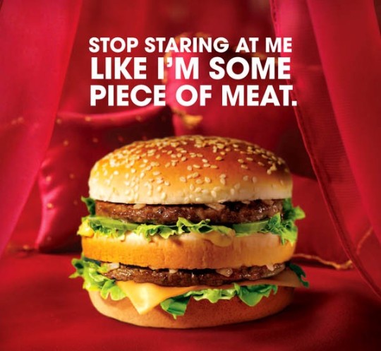
"Stop staring at me like I'm some piece of meat". This is the headline of a McDonald's ad from (...) that asked an utterly pressing question ; are you mac enough? Made by the all holy golden arches, this was an ad campaign for their second highest selling papal indulgence (citation needed), the Big Mac. Put simply, the ad shows their preliminary product atop a velvety smooth red bedspread implying such an obvious metaphor it would be difficult not to have a bewildered kind of double take. There is an uncomfortable amount of emphasis put on the piece of meat in question, you can't look away. This was done most effectively to make sure it kidnaps your attention. On top of that, there's a barely tasteful use of color in the ad to make the 563 calorie behemoth pop out like a sore thumb.
The mcdonalds advertisement as seen before, put simply, is asking you the viewer directly if you are man enough (or as the ad puts it, “mac enough”) to have sex with a big mac. Although i would say thats obvious, its a such an egregious use of “sex appeal” that it can be a little bit offsetting. Now, i don't think sex appeal is exactly the concept the ad is darting for, im taking this ad pretty seriously for what it is. I mean, it's a joke right? That was rhetorical, it's a joke, but i do think it good example of the once rampant use of sex in advertising, fast food ads specifically. From the many ads Carl's jr. has run about “size mattering” or a bikini model eating a chicken teriyaki burger or the Burger King super seven incher ads alluding to oral sex, its been go to for easy marketing for years, but as time has gone on people have only tuned them out more and more. I would say most people who have seen this ad have had a still, negotiated reading, as this is the sort of thing you just tune out, the same reason companies don't employ it as much anymore.
Despite everything, the ad does its job objectively well. You can't say much against how effectively it communicates its message, it's crystal clear and hits like a snowball. The ad doesn't have a central target audience, just the general demographic of people who would buy a burger, so most of America. I personally get a negotiated reading because on one hand it's just a harmless joke but on the other it represents, to me at least, the tail end of an extremely disappointing advertising trope. Although, i would prefer sex appeal to the more recent advertising hitch of ‘weird’ ads with cg characters and “hilarious” surreal humor. In the end though, the ad was just melted into the mental collective of other ads in its nature. We've stopped staring.
1 note
·
View note
Text
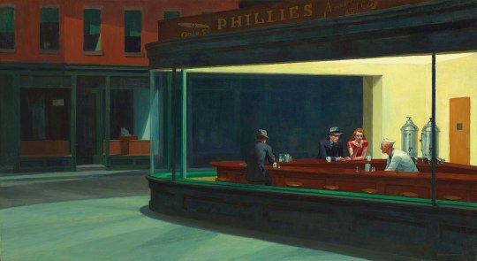
Nighthawks is undoubtedly Edward Hopper's magnum-opus. Made throughout 1942, Nighthawks is a very simple piece to understand visually. There's just a lonely street, a diner and the few people lingering on the inside. The painting is utterly somber. From first glance you can immediately read the room. The customers or the clerk arent downright sad but not the least bit happy either. I'd vaguely liken Nighthawks and by extension Hopper's other work to that of georgio de chirico, a landscaper influenced by surrealists who'd sprinkle figures around his paintings to grab the same emptiness, although that's where i think the similarities stop.
The two elements of art most prominently used in Nighthawks would be colour and space. The colour in the piece is very pastel, highlighting the painting well, its as if you can almost hear the dim buzzing of the lights in the diner with the office cubicle yellow they give off. Much attention is also payed to the colour of specific objects, such as the salt shakers, napkin dispensers and silver tanks of liquid. The faded colours pair perfectly with the melancholy emptyness of the piece, no one understood lonelyness more than hopper, more on that later. The most important principle of desing in nighthawks is proportion. Edward hopper was very meticulous with his paintings, he would sketch out drafts and plan them like a movie, making sure evrything was right. Along with that, he would model most men and women after himself and his wife respectively, this was because for making men it was convient, but as for women its because his wife wouldn't allow him to model female characters after anyone but her, wich is also the reason all his female models were rather aged later on in his career.
Nighthawks is about alot, but more than anything else Nighthawks is about lonelyness and existential dread. A common Hopper-ism so-to-speak in many of his paintings is that no one ever seems engaged, visible maybe the most in his painting "soir blue", hopper would often show multiple subjects that seem to disassociate themselves from their environment. No one would acknowledge one other. This is done in nighthawks as well, with the 3 customers and the clerk not paying attention to eachother, even the supposed couple not chatting, which is something you could take as a representation of how you can be lonely in a relationship or the more literal interpretation of that being hopper in his unhappy marriage. If thats assumed to be true, then you could say that what the woman is holding could be a pocket mirror, alluding to Hopper's wife's obsession with vanity. I cant say this theory is anything new for me, though, i have a large framed print of Nighthawks hung in my room, its a painting i think about alot. It makes sense Nighthawks is so blue and grey though, it was made during a time where the most destructive war in human history was building up, a time where he could look at his partner and only see someone he used to love, a time where everyday on his way to work on the A train he would pass by dozens of people in buildings feeling the exact same thing as him. Dread.
1 note
·
View note
Text
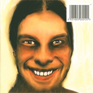
The aphex twin album "...i care because you do" has inspired alot of the work ive done as an artist. The album, being a 1995 sleek alien-sounding electronica album has many different sounds and motives. While still having traces of aphex twin's ambient roots, the album really helps me think up strange concepts for my art and gives me the motivation to imagine them on paper.
2 notes
·
View notes