Statistics
We looked inside some of the posts by queer-bucket and here's what we found interesting.
Average Info
Notes Per Post
5M
Likes Per Post
2M
Reblog Per Post
3M
Reply Per Post
2K
Time Between Posts
24 days
Number of Posts By Type
Text
10
Photo
7
Last Seen Tumblr Blogs


Fun Fact
Tumblr was attacked by a cross-site scripting worm deployed by the Internet troll group GNAA on Dec 3, 2012.
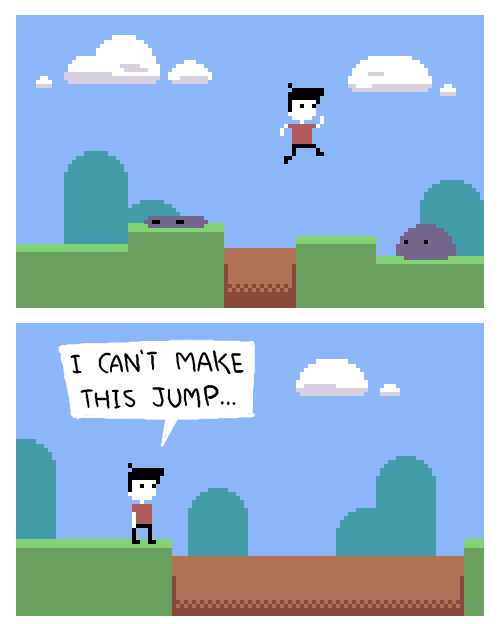
Text
Since last October when the Pitchfork Unsung feature on me was first released, I have received an overwhelming amount of messages and emails asking for the “Tame Impala Photoshop Tutorial” I talk about sending to a young boy’s father in Taiwan. It’s a good story, but the way the video is edited and my unfortunate choice of the word ‘tutorial’ instead of ‘email’ makes it seem like more than it really is. I simply sent a short email outlining my techniques, most of which are explained in the Pitchfork video. Because I have received so many requests- below is a basic explanation of my techniques that aren’t discussed in the video.
I think I explain the masking and airbrush enough in the video, but the most important detail not outlined is the use of Filter->Pixelate->Pointillize to achieve the grain. People assume I use Filter->Noise->Add Noise, but I rarely use that as it’s way too fine. I always work at 300dpi in RGB colorspace with CMYK Proof Colors turned on (dpi and color settings greatly change the look of filters and blend modes, and everything is converted to CMYK before print) and apply the textures at the very end. I usually finish the composition and colors and then copy a merged version of all layers and paste that as the very top layer and then apply Pixelate->Pointillize with the foreground color set to black and background color set to white, usually at size 3, but sometimes higher if I want the grain to be bigger. I then desaturate that layer and set the layer blend mode to Soft Light or Overlay depending on how severe I want the effect to be. I usually adjust the brightness and contrast of this layer to get things dialed in.
In addition to the Pointilize filter, I have a collection of paper and print textures I have scanned from old books and magazines that I use as overlay layers (always desaturated and adjusted to be as close to 50% gray as possible). There are always several layers at the top of my files effecting the layers below. I view this like mixing or mastering music, a final process to blend everything together and make things mesh and seem less digital, despite being made entirely in the computer.
I also use a totally convoluted system to achieve the colors. Often I work on something in a completely arbitrary color pallette and adjust the colors with a combination of Hue/Saturation and Color Balance adjustment layers or with solid colors set with different opacity and blend modes.
You can see in the image below the Tame Impala “Currents” cover with and without these adjustment layers and color overlays and how the look is drastically different. Without the overlay layers it looks very digital- cold and clean, and you can see the colors I worked with are completely different.

I’m constantly experimenting and changing the way I do things, and I encourage others to figure out their own way to get what they’re looking for. There is no right or wrong way to do things in Photoshop and it’s taken me years of experimentation to figure out how to achieve what I want to do. I wish I could respond to every question I receive, but there are just too many, so hopefully anyone interested in how I do things will find this post. And feel free to tag me in any experiments you make using tips from this post!
263 notes
·
View notes

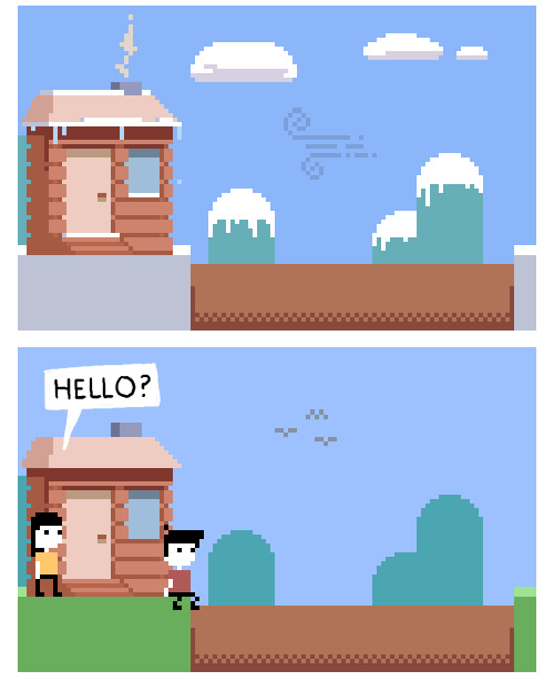
Text
293 notes
·
View notes

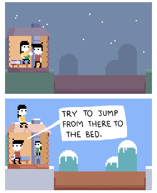
Text
That Trans Feeling™️ when you hear your deadname one (1) time and it floats around your head and makes you feel

3K notes
·
View notes
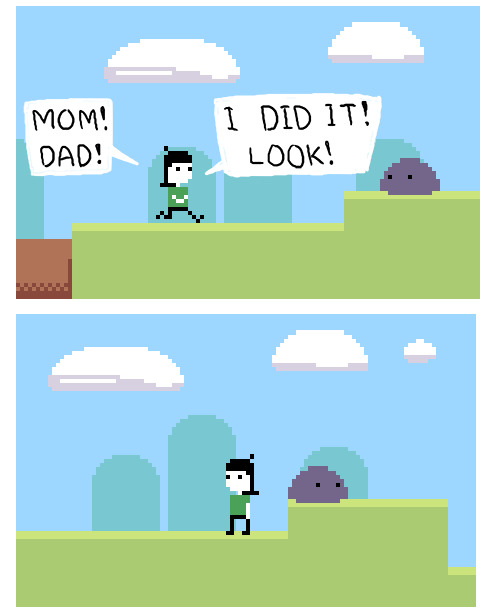
Text
okay,
scooby said ‘’ruh roh’’
shaggy said ‘’zoinks’’
velma said ‘’jinkies’’
daphne said ‘’jeepers’’
what did fred say
386K notes
·
View notes


Text
pls stop saying words to me … I don’t have a brain..
79K notes
·
View notes
Text
those little guys on the side of the nerds boxes?????? i love them
165K notes
·
View notes


Photo

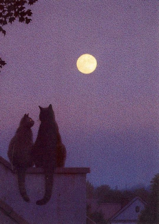
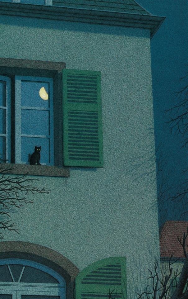
Quint Buchholz (German, b. 1957, Stolberg, Germany) - 1: The Cat’s Assembly (Katzenversammlung), 1995 2: Full Moon from the book Nero Corleone by Elke Heidenreich 3: On The Windowsill At Night (Nachts vor dem Fenster), 1995 Mixed Media
64K notes
·
View notes
Text
Citrus Scale equivalents
ORANGE = Teen and up audiences (T+) : PG-13 : Provocative poses, female-presenting-nippes, mentions of making out or semi-smexy acts.
LIME = Mature (M) : NC-17 : Non overly-explicit sexual acts. Like a couple doing the do but without the genitals showing, or a description of the act.
LEMON = Explicit (E) : R-18 : Overly-explicit sexual acts. All the in-n-outs and body fluids on display, very graphic descriptions of vanilla boinking or regular kinks (ex: light spanking, edging, roleplay)
GRAPEFRUIT = (No ao3 equivalent, but usually requires warnings) : Extremely kinky or morally faulty topics, weird and extreme fetishes. (Ex: pain kink, s.lave/master, u.nderage, n.on-con, knifeplay, p.etplay, watersports, tentacles, etc.)
21K notes
·
View notes