Don't wanna be here? Send us removal request.
Statistics
We looked inside some of the posts by quesaboba and here's what we found interesting.
Average Info
Notes Per Post
7
Likes Per Post
2
Reblog Per Post
5
Reply Per Post
0
Time Between Posts
13 days
Number of Posts By Type
Text
8
Photo
8
Link
1
Last Seen Tumblr Blogs


Fun Fact
Tumblr’s reach among the 26-to-35-year-olds in the US is 11%.
Text
Project 3
I accidentally wrote over my project 2 on the server, so my project is the same link as last time:
http://creative.colorado.edu/~vabo9916/fwd/project2
0 notes
Text
Web Reflection
Reflect on the class this semester. What did you get out of the class? How will you change how you approach classes or projects in the future?
I learned a lot in this class. It really helped me strengthen my Javascript skills as well as allow me to learn other things that I wasn’t able to focus on in the past. I had never worked with JQuery, JSON, AJAX, API’s, or Firebase before so being able to work with them in this class made me a lot more comfortable with having data outside of the webpage and not hardcoded in there.
Moving forward, I’m definitely going to make my portfolio site and all future sites more user-friendly, and web-responsive. I’ve learned how to organize information better within my webpages, so I am planning to revisit some of my old webpages and clean them up a bit. After taking this class, I definitely feel more confident in my skills as a front-end web designer.
0 notes
Text
Project 3: Idea
I’m going to add data from Twitter, Youtube, or other social media sites to my second project about United Airlines. I’m going to incorporate the data to show how much publicity the event got (how many retweets, how many views, etc.).
I will most likely include this data in a visual way that is consistent with the rest of my project, using hand-drawn images. I plan to have it appear along with the rest of the page and have the numbers count up to the actual number, to keep it visually interesting.
I plan to add this data to the multiple endings that I have already made (like the take a video ending), or to have another page that you can navigate to from the endings, from a “see what really happened” button. I don’t have a sketch this time around, but my visualization will include the icon of the site that I’m taking the data from, the title of the data, and the numbers.
0 notes
Text
Airline Adventure
I unfortunately forgot to take progress screenshots of my project, but here is the link to the final!
http://creative.colorado.edu/~vabo9916/fwd/project2
1 note
·
View note
Photo
http://www.nbcnews.com/news/us-news/david-dao-doctor-dragged-plane-files-court-papers-demanding-united-n745721


In light of more recent events, I have decided to focus on a different issue that has caught my attention. My game will be a “choose your action” narrative that will place the player inside of that United flight where the man was forcibly removed. The player will be prompted with choices on how they should react to the situation, and different narratives will occur based on their choice.
I plan to use JQuery for animations and to have the text appear by each letter so that the viewer is more interested in reading it. For the text, I will have to separate each of the letters into an array and then add them into a paragraph tag according to a time interval. This will involve putting the text into a variable and passing it through several different parameters to divide the text. I only know how to do this in p5.js, so I will have to look into how I could incorporate that into the rest of my page, or how to do that in Javascript/JQuery.
The message behind my project will be a call to action to all of the bystanders in the world who think that just because it’s not their problem, they shouldn’t have to do anything about it. It’s a reminder that we are all existing in this world together, and that we should take care of each other.
1 note
·
View note
Photo

My game will focus on how the government is taking away easy accessibility for women and forms of birth control. I know a lot of people who relied on the birth control to help with not only preventing pregnancy but also mitigating their cramps or excessive bleeding. This change in health care accessibility will affect many people, including myself, and will leave some people with nothing to rely on.
My game will be a form of a hallway dash where the player is running away from the government, represented as men in black at the bottom of the screen, and will have the goal of collecting any health care items they can. I’m still deciding whether or not to continue with this idea of birth control, or to extend it to health care in general.
Another idea I have is to create an unbeatable game that depicts the constant struggle to find a job after school. I’m going to be graduating in the spring and this is something that I am currently dealing with, to no avail.
My intended audience would be my peers who are experiencing the same things, and to hopefully create a little empathy or understanding among those who are not.
1 note
·
View note
Text
Project 1 Reflections
Reflect on your process both from the creative side as well as from the tactical side for this project. What went well? What didn't go so well? What would you do differently next time?
The coding for this project was really fun. It was challenging to learn something new and implement it correctly in my website. It was also really rewarding to do my own research and have everything come together. I didn’t really run into many problems that I couldn’t troubleshoot on my own, although some problems definitely took a long time to figure out.
Unfortunately, I couldn’t get everything that I wanted for the design finished, but that will be something that I will come back and touch on later. I think beginning with the hard things like figuring out all the mechanics of the page was a good order of operations. After figuring out all the code, it was easy for me to think about how I wanted my project would look. I also felt more confident in my project overall, knowing that it was definitely going to work whether or not I finished my images.
Next time, I might try to scale down my project a bit and not tackle something so time consuming as this one was. Maybe I will try something more challenging on the coding side, rather than centering my project around the design.
All around, it was a fun project, and I’m glad that I was able to have some creative freedom in what we were supposed to create.
0 notes
Photo


I’m not sure if I will be able to draw the 5 scenes I have left for tomorrow, but here is what I have so far! I’m hoping to at least get sketches in place for tomorrow, so I can convey the general narrative and flow of the story.
Other than that, I have all of my code working how I want it to. Here is the link to the project: http://creative.colorado.edu/~vabo9916/fwd/project1
0 notes
Photo


This story will be controlled by parallax scrolling. I’m still in the process of learning this, so I don’t have any pseudo code at the moment. I do know that each scene will be created by using nested divs and controlling the scrolling speed of each to create a story sequence.
The organization of this narrative will be mostly vertical, with message bubbles popping in from the side, and also serving as a story line.
Originally, I had way too many scenes planned and was getting overwhelmed with all of the scenes I am going to have to draw. I tried to make a storyboard before I even had all the scenes that I wanted to include in my head. After taking a step back from the project, I realized I needed to make the skeleton with the essential scenes first, and then I could go in and start visualizing.
In the bottom left corner of my first sketchbook page, I laid out the scenes I wanted to have, and then created the narrative around it so that it would all flow together. My next step is to string this into a storyboard, so I will have a visual layout of my narrative. I will post that once I have it solidified.
The last three photos are a sketch of what most scenes would look like, and how the text bubbles would work into the scene using parallax scrolling. This is just a very rough idea of what it would look like–the final drawings will be much more refined, and worked on.
I’ve cut out a lot work for me for the next couple of weeks, so my final project might still not be up to the quality that I want it to be by the due date. But, if this is the case, I will make sure that my code works and all the major elements using parallax scrolling are functioning first, and then go back and edit the visuals as needed.
1 note
·
View note
Photo

For my interactive narrative, I chose to focus on long distance relationships. I am currently in one, and thought it might be an interesting subject to focus on, since so many people nowadays experience this. For this project, I want to create and draw two different narratives side by side, depicting both halves of the relationship. I want to portray the trials of being apart, and when they finally meet again in person.
My audience would be others who are currently in a long distance relationship, or wonder what it would be like. I think the interactivity would enhance this story because it would make the viewer more involved in the subjects lives and perhaps be able to empathize more with what is going on.
I wouldn’t need much other content, except for reference photos to base my drawings off of. I have a lot of ideas for how this project will come to fruition, so I am a little concerned with how much of it I will actually achieve the way I want to.
0 notes
Photo
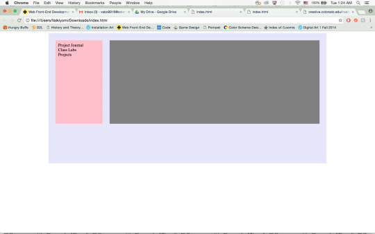
Here’s the link to my portal: http://creative.colorado.edu/~vabo9916/fwd/
The first thing that I needed to figure out for my portal was how to get everything to look and work the way I wanted to. I knew I needed CSS transitions for the dropdown menus, and I also knew I would need some Javascript to have my pages show up in the iframe. Once I got all the mechanics of the site down, I was able to easily add the glittery backgrounds and colors that I needed to bring the site together.
I knew a lot of what I needed to do from coding my own portfolio website from the past. I knew how to create arrow keys to go back and forth in a list of items, as well as how call the action by clicking on a button. All I needed to do now was to input it into this site and make sure it worked with the layout. I did run into a problem because instead of running through one list of items with one variable, I now had three different lists. I figured out how to work around this by adding two other variables that would track the position to their respective list.
Right now I've kept the design of my portal pretty simple. The focus for me this first time was to get it to function correctly and not do weird things when resizing the window. I hope to make this site more creative and have more pugs in it as the semester goes on.
As I mentioned before, I used a lot of the knowledge I already had from coding my previous website to make this one. I don't know exactly where I got all of my source code, but I mainly used W3Schools to figure things out on my own rather than copy-and-pasting someone else's code.
0 notes
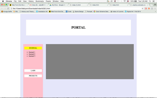
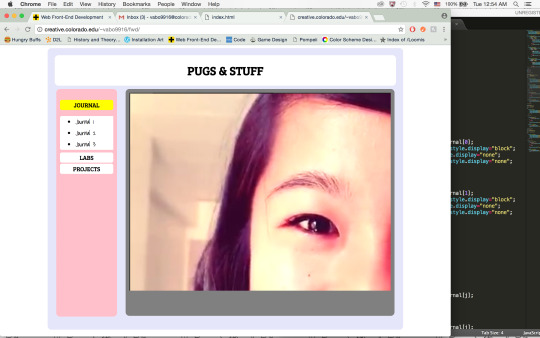
Photo

The theme of my portal is going to be pugs, with a color scheme similar to that of my icon for this Tumblr page (it will be bright and cheerful).
I will have two different layouts depending on the screen size (mobile/tablet and laptop). The full-size layout is going to be like the one pictured above, with a vertical nav bar and a fixed content box with a scroller. The contents of each button in the nav bar will only show when it is active; otherwise, the list will be hidden. When clicked, the content will show in the content box, and the user will be able to navigate between the pages using the nav bar and/or the back/next buttons.
For the mobile layout, I plan for the top header to be smaller, and the nav bar to be available through a hamburger button next to the header. The content will show up underneath.
0 notes
Photo


I’ve always been partial to print. I grew up going to Borders or Barnes & Noble on the weekends to find all the newest books, including waiting in line for the newest installment in the Harry Potter series. I still love the smell of crisp pages and the weight of a book in my hands—I could never make the switch to a Kindle or have all my books downloaded onto a tablet. There was something more concrete and meaningful for me in having a printed book rather than something electronic.
Whenever I gifted books to my friends, it would always feel like I was giving them part of myself, especially if it was my own personal copy of the novel. By giving them this physical thing, it came with all the experiences I had with the book, and I would have to recognize that those memories would have to live on with them, sealed between the pages of the book—not with me.
With electronic books, I think the immateriality of the content makes it hard for me to associate any significant feelings or memories to the book. There’s something more human and relatable about giving someone a physical card versus an e-card. But, digital files do have their advantages in that they’re a lot harder to lose, they won’t deteriorate over time, and you have the possibility to keep them forever (even if you gift it to a friend). Not to mention that they’re so easily accessible and downloadable anywhere off the Internet.
Perhaps the value I (and others) put on books is because they are more of a rarity nowadays. Who has time to go out of their way to go to a bookstore and buy a $20 book when they could by the same thing in the comfort of their home for $5 and have immediate access? Books and e-books are not that different anyways. They both are composed of words that make the same story, and they both have pages that one can flip with their fingers. The only difference is the form that it is delivered in: digital or print.
Digital forms of art have long been influenced by print—the evidence is in the code. All code is made up of a series of numbers, letters, and symbols, things that were once only deemed to be something that could be printed. While I might think that the difference between digital and print is distinct, the two mediums interact a lot today and help to create each other.
Right now, for example, I’m typing this up on my computer in a Microsoft Word document, but I could easily press the “Print” button and have all this digital jargon transformed into black ink letters on white paper. Or, if I had created a drawing that I wanted to post online, I could easily scan it or take a picture of it to convert it to pixels that can be accessible on the Internet. I often scan my work to my computer so that I can touch up some pencil marks, or even color it.
The dialogue between digital and print is ongoing, and in this last project, I have added to it with my short 6 pages. As I’ve mentioned before (in class and on here) I’ve worked in a digital-to-print manner before, with my literary magazine publication in high school using InDesign, and with my own personal artwork when I needed to get prints. So the transition from digital to print was not a new one for me, and I didn’t really face any new troubles with my installment in the book. I designed my project specifically for print, so there was no data loss in the printing of my work, except for maybe where the pages meet in the center (I’m not sure if the whole images will be viewable due to the center gutter of the book).
In my project, the sequence of the pages and how they looked facing each other played a big part in what determined my content. I’m not usually accustomed to making more than one piece for a project, so I had to think of each page as just a part to a whole—kind of like an image series. From what I saw in class, most of my other classmates did 6 individual pieces that could work on their own without the other pages. I made sure that my project could only be seen together to have the right meaning. I guess my pages could be seen individually, but it wouldn’t make as much sense as if it were whole.
As for the content of my work, I didn’t really address anything to do with print, and mostly focused on the digital identities that we create for ourselves online. I did, however, comment on the differences between our digital and physical identities. The skull in the center spread represents the true physical emptiness in ourselves in stark contrast to the brightly colored exciting lives we create and surround ourselves with online. While not specifically commenting on print itself, I did bring up the core difference between physical and digital mediums.
Overall, this project was very enjoyable and I can’t wait to see how the book turns out with everyone’s work in it! It’s been a great semester, thanks for everything!
1 note
·
View note
Text
Yes Men Movie
I had no idea what to expect when I found out we were going to be watching the Yes Men movie. My first thought was of the Yes Man movie with Jim Carry, where he was opened to new opportunities and consequences by being cursed to answer every question with a “yes.” The Yes Men movie was entirely different from my previous associations, and was rather focused on the impersonation and correction of an international company, the World Trade Organization.
The movie itself was very comical to watch due to the ridiculousness of their propositions (the gold phallic suit and their poop burgers), but had an underlying seriousness that these propositions were not too far from what was actually real. At times it was very uncomfortable for me to watch, as I felt embarrassed for what they were doing, and I cringed at the thought that the people who were listening (except for the college students) didn’t immediately oppose the Yes Men’s ideas.
The Yes Men made use of hactivism, detournment, and culture jamming to bring to light the nefarious results of globalization. The Yes Men began by hacking the new out of the old and create a virtual plane where the WTO was actually an organization that respected human rights and didn’t cater to large corporations. This abstraction blended so well with reality that the Yes Men were able to exist through this virtual reality in the real world. Their construction of an alternate plane for the WTO pointed out very real issues in the real world, and highlighted the differences that should be changed.
This critique of the world we live in, by pointing out what it is not and so highlighting what it is, reminds me of the art movement, Institutional Art. In this movement, artists questioned what the art institution was by pointing out what it was not. One of the movement’s most notable artists, Hans Haacke, created a poll in the entryway of the MoMA asking, “Would the fact that Governor Rockefeller has not denounced President Nixon's Indochina policy be a reason for you not to vote for him in November?” and invited viewers to put their answers (yes or no) in clear polling boxes placed under the question. Art museums are usually thought of as a neutral space free of politics and class, and by placing a very apparently political thought in that space, Haacke brought to attention the nature of the art museum. The viewers, in turn, were left with an uncomfortable sense of awareness of the space they were in; similar to the one I felt while watching the Yes Men movie.
Cyberfeminism was also based in hactivism, not of the WTO, but of the gaming industry, which was severely prejudiced towards men at the time. Similar to the Yes Men and Institutional Art, they mocked the industry by showing what it was not and creating games from a strictly feminist point of view, bringing to attention how biased the industry was.
The Yes Men, Cyberfeminists, and Institutional Art artists all created different abstractions of the real world, highlighting the true natures of the WTO, the gaming industry, and the art world, respectively, and all the flaws with it. While they created these different planes, they did not own these realities, it owned them. That which they created was mortgaged to others, and to the interests of others, to states and corporations who control the means for making worlds they alone discovered. All they could do was highlight the issues, and let the rest of the world take action to change it.
0 notes
Text
New Aesthetic
The New Aesthetic examines the interaction of the human world with the digital world, and the areas or times where it blends together and the distinction becomes indiscernible. Looking through Bridle’s Tumblr I could see many themes emerging through the layers of content collected there.
His Tumblr dealt with many things including, but not limited to: augmented reality, pixels, digital surveillance, drones, photo manipulation, facial recognition, and clothing. Almost all subjects clearly identify moments where the computerized world crossed over into the real world, including everything from holding a Sims character in your hand to wearing a pixelated mask over your face.
In Bruce Sterling’s response to the New Aesthetic panel at SXSW in 2012, he criticizes the depth of the New Aesthetic by saying that “something profound had been touched. Touched, although not yet grasped.” The ideas and conversation that the New Aesthetic was bringing up was very relevant and powerful to today’s world, but Sterling noted that it still needed to work out the kinks of being a new genre of art. It could not just skip the hard part of figuring out what it means and what its purpose was; the New Aesthetic still had a lot of growing to go in order to become a well-rounded genre of art.
Despite this shortcoming, Sterling does recognize that the New Aesthetic is bringing something entirely new to the table, and respects it in that sense. It brings a whole new perception of the world to the people, and invites them to see what the new technology that we have in the world today is really doing to our reality, even if we might not entirely understand what the technology does for us yet.
Ian Bogost responds to the New Aesthetic by answering Sterling’s invitation to go deeper, in a sense. He invites the New Aesthetic to go beyond the human reactions to new technology, and to also look at the reaction of the technology to us, as if it had its own feelings. The New Aesthetic has to take a different approach to the same subject that they are dealing with in order to gain dimensionality and to progress as a creative genre.
Taking an artistic approach, the art world has interacted with new technology in an almost harmonious way. Art has become seemingly more and more essential to the creation of new technology, with creativity at its core. With this new demand for artistic creation in technology, we see the development of many industry-oriented design jobs. Personally, I follow a lot of artists on Tumblr who work for large industries like Disney, DreamWorks, and other game companies. While they create work for their day jobs, I have also seen some of their personal creative work on Tumblr and exhibited in galleries. So, while it may seem that it might be impossible to be both personally creative and work for a company, I believe that doing both is possible, and might actually be encouraged by the industries they work for.
One piece of art that I immediately thought of while reading about the New Aesthetic was this glitched out piece of furniture by designer Ferruccio Laviani, called “Good Vibrations.” It takes the glitch aesthetic from the computer, and fabricates it into real life, blurring the distinction between the virtual and the physical world.

0 notes
Text
Mark Napier
Mark Napier was born in 1961 and currently lives in New York City. He was originally a painter and transitioned to the web when his friend introduced him to it in 1995. Once he made his first website in June, 1995, Napier knew he “couldn’t go back at that point to making still static art objects” (Napier).
Although he left the world of painting behind, it still continues to be his biggest influence when creating net.art. In his works the Shredder, Digital Landfill, and Riot, he draws on the aesthetics of painters Jackson Pollock and Cy Twombly. Similar to how they used the paint as their subject, Napier uses the raw materials of the web as the focus of his work. Napier also draws similarities between the technological history of painting and the Internet. The implementation of canvases to the painting world allowed paintings to be transported and displayed “anyplace that had an available wall, and could change owners easily” (Napier). In a similar way, the Internet creates a portable art form where artwork made for Web browsers can be seen anywhere that a person can connect to the Web. In this sense, Napier’s transition from painting to the Web is not so drastic; he is just working in the portable art form of the modern day.
In an interview with Moritz Stellmacher, Napier compares his work to Walter De Maria’s “The Lightning Field.” Instead of attracting lighting to poles set up in the New Mexican desert, Napier attracts people to his work: “People that are coming into the piece, doing something with the work to make it activate and come alive in a way that’s totally spontaneous and surprising even to me as the artist” (Napier).
This theme of user contribution and interaction is prevalent throughout many of Napier’s works, such as Net.flag, P-Soup, and the Digital Landfill. Napier uses this collaborative interaction to define the Internet as a public space. In Net.flag, users are invited to collaboratively create a “flag for the Internet,” using shapes, colors, and stripes found on flags from countries all around the world. In P-Soup, users collaborate on a real-time server to create an abstract piece of art and sound. And in Digital Landfill, users dump emails, images, websites, etc. that will be sorted into layers that will meld with each other, much how layers of compost blend together and become one.
Napier uses the interactivity of these pieces to parallel the nature of the Internet. Similar to how no one can own the design created in P-Soup, or the flag in Flag.net, or the Digital Landfill, no one can own the Internet; it is collaborative. Napier “made these artworks to explore the mutability of the web, to show how the browser imposes many of our real-world assumptions onto the virtual world, where those assumptions really no longer apply” (Napier).
Another theme that I found prevalent in Napier’s work was the “softness” and malleability of the web, as well as the impermanence of the web. Through many of his works, Napier explores the web as a medium, and manipulates raw code to create his pieces, like in Shredder, Riot, and Digital Landfill. While Shredder “destroys” the page and exposes its coded components, Riot and Digital Landfill take parts from sites and mash them together to create something new. How easily his software can take the web and alter it reflects the impermanence of the web.
I, personally, ran into the impermanence of the web when I was trying to boot up the Digital Landfill. When I tried to view the landfill or see the different layers of it, an “Error – 404” code would pop up. I ran into similar difficulties when trying to run the sites that relied on Java (Net.flag, P-Soup). Chrome does not support Java, so I had to go to Firefox to run it, and also change the security on my Mac so that it would allow Java to run. Already, I can see these sites decaying and becoming obsolete because the world of technology is always progressing.
As for the diminishing longevity of his work Napier believes that net.art should not be linked to the software it was created with. Just as music can be replayed anywhere by a band or from a recording, net.art should have the ability to adapt across platforms and be reproduced infinitely. “To hold onto that technology is to tie us to a sinking ship. We have to be nimble enough to jump to the next boat, and our artwork has to be adaptable enough to do that gracefully” (Napier).
0 notes