Statistics
We looked inside some of the posts by rachyrosa and here's what we found interesting.
Average Info
Notes Per Post
8
Likes Per Post
7
Reblog Per Post
1
Reply Per Post
0
Time Between Posts
1 hour
Number of Posts By Type
Text
17
Last Seen Tumblr Blogs


Fun Fact
Kazakhstan’s Minister of Communications and Informatics has blocked the Tumblr site because it contained 60 sites of terrorism, extremism, and pornography in 2015.
Text
NAVIGATION MENU ʕ•ᴥ•ʔ
RSA Changes Posts: #rsa_movingpictures_changes
Penguin Book Cover posts: #penguin cover brief
Major Project posts (Peng Kun): #major_project_RP
4 notes
·
View notes
Text


Major Project - Process book
Printed process book in box.
1 note
·
View note
Text


Major Project - Hand-In Box
Here is all the contents of my hand in the box and everything placed in the box. I have ordered it all in chronological order so the most recent items are at the top (including the penguin cover printed) to the first designs/sketches at the bottom of the box. In the side of the box is all the smaller books including: a sketchbook, notebook, final outcome, and penguin process book. Everything in the box is labeled with notes in segments organised together.
0 notes
Text
issuu
Major Project - Final Digital Book and Final Evaluation
The overall process has been very nerve-racking, worrying I was going to do something wrong I created numerous test prints. However, this has helped develop my project and gain an understanding of two mediums I was not very aware of before: risograph machine and creating physical work that is printed and completed by hand.
This whole process means I now have a greater understanding of pagination. Another process that was very difficult was making sure both spreads on a double-sided page were aligned when put through the risograph machine. If they were not aligned it would mean I wouldn’t be able to fold my book. I had to move the alinement up 6.5 mm to get this correct which took a lot of tests to get to that point. Some pages did not print as expected and some test prints worked better showing the different shades I wanted however that is the nature of riso.
A major part of this project has been time management. This is very important in case of problems with the riso machine and to allow time for drying before printing on the other side of the paper and before cutting.
The colours created from the riso have added more life and vibrancy to the illustration that I would not get elsewhere which was an exciting part of the printing. The colours were quite striking and complemented each other well being contrasting colours. I was very pleased with the overall colours and the vibrancy of them.
An issue I found with my riso prints was printing the masters for the risograph as the shades of the colours did not print the way I wanted for all the prints due to the printer printing the masters slightly lighter. I found this annoying, but it did not make too much of a difference to the overall print.
Something that I spent much time debating over was the font, whether to do handwriting or a font. Originally I did like the idea of handwriting but when I wrote it out I felt it did not look cohesive enough. Then the font I made still felt a bit digital and computer made. Therefore, if I had more time I would focus on the handwriting, writing it all out by hand with a fine thin ink pen. I feel this would have made the illustrations and writing feel more connected, I was just too concerned with time issues and did not want to put it into something that would be rushed and not finished to a high standard.
When the book was cut down and stitched, it was very satisfying, to see it come together. I decided to bind the book using a sewing machine. Originally I was not sure if it would go through the sewing machine or if the machine might eat the paper slightly but this turned out much better than I thought. It produced a neat thin continuous line going down my book that does not distract from any of the illustrations with thread hanging from either side to create a free-flowing movement and a feeling of acceptance.
Overall, I am proud of my achievement and feel excited about having completed this project.
2 notes
·
View notes
Text


Major Project - Final Photos of Book
1 note
·
View note
Text


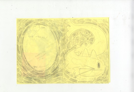
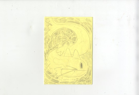
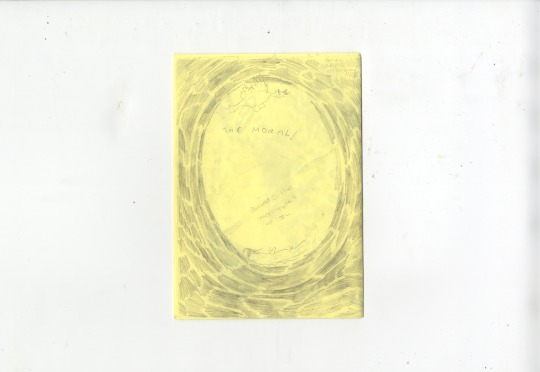
Major Project - Final Book Cropped Photos
These are zoomed-in, cropped photos to show the texture and detailing of the riso in a clearer light.
0 notes
Text


Major Project - Final Book Scans
These are all the pages including the front and back cover in the first image of the physical book. These have all been scanned in.
0 notes
Text


Major Project - Final Digital Spreads
These are all the final digital spreads of my comic. I have made the changes that were commented on in the last tutorial; the leading and justification of the text, creating an uppercase font, and making slight changes to my cover so it relates to my spreads more.
0 notes
Text


Major project - Final Presenation
This is the presentation I delivered for the final tutorial. Here I am presenting outlined, colours formatted for riso and the colours digitally mocked up. My feedback consisted of reviewing the type as it looked too justified and the leading was too big. Another point with the type is that I haven't created an uppercase font which I need to do. The last point is relating the front cover to the inside spreads in a clearer way.
0 notes
Text


Major Project - Final Layouts for the Last Tutorial
These are my current layouts for my final tutorial with the font based on my handwriting. These pages are coloured in the way the riso will print to give an idea of how it will look when printed.
0 notes
Text
Major Project - Final Narrative of Edited Text for my Comic
(cover page-title and Chinese title)
Page1: (no text)
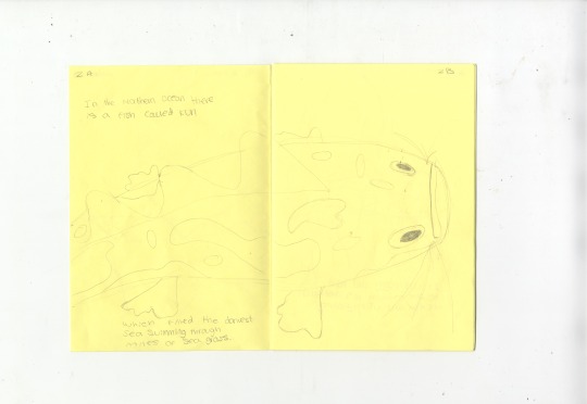
Page 2: In the Northern Ocean there is a fish called Kun which fills the darkest seas.
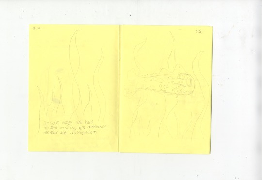
Page 3: It was foggy and hard to see through the sea grass, its destination unclear and unimaginable.
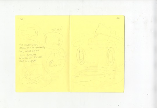
Page 4: The other fish look at Kun differently they keep their distance scared of its vast size and glare.
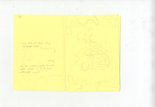
Page 5: Kun was unsure why everyone kept swimming away. all it wants is to feel less alone.
Page 6: time passes slowly ...
but then one day
Kun decides to reach out of the darkness.
Page 7: Believing in its abilities kun rose towards the light leaving the vast ocean evolving into a bird named peng.
Page 8: As it rises and rises, its wings are endless clouds filling the sky. The wind brushes under them as it stretches above the horizon.
Page 9: Peng-kun found true peace and acceptance in its abilities, surrounded and engulfed in blue from above and below, stretching into infinity.
Page 10: Heat shimmers in the air like galloping horses, dust floats like the morning mist, and living creatures are blown about in the sky.
Page 11: Spreading its vast wings Peng-Kun realises yesterday should not get in the way of today.
Page 12 (backpage): join Kun on its journey towards self-belief and the realisation of its abilities. Reaching towards its future kun turns into Peng, a crane representing new beginnings and being at peace with your choices. Peng-Kun’s new adventure it is about to start as it rises to the horizon and an exciting world filled with different possibilities. This narrative is based on one of the tales from the inner chapters of Zhuangzi an ancient Chinese fable.
0 notes
Text


Major project - Tutorial Presentation and Artist Recommended
In this tutorial, I presented my current layouts and what I was struggling with. In my last tutorial, it was suggested I add more of a graphic novel feel by adding panels to the pages to break up the story, however on some pages I have found this tricky. I also don't want to confine my illustrations too much. For this presentation, I presented the outlined spreads to show it in a clearer form, the version for riso, and mocked up with colour. Another area I presented is the font I made based on my handwriting using Glyphs. I decided not to use my handwriting due to the size and inconsistent style of my handwriting as it would look odd going from page to page.
The feedback:
breaking out of the boxes, developing the girds further
make the pages feel freer
think about the handwriting I want to use
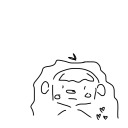
look at David Shrigley (shown in the fish illustration above)
look at Ivy Zheyu Chen (link above), handwriting style
look at Amelia Lewis-Colonna (link above), handwriting style
0 notes
Text


Major Project - Reviewing Pages and Wondering about Handwriting
Here I have all the current spreads printed off. I decided to go through them and annotate the layout, flow, and writing style. Originally I was using a sans serif font but it was suggested to me I try handwriting, which I also thought would elevate my comic going with my illustrative style. Currently, I am finding my handwriting on the pages inconstant and hard to read taking up space on the pages I don't have available. This makes the writing the primary part you see when it should be the illustration you see as I want it to be illustration lead.
0 notes
Text


Major Project - Image References for Sea Grass and Crane
For the drawings in my comic, these are the key references I used for drawing sea grass and the crane.
Image References for Sea Grasses:
Image one: https://www.google.com/url?sa=i&url=https%3A%2F%2Fwww.nwf.org%2FEducational-Resources%2FWildlife-Guide%2FPlants-and-Fungi%2FSeagrasses&psig=AOvVaw1Xdv7wkgfpGRU4SCmgo-gd&ust=1682869730064000&source=images&cd=vfe&ved=0CBAQjRxqFwoTCLDZ5rW4z_4CFQAAAAAdAAAAABAF
Image two: https://www.google.com/url?sa=i&url=https%3A%2F%2Fwww.smithsonianmag.com%2Fscience-nature%2Fseagrass-ocean-secret-weapon-climate-change-180976235%2F&psig=AOvVaw1Xdv7wkgfpGRU4SCmgo-gd&ust=1682869730064000&source=images&cd=vfe&ved=0CBAQjRxqFwoTCLDZ5rW4z_4CFQAAAAAdAAAAABAK
Image three: https://www.google.com/url?sa=i&url=https%3A%2F%2Fwww.theoceanagency.org%2Ftoolkits%2Fseagrass&psig=AOvVaw1Xdv7wkgfpGRU4SCmgo-gd&ust=1682869730064000&source=images&cd=vfe&ved=0CBAQjRxqFwoTCLDZ5rW4z_4CFQAAAAAdAAAAABAT
Image References for Crane Birds:
Image one: https://www.google.com/url?sa=i&url=https%3A%2F%2Fstock.adobe.com%2Fuk%2Fsearch%3Fk%3Dcrane%2520bird&psig=AOvVaw3_QKx8kEGySnzM99gAZJtp&ust=1682869862796000&source=images&cd=vfe&ved=0CBAQjRxqFwoTCMCWgPW4z_4CFQAAAAAdAAAAABAE
Iamge two: https://www.google.com/url?sa=i&url=https%3A%2F%2Fwww.daily-journal.com%2Foutdoors%2Fwhooping-cranes-tallest-rarest-birds-in-north-america%2Farticle_a510310c-5f20-11eb-a1c8-d7e1d3b8c8be.html&psig=AOvVaw3_QKx8kEGySnzM99gAZJtp&ust=1682869862796000&source=images&cd=vfe&ved=0CBAQjRxqFwoTCMCWgPW4z_4CFQAAAAAdAAAAABAJ
Iamge three: https://www.google.com/url?sa=i&url=https%3A%2F%2Fwww.britannica.com%2Fanimal%2Fcrane-bird&psig=AOvVaw3_QKx8kEGySnzM99gAZJtp&ust=1682869862796000&source=images&cd=vfe&ved=0CBAQjRxqFwoTCMCWgPW4z_4CFQAAAAAdAAAAABAk
0 notes
Text


Major Project - Why I have chosen the bird design to be a crane
Here I have different sketch developments working toward the final design of the bird. Originally I felt the bird looked too different from the fish when they should look similar as they are the same being. I decided to highlight feathers in the last sketch that create similar patterns and similar placement to the fish patterns giving the impression of scales
In this link above the symbols and meaning of a crane are explained, this bird inspired me in the design of Peng. Cranes are large birds, they have powerful wings representing wisdom, peace and new beginnings. The article goes on to explain 'According to Chinese legend, Taoist monks were sometimes thought to be capable of transforming themselves into cranes.'
0 notes
Text


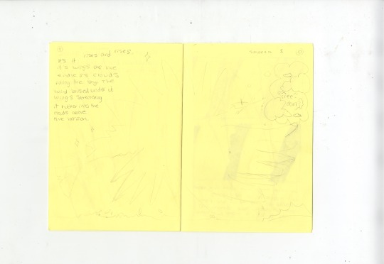


Major Project - Sketched version of Comic and Test Risos with Test Text Page
Here I have the scans from my hand-sketched comic and the testing of different fonts that could be used for the narrative.
I decided to sketch the narrative to get an idea of how it is currently flowing with the illustrations. This will help for future reference when digitally paginating my book.
For the font, I have decided to use Galvji in 17pt, as I feel it is the cleanest, not detracting from the illustrations whilst still having curved points.
In the last two prints are some test layouts using the risograph. This is the first time I have seen the outcome of the bird in riso print. I am happy with the shape of the bird and the scale of its wings. However, the pattern on the bird needs further development as it does not relate to feathers.
0 notes
Text


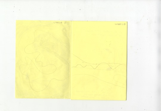
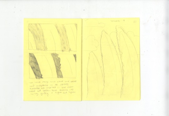
Major Project - Prints of layouts
These are the current layouts I have outlined, to focus on the movement of the narrative. On the pages I have made notes about what I feel needs to be changed and to develop pages that I am struggling with. The last three spreads are the ones I feel need the most development as the narrative is not conveyed clearly in these.
0 notes